A creative agency website that looks more like a piece of '90s Net Art than a boring portfolio
It can’t be easy as a creative agency when you’re commissioned to create designs for a fellow creative agency, but we reckon Studio Thomas has done a pretty great job with its work for Homer & Farley.
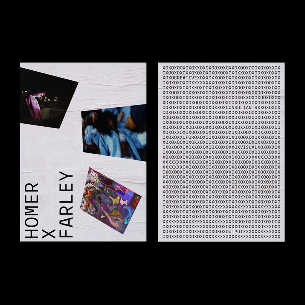
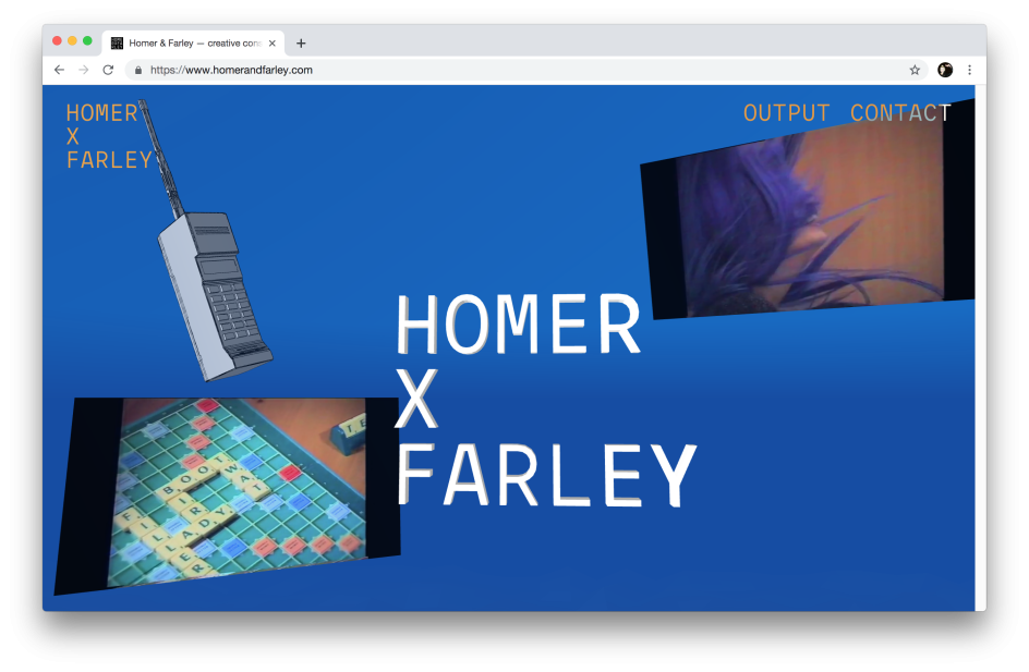
Studio Thomas created the identity and a brilliant website that looks more like a piece of '90s net art than a standard agency website: that spinning brick phone! The weird angles! The delirious scrolling! Oh, yeah, and those very “retro” drop-shadows on the typography. All pretty glorious, if you’re a fan of Cory Arcangel and scrolling through Rhizome archives (I most definitely am).
“We developed an immersive, three-dimensional world to house their eclectic portfolio of visual output,” Studio Thomas explains. “Visitors are invited to don VR goggles for the full experience."
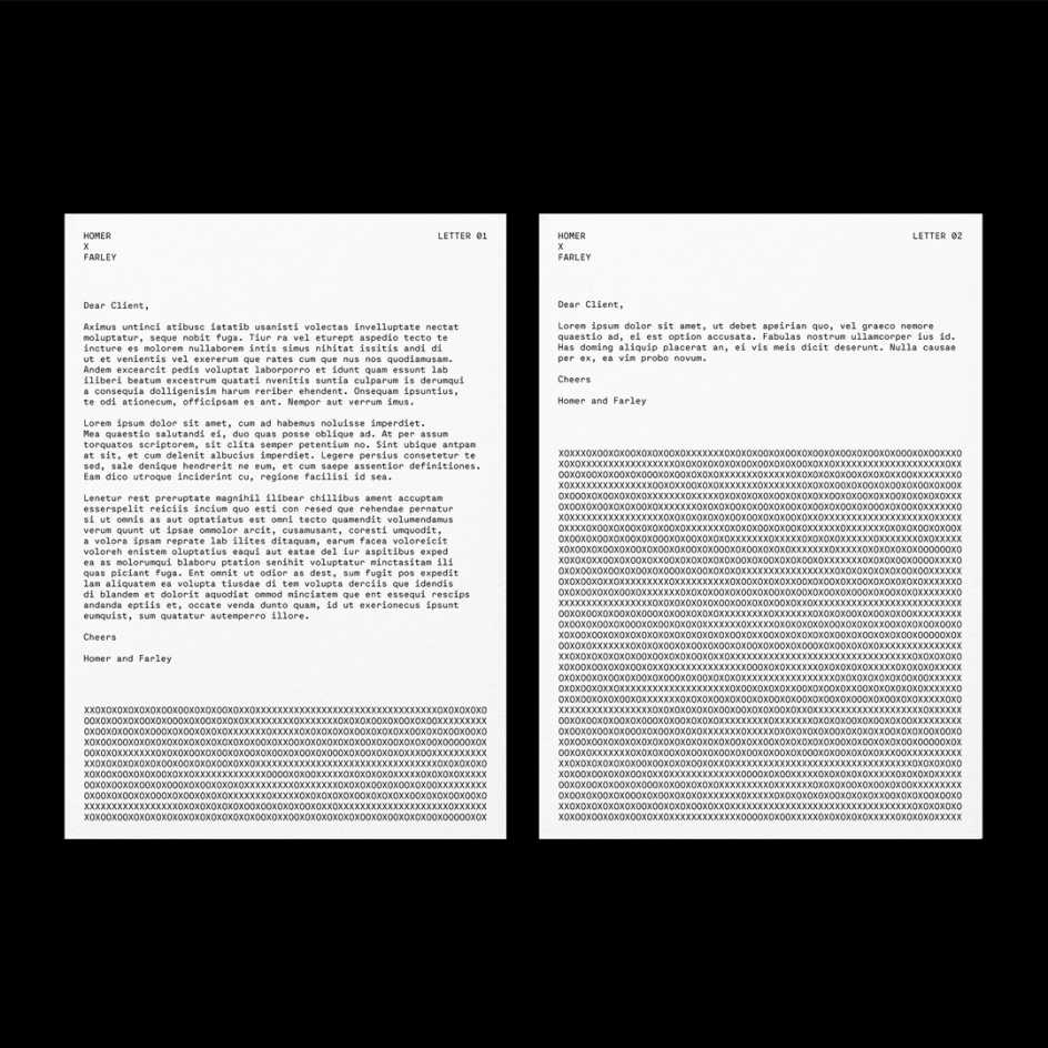
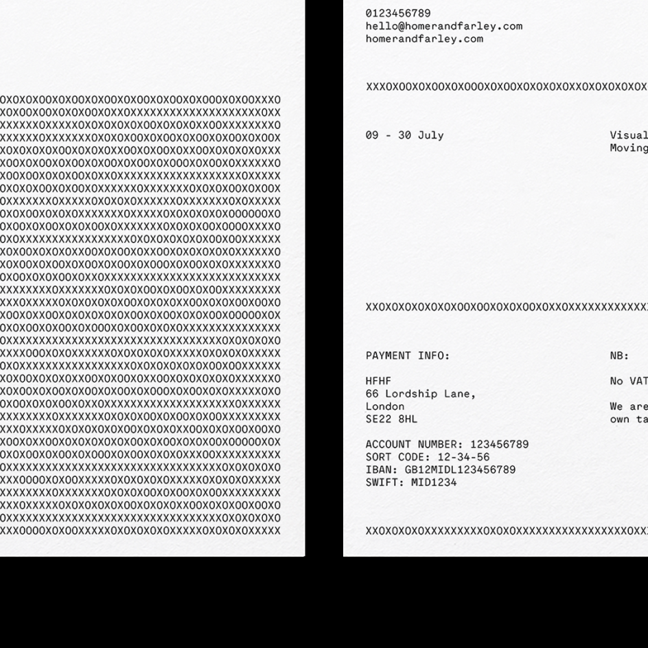
The identity is based on the idea of “collaboration, relationships and playfulness”, according to Studio Thomas. The new identity is designed to reflect the “friendly and creative nature of Homer & Farley's working process,” it adds. Their emotive XOXO sign-off is referenced in the brand assets which subtly underlines the light, conversational tone.”
Editor's Picks


Trending


](https://www.creativeboom.com/upload/articles/90/908fdb6378db1e95d12595416f54e6336d5e80b8_732.jpg)
Podcasts


Editor's Picks
Further Reading