Raw pet food brand HiRaw's new identity takes a playful approach
Vietnamese studio M — N Associates has been working with pet food brand HiRaw! to promote a different kind of animal diet. We share their new identity and explore the thinking behind it.
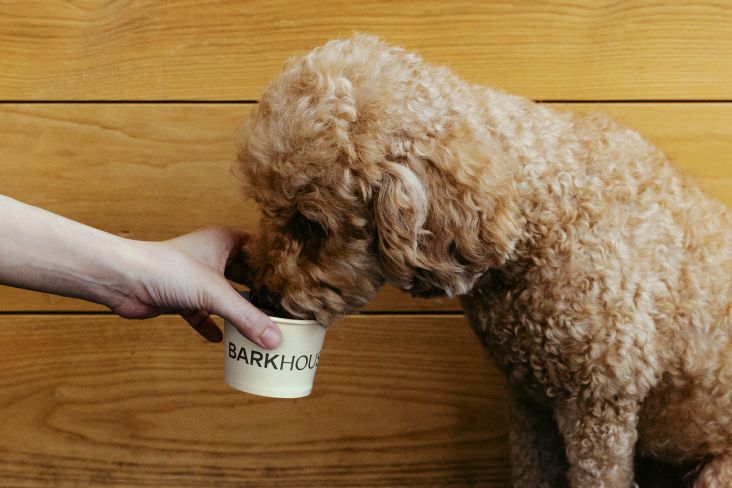
BARF stands for Biologically Appropriate Raw Food Diet. It's basically an alternative raw diet for pets that eliminates all processed foods and is instead made up of raw muscle meat and raw meaty bones, as well as vegetables and fruits.
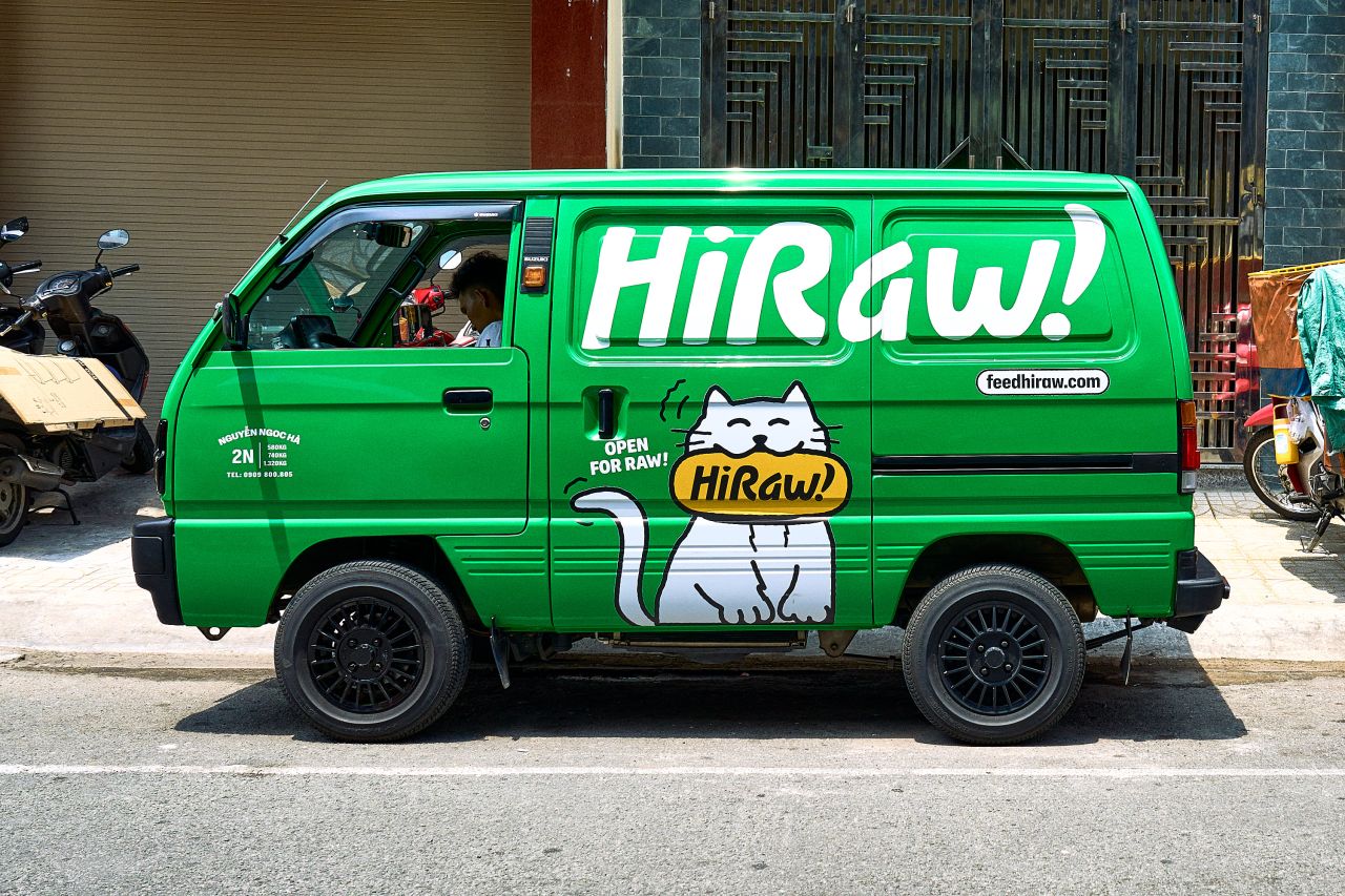
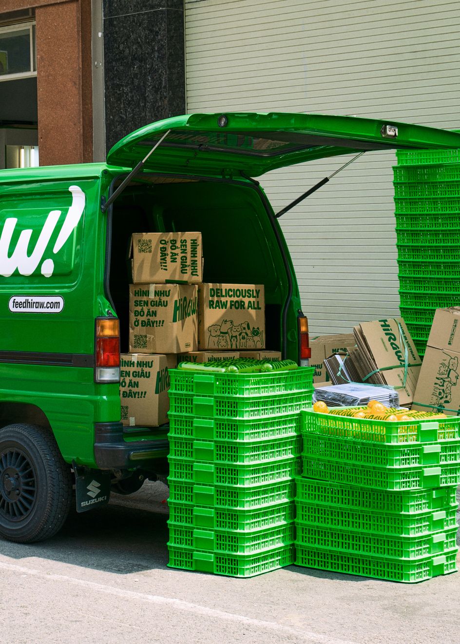
Founded in 2018, HiRaw! – a raw pet food company based in Vietnam – had been experiencing rapid growth. Consequently, they faced the need for a brand overhaul.
The problem was that their existing system had become chaotic, making it vulnerable to imitation from competitors and failing to make a strong impact on store shelves. To address these challenges, HiRaw! sought to embark on a rebranding journey. And so they teamed up with M — N Associates, a strategic branding studio based in Ho Chi Minh.
Together, they worked to develop a visionary brand strategy that would embody their core values of compassion towards all dogs and cats.
Brand strategy
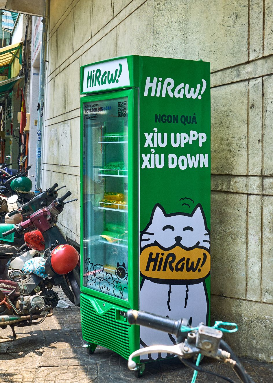
The company's goal was to create a brand identity system that exuded boldness, strength, contemporariness, and a touch of humour. The main aims of the rebrand were to establish a strong connection with their target audience, raise awareness about the brand, and reinforce consistency in visual and verbal language.
The guiding principle of HiRaw! revolves around the concept of 'Deliciously Raw for All'. This ideology underpins a strategic cohesive brand platform that unites and celebrates the love, joy and individuality of dogs and cats within HiRaw's brand universe.
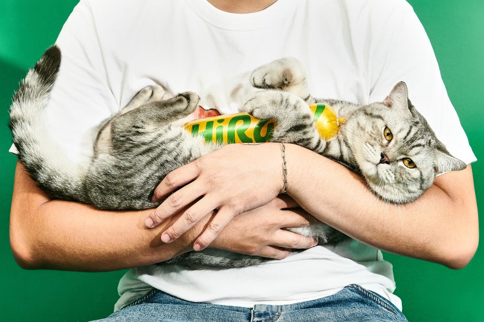
The new brand identity system is built on an inclusive platform that fosters a deep connection with pet owners and their beloved companions. Incorporating raw and authentic touches, it captures the playful and affectionate nature of pets, evoking a sense of warmth and excitement.
This approach reinforces the brand's dedication to promoting the well-being and happiness of all pets, showcasing its commitment to their care and nourishment.
Design elements
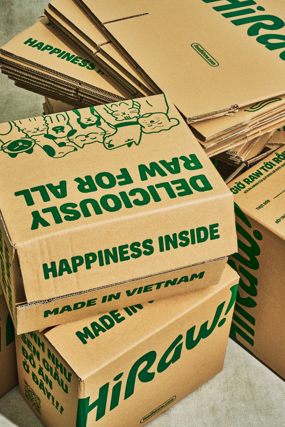
Grounded in the creative idea of 'Raw for All', the brand identity system for Hiraw is fuelled by the vibrant energy of pets coming together to feast on delicious, raw food.
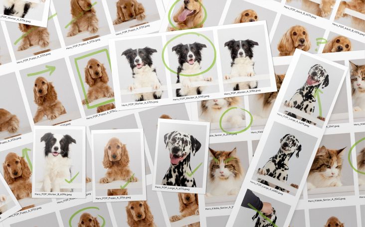
The essence of rawness takes centre stage within the new visual identity, resonating throughout the entire system, including typography, graphic elements, illustrations, and art direction for photography. This infusion of raw authenticity imbues HiRaw! with a distinctive and lively personality.
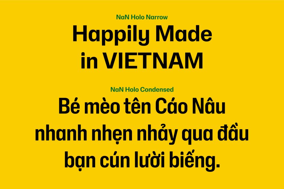
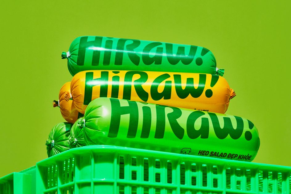
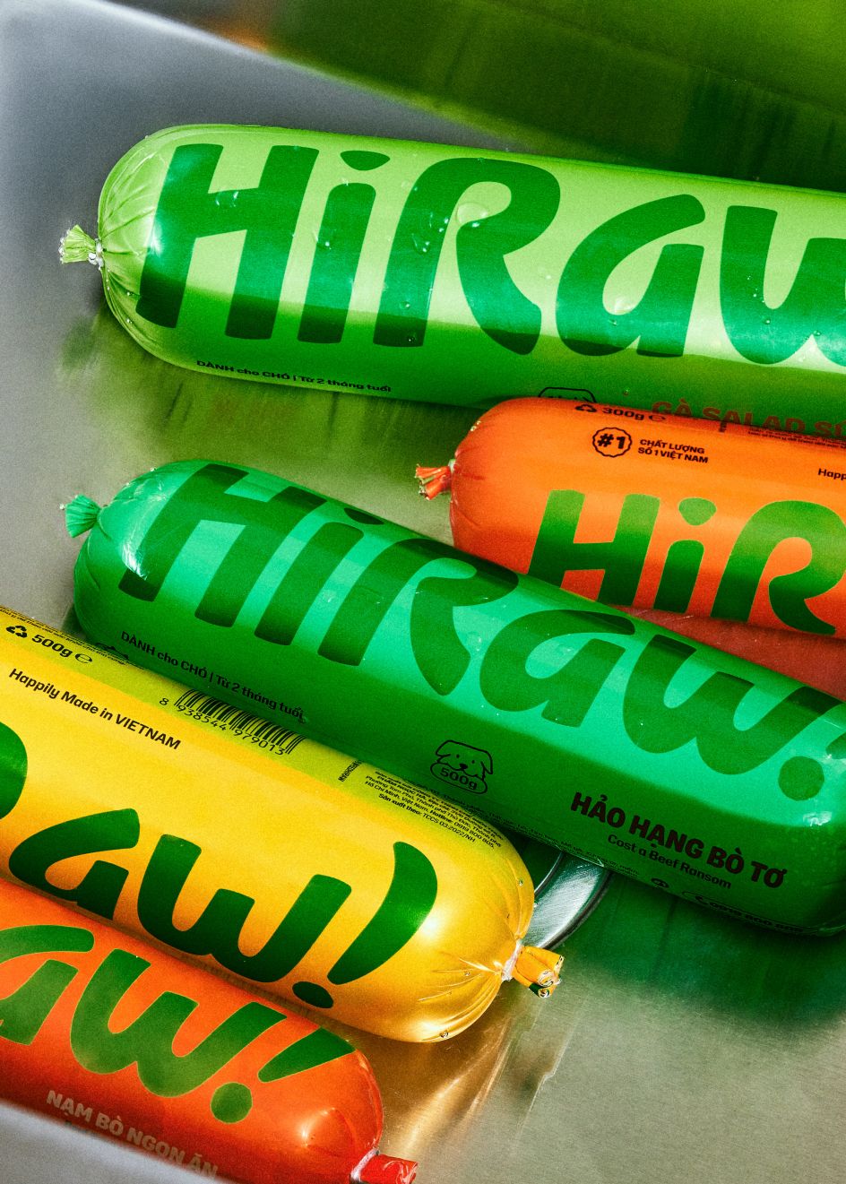
The custom MN Raw font incorporates the texture and essence of mixed food, further enhancing the raw aesthetic. The identity also utilises NaN Holo Narrow and Condensed as complementary fonts for context display.
With rectangular counters and rounded curves, this font adds a delightful touch to the branding. When used, its intentional mix of rounded and squared details brings surprise, character, and warmth. It exudes a reliable and original human touch without overpowering the overall design.
Through this new brand identity system, HiRaw! encapsulates the spirit of unity and the joy that comes from nourishing pets with premium raw food. It reflects their dedication to providing a wholesome and authentic dining experience for all furry companions.
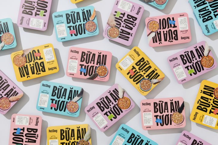
Packaging and TOV
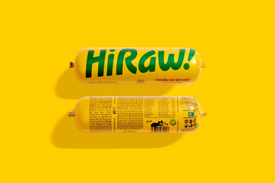
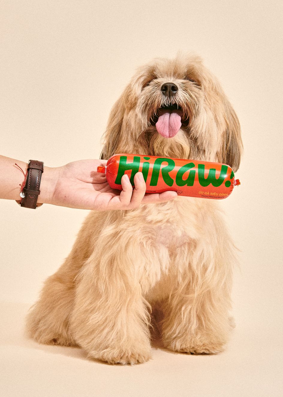
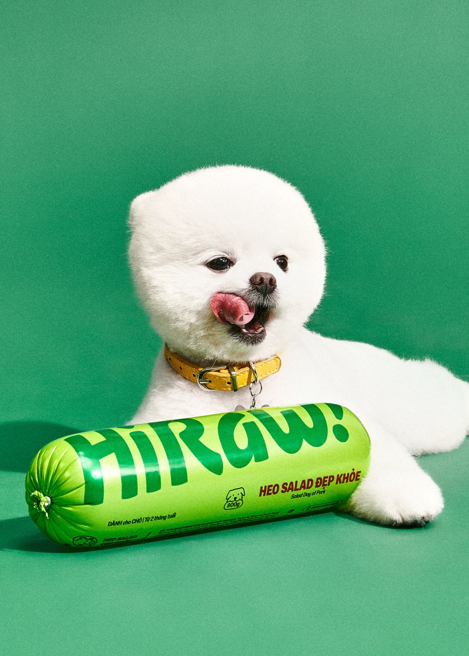
With a focus on enhancing shelf presence, the packaging is now strategically divided into two panels. The front panel takes centre stage, showcasing the HiRaw! logotype in a prominent and eye-catching manner. This ensures that the brand stands out among the competition.
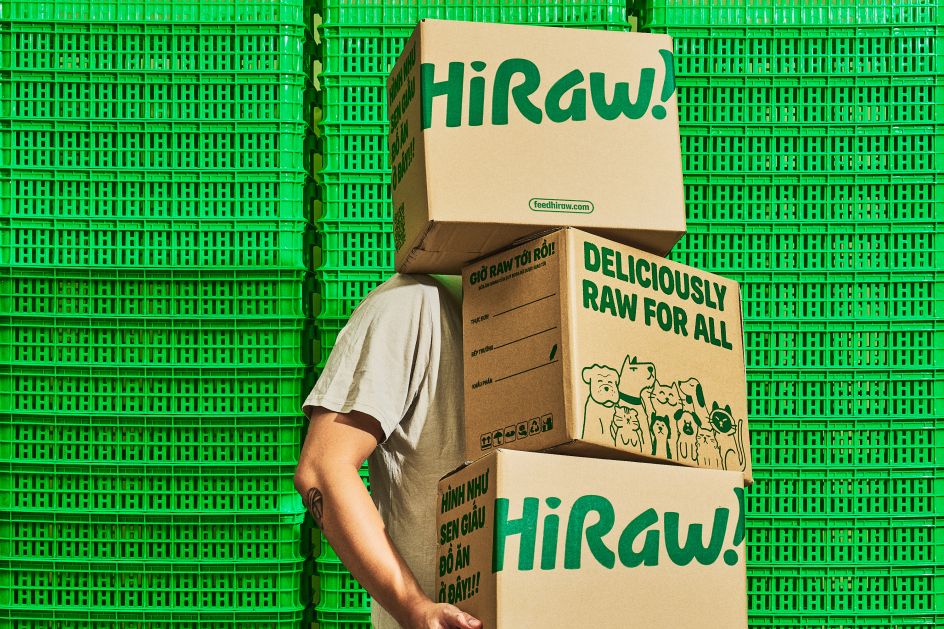
All the necessary English and Vietnamese content is thoughtfully incorporated on the back panel. In addition, humorous touches have been added to the barcode, injecting a sense of joy, excitement and personality into HiRaw!'s pet characters. To make the packaging even more memorable, playful, welcoming, passionate and relatable to customers, M — N Associates have also reworked each recipe name.
The overall goal is to create a fun and engaging experience that resonates with pet owners on a human level. Infusing HiRaw!'s packaging with a touch of playfulness and making the recipe names more memorable helps to leave a lasting impression and forge a strong connection with the brand's customers.
Editor's Picks


Trending


Podcasts


Editor's Picks
Further Reading