Environmental course provider's new branding is wonderfully down to earth
A new platform for learning environmental system has a slick new branding system courtesy of Pentagram and Mondial Studio. Rather than doing anything too clever, it sticks to the fundamentals of design, and is all the more successful for it.
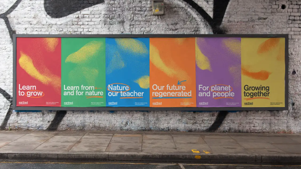
We all like to talk a good game on the environment. But how much do you really know?
Well, if the answer is "not much" and you'd like to change that, Earthed is an online platform where you can take part in expert-led based courses to learn nature skills and ecosystem restoration.
The many topics covered on this site, led by teachers from around the world, include biodynamic farming, food forests, river restoration, urban gardening and earth democracy. The aim of the platform is to help members become part of a global community that facilitates, restoring nature, growing food, sharing skills and discusings practical steps to help the planet.
As they put it: "Earthed is a nature skills platform that exists to make every river, city, farm and balcony burst with life. Here, you can learn skills from our nature teachers, celebrate traditional knowledge and those who hold it and take part in community activities across many topics and terrains."
Collaborative project
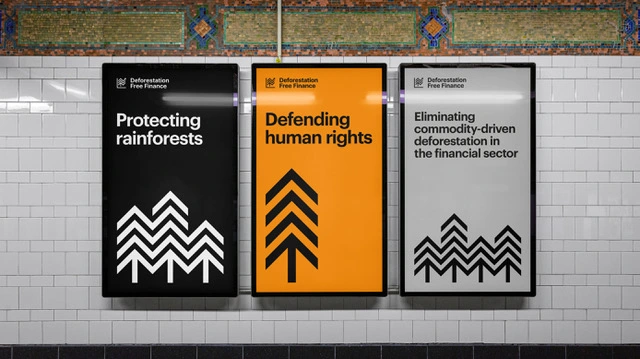
The project was created in collaboration with Naresh Ramchandani’s copywriting team (including Robyn Cusworth and Ashley Johnson) at Pentagram (before Naresh left as a partner last year) and Arthur Stovell at Mondial Studio, whose Deforestation-Free Finance brand identity we covered last October.
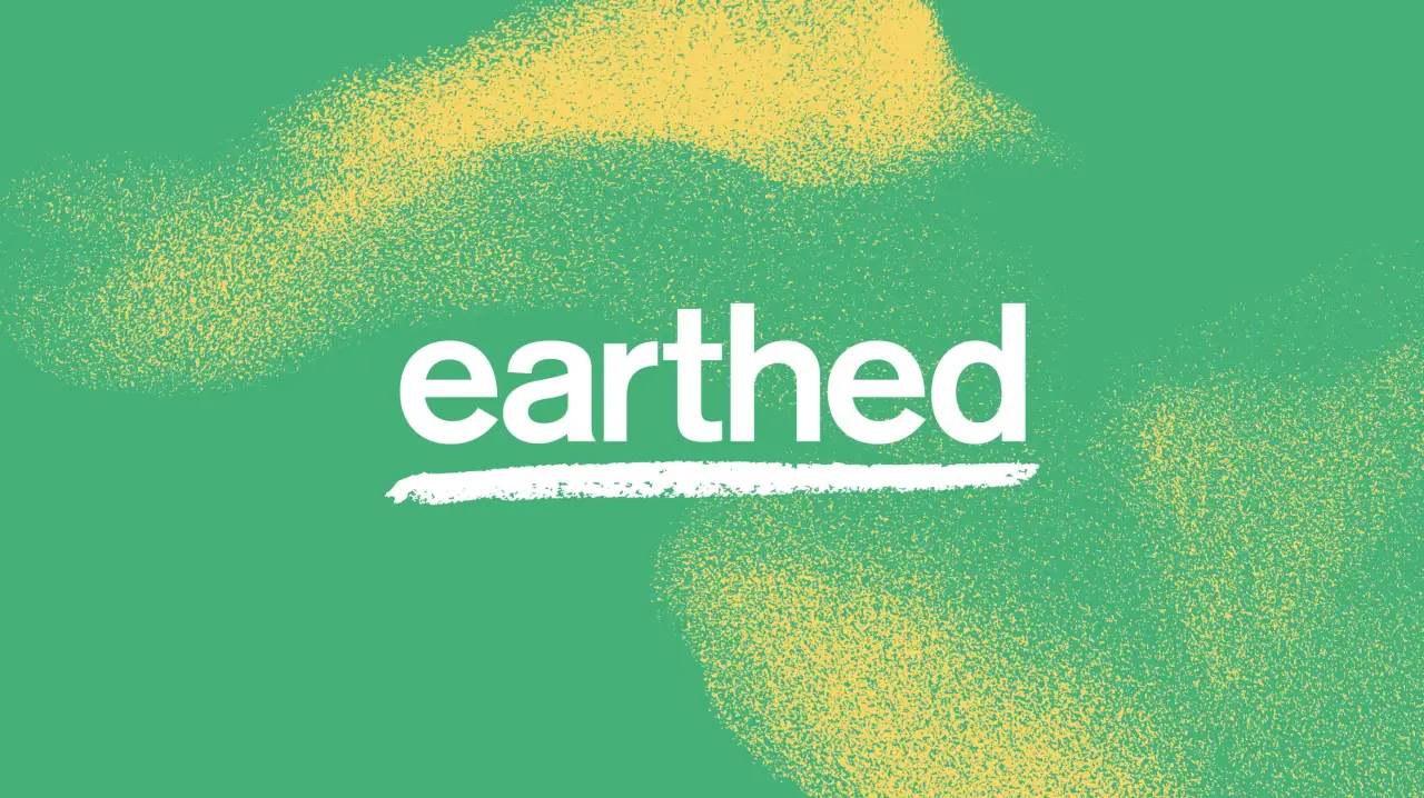
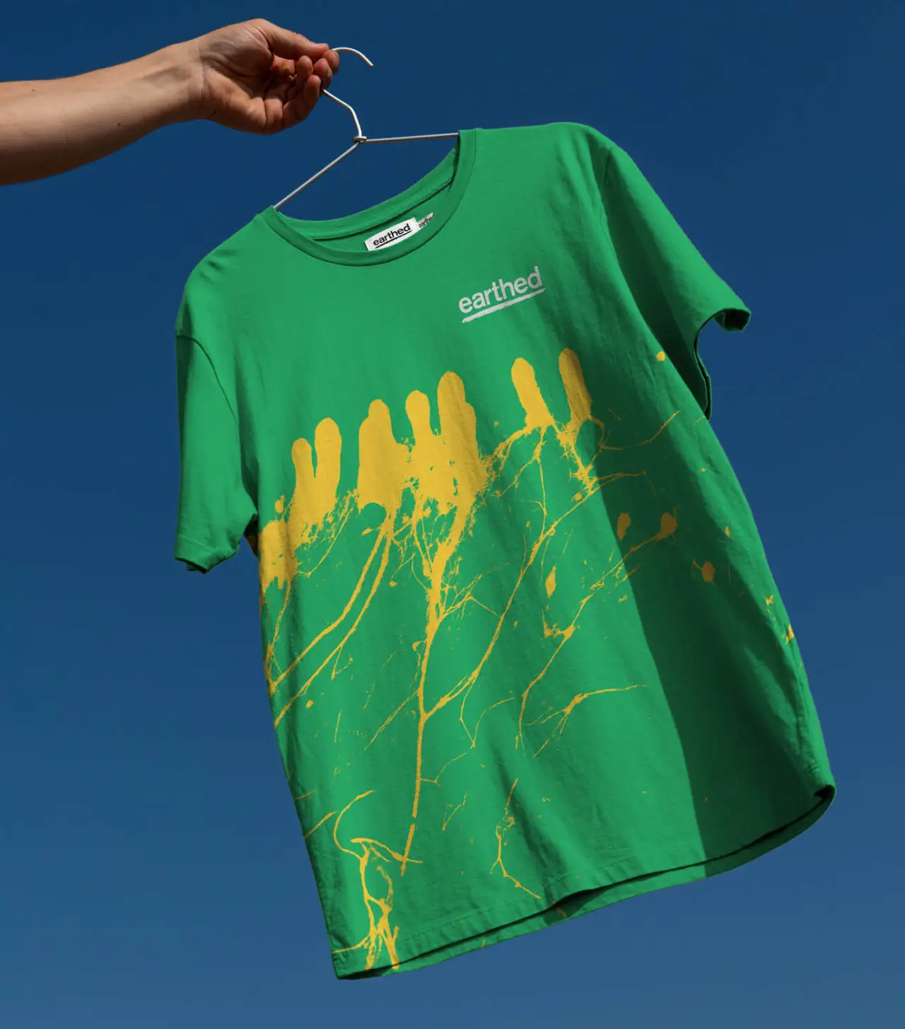
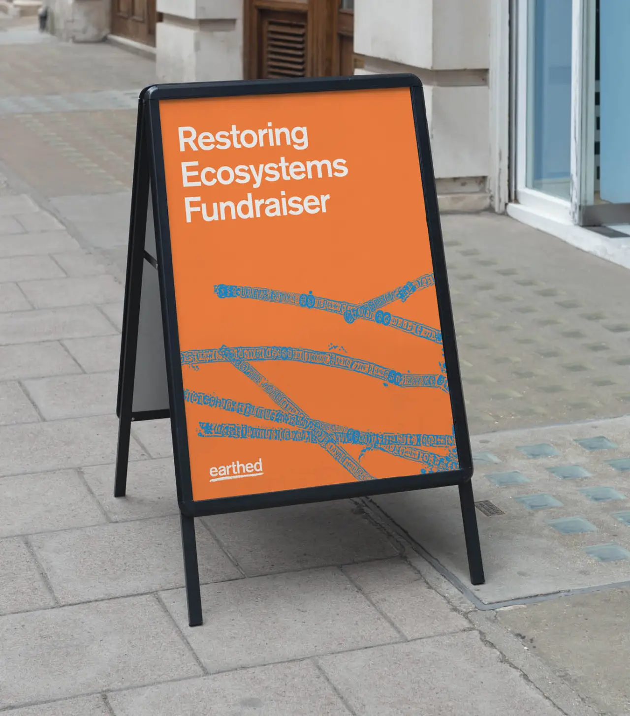
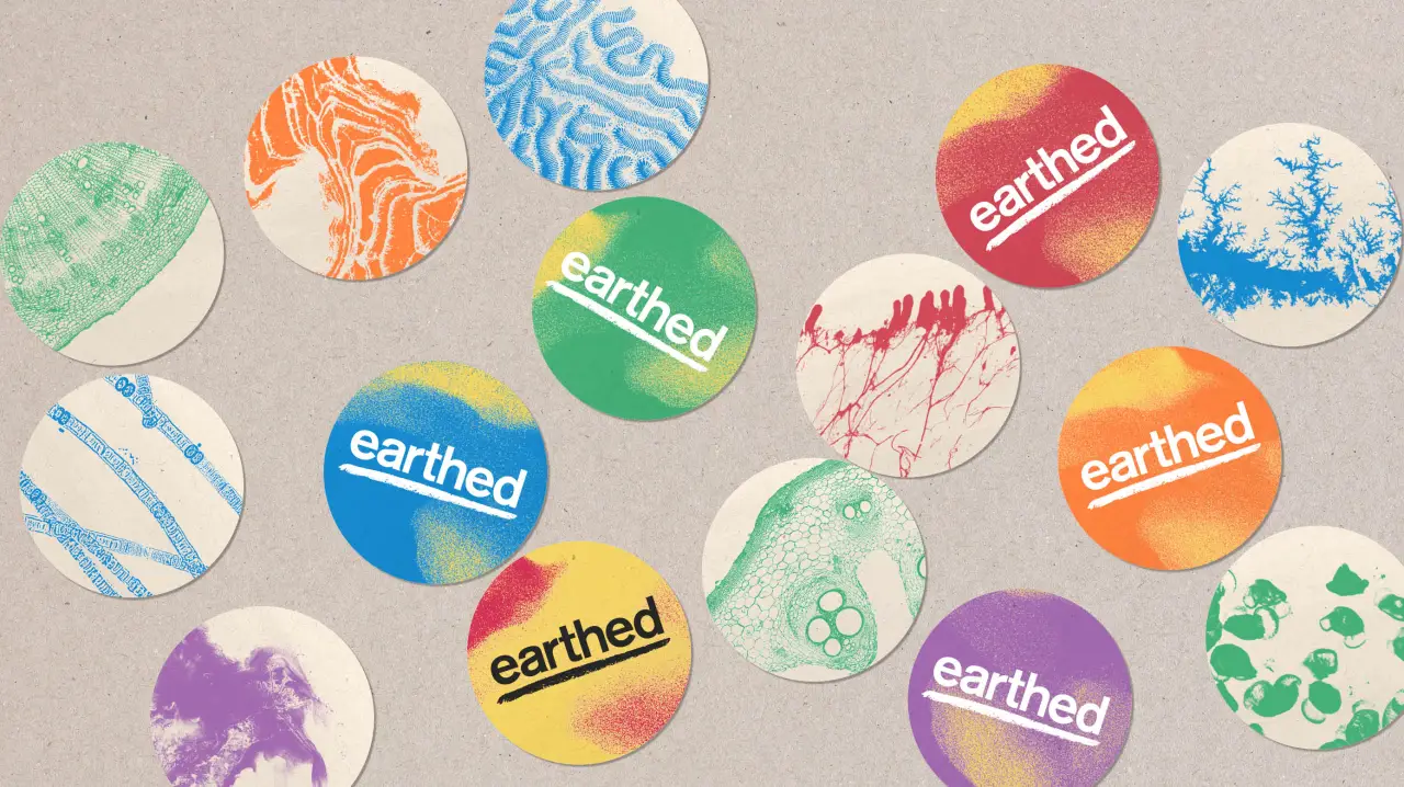
"Naresh’s team created the strategy and copywriting and I produced the visual identity," explains Arthur. "The solution for the identity was born from the logotype sitting on a simple hand-drawn underline to represent the ground; therefore being earthed.
"This then formed the starting point of the rough textures that appear throughout the rest of the identity as abstracted moments in nature, including the starling murmurations idents." (In case you didn't know, a murmuration is a swooping flock of birds flying in unison.)
Visual designs
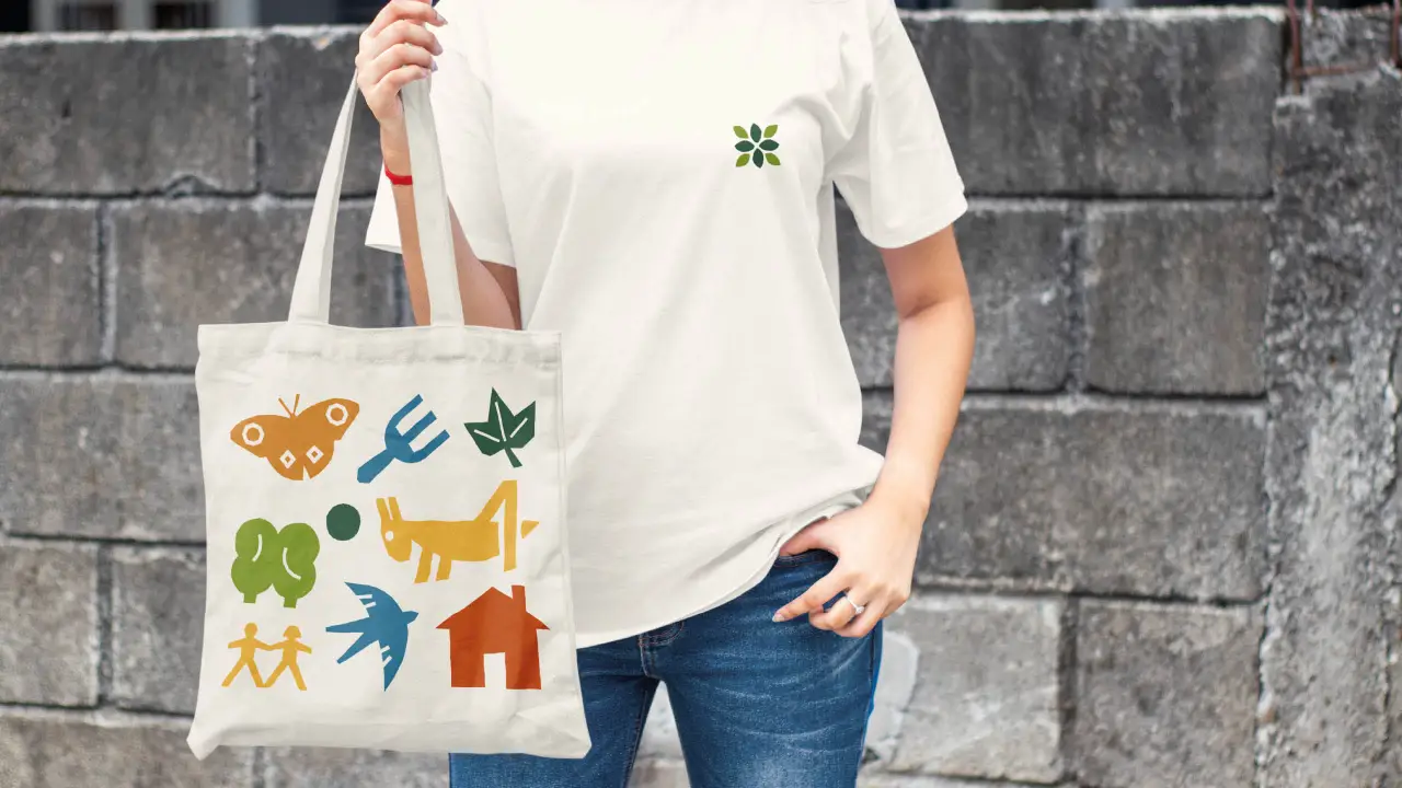
The resulting designs, suitably enough, feel very grounding and organic. The brushstrokes and added shapes, swirls, splotches and lines infuse the graphics and illustrations with a hand-drawn, rugged, natural feel that's blends nicely with the subject matter.
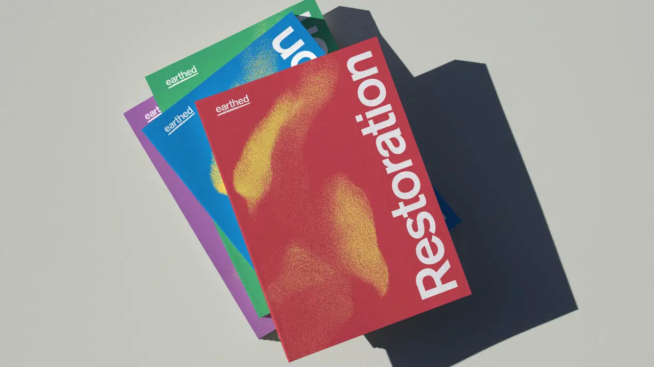
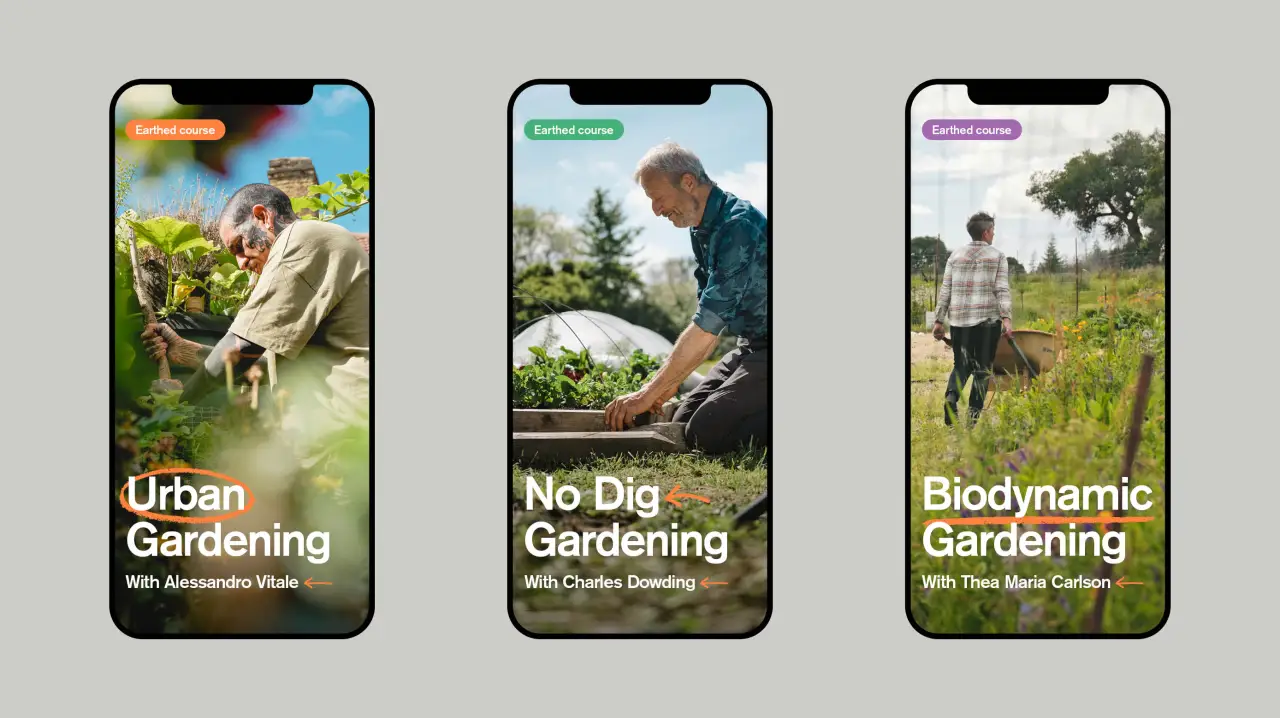
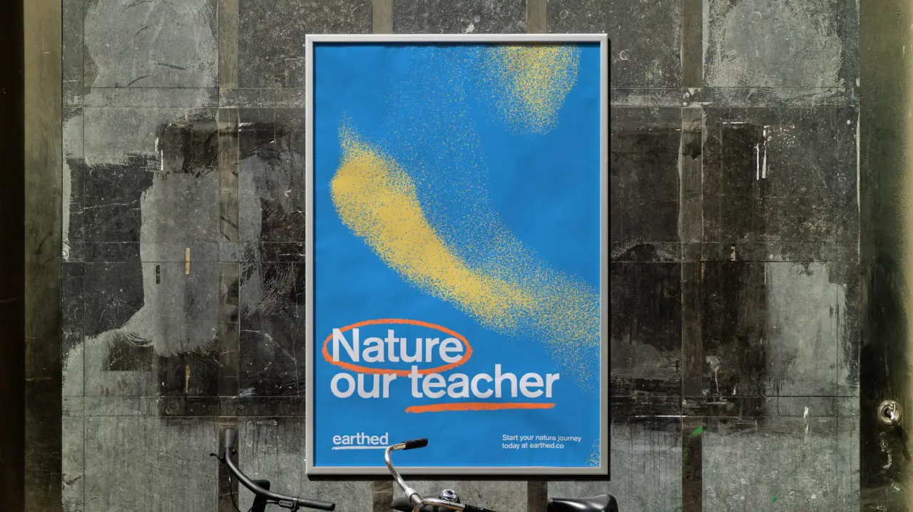
The typography, meanwhile, takes the lead to ensure clear messaging while the colour palette helps the assets as a whole feel bright and optimistic. And the photography, courtesy of Perspective Pictures, adds to the upbeat approach. It was a smart decision, in our eyes, to go for positive imagery, rather than wallowing in depressing scenes of environmental disruption.
Finally, and perhaps most importantly, the layouts are clean and uncluttered, conveying the message clearly via promotional assets and helping students navigate the content quickly and easily on the website itself.
Editor's Picks





Trending






Latest Jobs
Design Director, Opinion at The New York Times
Full-time·New York·$160k–$180k
Mid-Senior Designer at Something Familiar
Full-time·Bristol·£32k–£40k
Design Director at Human After All
Full-time·London·£66k–£88k
Midweight Graphic Designer at We Are Your Friends
Full-time·London·£36k–£44k
Digital Marketing Executive at Arise
Full-time·Sheffield·From £23,750
Client Partner at Halo
Full-time·Bristol·£30k–£36k