Kira Koroknai's wine label designs are a 'glorious mess'
Designer Kira Koroknai explains how she devised packaging designs for a limited-edition wine label. And they're pretty special, reflecting the unique balance of the drink.
Kira Koroknai is a Budapest-based freelance designer, with a focus on branding, packaging and editorial design. Her latest packaging project is a special-edition wine label made for Glug Wine Club Scotland.
As Kira explains, "The club's concept is to feature small-batch wines from new countries every month, with modern and exciting labels. For the Hungarian edition, I was assigned to design a label for Vojtek, a tiny, inventive family winery from Villány, best known for its big reds.
"Their main goal is to make unique flavours," she adds. "So they always add a twist to make it a bit different, whether through blending, ageing in old barrels for a longer period, or sometimes experimenting with oak staves. They mix technologies and techniques with excellent grapes, making something special."
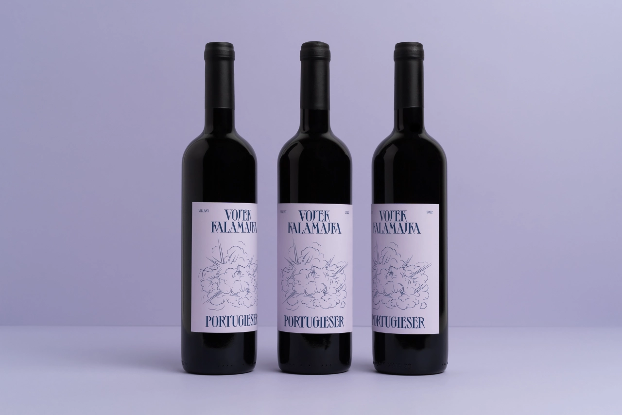
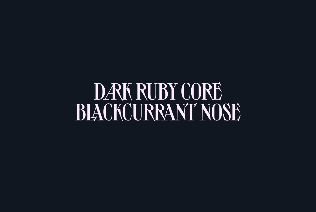
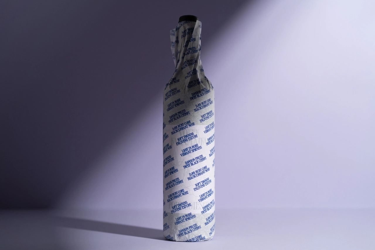
Kalamajka Portugieser is a fruity, velvety, and harmonious wine made almost exclusively in the Villány wine region in Hungary. "It's light in robe, yet scintillatingly spicy," says Kira. "It has a dark ruby colour with a black core, blackcurrant nose, damson fruit, and sweet black cherry in abundance on the palate."
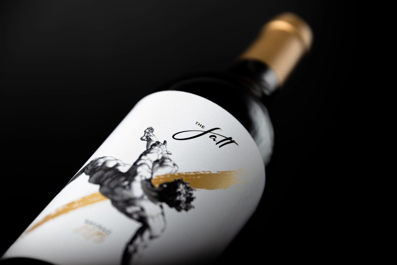
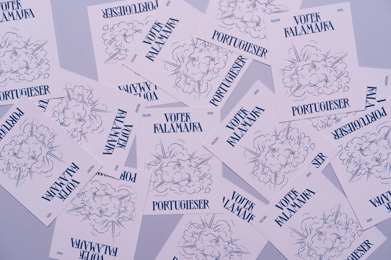
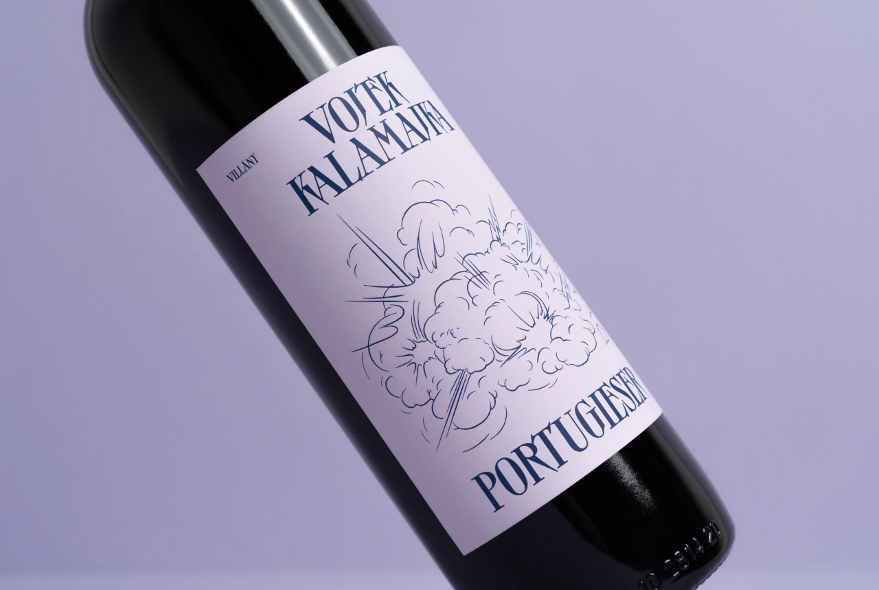
The label design was inspired by the name of the wine, which refers to a glorious mess. "I wanted to create an intriguing look using contrasting visual elements," says Kira. "These were arranged to achieve perfect harmony."
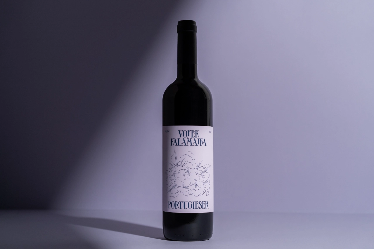
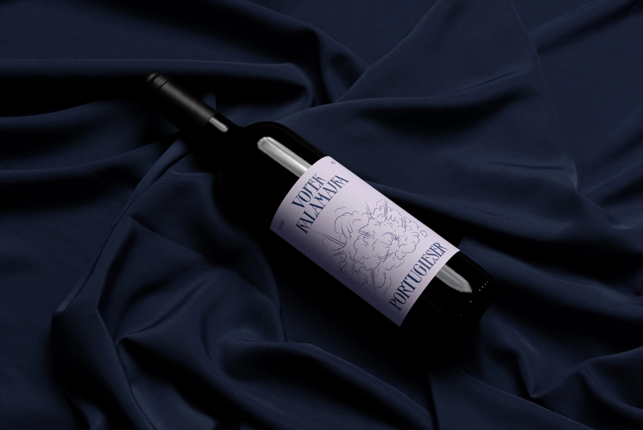
She continues: "The fine lines of the illustration balance the strong typography with extra tight line spacing. Reflecting on this dynamic contrast, the light pastel, lilac label, complemented with navy blue lettering, creates an invitation to explore the fresh, fruity, and bold notes of Vojtek's Kalamajka Portugieser."
Art direction and graphic design was led by Kira, with illustrations by Zita Beke and photography by Kevin Harald Campean.

Editor's Picks





Trending






Latest Jobs
Brand Designer, Product Launches at Figma
Full-time·New York·$127k–$269k
Senior 2D Motion Designer at Art&Graft
Full-time·London·£50k-£65k
Design Lead at Madeo
Full-time·New York City·$85k–$120k
Growth Strategist (Ecommerce) at Tribe
Full-time·Exeter / London·£50k + Bonuses
Senior Front End Developer at Crown Creative
Full-time·Belfast·£50k–£60k
Senior Brand Designer at Analogue
Full-time·Leeds·£38k-£45k