14 of the best brand identities created by students
From new identities to complete overhauls, students at Shillington are tasked with a variety of branding challenges which range from designing a fresh new look for a small business to breathing life into a tired city brand to change perceptions.
Amy Sil Mil. All images courtesy of Shillington and its students.
Here, we pick out some of the best identities, dreamt up and created by our recent graduates. The following projects are purely hypothetical – we'll let you decide which is your favourite.
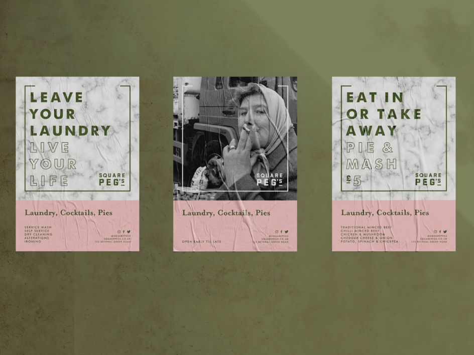
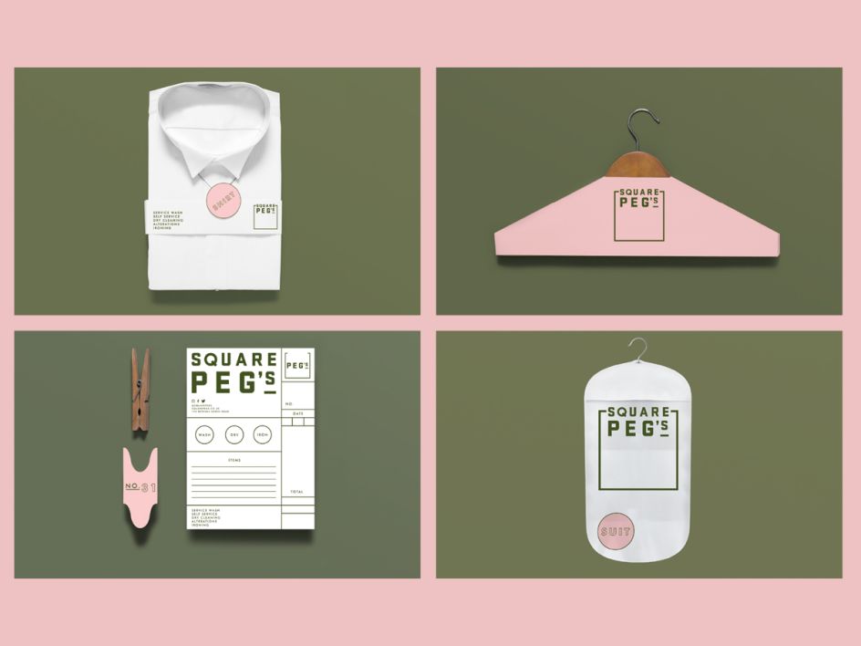
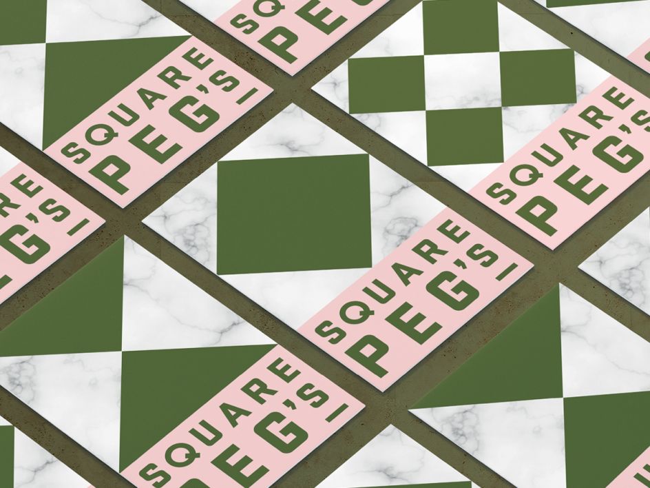
1. Eleanor Robertson, London: Laundrette Branding
Our graduate Eleanor Robertson created this identity for a new laundrette in Bethnal Green to present to a local social enterprise for funding. The concept needed to help revive a sense of community in London’s East End.
"I drew on East End traditions in a way that engages modern audiences by bringing patterns and textures found in the traditional pie and mash shops, as well as archive images, together with modern typography," Eleanor explains.
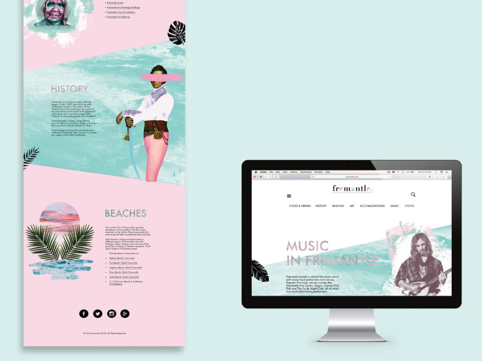
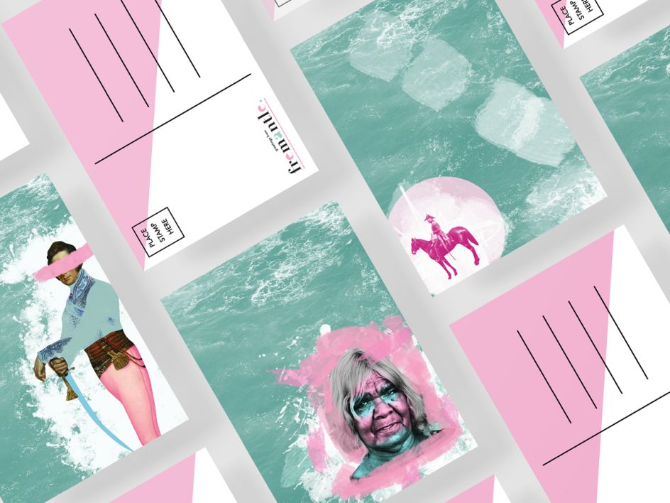
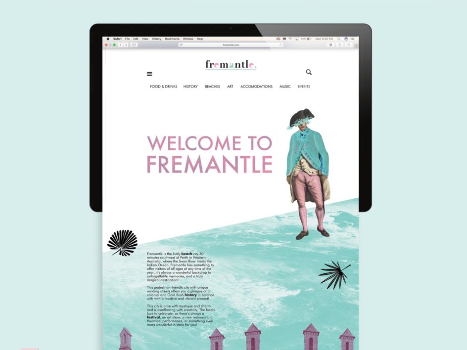
2. Ernie Holiday, New York: City Branding
For his identity project, Ernie Holiday decided to rebrand Fremantle, a major port city in Western Australia is located at the mouth of the Swan River. Using an appealing palette of pink and blue hues, Ernie highlights the beach and tropical culture along with references to the city's heritage.
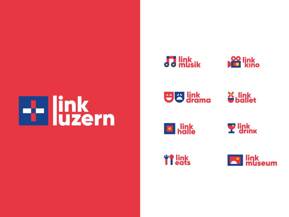
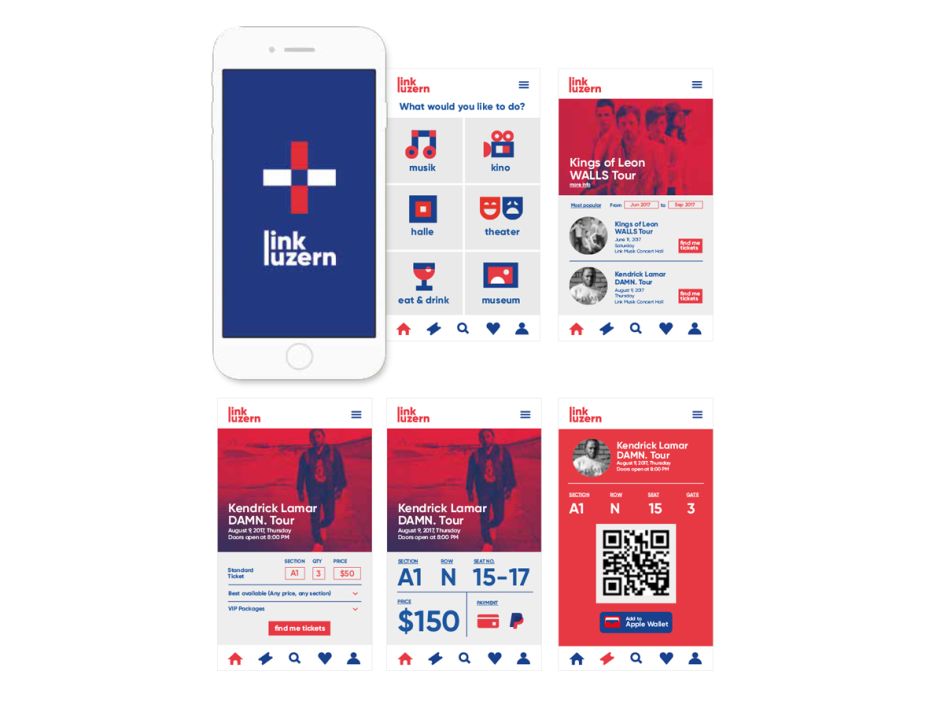
3. Miguel Lugtu, Melbourne: Branding for Multi-Purpose Venue
Our Melbourne graduate Miguel Lugtu, won an AGDA award for his branding of a "multi-purpose venue" in Lucerne, Switzerland, designed by Woods Bagot that would entice people to visit and explore its many facilities and features.
"For this brief, I took inspiration from Swiss graphic design and the way Woods Bagot uses meshes and links that wrap around their buildings," explains Miguel. "I used the keyword connect throughout this identity which resulted in the linked letters as well as overlapping shapes and colour overlays. The main brandmark was the product of two lowercase Ls overlapping with each other."
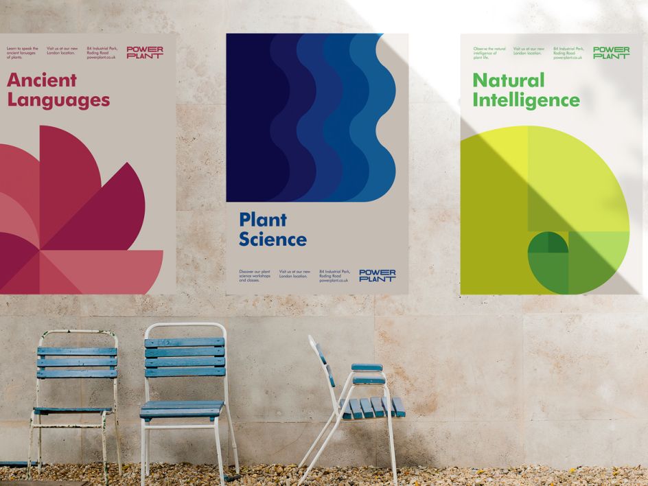
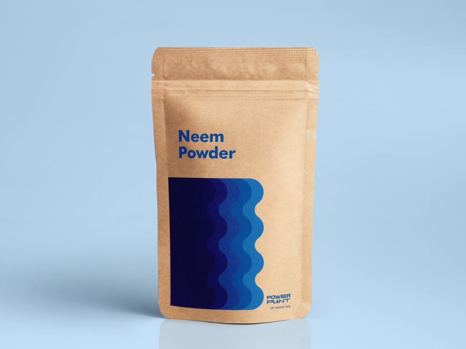
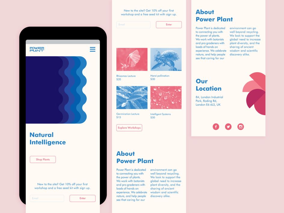
4. Michaela Early, New York: Urban Garden Start-Up Branding
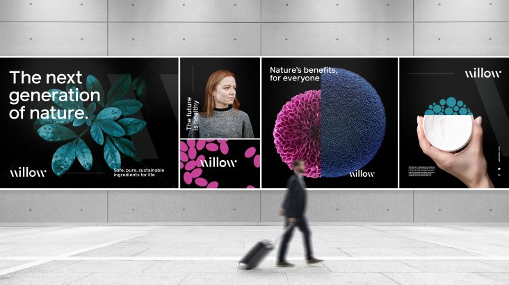
Michaela Early called upon the power of plants for her identity project. The brief was to design an identity for an urban garden startup company in London that centres around a community and gets young professionals excited about urban gardening and away from their computer screens.
"I drew on the language of, and obsession with, technology and artificial intelligence to shine a light on a form of impressive intelligence we tend of overlook these days: nature," says Michaela. "I wanted to connect young professionals through a concept they can understand (technology) to plants by personifying them as an alternate form of intelligence to get to know."
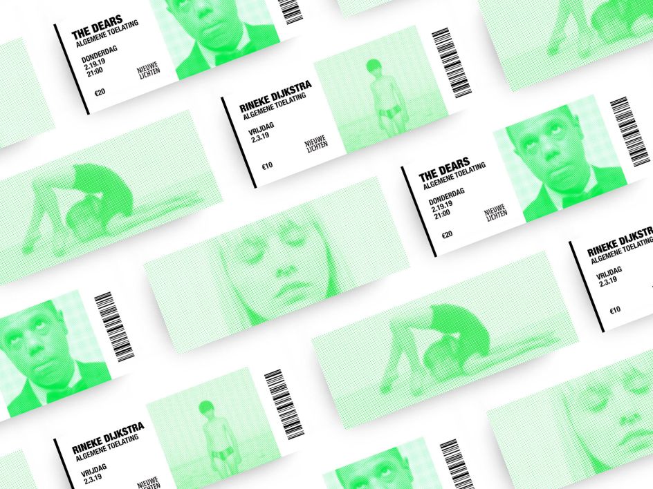
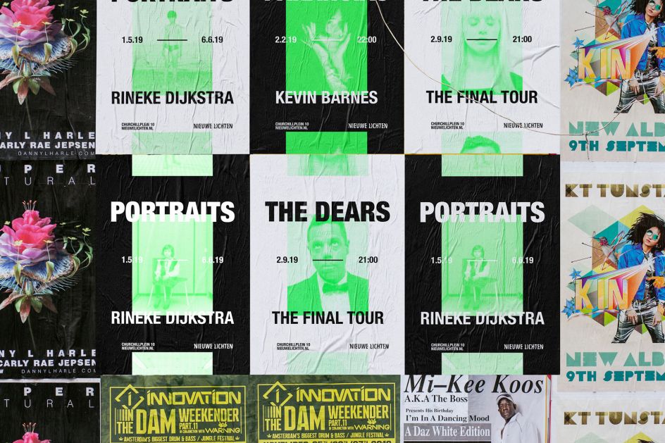
5. Victoire Scherer, New York: Events Space Branding
Victoire Scherer decided to create a corporate identity for a multipurpose events venue located in the Hague, Netherlands, designed by architecture firm C. F. Moller.
"Nieuwe Lichten is a space where visitors are invited to gain new, unexpected perspectives, whether they are attending a conference, a ballet, an opera show, a rock concert or an art exhibit," says Victoire. "Reflecting C.F. Moller’s sustainable, sleek architecture, Nieuwe Lichten’s branding is contemporary and full of life."
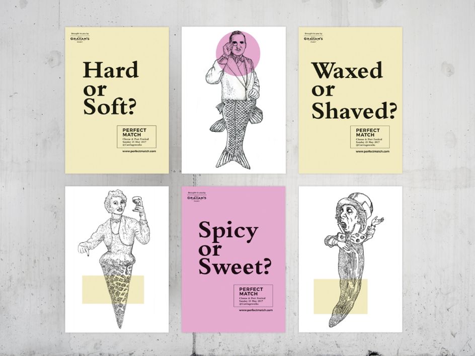
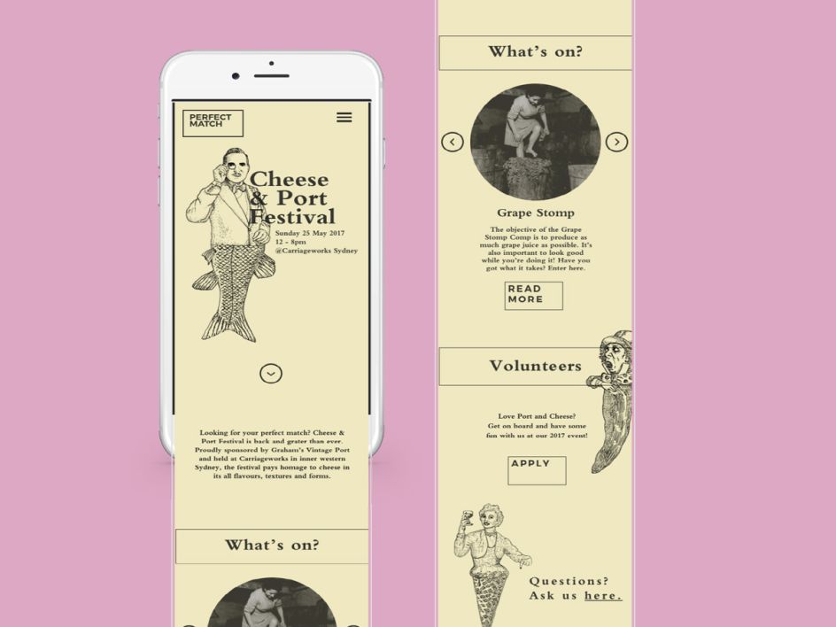
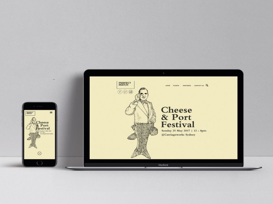
6. Elly Litton, Sydney: Rebrand of Port Brand
Elly Litton is another AGDA award winner who was recognised for her project, Perfect Match. The brief was to change perceptions of port wine amongst a younger audience.
"Graham’s Vintage Port Wine needed a reputation makeover," explains Elly. "Seen as old-school and often forgotten by Gen X & Y, I set out to brand a cheese and wine event that would capture the attention of a younger demographic and change the perception of Port."
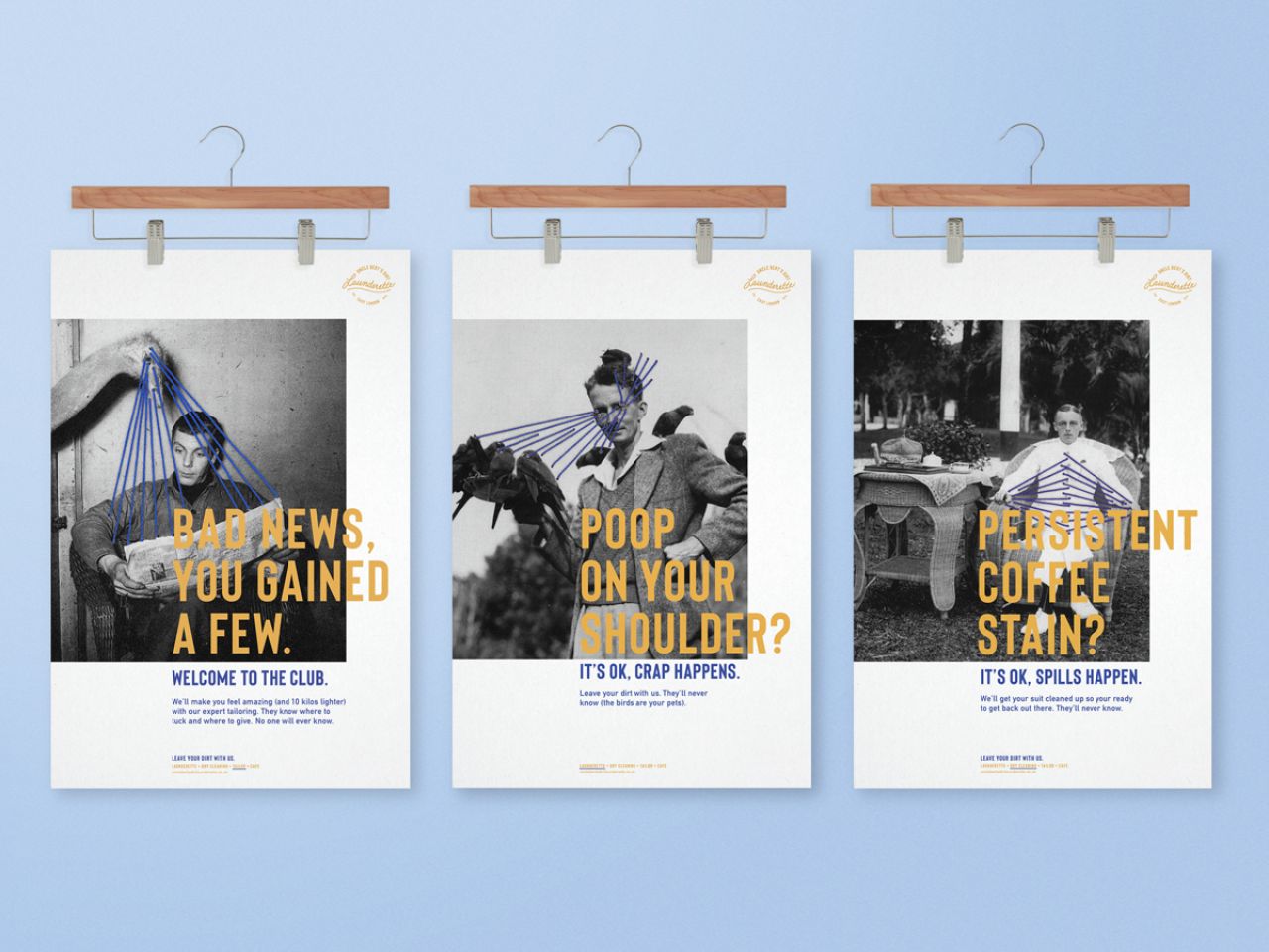
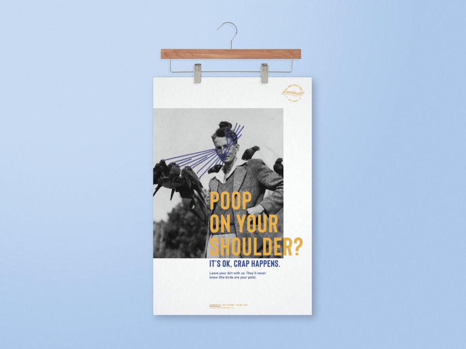
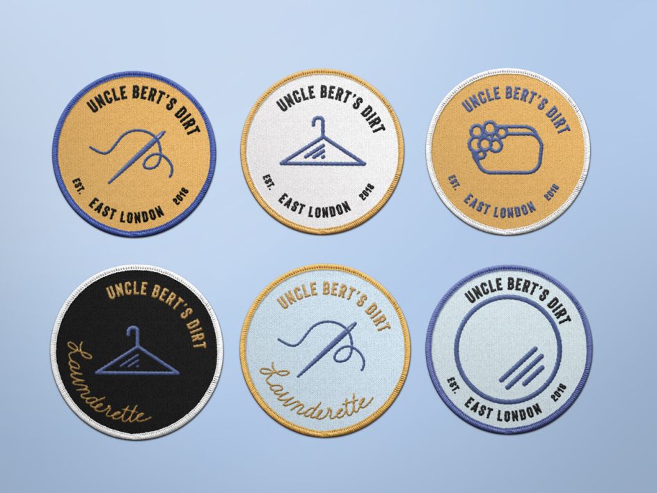
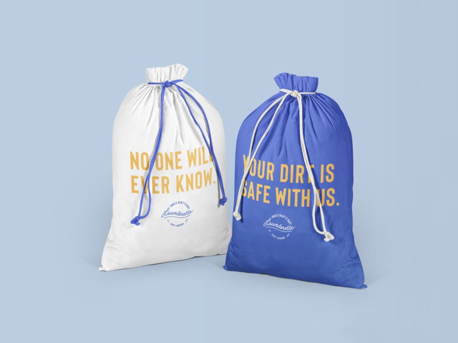
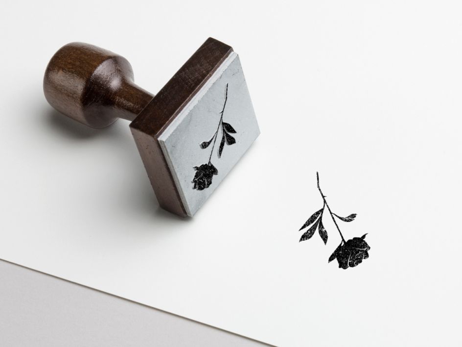
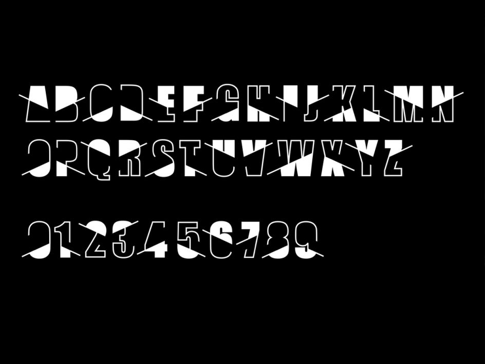
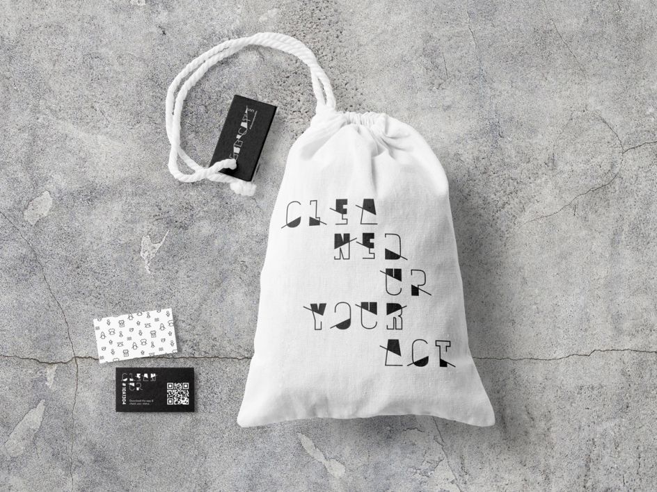
7. Amy Sil Mil, New York: Laundrette Branding
Uncle Bert’s Dirt is branding by Amy Sil Mil for a hypothetical startup launderette in East London founded by an ex-convict turned entrepreneur.
"After researching the culture of East London," says Amy, "I was intrigued by cockney slang and the grittiness of its past. Since the owner was an ex-convict and he was starting up a launderette, the idea of starting over with what you have, and thus using the 'threads' that you have, gave way to the concept 'every thread has a story'.
"I liked the idea that you could go to Uncle Bert’s to start over, clean up your dirty laundry and no one would ever know the story of how they got dirty. I used a cockney word as much as possible throughout the brand."
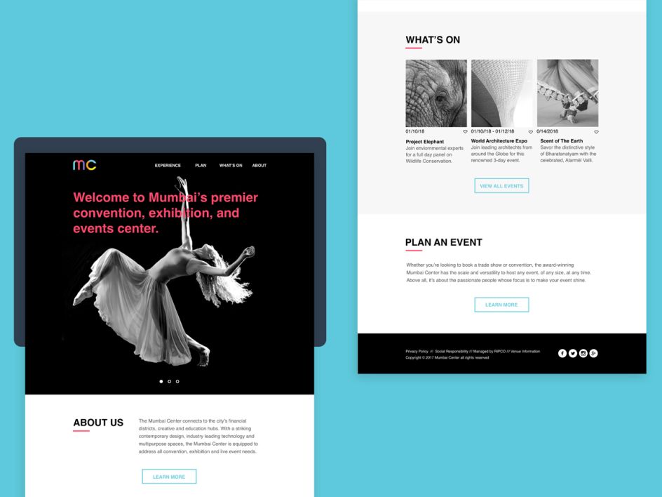
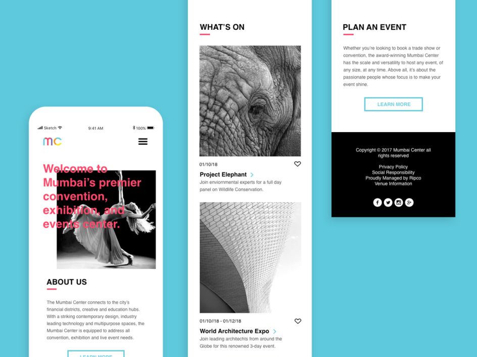
8. Nicole Ripka, New York: Mumbai Centre
For our New York graduate, Nicole Ripka, she set herself the task to brand The Mumbai Center, a new convention, entertainment and exhibition venue in Mumbai, India. The logo system was designed to represent the many facets and vibrancy of the city of Mumbai.
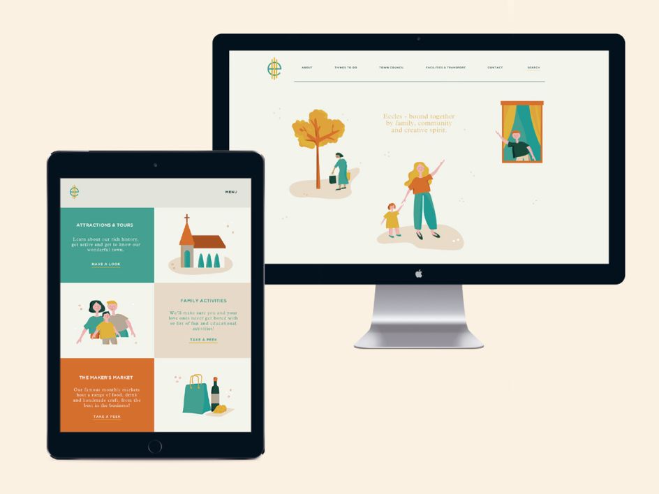
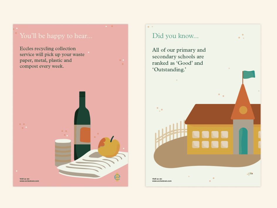
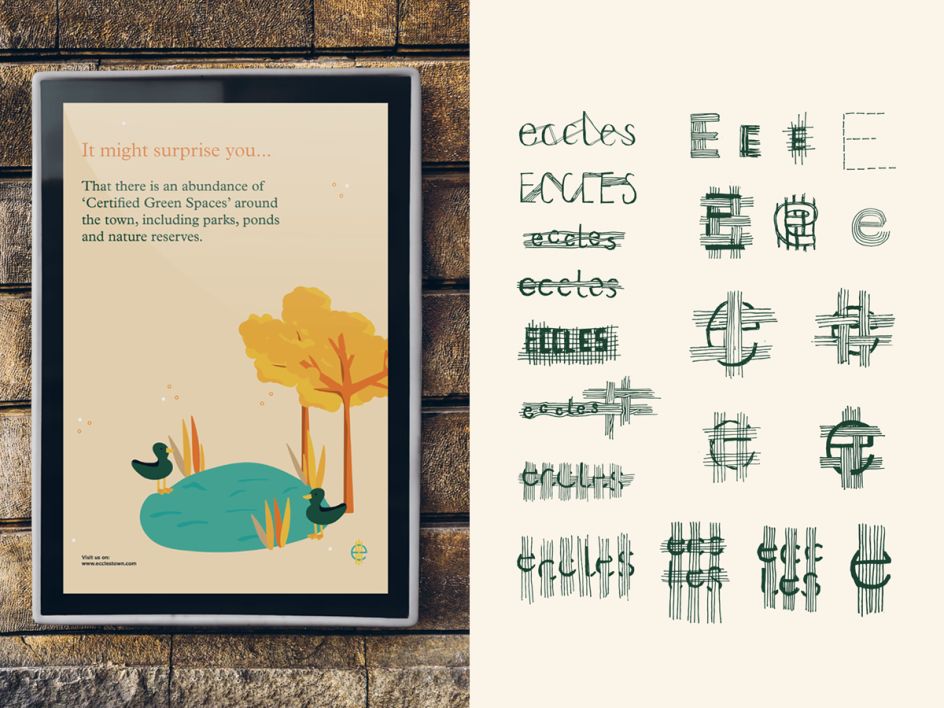
9. Nina Hamer, London: Town Identity
Our London graduate Nina Hamer designed an identity for Eccles in Manchester, focusing on what makes it unique and appealing. Her solution? She applied an accessible and soft illustration style, designed to appeal to creative individuals and children. The logo was inspired by the town's beginning as producers of cotton.
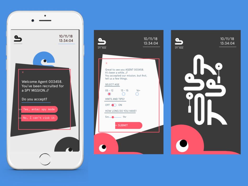
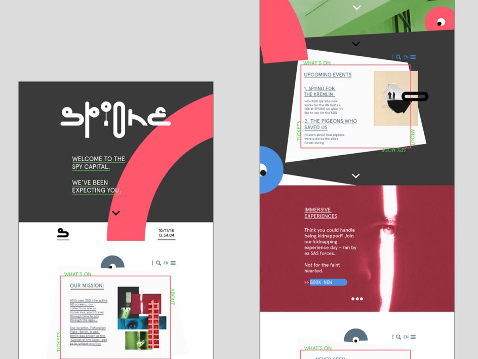
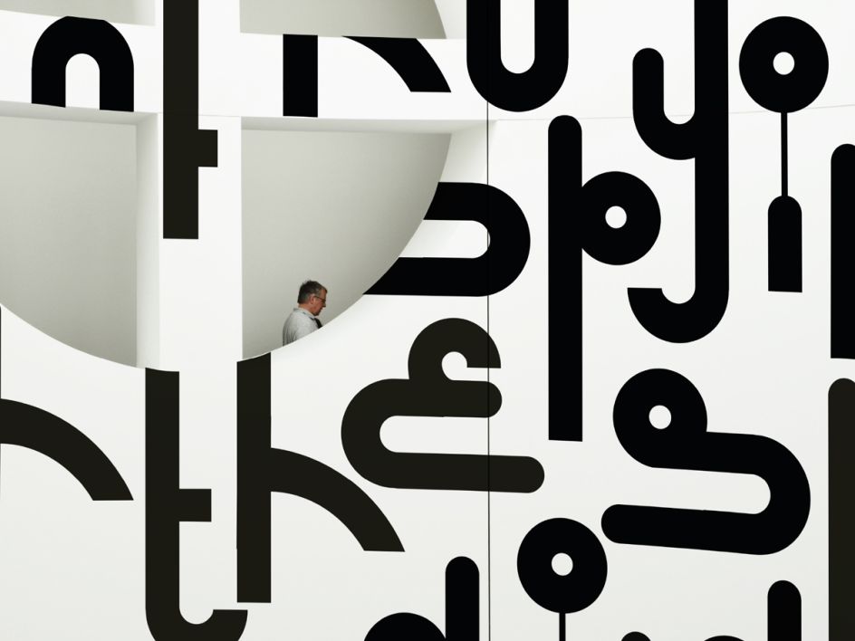
10. Talya Baker, London: Museum Branding
Talya Baker decided to rebrand Berlin's own spy museum, Spione Museum, to establish the attraction as a market leader in the "capital of cool". Just like the museum’s collections, the branding aims to transport viewers through time.
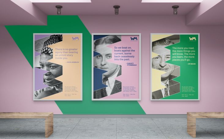
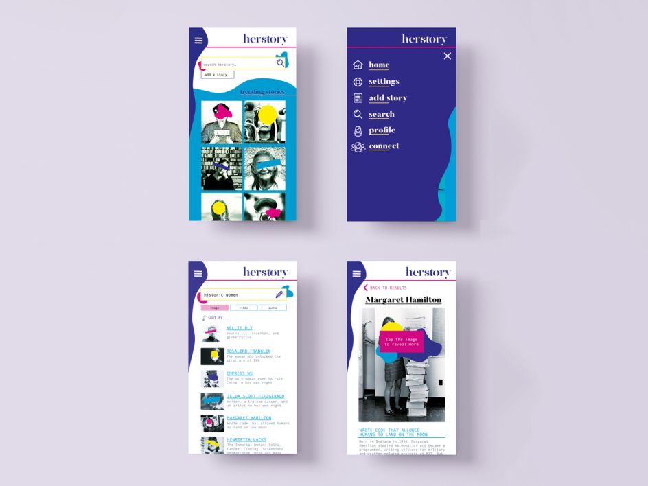
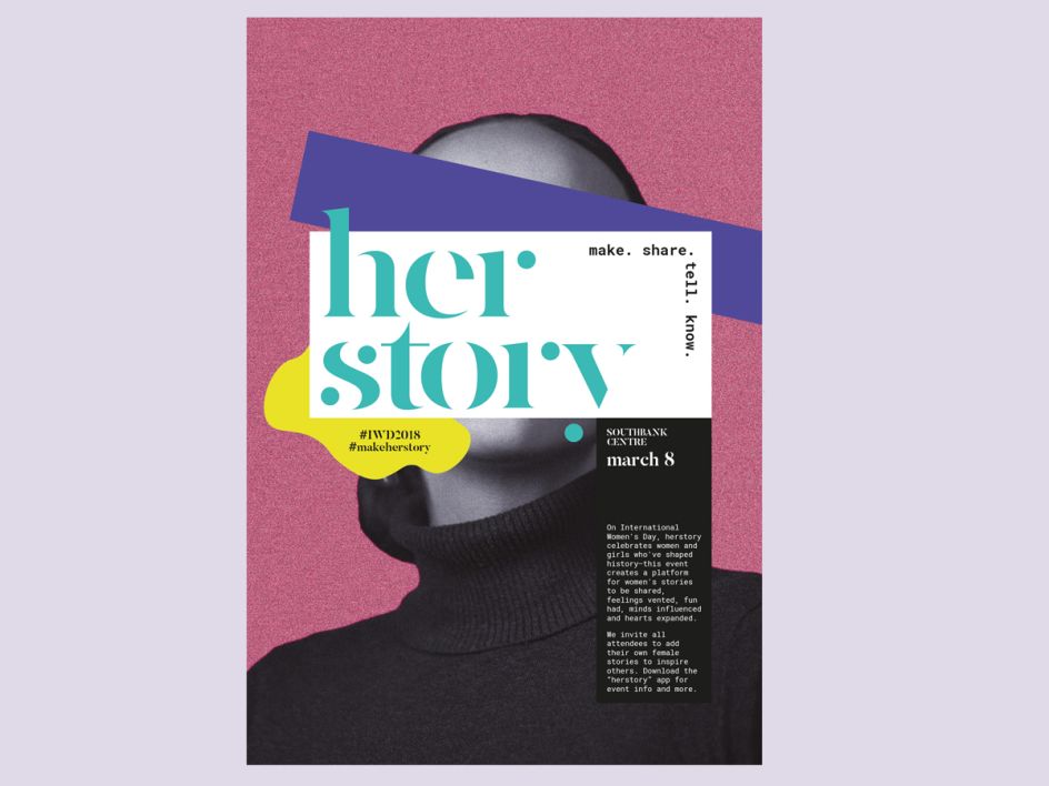
11. Alice Q. Lin, London: Her Story Event Branding
Alice Q. Lin decided to focus on International Women’s Day and showcase unknown names and faces. She wanted to create an attention-grabbing campaign for the annual event. "Many organisations celebrate a handful of the most recognised and known women of history," says Alice.
"In contrast, this campaign event celebrates and showcases the major achievements of lesser-known women who have made a mark on history, inviting event attendees to learn more about each woman or add new stories."
She developed a visual language to showcase unknown faces and encouraged wide appeal by using different platforms: a mobile app, an event in central London, and a virtual reality experience. What's more, her project won an award.
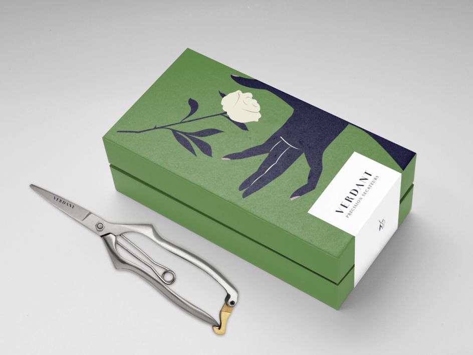
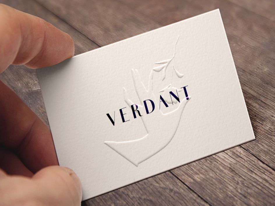
12. Emma Clay, Melbourne: Florists
Emma Clay, our Shillington graduate in Melbourne, came up with an identity for a new florist delivery company based in the Australian city. "My concept was to appeal to the corporate and hospitality industry rather than the public," says Emma.
Using keywords such as dependable, intriguing and succinct, her project oozes floral sophistication and we love the green and navy colour palette.
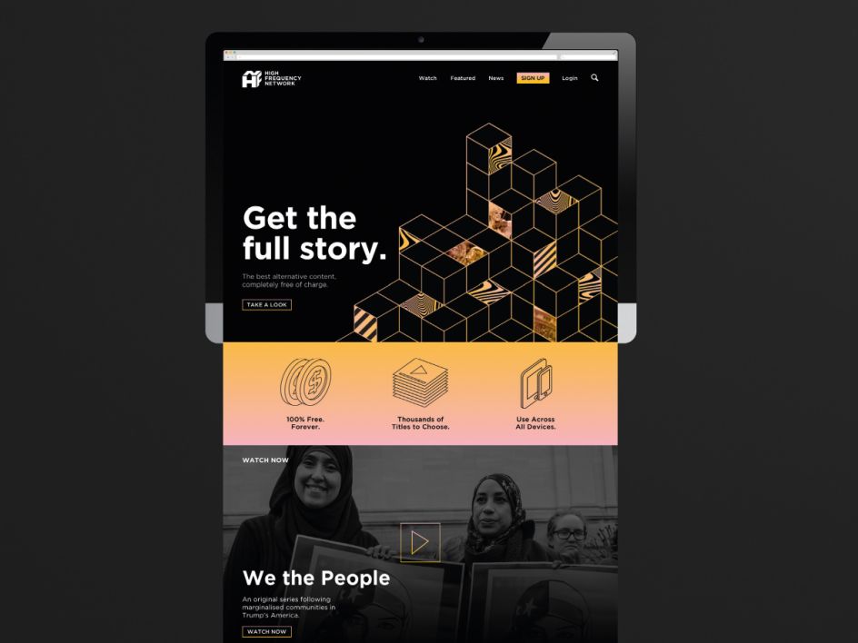
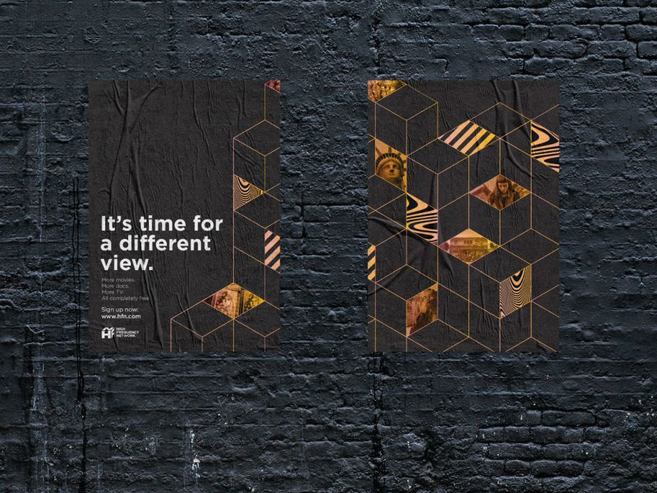
13. Lily Fielding, Brisbane: News Network Brand
Our Brisbane graduate, Lily Fielding, decided to get serious with her branding project, taking on the challenge of creating an identity for a news network. With a monochrome palette dashed with flashes of orange, it encourages instant credibility and respect. We also love the play on the logo, where Lily creates an icon for the "High-Frequency Network".
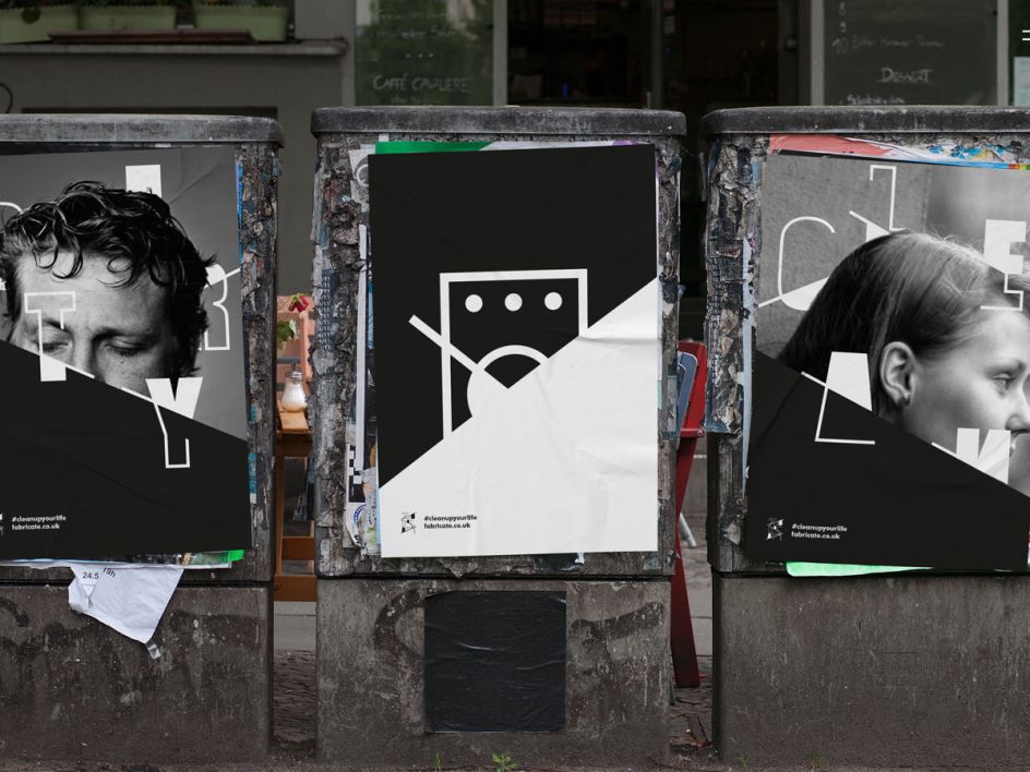
14. Ray Wong, London: Laundrette
Ray Wong, a Shillington graduate in London, got to grips with an identity for a cool, imaginary laundrette that also acts as an art cafe. "Fabricate is designed to reach and inspire a young, trendy audience in the edgy east side of London," says Ray. "The idea behind Fabricate is the interconnectivity of fabric and how it’s reflected in storytelling, like a tapestry. We create ideas from the acquisition of personal events, history and culture."
Further Information
This article was written by Anthony Wood, who is the Managing Director of Shillington. With 15 years of experience in design and a long stint of freelancing in Sydney and London, he relished the challenge of joining the international design school in New York City. He likes to write about design, entrepreneurship and learning.
Editor's Picks


Trending


Podcasts


Editor's Picks
Further Reading