Fortnight Collective designs new 'golden ale to spark change', Kindling
Creative agency Fortnight Collective has created a new beer campaign centred around social good for Odell Brewing Company's new Kindling beer. Billed as "a golden ale to spark change", it will be sold with 1% of proceeds given to charities in the brewer's community in Fort Collins, Colorado.
These charities include Wildlands Restoration Volunteers, The Growing Project, The Cultural Enrichment Center of Fort Collins, and The Gathering Place – all of which address a wide range of issues, including homelessness, forest restoration, food insecurity, and social injustice.
Fortnight decided on the name Kindling thanks to its fire connotations, aiming to form a metaphor for the brand that "has a charitable giving focus on numerous, smaller grassroots organisations that make a big impact through their efforts".
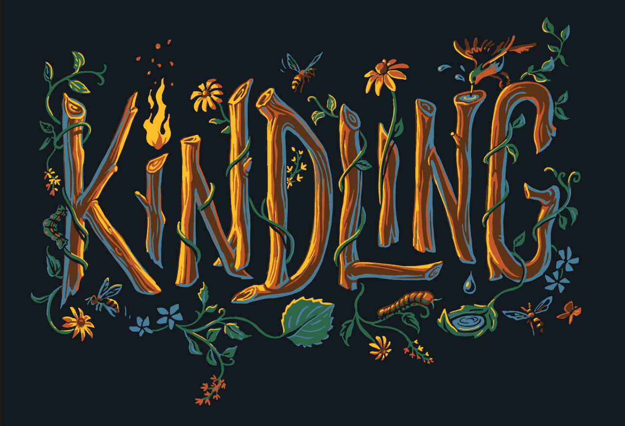
Fortnight extended this metaphor into the can design by putting the name front and centre, with lettering composed of wood and wildlife illustrations. As such, the name itself becomes the hand-drawn hero illustration as a logotype of branches and twigs (literal kindling). The letter 'i' was turned into a torch element and became "the light source we needed to illuminate the rest of the word and ecosystem of flora and fauna that lived within it," says Fortnight.
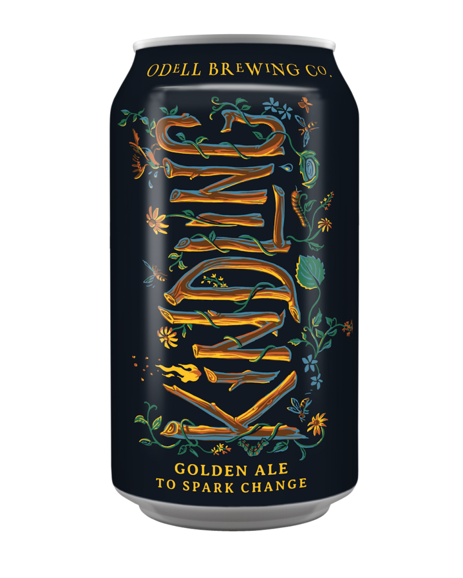
"From early in the design process, our instinct was to play with elements of light and dark," says Fortnight creative director Noah Clark. "Given the name was Kindling and the beer itself exists to 'spark change' at the local level, we wanted the artwork itself to illuminate an otherwise dark can somehow and be a metaphor for lighting the way to philanthropic outreach and action."
Illustrations of a robin and bees "represent humanity and a mission to galvanise a community." At the same time, the Black-Eyed-Susan flowers in nature are "symbols of justice," according to Clark, and the Periwinkles symbolic of resiliency.
"The water droplet being cupped by an outstretched leaf and the overall composition, of course, are a nod to the environment and conservation. And then finally, small accents like the butterflies and caterpillar represent themes of change and evolution," Clark adds. "It was a long journey to the final product, but worth every stroke of the pencil as we always wanted final artwork that was as meaningful as the brand's mission to give back."
Editor's Picks


Trending


](https://www.creativeboom.com/upload/articles/90/908fdb6378db1e95d12595416f54e6336d5e80b8_732.jpg)
Podcasts


Editor's Picks
Further Reading