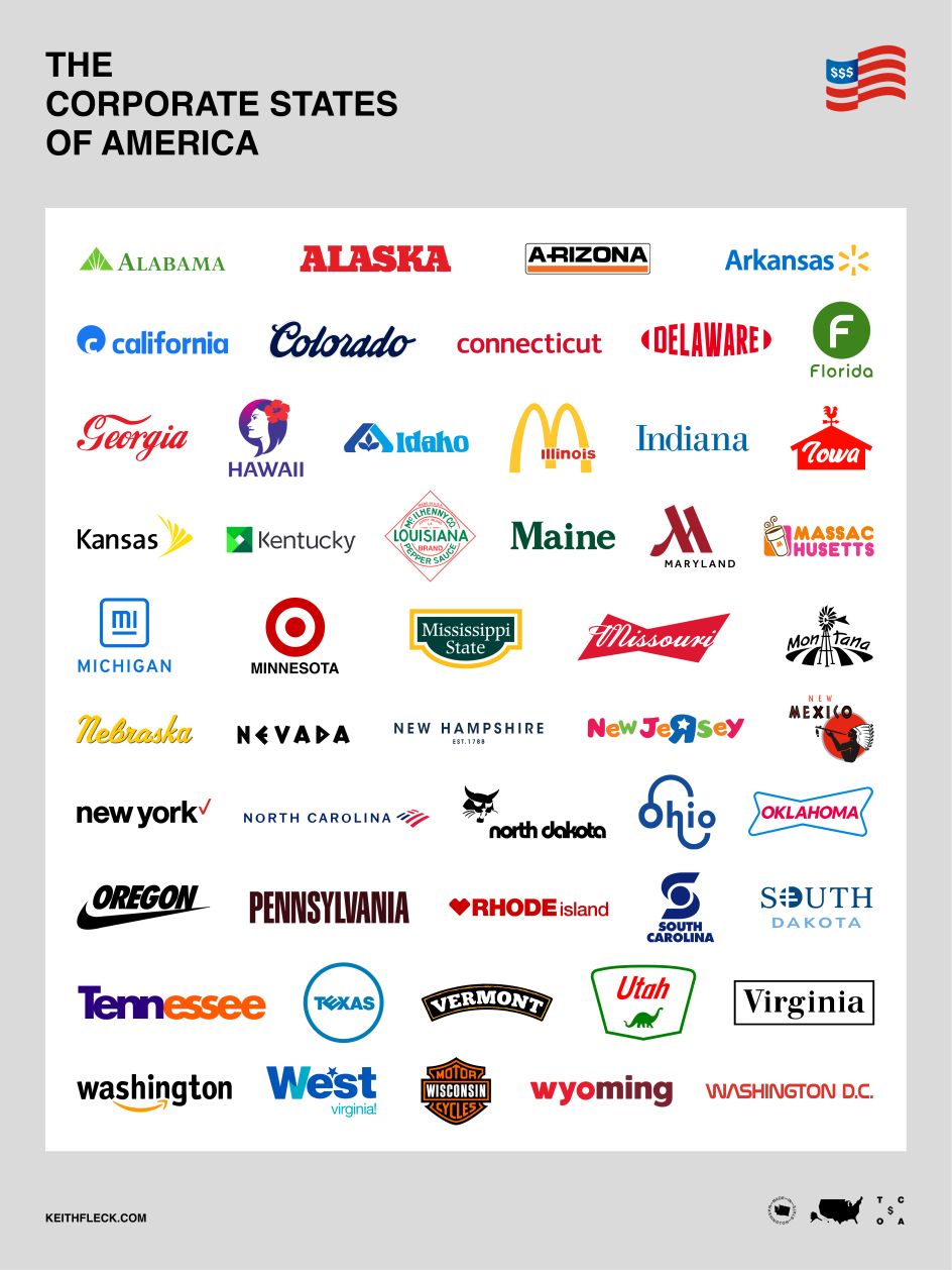
Keith Fleck brands all 50 states of America based on their biggest local corporate brands
By day, Keith Fleck is a senior design manager at Microsoft. By night, like many of us, he works on side projects and personal challenges to push his creative skills to the limit. One recent idea was to brand all of the United States of America, drawing inspiration from the most recognisable brand headquartered in each one.
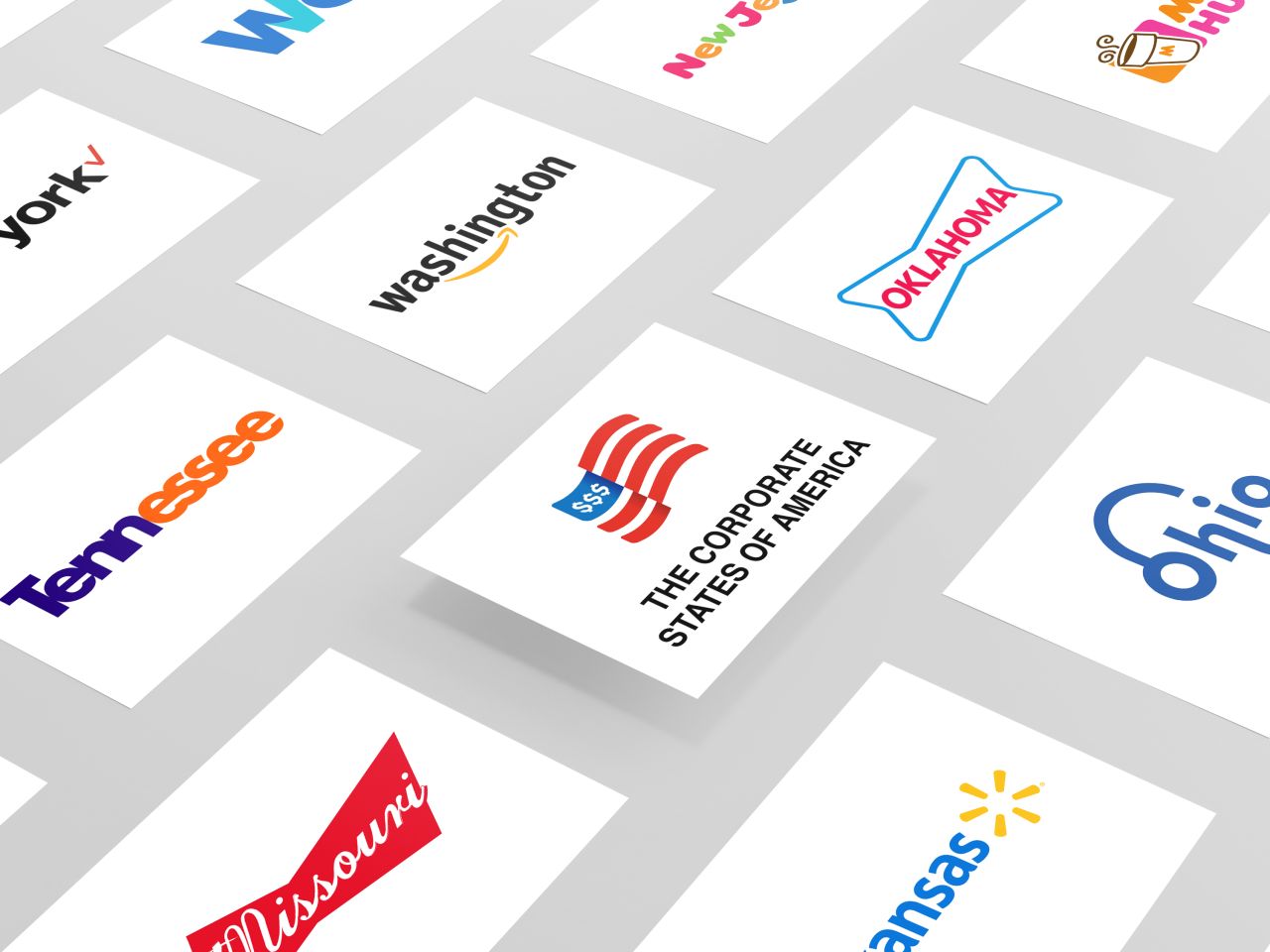
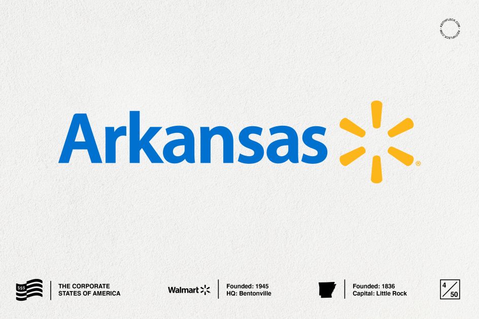
Taking several weeks to complete, the Seattle-based creative looked to the iconic colour palettes and familiar typography of these corporate brands to give each state its own unique branding. For Arkansas, we see a blue and yellow logo with the typeface Myriad – a look that is undoubtedly reminiscent of Walmart, the retail corporation that has been based in the state since 1945.
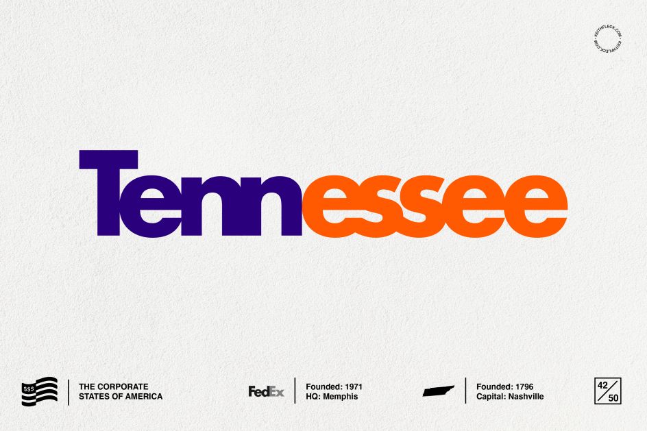
Over in California, meanwhile, Facebook leads the way. Founded in 2004 with its headquarters in Menlo Park, its distinctive blue logo in the classic Klavika font forms the basis of Fleck's corporate branding for the famous Golden State. Elsewhere, FedEx is the inspiration for Tennessee: it launched in Memphis in 1971. While Washington D.C. takes cues from NASA, which was established there in 1958.
Fleck has titled his project, The Corporate States of America and has created a micro-site and poster to share his final designs. "It was challenging because some states have many familiar and iconic brands, whereas in other states I had to dig a little deeper to find local celebrated companies," says Fleck. "It was fun to 'hack' each one, finding the right fonts and playing with elements to bring them to life. Some look great on their own and you can recognise the original brand immediately, whereas some are a bit harder to determine for someone who hasn't had any touchpoints with them."
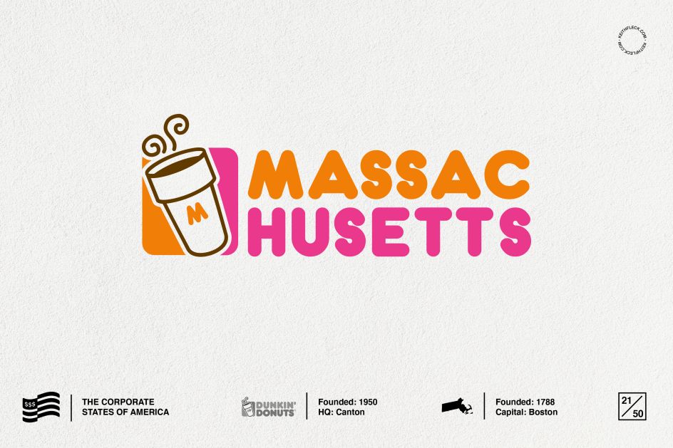
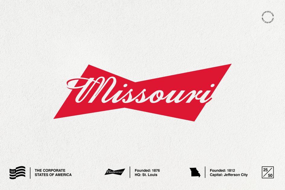
Not just a fun branding challenge, Fleck's project also teaches us a little about each of America's states...like discovering that McDonald's began in Chicago, Illinois, in 1955 in contrast to the state being founded in 1818, with Springfield its capital. And did you know Dunkin' Donuts launched in 1950 in Canton, Massachusetts? The state that has Boston as its capital and became a reality in 1788? There's also Toys "R" Us, the joyful inspiration behind Fleck's branding for New Jersey – the retailer was founded there in 1957 with its headquarters in Wayne.
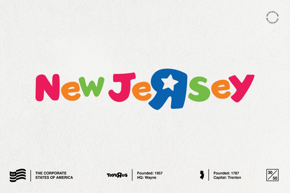
Does Fleck have any personal favourites? "It's actually a toss-up of Ohio and New Jersey," Fleck tells us. "Ohio was really enjoyable to create. Mimicking Kroger's ligatures and connecting the letters together ended being a lively shape that I can totally visualise on storefronts. Whereas New Jersey was relatively easy to make but is just so playful and happy to me. The big blocky letters and colours scream fun. Maybe my nostalgia of going to Toys 'R' Us when I was a kid comes out of this one."
Interestingly, Fleck grew up in the suburbs of Detroit in Michigan. Was his home state the most challenging, given its personal weight? "Well, when you think of Detroit, the first thing that comes to mind is cars and the 'Big 3' – General Motors, Ford, and Chrysler. I grew up with family members that worked at General Motors and I worked there a few years back in the User Interface Design team. Heck, I drive a General Motors vehicle today and so do most of my family back home. They recently rebranded their logo and I could see MI in there immediately, so it was an easy decision to make."
We encourage you to browse through The Corporate States of America and see what other corporate brands made the list. Or discover more of Keith Fleck's work at keithfleck.com.


](https://www.creativeboom.com/upload/articles/90/908fdb6378db1e95d12595416f54e6336d5e80b8_732.jpg)