Fascism, football and Helvetica feature on a journey through Italy's visual landscape
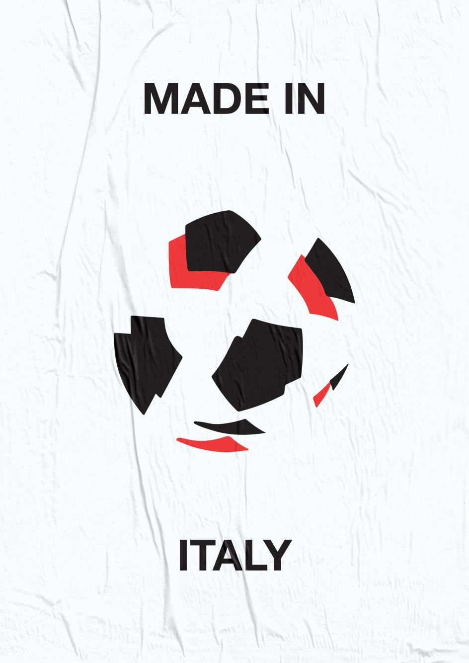
As an Italian, the earliest branding I can remember is the mascot insignia for Italy's 1990 World Cup. Ciao was the name of the figure who was used on some versions of the red-white-and green logo, an anthropomorphic player with a football-head that fascinated my curious young mind.
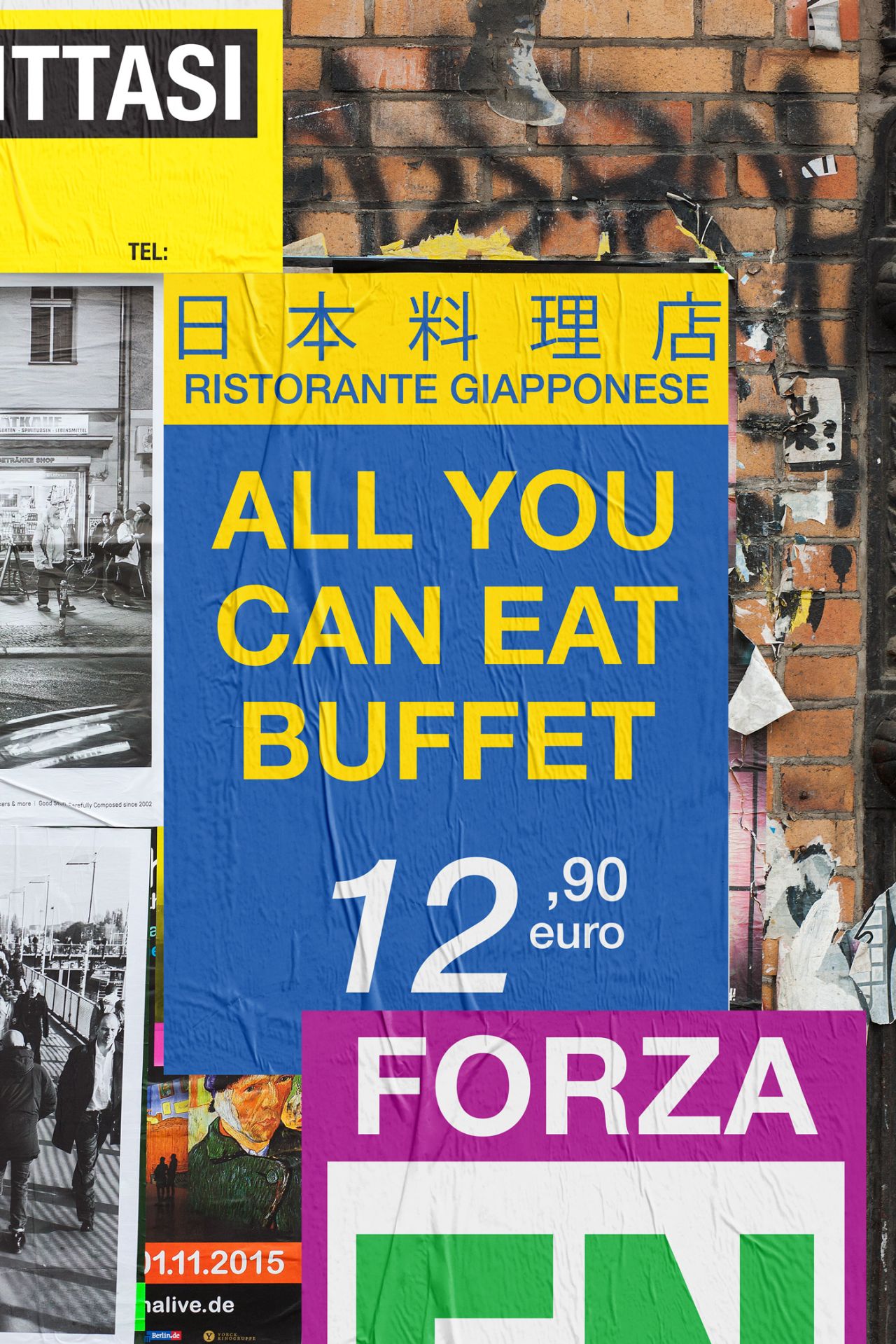
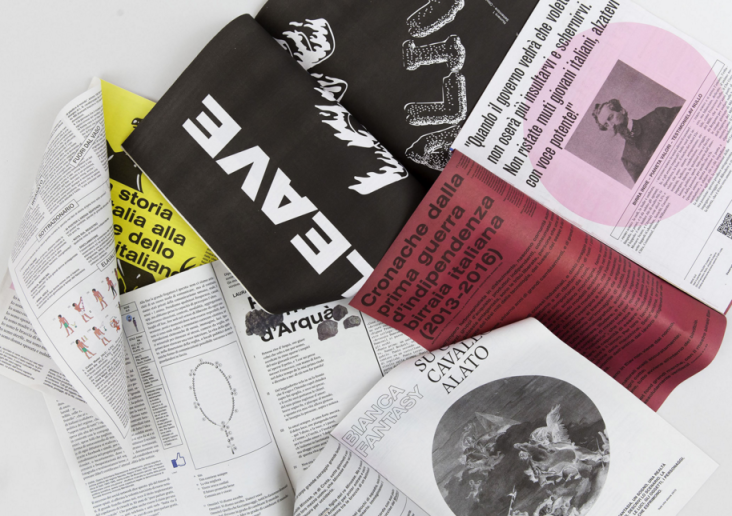
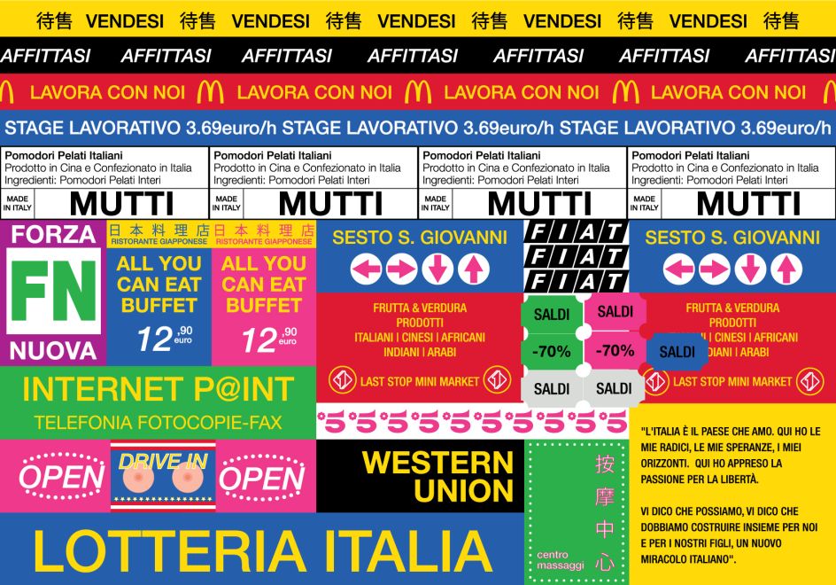
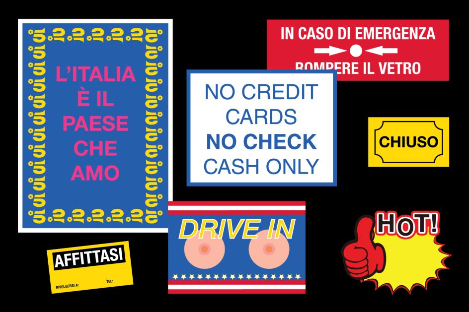
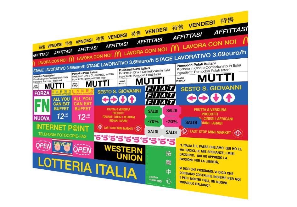
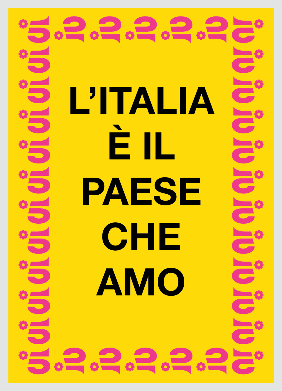
The classic version of the 1990 logo features in L'Italia è il Paese che Amo (Italy is the Country I Love), a new personal project by Giacomo Felace. One of our favourite Italian designers, Giacomo digitally explores the conflicting visual landscape of signs, logos and posters that surrounds his fellow citizens. It's a work designed to be 'anti-design' with its lively colour palette, messy messaging, and liberal use of the Helvetica typeface.
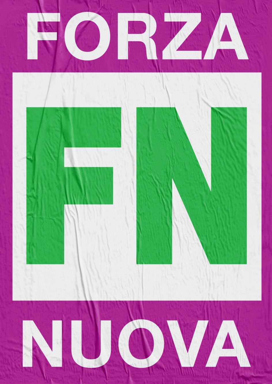
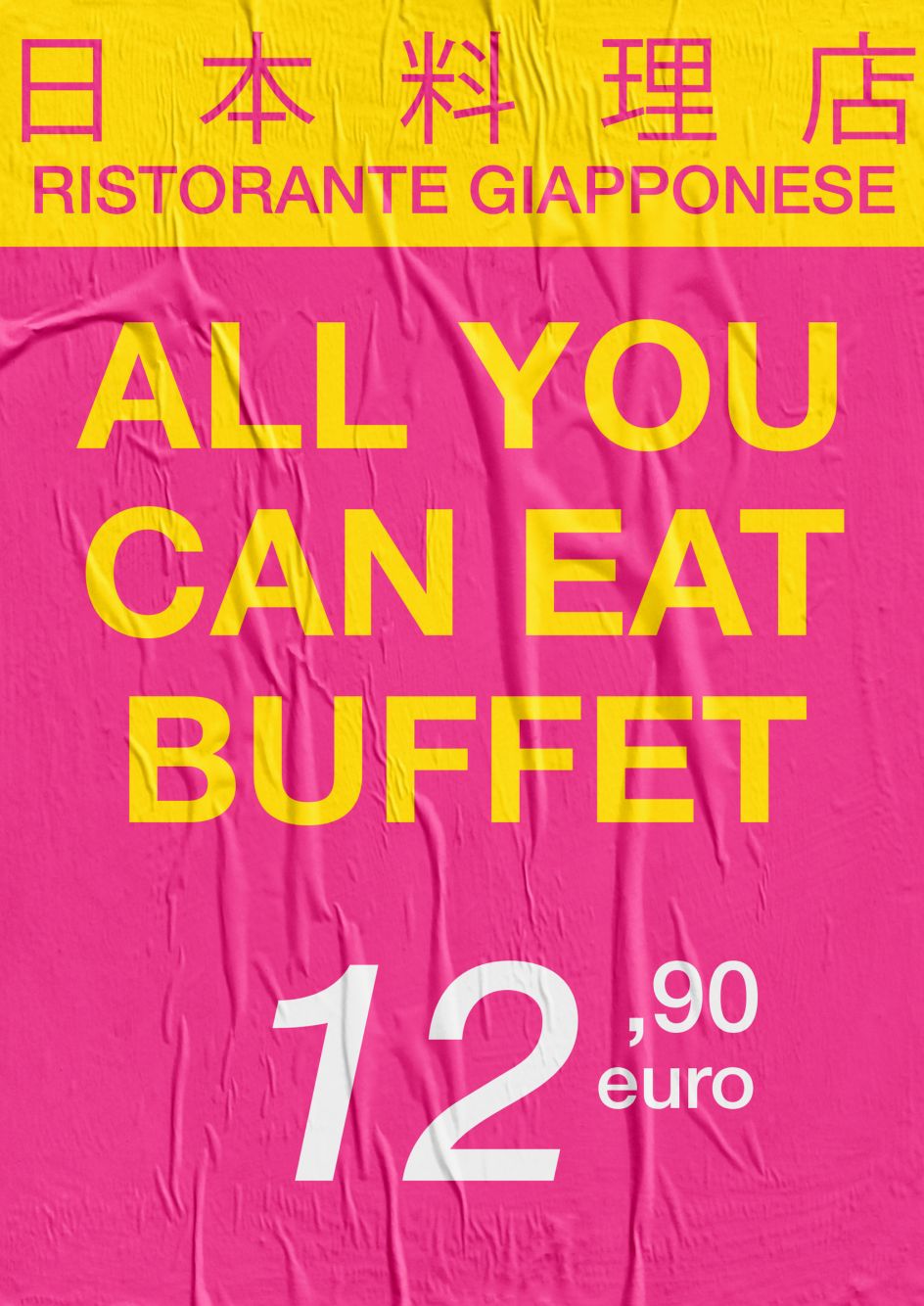
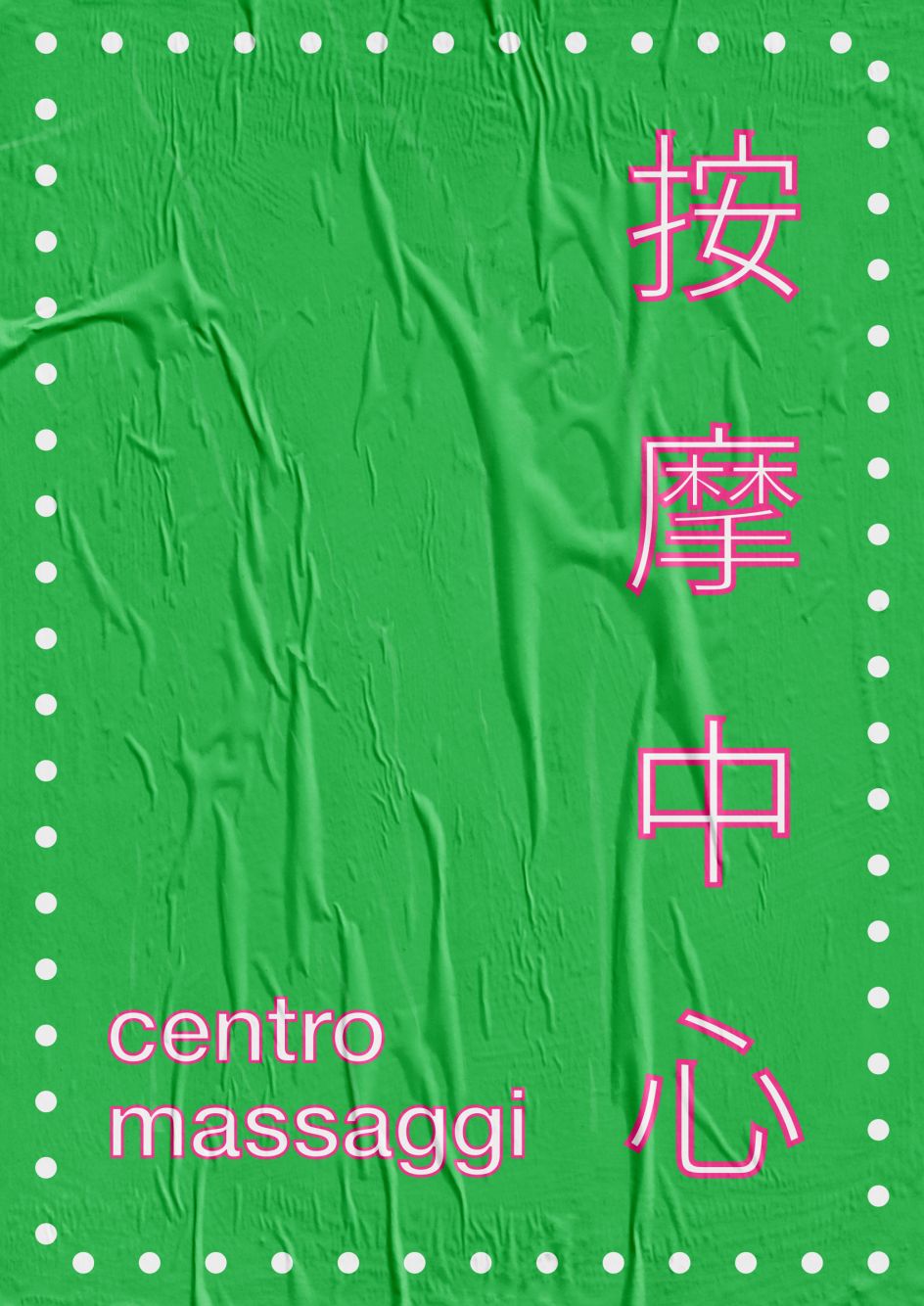
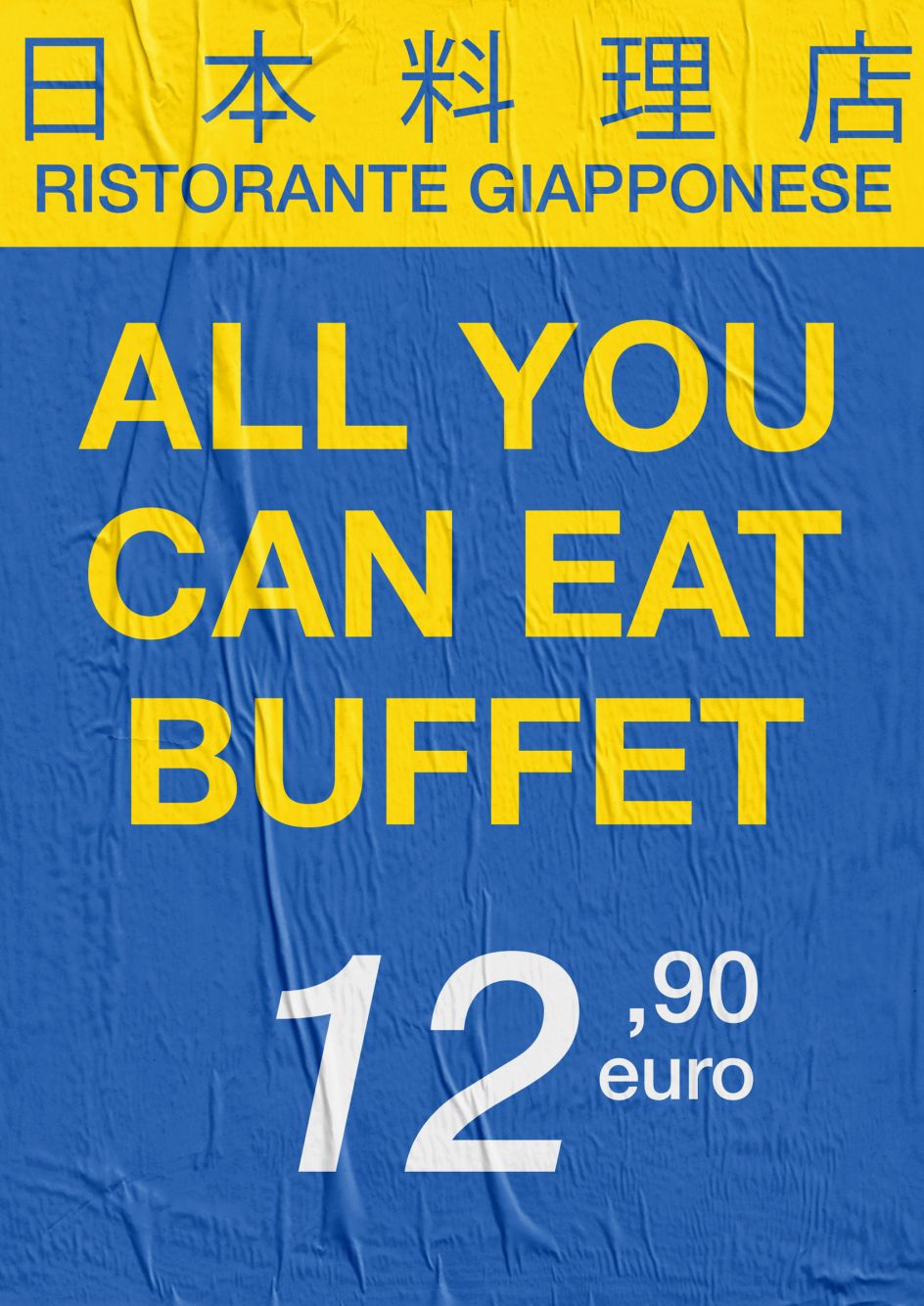
Sampled by Giacomo for the piece, one will find Chinese restaurant signs and McDonald's work ads. Somewhat provocatively, there's also the logo for Forza Nuova (FN), an Italian neo-fascist and nationalist far-right political party.
"Their original logo and banners are very recognisable by their colours (red and black) and bold typography," Giacomo explains. "Particular controversy in the recent past has sparked strongly homophobic and racist ideology and statements in Italy, so I played with their colour palette to give a green accent to the two main letters and a more 'candy' look to the surrounding area."
"I also used part of the 1990 World Cup logo to represent the one true love of Italians: football. Football is perhaps the only reason these days Italians would take to the streets to protest."
The Helvetica typeface was employed as a unifying motif to make this spaghetti of influences more homogeneous to the eye. It was also a small tribute by Giacomo to Massimo Vignelli, the Italian master of design who employed the font often.
"Massimo Vignelli is one of the most important protagonists in the history of design, and graphic design in particular," Giacomo gushes. "He's the polar star of every young designer. Through both his deep cultural commitment and his real comprehension of the design discipline, Vignelli crucially contributed to the design profession by keeping alive and also promoting the evolution of the fundamental principles of design."
Giacomo's own cultural commitment is in what L'Italia è il Paese che Amo symbolises, the "shady" area of his country, as he puts it. "For me, as an Italian, this work represents our glittering past, tax evasion, corruption, social sleepiness, the demographic collapse, low labour wages and the gap between the North and the South."
"Graphic design is not always created by good graphic designers, and the messages are often broken," Giacomo tells his fellow Giacomo. "Sometimes, this non-professional approach can create beautiful pieces of ugly design, and the mix with iconic pieces is the right contrast I was looking for."
The title of L'Italia è il Paese che Amo comes lifted from the words of Mr Bunga Bunga himself. As Giacomo explains, in 1994, Silvio Berlusconi appeared on Italian television screens announcing his entrance into the political field with the now-famous opening line, "Italy is the country I love." This moment marked a cultural and socio-economic turning point for the country that lasts to this day.
"I'm simply trying to ghostwrite Italian culture's stream of consciousness through pragmatic, amplified, stereotyped and conflicting messages," Giacomo says. "It is curious how there is an attitude of growing distrust of the foreigner who comes to Italy to seek his fortune, and at the same time, young Italians leave Italy to seek their fortune abroad. Isn't this just a circular movement?"
Editor's Picks


Trending


](https://www.creativeboom.com/upload/articles/90/908fdb6378db1e95d12595416f54e6336d5e80b8_732.jpg)
Podcasts


Editor's Picks
Further Reading