Florian Schommer on how punk and skater culture kickstarted his creativity
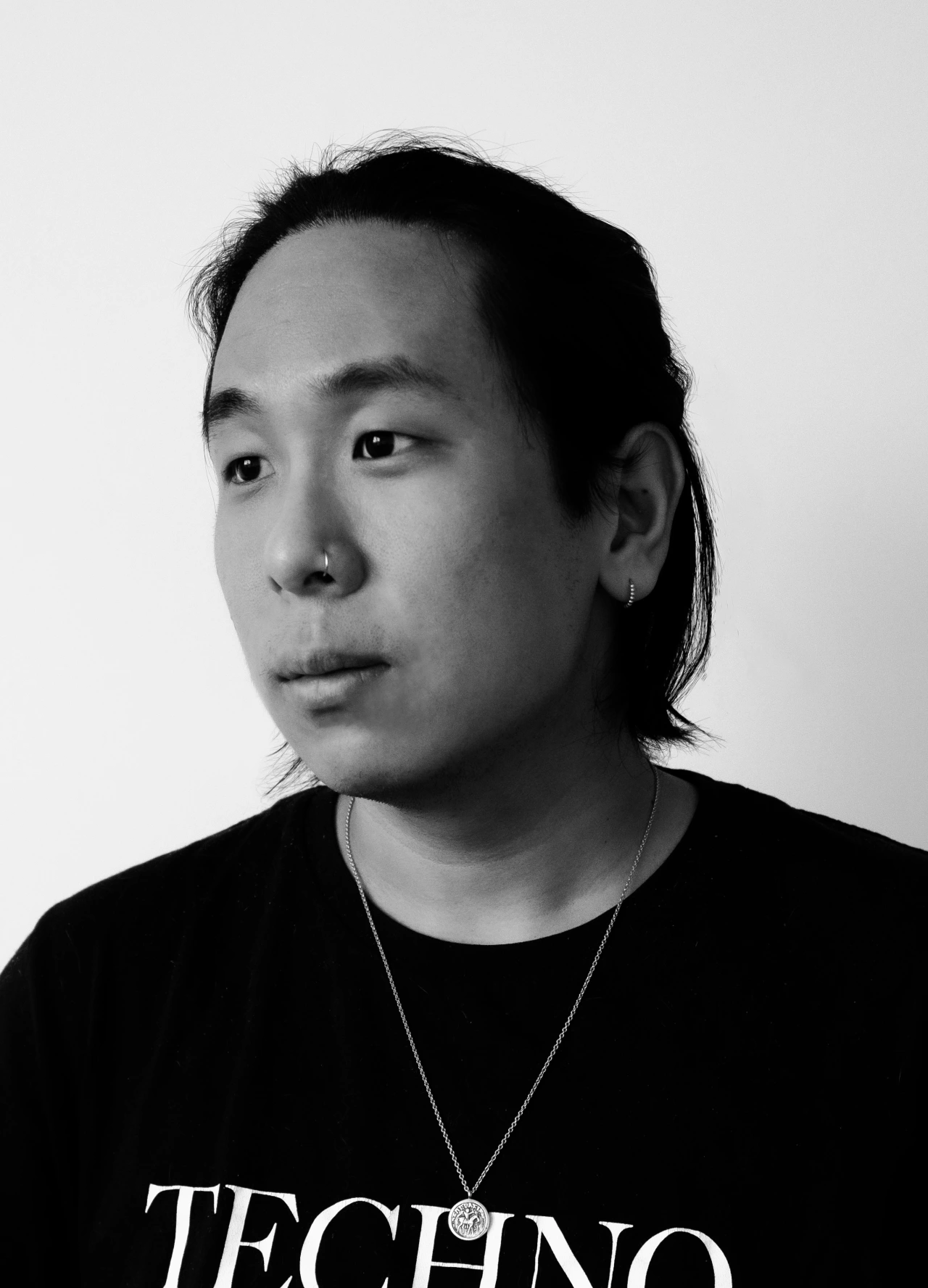
Florian Schommer grew up in a "nowhere town" in the West of Germany, close to the Dutch and Belgium border. As a kid, he didn't really have many interests and was very shy in school.

"When I look back," the Berlin-based illustrator/designer writes us, "it was skateboarding that lit the fuse for me and brought me to where I am today. I remember being a young teenager going to the city and staring at these skateboarders. It was fascinating for me; something about them was kind of scary. What impressed me the most was that they appeared to be fearless."
From there, Florian became a skater kid himself, hanging out at the local skatepark so much it became like a second home. Aesthetically skate culture had a huge impression on the young creative, and through skateboarding, he got deep into hardcore punk and its DIY philosophy.
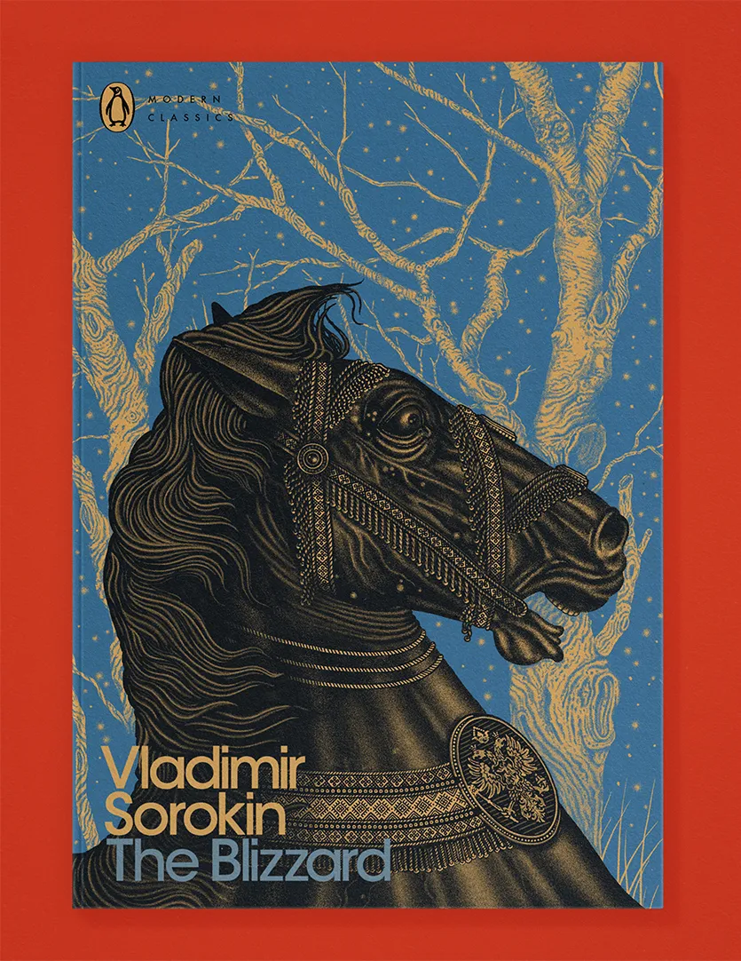
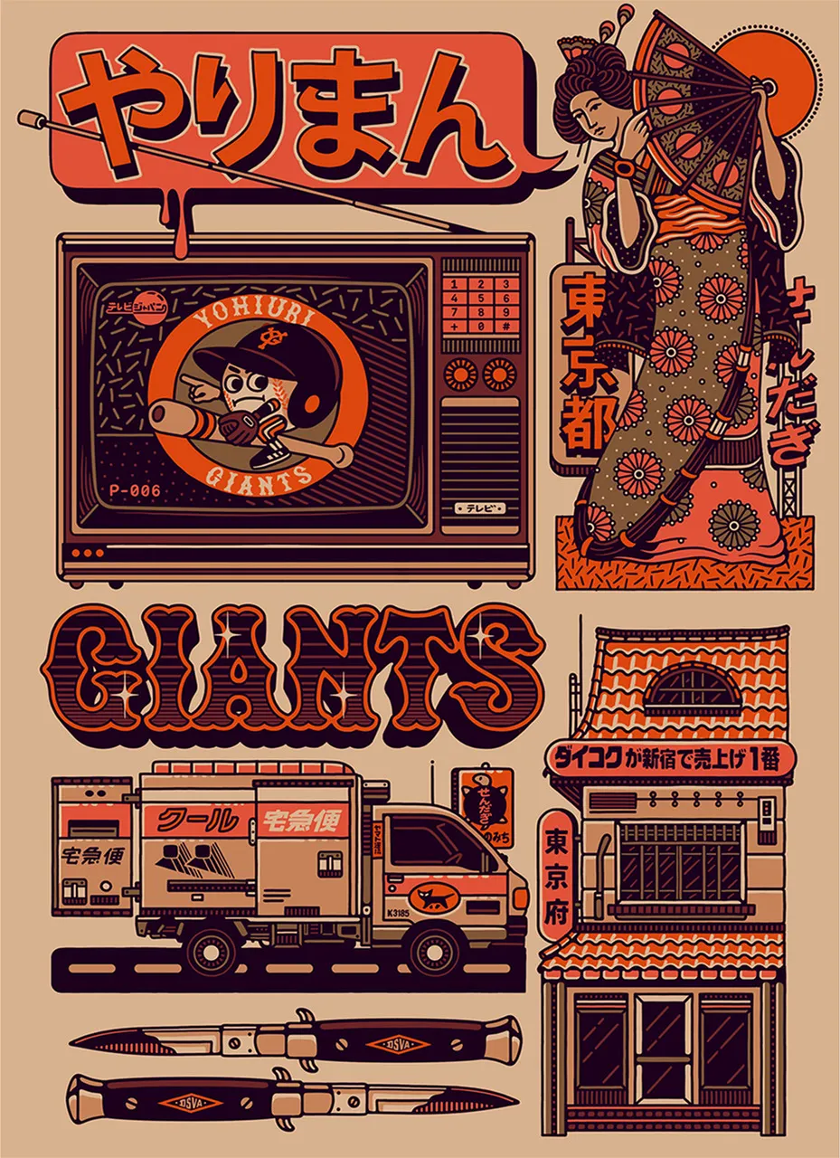
"I started a band in the early '00s, which was also a medium for me to take my first steps in design and illustration. We started to grow as a band, and I also evolved my skills as a designer. This led me to study Design in Düsseldorf. This School had a very free and open environment. I could totally do my own thing, as long as I handed in my assignments on time. This was really helpful because I also did a lot of tours with my band during that time; we played shows in a lot of different places like China, Australia, Southeast Asia and Kenya."
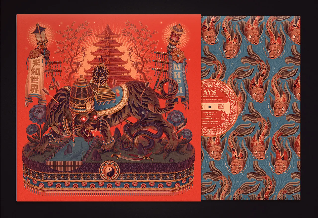
"For a while, my work was heavily inspired by what I saw on my tours. After I got my Bachelor's I moved to Hamburg where I started working in an agency, but during that time I received my first job offers, so I decided to be a freelancer. This probably was the best decision I've ever made, and in 2019 I moved to Berlin."
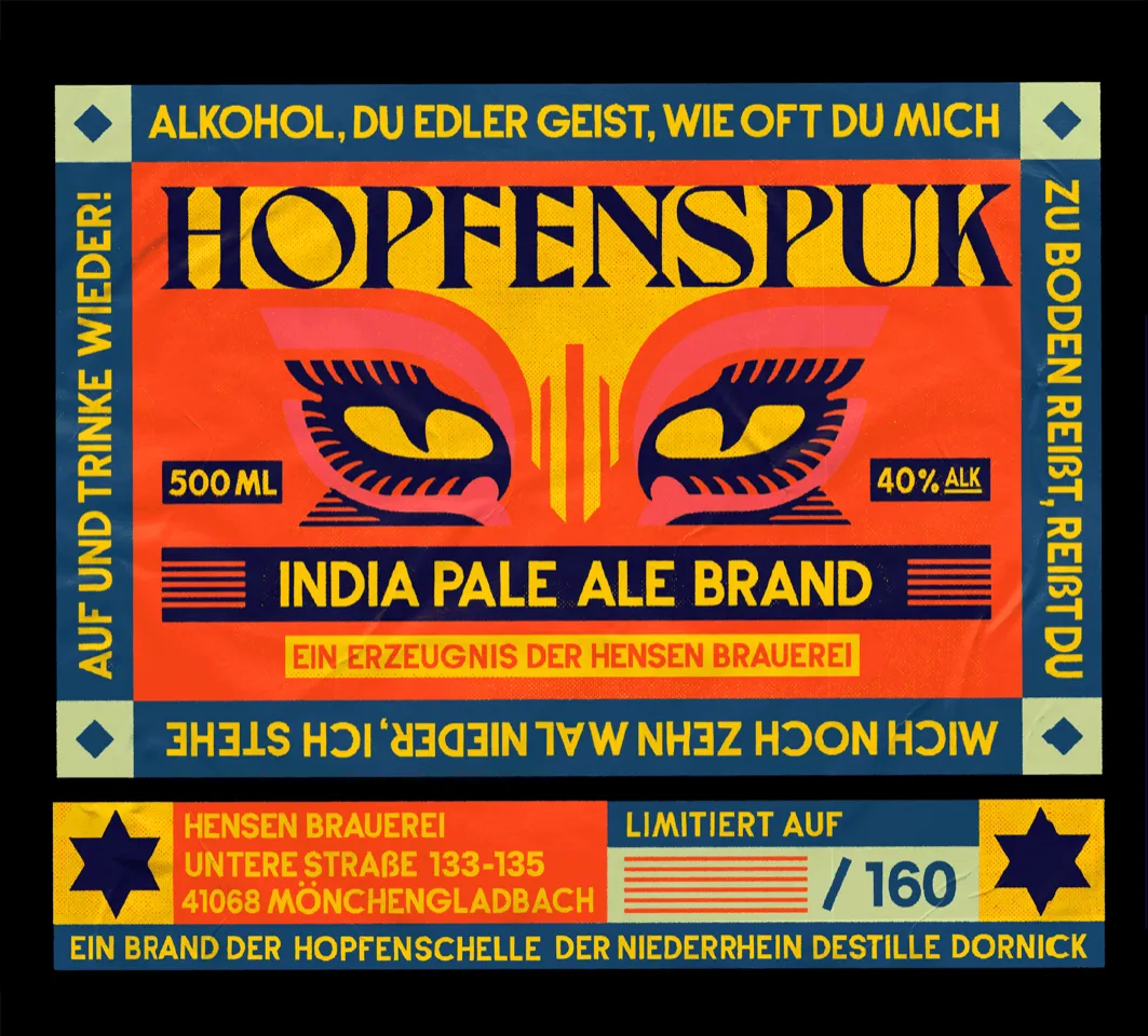
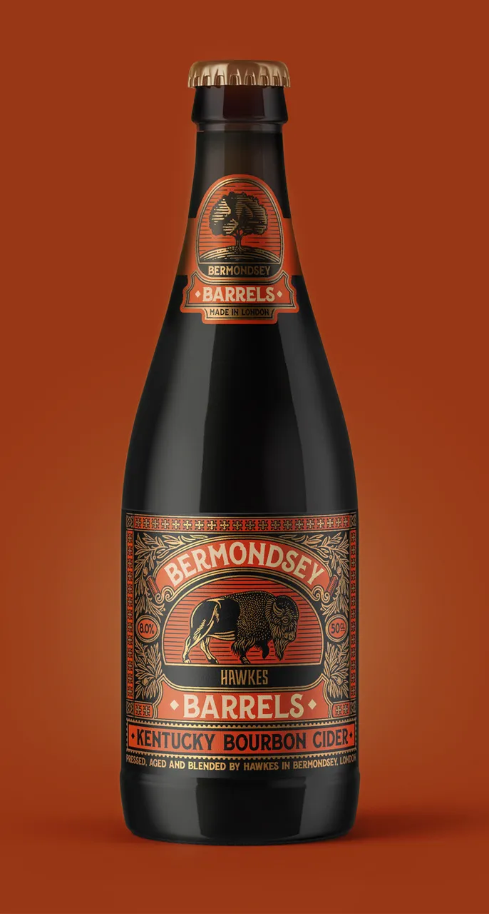
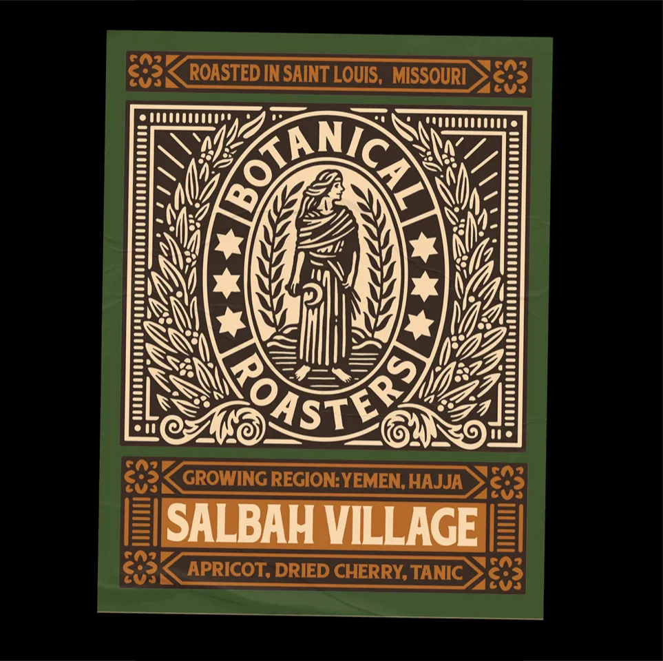
Florian's designs have lent themselves to a lot of packaging jobs of late, such as a label design for traditional German gin brand Rüdemann, and London-based cider makers Hawkes.
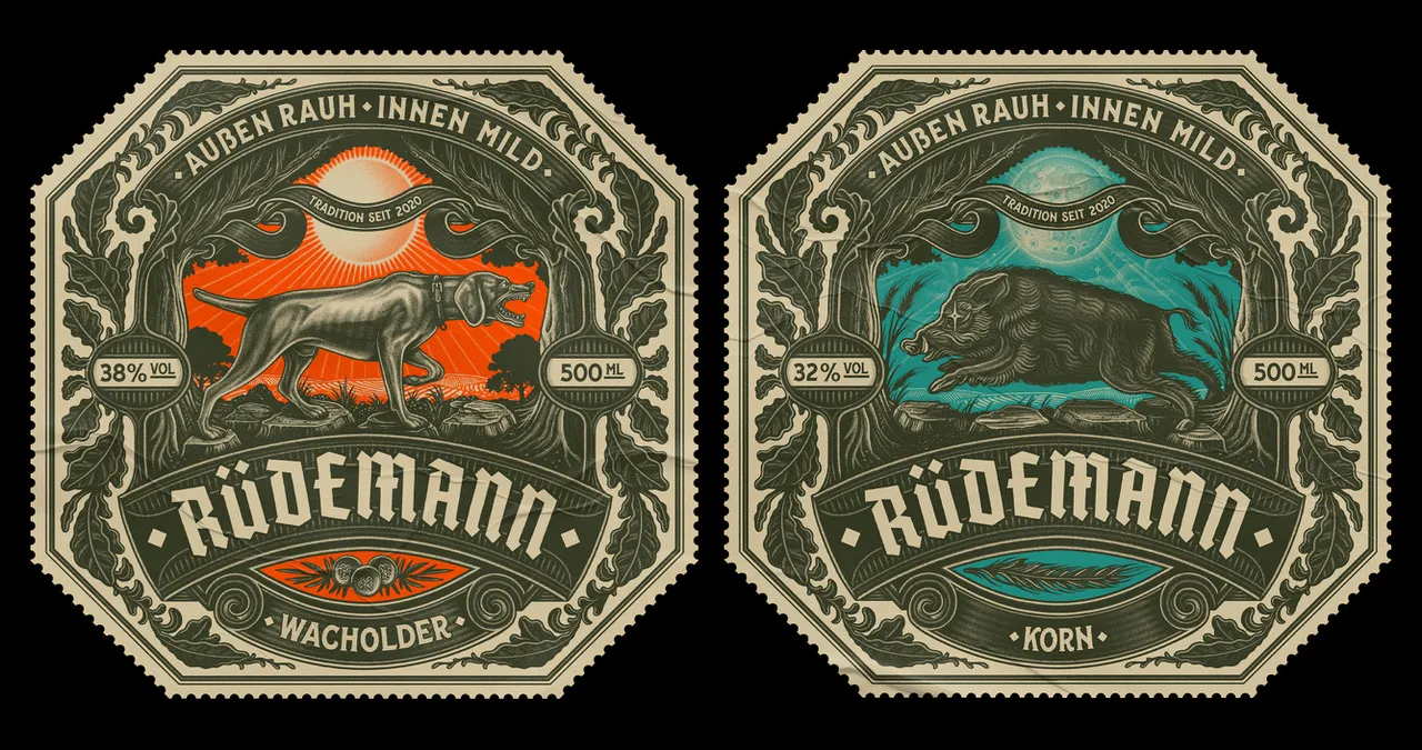
"Rüdemann was a lot of fun because the owners were really euphoric and they put a lot of energy into it. It's always great to work with people with positive energy. I also did the rebranding for a vegan doughnut company called Brammibals Donuts. These guys are really well known in Berlin, people are crazy about their doughnuts, and it was a lot of fun to work with them because I had the chance to do something completely different if you compare it to the stuff I usually do."
The creative gets bored rather easily, hence his need to keep trying new things like the Brammibals branding.
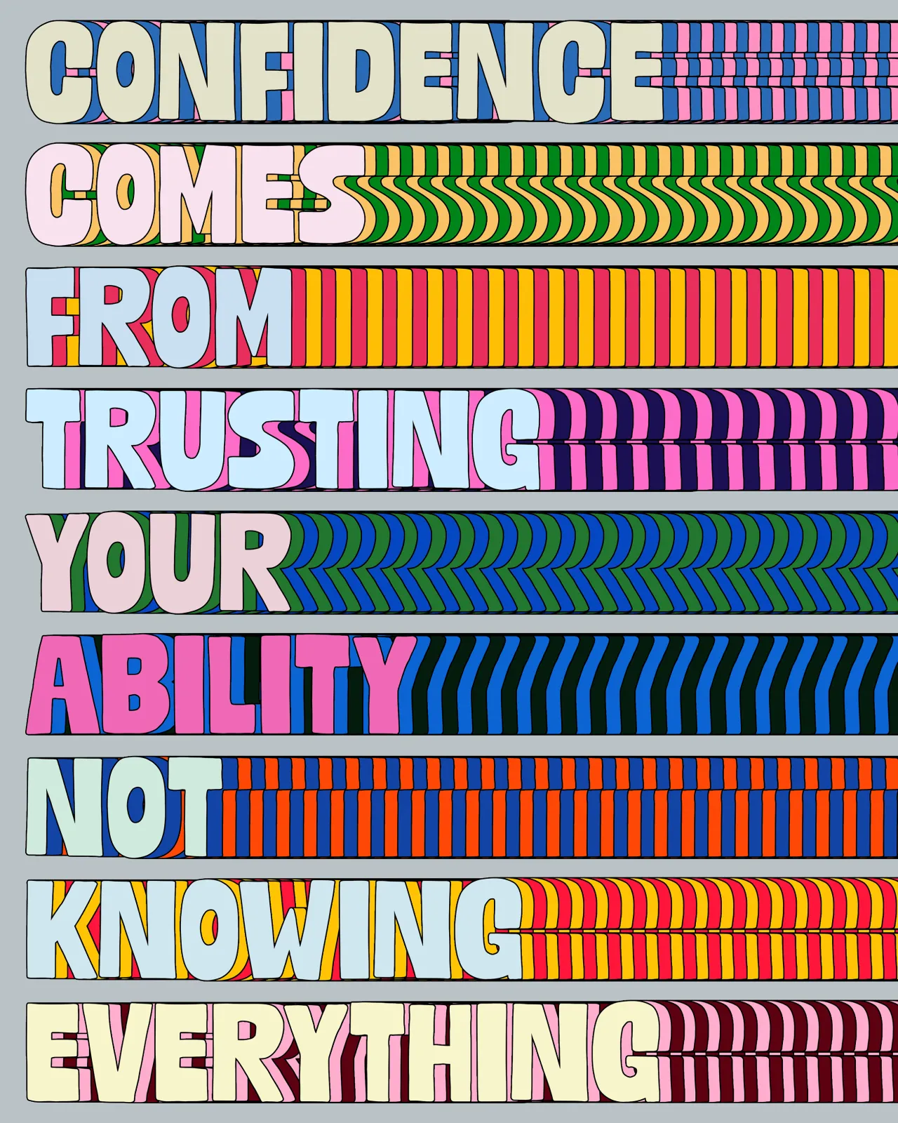
"Repetition is important to evolve and to get good at something, but it's also really important for me to break out of my comfort zone and just try other things without losing my DNA. Some people can stick to one style their whole career, and I totally respect that, but it doesn't work for me. I would get burnt out after a while."
Follow Florian Schommer on Instagram.
Editor's Picks





Trending






Latest Jobs
Graphic & Motion Designer at The SHARP Agency
Full-time·Leeds·£26k–£33k
Designer at New Genre
Full-time·London·£36k–£48k
Senior Designer at Creative Spark
Full-time·Manchester·£35k-£50k
Midweight Editor at Earworm
Full-time·Bristol·£28k-£32k
Marketing Copywriter at ustwo
Full-time·London·£40k-£50k
Design Director, Opinion at The New York Times
Full-time·New York·$160k–$180k




](https://media.creativeboom.com/c387d7c6-2338-4922-b891-d32d0a961eb8/conversions/b6ee419b8a4dcf7de3c537378b88c9d127fd695a-medium.webp)