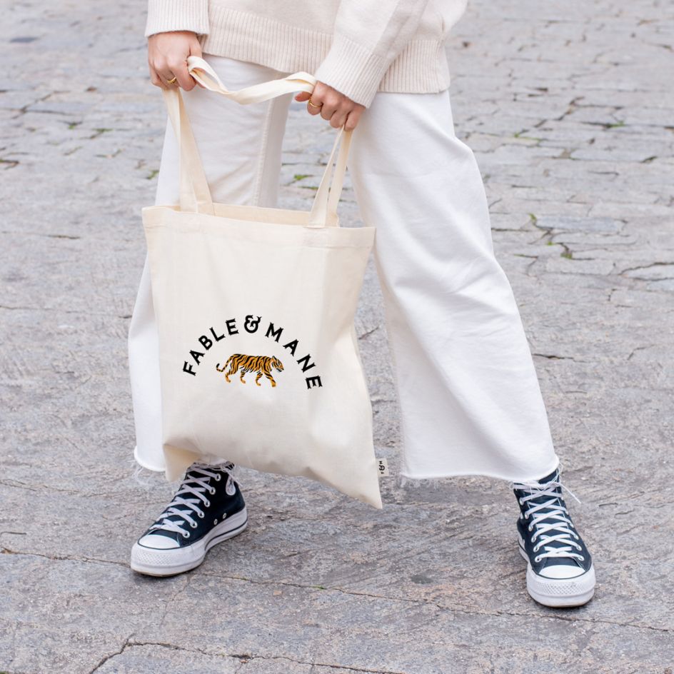
Alphabet's 'East meets West' identity for Fable & Mane draws on a symbolic tiger
Manchester-based studio Alphabet has collaborated with modern hair wellness brand Fable & Mane to create an identity that plays on Ancient Indian beauty secrets and has a symbolic tiger at its heart.
Alphabet was approached by Fable & Mane earlier this year to help its founder come up with a name and visual identity for the new range of hair products. During its research phase, the studio learnt that Niki Mehta was inspired by her Indian heritage and how during stressful periods she was reminded of the power of hair oiling, an Indian tradition. Alphabet helped to bring this story to life, turning it into a modern brand that's still very much rooted in tradition.
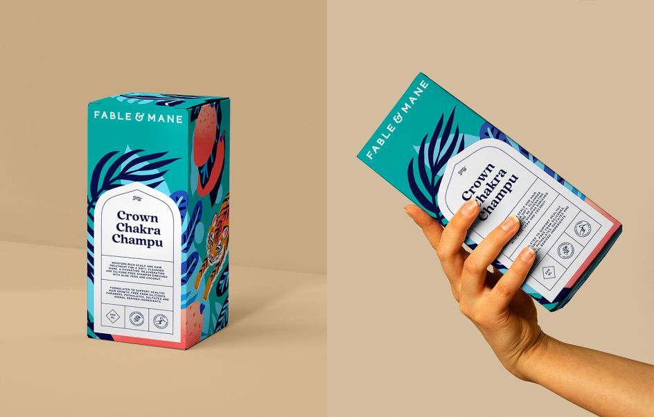
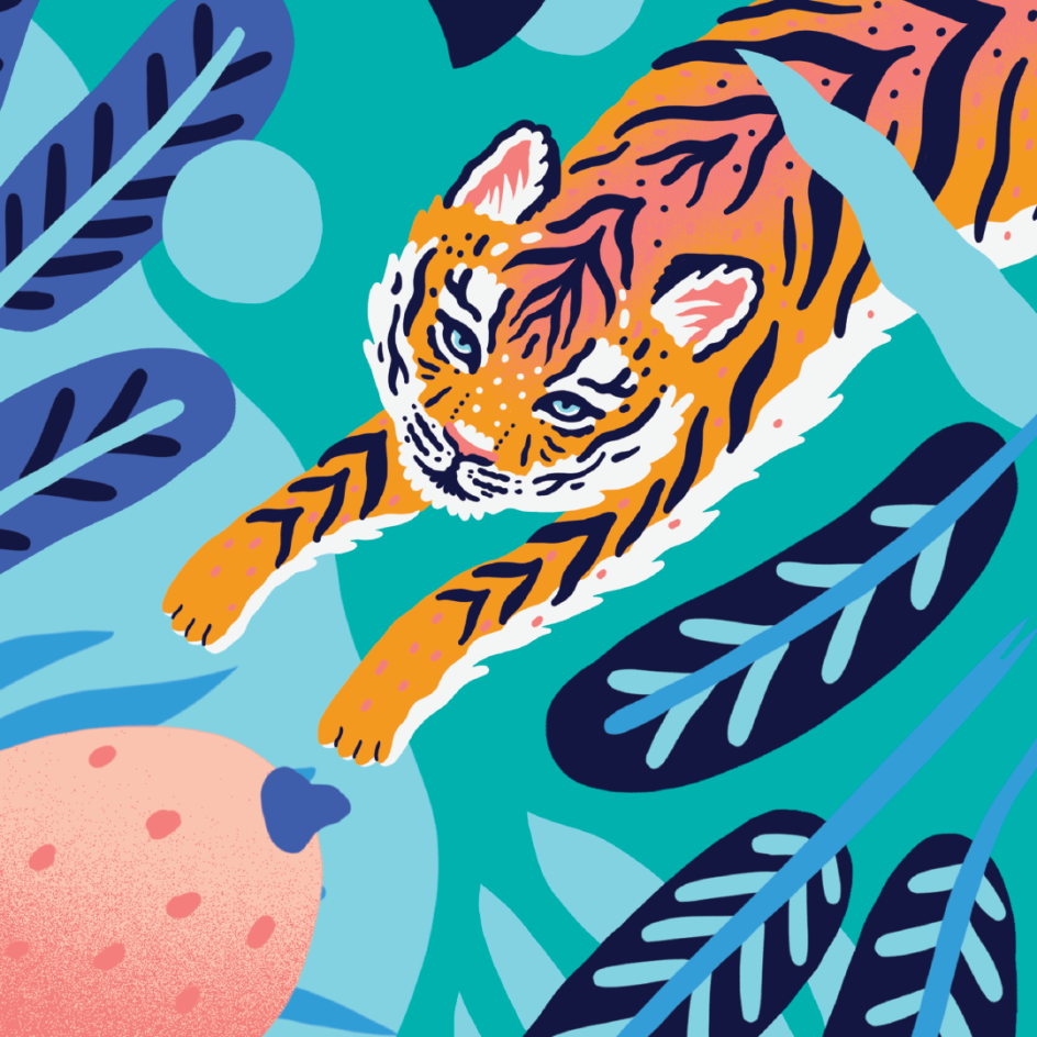
With a positive tone of voice and a playful suite of supporting illustrations by Marcos Navarro, the new identity is centred around a symbolic tiger. According to Alphabet, the animal is a symbol of "magnificence, power, beauty and fierceness and has been associated with bravery and valour". It also has a significant place in Hindu mythology as the vehicle of Goddess Durga.
The colour palette was also inspired by the tiger with "pinks and oranges from the animal's ears and face as well as blues from its eyes," according to the studio. "These colours are also a nod to the colourful shopfronts and signwriting in India," it adds.
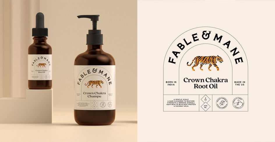
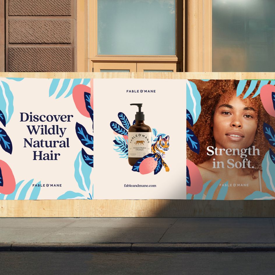
Looking at the packaging, the structure of the label itself is a modern take on traditional Indian beauty products, which often used devices or containers to hold text and graphics. For Fable & Mane, Alphabet created a rounded window shape as the core element, taking inspiration from iconic Indian architecture: It's a way of bringing an "Eastern touch to Western design," as Alphabet explains.
Symbols also feature heavily in the design. "We created a clean keyline iconography style that felt modern whilst retaining an ancient quality," the studio continues. "The visual style and positioning of the hands, in particular, draw upon traditional Indian culture."
Alongside the illustrations by Marcos Navarro, the accompanying photography is fresh, contemporary, and clean. "It's a contrast to some of the symbolism running through the logo and packaging design, as well as the playful and bright illustration style – crafting a perfect balance of East meets West."
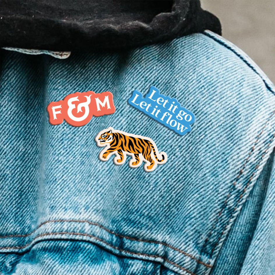
The identity has been rolled out to in-store displays and other marketing materials. Alphabet has also created a series of stickers that can be used either physically or digitally in future. And there's 'The Mane Edit', a bi-monthly newsletter and blog that "celebrates individuality, shares wild news, invitations and good karma treats".
Editor's Picks


Trending


](https://www.creativeboom.com/upload/articles/90/908fdb6378db1e95d12595416f54e6336d5e80b8_732.jpg)
Podcasts


Editor's Picks
Further Reading