Universal Favourite's identity for a sexual wellness brand helps to empower pleasure
How do you break down taboos and stigmas around sex and masturbation? Sydney-based design studio Universal Favourite recently worked with sexual wellness brand LBDO to embrace what is natural, and the reason why we're all here, by creating a "soft and inclusive" identity that shies away from anything "tacky".
"We wanted to create a distinct feel for the brand – something easy to understand that would speak to normalising the conversation around sexual pleasure," says Rachel Baker, founder of LBDO.
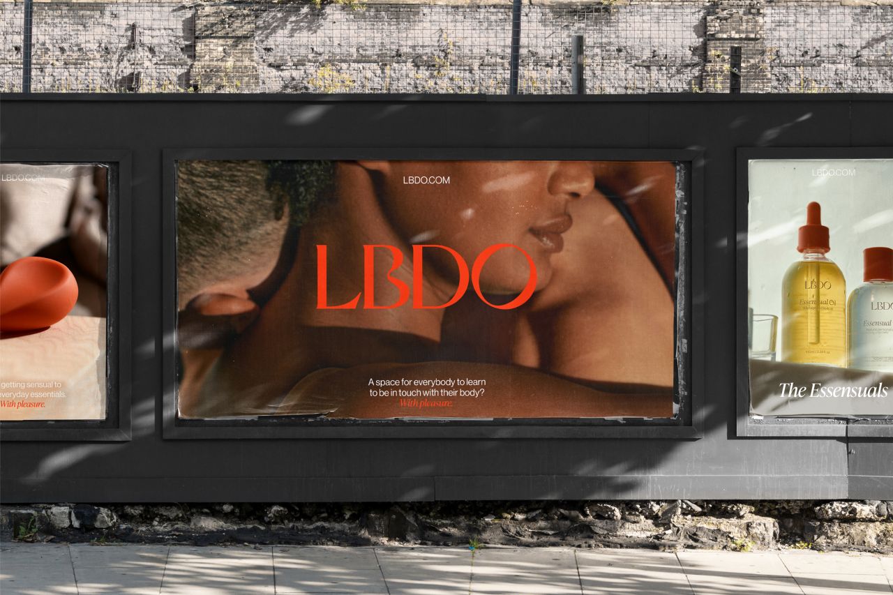
"From the get-go, we were drawn to the idea of getting in sync," says Dari Israelstam, founder and creative director at Universal Favourite, "a concept that not only speaks to the products on offer but also LBDO’s mission of normalising the conversation around personal pleasure and challenging the category by creating a brand that’s actually in touch with its audience."
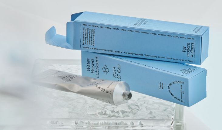
It's certainly a grown-up identity, avoiding any bright pink and purple colours or any "naughty" language that is often so imposing or overpowering in this category.
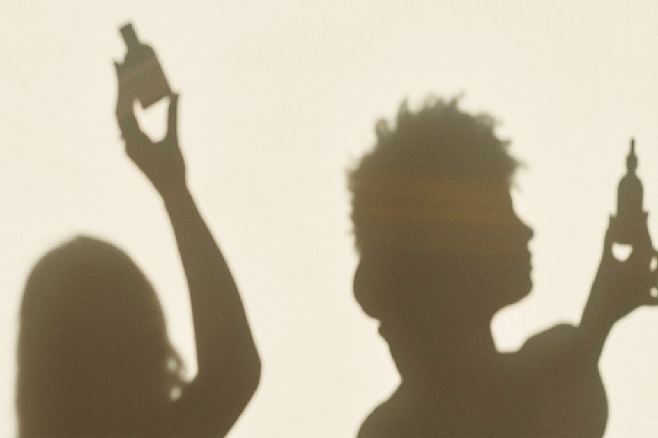
"As a nod to the ethos that LBDO is for every body type, the logo is a marriage of soft curves and hard lines," Dari continues, "an idea carried through the typeface pairing of Ivy Presto and Neue Haas Grotesk, the gender-neutral palette of mellow sands and greys with a passionate red highlight, and a photography direction playing with warm light and shadows."
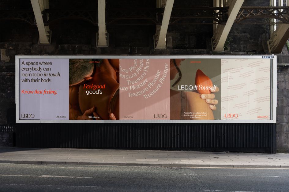
Universal Favourite worked with brand writer Cat Wall to develop an inclusive, relatable tone of voice and suite of messaging. "The typography and copy entangle to play a significant role across three different motion expressions (murmurations, ripples and interactive overlays) to create a sense of fluidity and sensuality," explains the studio.
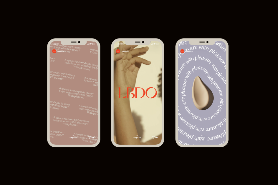
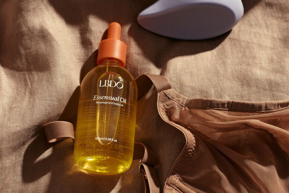
Looking at the packaging itself, it's sophisticated and, as Universal Favourite puts it, is "beautiful enough to sit on your bedside table", not shamefully hidden away.
"The mailer box is discreet and logo-less so the consumer can be comfortable having it delivered to any location," says Dari. "It is simply sealed with a sticker embossed with the brand line 'Pleasure to meet you' – a subtle insight to what's inside for an in-the-know receiver."
Of course, once you open the packaging, you're confronted with a big hit of LBDO red, which brings your attention back to the brand and helps the internal detail to stand out. The hero product, The Essensual Vibe, sits in a two-piece box, though both pieces come together to sync with one another.
Editor's Picks


Trending


Podcasts


Editor's Picks
Further Reading