DixonBaxi's identity for Canada Water helps to reimagine an historic neighbourhood of London
DixonBaxi has worked with British Land on a "once-in-a-generation" opportunity to reimagine Canada Water as a new town centre in the heart of London. The London agency has crafted an identity for the ambitious project that stretches across 53 acres and is on a scale not seen in centuries.
Home of the iconic Printworks London and local docklands, DixonBaxi wanted the new brand for Canada Water to capture the "multidimensional richness, diversity of the neighbourhood, and connections with nature and London's centre", as it explains, creating a strategy built on the "birthplace of leaders and mavericks". Apparently, social reformer, Ada Salter and engineer and inventor, Marc Isambard Brunel were born in the area – a discovery that led DixonBaxi to develop the central idea 'Lead the Change'.
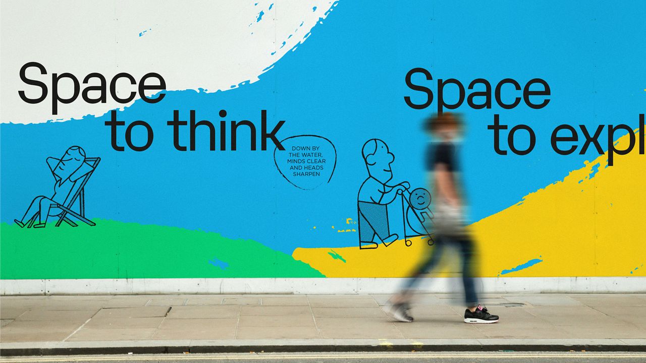
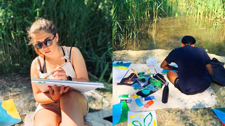
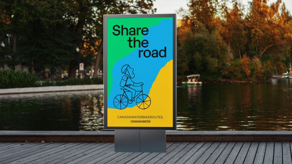
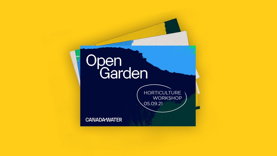
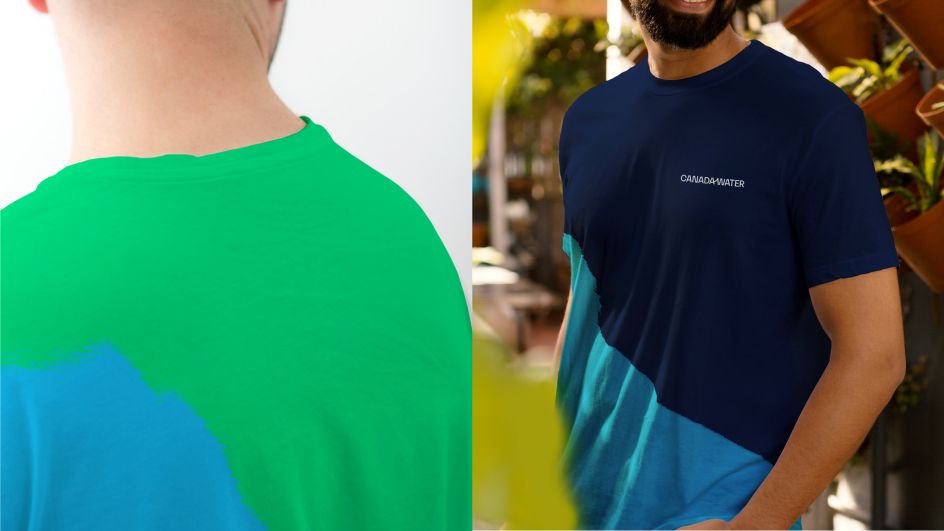
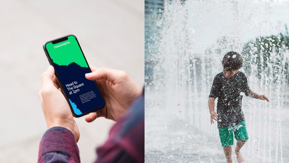
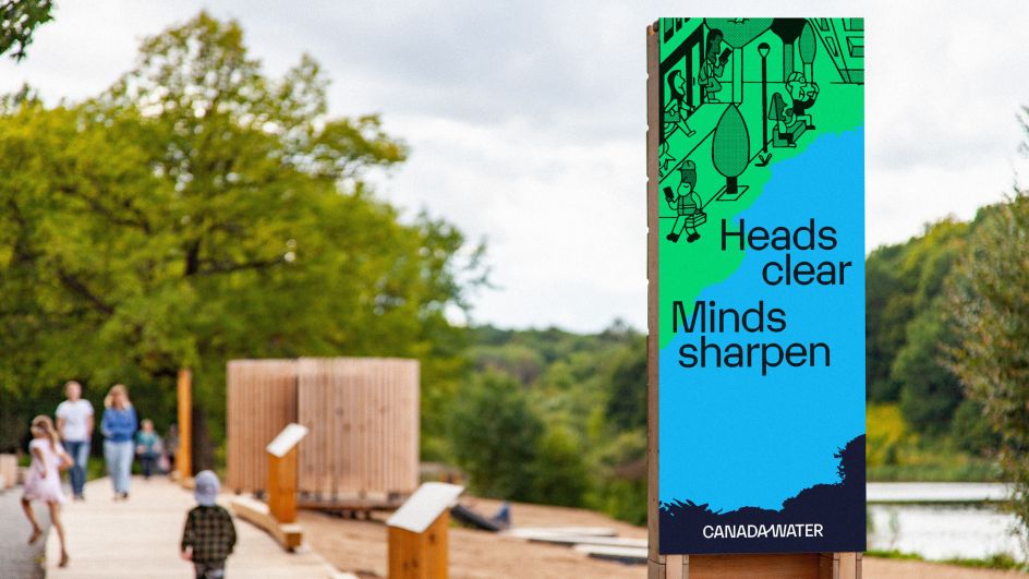
The identity features handmade "gestures" that "express the overlapping communities". These gestures were painted by the DixonBaxi team during days out to Canada Water – by the water, in the woods and in the parks. The resulting bold, sweeping strokes are inspired by these surroundings and are layered on top of one another to represent how the area has been built and rebuilt over many years.
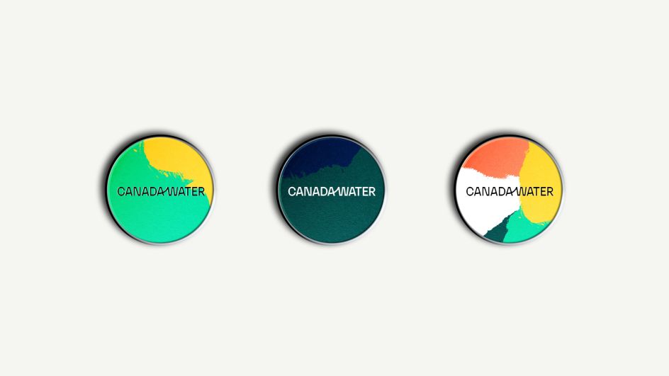
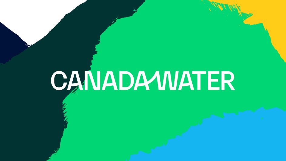
The Canada Water wordmark, meanwhile, has a discreet upward line linking the 'A' and 'W' to express the relationship between the natural landscape and its positive influence on the local environment. The upward motif is echoed in the other 'A' letters, creating a more "human feeling" while the angular forms of the typeface provide a contrast that feels more structured and architectural.
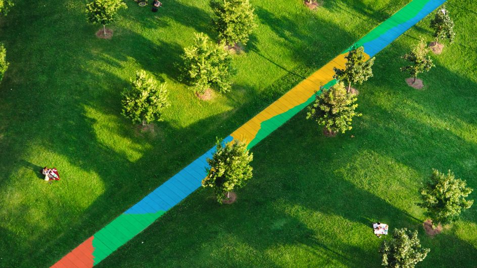
The colour palette is bright and vibrant and sampled from local areas and historical icons from local bridges to the docks and given names such as Harmsworth Blue, Brunel Clay, Mayflower Yellow and Stave Hill Green.


Karelia is the primary typeface for its "organic curvature and contrasting geometric forms for a distinctive look," explains DixonBaxi, while "typographic layouts feel conversational and evoke a sense of rhythm and journey".
DixonBaxi partnered with artist Jay Cover on a series of line work illustrations, which reveal mini stories of life at Canada Water and the contrast between the buzzing urban centre with the natural landscape of the woodlands.
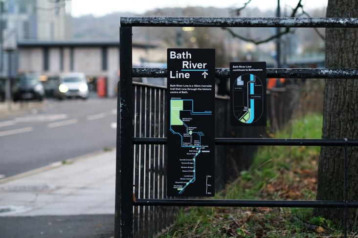
The brand stretches across many different touch points from the marketing suite, hoardings and signage systems to community films, clothing and environmental experiences. It will continue to grow, evolve and adapt over the next decade.


Editor's Picks


Trending


Podcasts


Editor's Picks
Further Reading