DesignStudio's 'imperfect' rebrand for Getsafe is a refreshingly honest take on insurance and the risks we take
Is it possible to make insurance interesting? Particularly for today's younger generation? DesignStudio's brand refresh for European startup Getsafe definitely makes it more relevant and appealing.
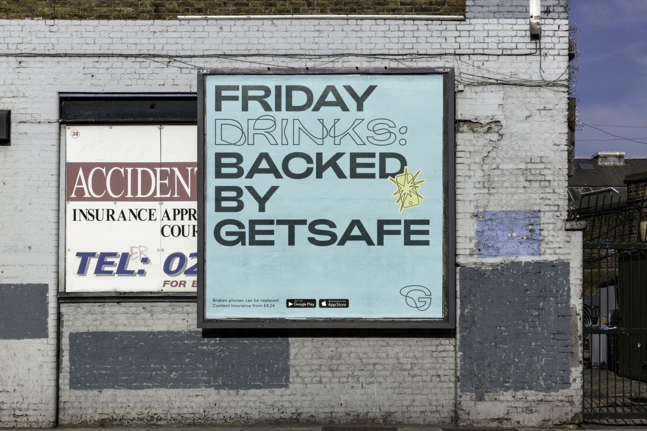
Yes, insurance can be confusing and boring or a necessary evil for any of us, nevermind the under-30s – no one wants to think about what could go wrong. But this was the targeted demographic and focus for the insurance firm which is on a mission to disrupt the industry and "put people's needs before incomprehensible policies and paperwork".
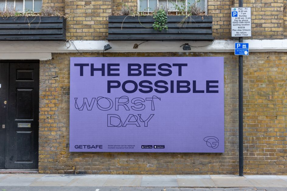
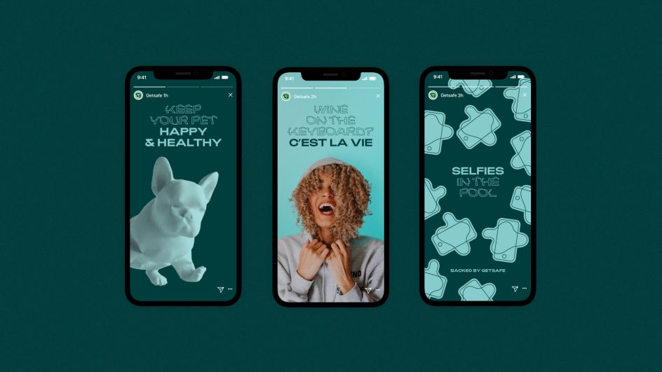
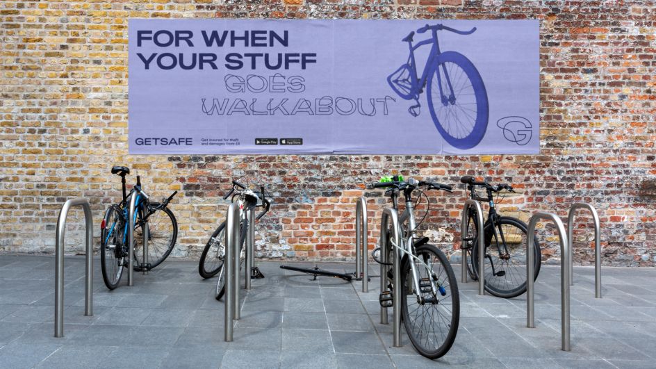
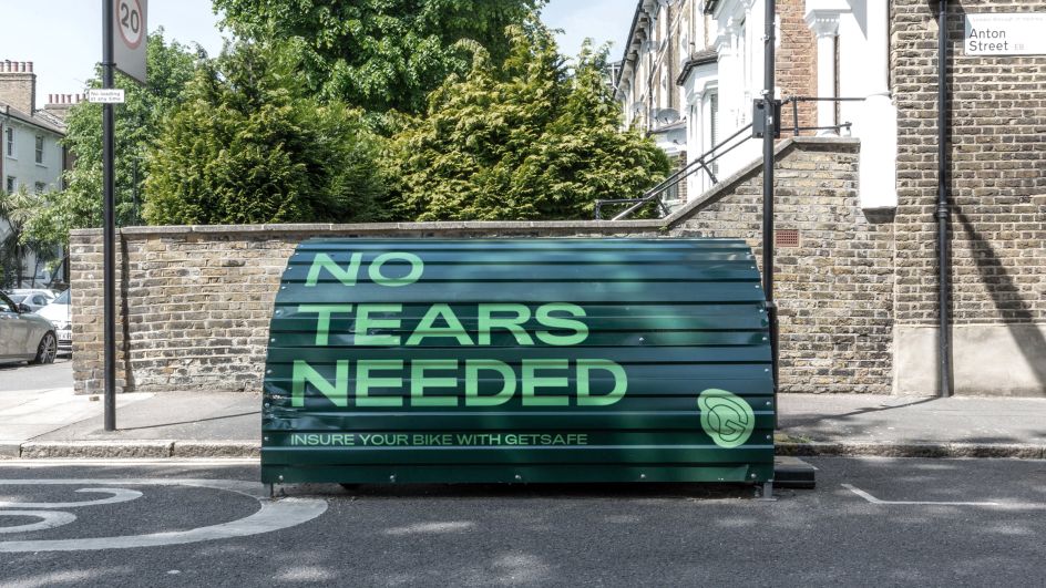
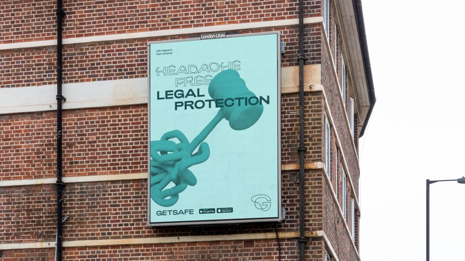
Of course, insurance exists because of risk, but typically insurers avoid talking about it. DesignStudio built on that insight and imagined a brand that tackles this head-on. Creating a more positive message, that talks openly about accidents that happen and the risks people take.
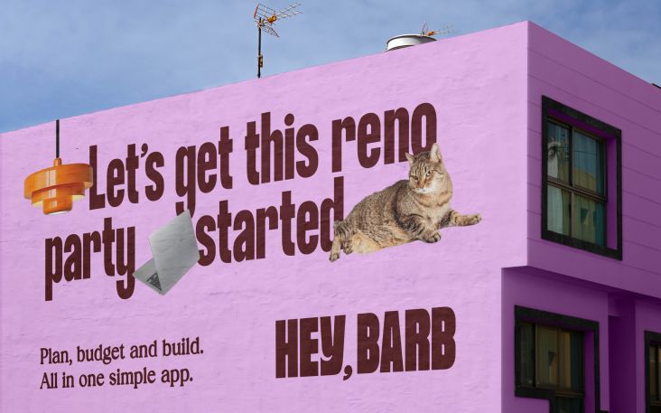
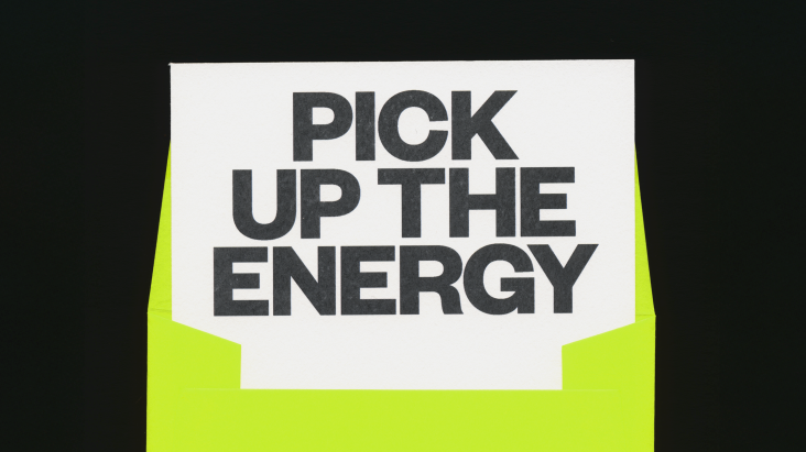
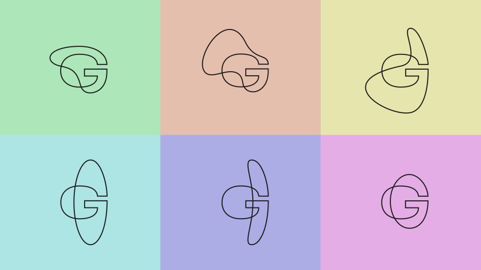
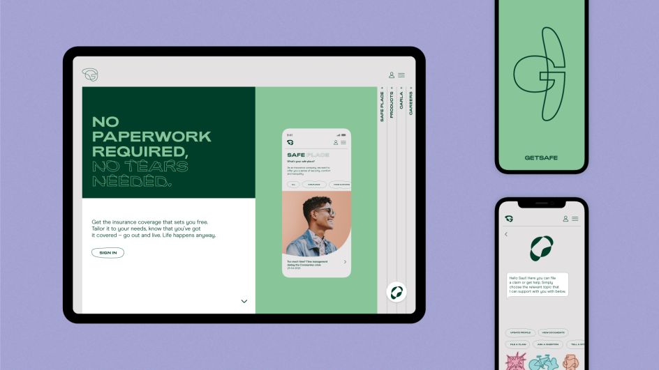
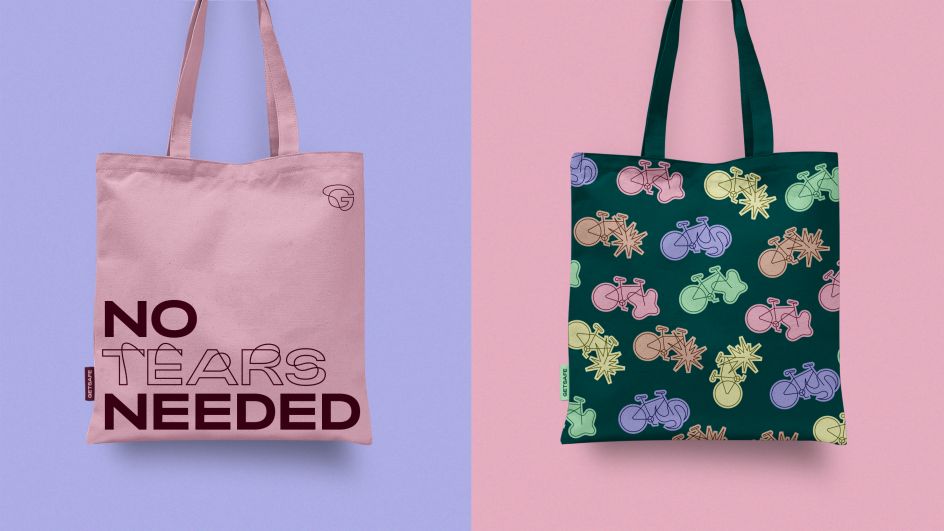
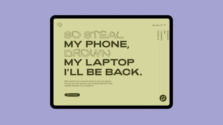
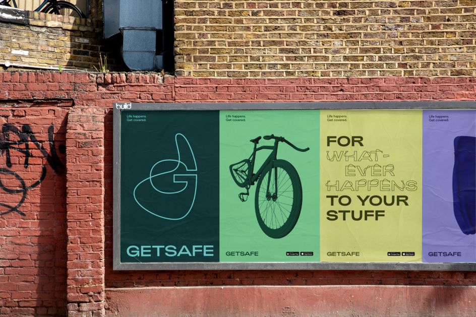
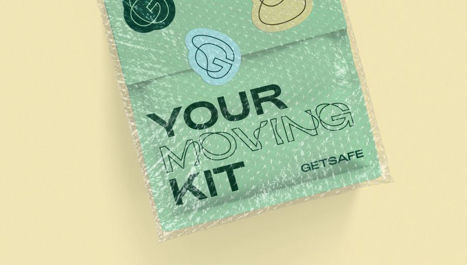
The visual expression embraces "happy accidents", its logo and bespoke typography are imperfect, they wave out of line to reflect reality with all of its imperfections. The new identity system adapts to different moments, with a colour palette that is luminous and eye-popping for outdoor ads, but more muted for the website and digital experience. Likewise, the tone of voice dials up and down. Big headlines have attitude and terms and conditions provide clarity.
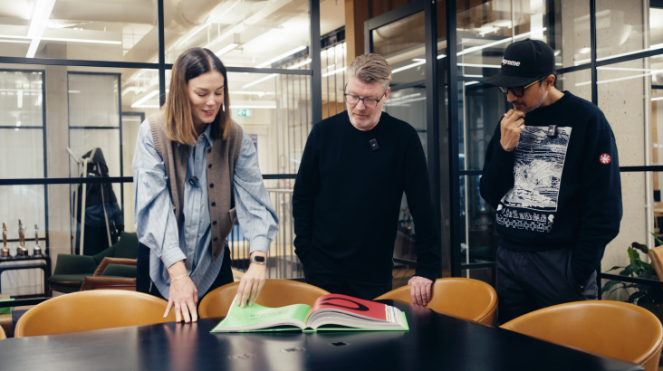
Campbell Butler, creative director at DesignStudio London says: "It was a joy working with the teams at Getsafe who have bravely embraced a brand that talks openly about the risks people take every day and how insurance can make life easier." Design Director Alexis Sellal adds: "Getsafe is one of these great companies where everyone is passionate and positive. That's the spirit we wanted to translate. The new brand is bold, daring and as ambitious as everyone we met at Getsafe."
Editor's Picks



Trending


Podcasts
Editor's Picks
Further Reading