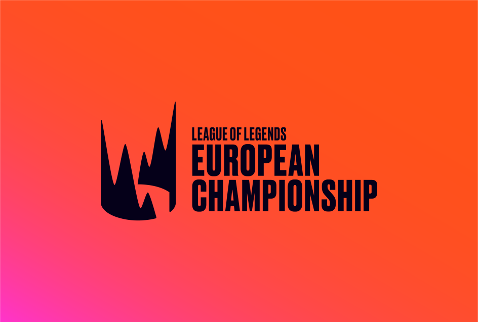
DesignStudio and Riot Games' rebrand of the League of Legends European Championship
DesignStudio has joined forces with Riot Games to reimagine the European League of Legends Championship, one of the world's most successful computer games.
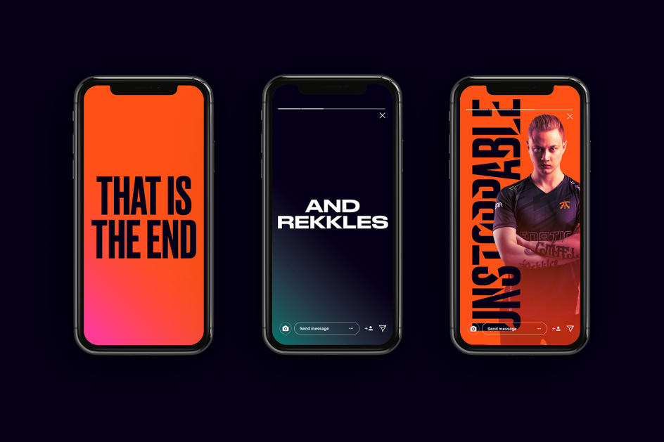
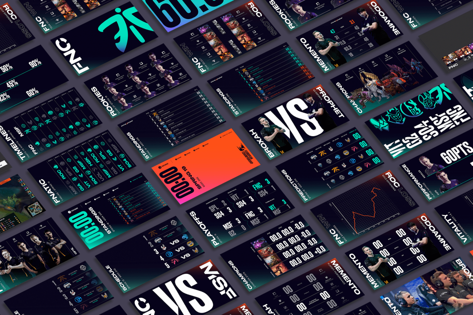
The European competition needed a new identity to set it apart from its North American counterpart and push it beyond the traditional sports clichés. Alongside a new name, the London agency came up with a fresh new identity, broadcast package and influenced parts of the set design.
"Europe’s competition is incredibly diverse, bringing together fans and professional players from over 40 countries," says DesignStudio. "The new brand embodies the character, passion and diversity of the community under the strategic proposition ‘Unleash Together’.
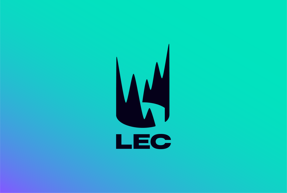
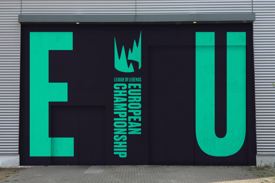
"The new logo captures this proposition, which is an explosion of triumph and celebration. The two sides of the mark represent two competing teams locked together to depict a single crown and a circular arena. The mark comes to life in animation, rising from the ground and twisting to show off its dimensionality. These motion behaviours reference the energy and magic in gameplay. The symbol is modern and stands boldly beside other sports brands."
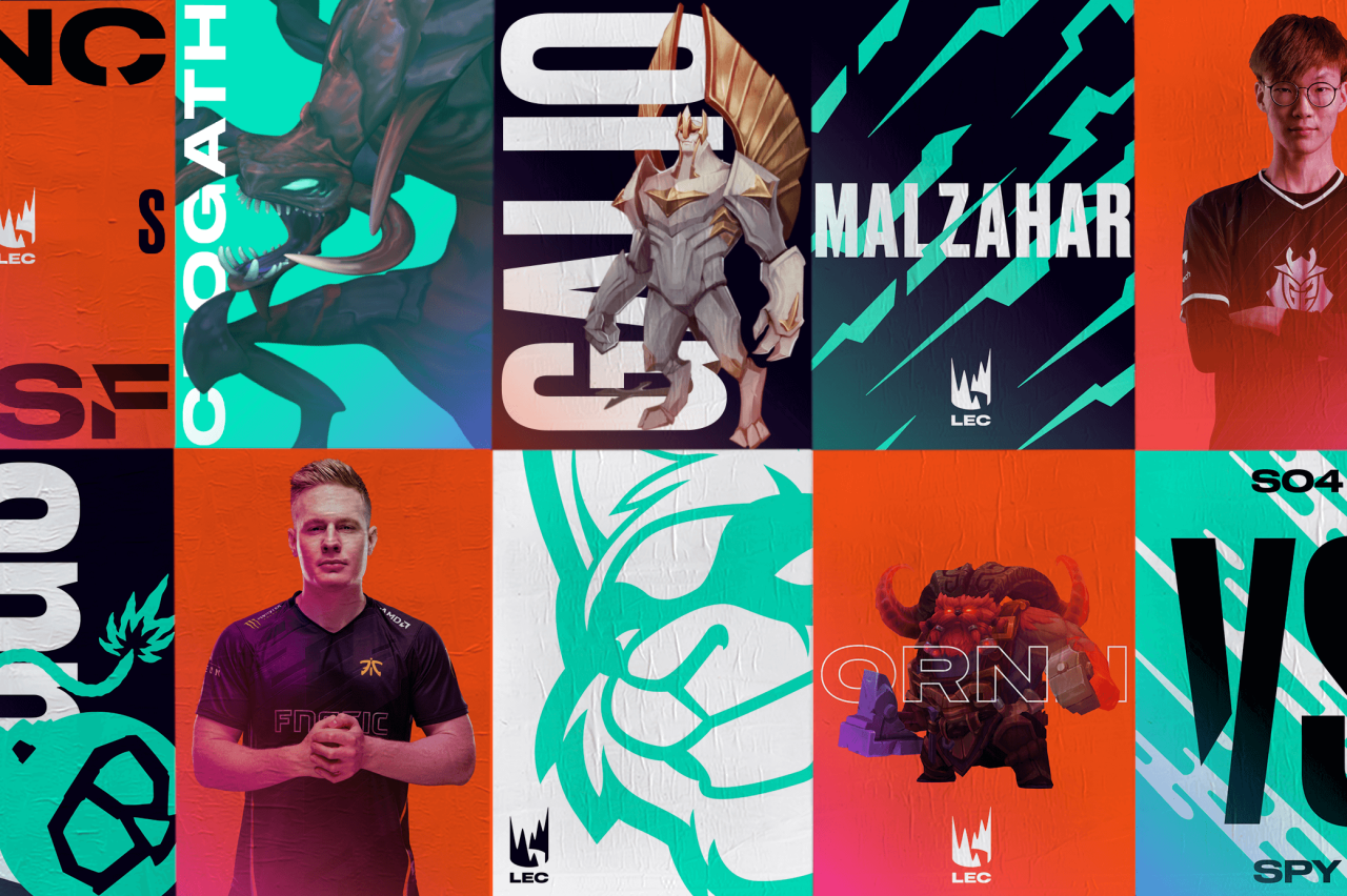
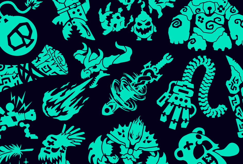
The wider graphic language is apparently inspired by League of Legends’ explosive energy and the clash of teams, fans and cultures in our league. Five graphic textures reference different energies in the game: Rush, Surge, Strike, Blaze, and Blast. They are used as high contrast backgrounds and as dynamic wipes in broadcast environments.
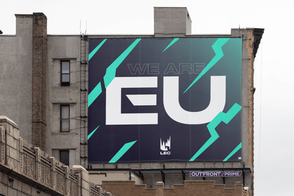
Reminiscent of old European boxing posters, the typography, meanwhile, is all about high impact. Two typefaces, Gatica and Druk, oppose each other in layouts. In collaboration with Commercial Type, Druk has been slashed and cut as if it has lived through a battle.


](https://www.creativeboom.com/upload/articles/90/908fdb6378db1e95d12595416f54e6336d5e80b8_732.jpg)