Design Ranch creates glossy not gothy raven-inspired identity for supper club Corvino
Like everyone’s favourite glittery-heeled heroine Dorothy, Design Ranch hails all the way from Kansas City.
Working across branding, packaging, art direction, digital design, interior graphics and signal—the whole package, basically, the studio works with a range of clients across fashion, food, charitable foundations, cultural projects and more.
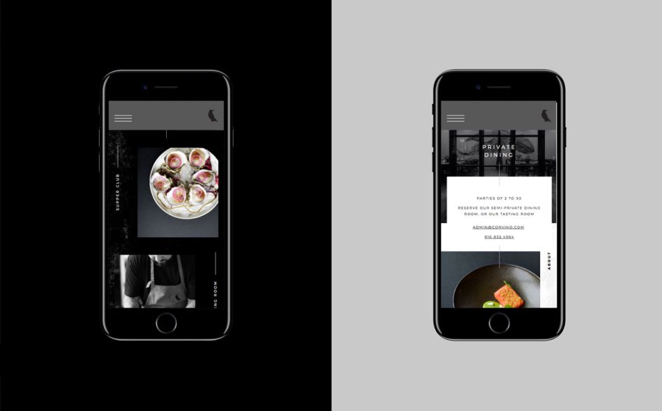
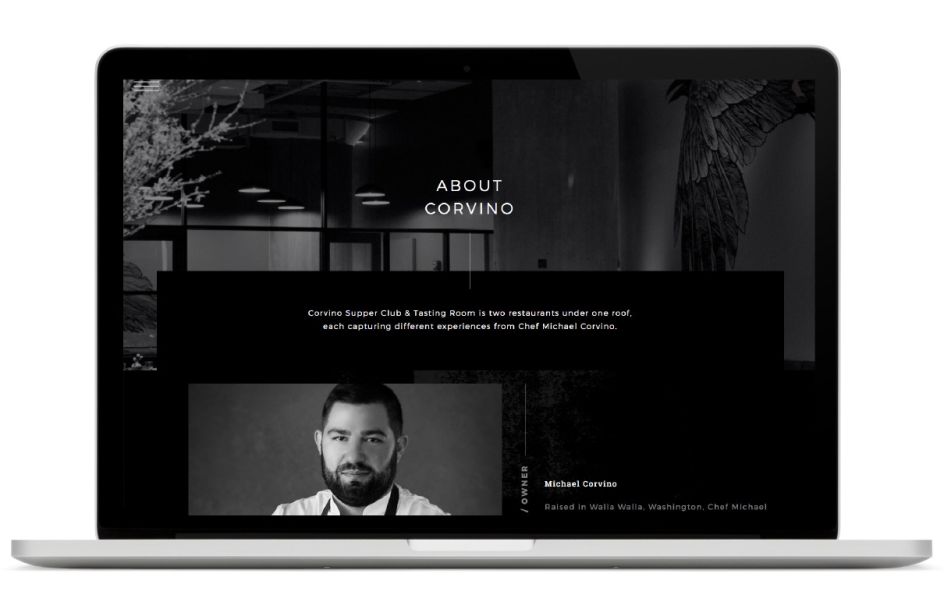
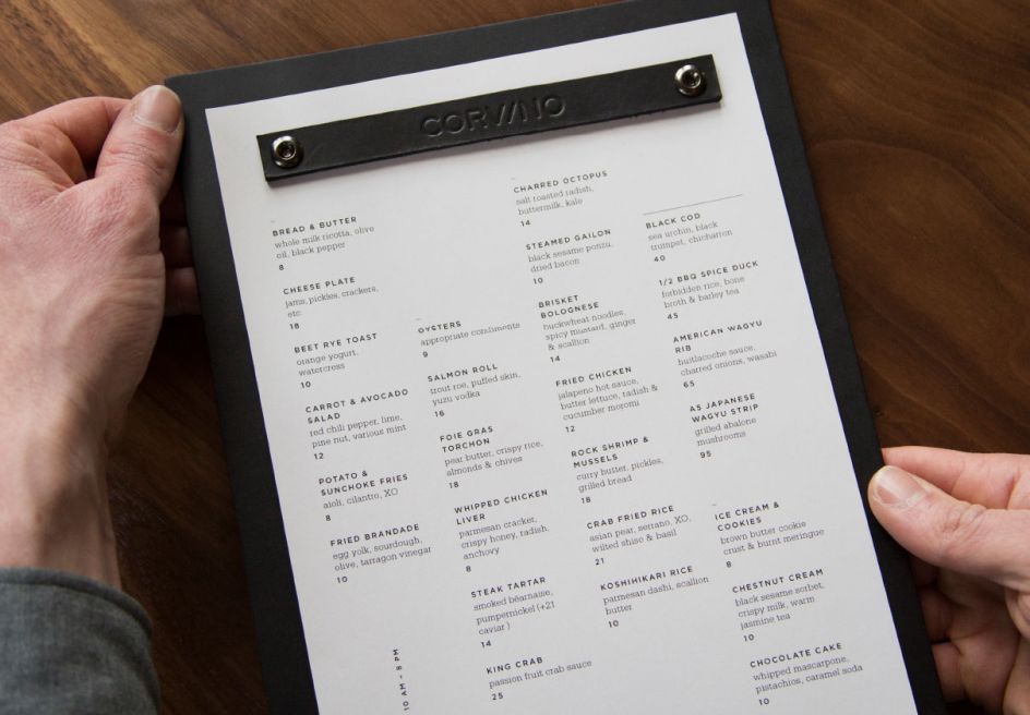
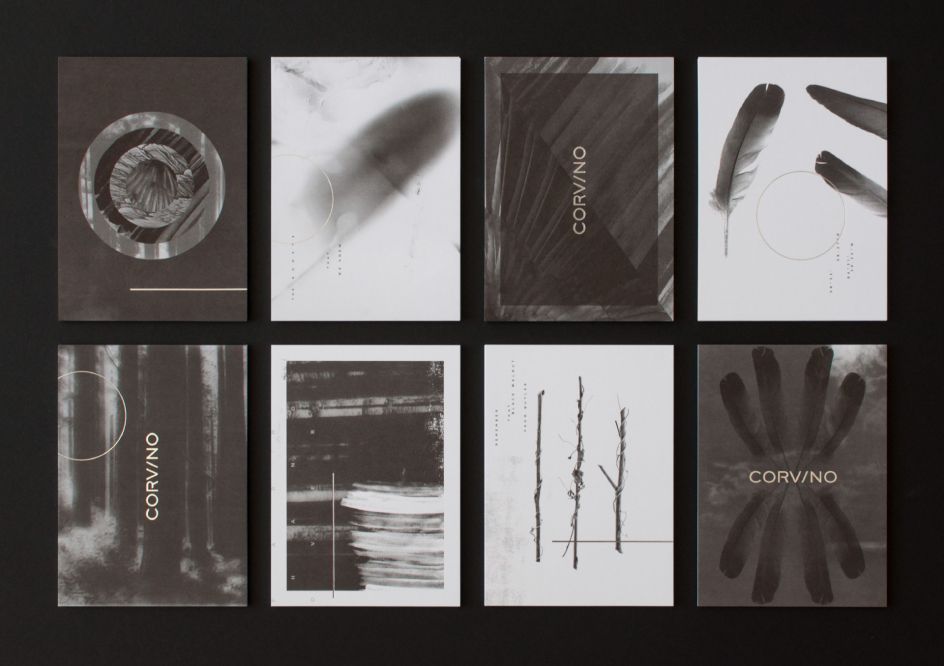
One recent project that highlights its ability to create holistic identities that work just as well across huge walls as tiny phone screens are its designs for supper club and tasting room Corvino.
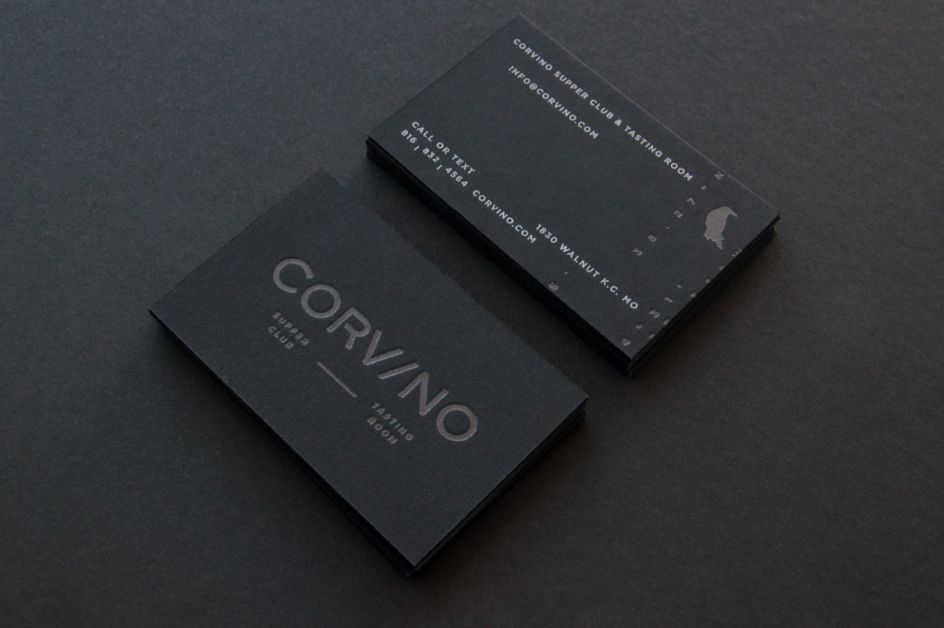
While the dining concept is named after its founders Michael (the chef) Corvino and general manager Christina Corvino, the word also means “raven.”
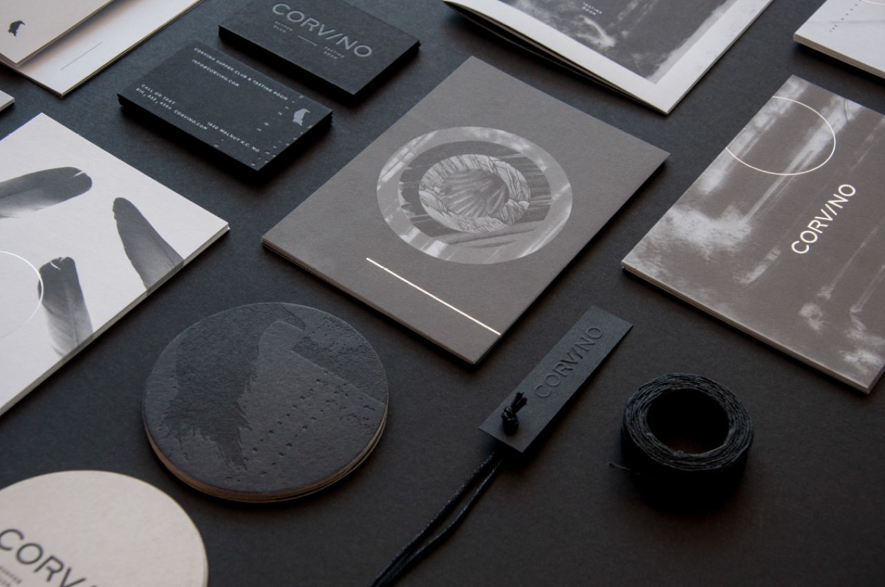
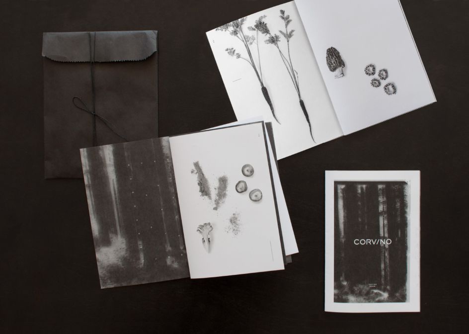
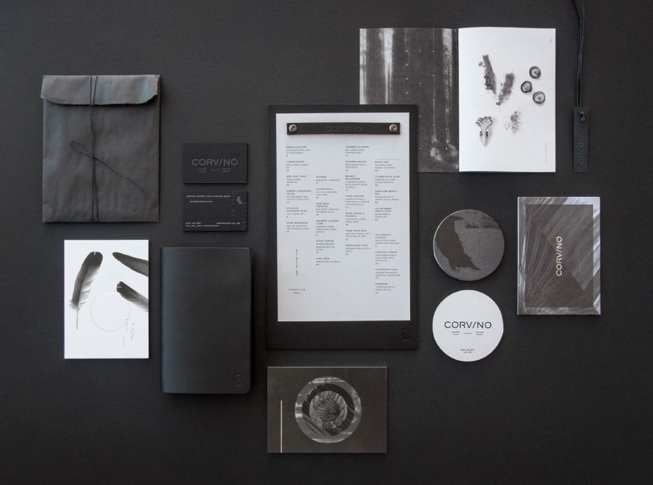
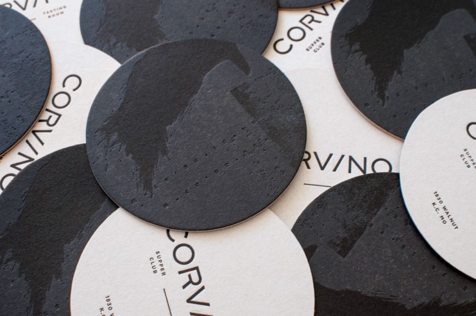
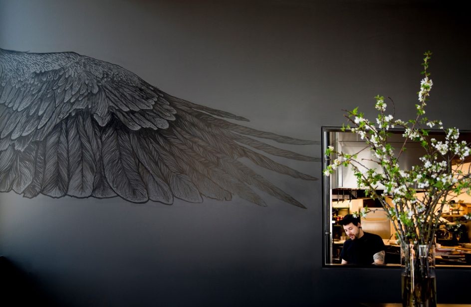
It was this enigmatic bird that Design Ranch drew on for its designs. “The Raven, provided the inspiration behind the colour palette, textures and materials,” says Design Ranch. As such, the designs lean heavily on black, shades of grey and touches of white; all in all, managing to achieve something glossy rather than gothy.
The look is minimal yet striking, with an emphasis on subtle but effective touches, like textured ravens on the coasters and monochromatic printed effects across collateral like menus, pamphlets and promotional materials.
Editor's Picks


Trending


Podcasts


Editor's Picks
Further Reading
](https://www.creativeboom.com/upload/articles/90/908fdb6378db1e95d12595416f54e6336d5e80b8_732.jpg)