Dekoratio creates on-trend brand identity for Cornware's biodegradable tableware
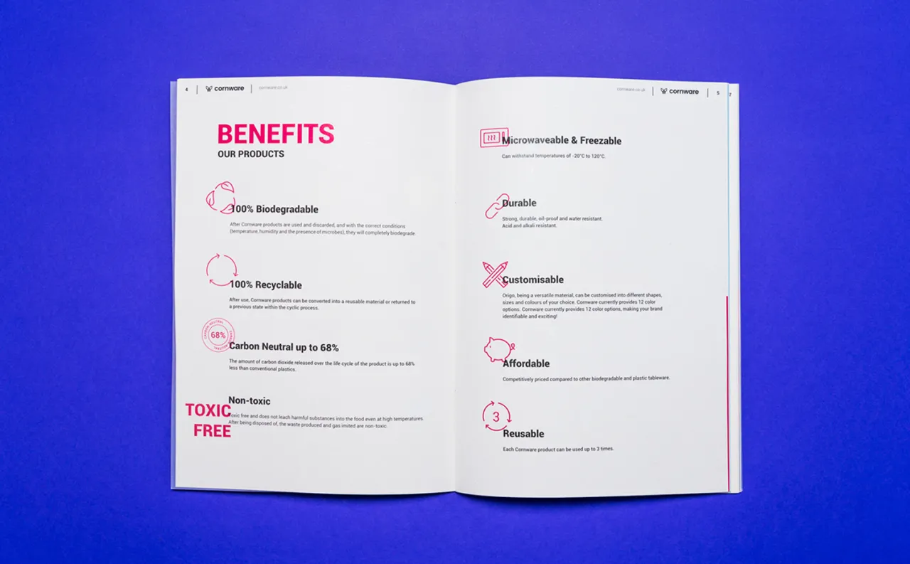
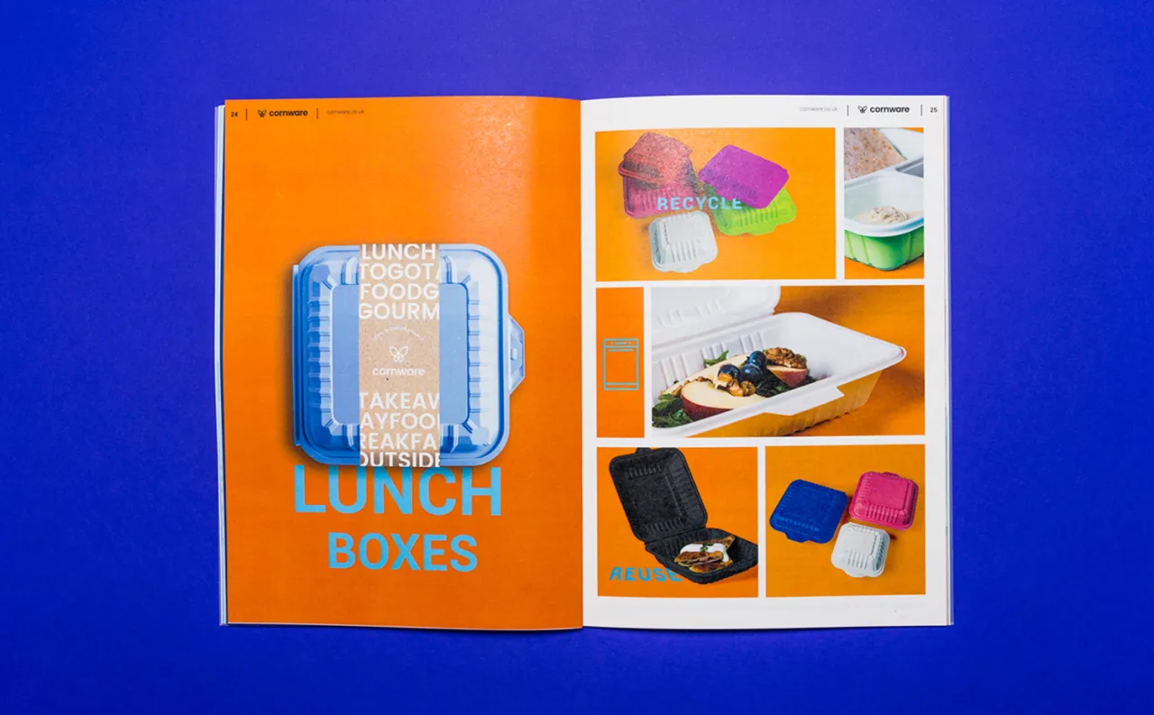
Budapest-based branding and design studio, Dekoratio, was tasked with creating an iconic, cool and fashionable identity for Cornware – a London-based brand that produces 100% biodegradable, high quality, disposable tableware.
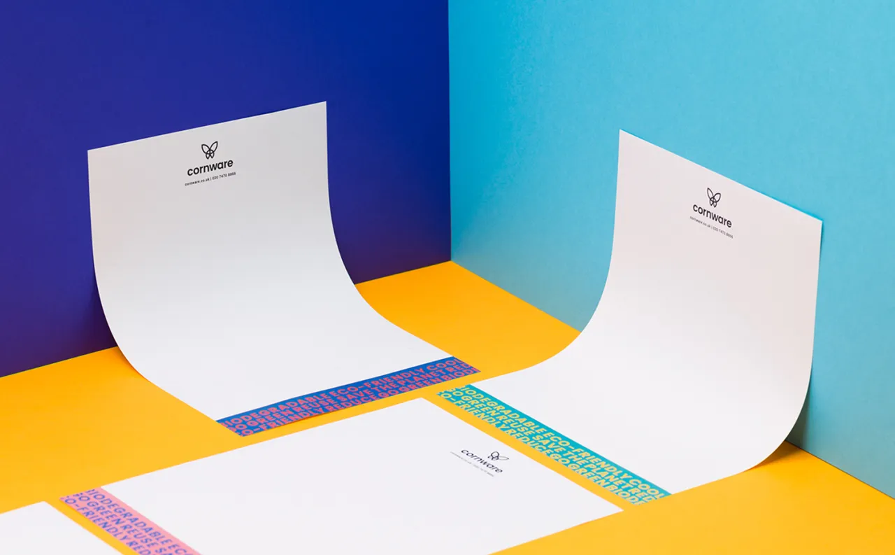
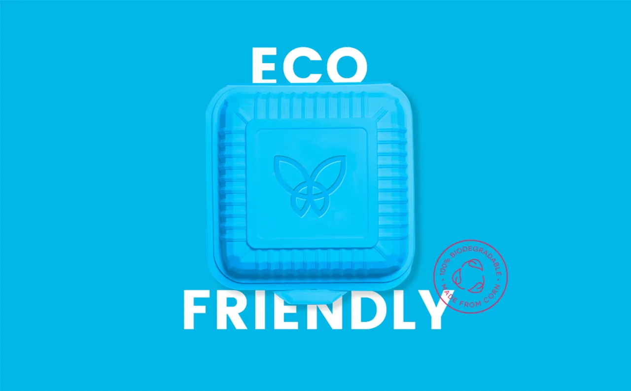
The brand identity had to include a characteristic and memorable symbol, that people could relate to and would immediately recognise on products.
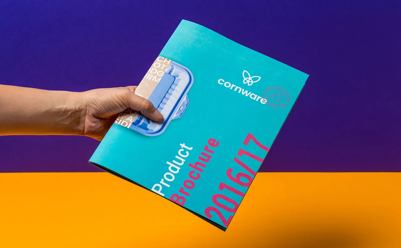
Designer, Zsofia Nagy, explains: "In order to achieve this goal, we used bright colours, instead of the way too familiar sand, grey and green colours that are commonly used by recycling brands.
"As for the logo, we chose the butterfly, as it represents rejuvenation and it is also a symbol that is easy to remember. The type is made up of bold letters so it can stand out and can be recognised even when printed small on the plates." Discover more on Behance.
Via direct submission | All images courtesy of Dekoratio

Editor's Picks





Trending






Latest Jobs
Senior 2D Motion Designer at Art&Graft
Full-time·London·£50k-£65k
Midweight Designer at Catalyst Creative
Full-time·London·£32k-£36k
Brand Designer, Product Launches at Figma
Full-time·New York·$127k–$269k
Brand Strategist at DNCO
Full-time·London·£45k-£60k
Client Director at Koto
Full-time·Berlin·€70k-€85k
Frontend Developer at Northern Artillery
Full-time·Leeds·£35k–£45k