Agua de Madre is a water kefir traditionally brewed in small batches in London. Naturally low in sugar, this sparkling beverage offers numerous health benefits derived from the fermentation process.
Firstly, it's naturally low in sugar. Secondly, it's packed with billions of live cultures, which means it is good for your gut health. Indeed, the name itself, which translates as 'water of the mother', pays homage to the "mother" culture used in fermentation.
At the same time, Agua de Madre supports real-life mothers, too, as the company gifts one percent of profits to female-focused charities every year.
The brief
Founder Nicola Hart tasked Chris Chapman with rebranding and redesigning Agua de Madre, to create a multigenerational product which people would be inspired to drink.
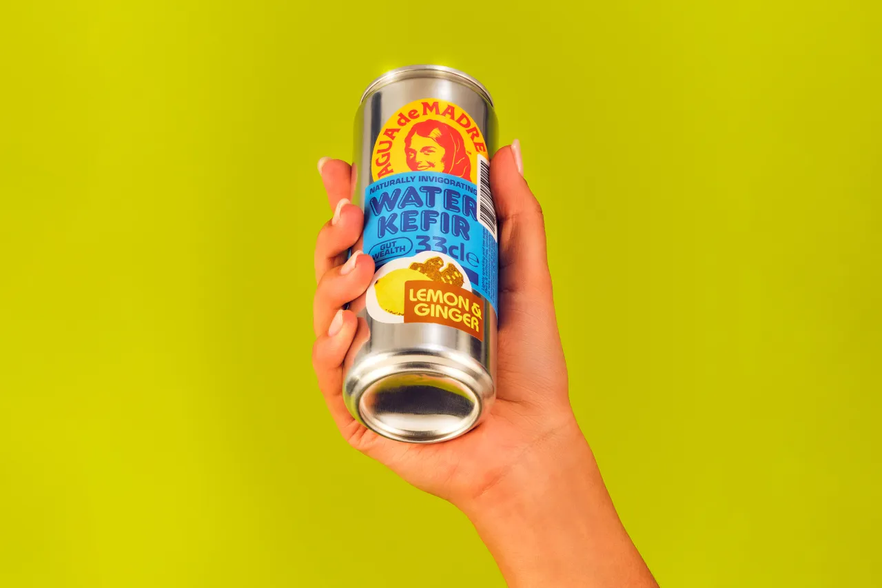
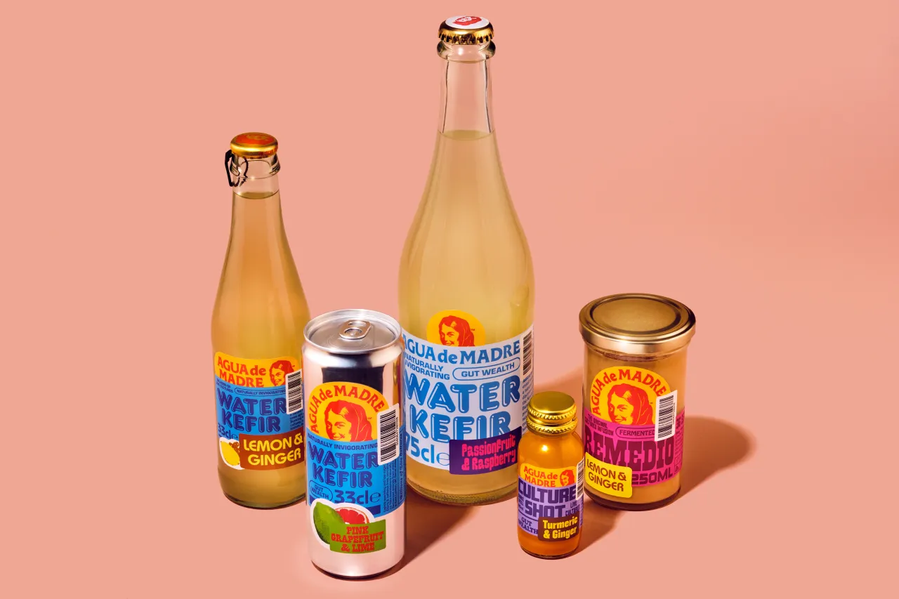
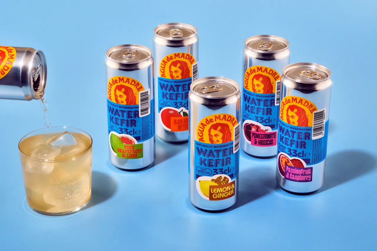
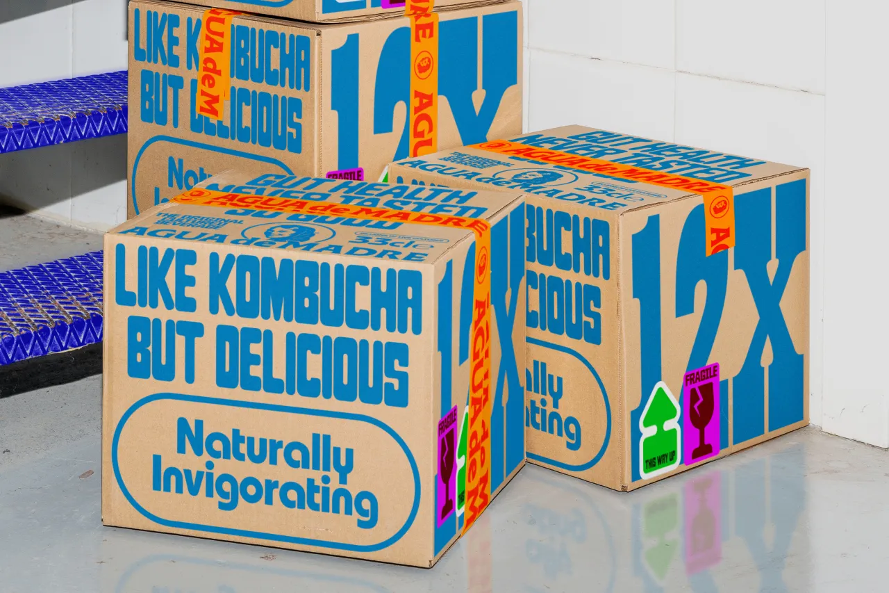
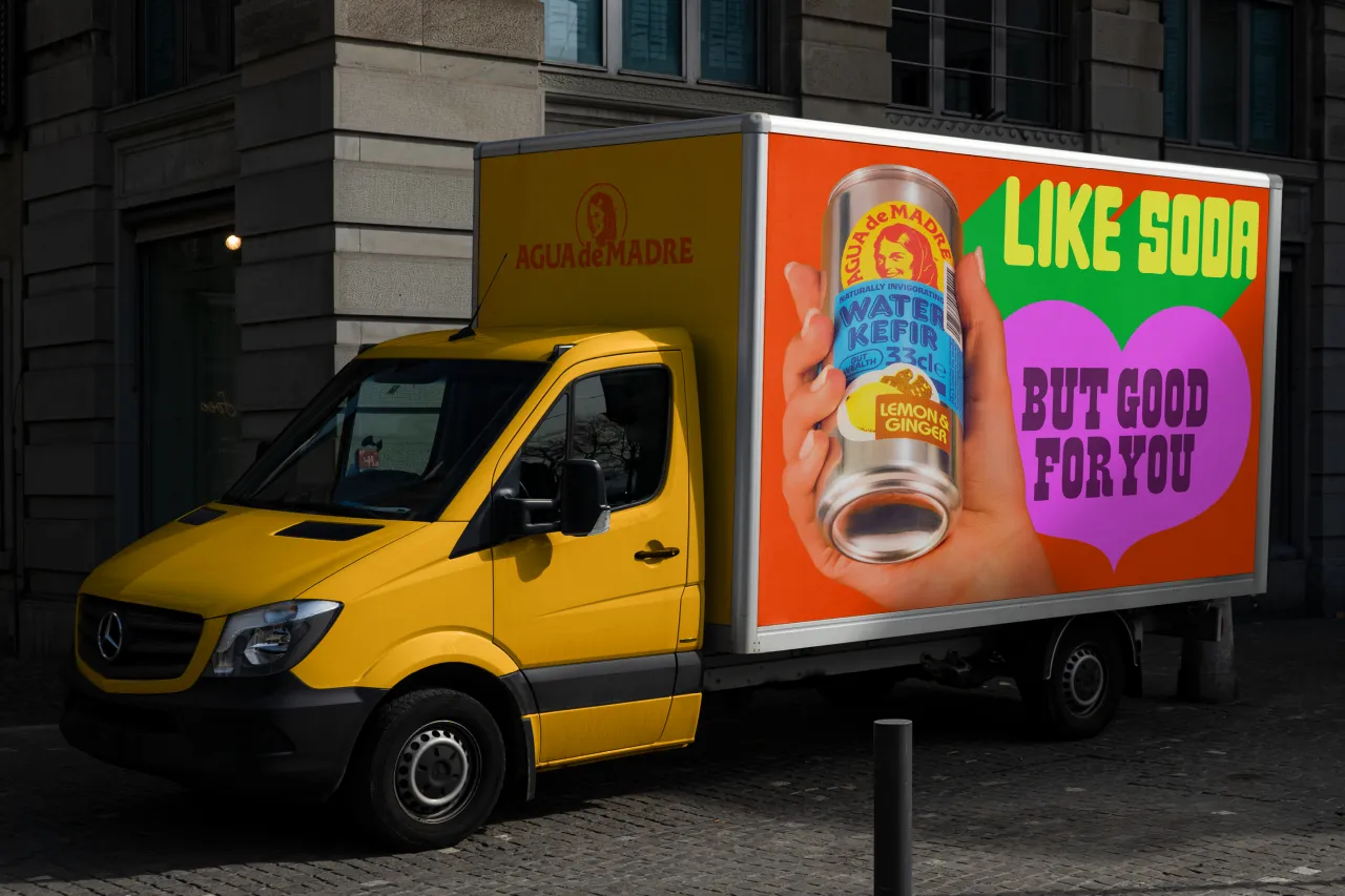
The rebrand had two main goals: to communicate the drink's taste and to honour the spirit of the mother.
As Nicola explains, "When I founded Agua de Madre in 2017, I wanted not only to create a delicious drink that was good for people but also to encourage Madres to shine in all forms, nurturing our guts and our communities along the way."
Visuals and logo
While Nicola was open to a complete rebrand, Chapman felt it was important to keep some of the existing branding, particularly given how phased the rollout of the new branding would be.
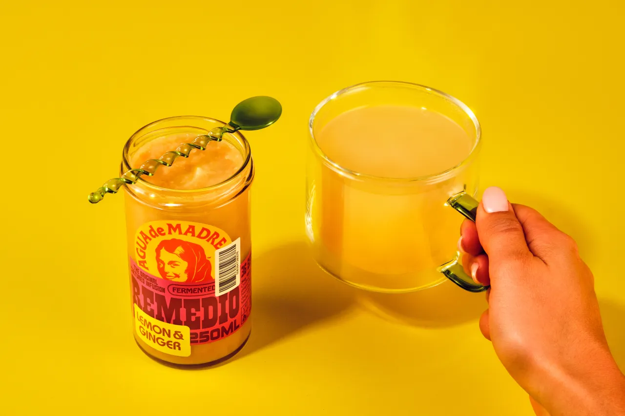
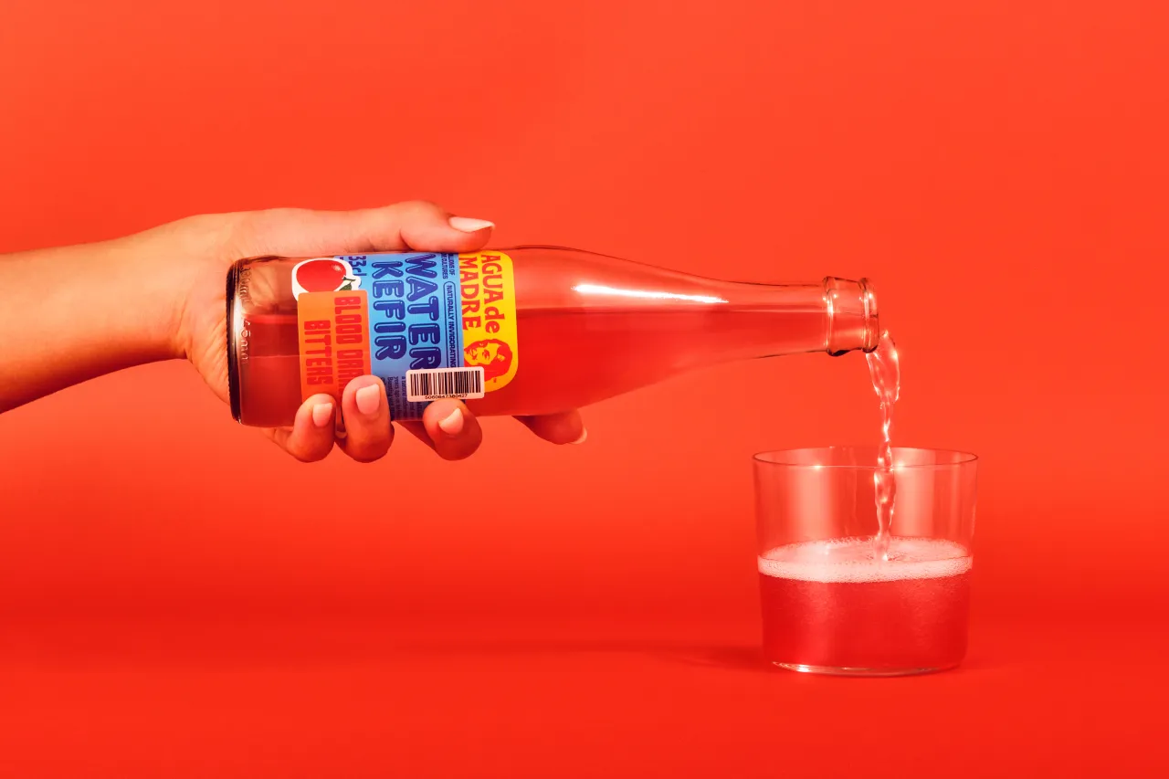
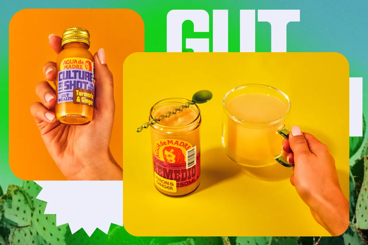
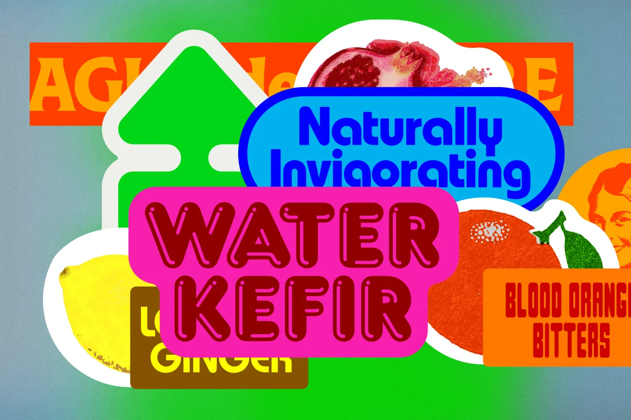
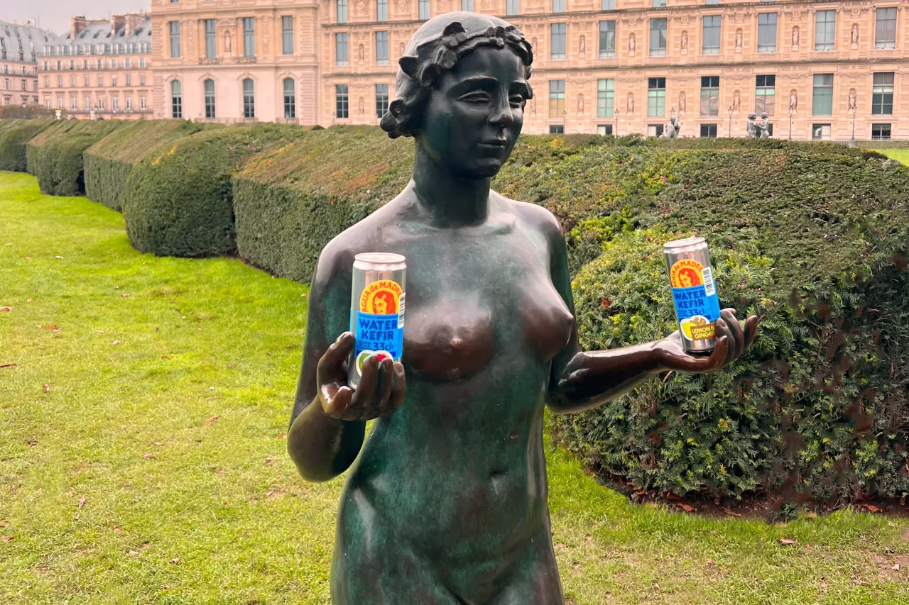
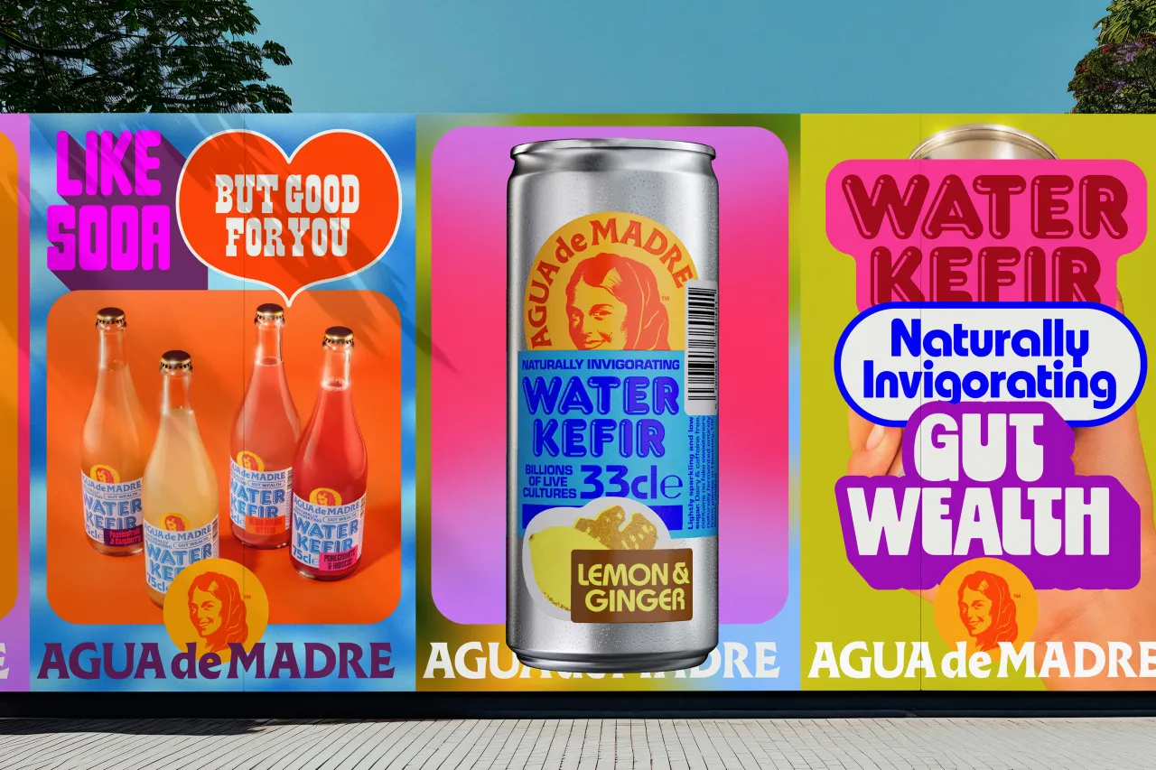
"We decided it would be a good idea to keep the illustration of the Madre's face and the font of the wordmark," he explains, "as these felt like the most salient features of the branding.
"By jostling these with vibrant colours and nostalgic typefaces together, we were able to suggest the drinks' lively taste," he adds. "And the playfully overlapped 'stickers' also reflect childhood joy, hinting at a time spent with our own madres.
Typography and colour palette
While water kefir is low in sugar and sophisticated in taste, it is a soda-style drink. To reflect this, the team used familiar, playful fonts and bright, vibrant colours, helping to set it apart from alcohol and kombucha.
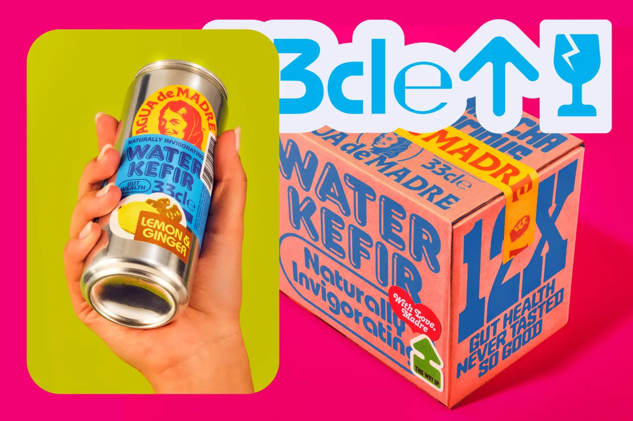
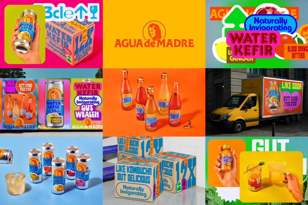
"Tapping into retro or nostalgic themes, there is always a risk that the result can feel pastiche," notes Chris. "Overlapping the stickers in a way that threatens to obscure information was important to creating a contemporary feel."
Overall, this was a happy project, says Chris. "Everything about this rebrand and the mother-led team behind it was so positive and joyful, and I believe that comes through in the work," he enthuses.
The client was happy, too. "Chris's rebrand has captured all that I was aiming for when I created Agua de Madre," says Nicola. "The excellent design work has brought out the retro feel and the fun, elevating it beyond the classic to add a super edgy contemporary spin."
Editor's Picks





Trending




Latest Jobs
Design Director at Koto
Full-time·London·£72,000 – £90,000
Senior Designer at David&Goliath
Full-time·Los Angeles·$100,000 – $140,000
Copywriter, Developer at Anthropic
Full-time·San Francisco·$200,000 – $255,000
Design Lead at DoorDash
Full-time·San Francisco·$142,800 – $210,000
Associate Director of Experience Design at California Academy of Sciences
Full-time·San Francisco·$150,000 – $165,000
Designers / Copywriters / Art Directors / Creatives at Hatched
Full-time·London·£25,000 – £55,000