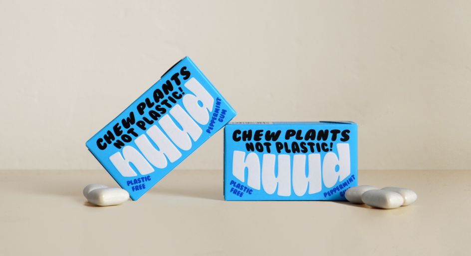
By gum, it's not plastic! Mother Design's branding for disruptive startup Nuud
Remember the mass campaign to phase out plastic straws that blew up a few years ago? Well, Nuud wants to do the same for plastic chewing gum. And Mother Design has crafted a playful brand identity for this disruptive startup.
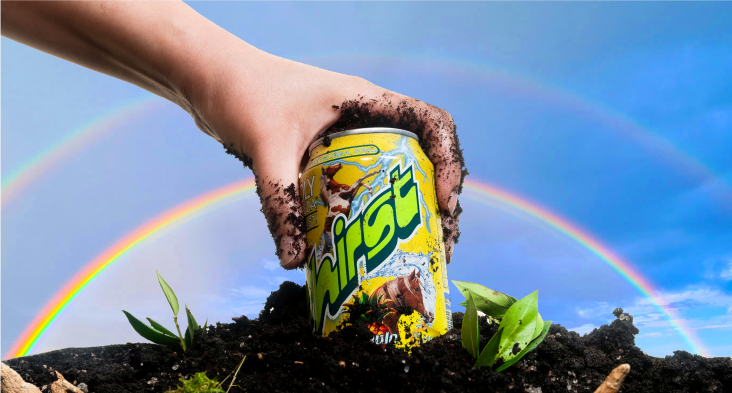
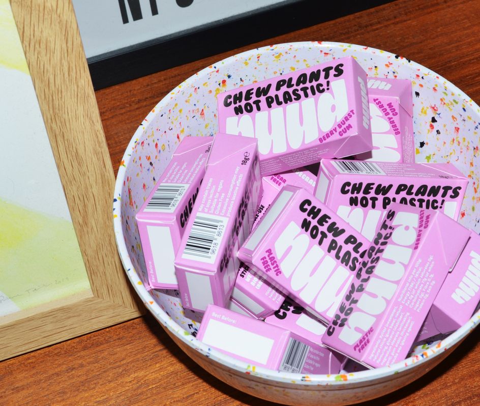
The new biodegradable gum brand aims to rid the world of the millions of tons of polymer contained in conventional, synthetic chewing gums. And so it's on a mission to offer the public a natural, sustainable alternative.
"Most people don't know that regular chewing gum is made of single-use plastic and isn't compostable," says Keir Carnie, founder of Nuud. "UK councils spend around £60 million a year cleaning up gum from our streets. We want to tackle this and effect a wholescale change in behaviour when it comes to chewing gum.
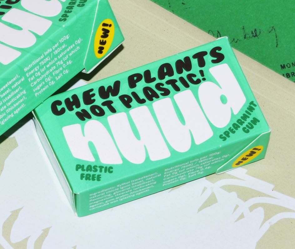
"Our brand is designed to encourage this shift in a fun and engaging way," he continues. "Made from the sustainably harvested tree sap chicle, Nuud gum decomposes as quickly as a banana skin."
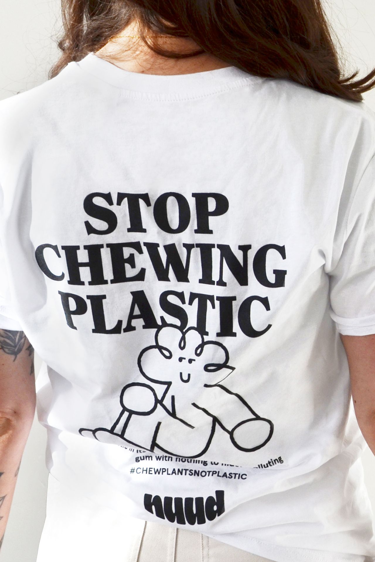
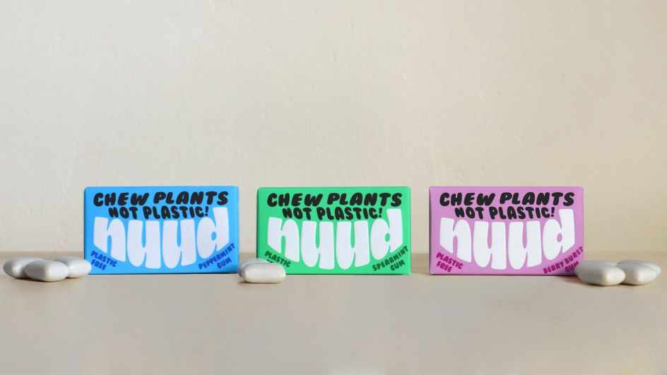
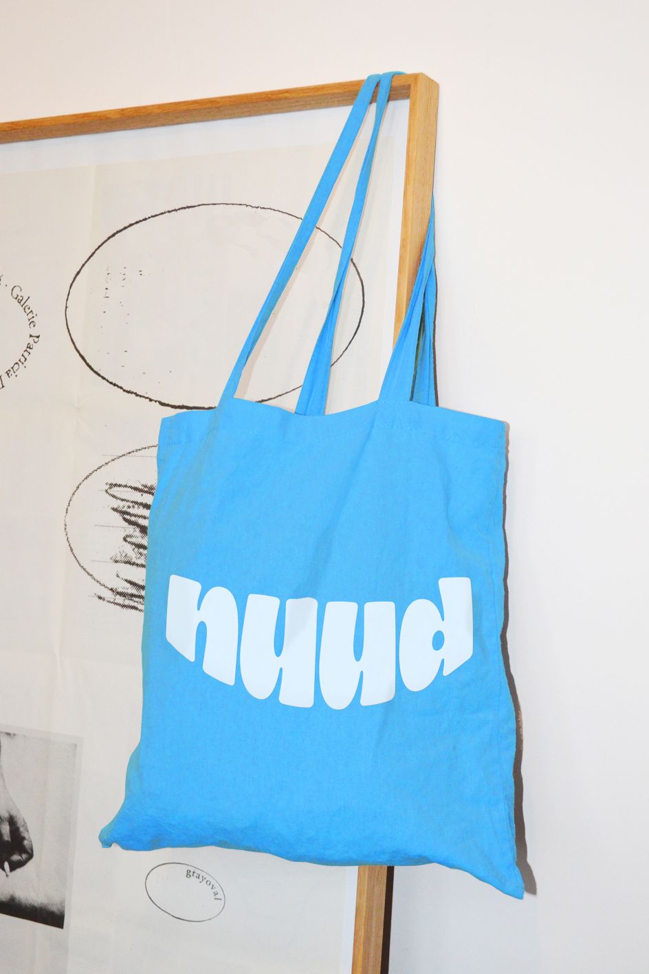
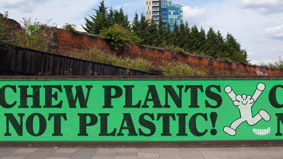
The brand identity and visual execution support these ambitions. Created by Mother Design, in collaboration with Carnie and Mother's incubator arm Broody, it reinforces the brand's personality, energy and messaging, guided by the core sentiment of 'fearless, fun, transparent and eco' and the strapline: 'Chew plants, not plastic!'.
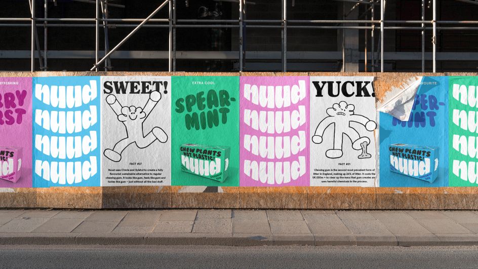
The identity is based around a logo inspired by a clean, happy mouth. This is complemented by a friendly, playful and gender-neutral mascot, Charlie, designed by South Korean illustrator Daye Kim. Both the logo and mascot exist as animations as well as static forms.
The colour choices follow traditional hues within the gum category – blue for peppermint, green for spearmint – but the palette also includes a neutral grey as a platform for more campaigning or informative communications.
"It was important that the brand didn't come across as militant or patronising," explains Thomas Humeau, design director at Mother Design. "Nuud is tackling a serious issue but doesn't want to come across as too worthy. Inspired by other food categories that often make use of a mascot, we introduced Charlie to help the brand communicate its passion and inform users with levity."
Carnie adds: "The visual identity perfectly expresses the brand's personality and message – it has helped make the product universally appealing and accessible. We have just agreed on a 200-store listing with Waitrose [launching 21 April], which would not have been possible without the branding work by Mother Design."
Editor's Picks


Trending


Podcasts


Editor's Picks
Further Reading