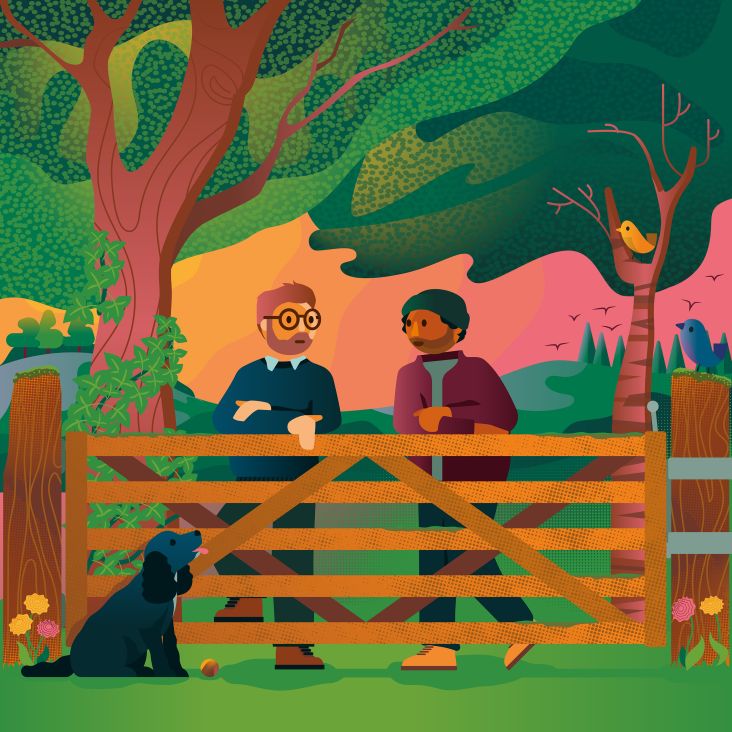
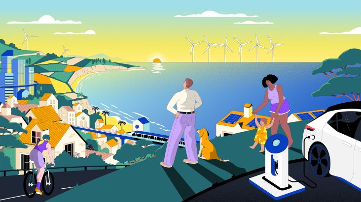
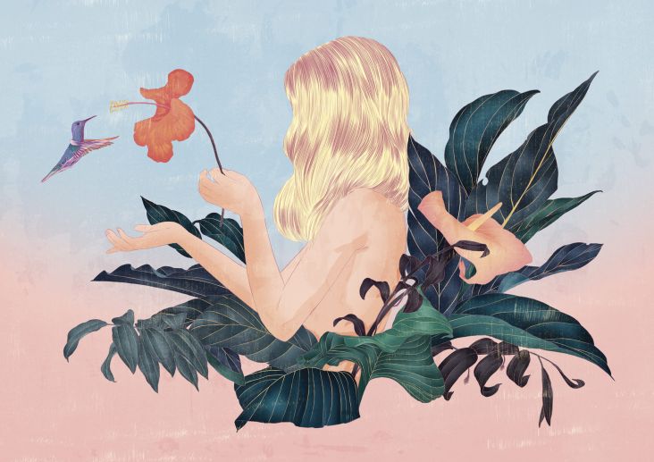
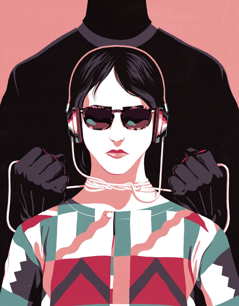
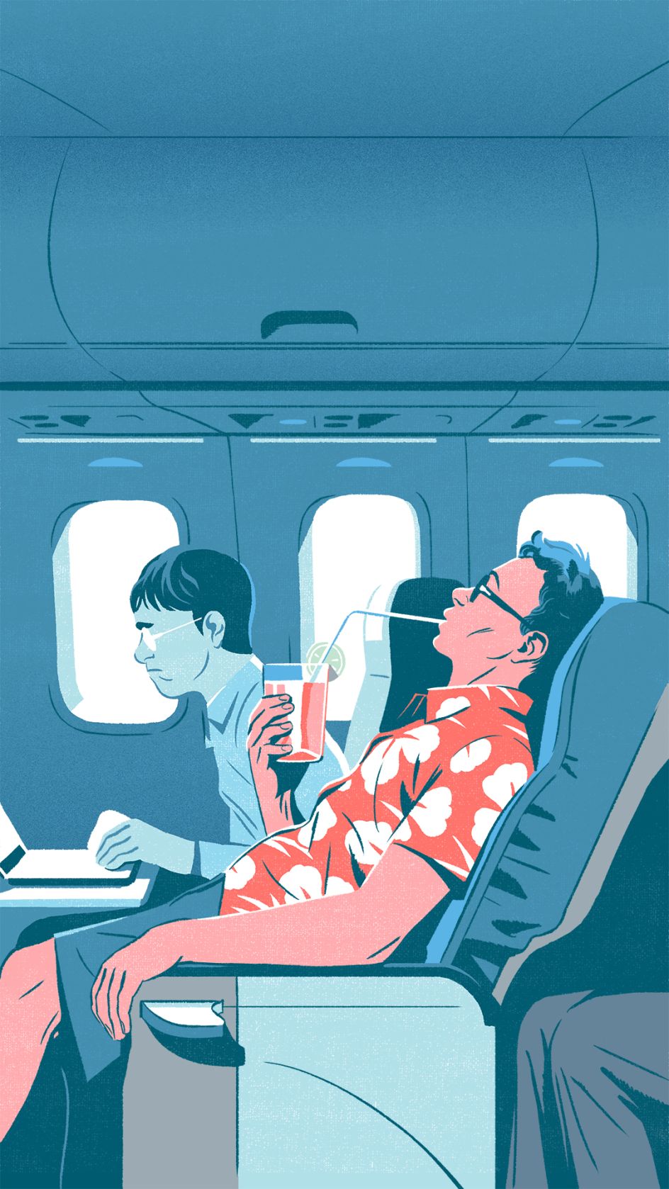
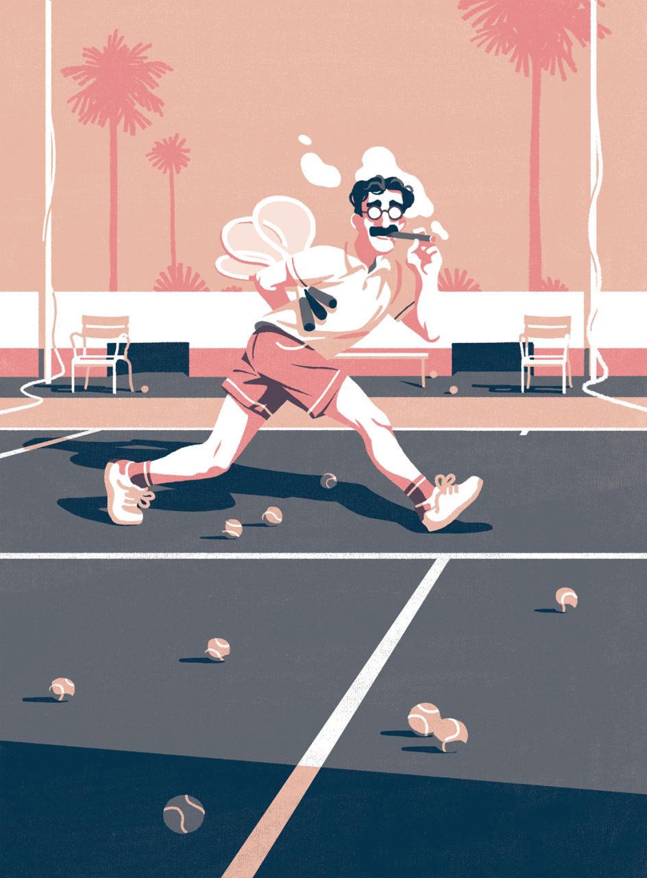
Illustrator Bruno Mangyoku's minimalist style, limited colour palettes and cinematic backdrops
A graduate of the legendary Gobelins Paris school, Bruno Mangyoku has pursued a career as both an illustrator and an animation director. Fuelled by his passion of cinema, his illustrative process is also greatly influenced by American graphic novelists such as Daniel Clowes, Charles Burns, and Adrian Tomine.
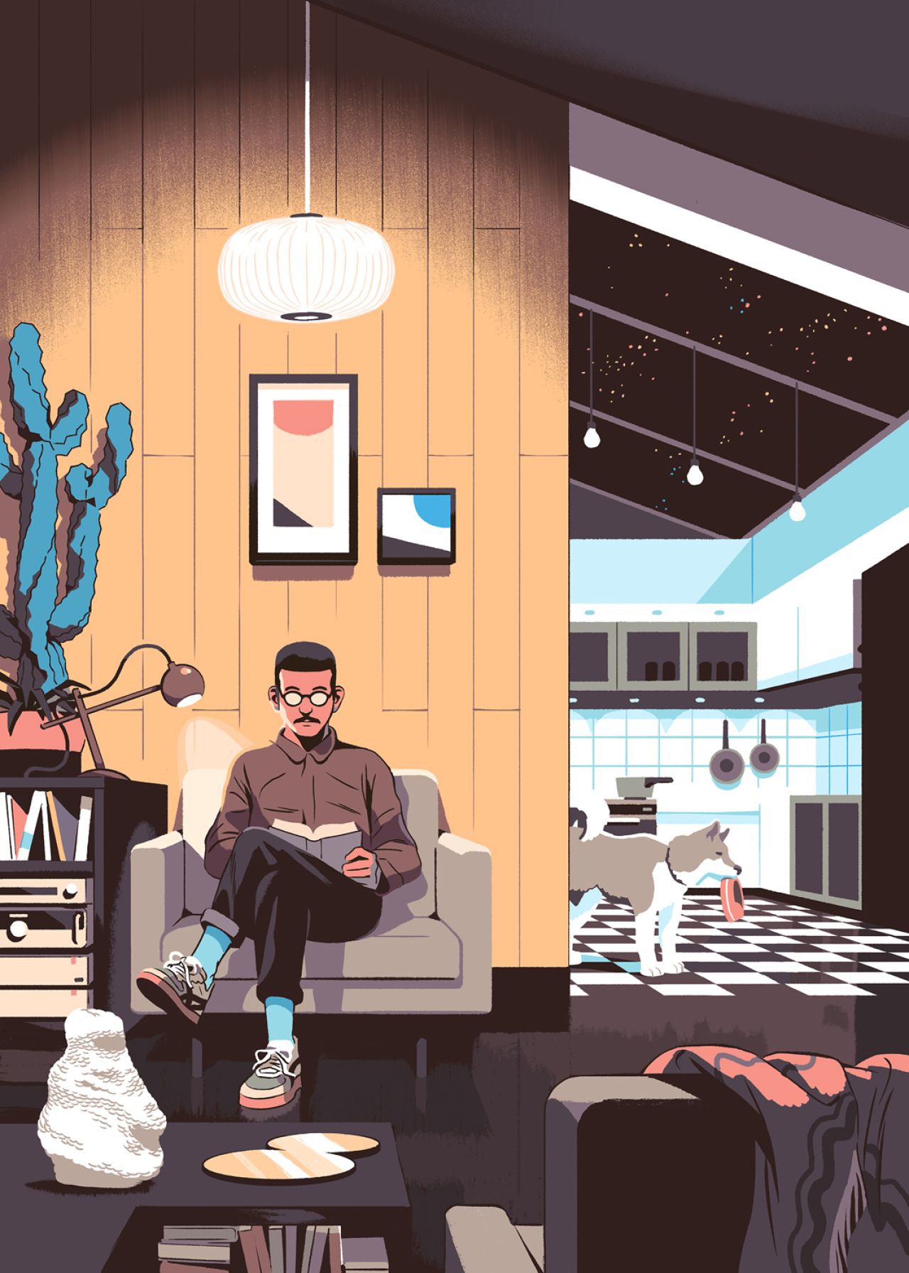
Represented by the reputable Handsome Frank, he often employs a limited colour palette in his work, comprising of bright and strikingly contrasting shades, whilst his primary focus is the character design and silhouettes, staged around simple yet cinematic backgrounds.
Why such a minimal approach? "For a couple of reasons, actually. Given my strongest skill being drawing, I tend to focus on this aspect first and foremost," Bruno tells Creative Boom.
"The most fun I have is when roughing out black and white sketches, pushing the process as far as I can. In the end, the rough sketch is pretty close to the final piece, but in greyscale, so I don't need to dwell too much on an overly complex colour palette. I think there has to be a balance between colour and shape; rich and complex colour picks don't mix well with an already clear and strong drawing, in my honest opinion."
"A limited colour palette is also very useful when establishing a visual identity to a series of drawings. I usually work in a series of illustrations, and I like to tie the images together with their similar simple colours," adds Bruno.
To understand a little more about his process, we asked Bruno to talk us through a project – from initial brief and ideas to bring it to life. He chose a New Year greetings card for a French accounting firm as a recent example.
"The creative agency in charge of making the bridge between the client and myself came up with an idea of making two versions of the card: still and animated. I was thrilled to come back to animation; a bit anxious also, as it's been a while since I've dabbled in this medium.
"The brief was quite flexible and gave me sufficient leeway for my creative freedom. The only mandatory thing was to dress up the main character in a blue suit and tie, with a yellow pocket square, in order to match the iconic suits of the firm's members.
"While brainstorming with the agency, we came up with the ideas of 'travel', 'foreign country', 'culture shock'... This year's main scope was to convey the feeling that the firm's accountants were willing to go the extra mile for their clients."
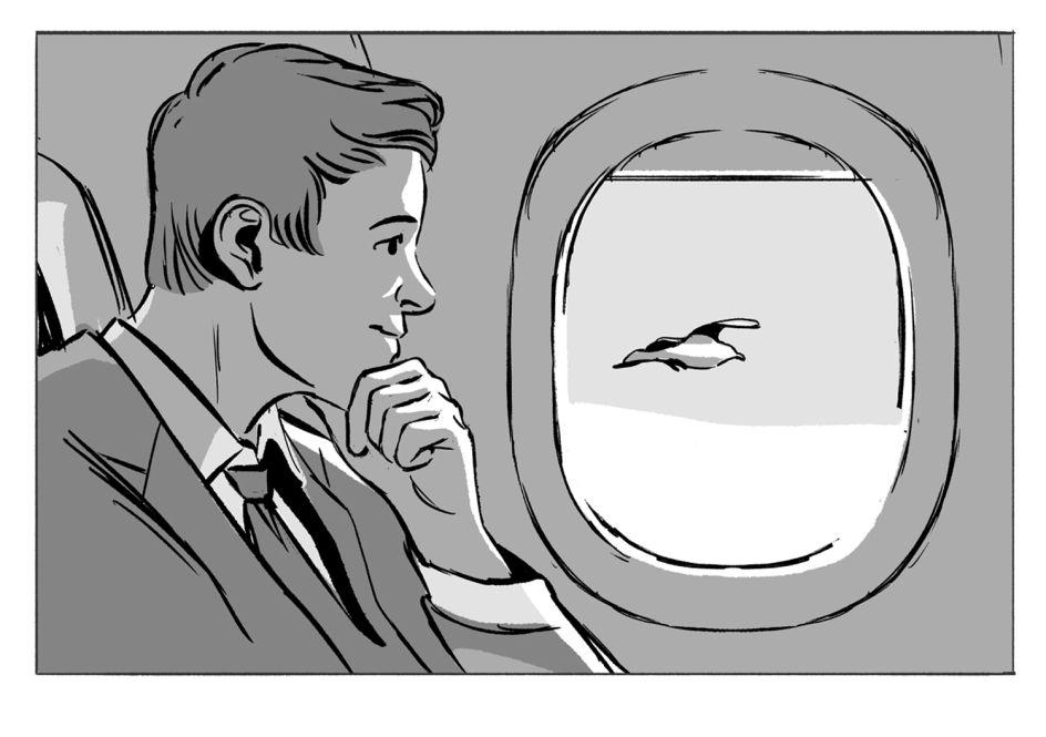
"I started sketching a rather simple and straightforward image. My first idea was to mimic the vintage feel of old travel posters but in the end, I felt that the image lacked impact. I had to add more scale, more punch. I went for the idea of culture shock – the first country that came to my mind was Japan (and, more specifically, Tokyo) which is widely regarded as one of the most culturally foreign places in the world for French people.
"Being half Japanese myself, I enjoyed the idea of drawing some inspiration from what I like in this culture. But still, I found that the image was too bland and lacking in impact. I liked the character being lost in the city, but I think I could push the idea further."
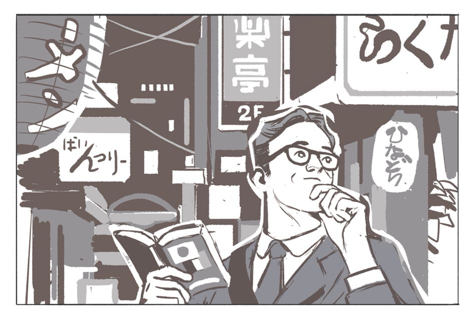
"This is when I started going for the 'lost in the jungle' version. I thought the feeling of being lost because of culture shock could be bolstered by a strong background, and the wilderness of the jungle was an ideal setting for an impeccably dressed accountant. This is the first sketch I sent to the client, the previous ones being merely results of trial-and-error.
"The client then sent some notes, wanting some minor changes like adding an attache case, and changing the style of the hat (they felt that he looked less like an accountant than a random lost tourist). My colour process is a bit particular, as I rarely make a quick colour-mock-up before tackling the final phase. Again, it's a bit like a trial and error stage, where I choose my palette on a small portion of the illustration (like the lower right quarter), spreading the process on the overall image when I'm happy of my colour picks. All these steps led to the final piece."
When asked if he has a particular favourite medium, either illustration or animation, Bruno says, "Those mediums are so different, it's hard to rank them in terms of preference. Illustration is my main job these days, and I have tons of fun creating still pieces from start to finish, on my own. But the basis of my craftsmanship is animation. "I feel that I'll always come back to animation, and specifically animated short-films. The way I'm the most comfortable, conveying my ideas and telling stories, is through motion.
"Also, there's a big difference with 'teamwork' between illustration and animation, and there are some days I miss working with friends on animated movies. But illustration has this simple straightforward process, of making things from A to Z, on your own, that appeals to me a lot. In this respect, it is an immensely satisfying medium."
Editor's Picks


Trending


](https://www.creativeboom.com/upload/articles/90/908fdb6378db1e95d12595416f54e6336d5e80b8_732.jpg)
Podcasts


Editor's Picks
Further Reading