DesignStudio renews Fiskars Group's identity to help make 'the everyday extraordinary'
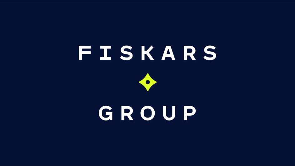
DesignStudio has collaborated with Fiskars Group to renew the company’s visual identity based on its purpose of "Making the everyday extraordinary". With a portfolio of some of the world’s most iconic consumer products, the Group started life as an ironworks, creating farmers' tools in the 1600s.
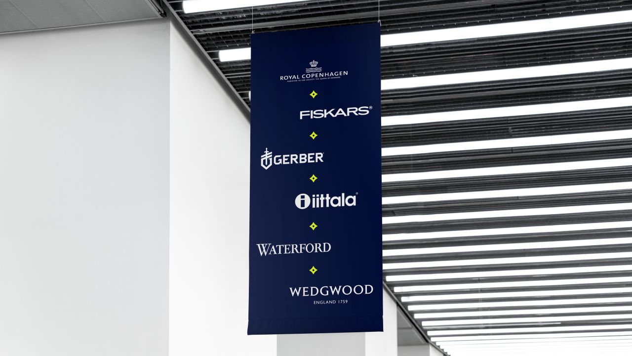
It challenged DesignStudio to strengthen its identity and voice to speak to employees, stakeholders and the wider community. "We also needed to celebrate the strong vision, and the network of talent that’s continuing to grow," adds DesignStudio.
Following its usual route of discovery, DesignStudio immersed itself in all things Fiskars, travelling between its consumer brands' flagship stores, production sites, and even Fiskars village itself – the Group’s birthplace and heritage site.
"Fiskars Group believes that our lives happen in the everyday moments," says DesignStudio. "It is the little things that shape us, and have a big impact on our quality of life. These moments, at times mundane, can be extraordinary. Strategically, this positioning had already proved successful, but the brand needed help growing the idea and bringing it to life.
"We helped create a stronger sense of one company across all the Group’s brands – a shared set of aims everyone could rally around and work towards together."
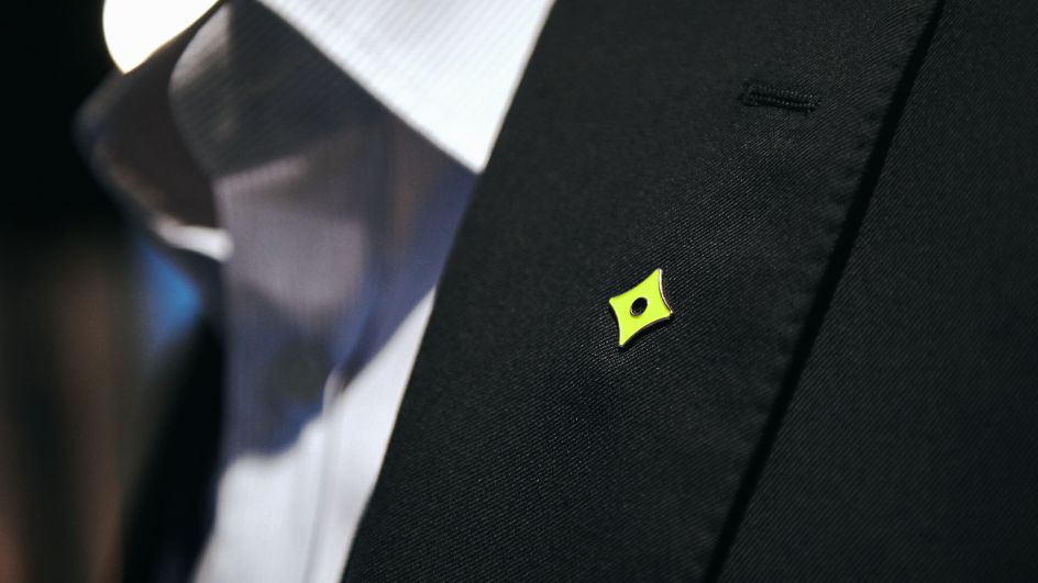
The symbol aims to represent the "everyday extraordinary". Inspired by Fiskars original branding, the new mark is a modern take on hundreds of years of heritage. And as well as being a graphic device, the symbol unites everyone under the shared belief of making daily life better for each other.
The wordmark, meanwhile, has extended letterforms – it’s a nod to Fiskars Group’s original logo. The notches between joins reference connection, and relate to the forms from DesignStudio's symbol. The letterforms have squared off counters too. It gives the mark an artisan feel – crafted, but imperfect.
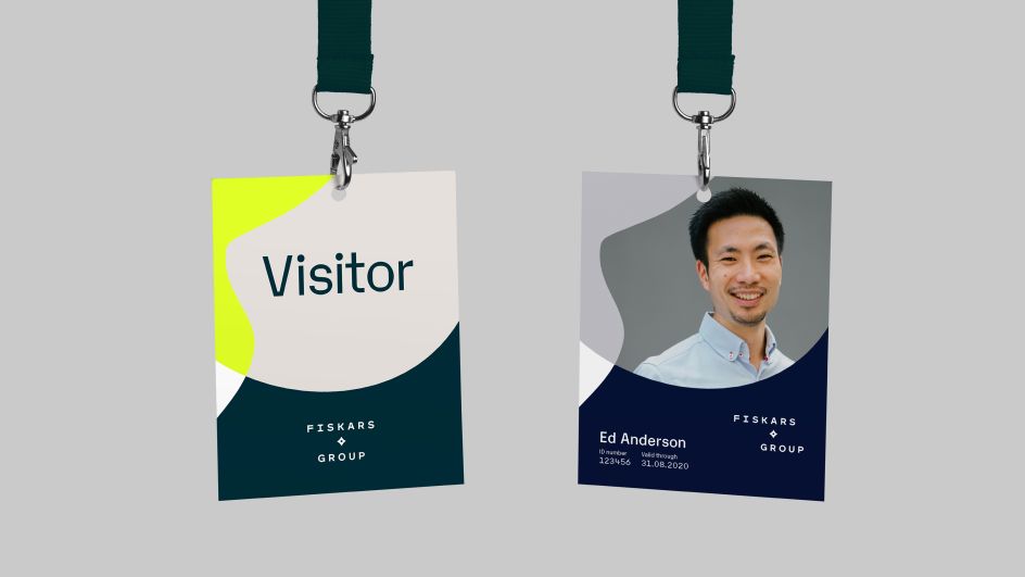
The wider graphic language aims to highlight the extraordinary things that happen when people and ideas are brought together. "When the graphic forms overlap, it signifies something special – this might be the newest innovation, an interesting collaboration or a snapshot of a mundane moment made momentously," remarks DesignStudio.
The colour palettes are made up of friendly, natural tones, apparently inspired by everyday life. But the hero colour, Extraordinary Green, is a vibrant creation. "Having a materials palette allows Fiskars to reference its brands’ products without showing them. Instead, it uses beautiful textures from the things they’re made of, such as wood or ceramics," concludes DesignStudio.
You can read more about the thinking behind the identity over at design.studio.
