Brand Opus 'breaks bread' for a new identity for one of America's largest bakery chains
BrandOpus has rebranded Panera, an iconic American fast-casual restaurant chain Panera. The agency was briefed to increase the "relevance" of the brand with consumers, and brandOpus created a new logo and visual identity that "centres warmth and a feeling of togetherness," it says.
Panera is one of America’s biggest bakery-cafe chains and boasts more than 2,100 restaurants nationwide. Fresh bread is baked daily in its cafes from the 'Mother' sourdough starter that's been used for more than 30 years.
BrandOpus first did in-depth research into people's perceptions of the brand, which indicated that it needed to express a more "abundant and welcoming" feeling.
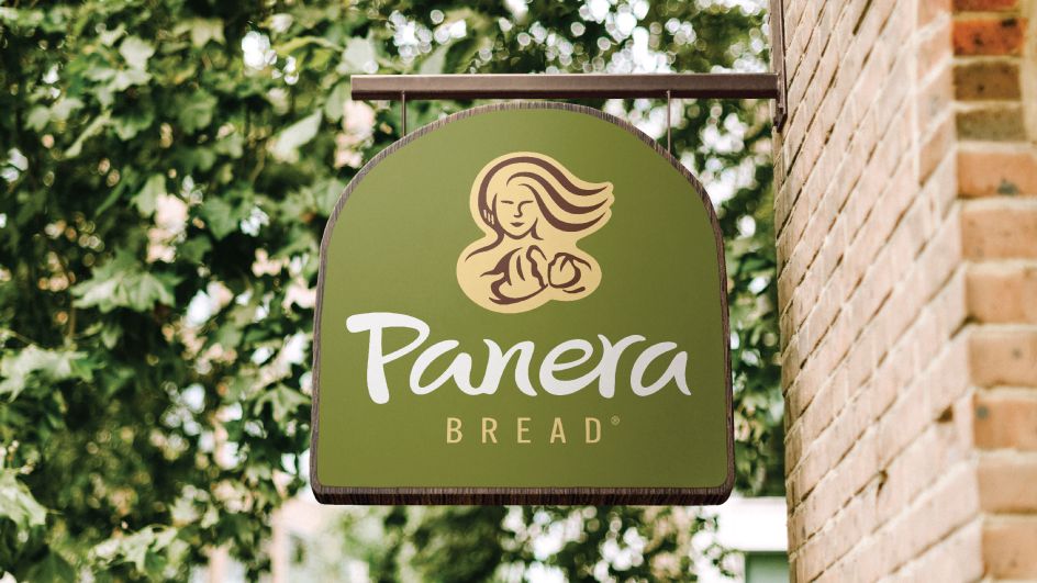
The new designs focus on a contemporary reworking of Panera's well-known Mother Bread logo, which now depicts the bread breaking towards guests to "symbolise warmth, generosity and bringing people together," according to BrandOpus. "More youthful and dynamic, her hair flows wild and free, evoking a sense of untamed abundance. And by actively breaking bread, the new logo quickly and non-cognitively codes a feeling of togetherness and generosity." The agency adds, "The new distinctive holding shape is handcrafted to reflect a bread oven. Moving away from the previous square shape design, it creates a feeling of warmth and comfort."
Alongside the new logo, the wordmark has been redrawn to create a more handwriting-like design to make it more free-flowing and handwritten, "evoking a sense of passion, naturalness and authenticity," says BrandOpus.
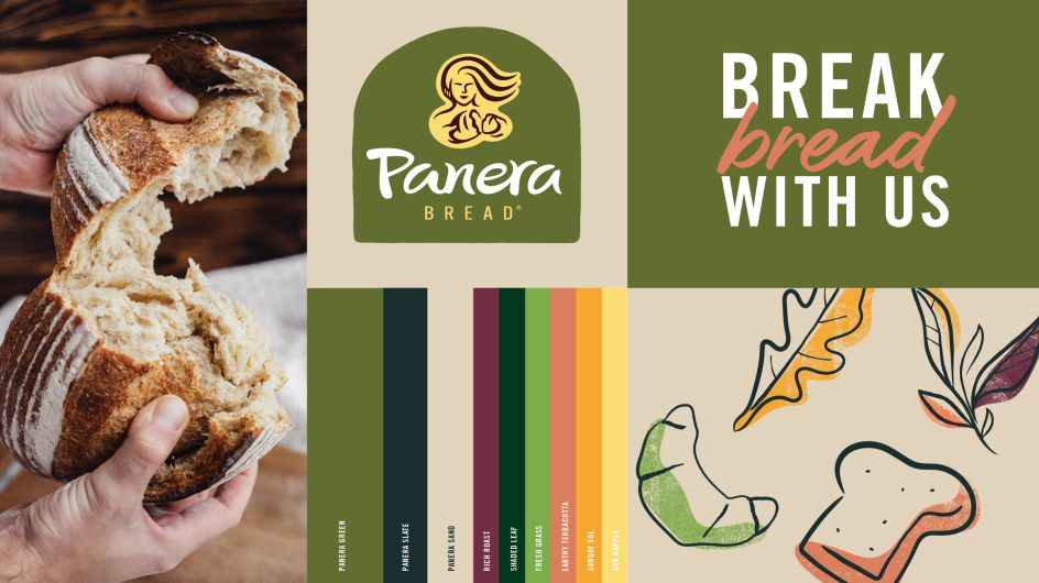
The previous branding's colour palette has been retained but has been evolved and expanded with the aim of bringing a "fresher" and more "energised" feel.
"Our biggest challenge was preserving vital memory structures from Panera's rich heritage, whilst tapping into new associations rooted in pleasure, enjoyment and warmth," says Nir Wegrzyn, CEO and founder of BrandOpus comments. "Inspired by the passion and abundance of the brand, the revitalised design is a radical revolt against food restrictions today."
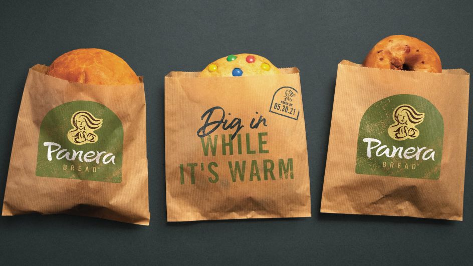
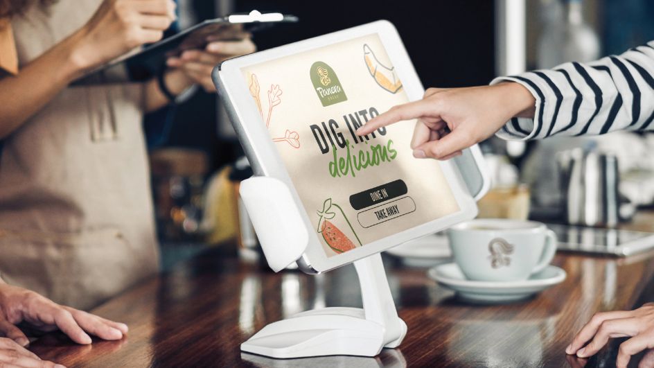
The logo and other new design elements are rolling out across Panera's packaging, restaurant décor, signage, website and app throughout the year.
Editor's Picks


Trending


Podcasts


Editor's Picks
Further Reading