Boom Brief #8: How you brought a fictional Italian bakery to life
From open-crumb wordmarks to watercolour sunrises, this month's challenge demonstrates how the best briefs smell like fresh bread and demand something genuinely original.
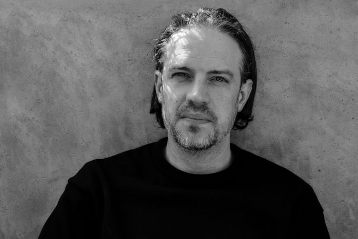
Craig Nash aka Studio Sláinte
Welcome to the eighth in our series of Boom Briefs: monthly creative challenges designed to stretch your skills, get your ideas flowing, and give you something to make—purely for the love of it. And March's brief had a simple, seductive premise.
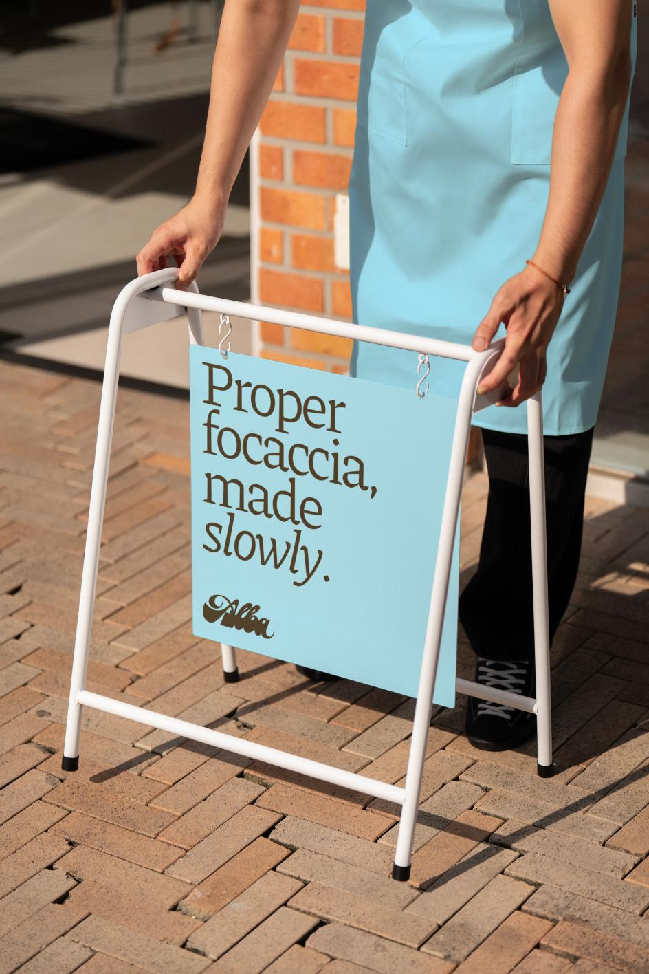
We asked you to imagine an Italian artisan bakery in an English market town, founded by a man called Marco who came to Britain, fell in love with the place, and decided it needed a proper bakery. Everything is made by hand. Focaccia, buttery pastries, and handmade pies. The brief called for something artisan but not precious. Italian-influenced but rooted in its English surroundings. Warm, confident, and a little characterful.
It might all sound straightforward, but in practice, briefs like this are deceptively tricky. Bakery branding has a well-worn visual language (warm ochres, rustic textures, heritage serif type), and it takes genuine creative conviction to resist the pull of the obvious.
Under the hashtag #cbbriefalbabakery, the designers who entered this month's challenge didn't just resist it. Several of them turned their back on it entirely and found something far more interesting...
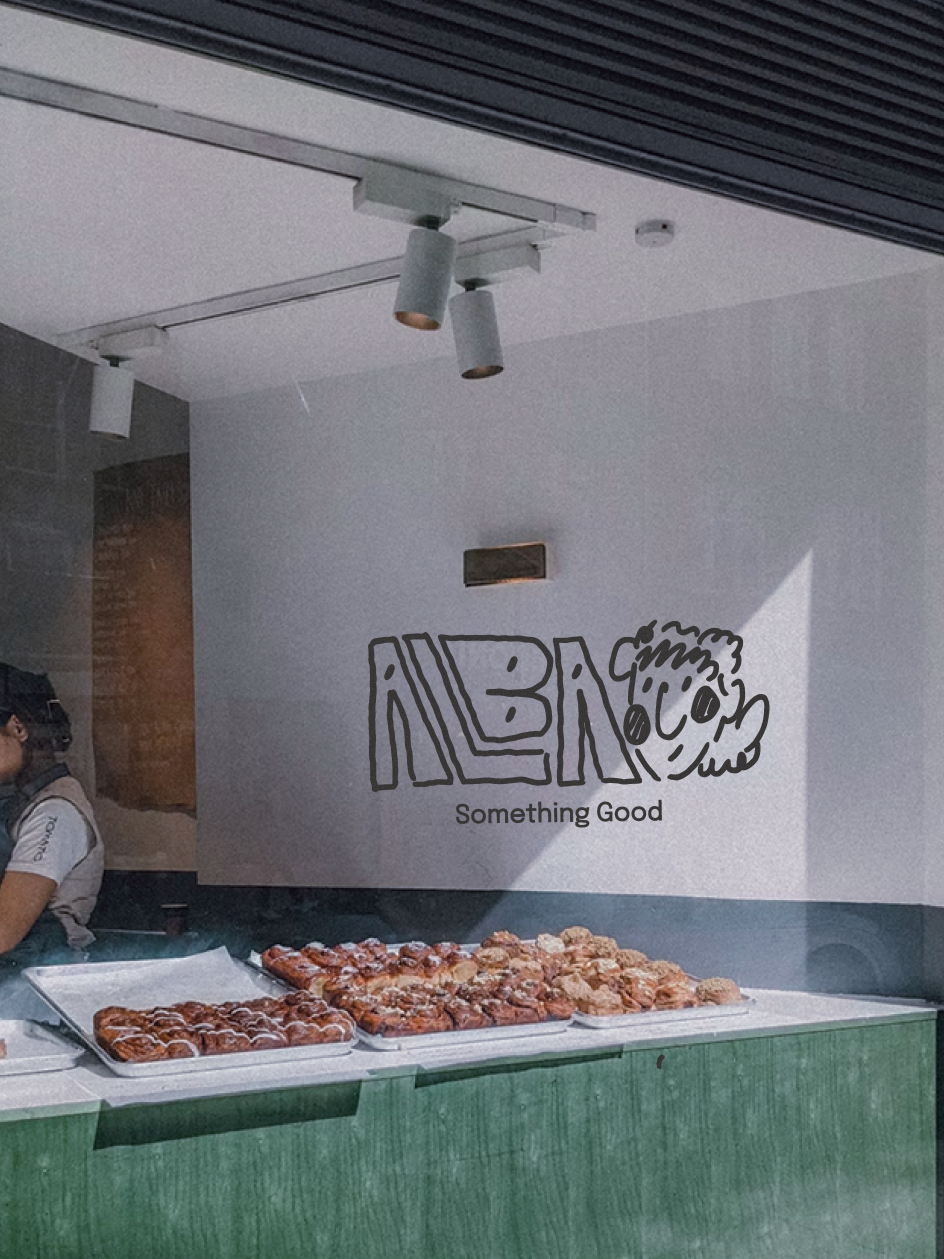
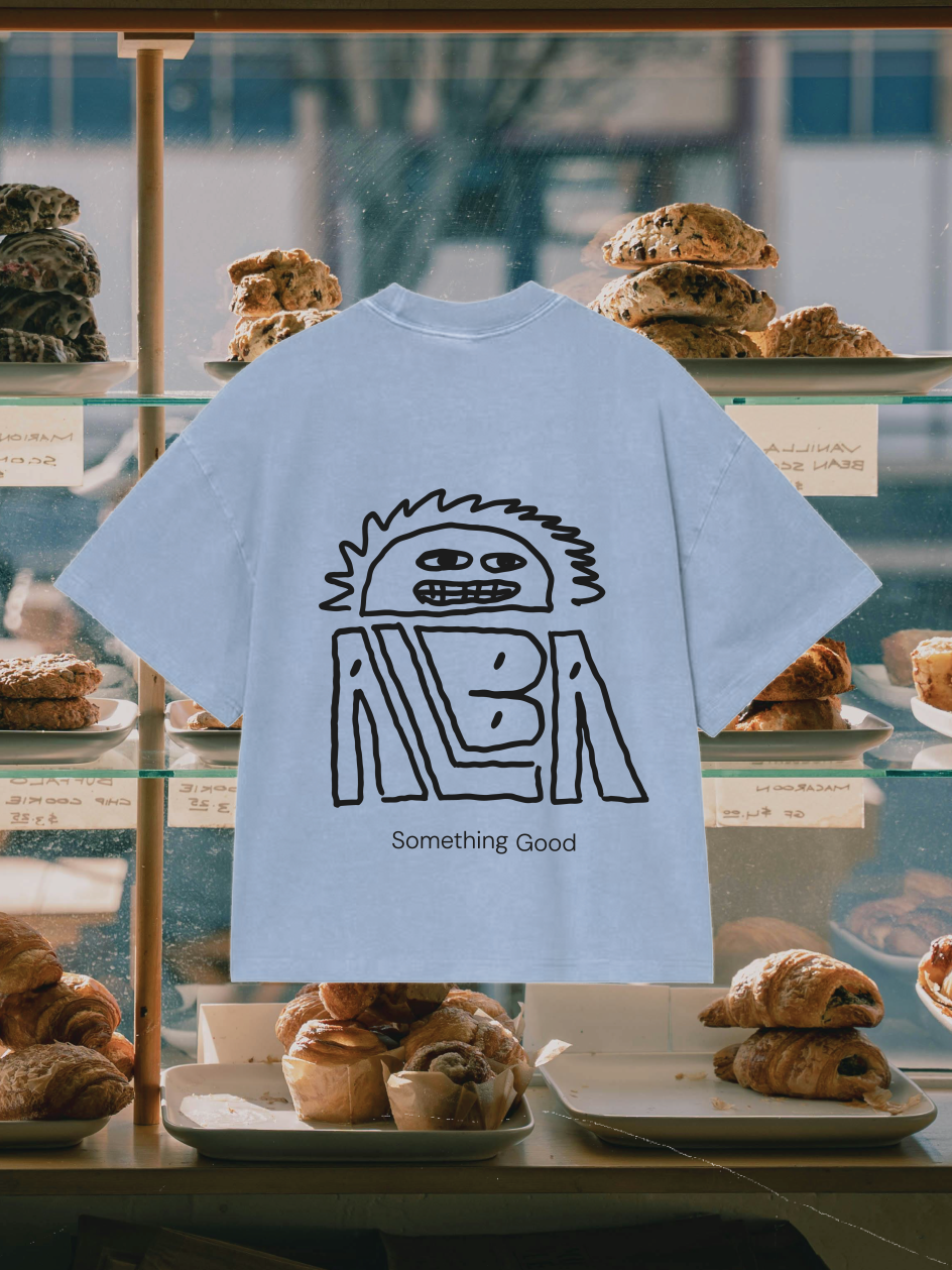
The rise, made visible
London design director Melvyn Johnson found his concept in a single, precise idea: the open crumb.
If you've ever torn into a good sourdough, you know about the airy, irregular texture of the interior: the pockets and channels that form as the dough rises. Melvyn used that structure to build his wordmark, giving the letterforms a quality that feels as if they're still expanding, still breathing, still in the act of becoming.
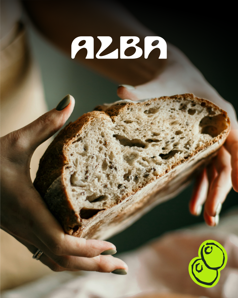
The concept is rooted in the primary meaning of Alba (dawn, daybreak, the moment of rising), but avoids the visual clichés that word usually triggers. There's no sun-over-horizon motif, no golden glow. Just letterforms that feel like they've been caught mid-rise.
The broader identity pairs this with a palette built around Cotswold green: deep, earthy and rural, with a sharp citrus accent that adds early-morning freshness. Illustration and photography are layered in to create what Melvyn describes as "a brand you can taste and touch". He's also quick to note that the wordmark can be reconfigured across applications (labels, uniforms, packaging) as if you were arranging dough on a tray.
Flipping the script on rustic
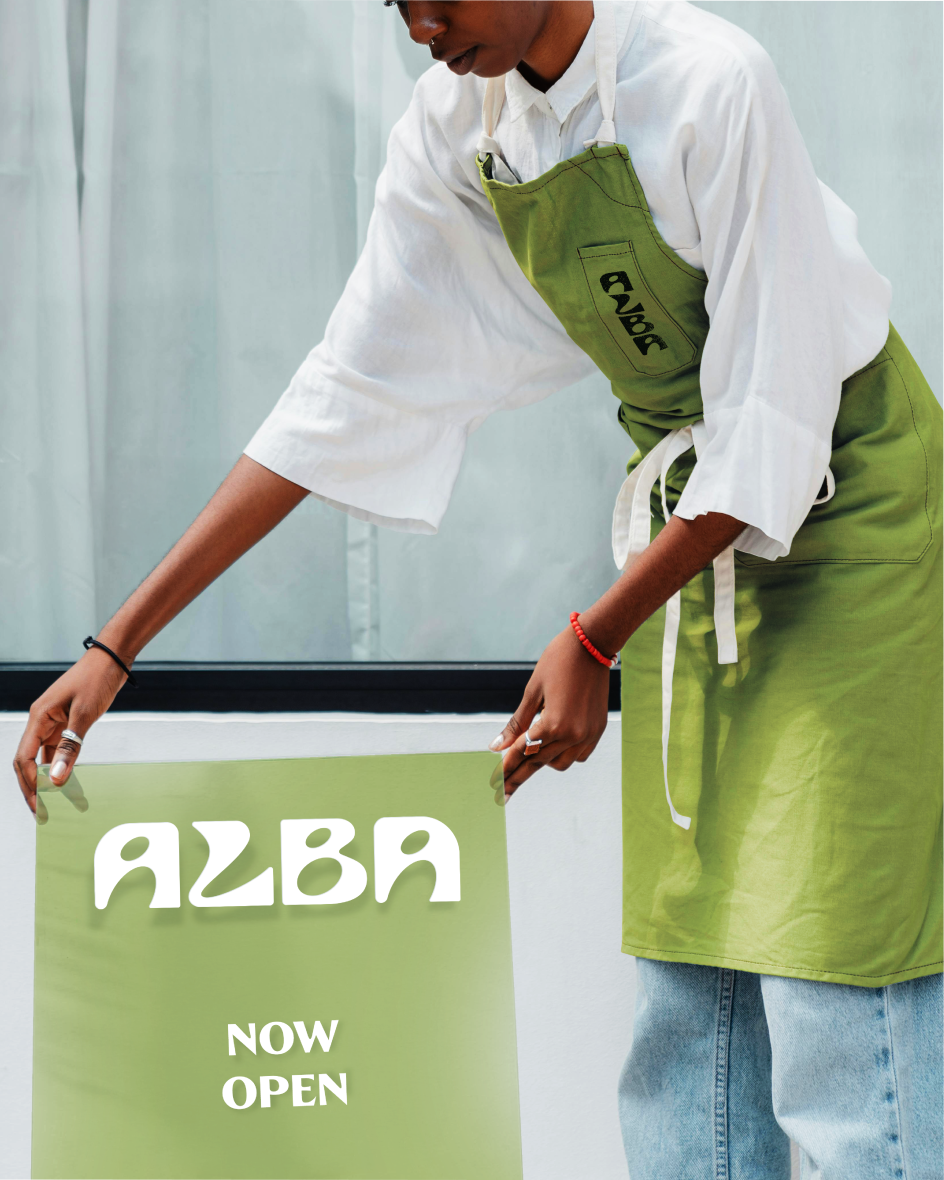
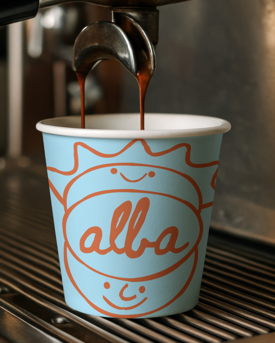
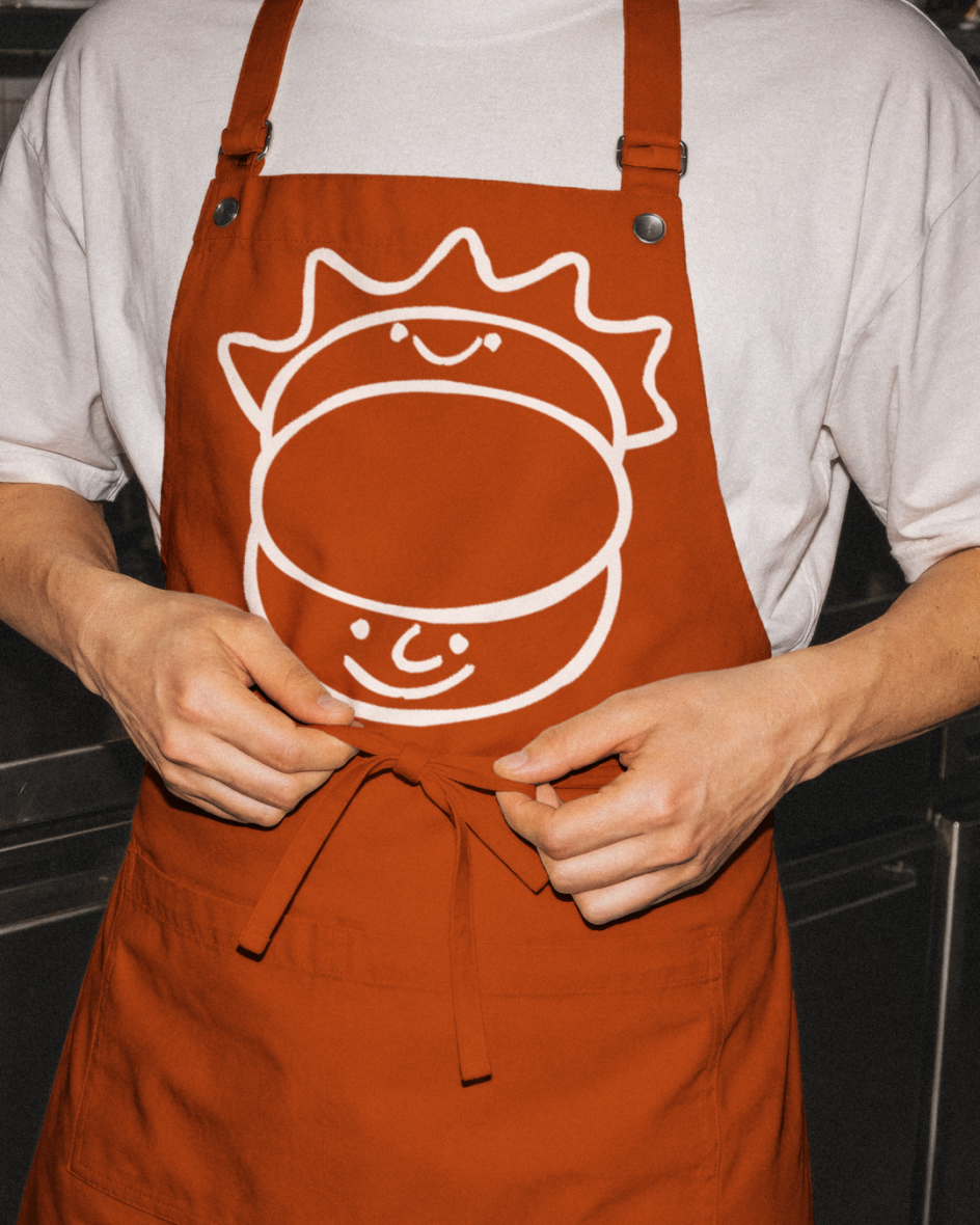
Another conceptually audacious response came from London-based brand designer Hafiya Moulana, who made an early decision that changed everything: she looked at what most bakery brands do and went in an entirely different direction.
Rather than the usual warm tones and rustic textures, Hafiya built Alba's identity around the quality of light just before a town wakes up. Early mornings, she notes, are cooler (slightly blue, slightly purple), and that observation became the foundation for a palette that feels genuinely distinct in the category.
The name Alba translates to 'sunrise' across Italian, Spanish and Catalan, but instead of rendering it as gold and amber, she interpreted it as the cooler, quieter moment just before.
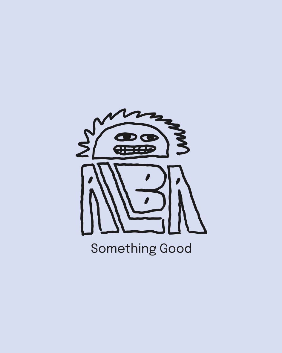
At the heart of the identity sits a dawn illustration with human features: a character that sits somewhere between motif and mascot, representing Marco's personality. She describes the figure's subtle blush as giving him warmth "without overpowering the brand".
Alongside this, Hafiya designed an apron with embroidered details, drawing on her background in fashion to bring a tactile, craft-led quality to the touchpoints. It's a brand, she says, designed with "personality and brains"—and we have to agree.
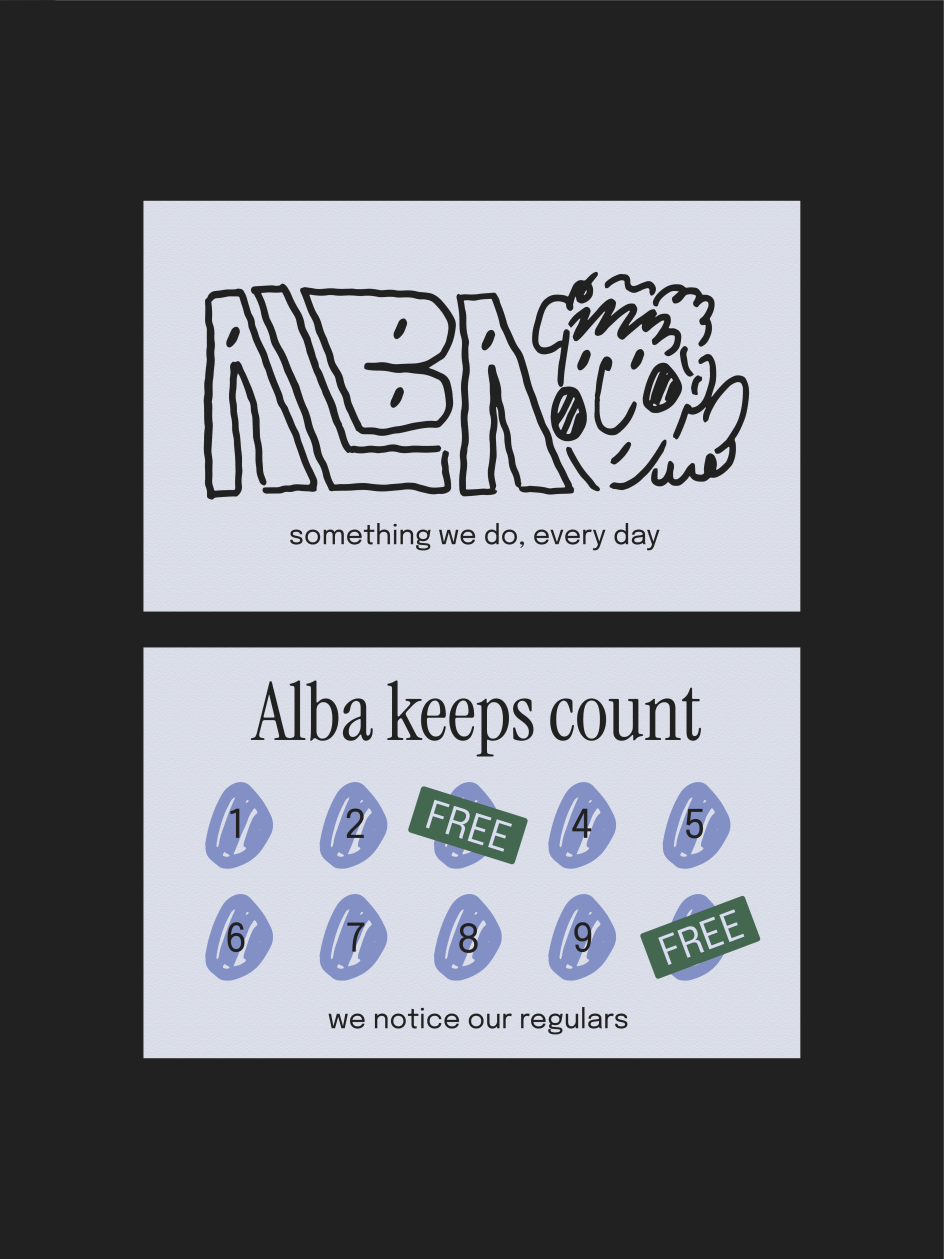
Craft as the whole point
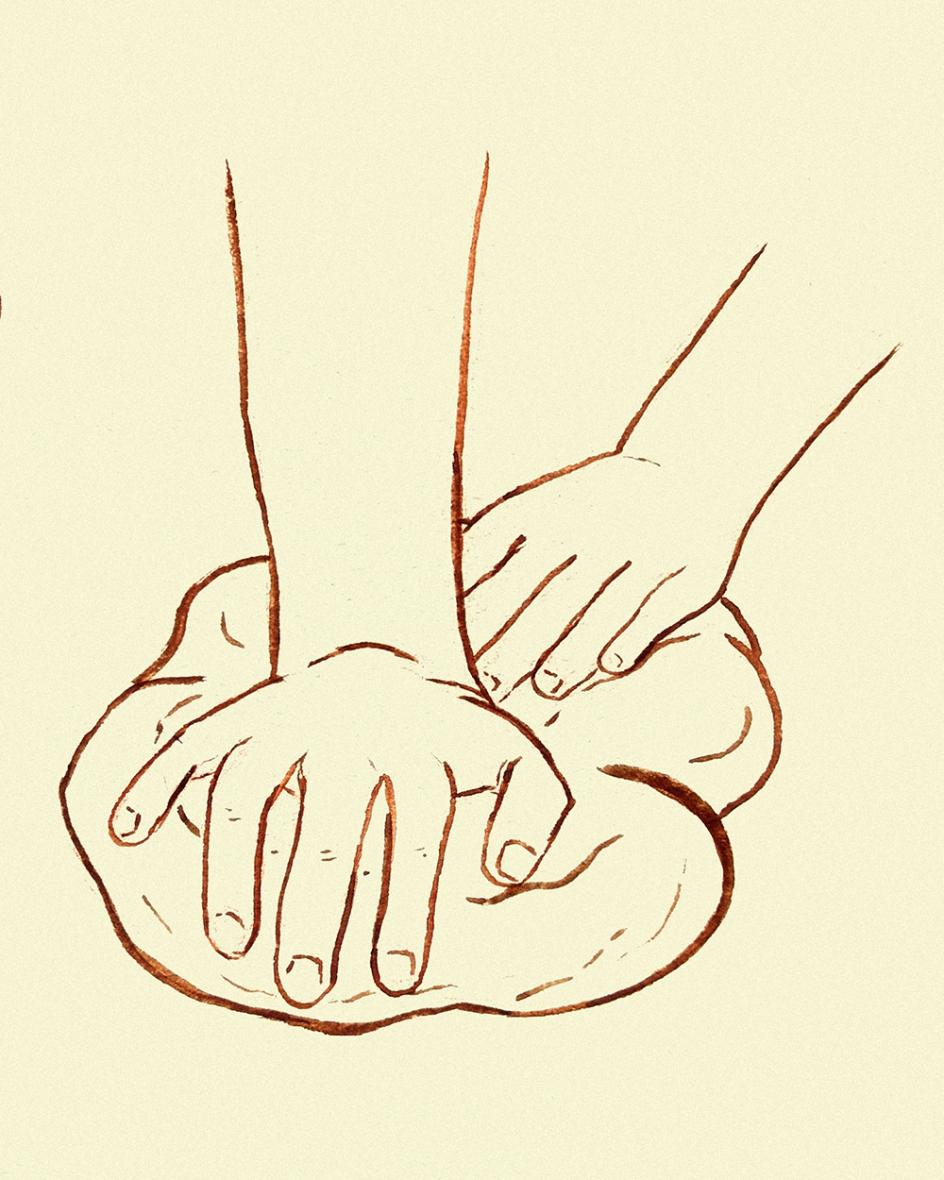
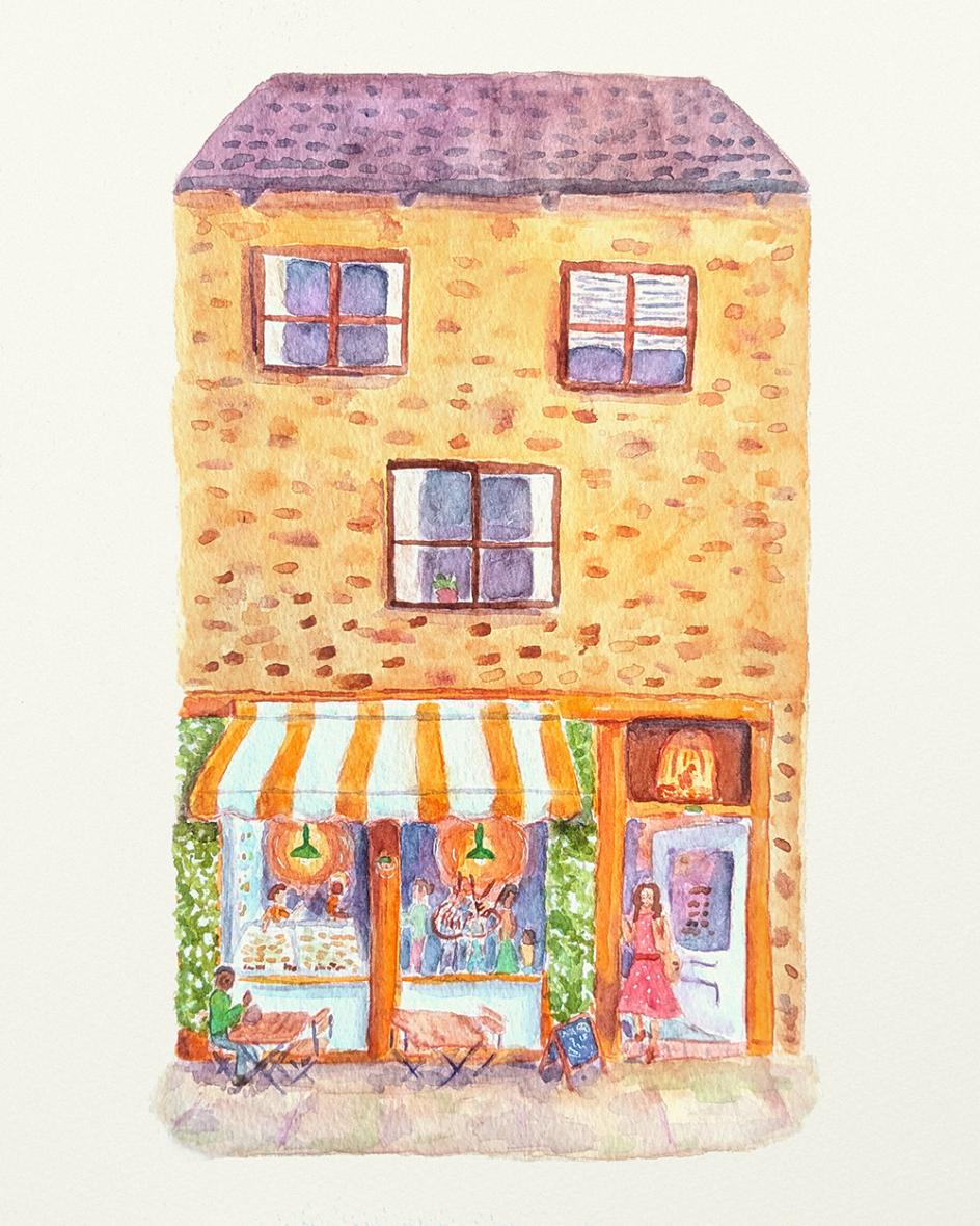
Yorkshire-based illustrator Beth Dooner took a different approach again; one that could have felt like a sidestep but instead became a very clear point of view. She went entirely analogue, producing a suite of watercolour illustrations: a baker working at sunrise, hands kneading dough; detailed studies of the baked goods themselves; and a lovingly imagined shopfront set in a Skipton-like Yorkshire market town, sandstone buildings glowing in early light.
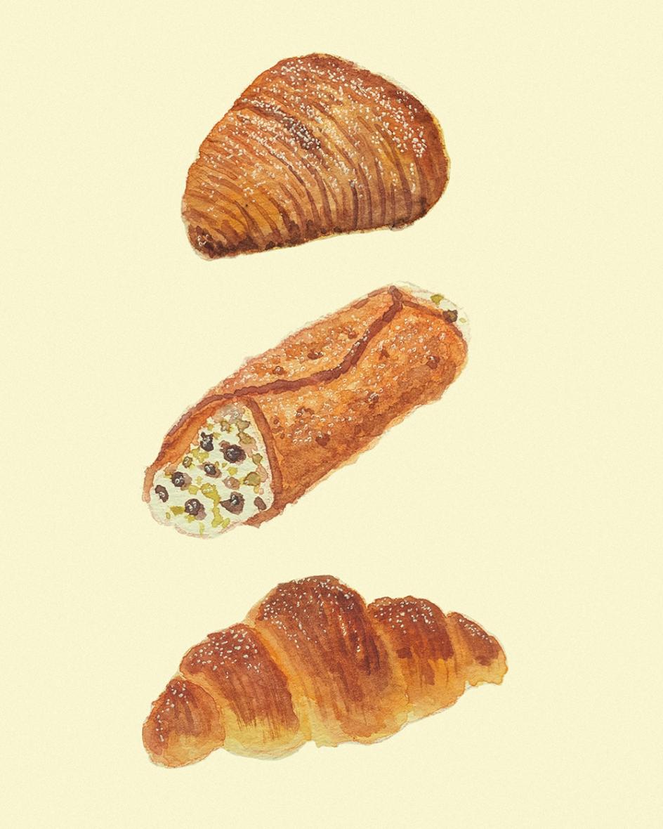
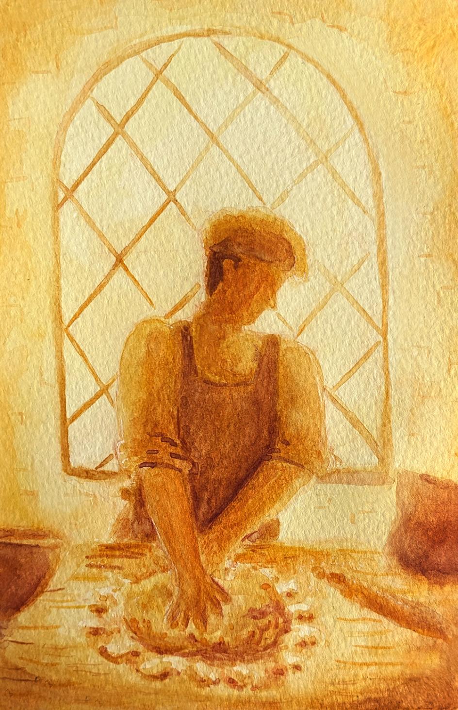
The brief said "artisan but not precious". Beth's observation was that watercolour, by its nature, can't be precious: it does what it wants. Leaving the original pencil lines visible, allowing the paint to bloom and behave unpredictably? That's not a limitation, it's the argument.
The recurring motif of hands kneading dough carries through across packaging and loyalty card concepts. She even suggests a pun: customers can keep "kneading the card" until they earn a free loaf. It's warm and unforced, and, she says, the whole project gave her a moment of genuine clarity about the value of her own work.
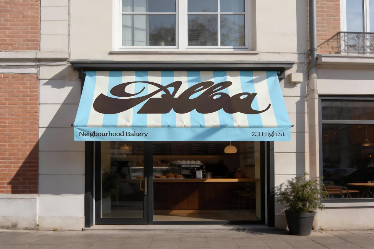
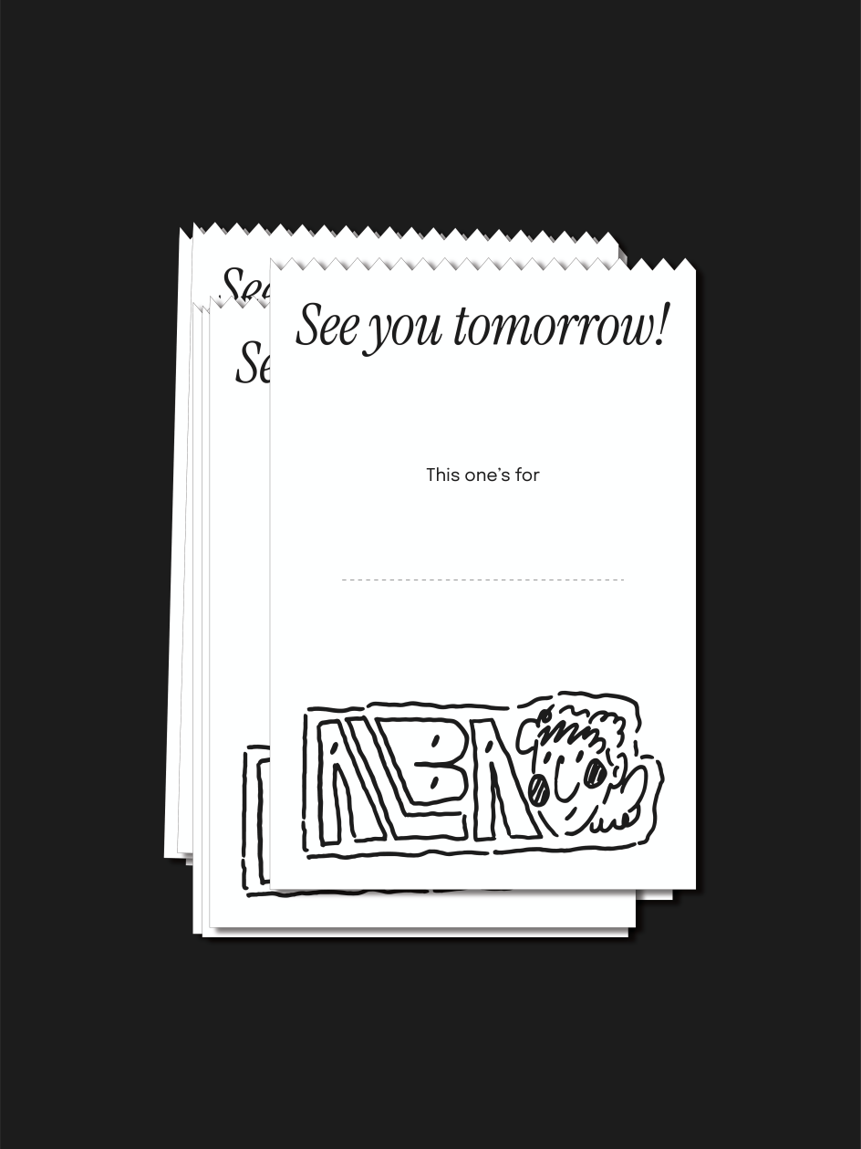
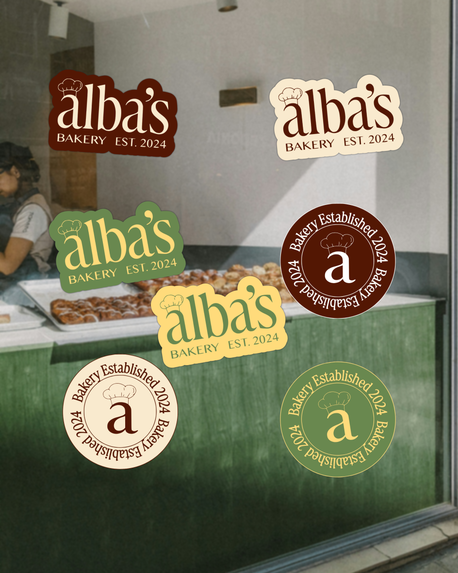
A wordmark that earns its character
London designer Craig Nash—who's set up Studio Sláinte as a creative outlet alongside his day job leading an in-house design team—brought a more typographically centred approach to the brief. His wordmark is based on the typeface Kolta, which he adjusted and refined to better suit his vision, landing on a cursive, characterful form without tipping into affectation.
What's notable about Craig's process is his self-awareness about the research phase. He describes the risk of "drifting into unintentionally echoing other brands" when surrounded by beautiful Italian and bakery references, and the conscious effort required to filter those influences and stay true to his own vision.
The result is an identity that balances Italian warmth with British market-town groundedness through its tone of voice as much as its visual language. The mockups, rendered with care, make it easy to imagine this brand actually existing on a high street.
Where two nations meet
Leeds-based designer Ashton Bolton arrived at the brief with a clear instinct: resist the generic. Rather than reaching for wheat sheaves or rolling pins, he asked himself what could genuinely represent Alba's dual identity—Italian soul, English home—and found his answer in national symbolism.
The centrepiece of his identity is a robin carrying a corbezzolo, Italy's national fruit. England's national bird, bearing something unmistakably Italian in its adopted home. It's a small image with a lot of meaning packed into it: migration, pride, belonging, and the little act of bringing something precious from one place to another.
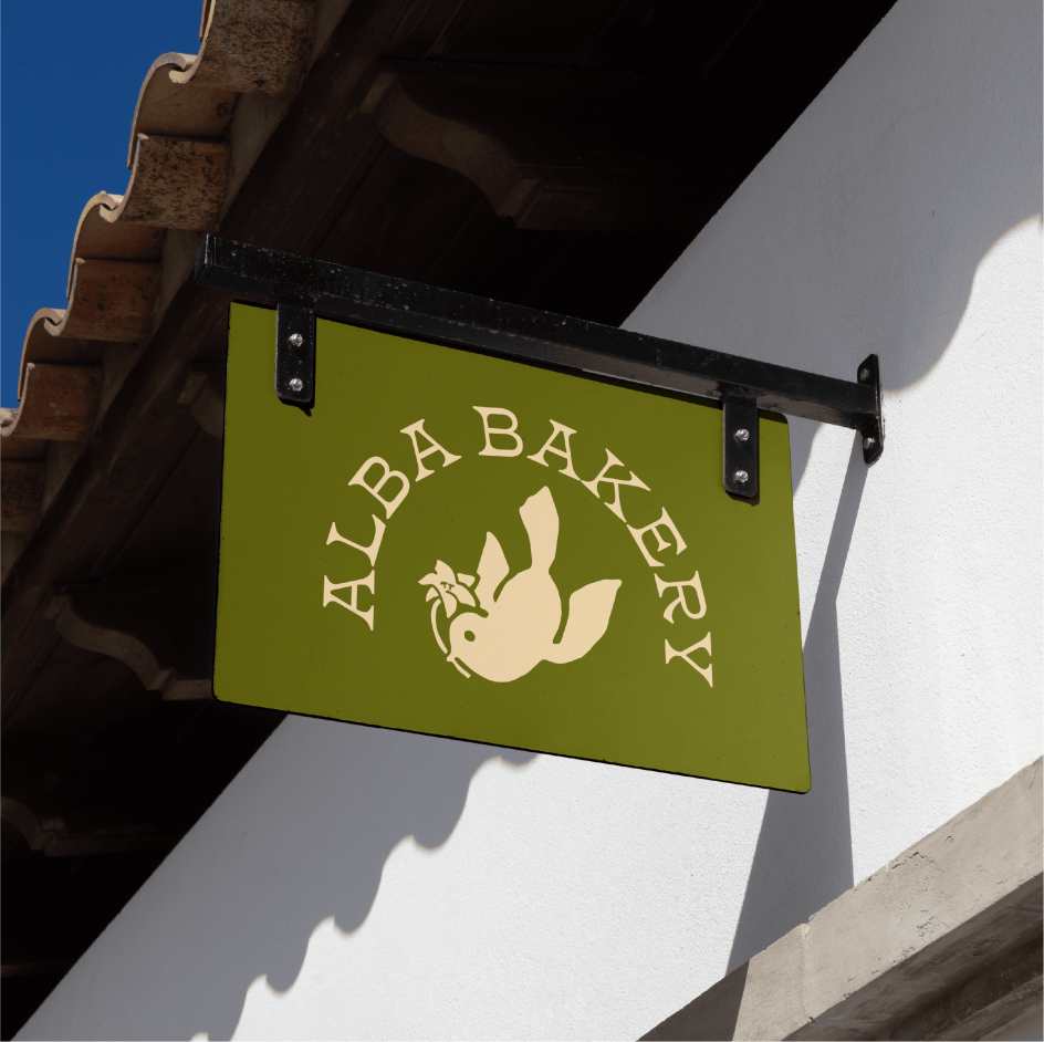
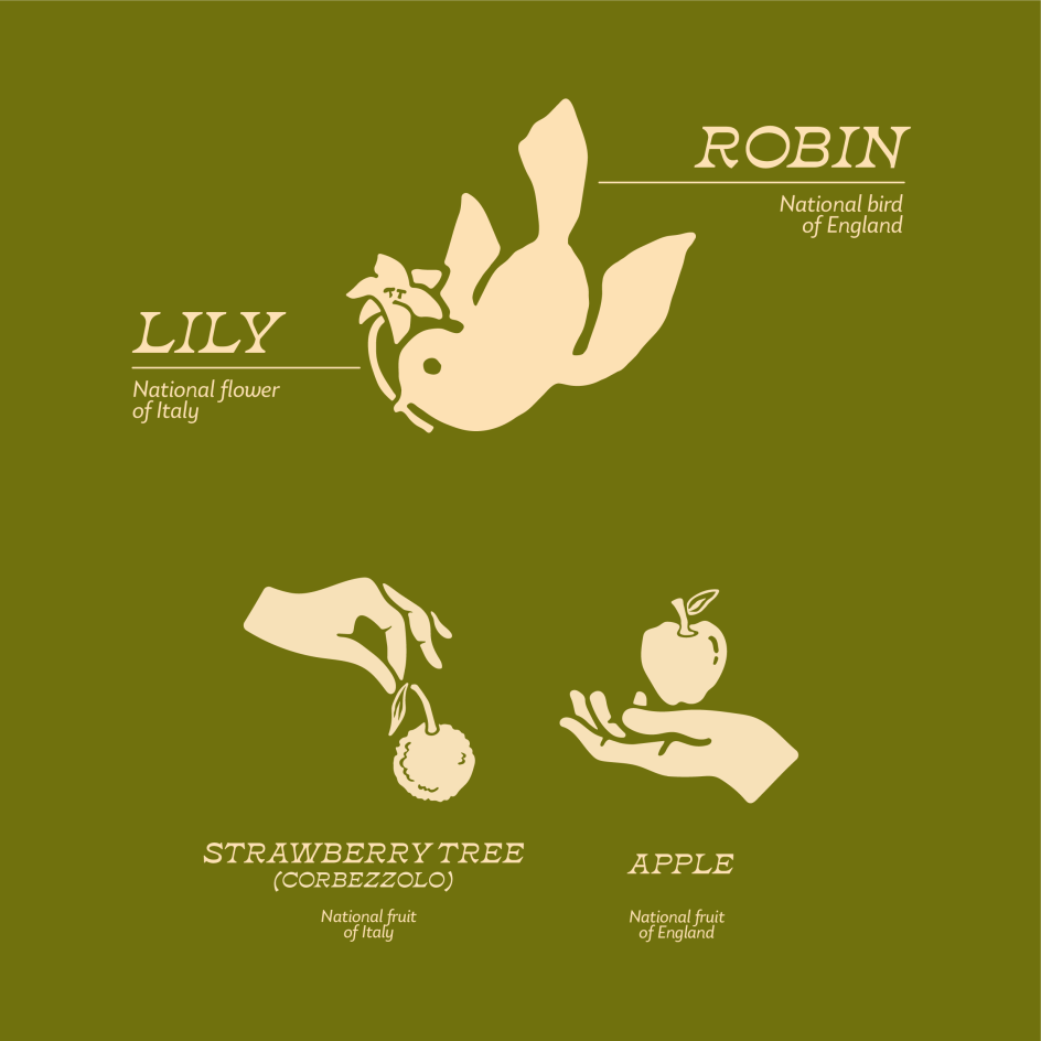
The broader identity leans into warmth and handcraft—natural tones, a logo with a handmade quality—but it's the robin motif that gives it genuine personality. Ashton describes wanting a brand that feels "personal, homely and proud of its roots", and that single illustration does more to communicate that than any amount of rustic texture ever could.
His process is methodical: sketchbook first, then mood boards, then what he calls "brand nouns".... keywords distilled from the brief that help him filter all his ideas. He admits the logo took longer than expected, with plenty of revisions and second-guessing along the way, but the brief kept him on track. Sometimes the best creative tool is simply re-reading the instructions.
First brief, strong instinct
Orlando-based designer Jada Rodriguez describes this as her first proper brand design, having previously worked primarily in Canva before deciding to push herself into Illustrator and Photoshop for this brief. The result draws on her personal experience of visiting Italy: the memory of small, family-centred bakeries where you knew the owner and occasionally got something slipped in for free.
Jada's response keeps things simple: clean, recognisable and grounded in the idea of recipes passed down through generations. There's a directness to it that feels right for the brief.
That Jada pushed herself through an unfamiliar set of tools and emerged with something coherent and charming makes it all the more worth noting. She describes the project as the one that made her realise how much she actually enjoys this… exactly the reason Boom Briefs exists.
Tape, script, and the baker's scrawl
Brooklyn-based designer Maulika K Hegde of Studio MKH built her Alba around a specific place and a specific story: a third-generation Milanese baker who'd made Dover his home, serving focaccia alongside Kentish huffkins and Canterbury tarts.
The sun's ellipse at dawn gave the identity its central motif; the handwritten label scrawled over a piece of tape on a bakery container gave it its typographic logic: Beth Ellen for the script-like spontaneity, Ballinger Mono for the precision behind it.
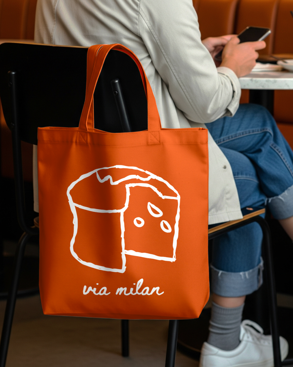
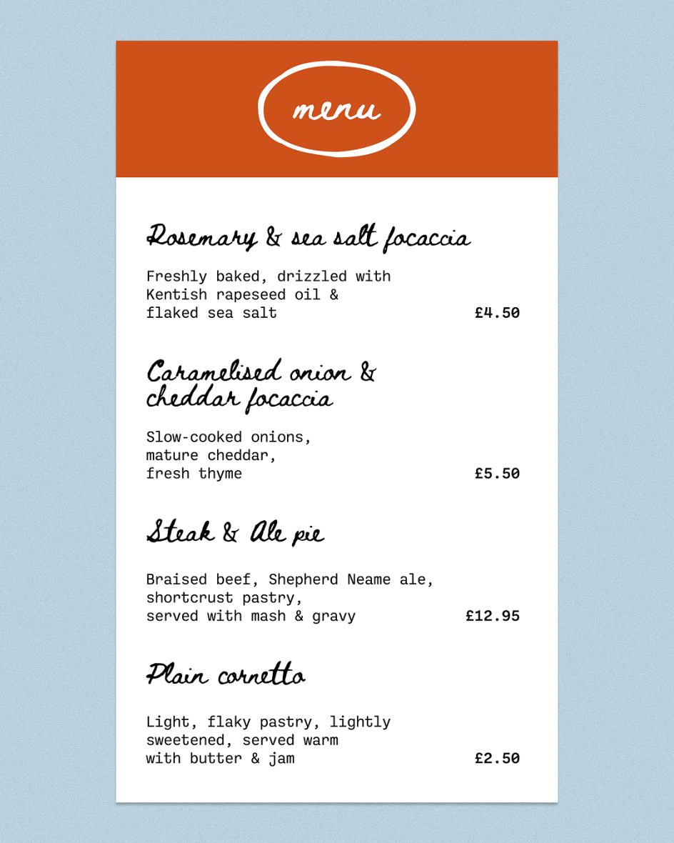
Her research involved pastries from her local Brooklyn bakery and Instagram deep-dives into coastal Kent cafes, all without ever visiting Dover herself. No moodboard... just sketching. She was determined, she says, not to let it be "half-baked". Visually capturing the story within the brief is what she's most proud of.
Love the mess
Hertfordshire-based designer Zoe Foreman took her cue from something most bakery brands try to hide: the mess. Sticky fingers, croissant flakes, biscuit crumbs... rather than polishing it away, her concept embraces it. The idea of 'love the mess' led her to the behaviour of dough during proofing, where separate buns slowly press and merge into a single loaf. The logo comes in four parts, each at a different stage of that process, until by the end it's almost unreadable.
Without a large illustration system to lean on, she pushed the concept through typography instead: tightly led type and copywriting doing the heavy lifting alongside the logo. The process was pen and paper first, sketching out fat, merged letterforms and working out how far she could push the 'blobbishness' before it stopped working. Then the usual digital tools to bring it to life.
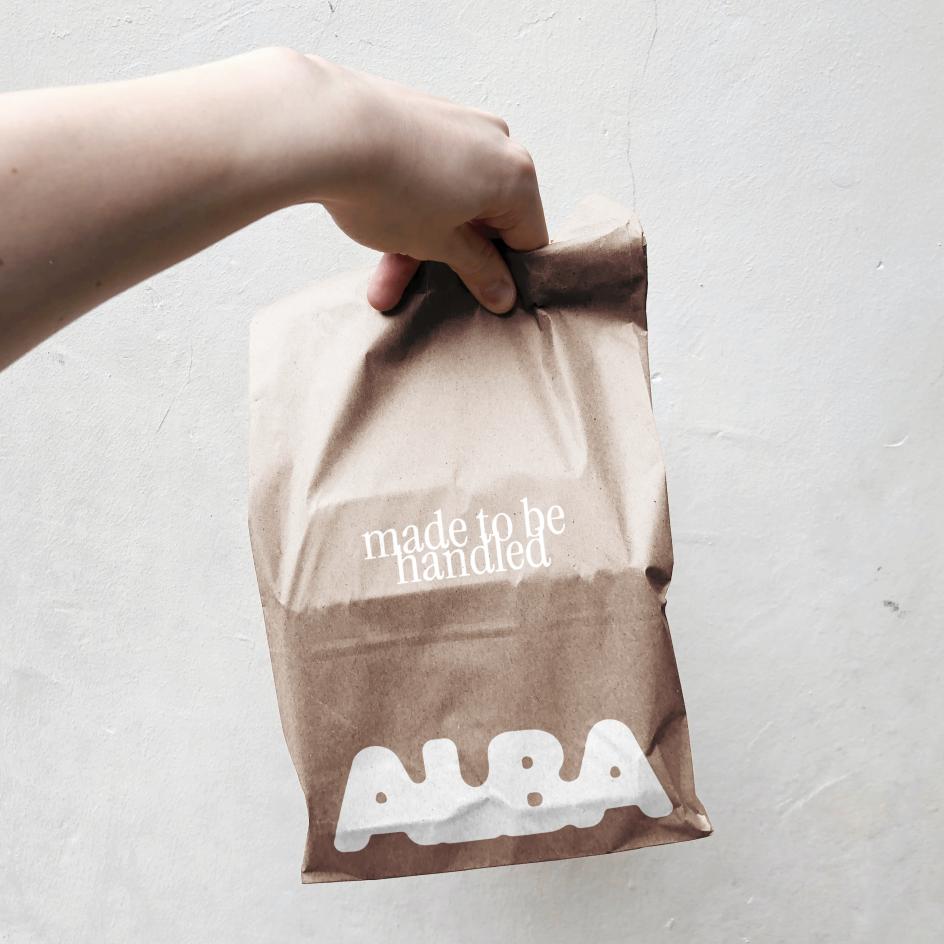
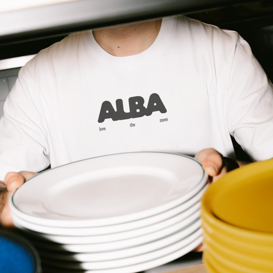
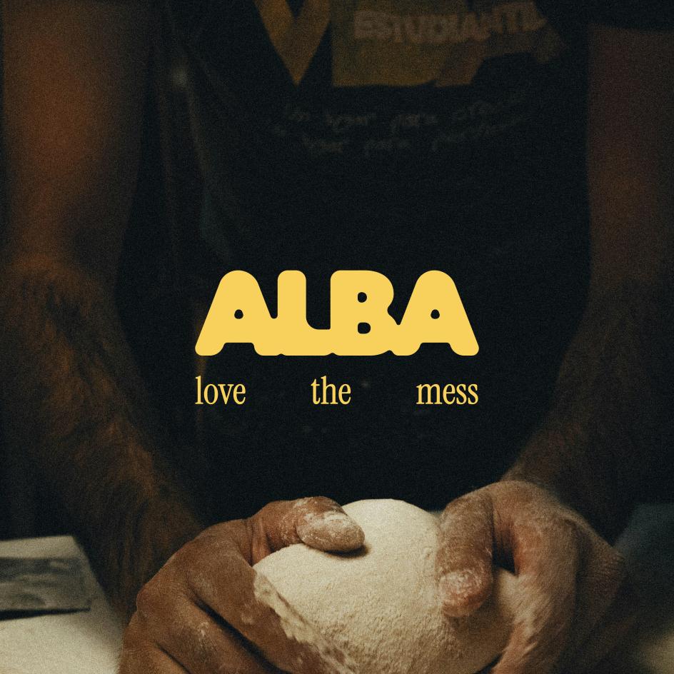
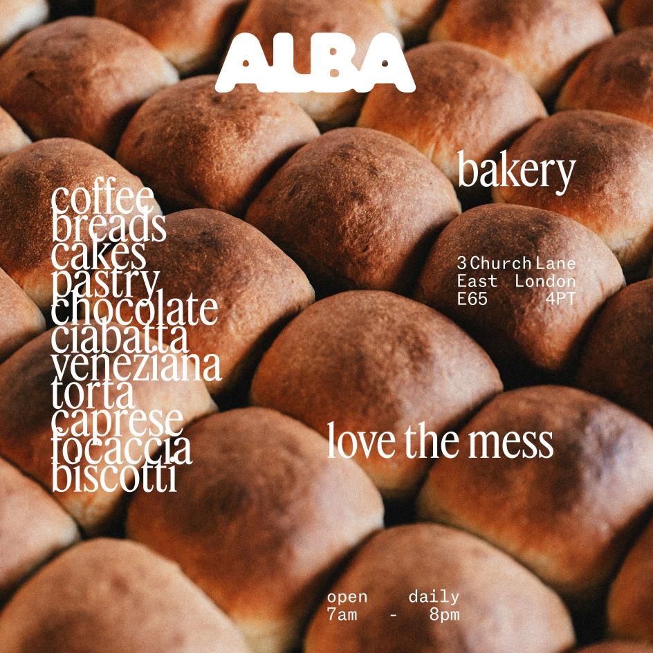
She admits to one false start: she spent the early stages convinced the bakery was called Alma, and has several sketchbook pages of squashed M explorations to show for it. On the upside, the brief gave her something she finds harder without a client breathing down her neck – the ability to trust her instincts quickly and commit. She's proud of how fast she found her footing.
How to get involved
From open-crumb letterforms to cool pre-dawn palettes, watercolour hands and cursive wordmarks refined over several restarts, the range of responses to this brief is a reminder of why the same prompt, given to different designers, will always produce something surprising. Cool, eh?
Want to take part? Boom Brief #9 is coming soon. Head to @creativeboom on Instagram to keep an eye out. When it's released there'll be no pressure or expectations: just a prompt, your instincts, and the freedom to make something that didn't exist before. Enjoy!
Further Information
Follow Creative Boom on Instagram to look out for the next Boom Brief, coming soon.

Editor's Picks


Trending

Podcasts

Editor's Picks
Further Reading