Hey honey, I’m rebranded: sweet new designs for environmentally conscious Bee One Third
Looks like Australian Studio Gangplank has been on very good bee-hive-iour lately, working with urban and coastal beekeeping enterprise Bee One Third on some beautiful branding and packaging designs.
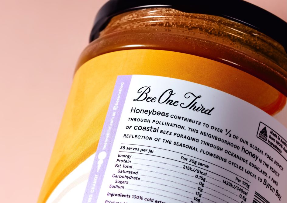
The organisation was founded in response to the crisis of the world’s declining bee population—a big issue when you consider that “one-third of our global food supply depends on bee pollination,” according to Studio Gangplank. The Bee One Third team manages more than 150 beehives across Australia, siting them across inner-city rooftops, suburban backyards, coastal landscapes and native bushland.
The project involved a complete brand refresh, including designs for 144 unique product labels across five different product sizes and variants, print and digital marketing collateral, and a new e-commerce website.
The agency was brought in to create new labelling for the enterprise’s product range that would help it stand out on shelves and emphasise the product’s uniqueness, as well as appealing to both interstate and international retailers.
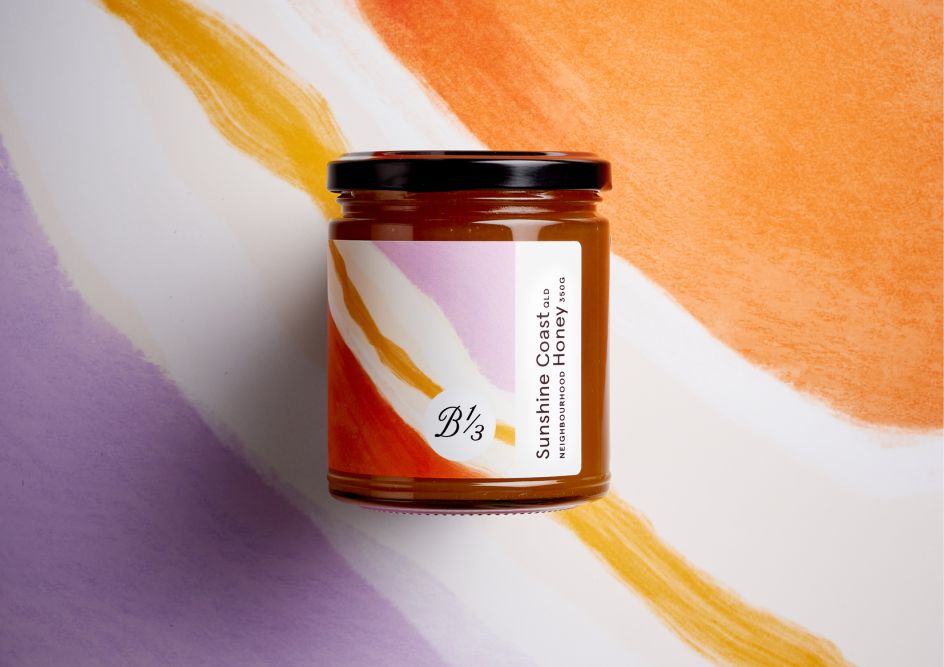
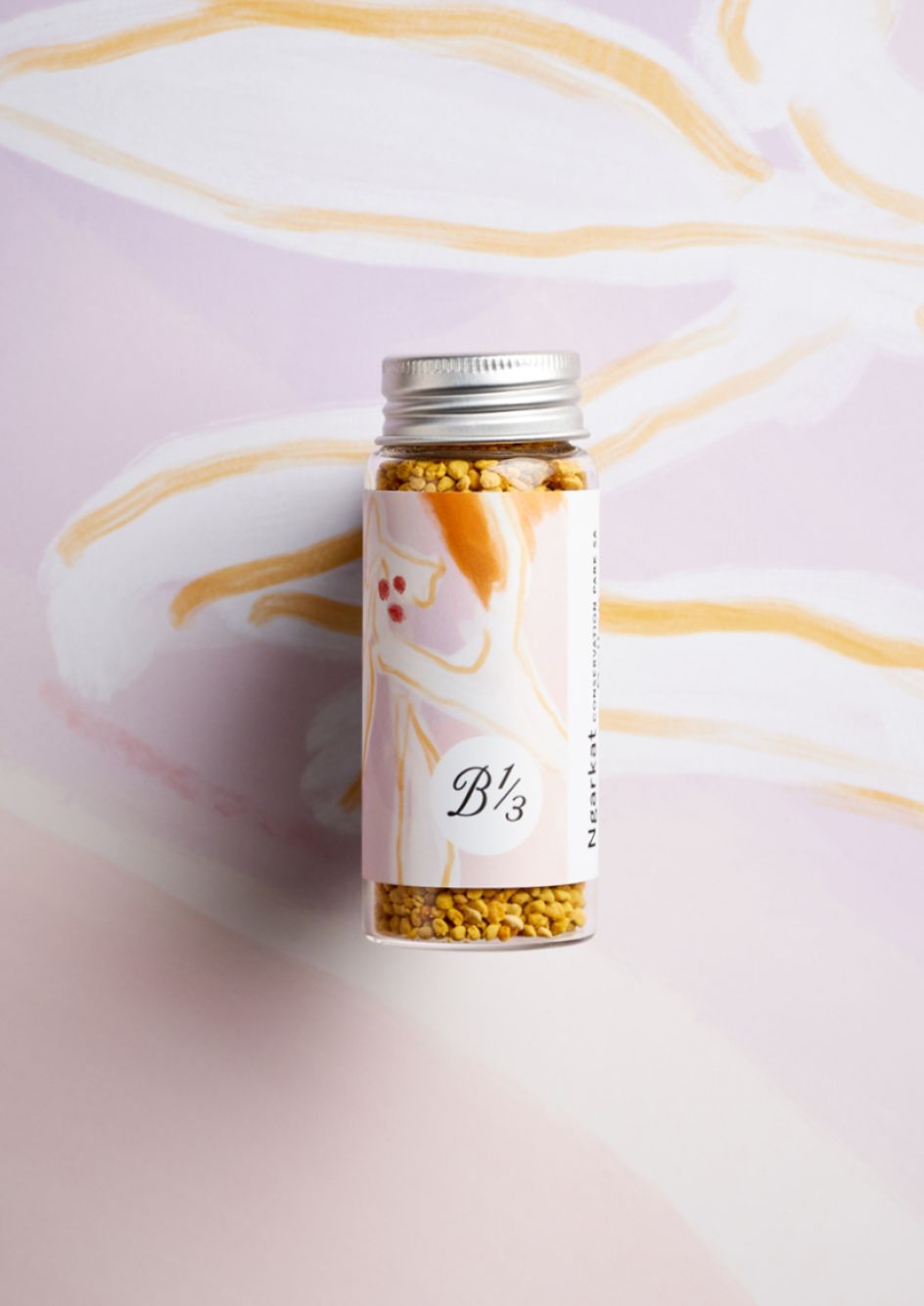
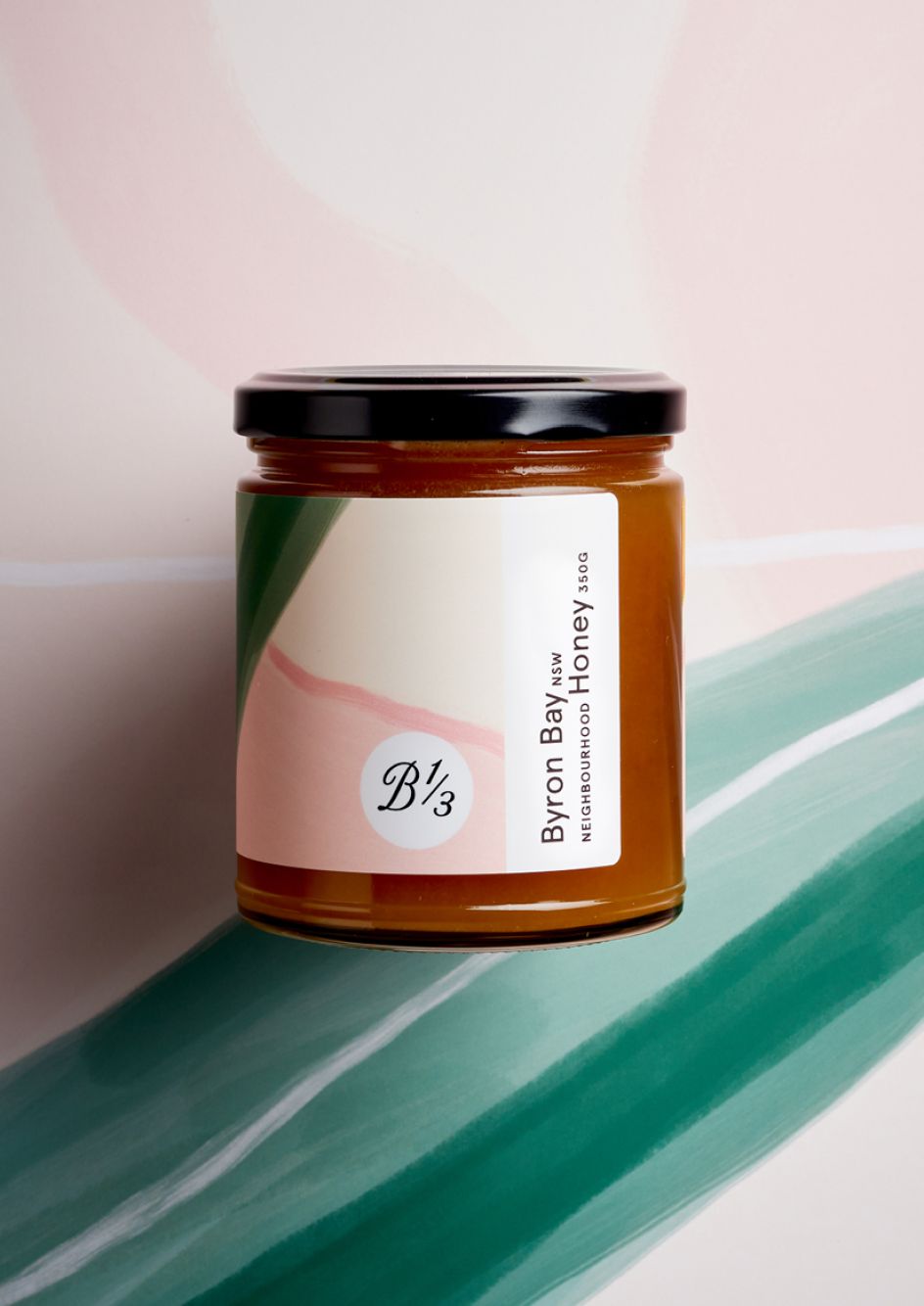
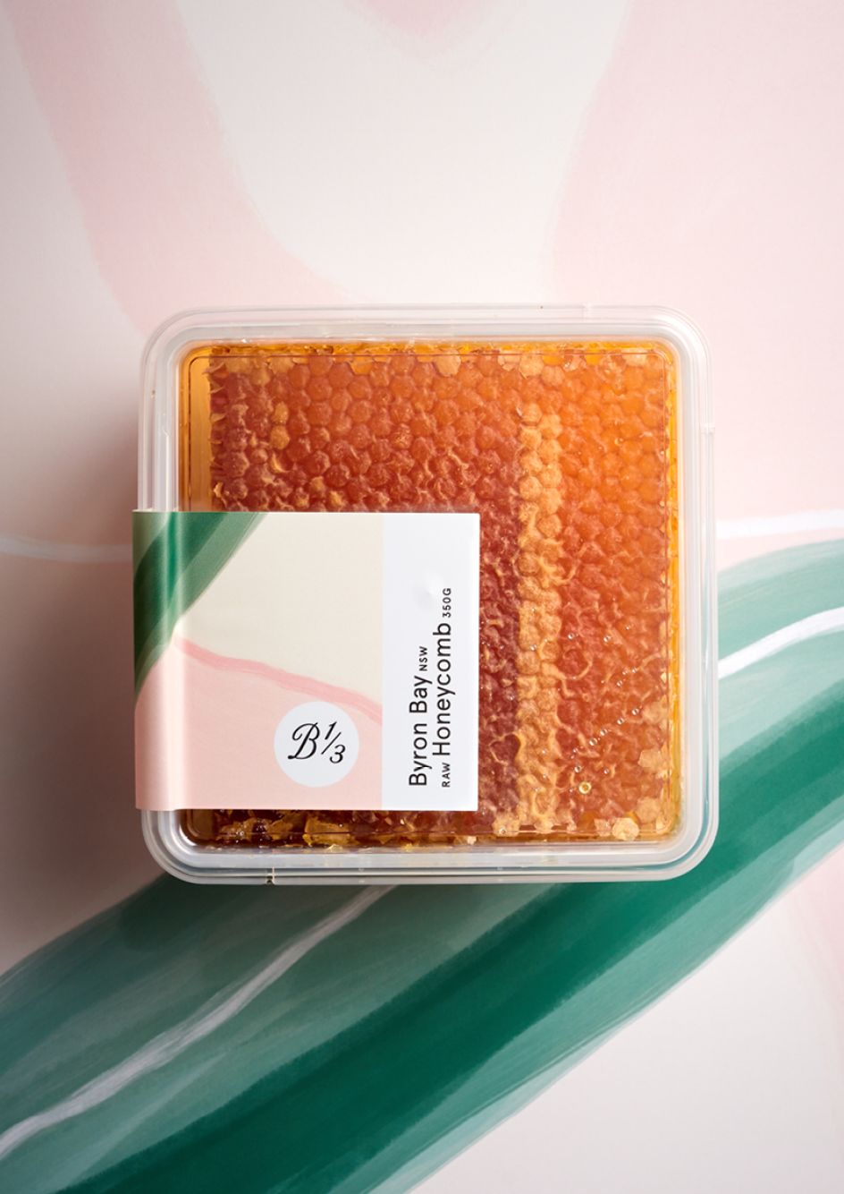
“Instead of championing the company name, the new labels hero the hive source which is the product's primary point of difference,” says Studio Gangplank, adding that hive references had been missing from the previous brand designs.
“Reminiscent of wine, these honey varietals are truly unique in flavour, colour and texture depending on the ‘terroir’. Not only was the name of each location elevated, but each location was also given its own custom illustration.”
The illustrations are more than purely decorative: they also offer the chance for people to learn more about the provenance of each honey variant, and demonstrate that the product differs depending on the season. As such, Studio Gangplank introduced “a seasonal approach similar to wine harvests,” meaning each seasonal harvest will boast a new style and educational theme.
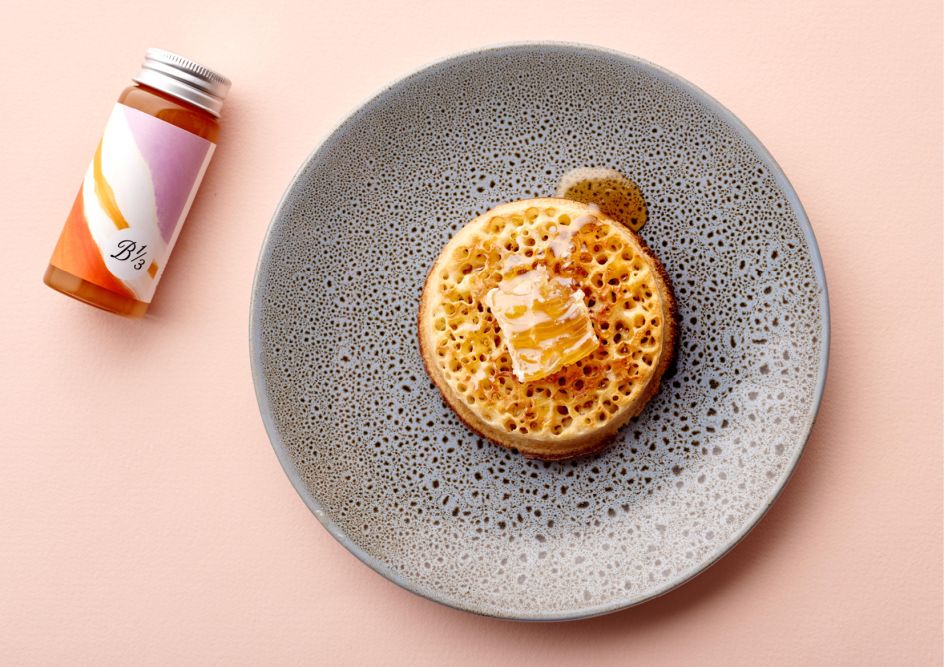
The first of these to launch, the Spring Summer 2018/2019 range, features an illustrative style inspired by the ‘pollen path’ process used by bees to communicate with each other to identify pollen sources. Each season will be unique in its design and image use, making the jars not just beautiful, but a nice little limited-edition artwork-turned-possible future storage container.
“The format of the packaging labels was a major consideration, with ease of application and a view of the honey within being primary objectives,” says Studio Gangplank. The design team used a single rectangular strip “which exposed one-third of the front face,” it explains.
“The exposed one-third section served two purposes: it revealed each honey varietal’s unique visual properties, plus it paid homage to the company name, Bee One Third. The simplicity of the label meant the application of the label could now be automated and—in line with the company's environmental conscience—the jars are also easy to de-label and repurpose for other uses.”
Since the new brand designs launched, Bee One Third products are now stocked in major global retailers across countries including Hong Kong and the US.
Editor's Picks


Trending


Podcasts


Editor's Picks
Further Reading