Atelier à propos creates a cheeky identity for The Scoop Café, in 'Franglish'
It's not often a restaurant bills itself as "at the crossroads of the French brewery, the American diner and the Irish pub"; and it's even rarer that an establishment associated with any of those things would present itself with branding that thoroughly avoids cliche.
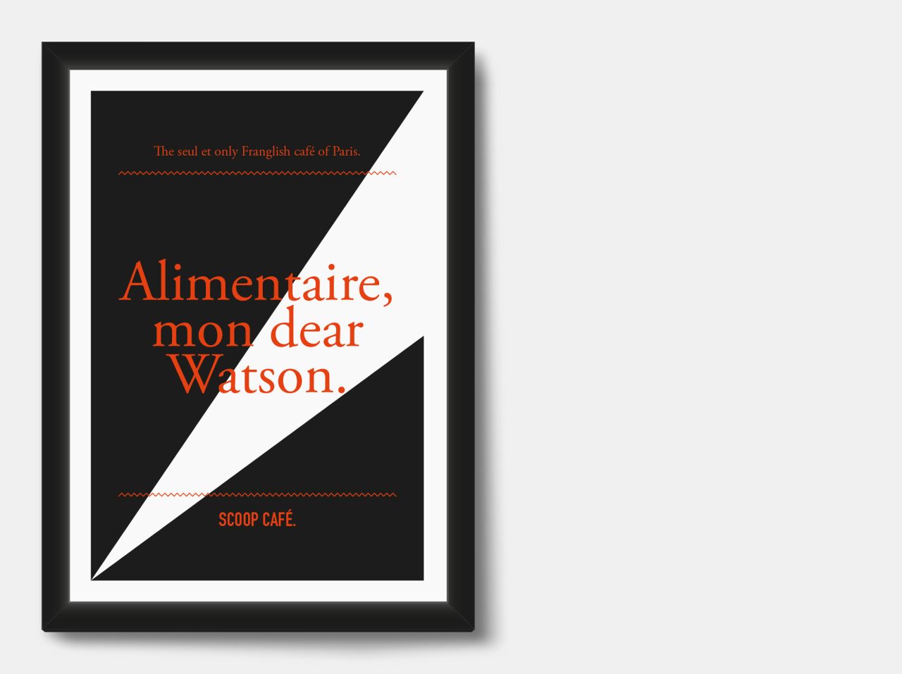
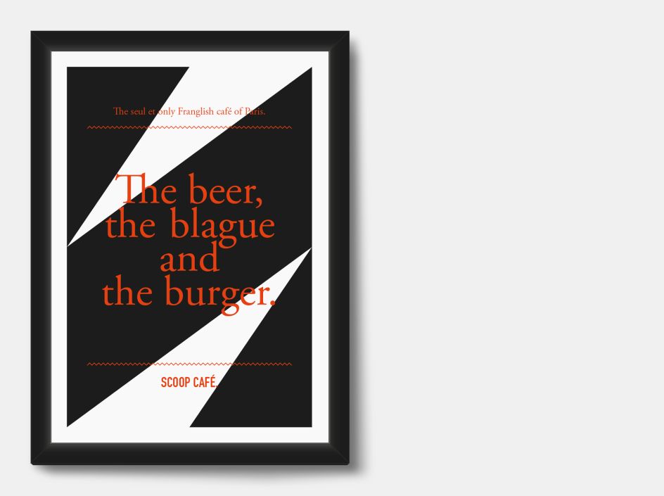
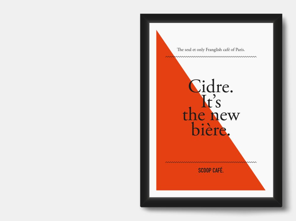
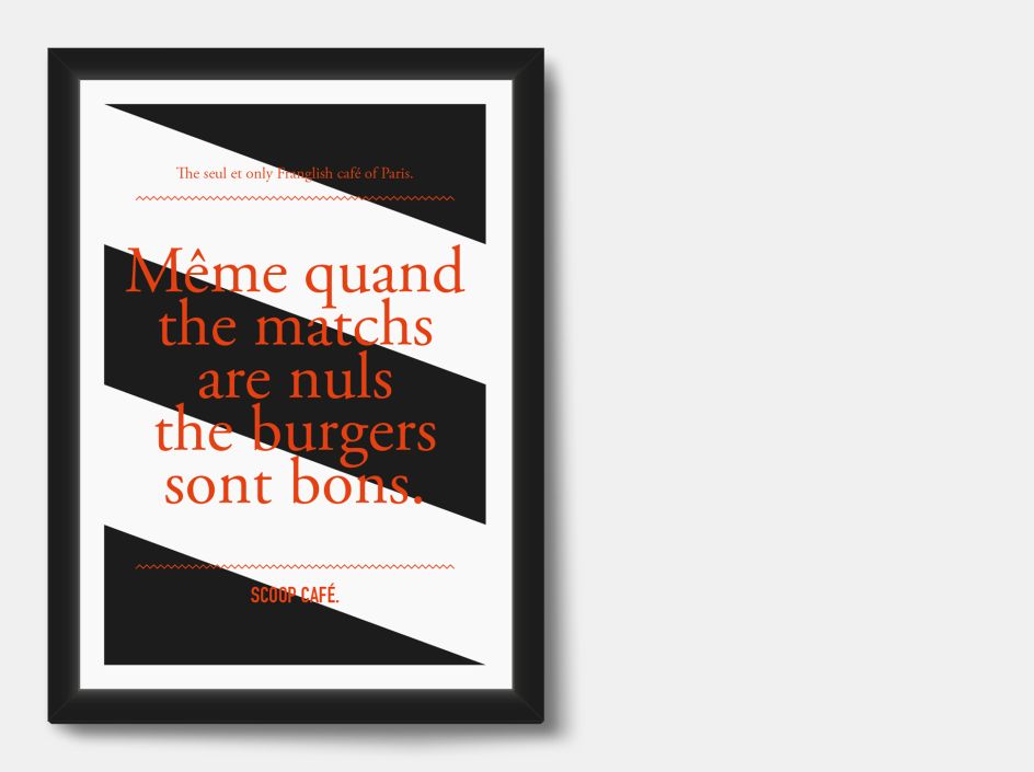
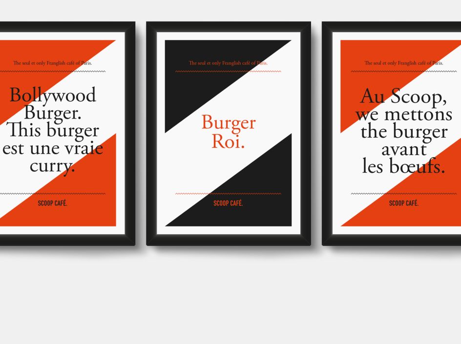
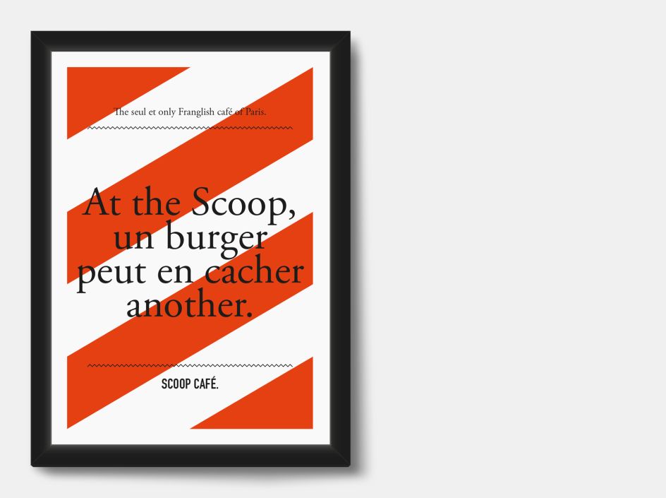
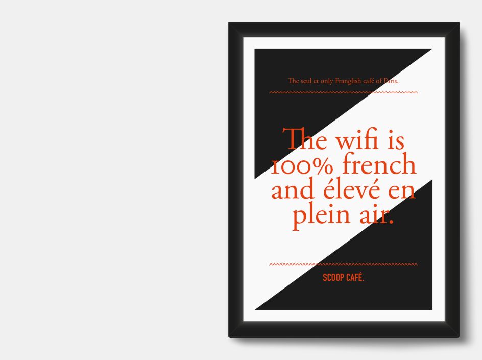
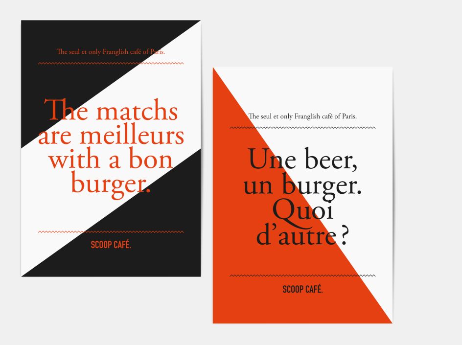
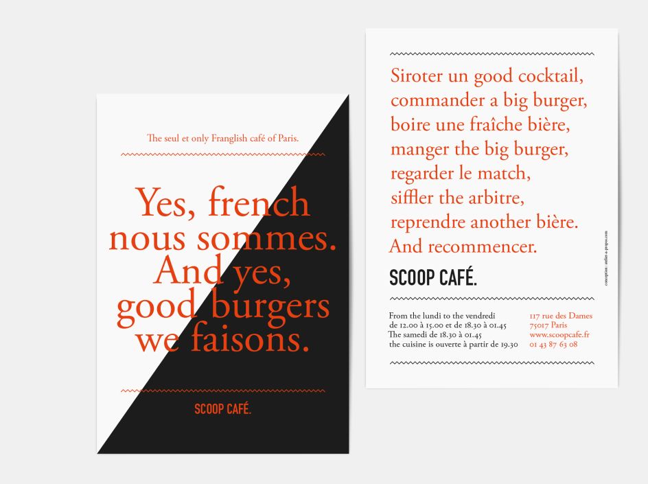
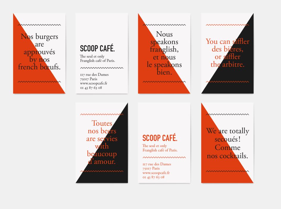
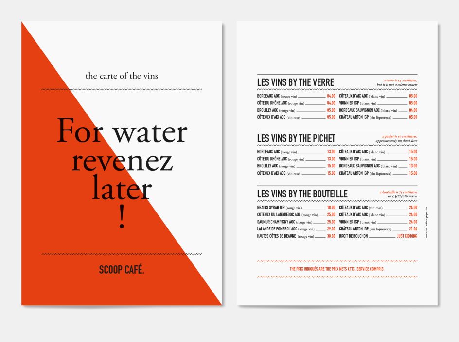
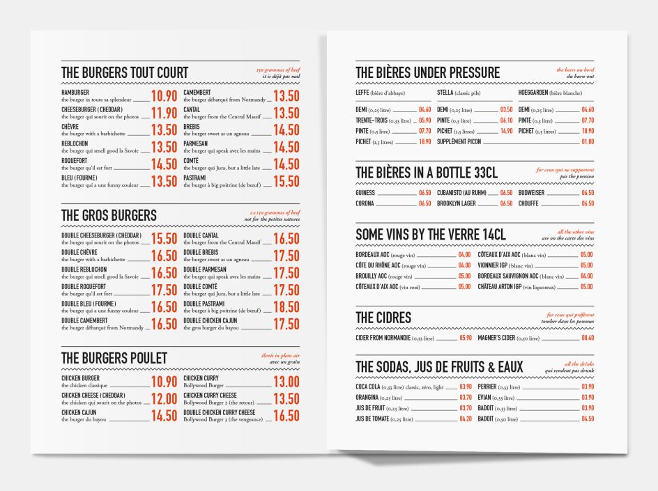
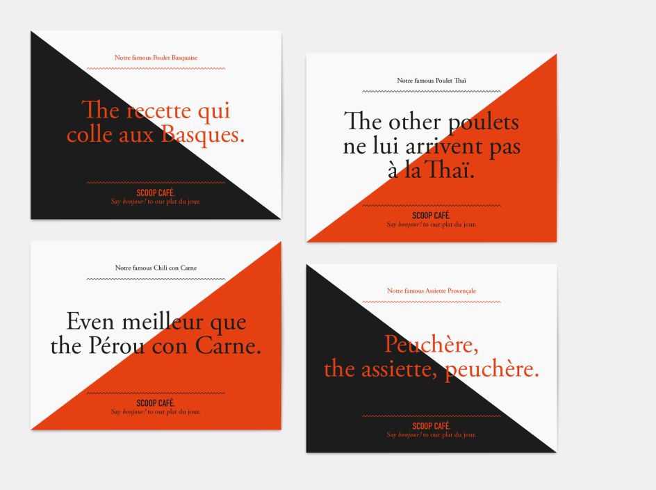
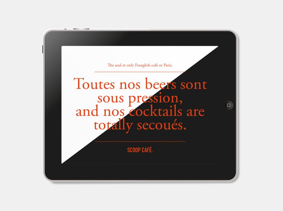
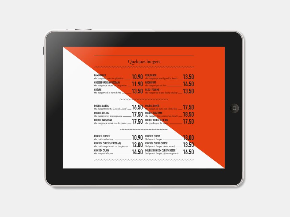
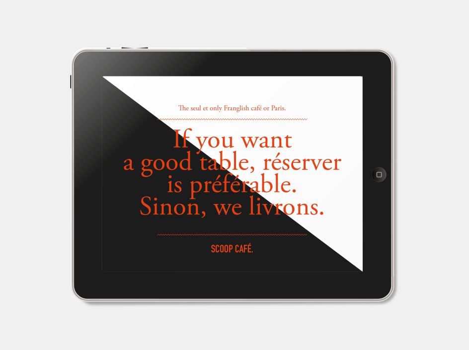
So it's refreshing to see the approach that French studio Atelier à propos took to creating the designs for the eatery in question, The Scoop Café. The joyfully unpretentious joint prides itself on serving burgers during football matches, but in a slightly more elegant way than, say, a Walkabout pub. As such, the copywriting and visual language appropriate ideas around "Franglish", that unmistakeable blend of languages usually deplored during sporting events, or heavy drinking.
Atelier à propos' design solution avoids cliches of brashness, neon or sporting imagery, instead taking a Modernist-inspired approach with a limited colour palter of white, black and deep orange. Keeping things closely, an understated serif typeface is used to spell out cheeky plays on intercontinental parlance, like "The matchs are meilleurs with a bon burger" ("Matches are better with a good burger," in full English.)
Based in PAris and with an outpost in Miami, Atelier à propos was founded by Vincent Champenois, and specialises in visual identity and print work. You can see the studio's projects on its website here..
Editor's Picks


Trending


](https://www.creativeboom.com/upload/articles/90/908fdb6378db1e95d12595416f54e6336d5e80b8_732.jpg)
Podcasts


Editor's Picks
Further Reading