Alphabet's new identity for one of the leading cryptocurrency marketplaces in the world
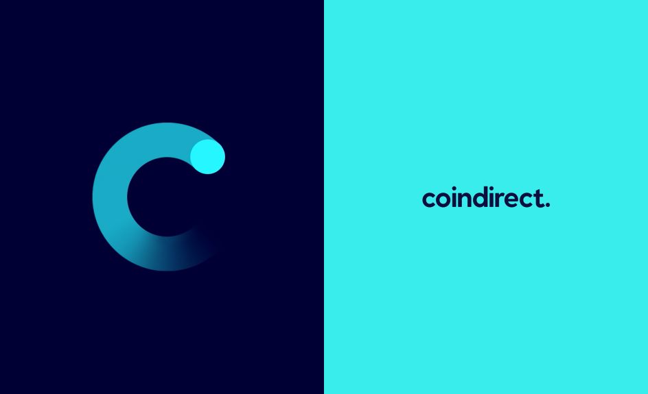
Manchester studio Alphabet has refreshed the identity of one of the leading cryptocurrency marketplaces in the world, Coindirect.
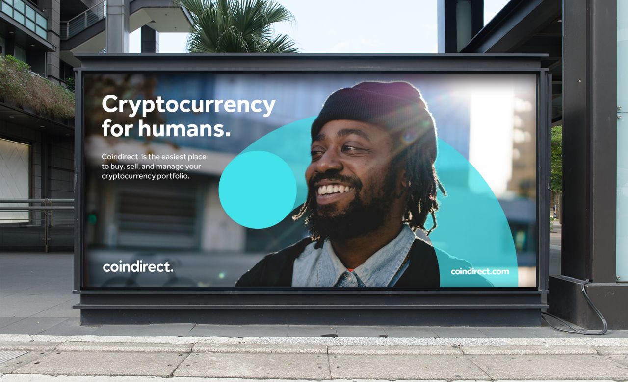
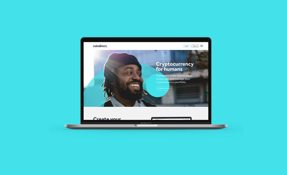
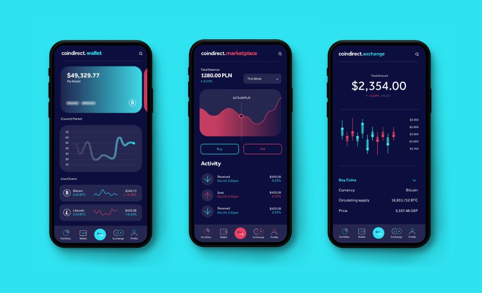
They coined (ouch, no pun intended) the strapline 'Cryptocurrency For Humans' and created a relatable, conversational tone of voice with a "unique graphic device that informs the whole brand" from image treatment to illustration.
"It feels a little bit more approachable and 'human'," says Sam Lane, one of the co-founders of Alphabet. "The core aim was to evolve Coindirect into a contemporary brand with a friendly personality that is straightforward, open and honest. Our client had a clear vision to make the idea of cryptocurrency more accessible to everyday people.
"With the confusing nature and ambiguity of cryptocurrency, it seemed to make perfect sense to create a relatable, conversational tone of voice to cut through the jargon often used in this highly saturated market."
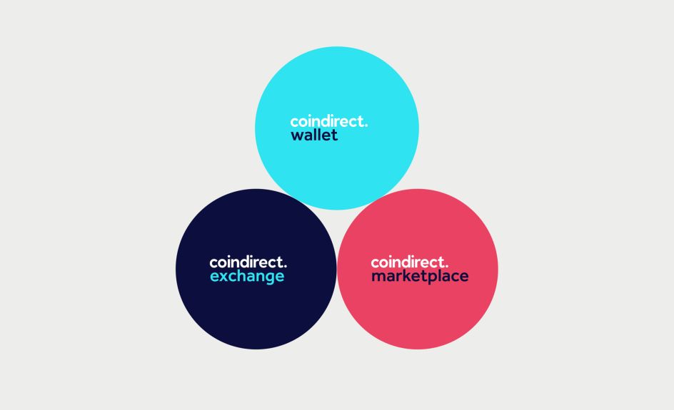
Did the team at Alphabet face any challenges that they overcame? "Coindirect is interesting in that it's a brand that caters to a wide variety of audiences through its sub-brands. So one of the biggest challenges was creating an identity that spoke to everybody, from potential investors right through to entry-level users," adds Sam.
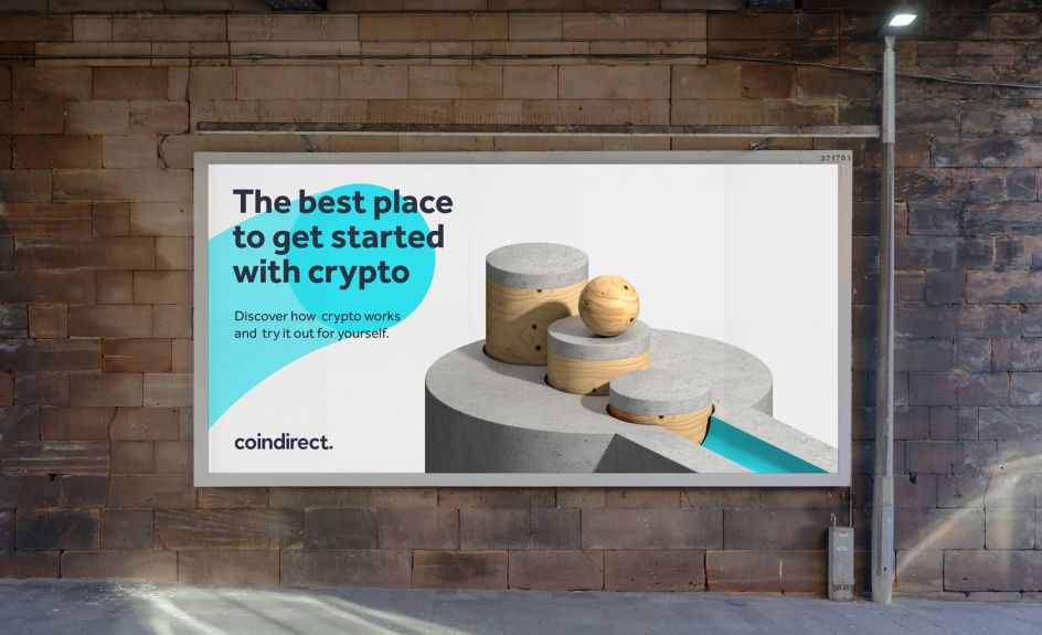
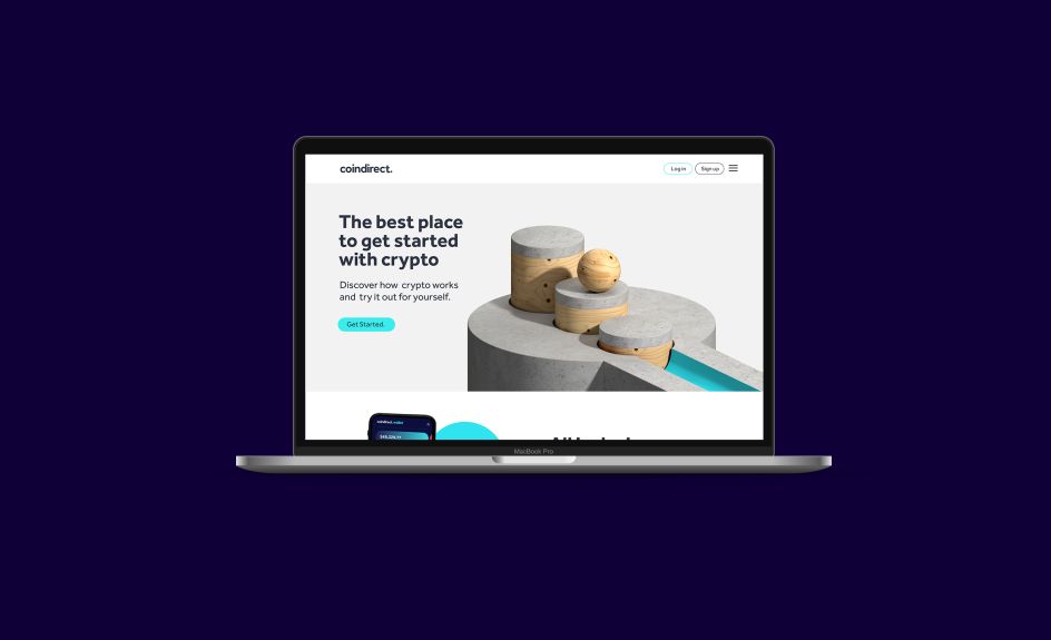
"We wanted to create a brand that could cater to everyone and we achieved this by emphasising a conversational tone of voice and using playful visual assets such as the 3D animations, which were designed specifically to help entry-level investors understand the intricacies of cryptocurrency in a very simple way."


Editor's Picks


Trending


](https://www.creativeboom.com/upload/articles/90/908fdb6378db1e95d12595416f54e6336d5e80b8_732.jpg)
Podcasts


Editor's Picks
Further Reading