A new identity for Taidehalli
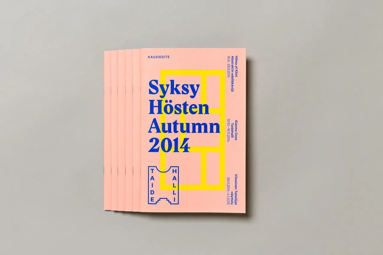
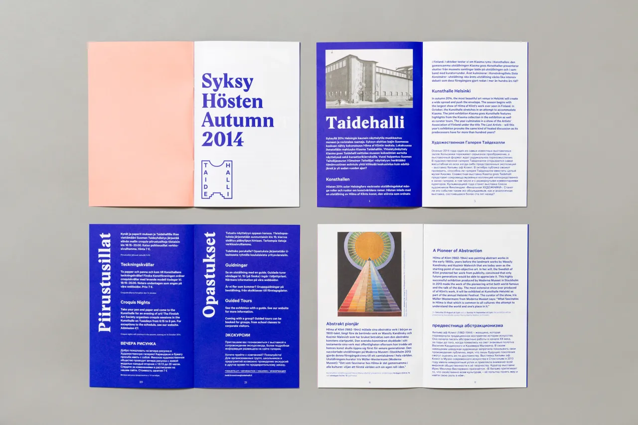
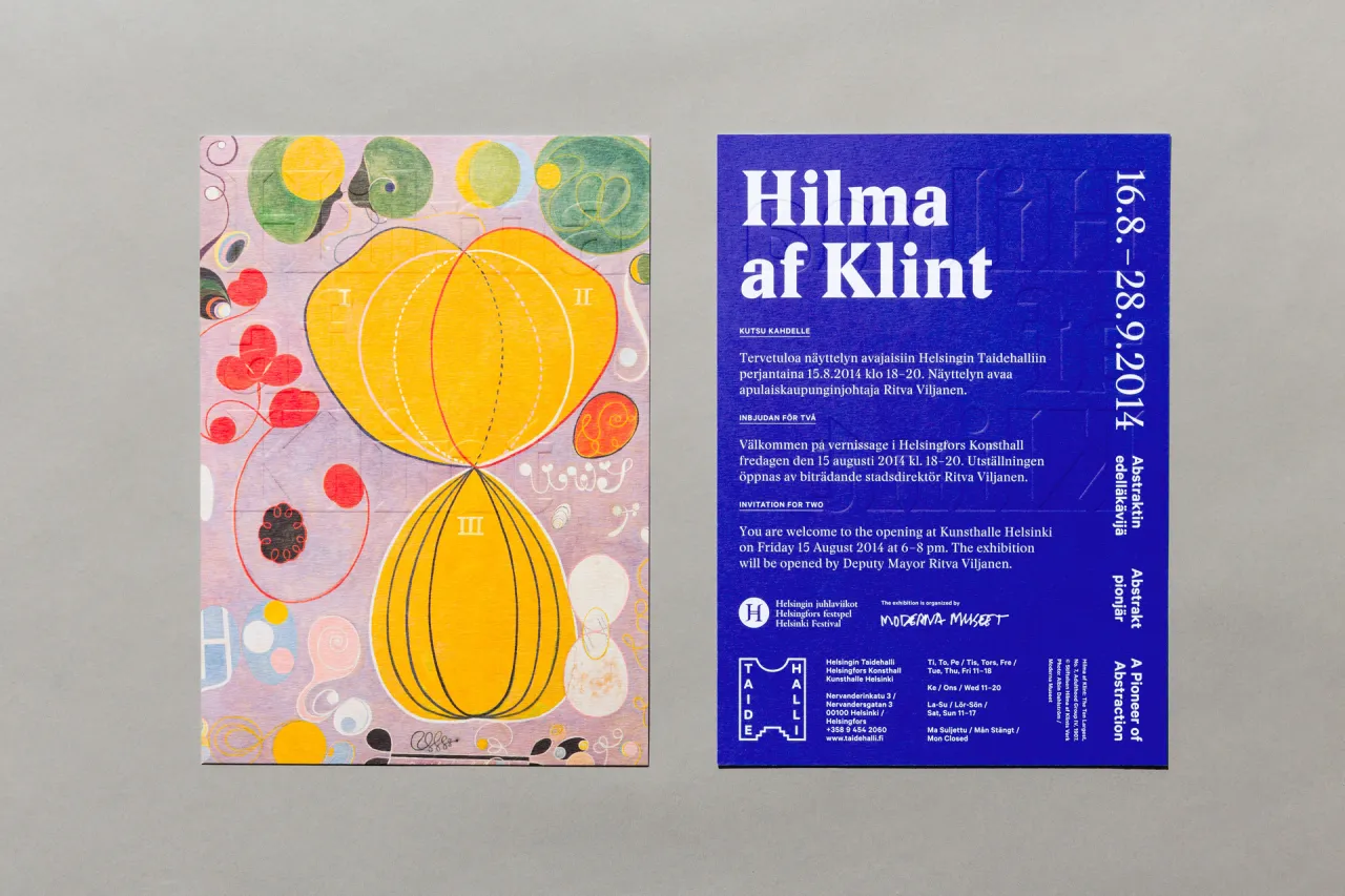
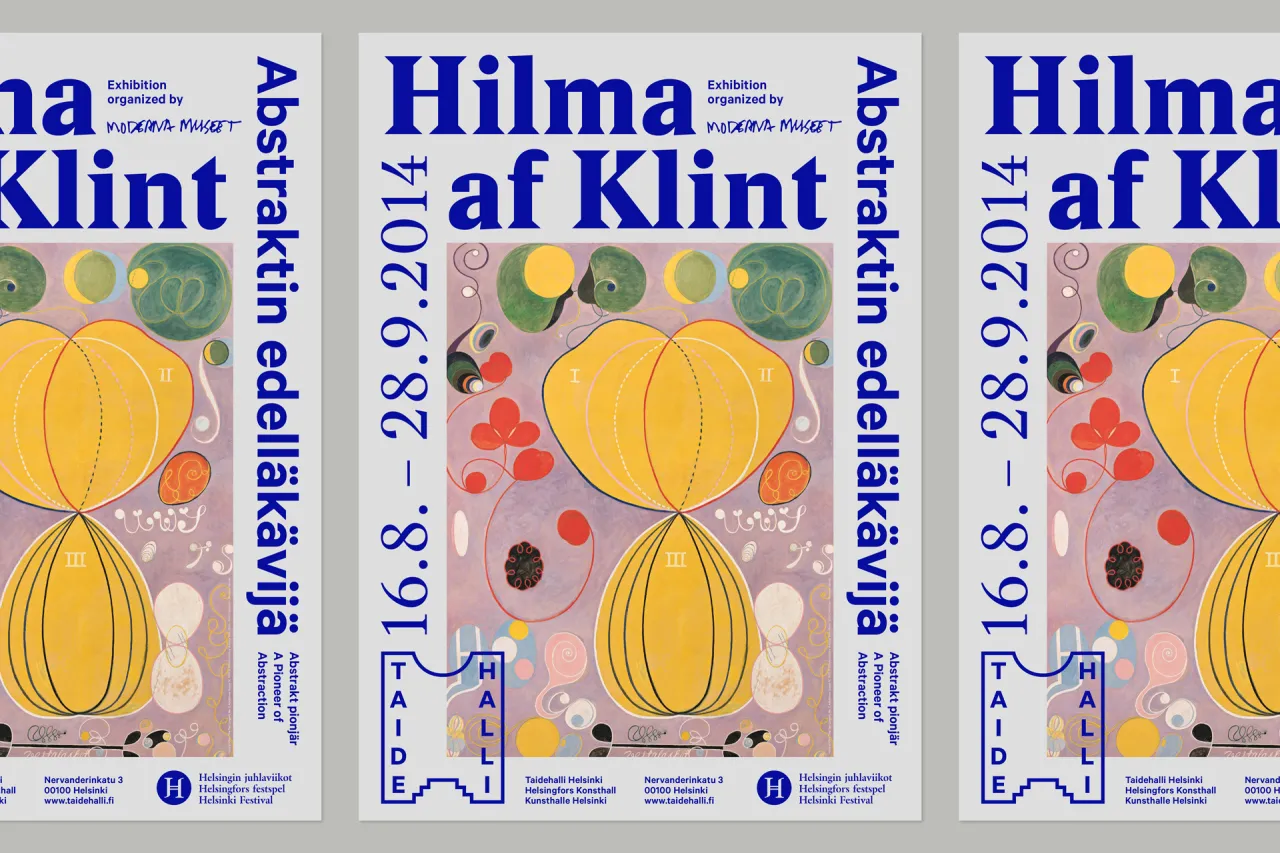
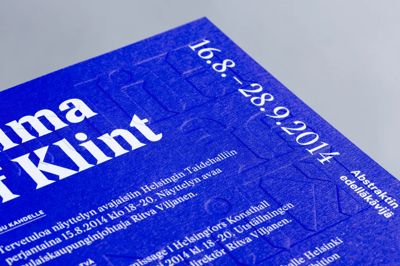
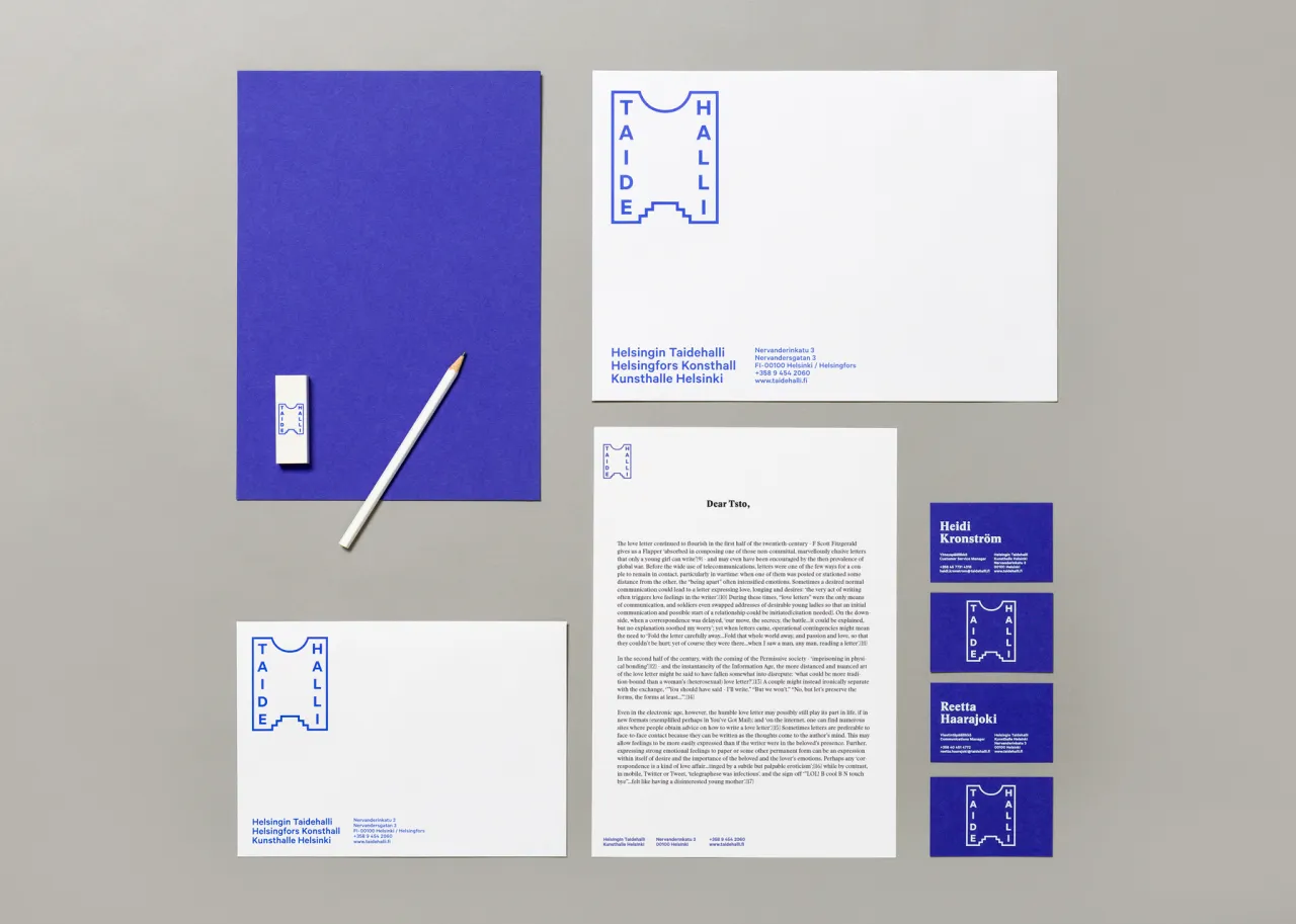
Helsinki-based creative agency TSTO has created a new identity for Taidehalli, also known as Helsinki Kunsthalle, which has rooted itself firmly in its 86-year history as one of the key spaces for exhibiting contemporary art in Finland.
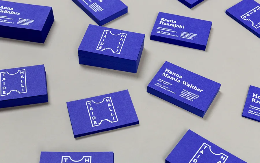
"Our approach for renewing the identity started out from an architectural view point. The Taidehalli building was finished 1928 by Jarl Eklund and Hilding Ekelund. The identity features a set of graphic elements that are based on the intriguing small details of the building itself.
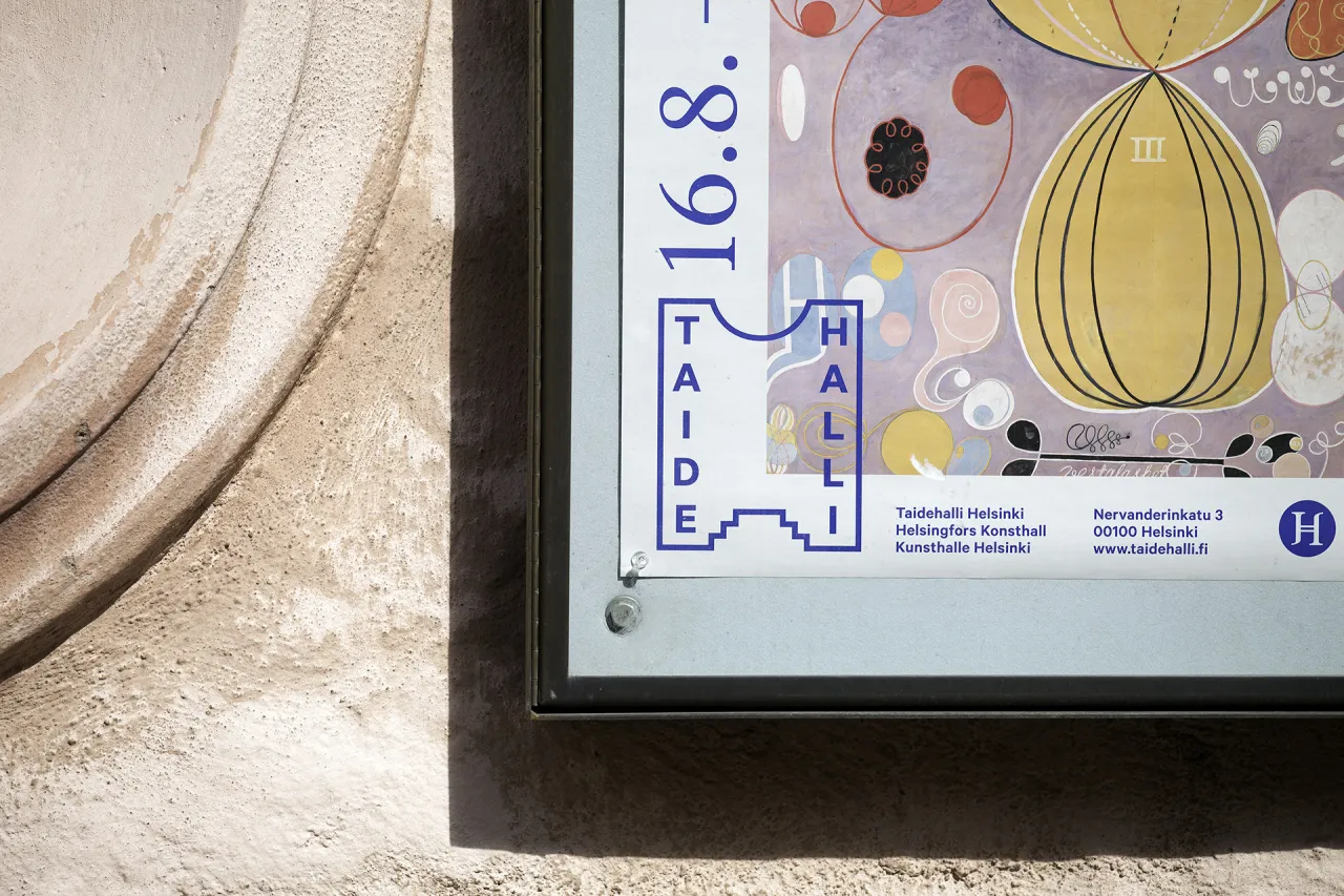
"The logo draws inspiration from the main facade overlooking the entrance of the building. Although the Kunsthalle is an old and established institution it is constantly developing and looking for new ways to approach contemporary art. With this in mind we created a few alternative logo versions reflecting a similar kind of curious playfulness."
Editor's Picks





Trending





Latest Jobs
Midweight Designer at All Purpose
Full-time·London·£30k–38k
Designer at New Genre
Full-time·London·£36k–£48k
Art Director at SPOKE
Full-time·London·£55k-65k
Growth and Client Development Director at 3800
Part-time·Sheffield·£60k-80k
Brand Strategist at DNCO
Full-time·London·£45k-£60k
Account Manager at BUILDHOLLYWOOD
Full-time·London·£34k–£38k