Dutch designer Stijn van Hapert's album artwork traces journeys of addiction
Dutch creative director and graphic designer Stijn van Hapert has long worked with musicians—including a bevvy of Grammy nominees including Bebe Rexha, Camila Cabello, Meghan Trainor, Offset, and more.
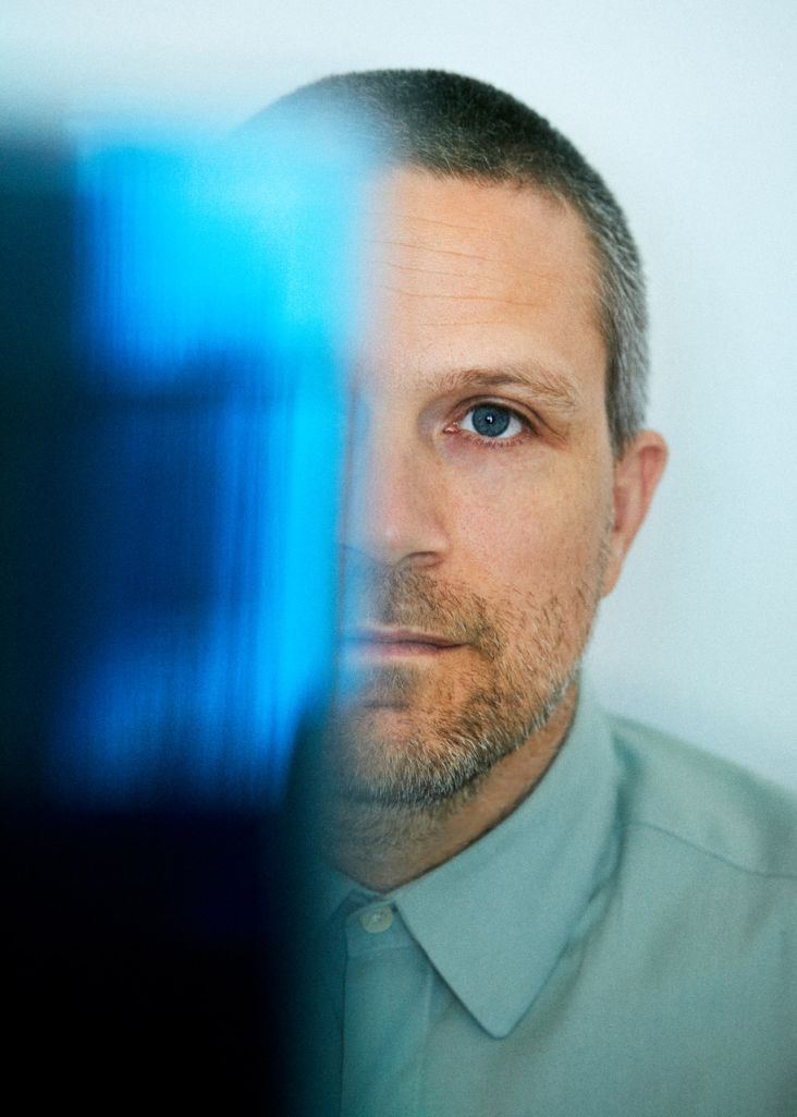
His work delights in the marriage of physical techniques with modern technology, as exemplified in his new designs for LA-based indie-electronic artist and producer Stephen. An odd name, sure, but seemingly the guy's pretty popular: his hit single Crossfire, has been streamed more than 100 million times.
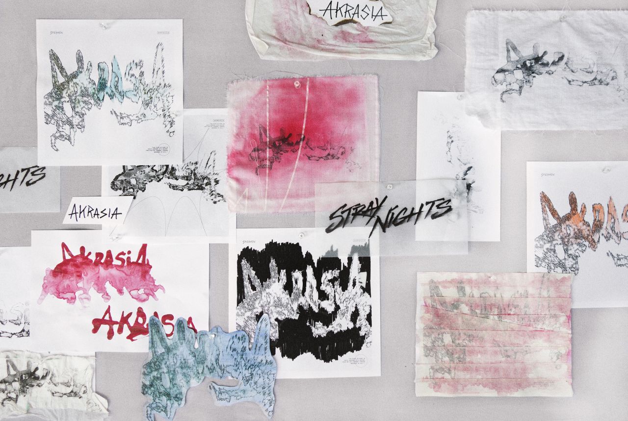
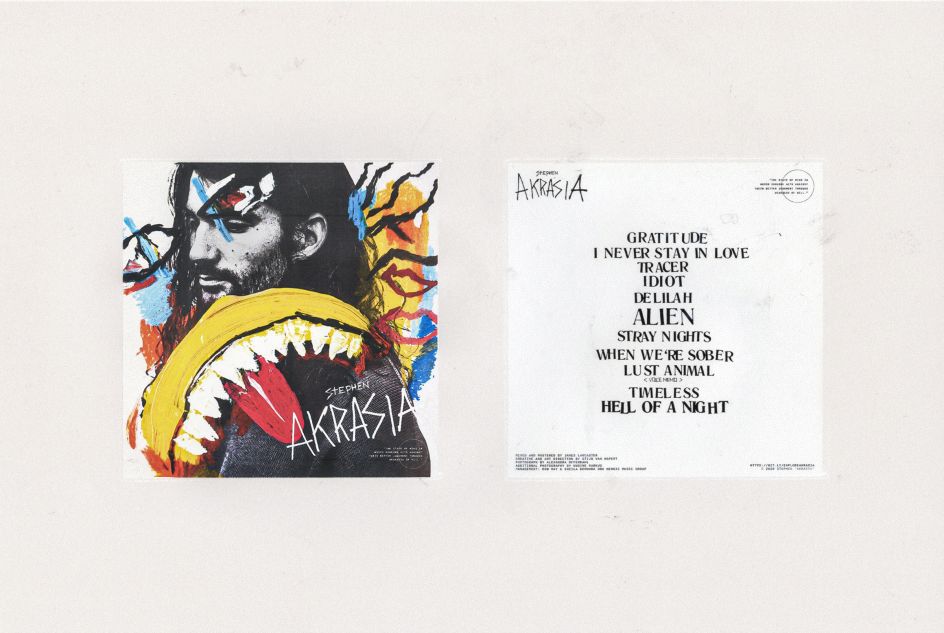
Stephen and team commissioned van Hapert to work on his second album, Akrasia. "It has been one of the most experimental commercial projects I've worked on so far," says the designer.
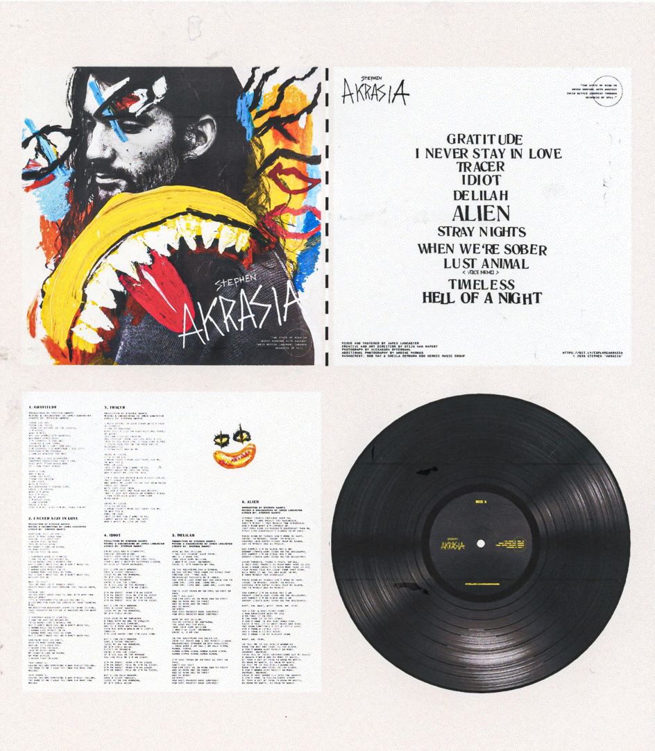
The album name is defined as "the state of mind in which someone acts against their better judgment through weakness of will". Van Hapert describes the record as an "intense and honest" release that subtly delineates "Stephen's inner battles with addictions that vary from relationships to video games and drug usage."
Taking cues from the dark but playful nature of the album, van Hapert says his approach was to try to "visualise the intimate rollercoaster of thoughts and emotions in a graceful and opulent way." The designer and the musician initially spent a lot of time chatting and brainstorming, and it emerged that Stephen wanted a fresh start with the creative direction from previous releases.
</div>
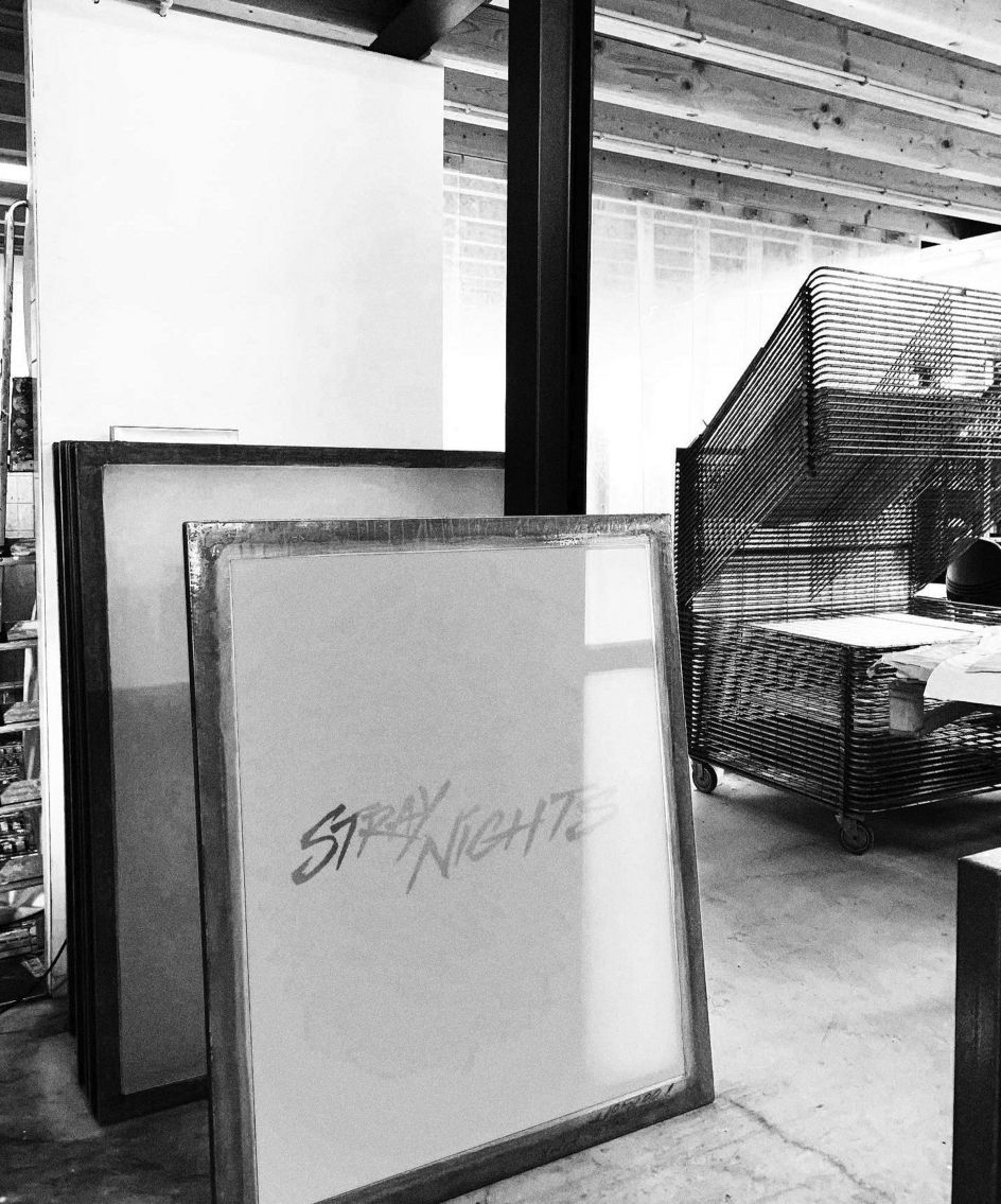
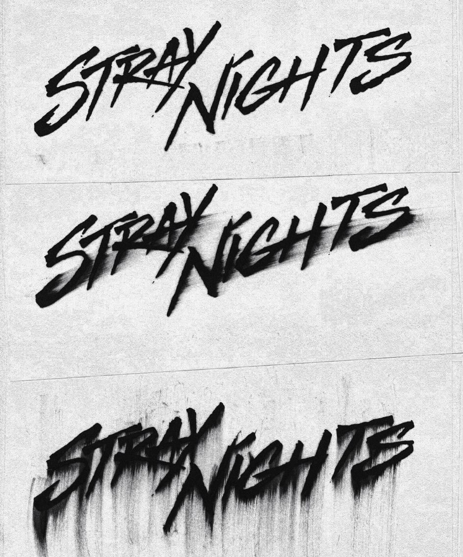
The experimental layering in the album's sound production of the album, and its use of various tools and media, went on to inspire the album's visual aesthetic. van Hapert experimented with numerous techniques across both analogue and digital devices, including silkscreen printing, scanners, traditional art supplies, old TV-screens, a typewriter, and more. "By combining and playing around with these different techniques, I created a landscape of intimacy and coincidence, where the technical 'rules' disappeared, and intuition took over," he says.
"Using mixed media opens the door for imperfect one-of-a-kind outcomes, which is often present in my work. It adds this in-depth layer of intimacy with the artist's, as well as my own identity. The amount of layering used to create the artworks makes it almost impossible to recreate or trace the process."
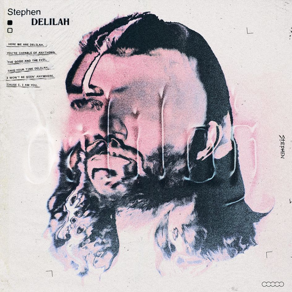
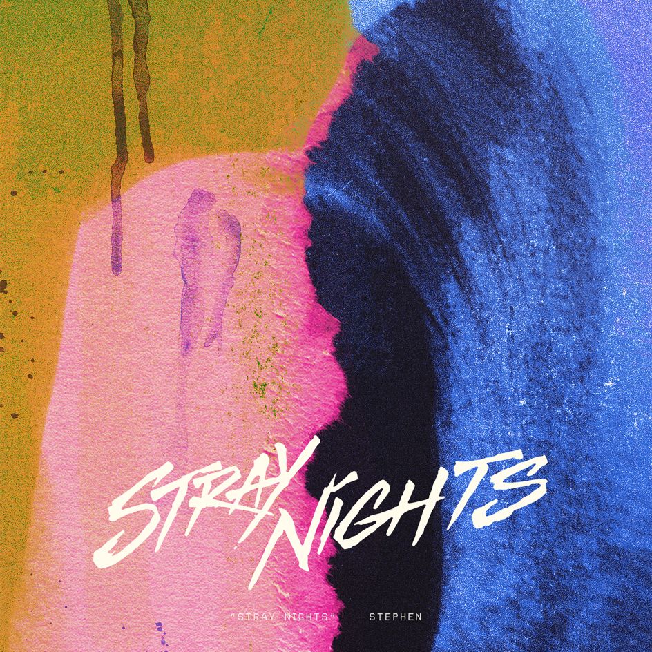
The final designs look to have a raw, intimate and experimental vibe; while each single cover design represents a different part of Stephen's journey through battling addiction. The theme and feel of each track were used to inform the colour palette, while the album cover design uses a range of hues to represent the "rollercoaster" of his experiences.
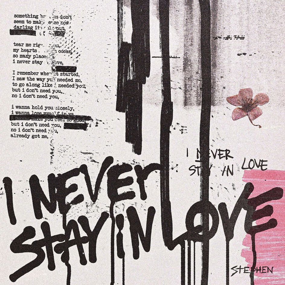
Throughout the process, the designer spent a hell of a lot of time in his studio experimenting with typefaces, textures and photo editing techniques – beginning the work on the series of singles with the track, I Never Stay In Love, in which van Hapert says he explored Stephen's inner battle with love. "The colours from this artwork show the selfless commitment and worship of love, while the bold black spray-painted title represents a sense of frustration and controversy, accompanied by sadness."

Other tracks variously explore "addictions" to the video game Overwatch ( the designs represent Stephen as a "shadow trapped behind the fence of blue-light television pixels"); the singer's female alter-ego Delilah; the beauty of a drama-free relationship and more.
"I approached the Akrasia album packaging design as an adventure of contrasts," says van Hapert, who isolated himself in his studio playing the tracks on repeat before creating more than 100 experiments and drafts for the designs.
"At first sight, the crayon illustrations seem to be a playful detail, but when you take a closer look, you can feel the darkness," he adds. "It's like they form a shield or cage; it depends on how you interpret it. The final packaging design shows darkness, playfulness, rawness, and honesty."
Editor's Picks


Trending


Podcasts


Editor's Picks
Further Reading