Steam meets ice in Franklyn's branding for unusual new sauna startup
Do you fancy plunging from a sauna into freezing cold water? It's a tough sell, but Franklyn's branding for new company Framework is doing a lot of the heavy lifting.
We all like a sauna, right? But freezing cold water…? Well, if you've heard about the Wim Hof Method or seen his TV show Freeze the Fear, you'll know it's good for you, at least. But for most of us, it's still a tough sell to actually go through with it.
This hasn't, though, stopped former Uber executive Allen Penn from his plan to sell sauna bathing and cold water immersion – aka contrast therapy – through a new brick-and-mortar wellness concept.
The branding, of course, would have to work hard to sell this unusual concept. And so the company turned to Brooklyn-based creative studio Franklyn to craft a visual identity that would cut through the noise of endless fitness trends and lure the most nervous bathers into the water.
Brand concept and naming
Perhaps surprisingly, Franklyn's identity cuts through the woo-woo spirituality often associated with sauna and bathing culture. Instead, the designs focus squarely on the simple yet powerful elements at the core of contrast therapy: hot air and cold water.

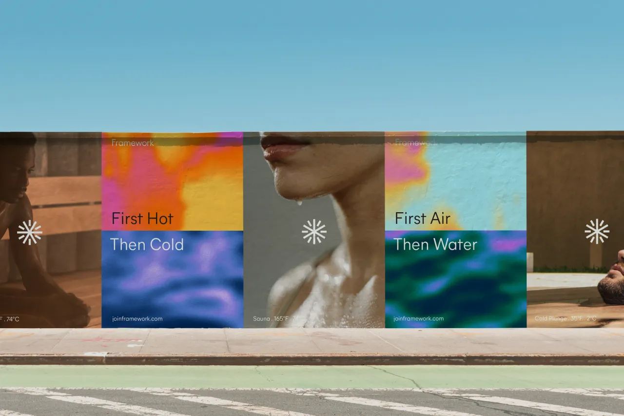
Design director Jelle Maréchal explains that they wanted the brand to highlight the radical simplicity and scientific benefits of this age-old practice.
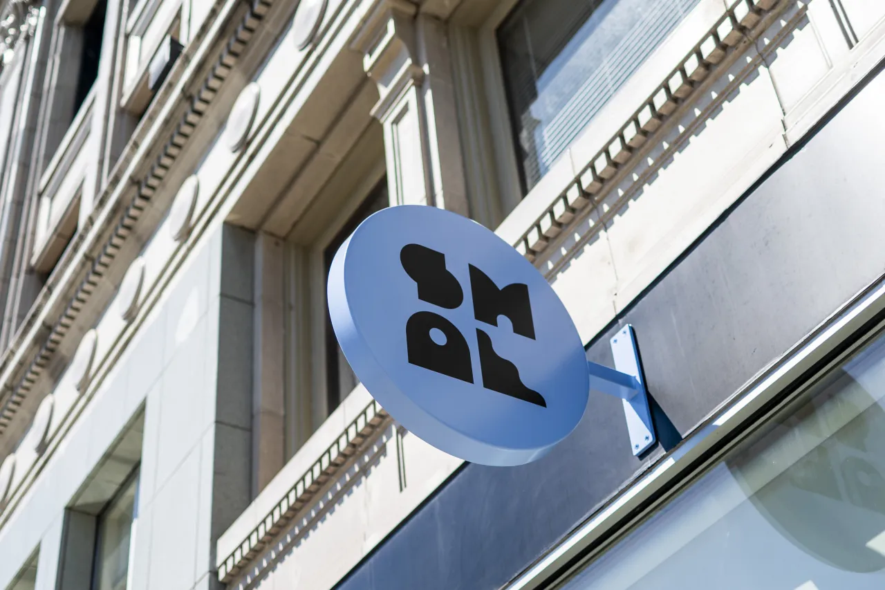
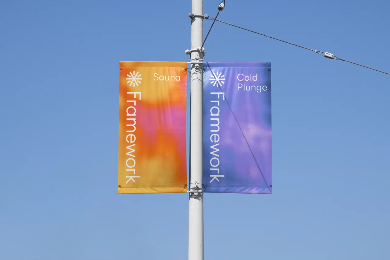
"Our logo and graphic textures focus on the simplicity of contrast therapy's fundamental elements – hot air and cold water – to bring the brand to life," he says. "We also coined the name Framework to reference their unique take on making it part of an active lifestyle through a subscription-based model."
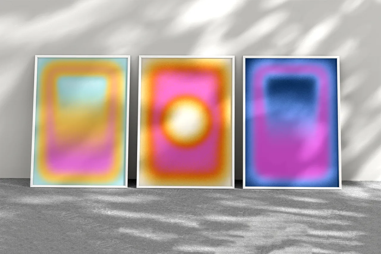
The immersive gradients in the visuals are designed to evoke the visceral experience of moving between extreme temperatures. Overall, says Jelle, "The brand strikes a balance between approachability and intellect, creating an inviting environment that communicates the science behind sauna in a simple and straightforward way."
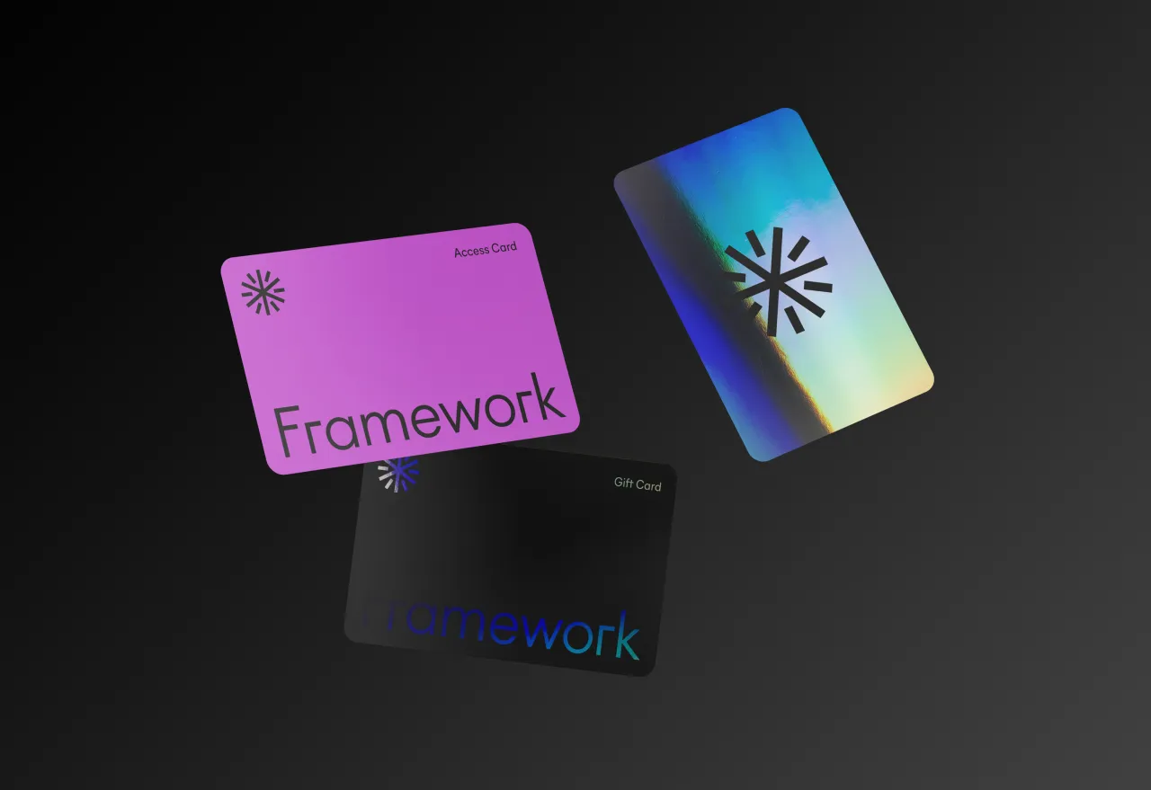

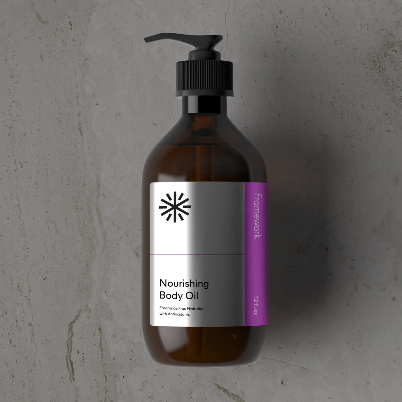
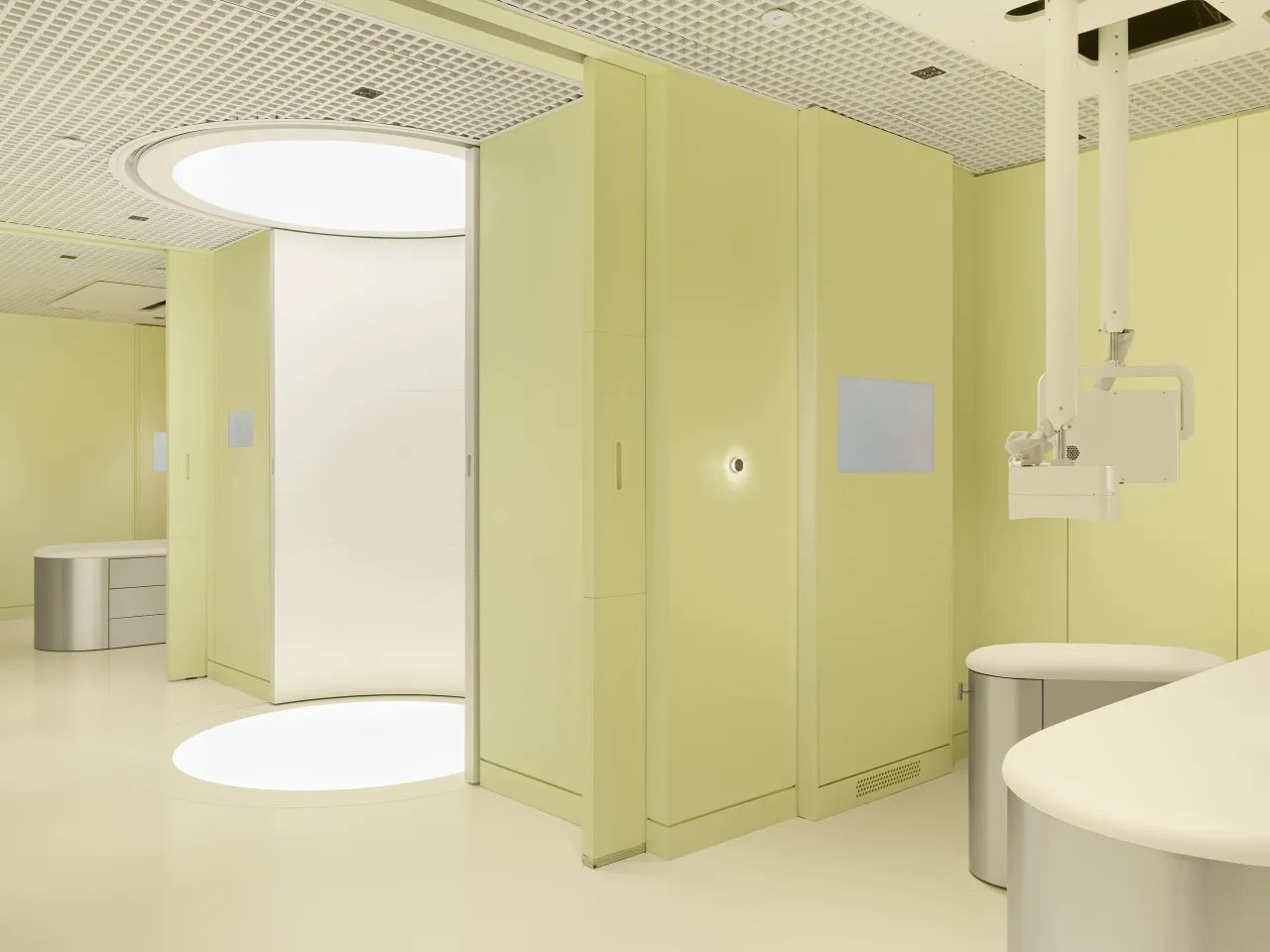
It's a brave direction to take, but it's worked a treat. By forgoing the typical Scandinavian aesthetic, the branding manages to feel contemporary yet timeless with its minimalist geometry and atmospheric colour transitions.
Framework's first location opens next month in Berry Hill, Nashville, offering a modern take on the traditional Swedish sauna experience combined with rejuvenating cold plunge pools. If the buzz around the brand is any indicator, this could be the start of contrast therapy's next wave.
Editor's Picks





Trending




Latest Jobs
Art Director at The New York Times
Full-time·New York·$120,000 – $130,000
Director, Creative Technology at Code and Theory
Full-time·New York·$160,000 – $225,000
Senior Designer at BKC
Full-time·£50,000 – £60,000
Creative Director (Social) at Known
Full-time·Los Angeles·$125 per hour
Technical Designer & Illustrator at Reuben Read
Full-time·Harlow·£30,000 – £35,000
Marketing Manager at University of Birmingham
Full-time·Birmingham·£36,636 – £46,049