The Counter Press rebrands Sir Terence Conran's swanky Bibendum restaurant
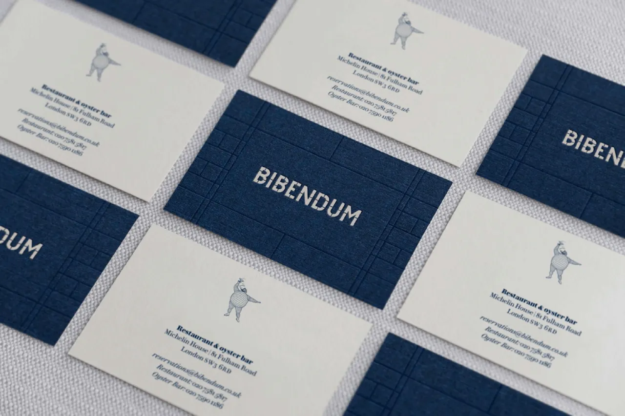
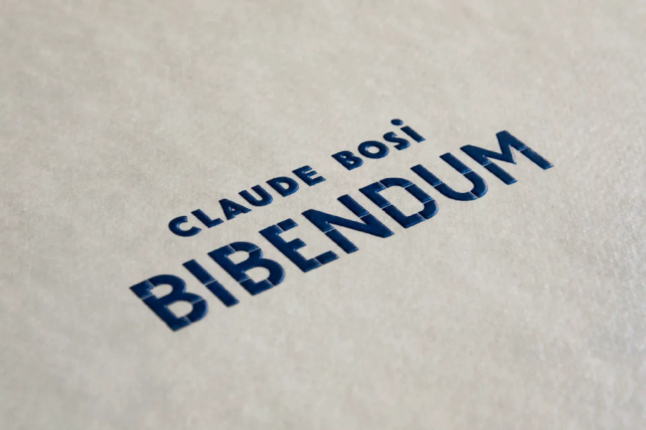
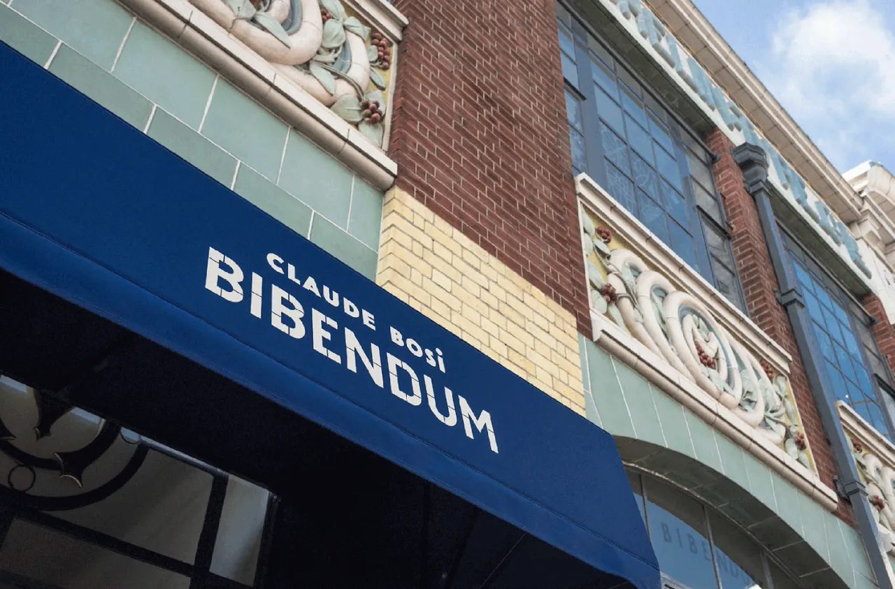
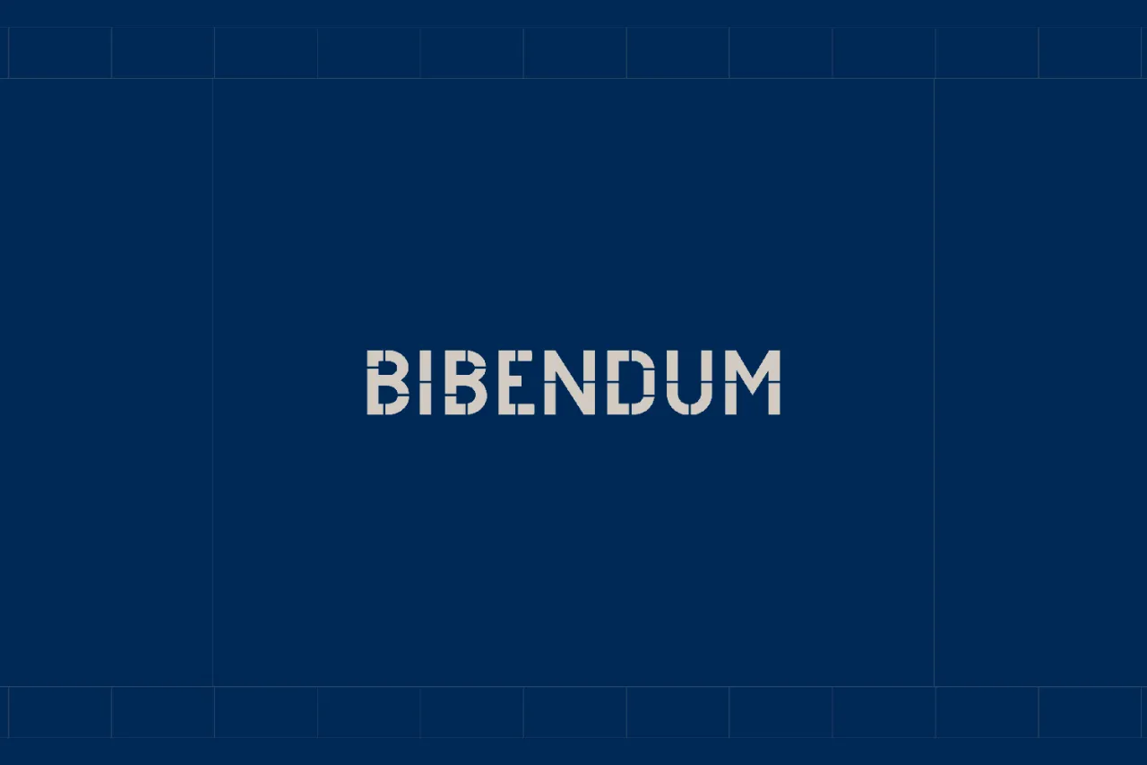
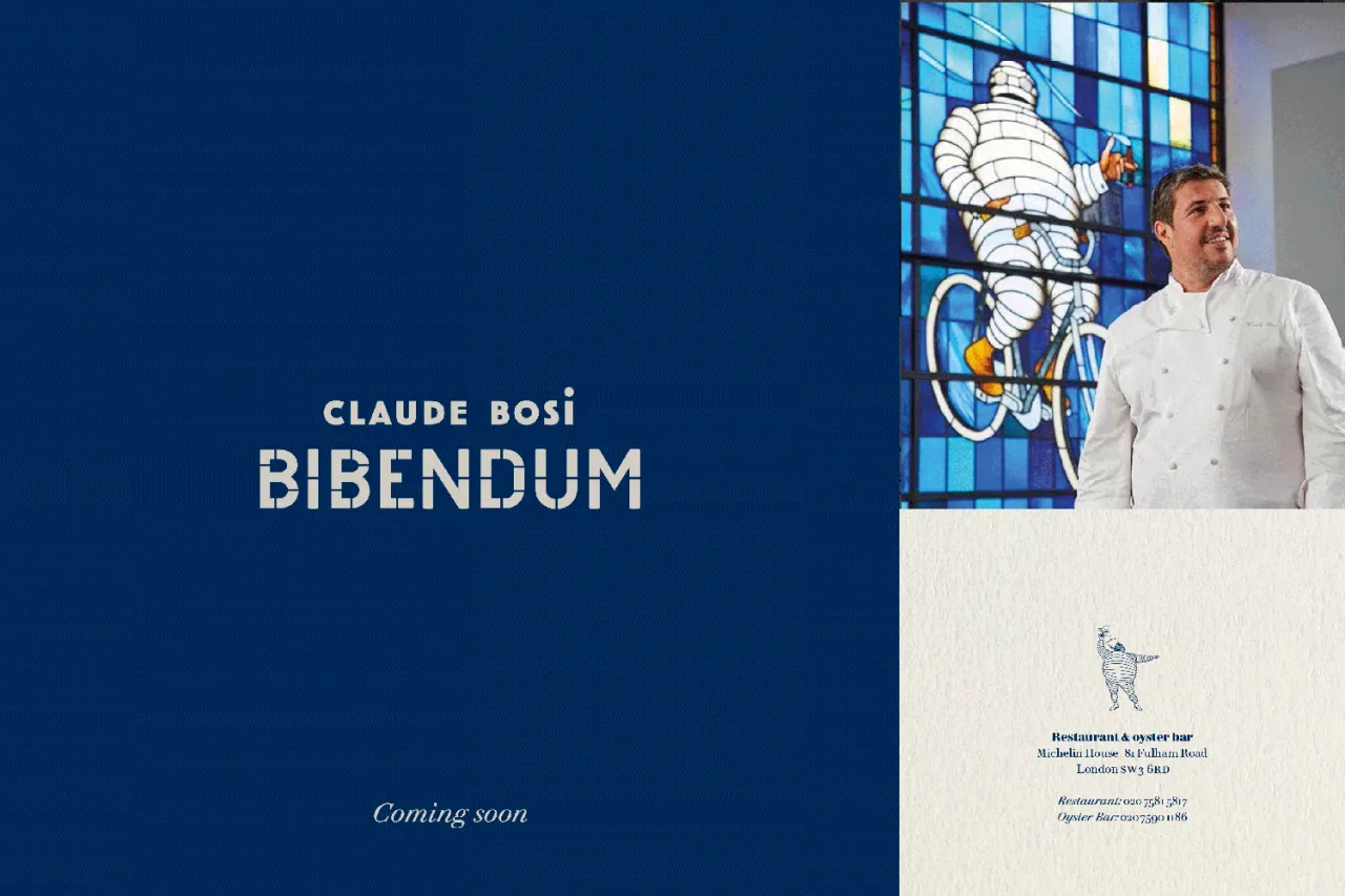
The Counter Press has rebranded iconic London restaurant Bibendum, creating a new graphic look and feel for the flagship Conran eatery that initially burst on to the scene in 1987 in the former Michelin HQ, Chelsea.
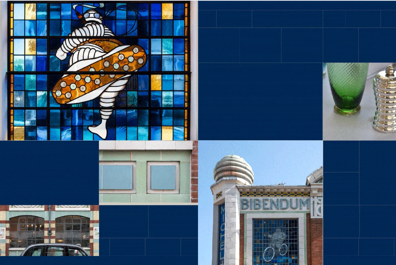
The new designs were inspired by the architecture of the 1911 François Espinasse Art Deco and Art Nouveau building, which features a range of styles and materials from complex mosaics, to ironwork, tiles, and stained glass windows.
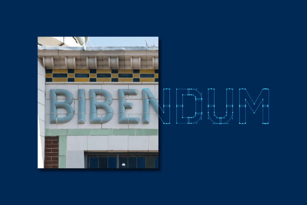
The logotype draws on the beautiful tiled lettering that sits at the top of either side of the building. "We started by tracing these 3D letterforms but then adjusted and simplified them so that they would work better as a word mark, especially at small sizes," says The Counter Press.
"It’s more of a faithful interpretation rather than a straightforward reproduction. Instead of creating a logo and turning it into new signage, we took old signage that was already there and turned it into the new logo."
The grid pattern and blue and cream colour palette used throughout the identity were inspired by the brickwork and tiles of the building, looking to harmonise with, rather than embellish, the exquisite existing details. As such, the new identity has been designed to feel like an extension of, and complement to, the building and the experience. The Michelin Man character remains as a playful supporting element within the brand.
Editor's Picks





Trending






Latest Jobs
Account Director at How&How
Full-time·London·£73k-£79k
Senior Creative Lead at Random Studio
Full-time·Amsterdam / Paris·€90k-€110k
Creative Project Manager at Analogue
Full-time·Leeds·£28k–£35k
Brand Designer at Adfin
Full-time·London·£30k–£50k
Midweight Full Stack Developer at Bureau for Visual Affairs
Full-time·London (Open to remote)·£35k–£50k
Creative Content Executive at Cognition
Full-time·Birmingham·£28k–£35k