Studio Blackburn gives Sunderland a new 'living room' with its identity for Culture House
The London studio has folded two letters, 'C' and 'H', into a house symbol for the new cultural venue, which includes a 360-degree immersive gallery and a rooftop sky garden.
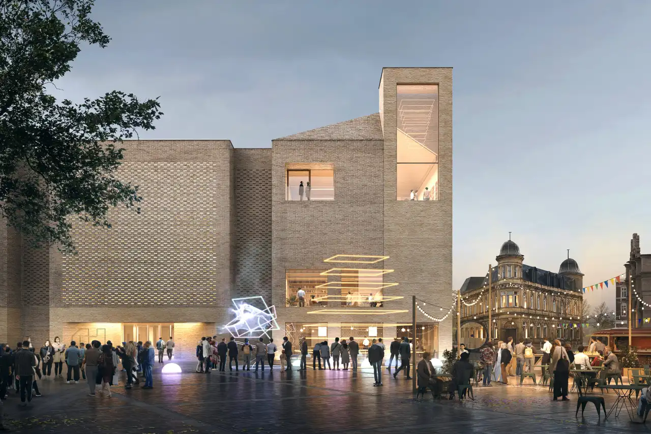
There are some good things happening up north. There always are. The latest is in Sunderland, where the city has just opened a new four-floor space for art and culture. And it's got an identity to match thanks to Studio Blackburn.
The London creative agency is a long-term partner of Sunderland City Council and was brought in to help brand the new multi-million-pound venue and library in Tyne and Wear. It's part of the Riverside Sunderland regeneration project, and it brings together art, technology, and culture all under one roof. It's also the new home of the National Centre for Creative Smart Cities.
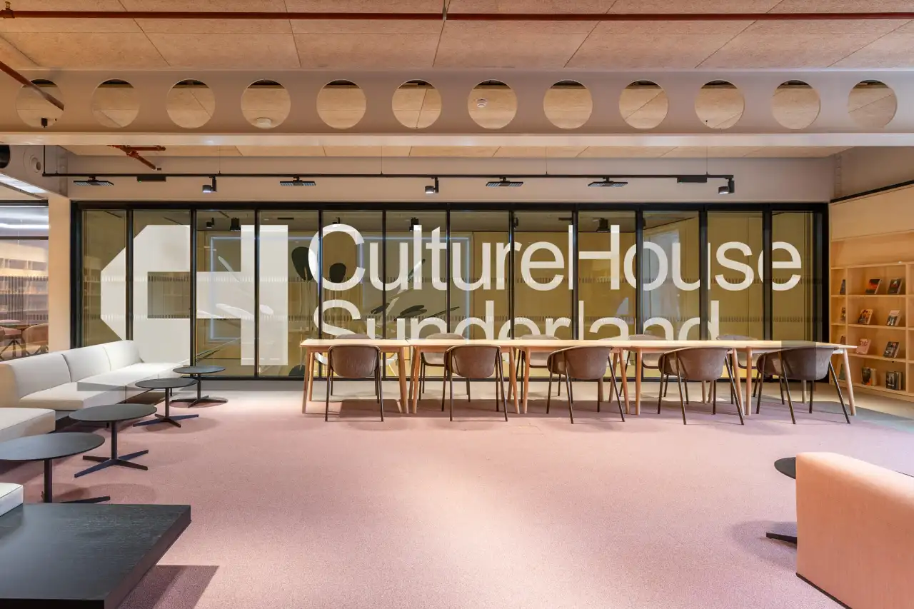
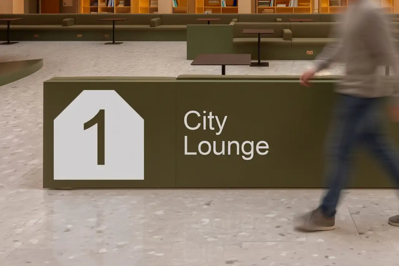
The idea behind the new hub, called Culture House Sunderland, is that it becomes a "living room" for the area. A place where locals can meet and enjoy shared experiences. "We wanted to create a space where everyone feels welcome and where people can find something that interests and inspires them," says Leanne Littlewood, director of Culture House and head of culture at Sunderland City Council.
I have a soft spot for Sunderland. My grandparents are from Durham, and my grandpa, John Robson, passionately supported Sunderland FC. He was a journalist at the North-Eastern Daily Gazette, and his father was an editor, I believe. You could say the trade runs in the family. My mother says he was the only man in the street to come home with clean hands, given much of Durham's industry was coal mining. In fact, when I smell coal I'm always whisked back to their old terraced house.
Back to the story. Sunderland once had the largest shipbuilding port in the world in the 19th century, and a proud history of many other industries: salt, glassmaking, you name it. Like many post-industrial areas, it's had its fair share of ups and downs. A new venue that contains an immersion gallery, green screen studio, rooftop sky garden, podcast studios, and children's play zones is very good news for Wearsiders.
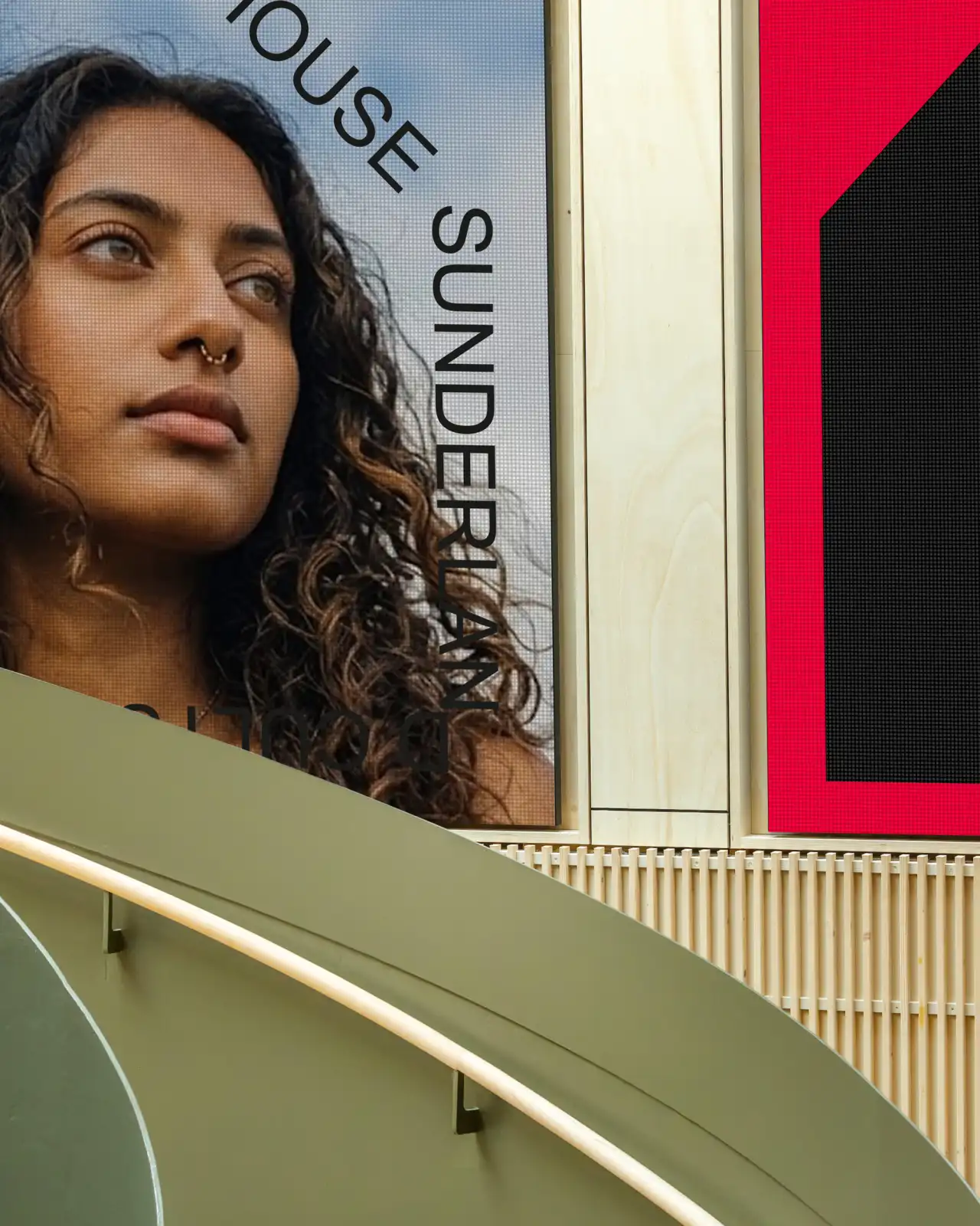
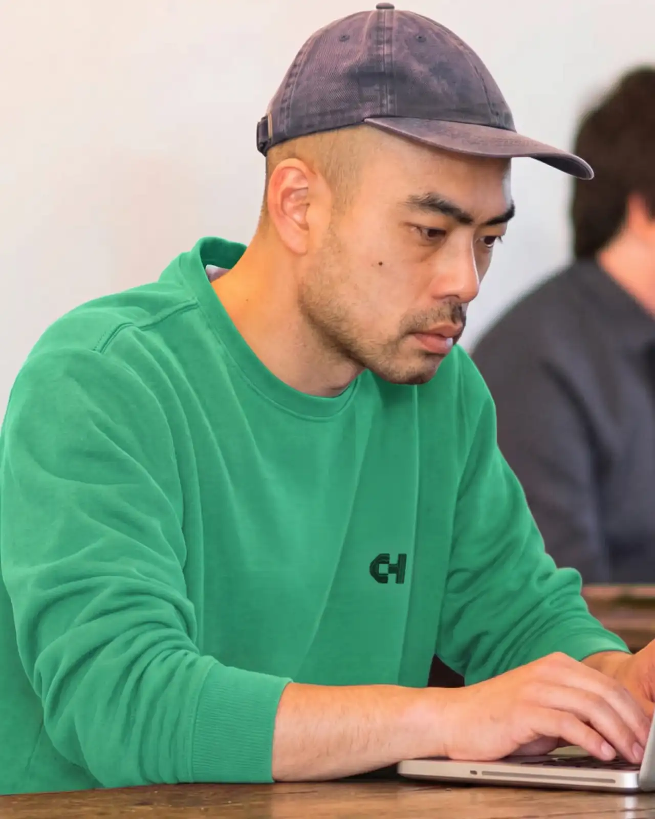
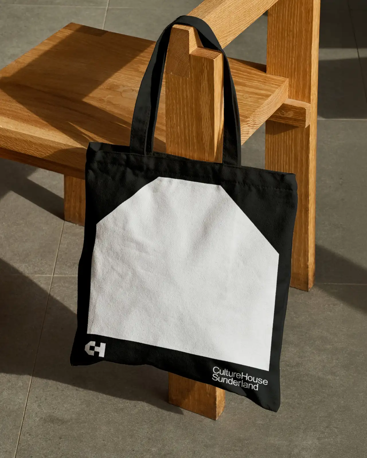
"This critical new public space belongs to the people of Sunderland," says Paul Blackburn, founder of Studio Blackburn, "so it was important that its identity not only reflected the energy and character of the city, but created inclusive, aspirational and stimulating experiences for everyone that interacts with it."
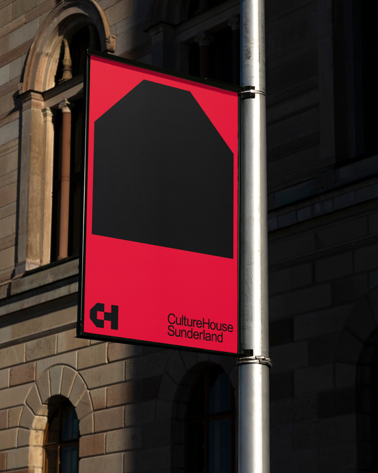
So how do you turn a "living room" into a logo? Studio Blackburn started with the initials. The 'C' and 'H' initials anchor the logo system and work individually or as a lock-up within the wordmark to form a house symbol. That house shape is also used as a solid form to frame imagery, guide animated type, and structure a modular wayfinding system for the building.
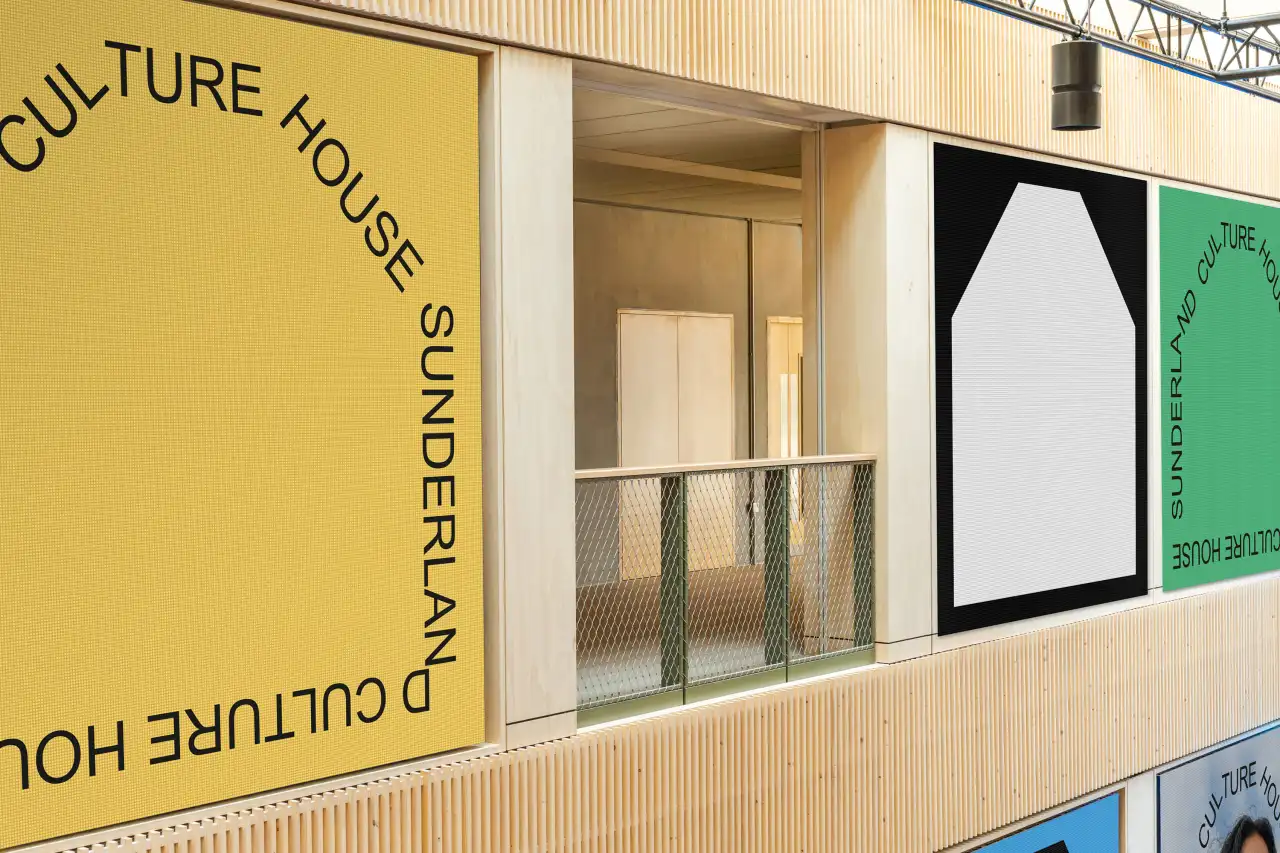
The colour palette matches the building's architecture and material choices, providing a set of hues that feel at home with the space. We're talking yellow, red, blue, and green, all backed by a monochrome framework.
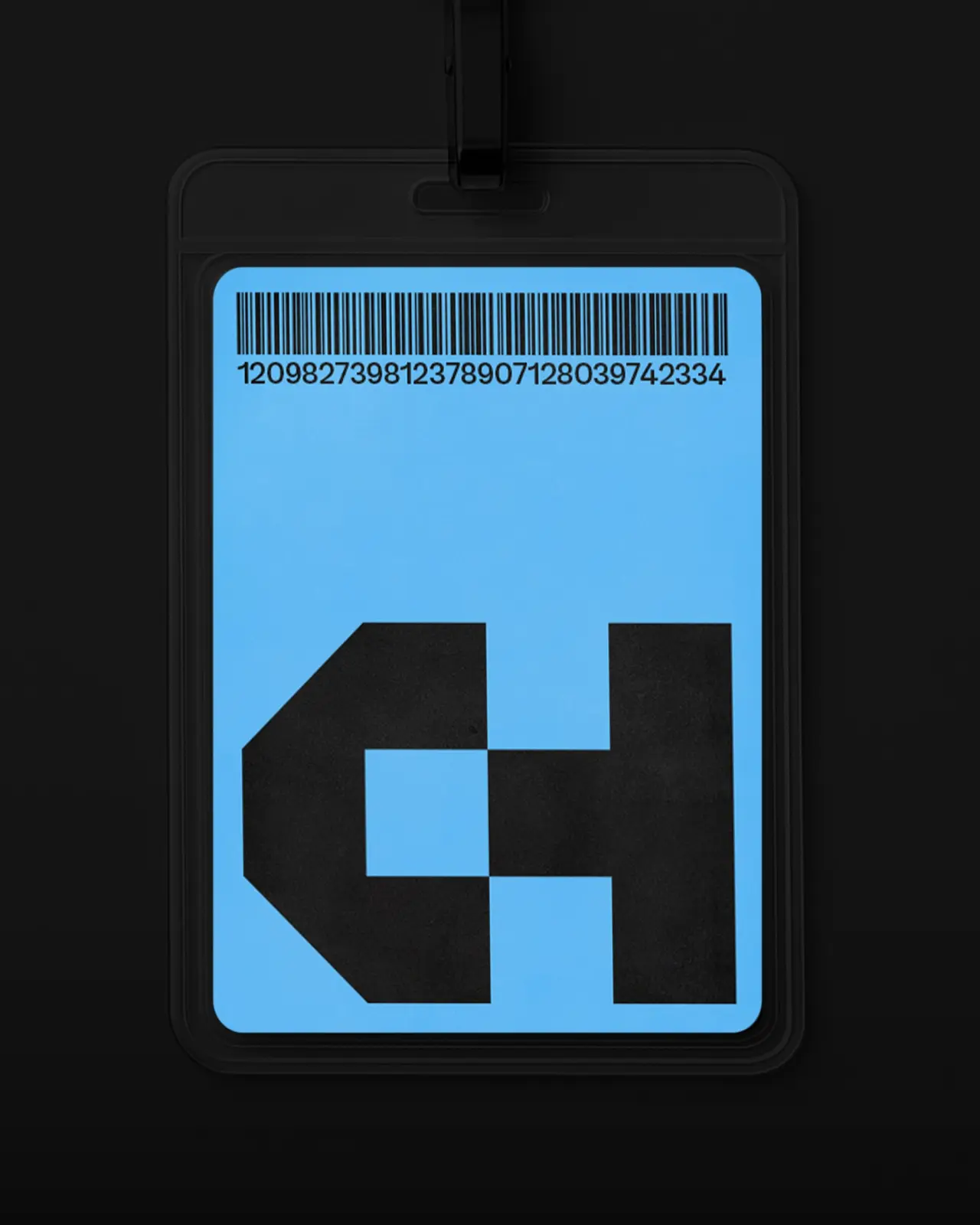
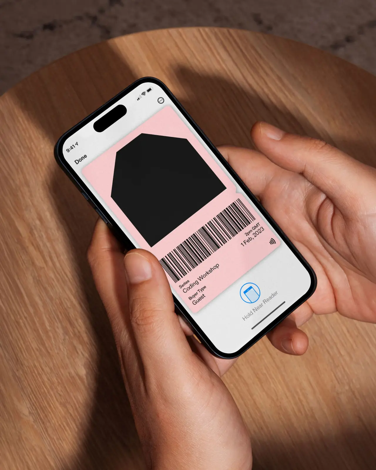
Accompanying photography and animation help to ground the identity in its community, and Studio Blackburn applies the house shape as a recurring frame across the website, socials, print, and signage.
I love the way the typography moves to show the outline of a house. It's such a simple feature but one that instantly makes me feel at home. I like how the logo locks together, too – releasing to show the 'C' and 'H' initials of Culture House.
Tone of voice, finally, is "insightful and accessible" to inspire creativity and culture in visitors. It feels homely and welcoming, just as the space hopes to be.
Editor's Picks





Trending




Latest Jobs
Art Director at The New York Times
Full-time·New York·$120k–$130k
Growth and Client Development Director at 3800
Part-time·Sheffield·£60k-80k
Midweight Designer at Catalyst Creative
Full-time·London·£32k-£36k
Creative Director at Koto
Full-time·London·£95k-£130k
Client Director at Koto
Full-time·Berlin·€70k-€85k
eCommerce Web Designer at on/Sight
Full-time·$75k–$95k