From Creative Boom's Instagram to a full rebrand: How Davy Denduyver met A Human Agency
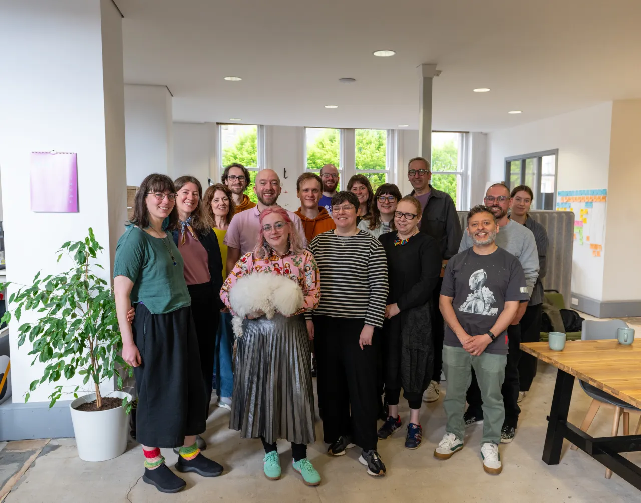
Founder Ryan Claydon was scrolling through one of our regular Instagram posts when he noticed the designer's work. He approached Davy Denduyver to refresh his agency's identity, just in time for its fifth birthday.
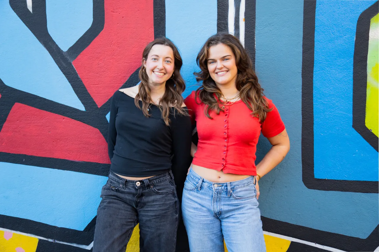
Around 18 months ago, I gave Creative Boom's Instagram a serious refresh. I treated it like a magazine and created a handful of regular series to fulfil our original mission: championing artists and designers.
One of those regulars is Ten Under 10K. The idea is simple. We pick 10 creatives with fewer than 10,000 followers and give them a spotlight. People then comment and nominate themselves or a friend for next time.
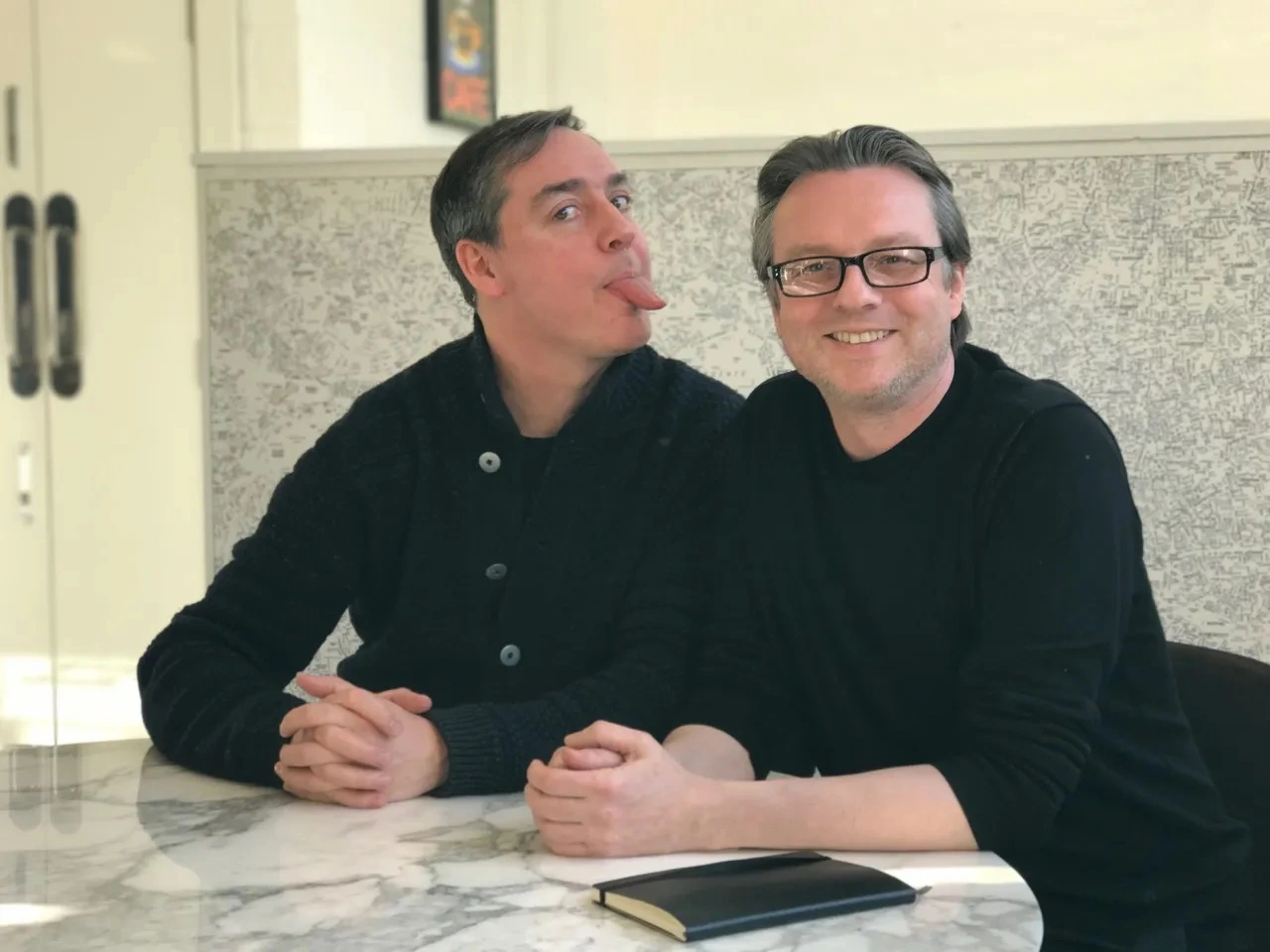
One week, Belgian graphic designer Davy Denduyver was featured, and we hoped it would help. We didn't expect an email a few months later saying it led to work. That email came from Ryan Claydon, founder and agent at illustration agency A Human Agency, who had spotted Davy in the post and hired him to create a new identity for AHA as it turns five.
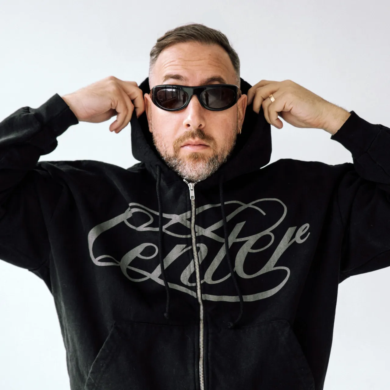
"Davy's work has a tactility to it, and I was initially hooked by his identity for the Barcelona-based restaurant Mina," Ryan tells Creative Boom. "When I saw how he combined hand-drawn elements with typography, I knew he was the right person for the job. During our call, we were joking around as much as discussing the new identity; we both have an anarchic sense of humour, which I value a lot in a partnership."
I'm sensing a lot of "human" at play here. A nice bit of reassurance for anyone freaking out that people don't matter any more in the age of AI. I've always said business is about people and nothing has changed. So hearing Davy remembers that initial chat the same way is wholesome: "Ryan and I instantly clicked," he says. "I think we talked about the brief, less than just chatting, which is what I liked the most. Ryan really liked much of the work I'd done before, and it was clear what brought him to reach out. The project felt right up my alley from the start, and the smooth-sailing process reflects that."
Found, not followed
Davy marks nine months of working fully independently this month. Being discovered on Instagram says a lot about how designers can still find work. "It's always cool to see that those things do actually land you clients and connections with really cool people," he says. "I know the industry is at a weird place right now, but when it comes to getting work, I can't complain. I think the consistency and dedication it takes to do this is why it's working out. There's no marketing strategy behind what I do. I aim to make good work, and then I share it. Gladly, the right people still find me without having to be a content creator in addition to a designer."
This is why I run the series. It helps busy creatives to get noticed. We know those we spotlight will get more followers. Some message us afterwards to thank us, saying how it resulted in more than 1,000 new fans. Wow. But we never expect it'll lead to work. We hope it will. That's the dream.
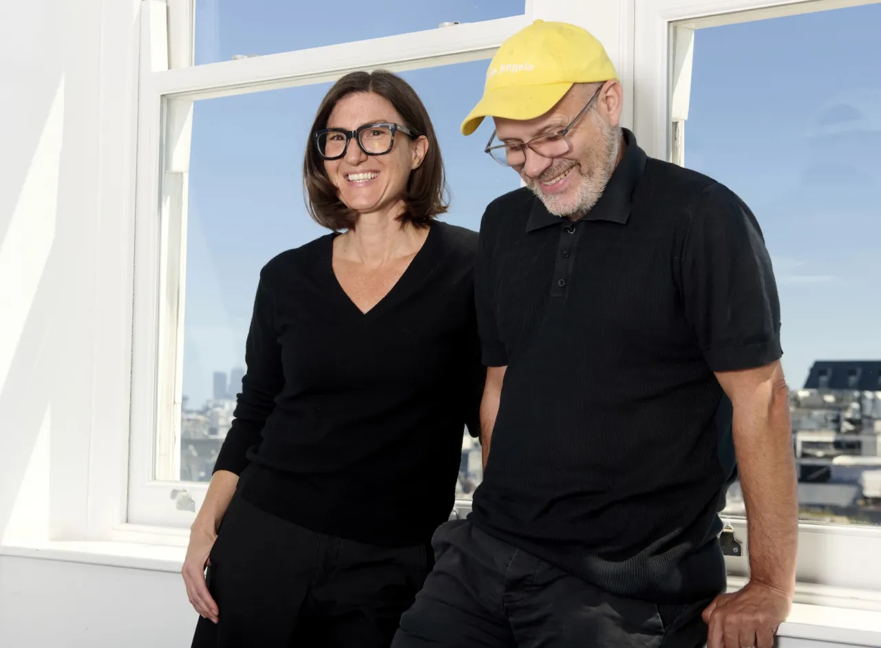
As an agent, Ryan himself usually sits between artist and client. Being the client for once let him practise what he preaches. "I didn't want to be another 'I'll know it when I see it' client, as I know from 15 years of experience how frustrating that can be," he says. "I gave Davy a very clear brief outlining what I needed, but gave him a lot of creative freedom. We only had two minor changes throughout the entire project."
A clever name
AHA's new look builds on its name. And no, it's not brand new given all that's happening. It's been around for a while. It's just grown more meaningful over time. Ryan chose it in 2020.
"I was going through a redundancy process at my previous agency," he recalls. "Human connection and personal agency were at an all-time low, and I wanted A Human Agency to be a place where illustrators are championed for how they think and their perspective on the world, not just their creative output and the end product – although that is very important."
"Recently, though, I see the name as a pushback against the rise of AI slop within the creative industries and a way to connect with clients that seek human voices and authenticity of authorship."
Is this why Ryan wanted a new identity now? "A Human Agency turns five in January, and it seemed like a good time for a change of direction," he says. "I'm very glad I chose the name in 2020! Davy's identity is wonderfully imperfect, just as I wanted it to be: it has a folk, crafted feel, it's weird and unexpected, and it's tangled and surprising. Something that AI will hopefully struggle to replicate."
Stamped by hand
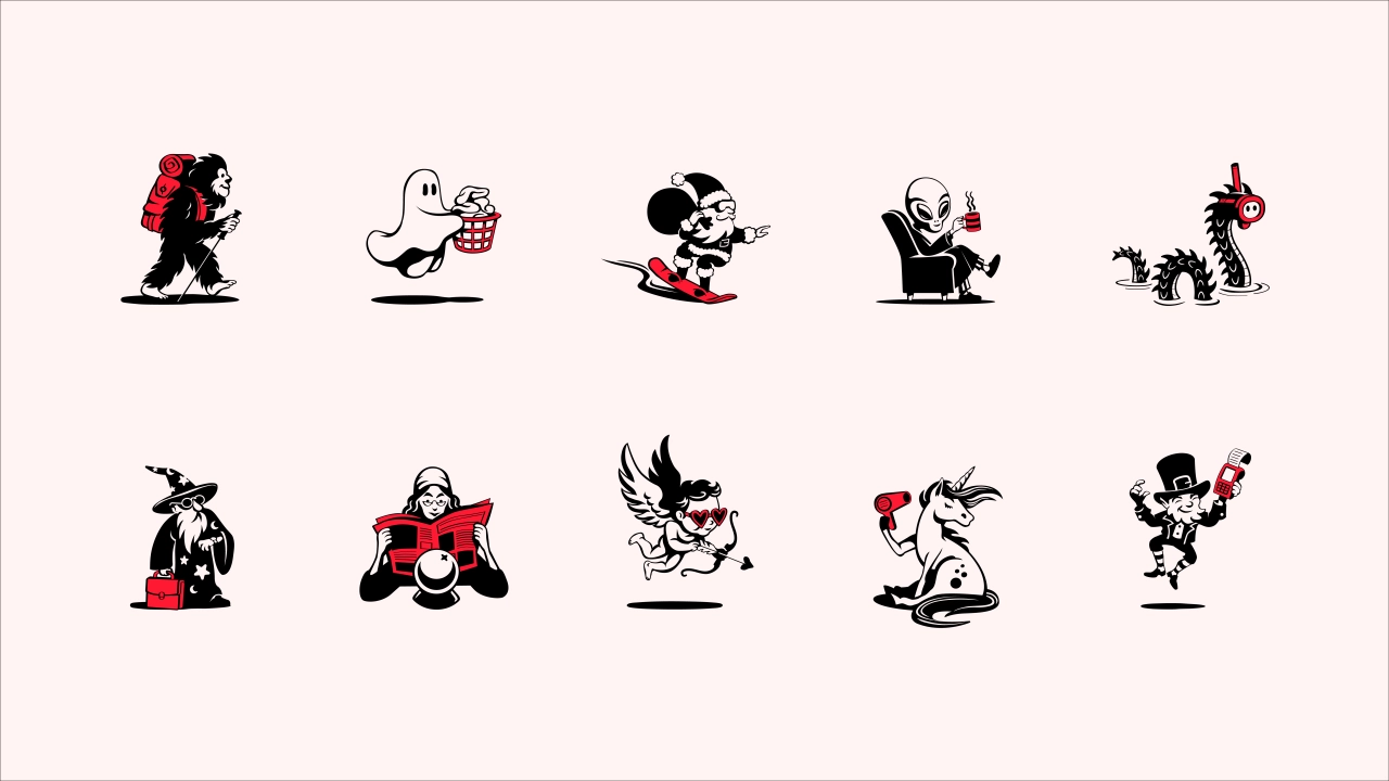
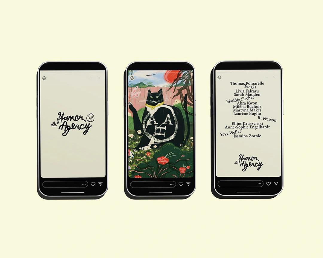
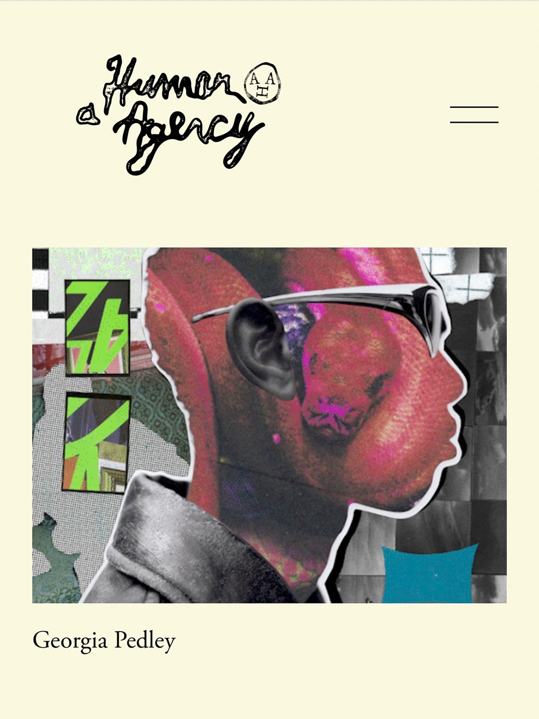
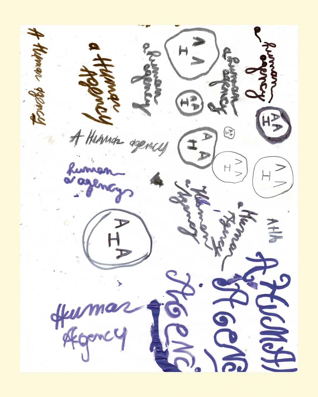
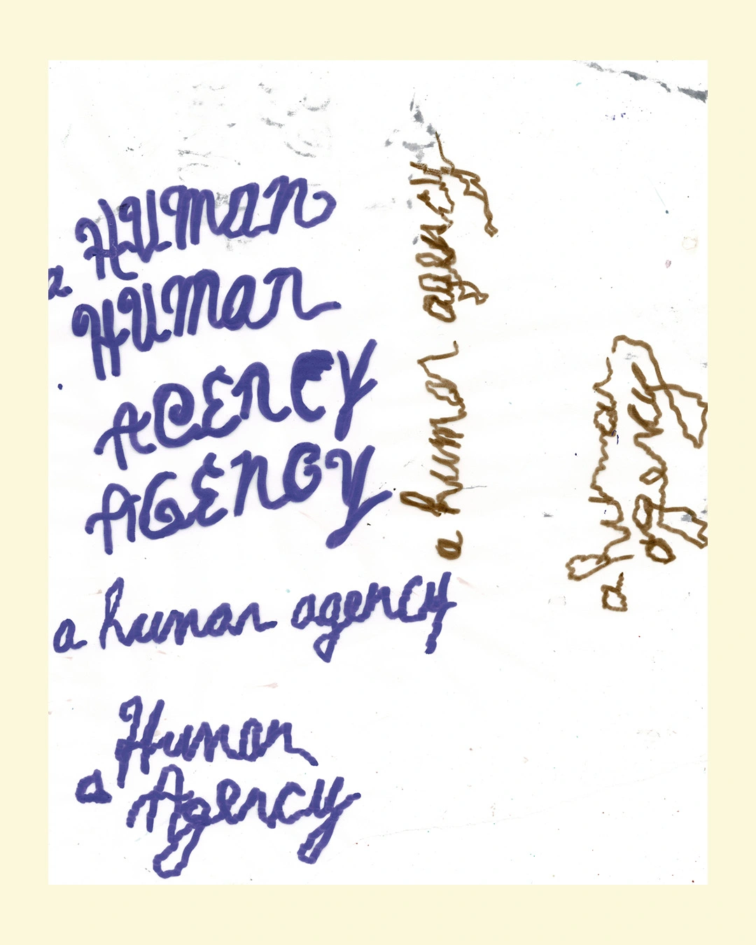
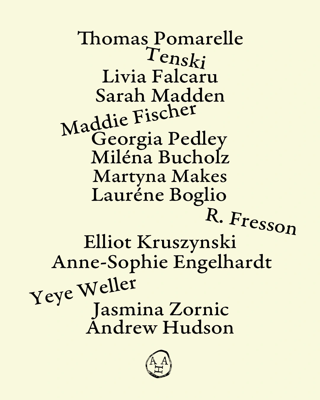
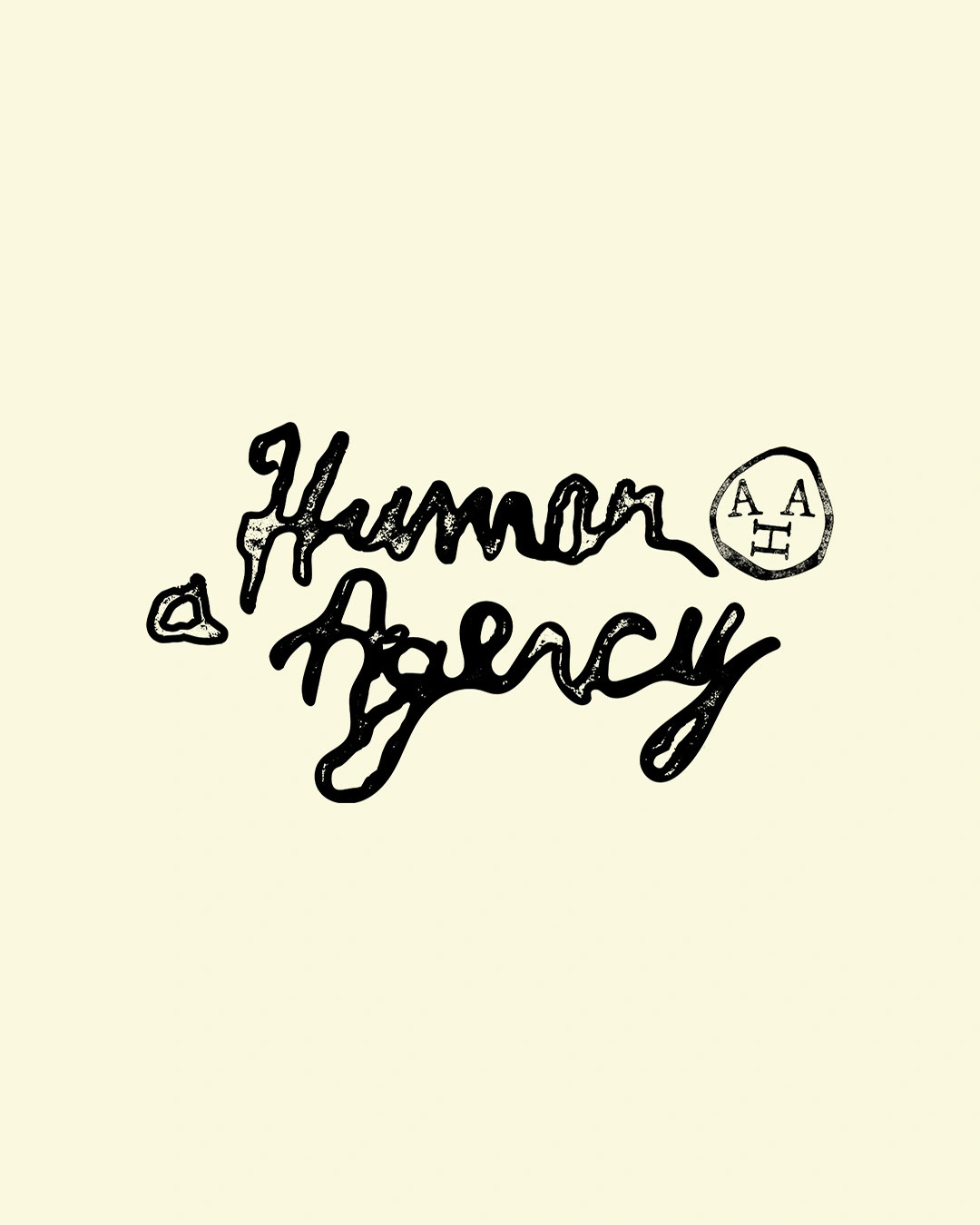
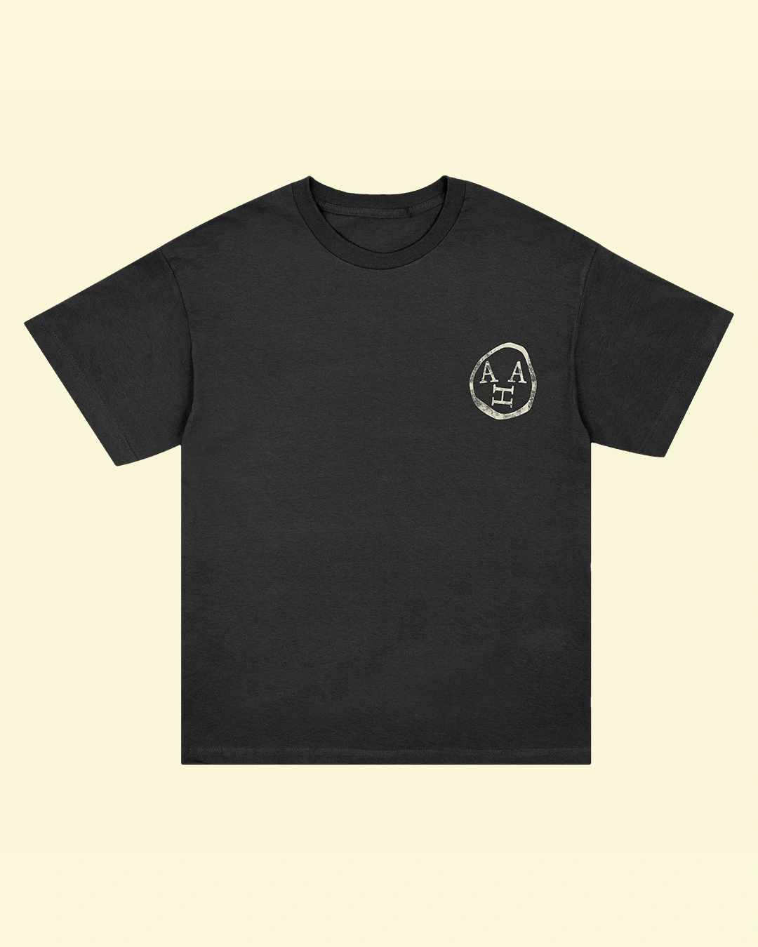
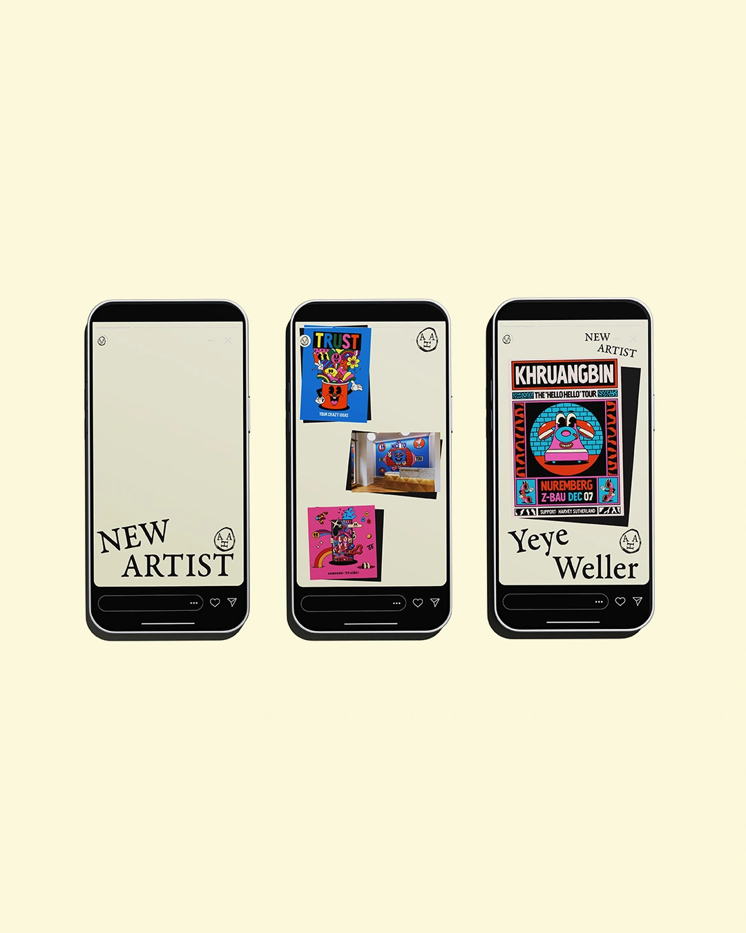
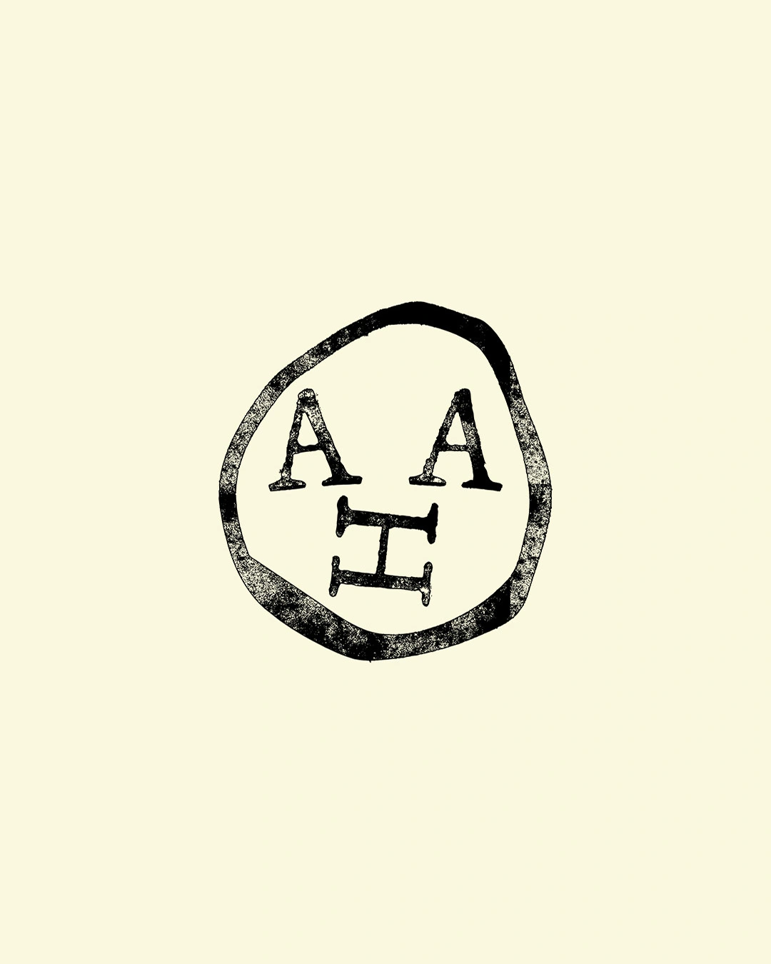
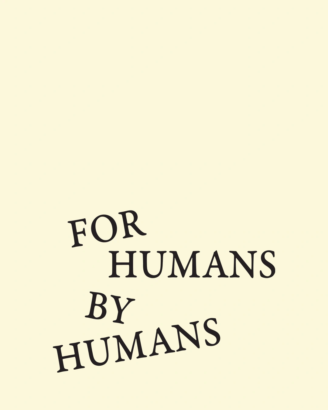
Illustration was ruled out early so the identity wouldn't clash with AHA's 14 artists. Instead, Davy created a hand-drawn wordmark and emblem, set on a soft cream-and-black palette, with serif type that tilts to add to the "human" effect.
"Both the wordmark and symbol are done by hand and are made to resemble stamps," says Davy. "I thought AHA was almost a museum, something that supports the work rather than hijacking it. The identity acts like a pedestal for the artwork."
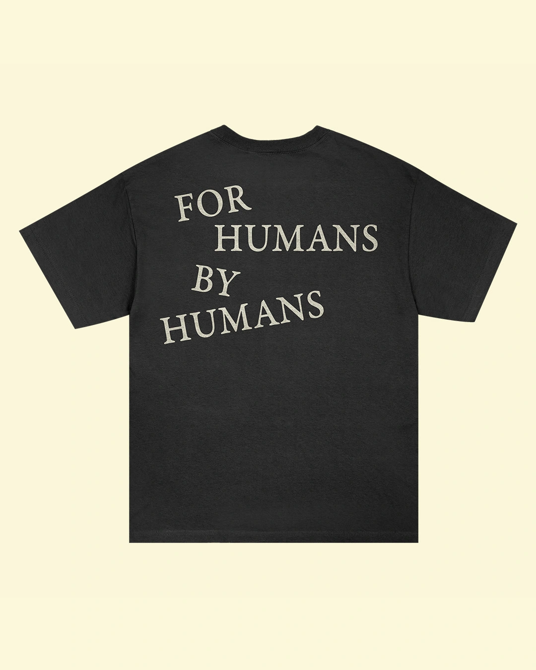
The brand motto, 'For Humans. By Humans.', runs across business cards, totes, caps, T-shirts and even packing tape.
Davy doesn't use AI at all. "I believe the process, experimentation, conversation and embracing imperfections is what makes design a beautiful field to work in," he says. "There's no prompt that can copy that."
As for what's next, Davy celebrates a decade in practice next year and wants to work with more international musicians. Ryan, meanwhile, plans to focus on charitable uses of illustration and on mentoring. "If the next five years are as good as the first five, then I'll be very happy," he says.
Editor's Picks


Trending
Latest Jobs
Assistant Producer at FABRIC
Part-time·Birmingham·£27,935 pro rata
Senior Social Media Manager at Whitney Museum of American Art
Full-time·New York·$95,000 – $100,000
Associate Director of Experience Design at California Academy of Sciences
Full-time·San Francisco·$150,000 – $165,000
Associate Creative Director, Events at The New York Times
Full-time·New York·$148,000 – $170,000
eCommerce Web Designer at on/Sight
Full-time·$75,000 – $95,000
Junior Account Manager at Gardiner Richardson
Full-time·Newcastle·£30,000 – £32,000