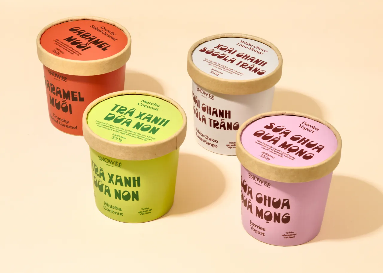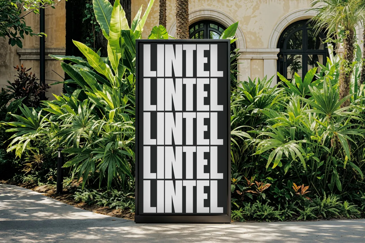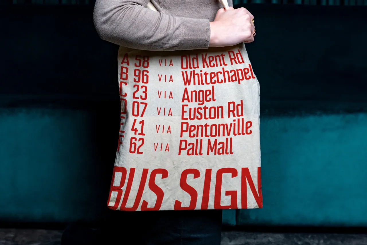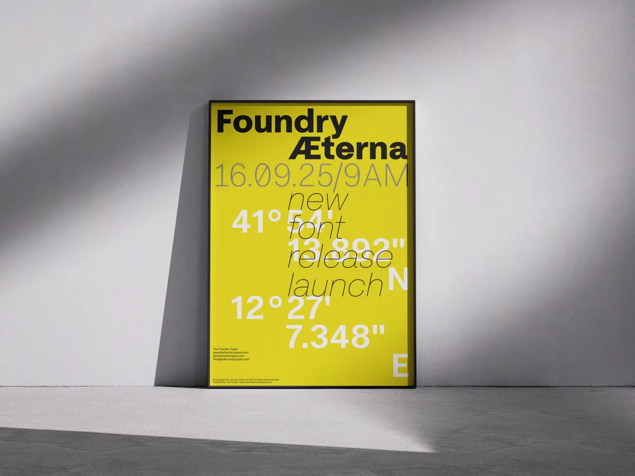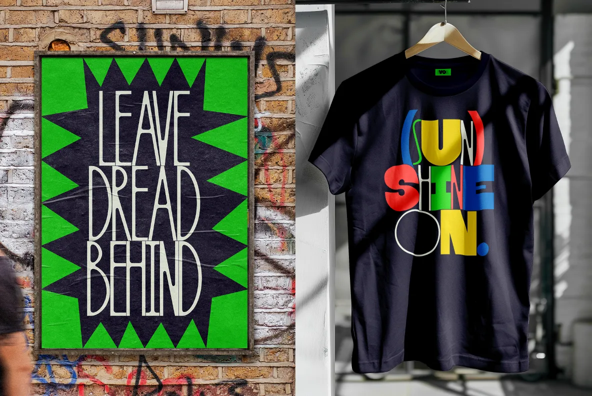
As the festive holiday season approaches, we just have time to share some of the best new typefaces for December. And boy, are they worth checking out.
This December, independent type foundries are pushing the boundaries of letterform design, offering a stunning array of typefaces that blend historical inspiration with contemporary innovation.
From playful storybook-inspired fonts to multilingual sans-serifs, this month's releases demonstrate type design's incredible versatility and creativity.
These typefaces aren't just about letters on a page; they are about storytelling, cultural connection, and visual expression. So whether you're seeking a font for branding, editorial design, or personal projects, they're well worth checking out. And if you need further inspiration, check out our roundup of the best fonts for November too.
1. Meraki
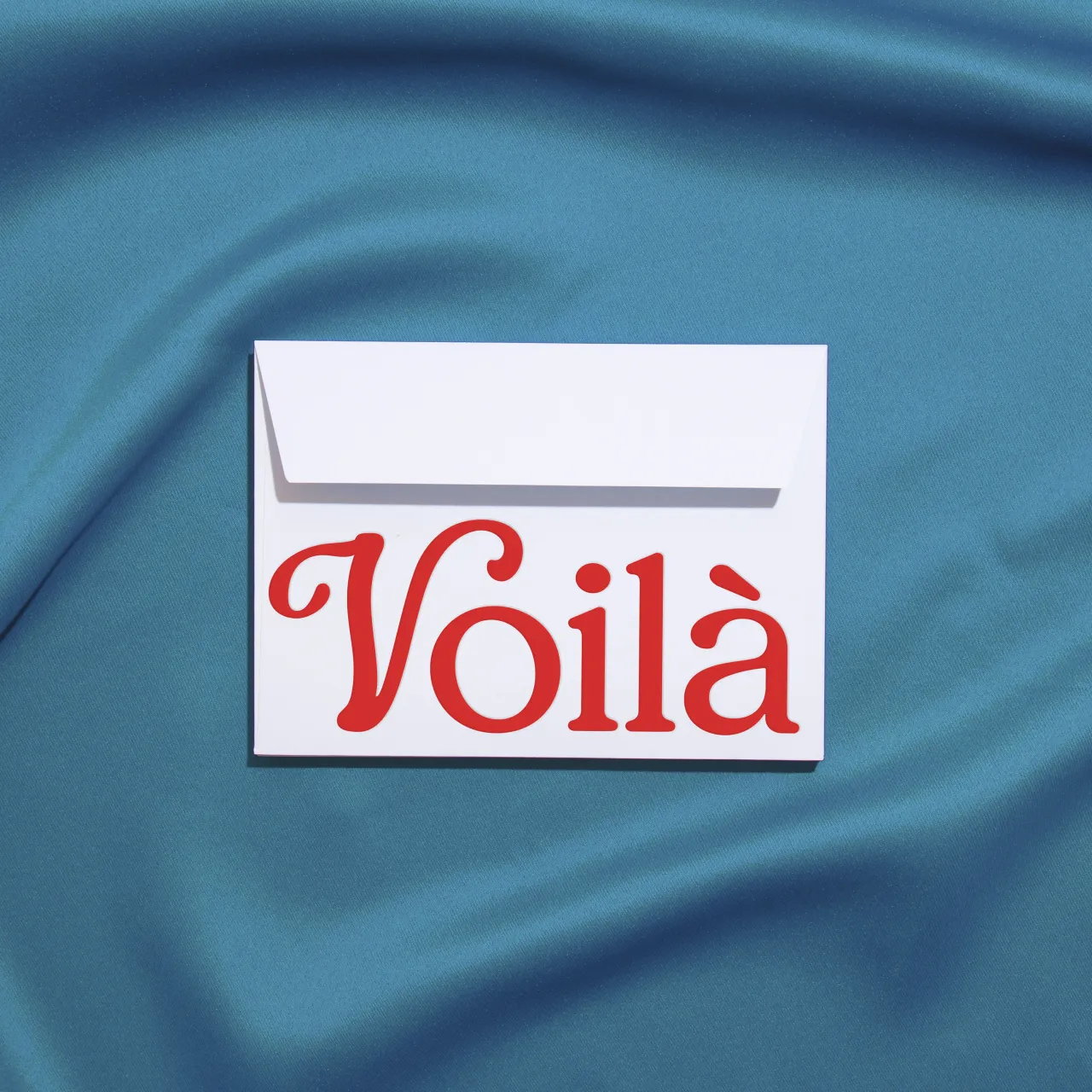
Famed New York designer Jessica Walsh only launched her new type foundry, Type of Feeling, back in August. But they've already released some superb fonts, and here's another great release to add to the collection.
Meraki was inspired by a Greek word that means doing something with creativity, love, and soul. It's been designed to be a versatile typeface that can be used as a warm, classic serif or as a more intricate, decorative option using alternate versions of the letters. It includes special uppercase letters that allow designers to embed more personality and rounded serifs into their work.
2. Otto by Dinamo
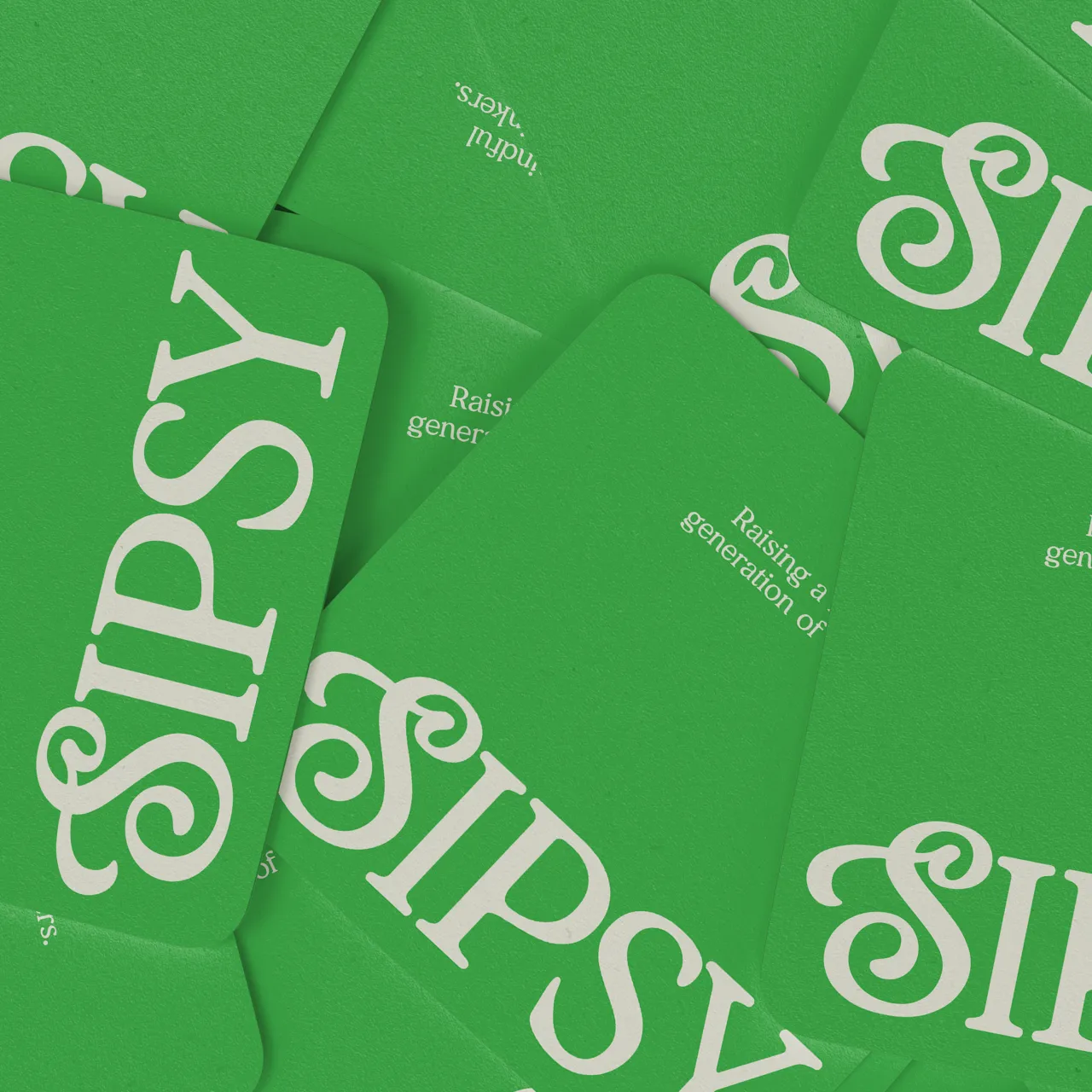
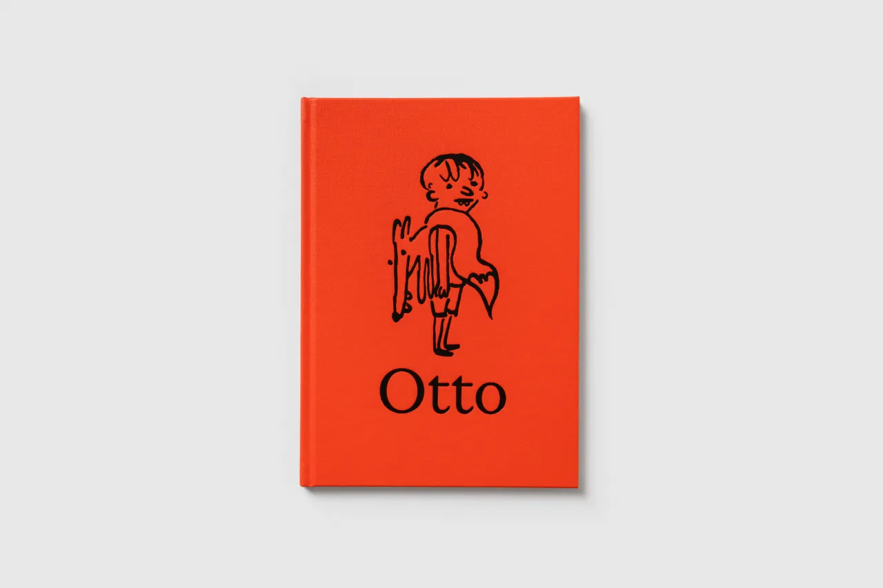
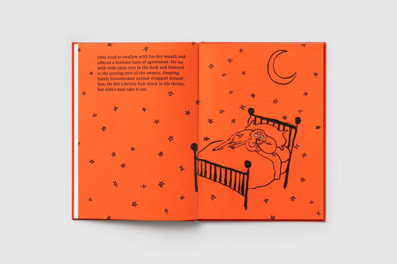
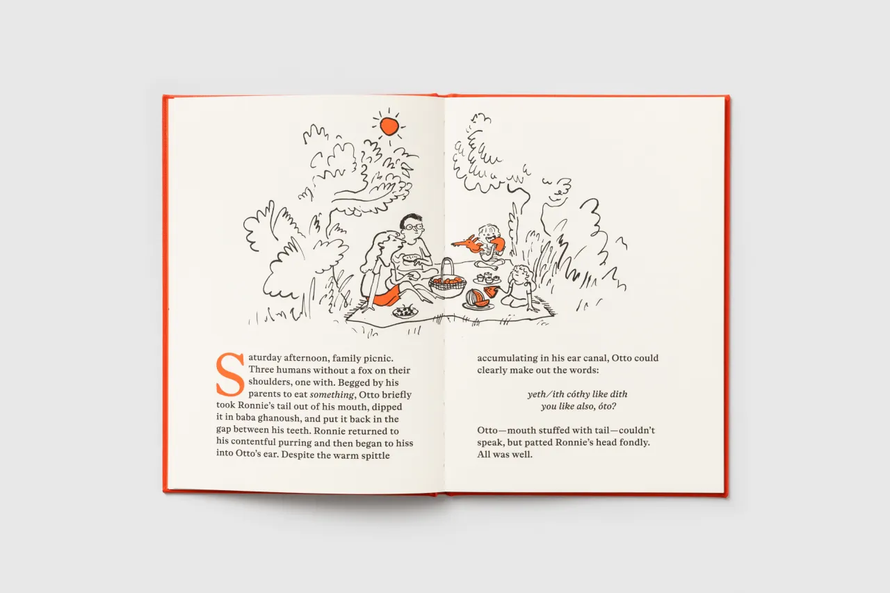
Developed by Amsterdam-based designers Sam de Groot and Laura Opsomer Mironov, Otto is a text typeface with a cheerful, subtly cartoonish presence. Inspired by the 17th-century type from Miklós Kis, the font reimagines Baroque serif traditions with a modern twist.
Available in four weights from Light to Bold, Otto features distinctive characters like impishly lopsided R, S, and & symbols. Its italics break from traditional flowery styles, offering a bubbly, understated design with a dynamic rhythm. As a delightful quirk, the typeface includes eight Dinamo pig illustrations, some drawn by the designers' children.
Accompanying the font is an actual storybook—also called Otto—written and designed by de Groot. Thus, this is perhaps the first typeface launch with its own narrative companion.
3. Sans Norm by MuirMcNeil
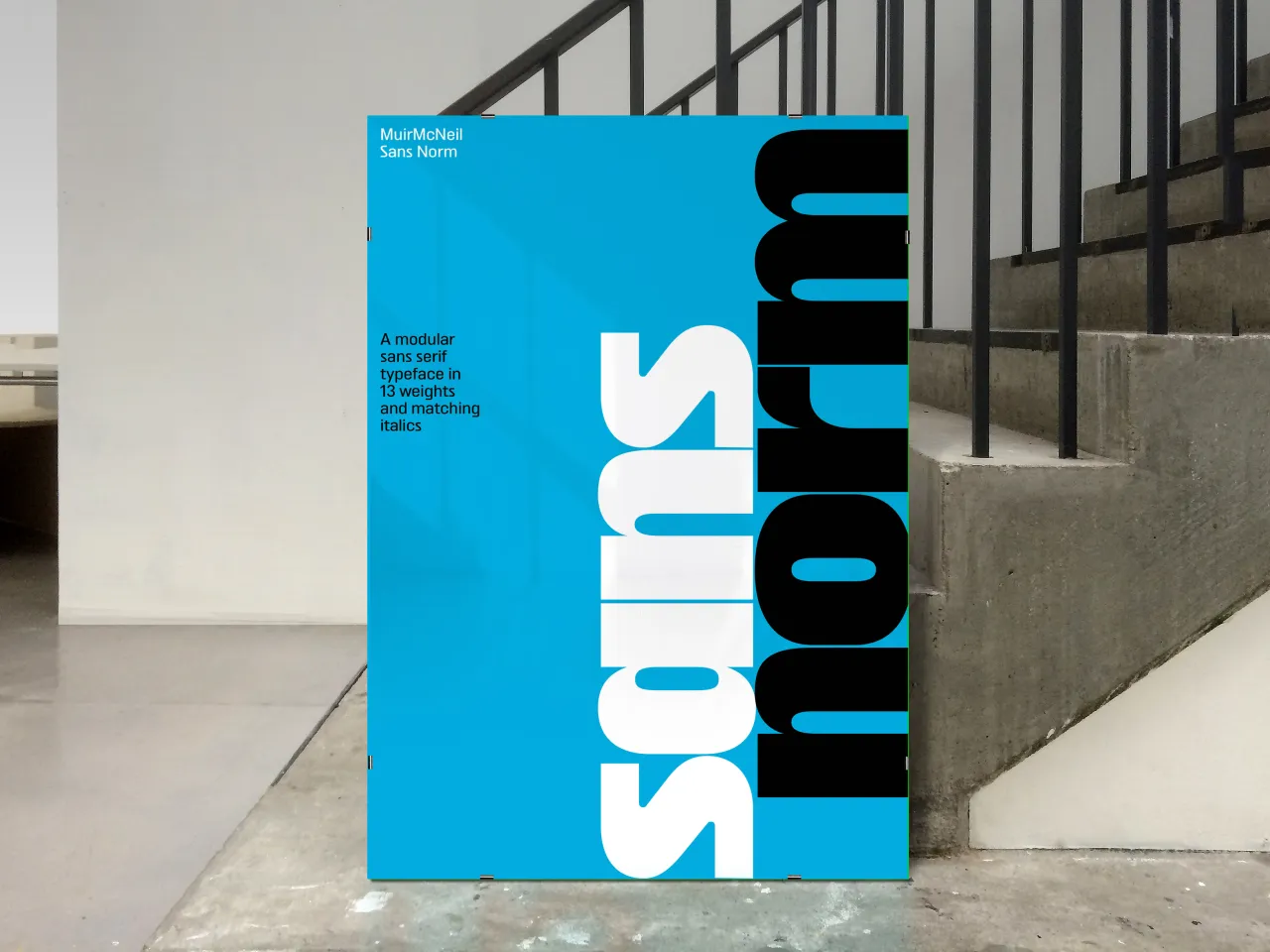
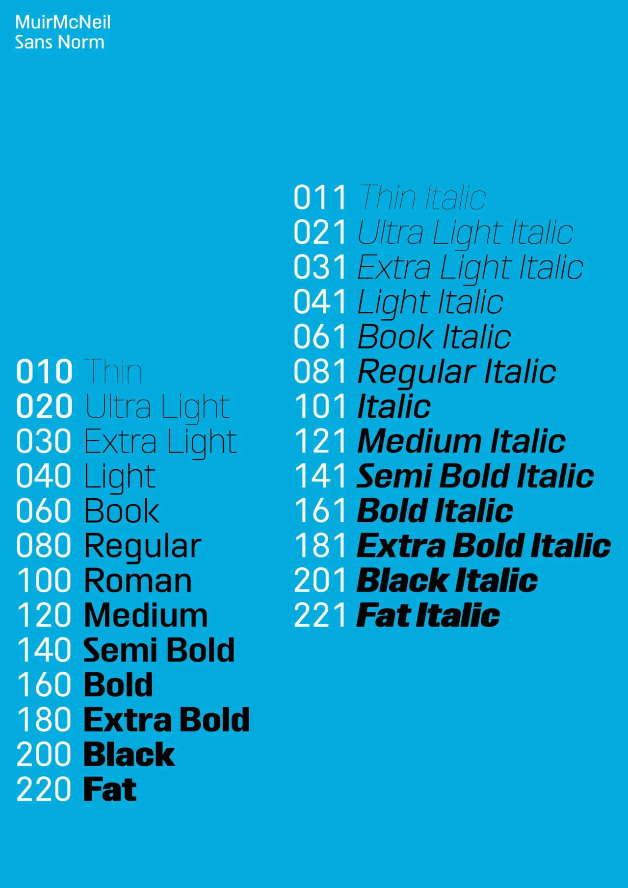
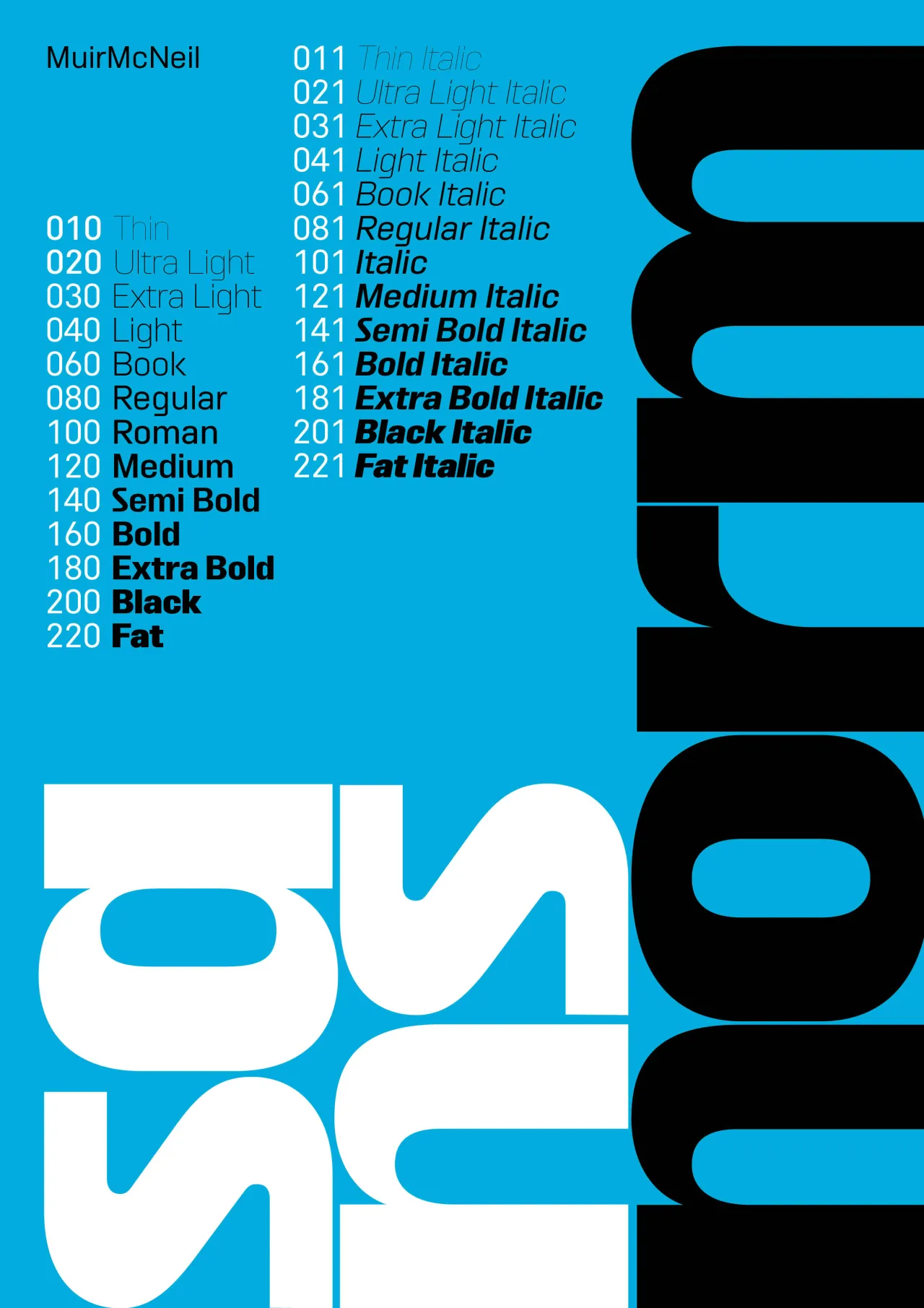
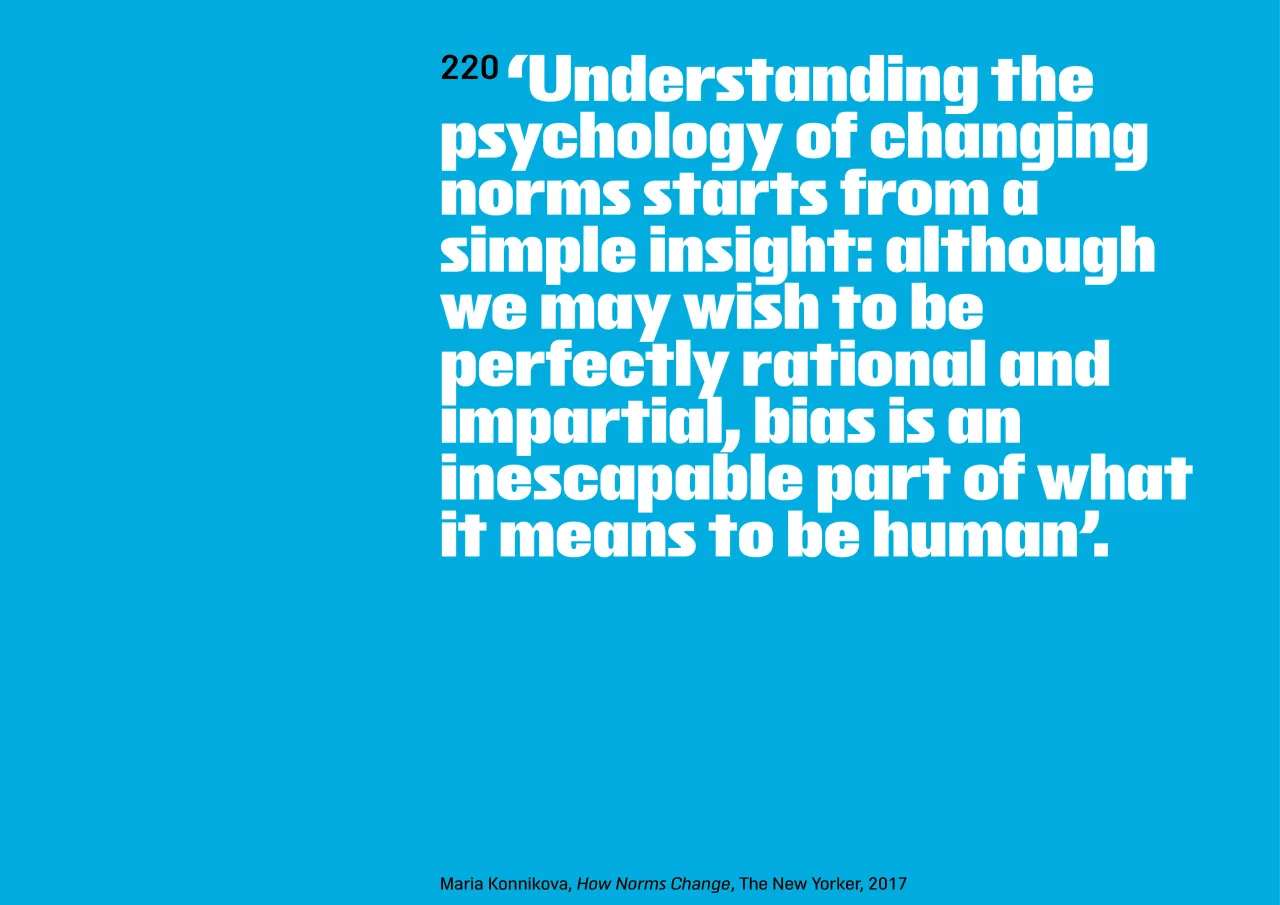
MuirMcNeil's Sans Norm is a meticulously crafted sans serif that emphasises vertical stroke rhythms. Drawing inspiration from utilitarian 20th-century geometric designs such as DIN 1451 and OCR-A, Sans Norm offers a mechanised, stripped-down aesthetic that prioritises functionality and versatility.
Constructed on a skeleton similar to MuirMcNeil Sans Sans, the typeface provides an economical and distinctive design. Available in upright and italic styles, each with 13 matching weights, Sans Norm is designed for extensive reconfiguration and adaptable use across various design contexts.
4. Nurom Next by The Northern Block
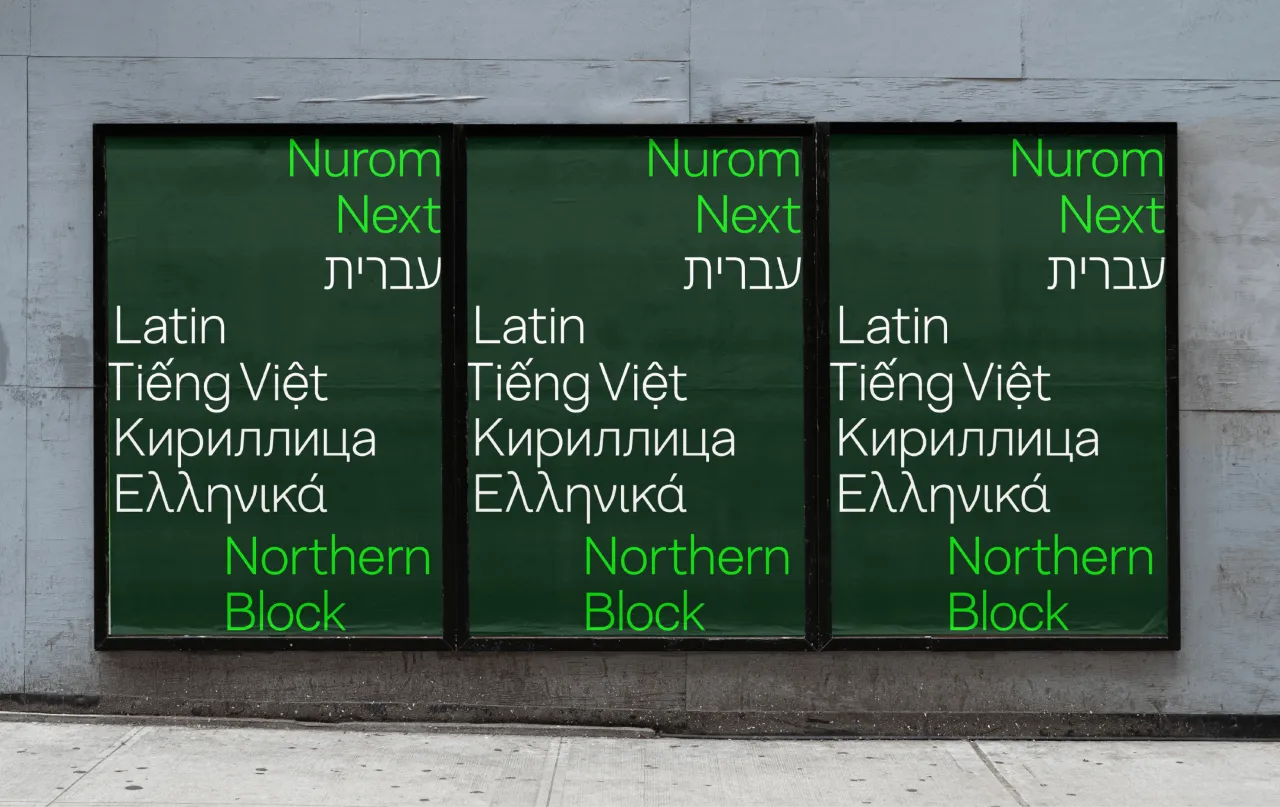
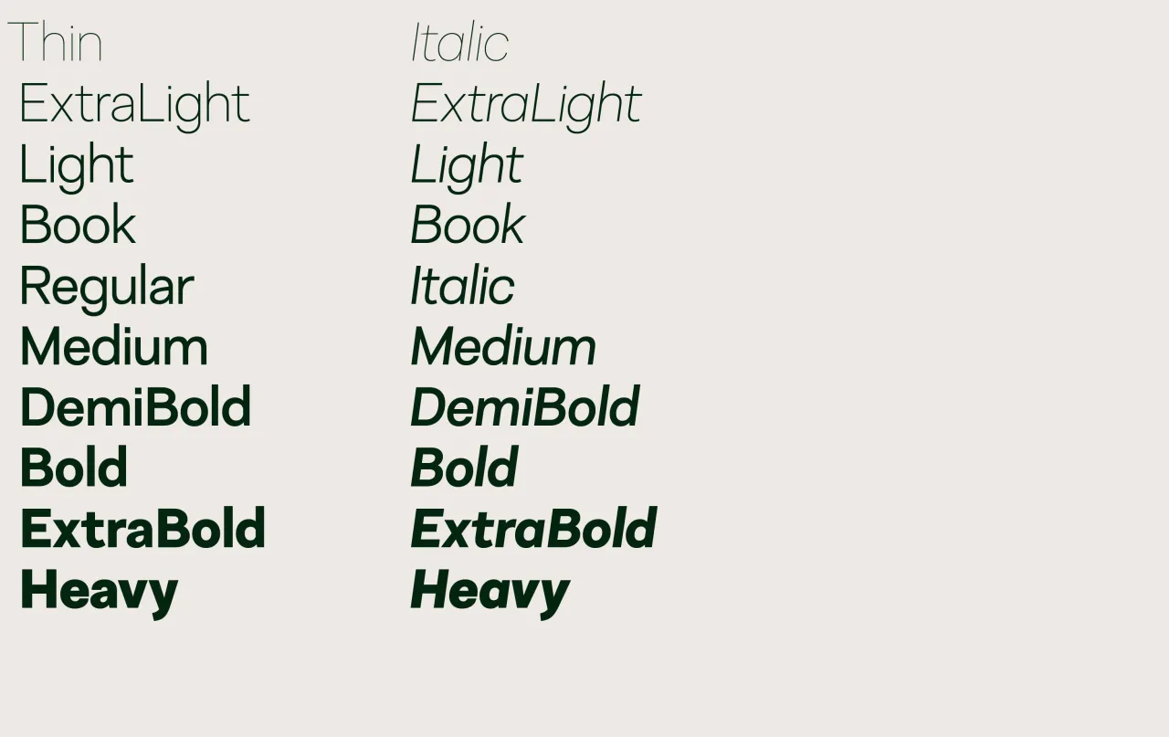
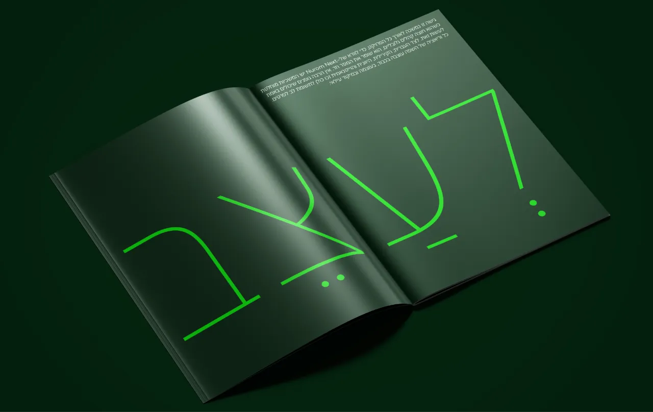
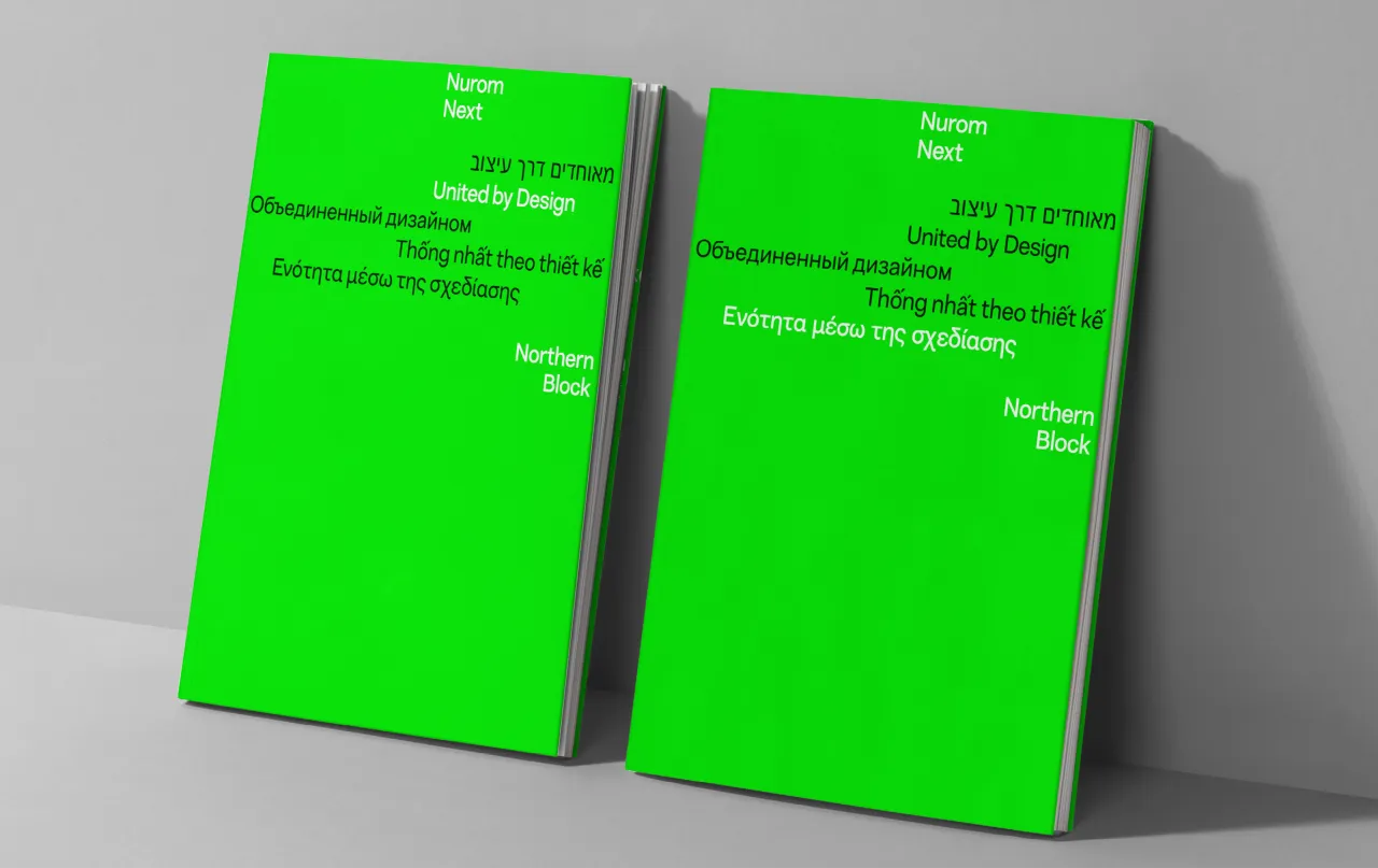
Ten years in the making, Nurom Next represents a significant evolution in multilingual typography. This contemporary sans-serif typeface goes beyond historical revival, offering a fresh personality that balances clean lines and modern aesthetics.
With extended language support, including Cyrillic, Greek, Hebrew, and Vietnamese, Nurom Next boasts over 1,000 characters and 20 weights. Its comprehensive OpenType features—including localised forms, scientific notation, and discretionary ligatures—make it an incredibly versatile font for global design projects.
5. Aconchego by Fabio Haag Type
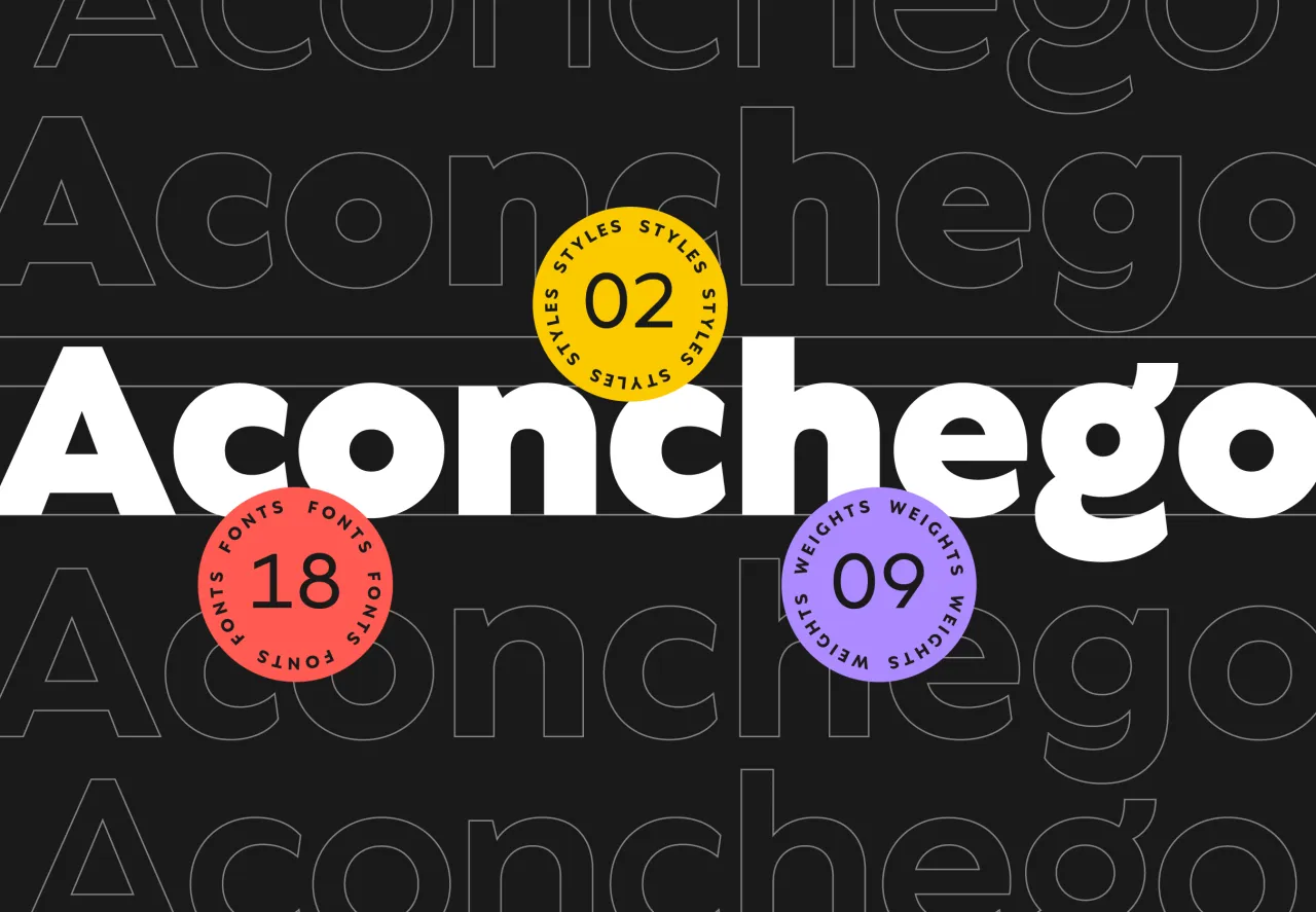
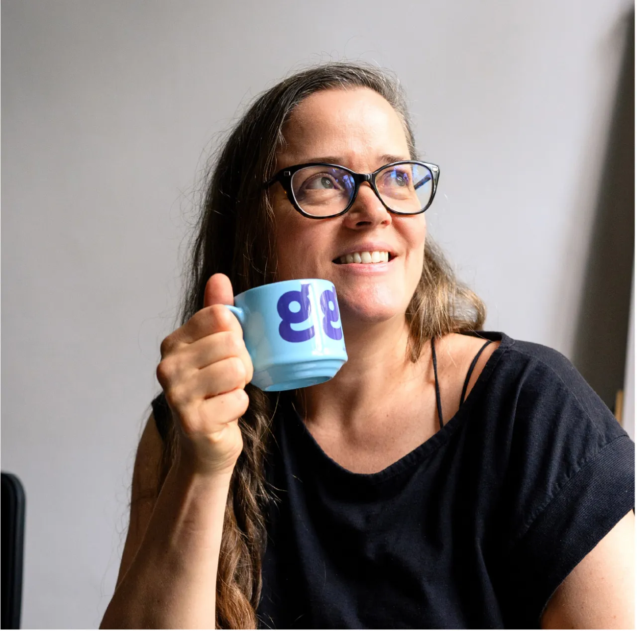
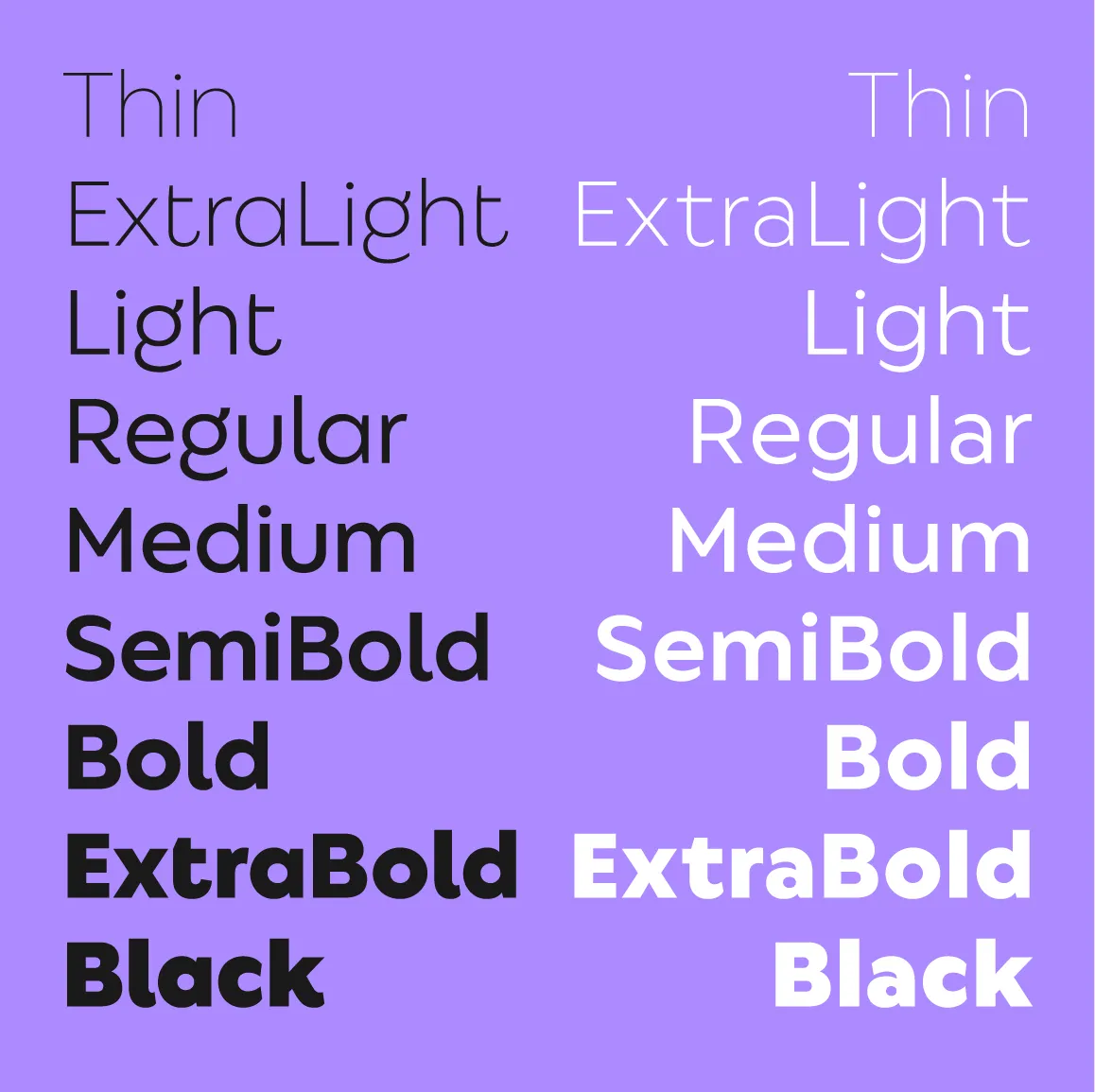
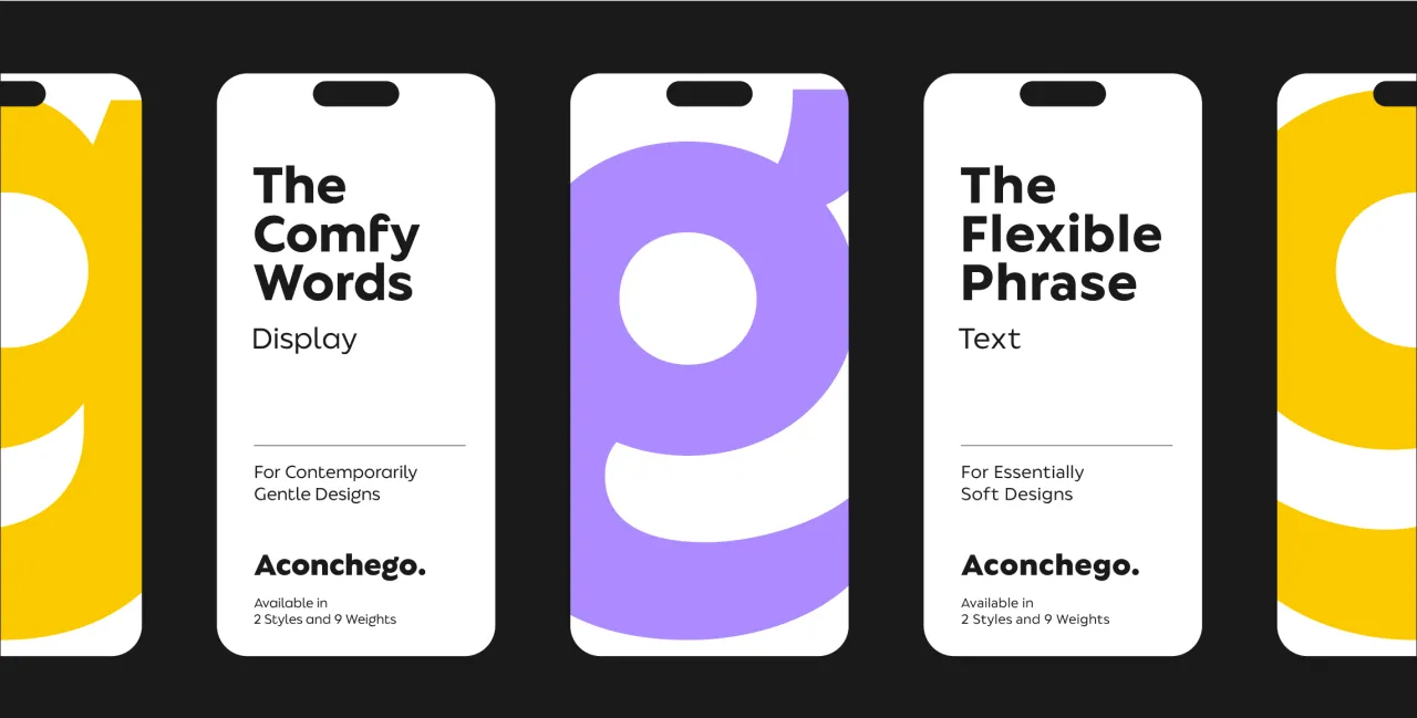
Can a geometric font feel cosy? Fabio Haag Type's Aconchego answers with a resounding yes. This typeface explores the concept of comfort through letterforms, offering a unique blend of geometric precision and gentle expressiveness.
Designed to evoke pleasant sensations, Aconchego features flexible, smooth characters that bring a sense of warmth and intimacy to the design. It's a typeface that invites designers to infuse their projects with a touch of comfort and contemporary gentleness.
6. Airport by Lukas Schneider
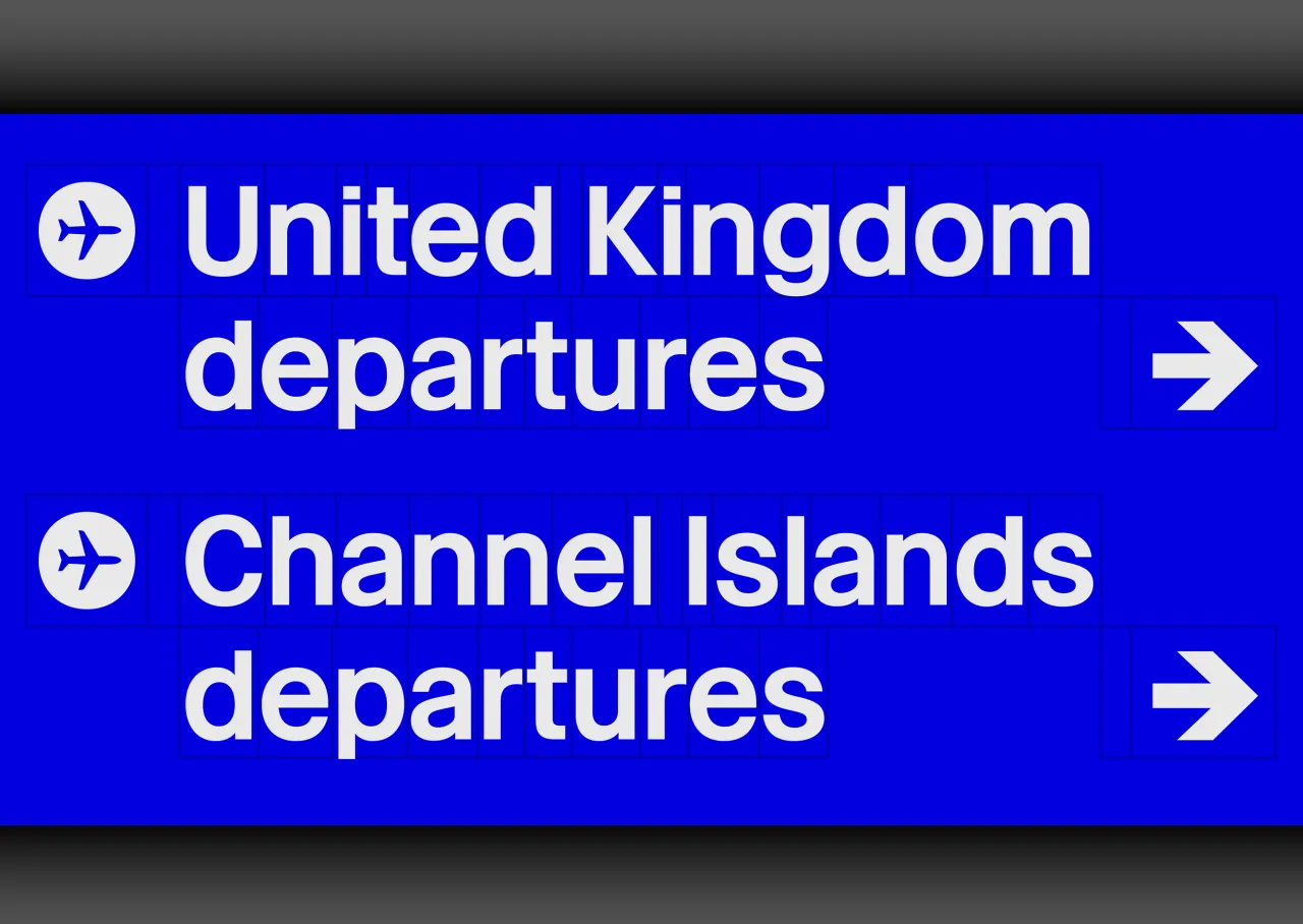
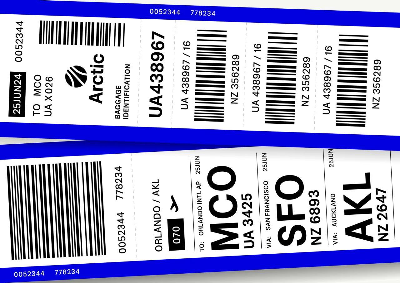
Airport is a digital reinterpretation of Matthew Carter's 1961 alphabet, originally designed for London's Heathrow Terminal 3. Schneider's version expands on Carter's original concept, offering seven weights and optimised for contemporary use.
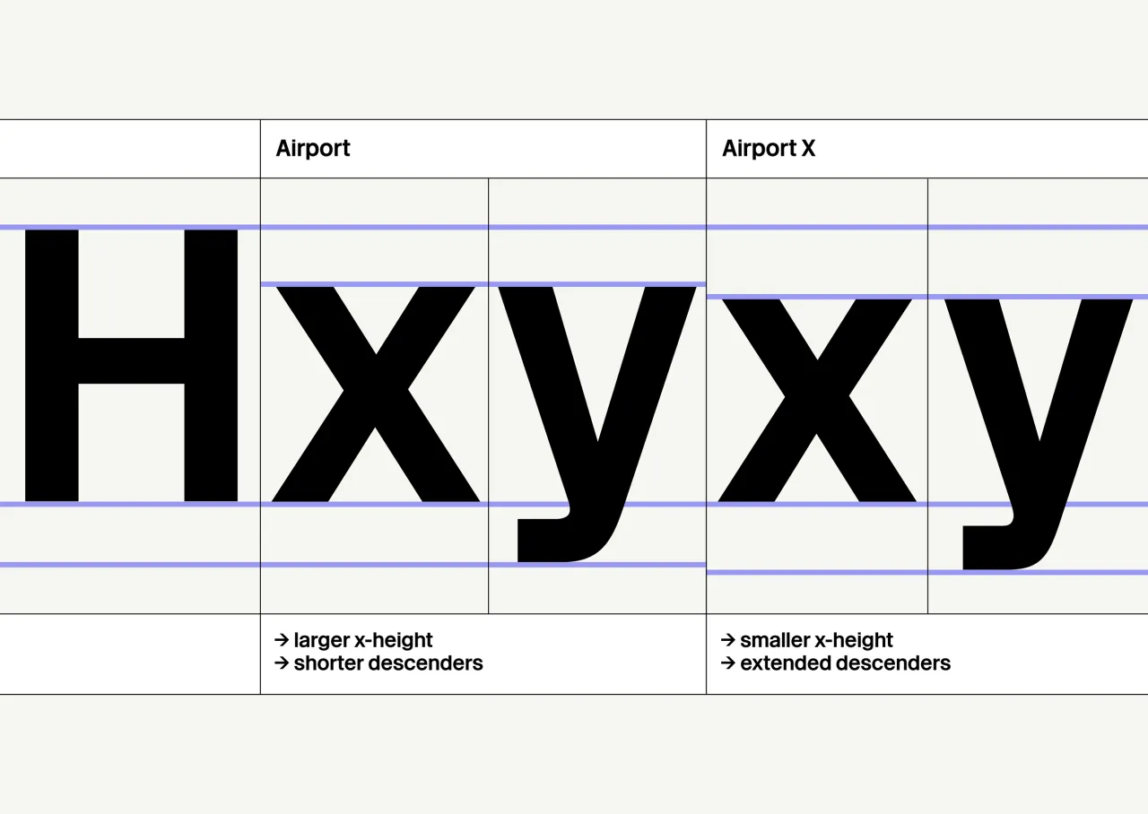
Supporting numerous Latin-based languages, Airport includes unique extras such as alternates, arrows and circled glyphs. An optional variable font with a weight axis and a special Airport X variant with a lower x-height provide designers with extra flexibility.
7. Favora by In-House International
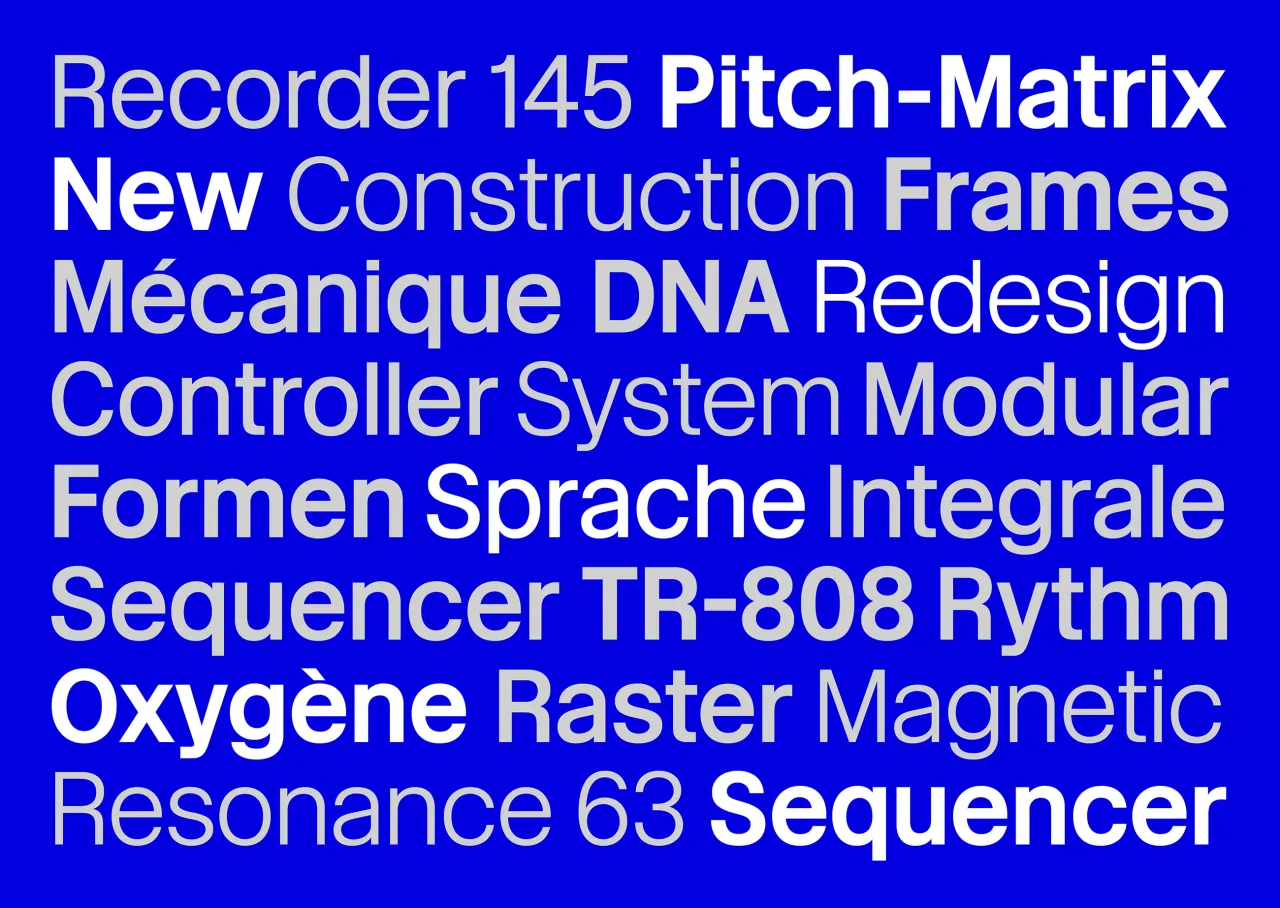
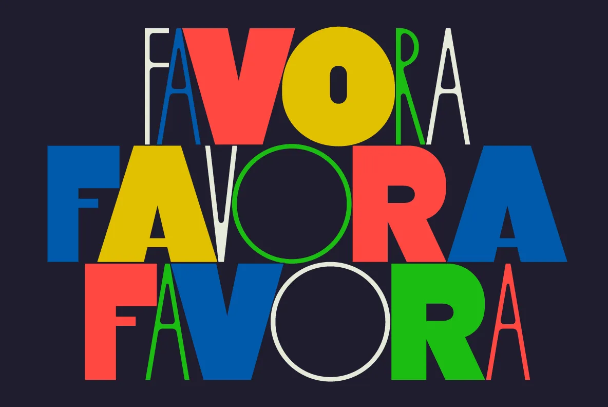
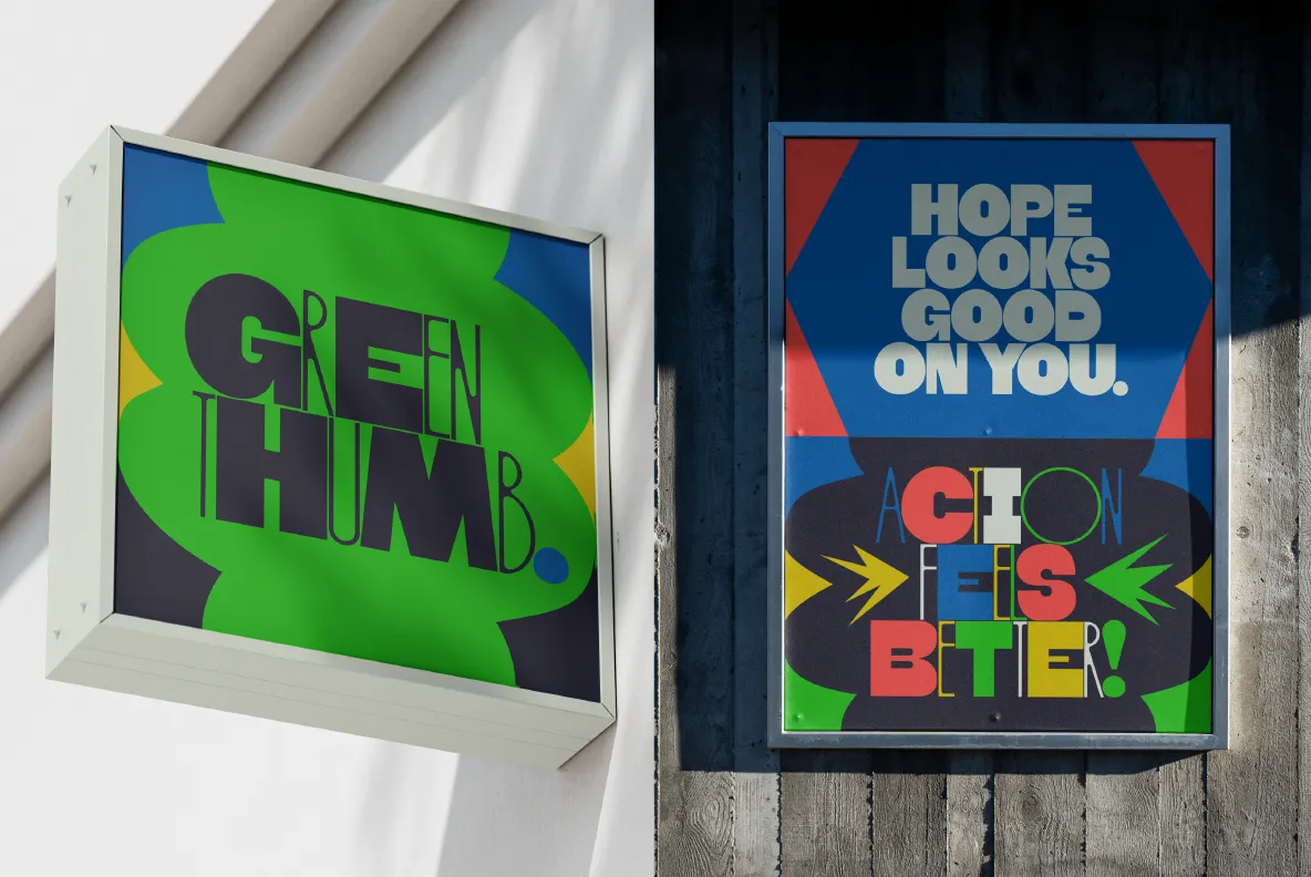
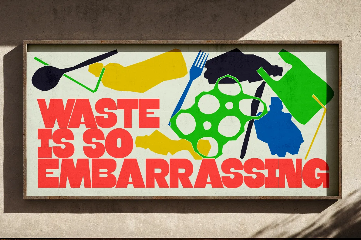
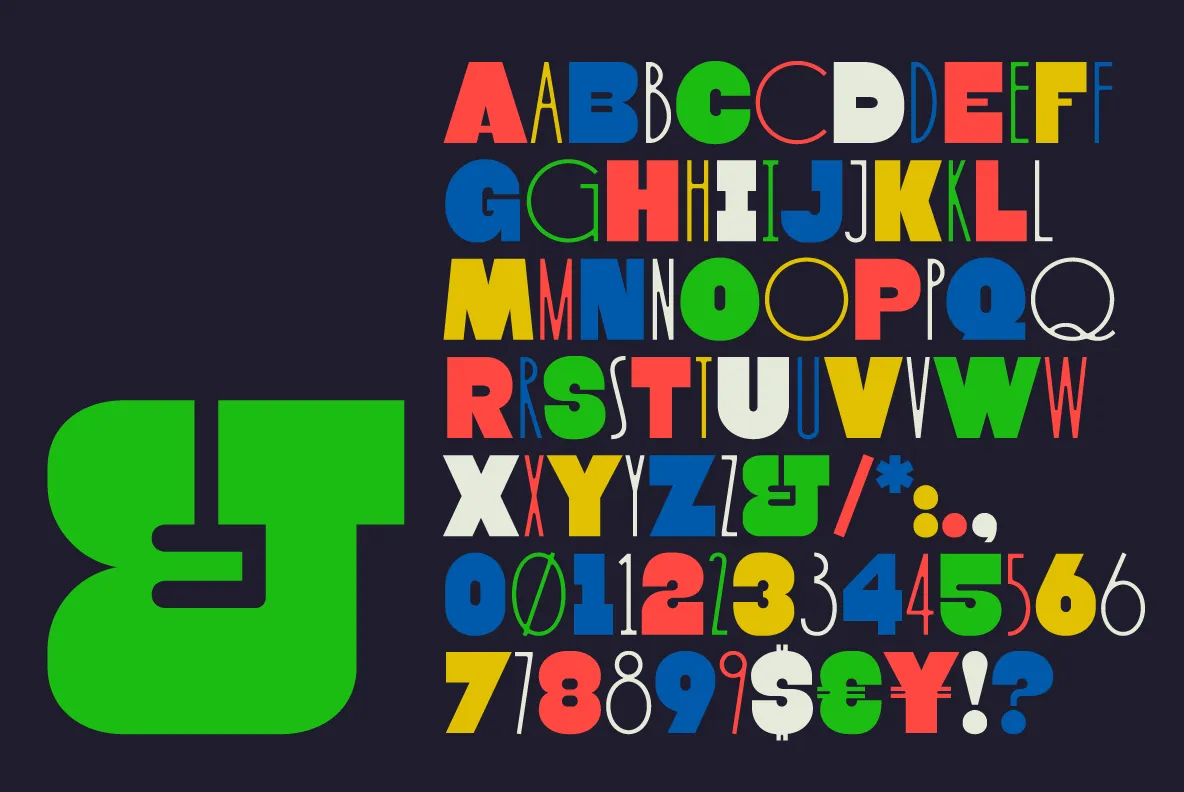
Favora is a two-weight display typeface that embodies forward momentum and societal progress. Inspired by commercial signage and protest posters, the font channels transformative moments with a sense of optimistic possibility.
Its thicker weight draws from public announcement styles, while the thinner variant evokes sophisticated architectural and invitation design. In short, Favora is more than a typeface—it's a visual representation of hope and potential.
8. Wulkan by The Designers Foundry
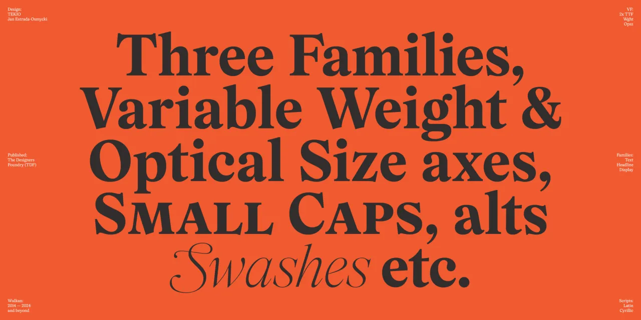
Originally released in 2019 and designed by Jan Estrada-Osmycki, Wulkan originated from a personal quest to create an expressive serif that could capture the spirit of graphic design pioneers like Herb Lubalin and Tom Carnase.
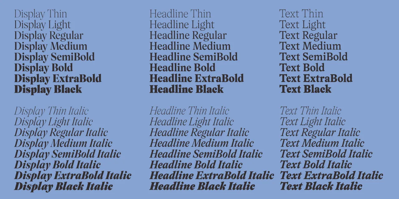
The new version expands far beyond its initial offering, introducing Text and Headline families with a variable optical axis that allows seamless transitions between different typographic contexts. Featuring spiky serif details, ball terminals, and a calligraphic flow, Wulkan now supports Cyrillic and includes a new Black weight.
The redesign was no small feat: Estrada-Osmycki essentially redrew the entire typeface, adding sophisticated OpenType features like small caps and swashes. With optimisations for longer texts and enhanced versatility, Wulkan has evolved from a striking display font to a comprehensive typographic workhorse that maintains its original expressive character while becoming dramatically more functional. Meanwhile, the legacy version of Wulkan Display can be found here.
Editor's Picks





Trending




Latest Jobs
Visual Development Artist - Feature at Sony Pictures Animation
Full-time·Los Angeles·$53.37 – $83.75 per hour
Director, Strategy at Interbrand
Full-time·New York·$160,000 – $210,000
Multidisciplinary Designer at Formation Games
Full-time·London·£40,000 – £50,000
Communications Strategy Director at David&Goliath
Full-time·Los Angeles·$120,000 – $180,000
Senior Director, Strategy at Interbrand
Full-time·New York·$210,000 – $260,000
Designer, Marketing (Games) at The New York Times
Full-time·New York·$85,000 – $100,000