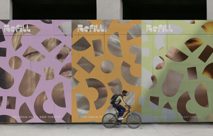
&Walsh finds comfort in rebrand for Plenty, a sustainable indoor vertical farming company
New York creative agency &Walsh is behind the rebrand for sustainable indoor vertical farming company, Plenty, featuring a bold and "approachable" custom font inspired by plants, and an identity and packaging influenced by the flavour of its produce.
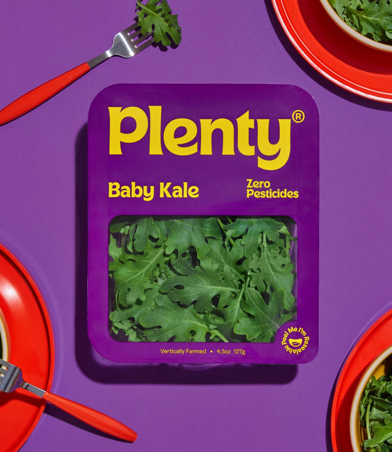
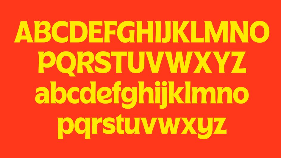
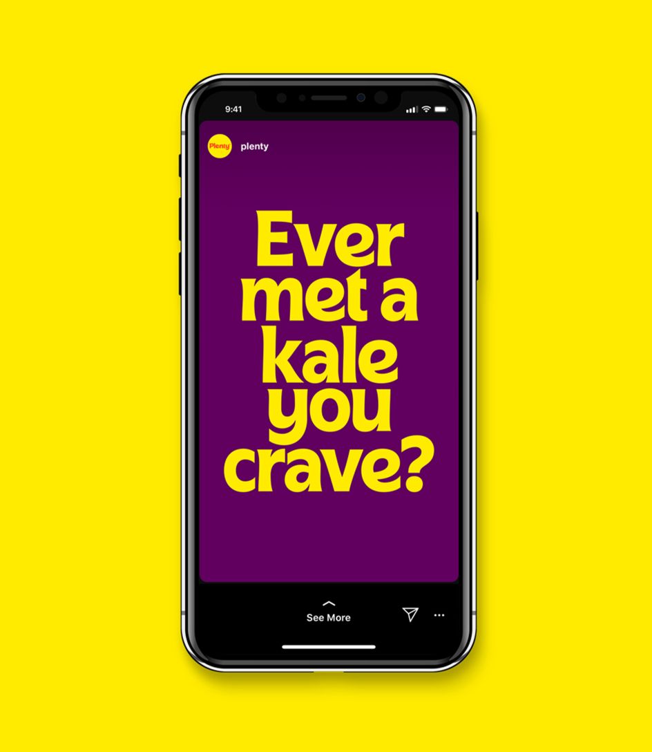
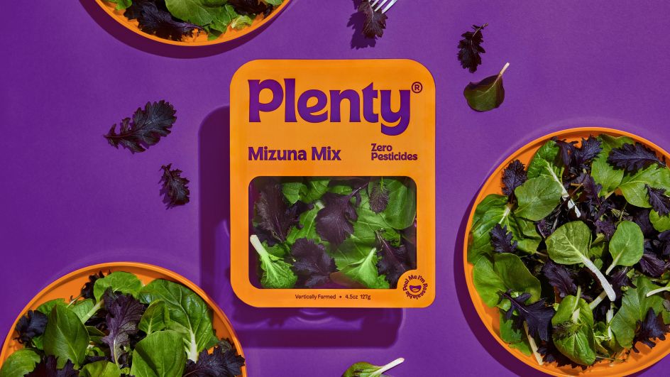
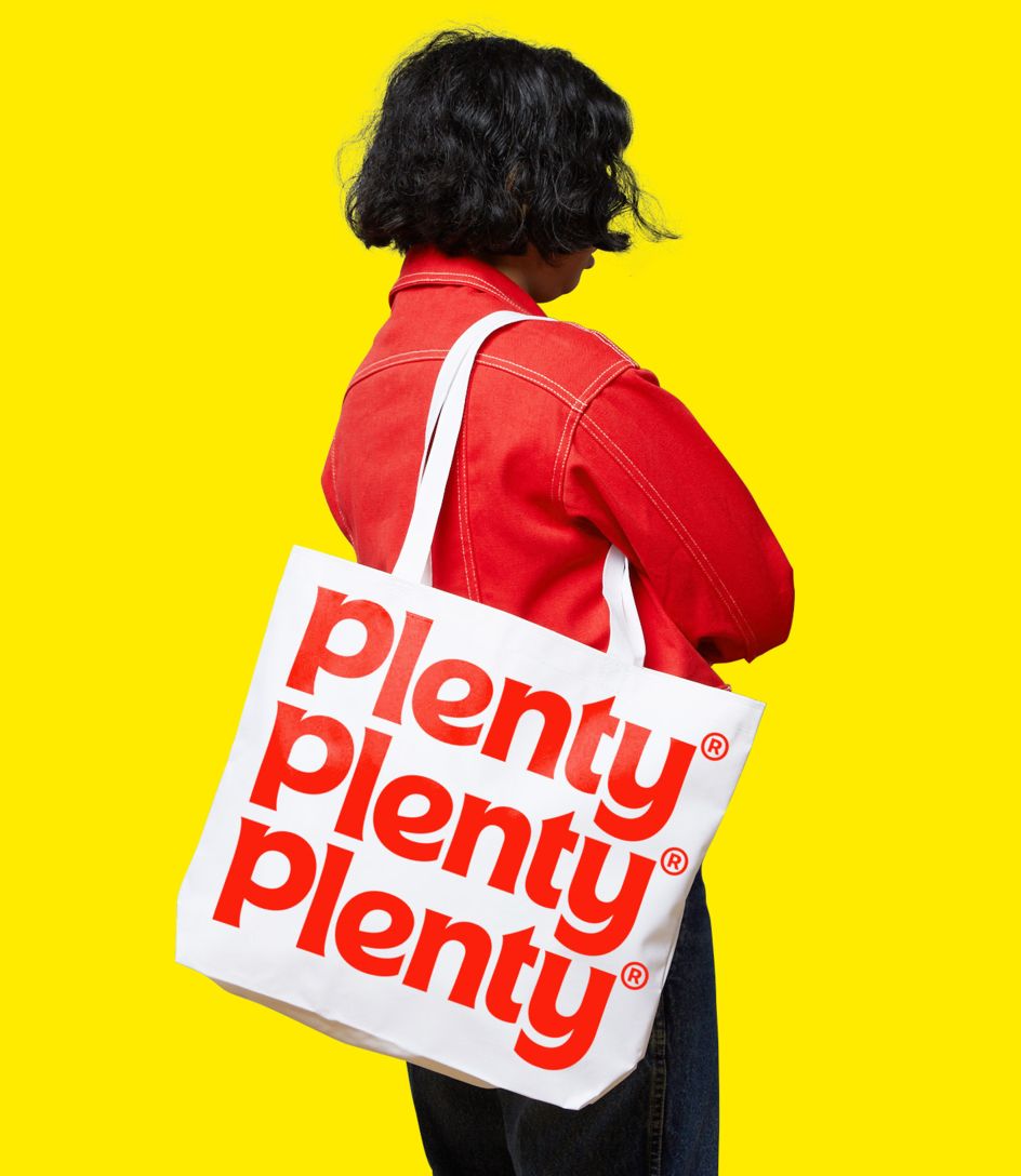
It's a refreshing approach by Jessica Walsh and her team, who have avoided any of the clichéd "healthy green" visual cues like some of Plenty's competitors. With a bright and friendly colour palette and non-fussy, almost retro aesthetic, at its heart lies the crafted font, known as Plenty Custom – a humanist sans serif with leaf-like corners and terminals. "Wherever possible, the font avoids straight lines and is made up of curved and tapered strokes," as &Walsh puts it. "The stroke endings are sharp and the curves are as round as a ripe tomato."
There's a purpose behind Plenty that caught the attention of &Walsh: "What stood out to us was its commitment and desire to make the tastiest, freshest cleanest greens accessible to the masses," Jessica tells Creative Boom.
"Making greens and healthy foods flavorful and accessible to people is very important. Right now, many people turn to unhealthy, processed, and fast foods because of the price and accessibility. In the long term, this causes numerous health problems, which has become a public health issue in America."
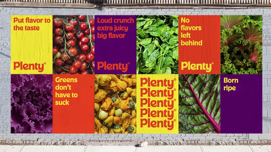
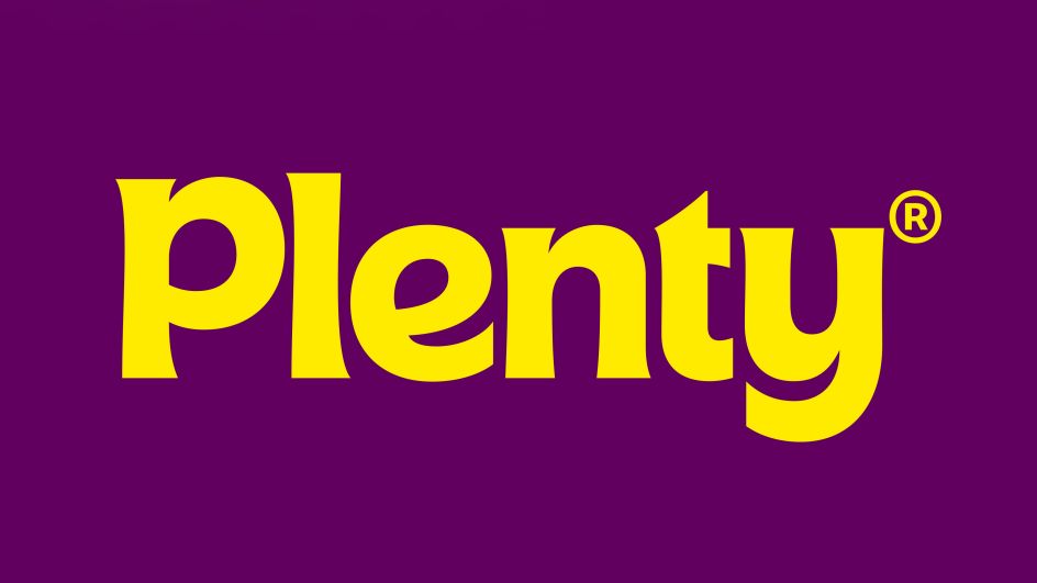
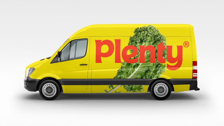
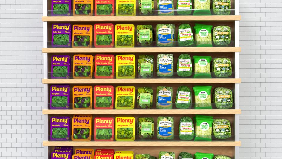
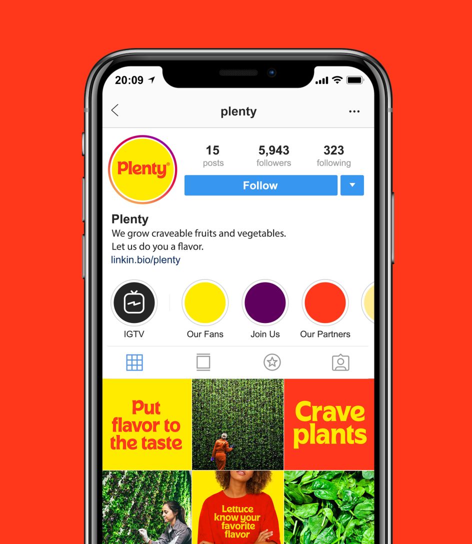
In their research, Jessica and her team looked at what would make the brand feel more warm and accessible, while also evoking comfort and tastiness – and that's where nostalgia steps in: "Fast food companies (such as McDonald's and Wendys) often use red and yellow colours in their branding, which have been shown to make people feel hungry. Why not use this technique for healthy foods?" adds Jessica. "With the colours and type choices, we wanted to create a friendly and happy brand that also stood out on the shelf from the competition.
"Almost all greens brands use a similar design aesthetic, so we aimed for the Plenty packaging to pop off of the shelf and pique people's interest. We did extensive target audience testing on the logo and packaging throughout the process to test the new packaging and typeface design, with the final result of our work scoring higher for warmth and accessibility than the previous brand work."
Editor's Picks


Trending


Podcasts


Editor's Picks
Further Reading