The new colour, PANTONE 17-3938 Very Peri, has been specifically crafted to reflect the times we're living in. A dynamic periwinkle blue hue with a vivifying violet red undertone, the company describes it as "an empowering mix of newness... opening us up to a new vision as we rewrite our lives".
In other words, with our physical and online lives merging in new and exciting ways – such as the expanding metaverse and the rise of the digital art community – the new colour represents the joyous and dynamic spirit of modern creativity.
And to highlight the importance of colour to digital design, Pantone has teamed up with Microsoft to bring Very Peri to life across Microsoft products.
Very Peri will be popping up in the Edge browser and other Microsoft apps
As experts in digital tools, Microsoft recognises how powerful colour is from a UX perspective because it's such a universal language. By short-cutting the journey to our core brain systems, colour is able to instantly and effectively convey things like mood, personality and the essential information to users.
To harness its power, Microsoft has thoughtfully incorporated PANTONE 17–3938 Very Peri into new Microsoft Teams backgrounds, along with a palette of complementary hues to bring fresh energy and personality to meetings.
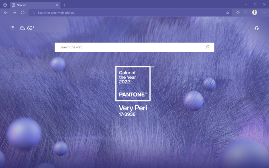
The new hue will also appear in the newest PowerPoint templates, Windows 11 wallpapers, and an Edge browser theme.
Throughout 2022 can see the colour infused across some of the most popular Microsoft tools, giving its productivity apps a new sense of visual possibility throughout, which creative professionals, in particular, should respond to positively.
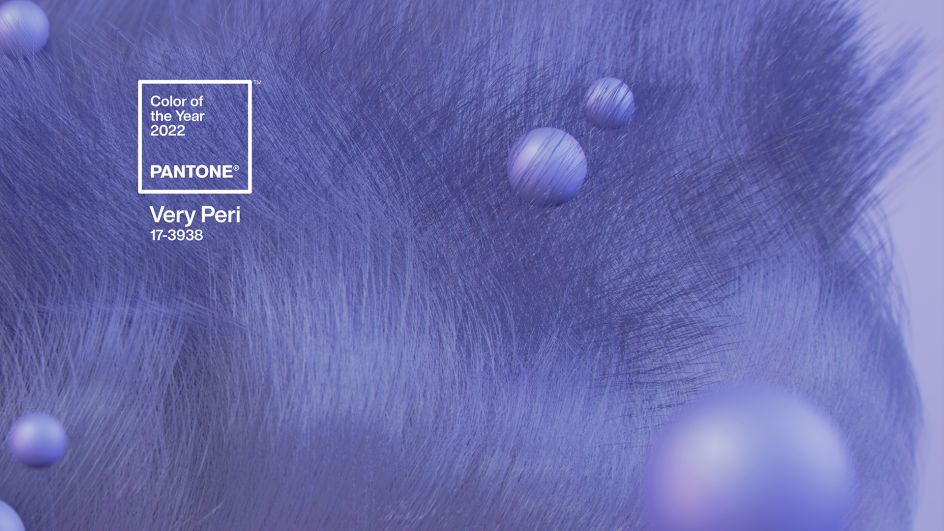
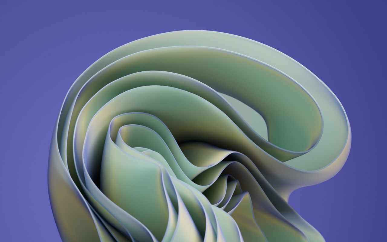
Pantone's new Colour of the Year is PANTONE 17-3938 Very Peri
One of the new Windows wallpapers using Pantone's new hue
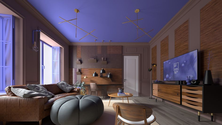
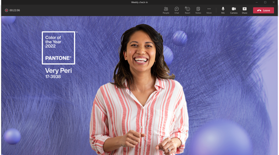
The new colour in a Microsoft Team's background
For our part, we love the new colour, which blends the faithfulness and confidence of blue with the energy and excitement of red in a way that really feels innovative and original. The choice of a pearlescent purple by Pantone is a bold one but really pays off. After all, it isn't just dramatic at an intellectual level: as a colour at the lower end of the visible light spectrum, it evokes a physical response that makes a deep and resonant impact on, and connection with, anyone viewing it.
With all that in mind, we're looking forward to seeing it popping up in Microsoft's apps, giving everything from web surfing to Microsoft Teams calls a more dynamic look and feel in the year to come.

Editor's Picks


Trending


Podcasts


Editor's Picks
Further Reading
](https://www.creativeboom.com/upload/articles/fc/fc51b7be78cf05cb896bc8cf90785d67072b855b_732.png)