Optic: Counter-Print's new book explores the world of optical effects in graphic design
What is it about optical illusions that captivates graphic designers so much? These optical effects are often found in beloved book designs, packaging, and branding the world over. In Counter-Print's latest book, the publisher delves headfirst into this mesmerising realm of art and design.
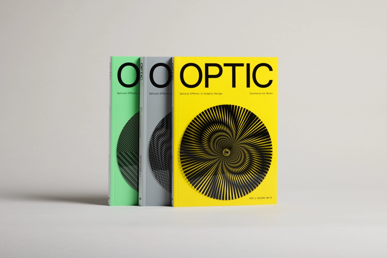
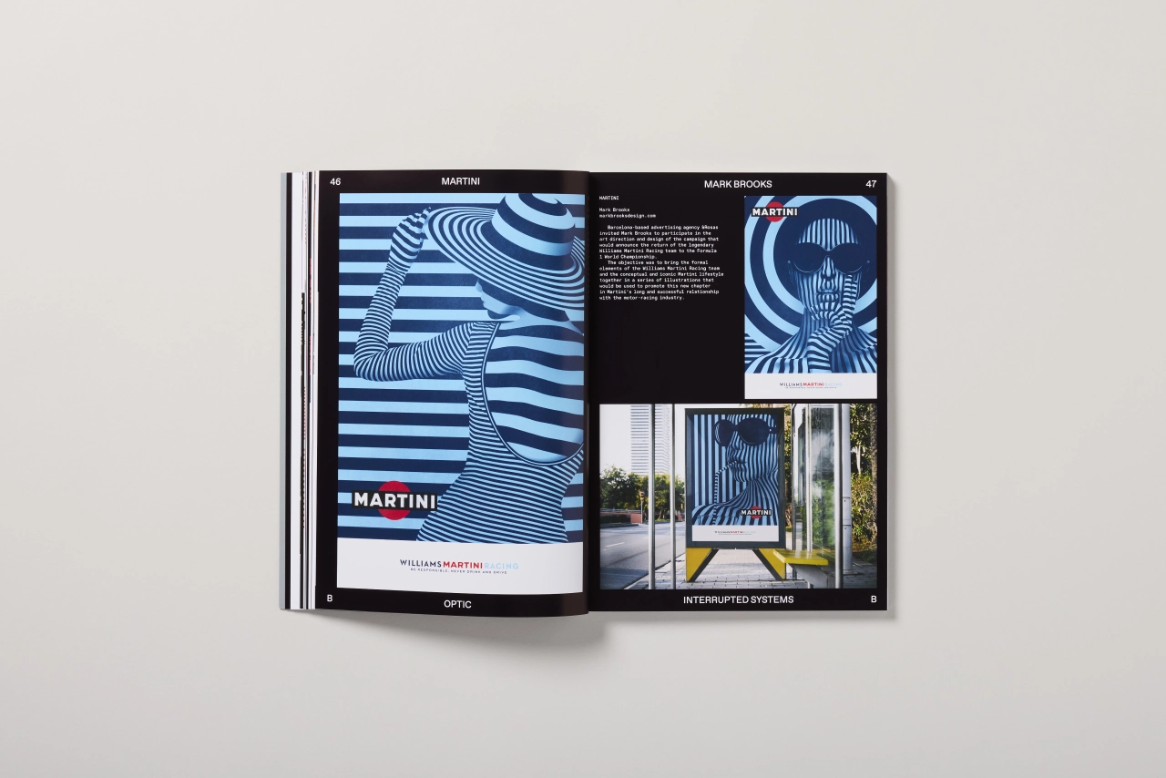
Counter-Print's new book, Optic
Titled Optic, the book is a must-read for any discerning creative keen to learn more about Op Art of the mid-1960s and its optical effects continue to influence the language of graphic design today, arguably more than any other movement.
Packed with inspiration, it covers everything from periodic structures, interrupted systems, and relief to impossible objects, diffusion and isometric illusion. Each section reveals the unique forms and techniques talented designers employ to create breathtaking visuals.
As we've come to expect from Counter-Print, the book is a feast of insight, as it contains interviews with leading artists and studios such as Abby Haddican, Daughter, Toko, Classmate, Mainstudio, Manifiesto, Study LLC., Burrow and Parker Studio – all of whom share more of their careers and their use of optical illusions in their work.
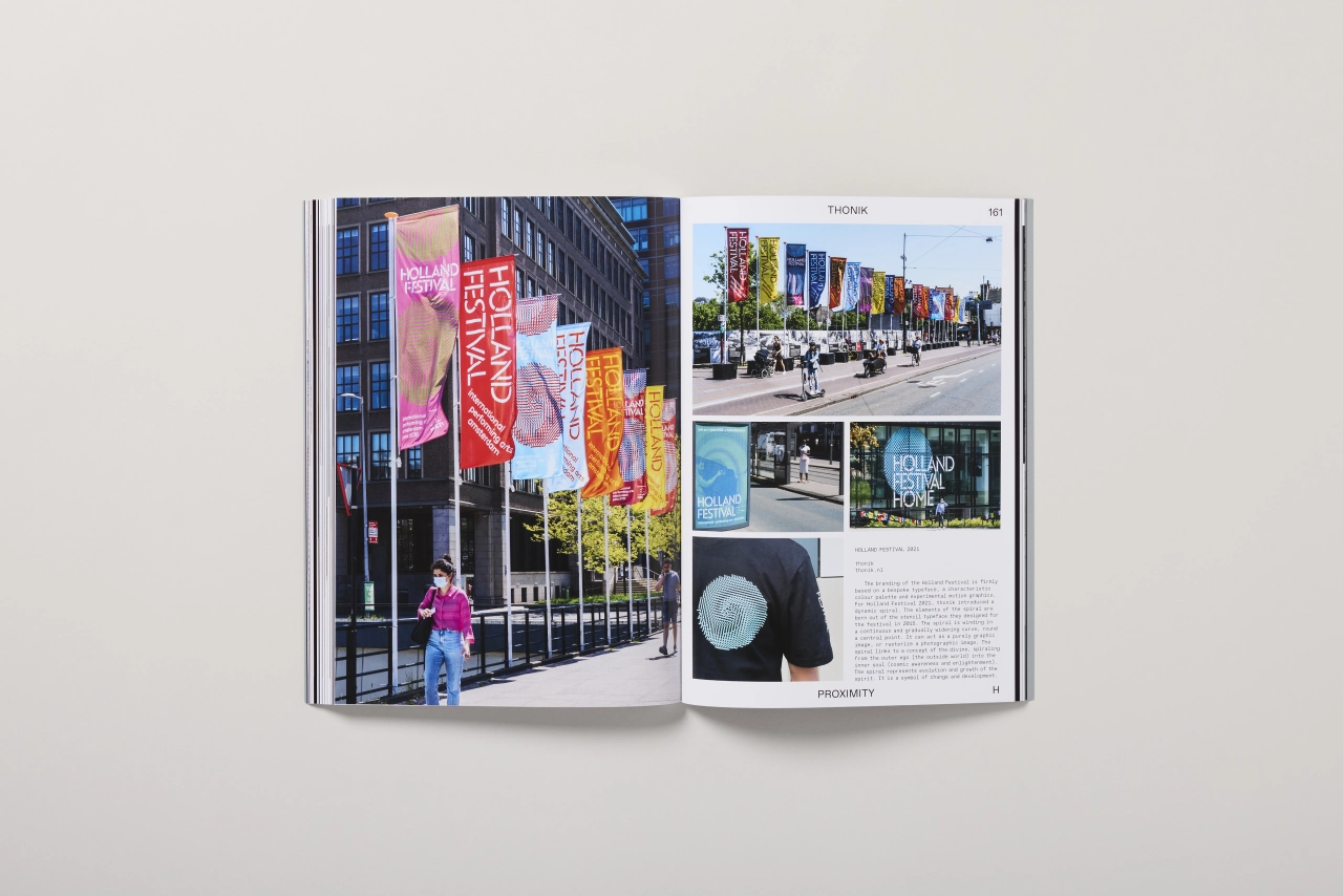
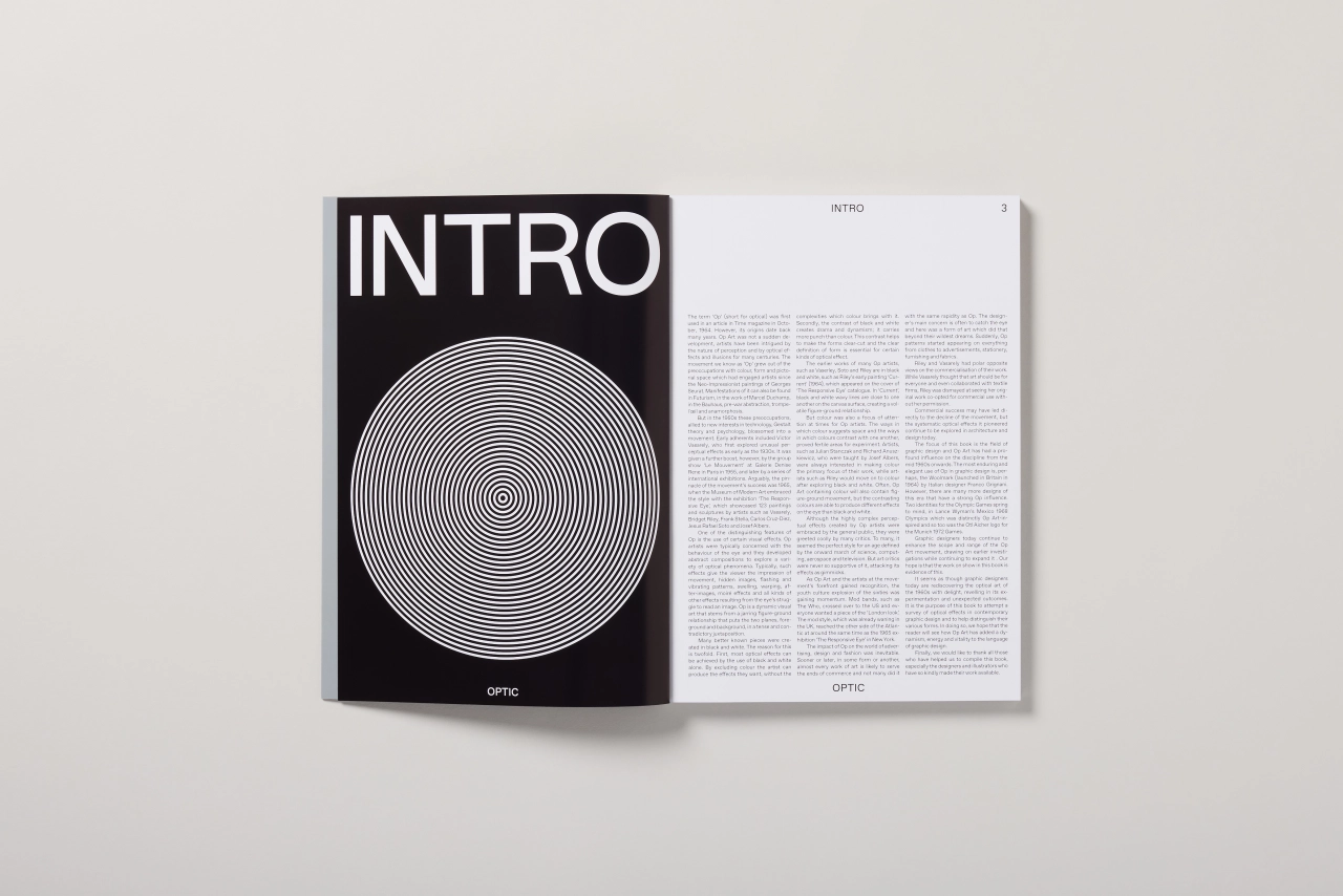
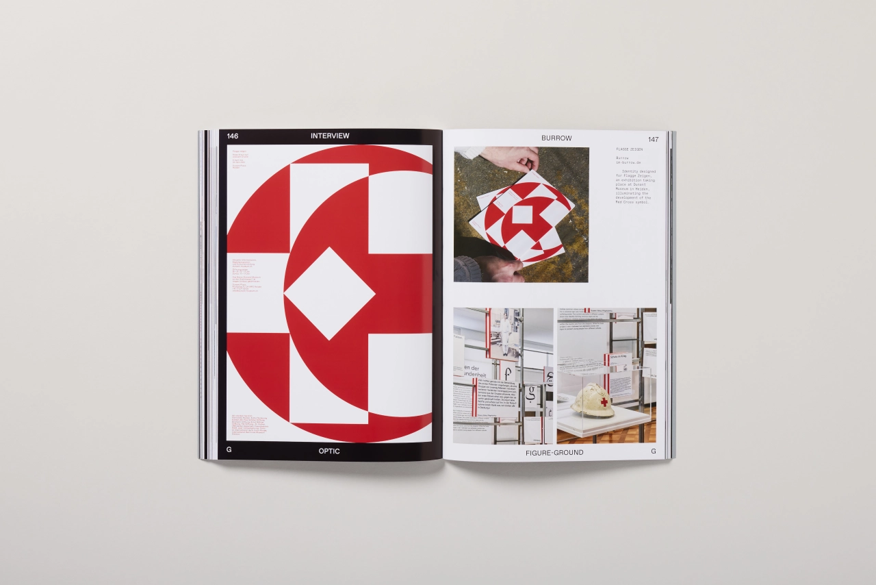
"Optical illusions possess a magnetic allure for creatives, and it's no wonder why," explains Jon Dowling, co-founder of Counter-Print. "Take, for instance, the Woolmark, an exemplary and elegant use of Op Art in graphic design, conceptualised by Italian designer Franco Grignani and launched in Britain in 1964. This iconic creation exemplifies the captivating power of optical illusions.
"Delving deeper into the era, we find numerous designs with a strong Op influence, such as Lance Wyman's Mexico 1968 Olympics identity and Otl Aicher's Munich 1972 Games logo. These designs vividly demonstrate how Op Art inspired and shaped graphic design, leaving an indelible mark on creative minds."
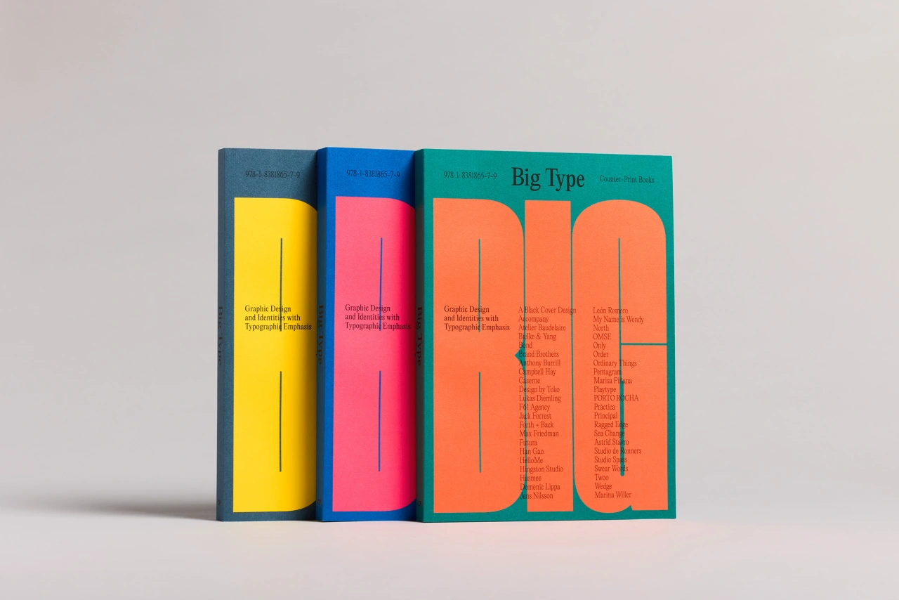
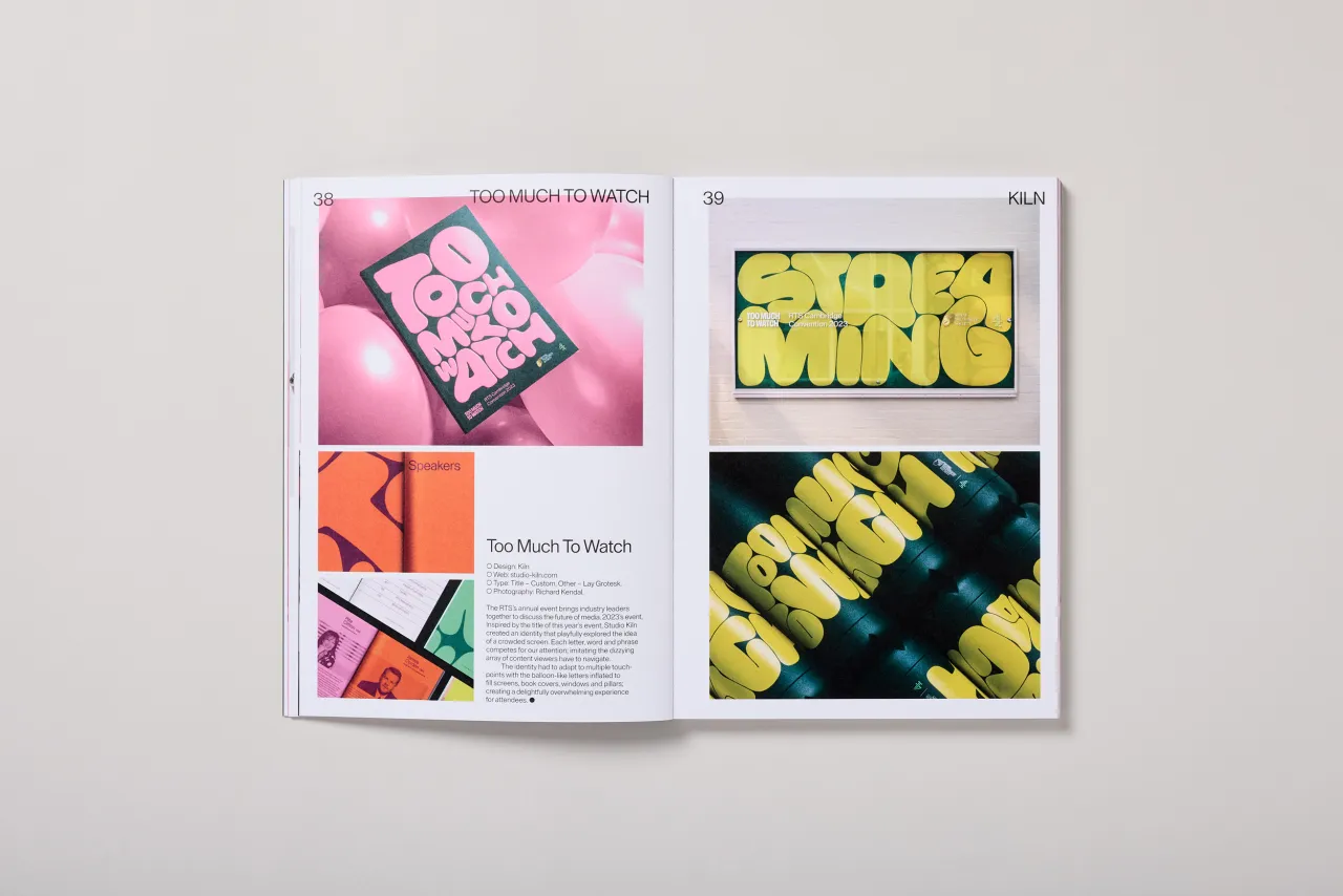
Optic follows on from Counter-Print's popular Big Type and Mascot titles, released last year where the publisher takes a deep look at a unique theme with the realm of graphic design and illustration. "We take great pleasure in exploring themes that not only pique our curiosity but also resonate with the visual output of designers," Jon tells Creative Boom.
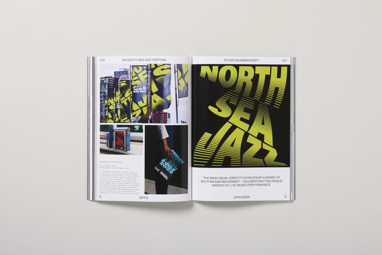
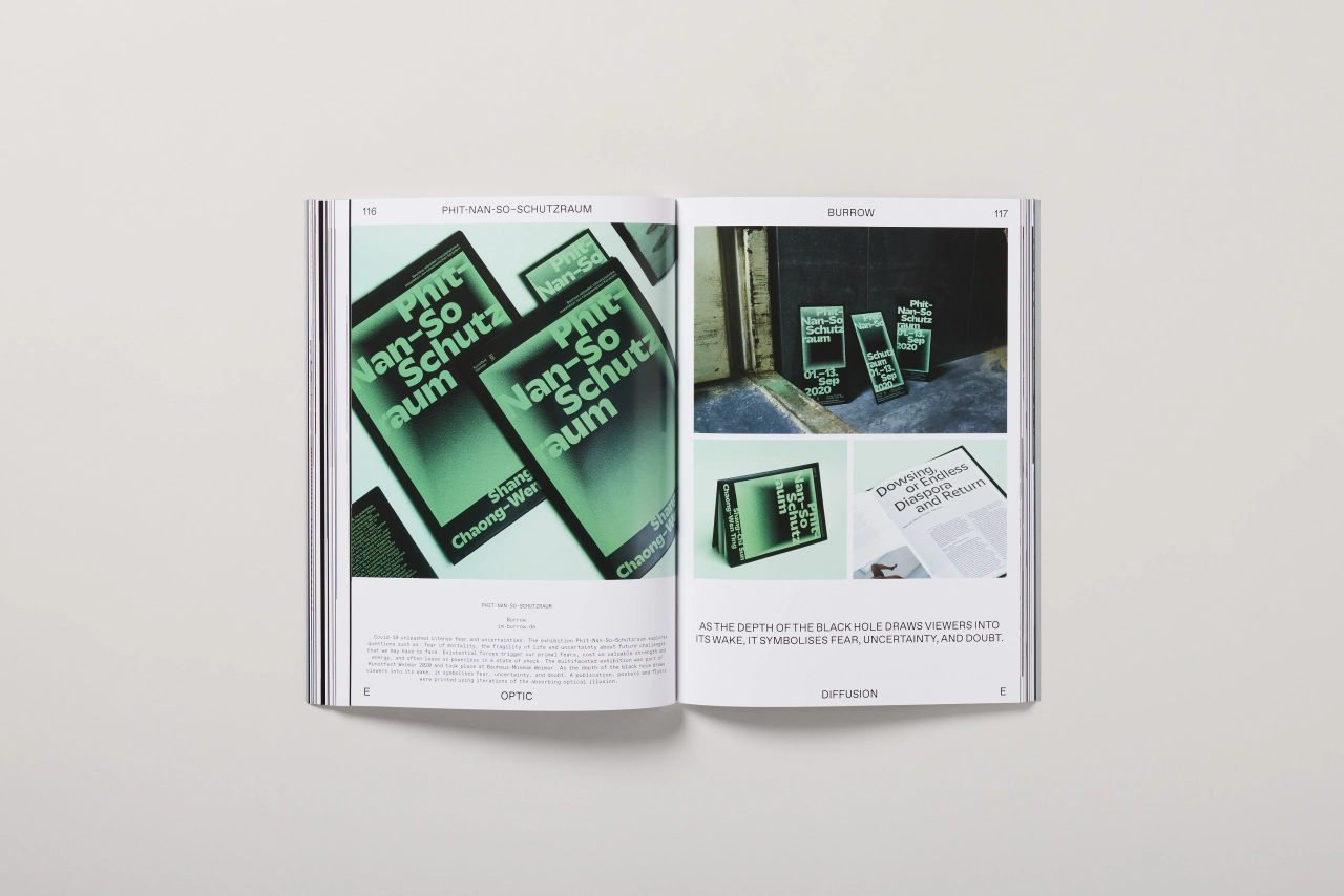
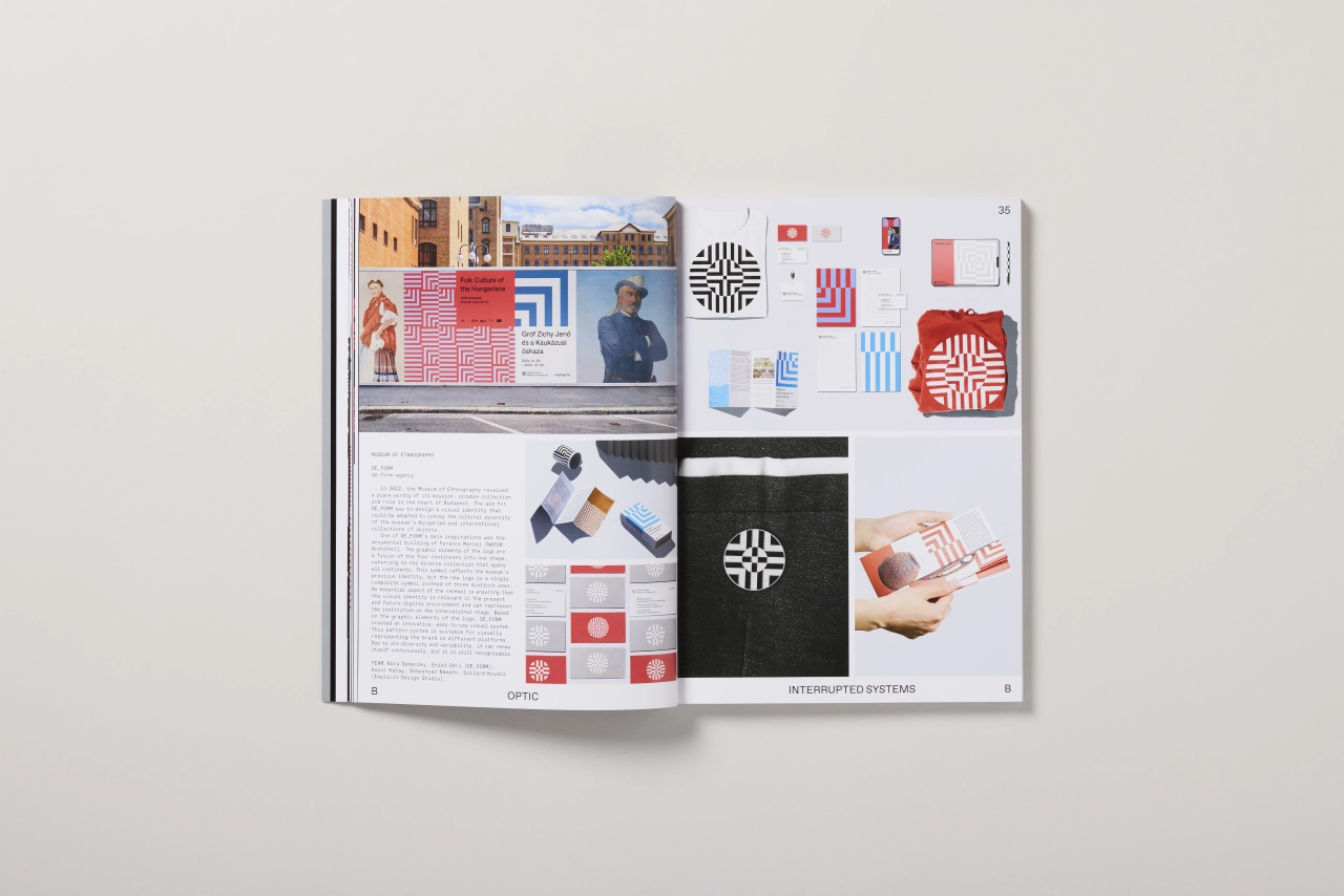
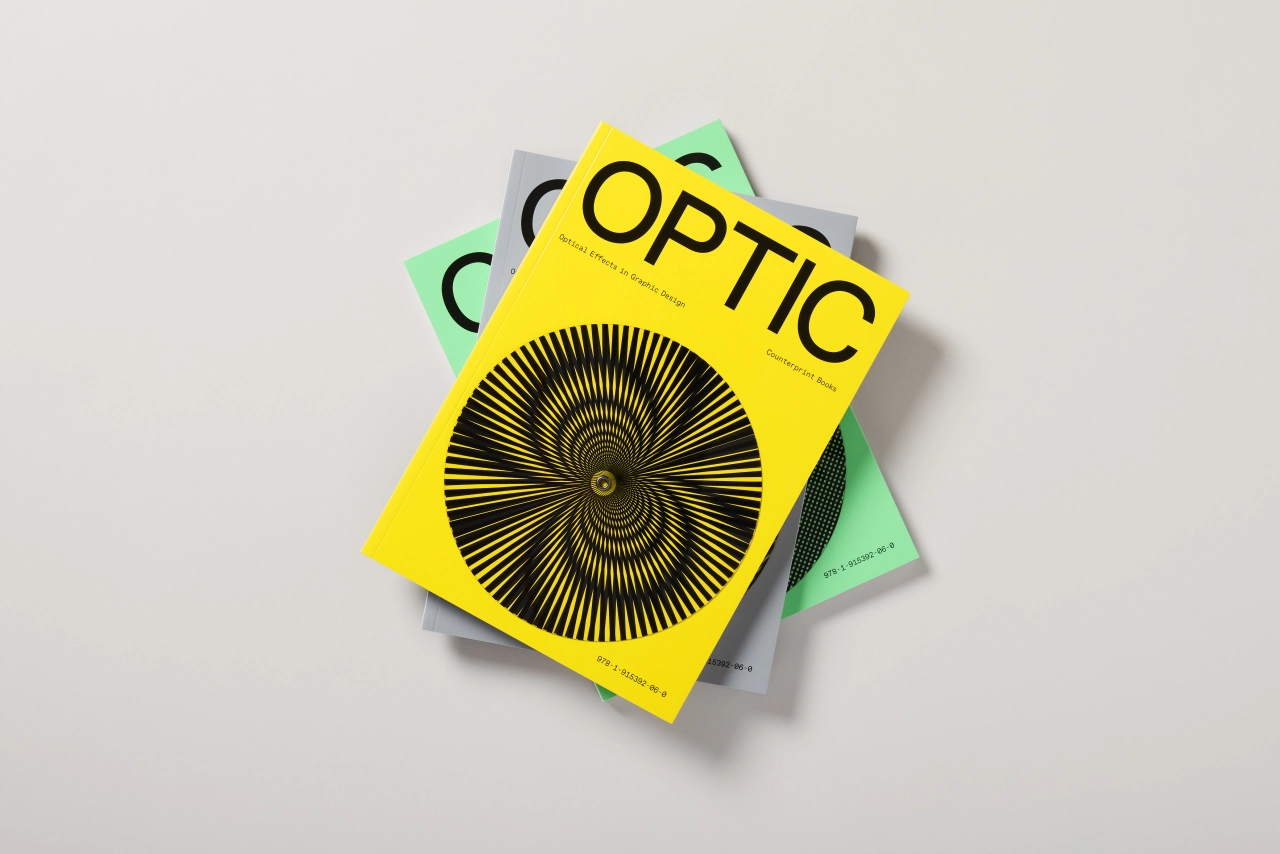
One running theme in Optic that stands out is the significance of black and white in creating optical effects. "It is evident that historically, many well-known pieces within the realm of optical art were predominantly created using black and white. The same is the case today, and there are two primary reasons behind this choice," says Jon. "Firstly, black and white alone have the potential to achieve a wide range of optical effects. By excluding colour, artists can focus on manipulating tones and contrasts to produce the desired visual illusions. Removing the complexities associated with colour allows a more direct exploration of the optical phenomenon at play.
"Secondly, the contrast between black and white carries inherent drama and dynamism. It possesses a visual impact that surpasses the use of colour. This heightened contrast helps make forms appear distinct and well-defined, which is crucial for certain optical effects to be effectively conveyed."
There are plenty of other examples within Optic that demonstrate Op Art's ongoing influence on contemporary design. One such case is Underline's work for Halo, a taproom and brewery that has been quite adventurous in its branding.
"It takes the traditional recipes of rare styles of beer and experiments with the ingredients, so the use of optical illusion and its experimental nature is very apt," says Jon. "The designers were inspired by the goal of setting Halo apart from other craft breweries by creating a brand and label system that defied the common visual language in the industry. They wanted to capture the adventurous and unconventional nature of the brewery through their designs. I think Op Art, in this context, works really well to deliver the brand message."
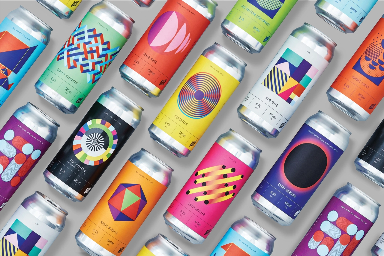
Underline's work for Halo
Of course, Jon admits, it's always difficult to single out any piece of work when compiling books such as these, and there are plenty of other examples that designers will find useful and compelling. "I hope that the reader will get a sense of the breadth of possibility optical illusion can bring to their work," adds Jon.
"Overall, we hope that designers will gain an understanding and appreciation of the rich history and influence of Op Art in graphic design. This book aims to survey the optical effects present in modern graphic design, distinguishing their various forms and showcasing how Op Art has injected dynamism, energy and vitality into the language of graphic design. Ultimately, we hope designers will gain inspiration and a deeper appreciation for Op Art's influence."
Editor's Picks





Trending






Latest Jobs
Senior Copywriter at Human After All
Full-time·London·£48k–£66k
Client Director at Koto
Full-time·Berlin·€70k-€85k
Creative Content Executive at Cognition
Full-time·Birmingham·£28k–£35k
Brand Strategist at DNCO
Full-time·London·£45k-£60k
Graphic Designer at Crux Product Design
Full-time·Bristol·Up to £36k
Creative Director at Koto
Full-time·London·£95k-£130k