The humble Mascot takes centre stage in a new book that explores its place in graphic design
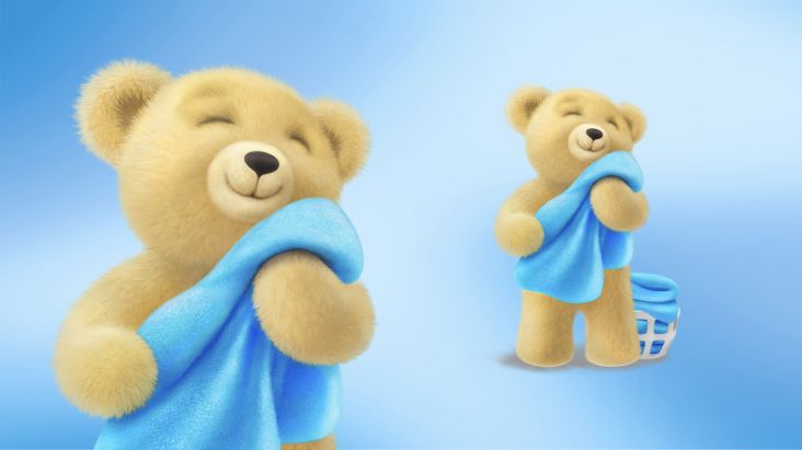
From burger chains and newspaper clubs to tech firms and banks, the mascot continues to be as popular as ever in contemporary graphic design. A new book by Counterprint takes a closer look at their charm, exploring dozens of brand identities that feature these fun characters.
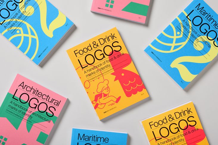
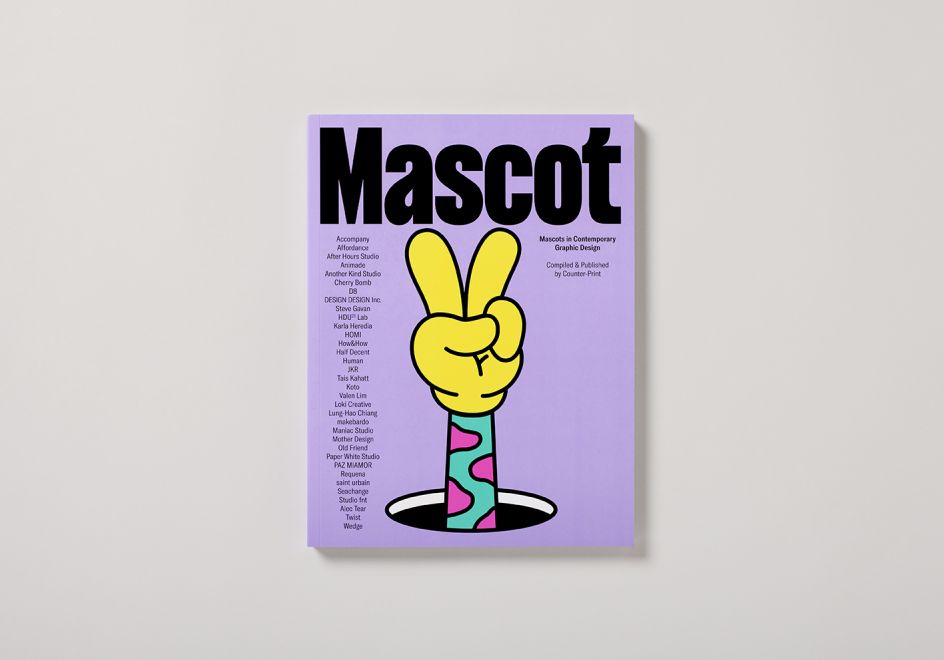
Titled Mascot, the book is the latest offering from Céline Leterme and Jon Dowling, the founders of the online bookshop and publisher, which they launched together almost 15 years ago. It follows an impressive line of Counterprint books so far, featuring anything from the biggest names in design to deeper explorations of logos and type in every corner of the globe.
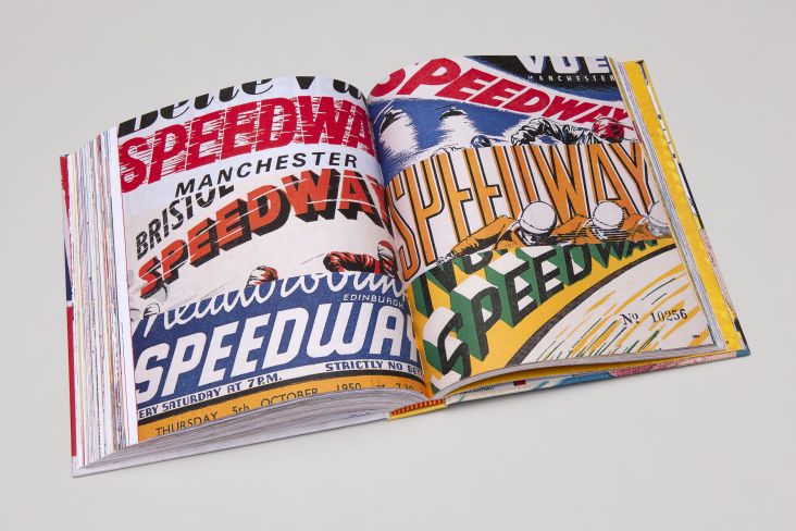
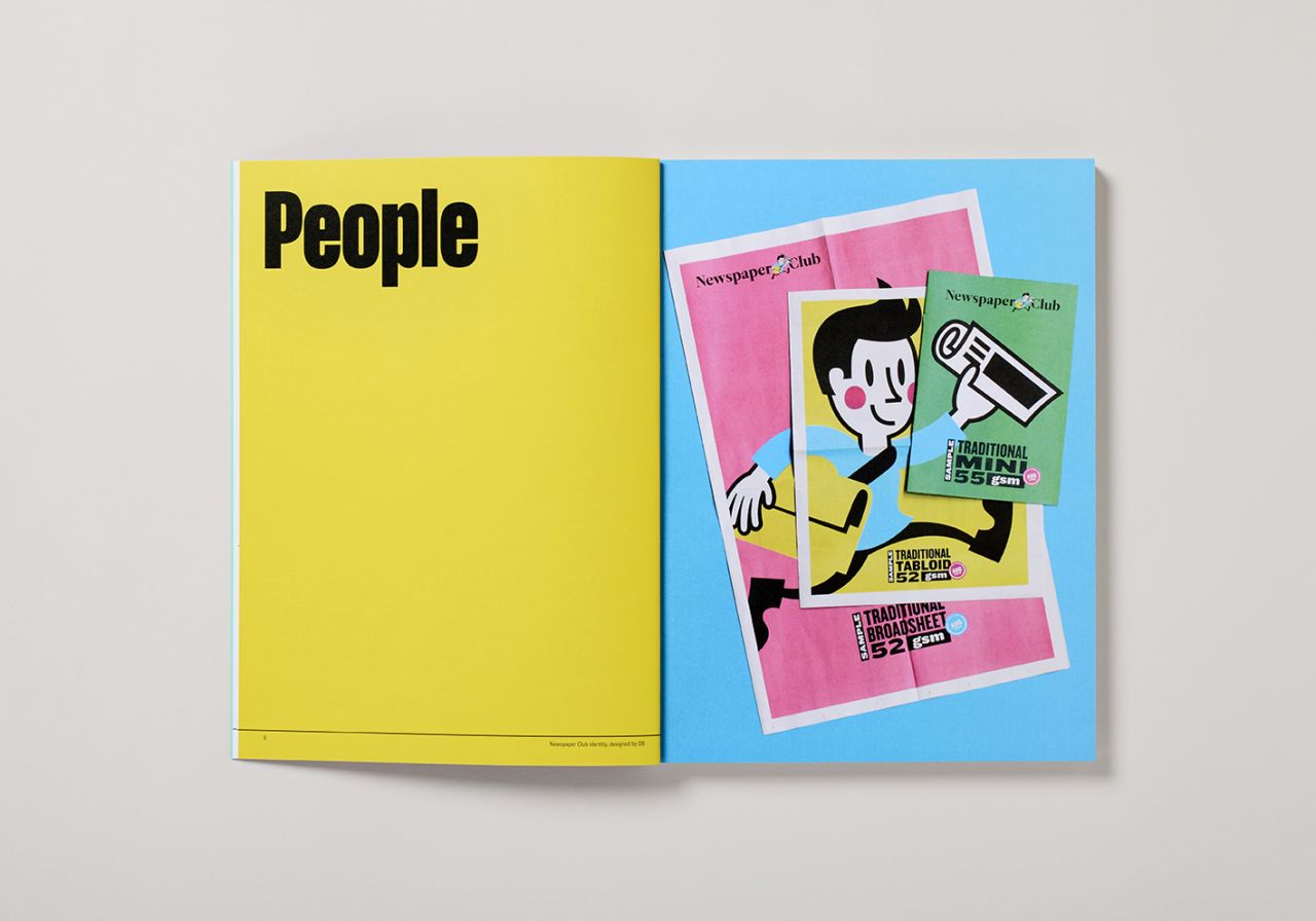
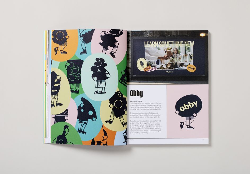
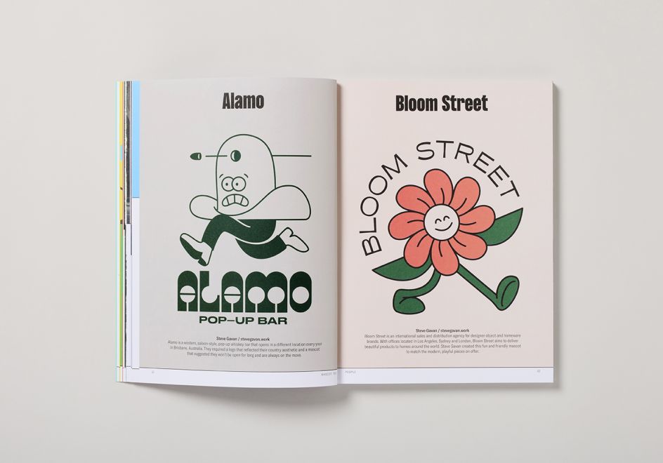
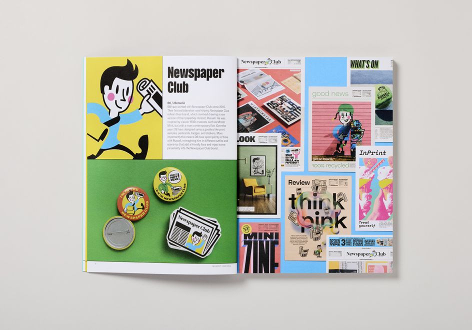
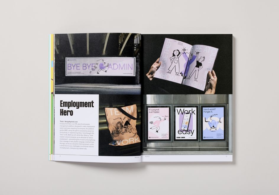
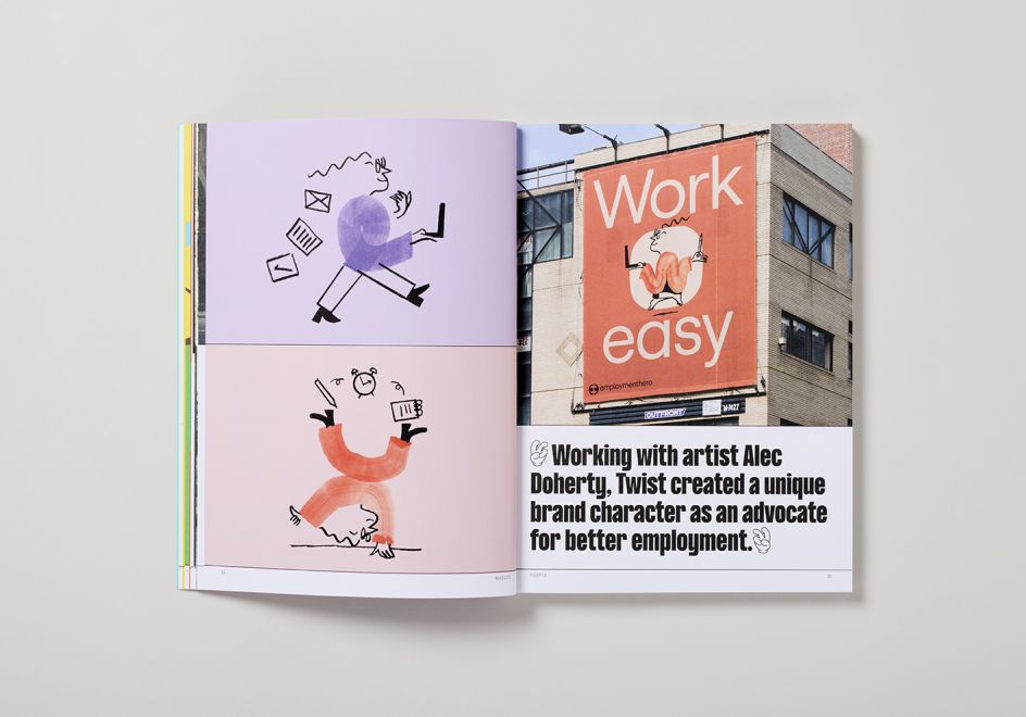
In Mascot, the pair wanted to celebrate the use of mascots in contemporary graphic design, ones that help sell or promote anything from tech companies and financial organisations to burger chains, record fairs and publishers. Looking at work from design studios such as Accompany and Cherry Bomb to Koto and Mother, the highlighted mascots can be simple and playful or sophisticated and current, but all are intended to make you smile, stand for something or both. You could say that mascots are often the cherry on top of brand identities, injecting meaning and playfulness to create a lasting impression.
The idea for the book began many years ago when Céline and Jon were running a design agency. "I was tasked with designing the mascot of a dog for an aggregating news site," Jon tells Creative Boom. "After the job was completed, they asked me to write an article for the news site about the design of mascots. I went through my favourite mascots from childhood, how I had encountered them and what they represented to me. It made me realise how deeply some mascots affect us and cemented my love for them."
Since the pair began publishing books for Counterprint, it was a theme Jon has wished to revisit. "Over the last two or three years, we've worked on a series of mini logo books on different themes, and many of the entrees have been mascots. This gave me the confidence that we could place the theme in a contemporary context and that it would not be an exercise in nostalgia."
Looking through the work on display, there are many brilliant examples of mascot use, as you'd expect following Céline and Jon's careful curation. When the pair approached designers and studios, they said it was one of the "warmest receptions" to a theme they'd had. As such, they have several interviews in the book from the likes of Steve Gavan, Andrés Requena, Karla Heredia, and Linda Jukic of Accompany. However, Alec Tear's thoughts on the matter resonated with Jon the most. Alec wrote: "I think the most successful mascots are the ones who become a personification of their brand – they live and breathe them: continuously reminding their audience of who they represent. To achieve this, a mascot's physical appearance needs to be extremely distinctive and memorable.
"A good mascot should also have the ability to move, gesture, react, interact and generally communicate on a level that a brand alone would not otherwise be able to. A lot of mascots don't have these abilities, and I find it difficult to differentiate them from a regular static logo. In my opinion, a mascot who isn't 'alive' is certainly not being utilised to its fullest potential and maybe isn't really a mascot at all."
Does Jon have any favourites from the collection? "A mascot can breathe life into a brand. It acts as a face and personality that can't easily be achieved in the same way through using a standard logo or symbol," he says. 'The ones that resonate most with me are the ones that have the most' life' injected into them. Much like Alec Tear, I like the ones that move beyond the static, the ones that can make you laugh or empathise with them."
Jon pitches the identity Alec and illustrator Dan Woodger created for The Mean Tomato as one such brand. "It's an incredible achievement and must have taken bravery on the part of both designer and client. Like many brands that utilise mascots, it taps into the nostalgia we all feel towards them, but also towards mischievous cartoon characters like Dennis the Menace or Bart Simpson. This similarity, Alec told us, even informed the spiked hairstyle of the tomato."
Alec Tear also told Céline and Jon that the mascot had to be "mean" – hence the company name, but also "cheeky, witty and absolutely full of himself, while still lovable". As Jon adds: "That's a tricky task, but one I think they achieved expertly. I'm so impressed with the various poses they created and how the mascot interacts with the applications. It's funny, cool and very mischievous."
Mascot by Counterprint is available to purchase for £20 from counter-print.co.uk.
Editor's Picks


Trending


Podcasts


Editor's Picks
Further Reading