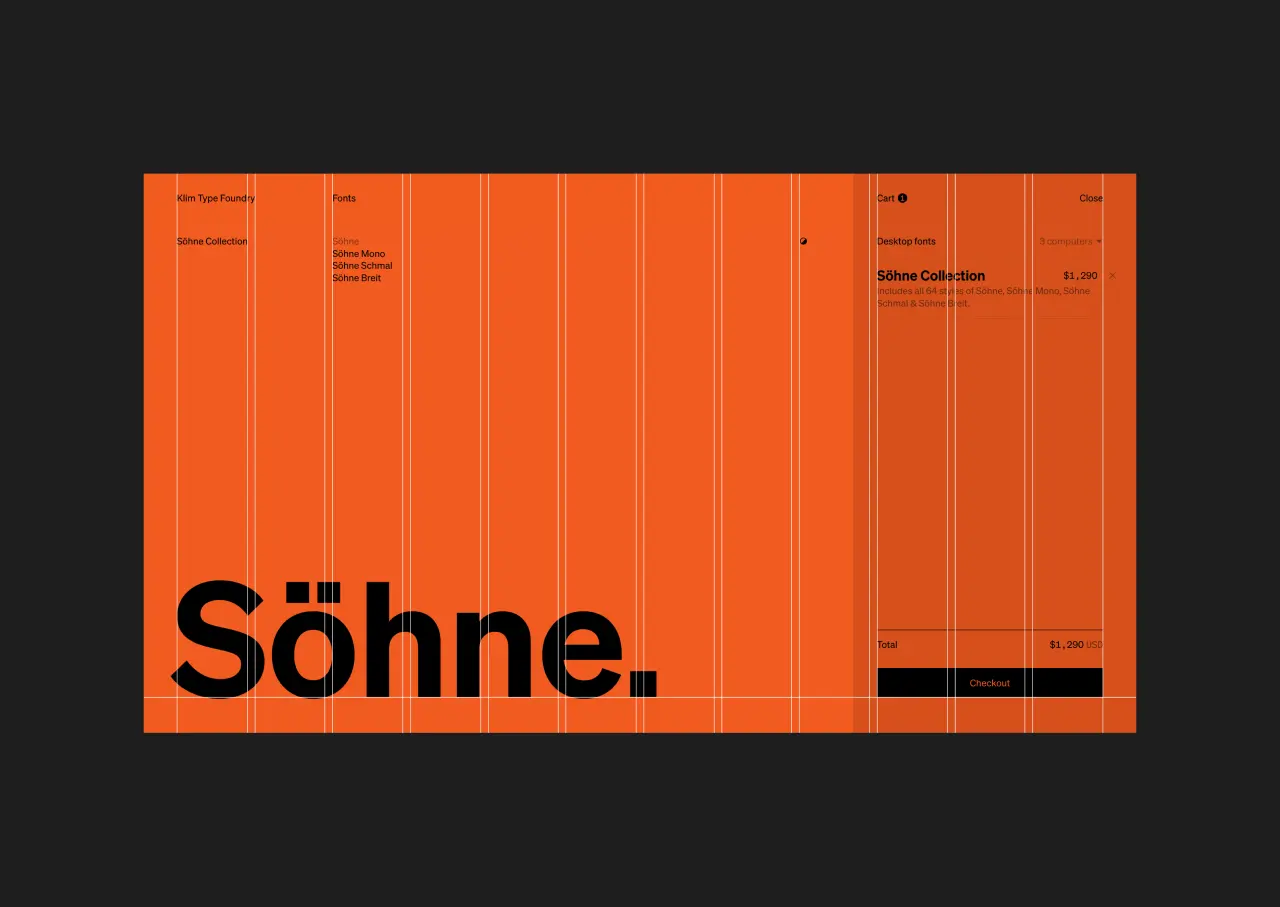
Kris Sowersby of Klim Foundry explores The Art of Letters in new book
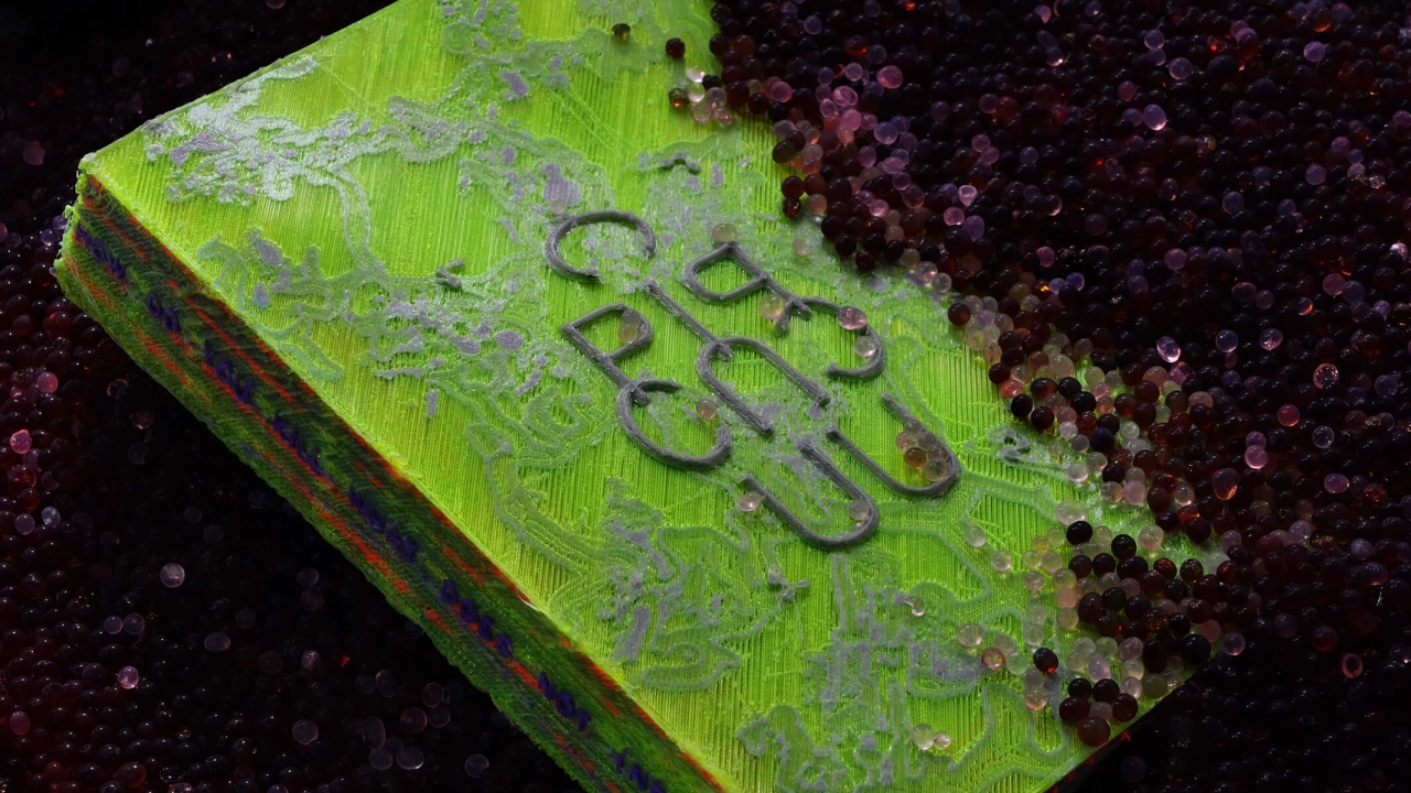
Kris Sowersby's The Art of Letters is a whopping 800-page book that examines the intersection of art, function and form in type design.
Sowersby is founder of Klim Type Foundry, an independent typeface design studio based in Wellington, New Zealand. The renowned foundry is behind a popular library of commercial fonts, and Sowersby has also designed custom typefaces for clients including The Financial Times, PayPal and National Geographic.
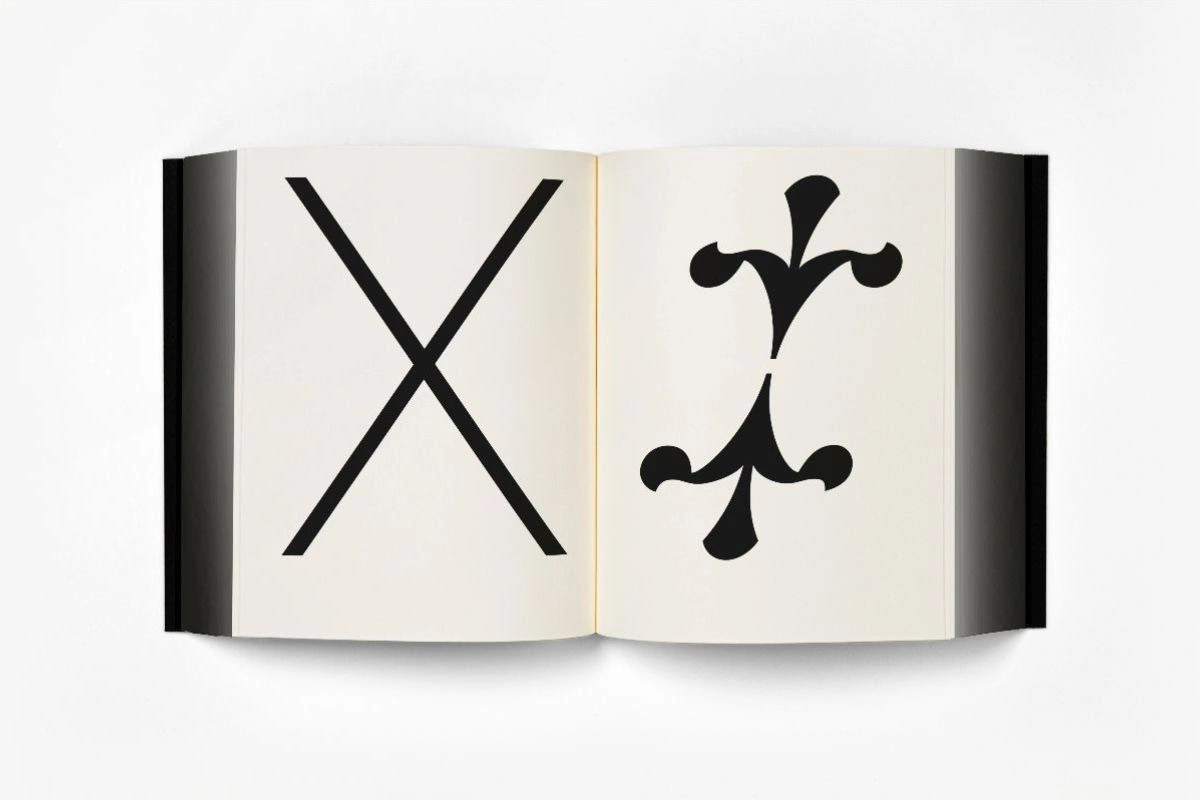
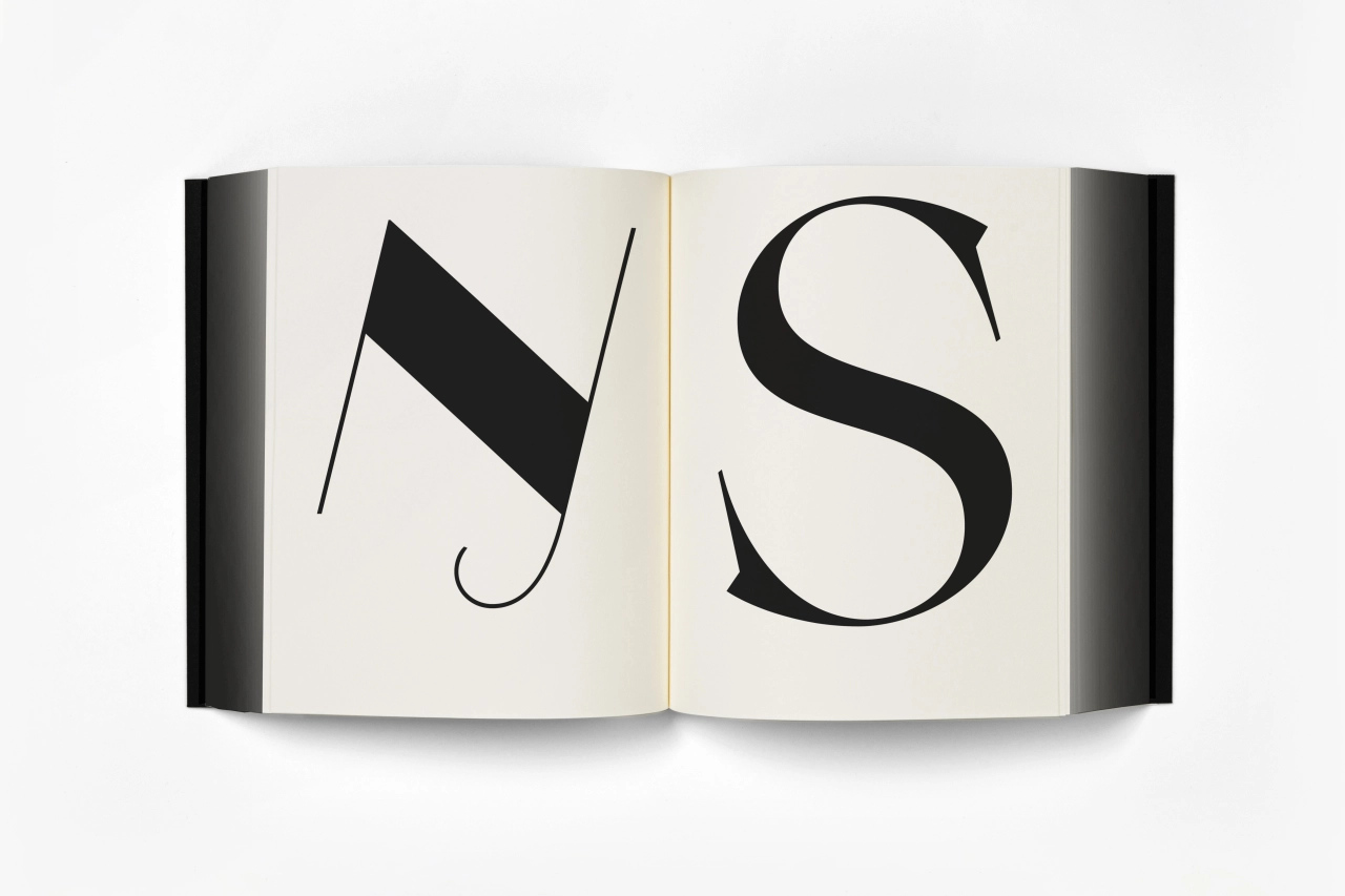
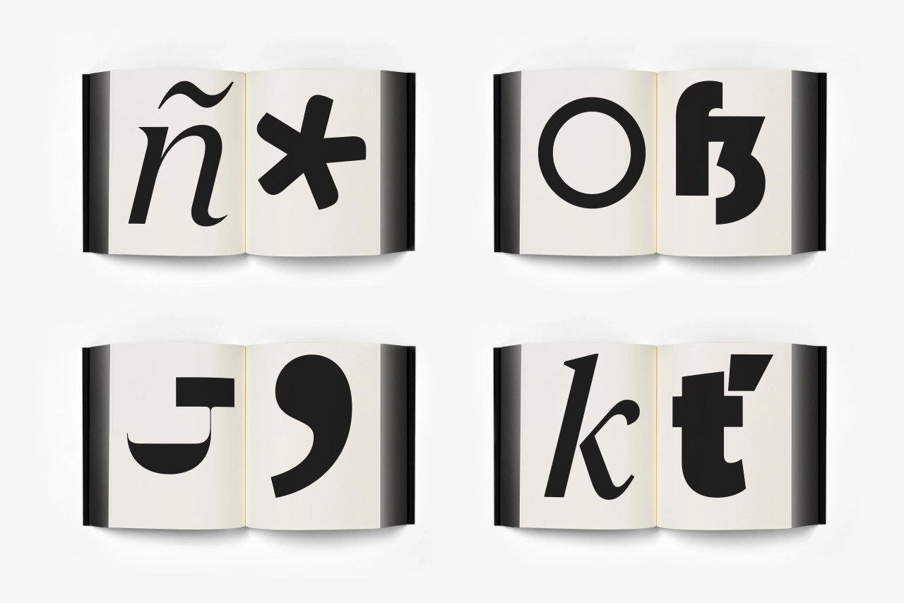
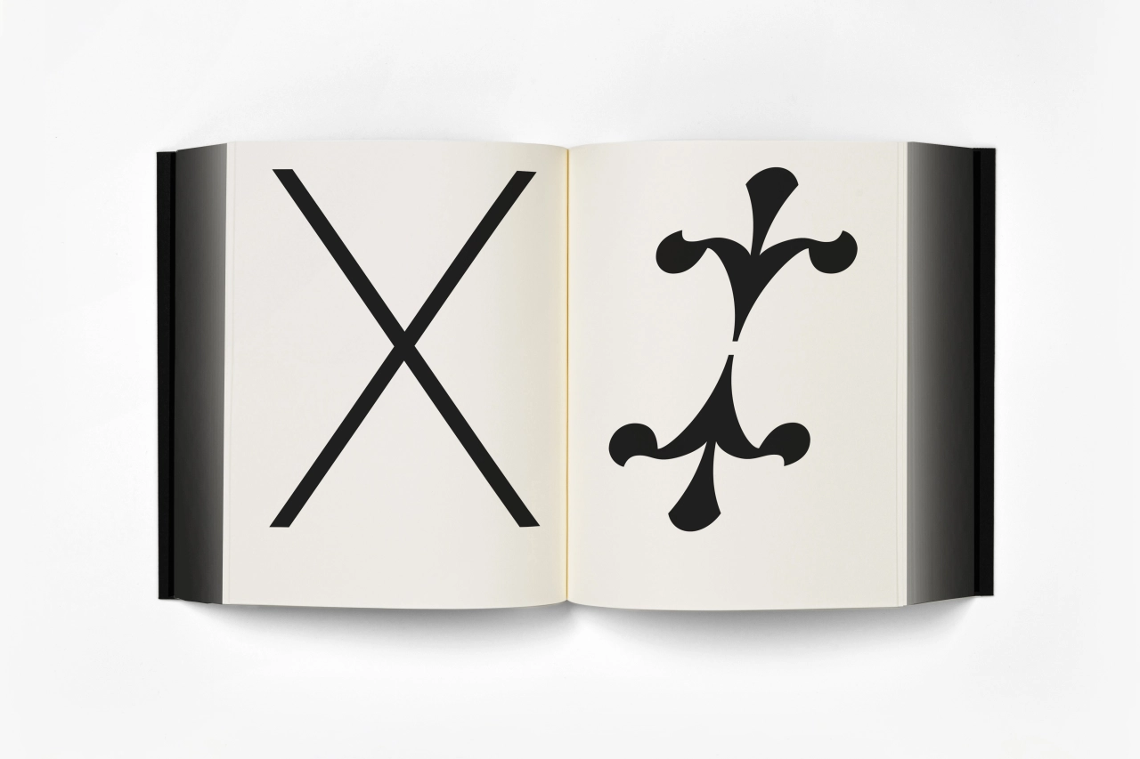
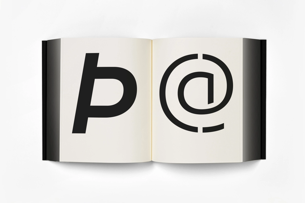
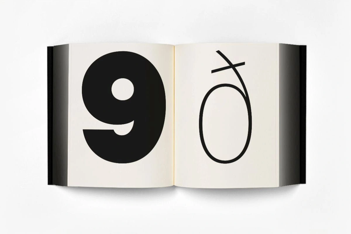
The new book is led by visuals of letterforms, presenting Sowersby's letter-drawing practice in the context of the characters' presentation as independent works of art. As such, function and style and the relationship between the two are the focus. The book also "celebrates the absurd beauty involved in creating multiple expressions of predetermined alphabets through nuance and theory," according to publisher Formist Editions.
As Formist points out, without the context of language systems and alphabets; letterforms and characters can be viewed as singular abstract drawings. While type designers spend their days carefully crafting and drawing these characters; the book aims to take a step back and allow readers to "re-see, or to see for the first time, their individual form and beauty."
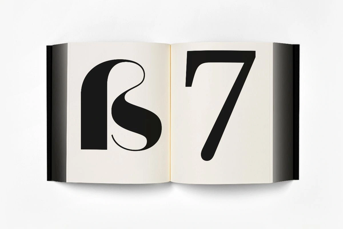
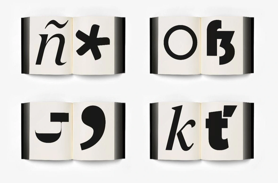
Alongside a wealth of imagery, the book also includes a critical essay by UK-based graphic designer, writer and educator Paul McNeil, co-founder of agency MuirMcNeil.
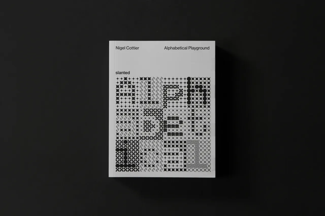
The book is designed by Australian creative Mark Gowing, who recently had his own book published of his poster works,. Gowing and Sowersby have collaborated to create a custom typeface for the book, which is currently fundraising on Kickstarter.
Editor's Picks





Trending






Latest Jobs
Talent Agent & Producer at The Jacky Winter Group
Full-time·Los Angeles·$70k-$85k
Account Director at How&How
Full-time·London·£73k-£79k
Senior 3D Motion Designer at Art&Graft
Full-time·London·£50k-£65k
Senior Front End Developer at Crown Creative
Full-time·Belfast·£50k–£60k
Senior Digital Designer at Red Antler
Full-time·New York·$95k-$130k
Brand Designer at Adfin
Full-time·London·£30k–£50k