Type foundry Klim launches a new typeface, Söhne, along with a gorgeous new website
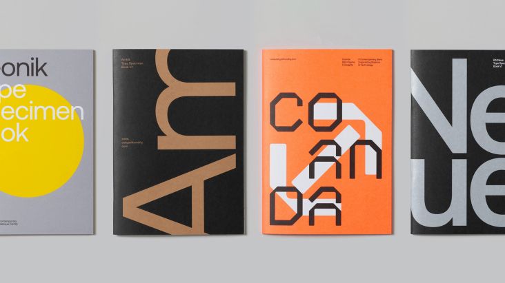
Söhne is the latest font to be released by Klim, the New Zealand type foundry we're big fans of, here at Creative Boom.
All images courtesy of Klim
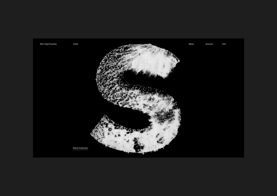
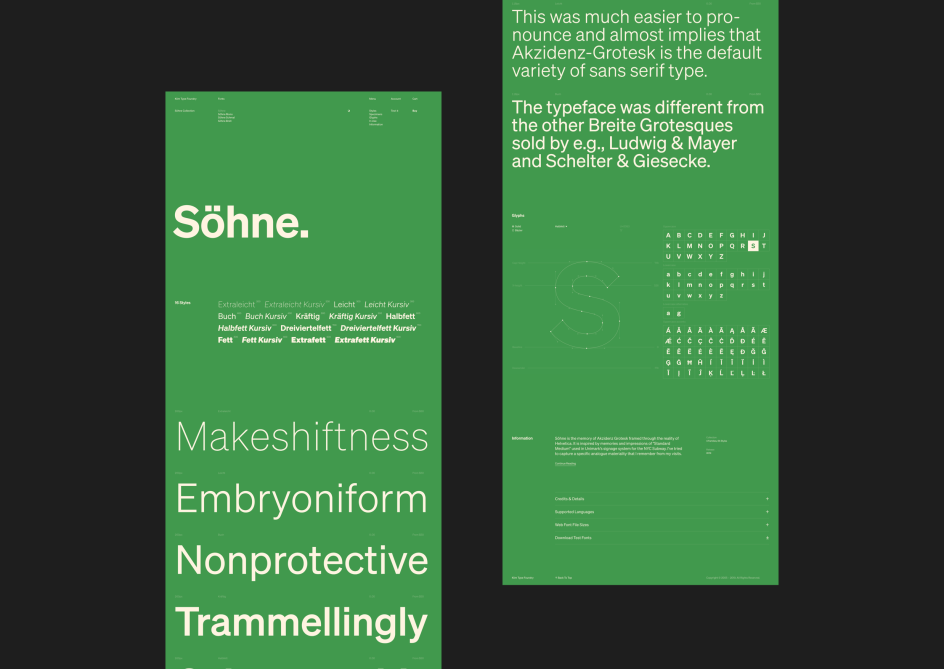
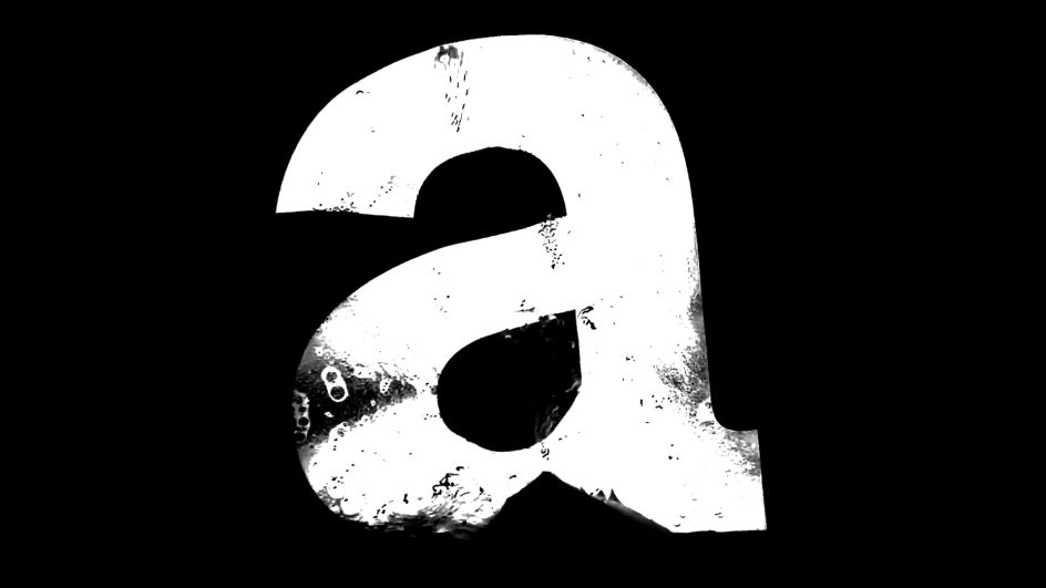
"Söhne is the memory of Akzidenz-Grotesk framed through the reality of Helvetica. It is inspired by memories and impressions of 'Standard Medium' used in Unimark’s signage system for the NYC Subway. I’ve tried to capture specific analogue materiality that I remember from my visits," says Klim's director and lead type designer, Kris Sowersby.
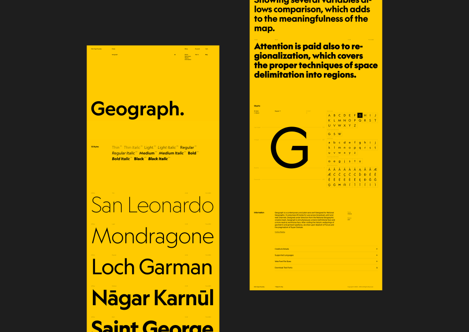
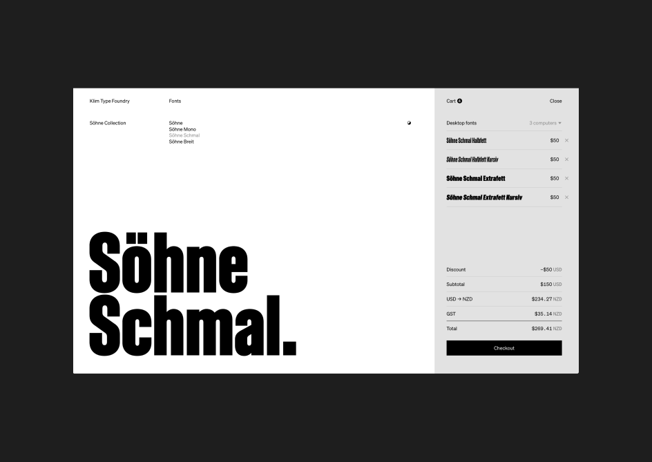
As a collection, Söhne (which means "sons" in German) includes four families: Söhne, Söhne Schmal (Condensed), Söhne Breit (Wide) and Söhne Mono. Each has a comprehensive range of weights and styles.
While the collection offers plenty of opportunities for display and text, Sowersby has an affinity for two weights, Halbfett and Fett, which have "solid, confident, poster-like qualities that resonate with my personal concept of Azkidenz-Grotesk".
Söhne has been on pre-sale since early 2019 and is in use for a limited set of brands. It's now available to download as a test font pre-purchase.
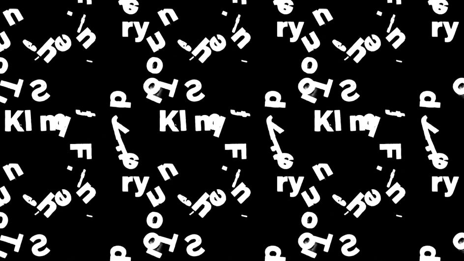
To mark the release of Söhne and to bring it to life, Klim Type Foundry teamed up with NYC and Geneva-based design agency DIA.
"DIA is at the vanguard of kinetic typography. I've always admired their work, so I'm delighted to collaborate with them," says Sowersby.
"Their films express the idea of Söhne – the idea of memory versus reality. The fallibility of memory. They were initially developed within a framework of ‘grotesque accidents’, but evolved to capture a sense of materiality and memory."
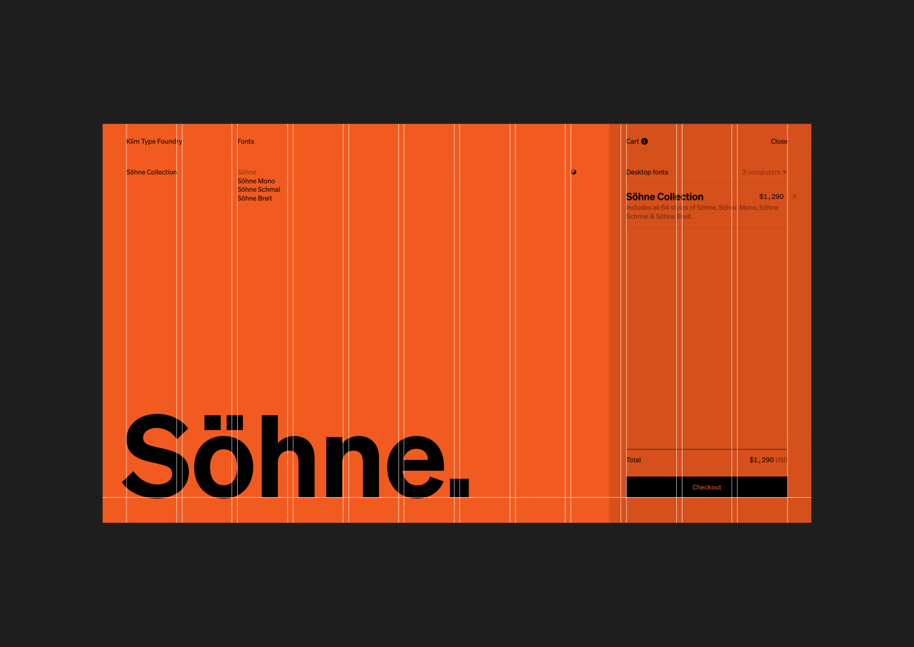
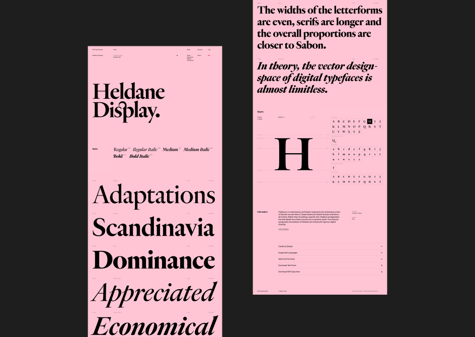
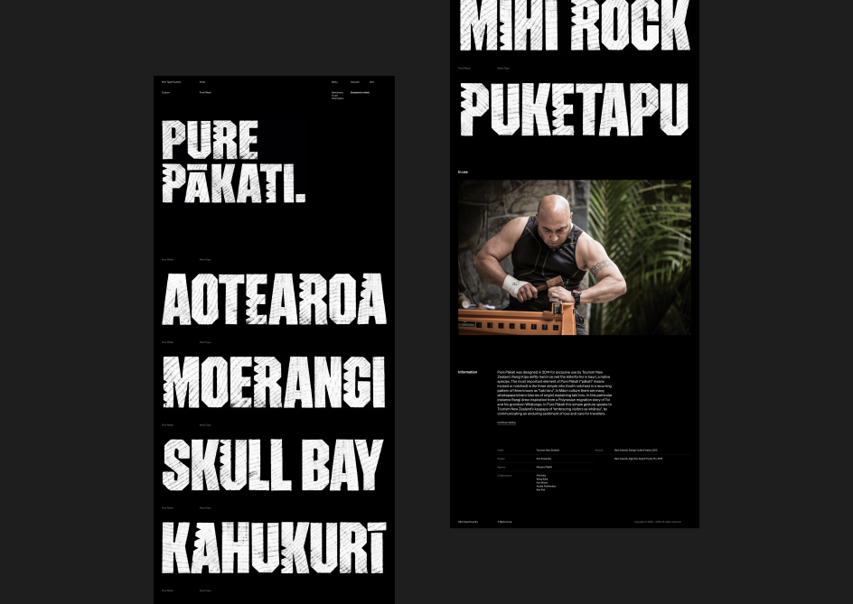
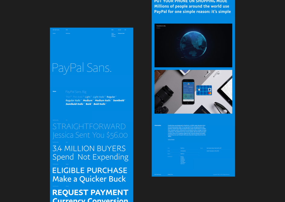
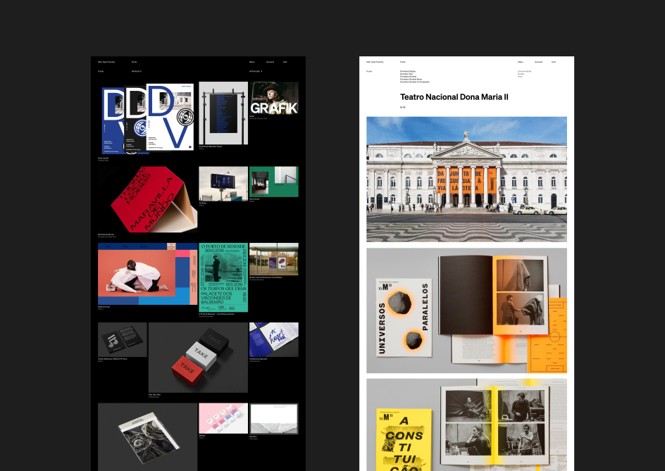
Klim’s new website, meanwhile, was designed by Wellington-based studio Springload. The redesign extends the popular features of the existing site and introduces new features that give designers more options to test and research fonts before purchase.
"Our objectives were quite simple," says Sowersby, Klim's director. "We wanted visitors and customers to play with our type, test it and read about it. We wanted the experience to be effortless, informative and interesting, and for buyers to encounter a straight-forward and direct purchasing and licensing process. Aesthetically, we wanted the redesign of the site to complement Söhne, which is our new brand font."

Editor's Picks


Trending


Podcasts


Editor's Picks
Further Reading