8 eye-catching typefaces that will elevate your editorial designs
These beautifully crafted typefaces from Blaze Type will sharpen your layouts and bring genuine character to every page.
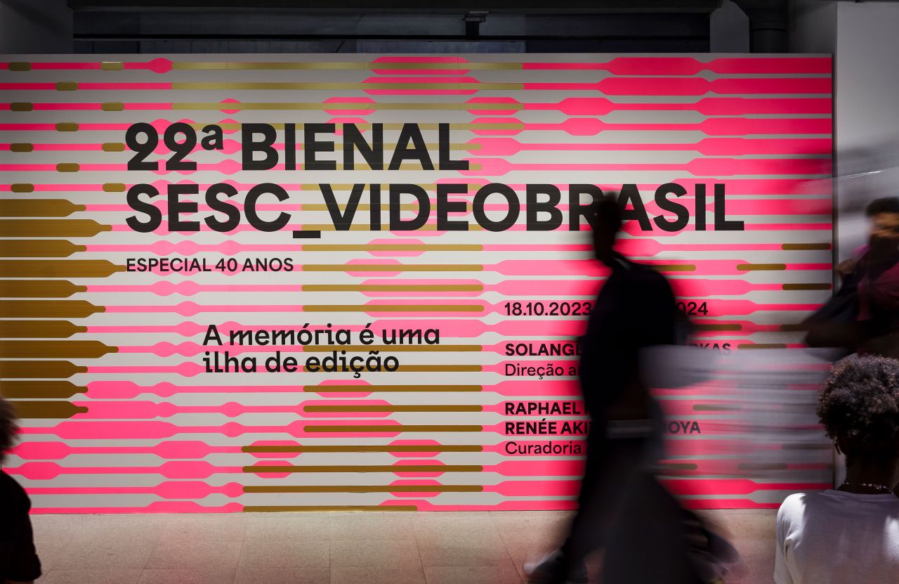
Area in use for 22º Bienal Sesc, Videobrasil, project by Luciana Facchini. Pictures by Nino Andrés
Typography is one of those things that separates good editorial design from great editorial design... and great from genuinely memorable. The right typeface doesn't just carry words across a page; it sets the emotional register, establishes hierarchy, and does half the creative heavy lifting before a reader processes a single sentence.
The problem? Hunting down type that's both distinctive and genuinely usable can take hours. So at Creative Boom, we aim to do the legwork for you and bring you indie type foundries with the best fonts, some of which may have slipped under your radar.
One foundry that's long been on radar is Blaze Type. Founded in 2016, they've spent the past decade building a catalogue of more than 100 variable typeface families, all designed with editorial and branding work in mind. And they're well worth checking out.
To get you started, here are eight typefaces from their catalogue that deserve a place in your editorial design toolkit right now.
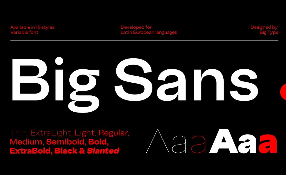
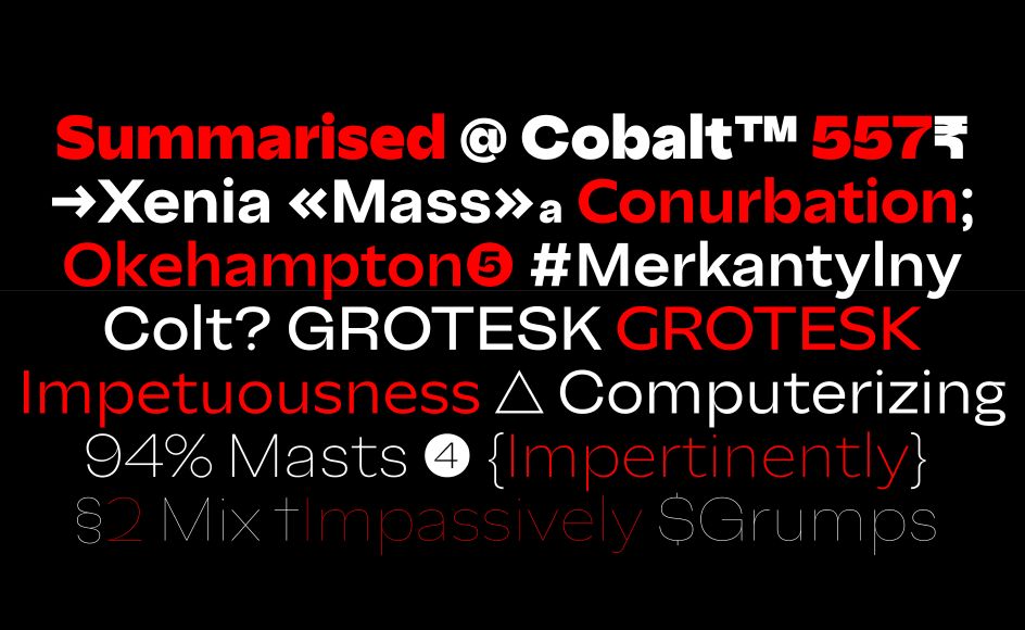
1. Big Sans
If you've ever wanted a sans serif that can go from buttoned-up to expressive without switching fonts entirely, Big Sans is worth your time. By default, it's clean and precise; firmly rooted in the mid-century grotesque tradition, with enough geometric structure to give it backbone. But activate Stylistic Set 7 and the personality shifts: terminals go vertical, proportions open up, and suddenly you have a typeface with considerably more warmth and human rhythm.
That dual nature makes it genuinely rare. Across 9 weights from Thin to Black, each with a matching slanted style, Big Sans handles everything from dense footnote text to punchy cover lines without breaking a sweat. Designed by Karol Mularczyk and released in 2025, this is a workhorse with an interesting inner life.
2. Druto
Space is always a negotiation in editorial design: you want generous leading for readability, but tighter spacing for denser layouts. Druto was built specifically to resolve that tension. Designed by Adrien Troy and released in 2025, it achieves minimal line spacing without sacrificing comfort, thanks to a strong visual horizontality, very high arches, and flat counter-forms that keep the eye moving efficiently across the line.
The result is a typeface that feels open and wide even when compressed, making it ideal for long-form journalism, data-heavy spreads, or any layout that needs to pack a lot in. Four weights, three widths and matching italics give you plenty of control. Think of it as type that's been engineered around the reader.
Druto
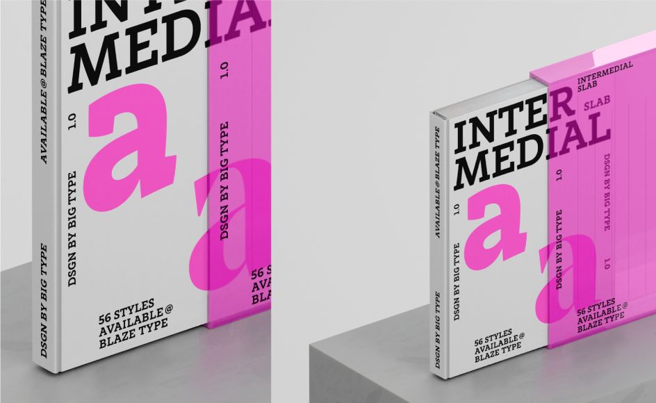
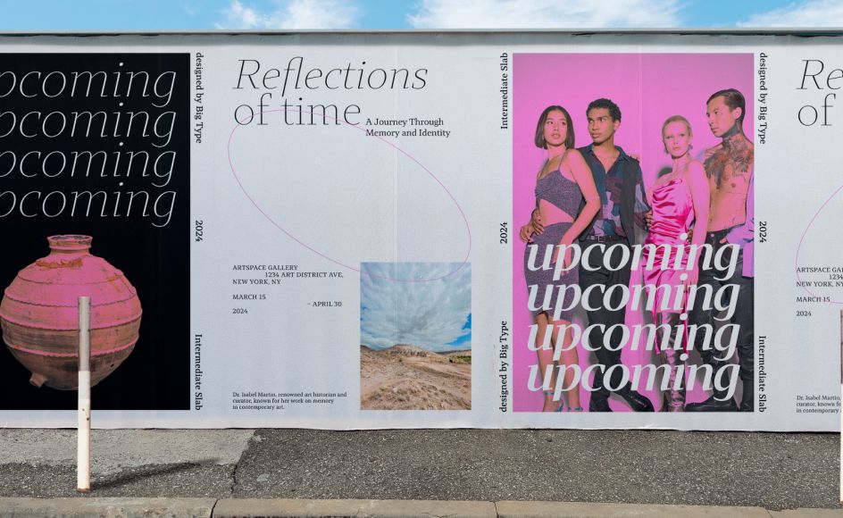
3. Intermedial Slab
Slab serifs are having a moment right now, and Intermedial Slab is one of the most considered options on the market. The key to its versatility lies in its contrast range. High-contrast styles are built for commanding, eye-catching headlines; low-contrast options work beautifully for longer body text. Mix and match the two, and you have a typographic hierarchy built in, with no additional fonts required.
Designed by Karol Mularczyk and released in 2024, every style carries a humanistic warmth that stops it from ever feeling mechanical or cold. Whether you're building a brand identity system, laying out a long-read feature or designing a print magazine, this family adapts without losing its character. It's the kind of typeface that makes a design system feel genuinely cohesive.
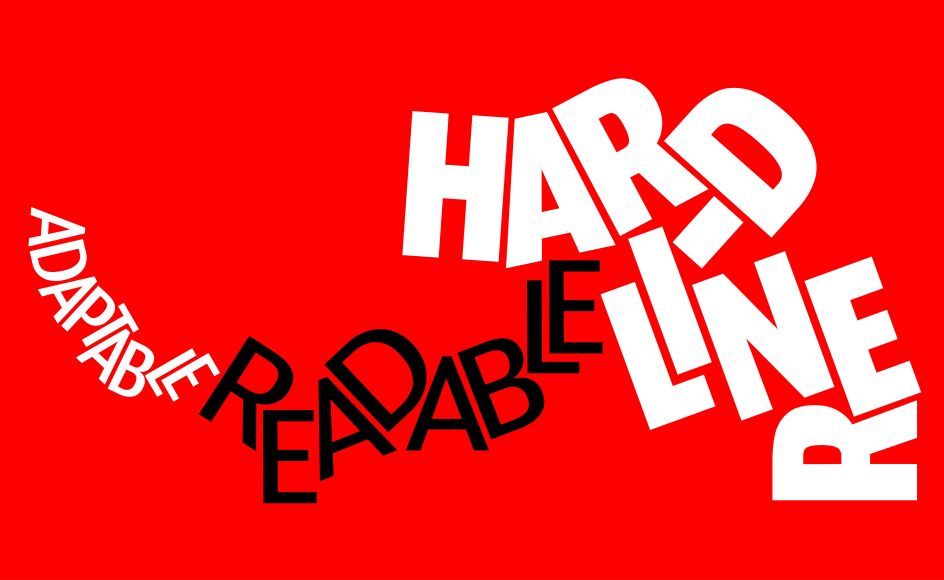
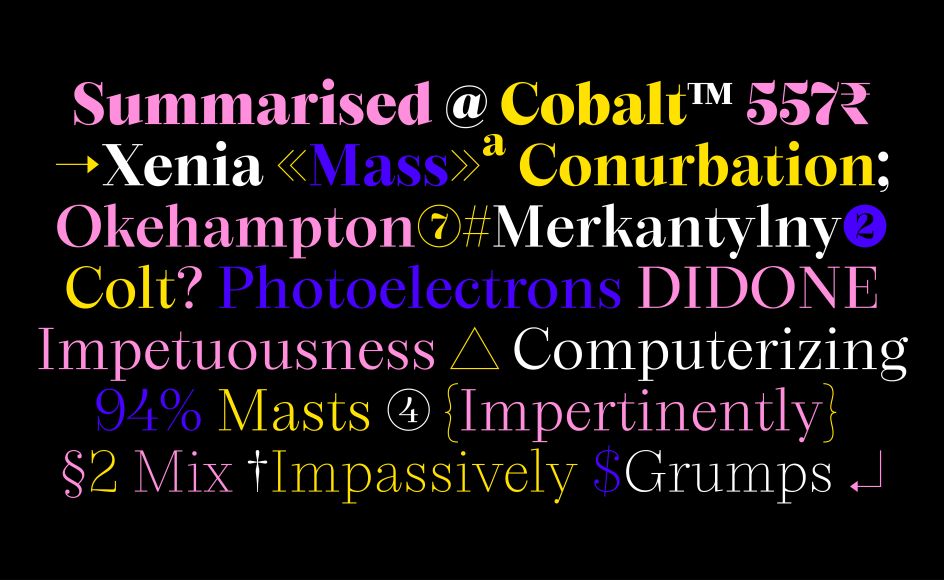
4. Area
If you're looking for a geometric sans that can handle everything from a hairline caption to a bold headline – and do it with real architectural conviction – Area is worth your attention. A variable superfamily of 176 styles spanning compressed to extended widths, with standard and inktrap variants throughout, it's built on a rigorous modular structure that softens into something more neogrotesque in use, making it surprisingly comfortable for running text as well as display work.
Designed by Matthieu Salvaggio and released in 2024, Area comes with full variable font support, meaning you can move fluidly across weights and widths rather than jumping between static files. The inktrap variants aren't decorative flourishes; they're engineered to hold up at smaller sizes, keeping things clean even when conditions aren't ideal. It's a genuinely versatile system, as comfortable in a cultural institution's identity as it is in a tech brand's UI.
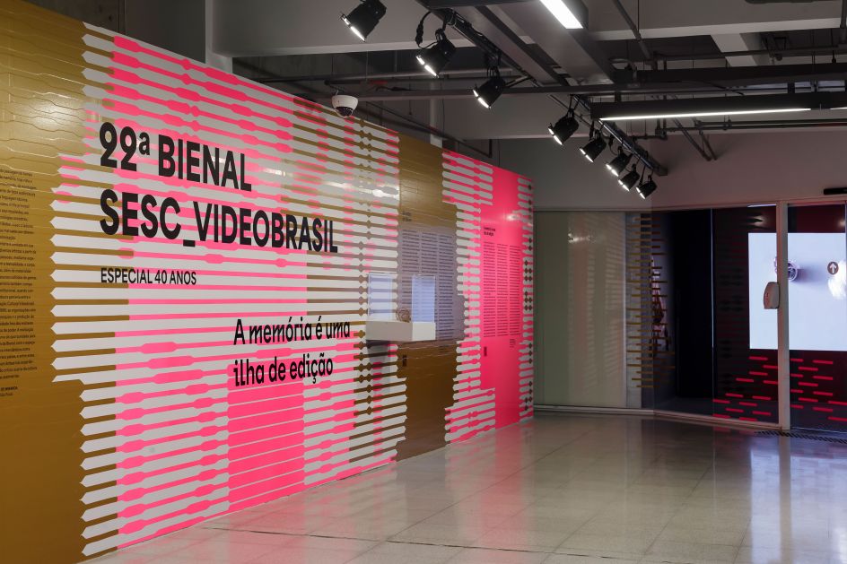
Area in use for 22º Bienal Sesc, Videobrasil, project by Luciana Facchini. Pictures by Nino Andrés
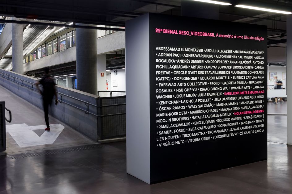
Area in use for 22º Bienal Sesc, Videobrasil, project by Luciana Facchini. Pictures by Nino Andrés
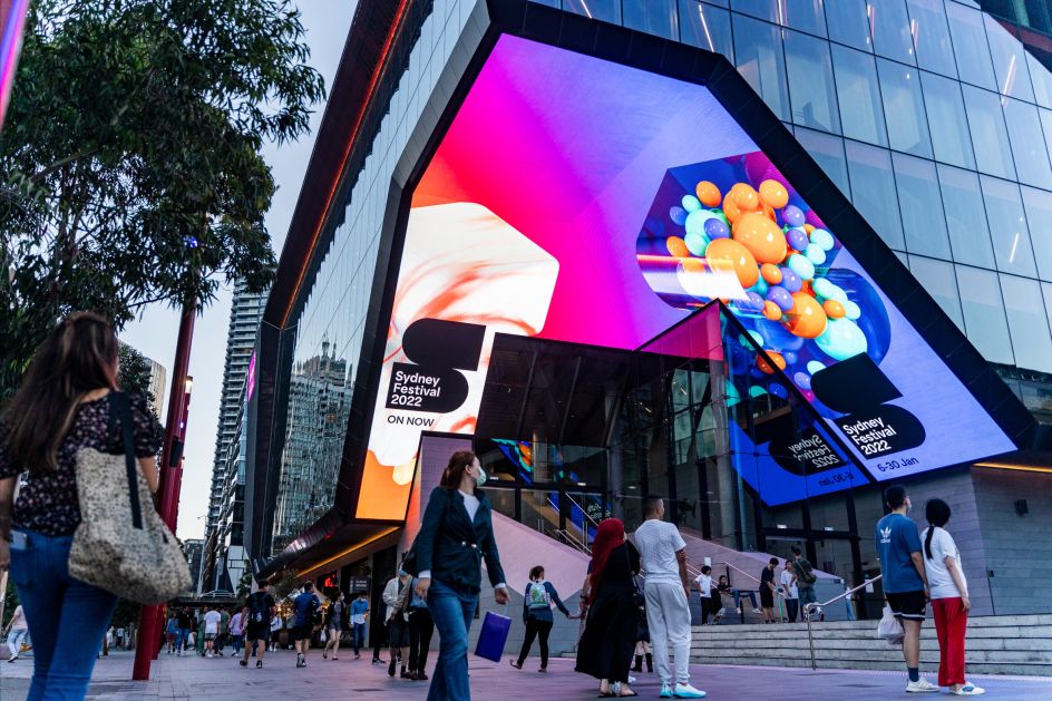
Area
5. Apoc JP
One of Blaze Type's most celebrated families, Apoc has been a go-to for standout contemporary design since its 2018 debut. Defined by sharp, expressive letterforms and a bold, confrontational elegance, it was built for display work that demands attention: website headers, exhibition posters, album covers, and more.
Apoc JP, released in 2026 and designed by Matthieu Salvaggio and Caio Kondo, extends the family into Latin and Japanese (Kana) scripts, supporting both horizontal and vertical writing systems. For editorial projects working across languages and cultural contexts, this kind of dual-script sophistication is genuinely rare. Light and dark, East and West: the typeface carries its contradictions beautifully.
Apoc
Apoc
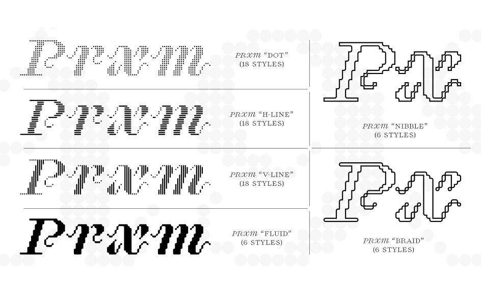
6. Proximity
Proximity has an unusually compelling origin story. It began as a bespoke italic for PROXIMA, a Barcelona-based creative studio working in live music, and its conceptual roots show. The underlying idea is a pixel grid: individual elements that, when connected, form something greater than the sum of their parts. From that starting point, the system expands into six further sub-families, including fluid continuous shapes and expressive outlined styles.
What makes it editorially interesting is that it manages to escape the retro 8-bit clichés usually associated with modular, pixel-based type. Designed by Valerio Monopoli and released in 2025, Proximity is sophisticated and precise, available in three weights with matching italics, and supports adjustable pixel sizing for tight typographic control. It's a serious choice dressed in a distinctive costume.
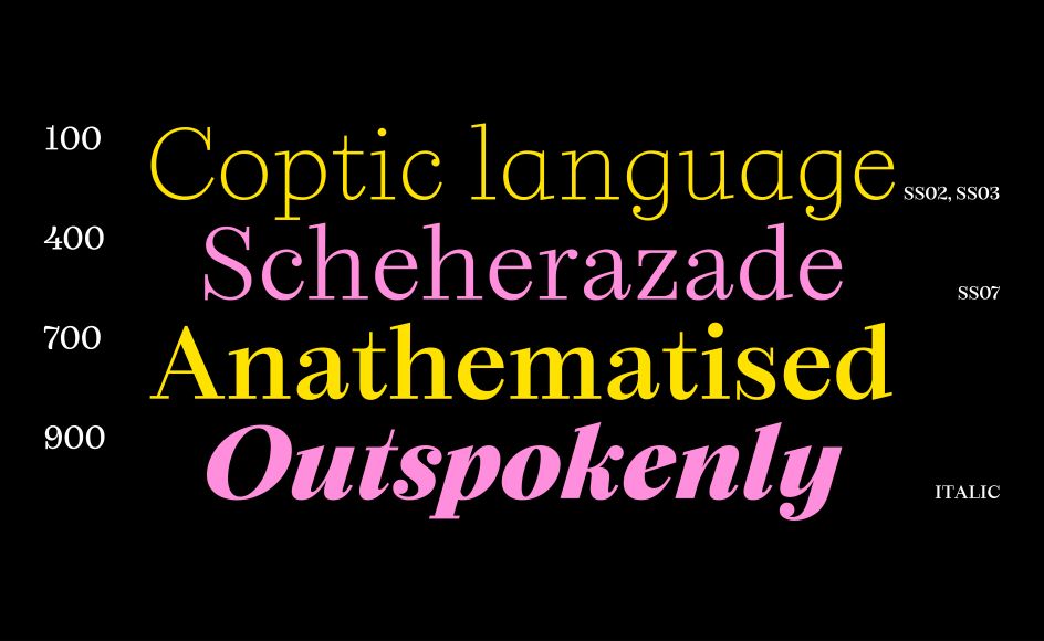
7. Seraphine
The Didone genre, with its high contrast, hairline serifs and vertical stress, has deep editorial credentials. Seraphine is a contemporary take on that tradition, bringing it fully up to date. Nine weights from Thin to Black, four optical sizes for performance at different scales, true italics that retain the flowing elegance of classical Didone design, and full variable font functionality: this is a typeface that covers a lot of ground.
Designed by Karol Mularczyk and released in 2025, Seraphine also includes a set of decorative stylistic sets that expand its creative range; useful when you need your type to work harder as a graphic element in packaging or branding work. If you want the authority of a classical serif with the flexibility of a modern variable font, Seraphine delivers both.
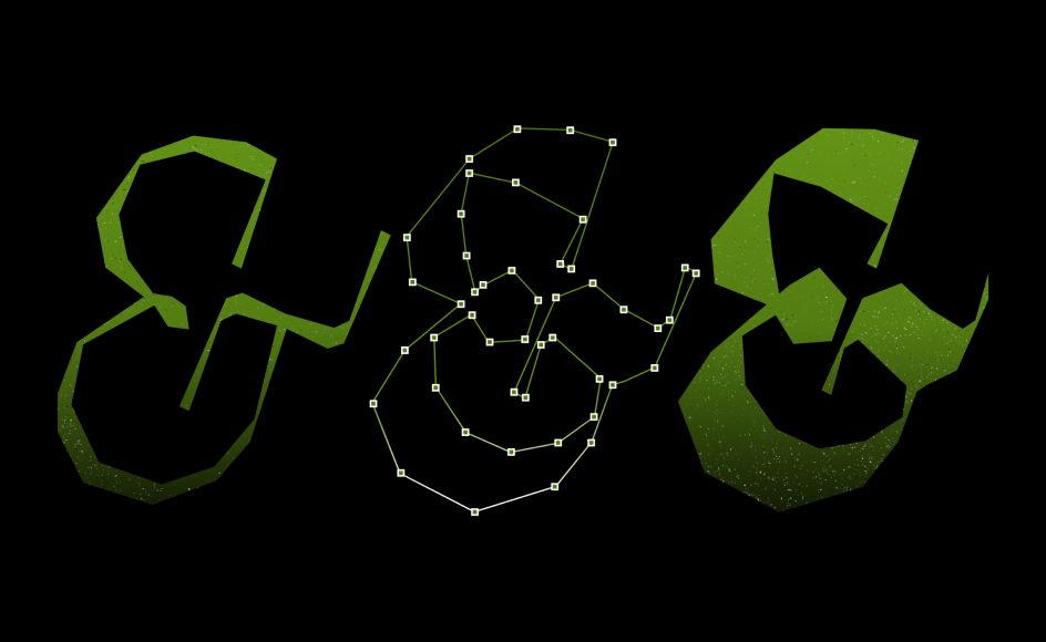
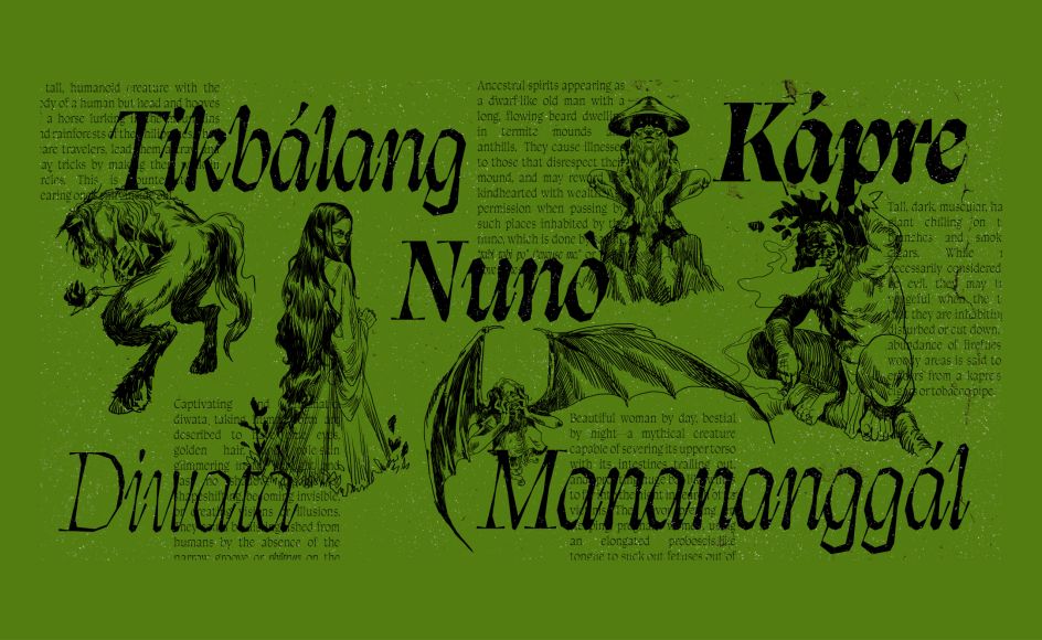
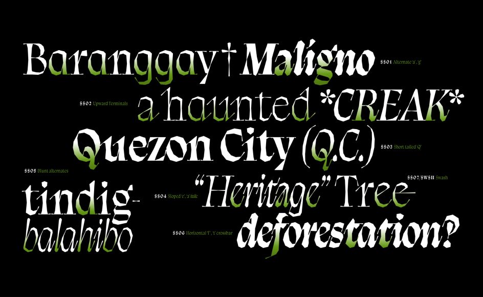
8. Balete
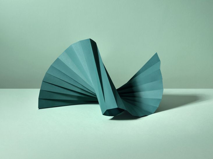
We've saved the most distinctive for last. Balete is inspired by the balete tree of Philippine folklore, a hemiepiphyte infamous for strangling its host, and the influence is felt in every letterform. Slender, creeping terminals emerge from twisting stems. The letterforms carry the illusion of fluid calligraphy, but without a single curved line. The effect is eerie, beguiling, and completely unlike anything else in editorial typography.
Designed by Jad Maza and released in 2024, the family spans Thin to Black weights in distinctly drawn Roman and Italic styles, and supports Latin European and Vietnamese scripts. This is not an everyday workhorse; it's the typeface you reach for when a project calls for mystique, storytelling and a real point of view. When the brief says "we want something unforgettable", Balete is your answer.
Balete
Balete
Balete
Further Information
All eight typefaces are available to explore, test and license at Blaze Type. Trial versions are fully functional: drop them into your layouts and see what fits before you buy. Prices start from €40, with an 80% discount for students and academics.


Editor's Picks


Trending


Podcasts


Editor's Picks
Further Reading