Superfeet steps into a new era with the help of MLTI NYC
Performance insole leader Superfeet partners with MLTI NYC to unveil a vibrant new brand identity, blending science, motion, and soul to meet the demands of modern athletes.
If you think performance insoles are a sleepy product category, think again. Superfeet, the global leader best known for pioneering biomechanically driven insoles since 1977, has made a confident leap into the future with a brand transformation as energetic as the athletes it serves.
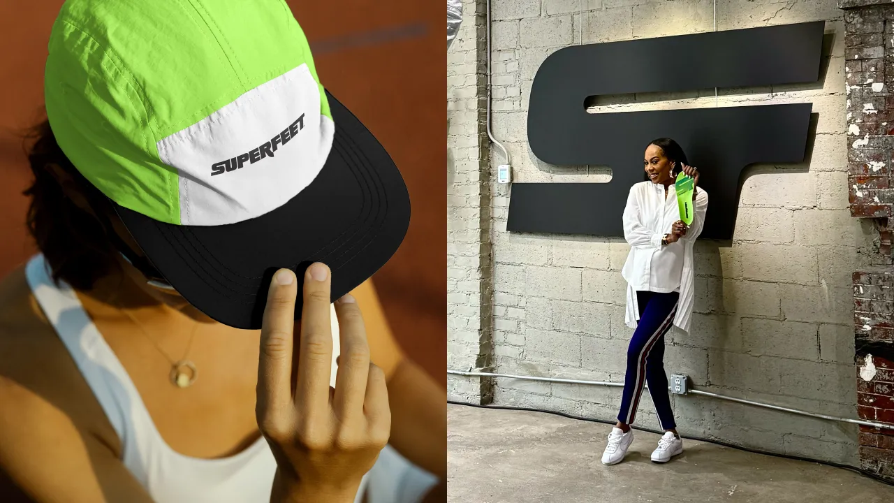
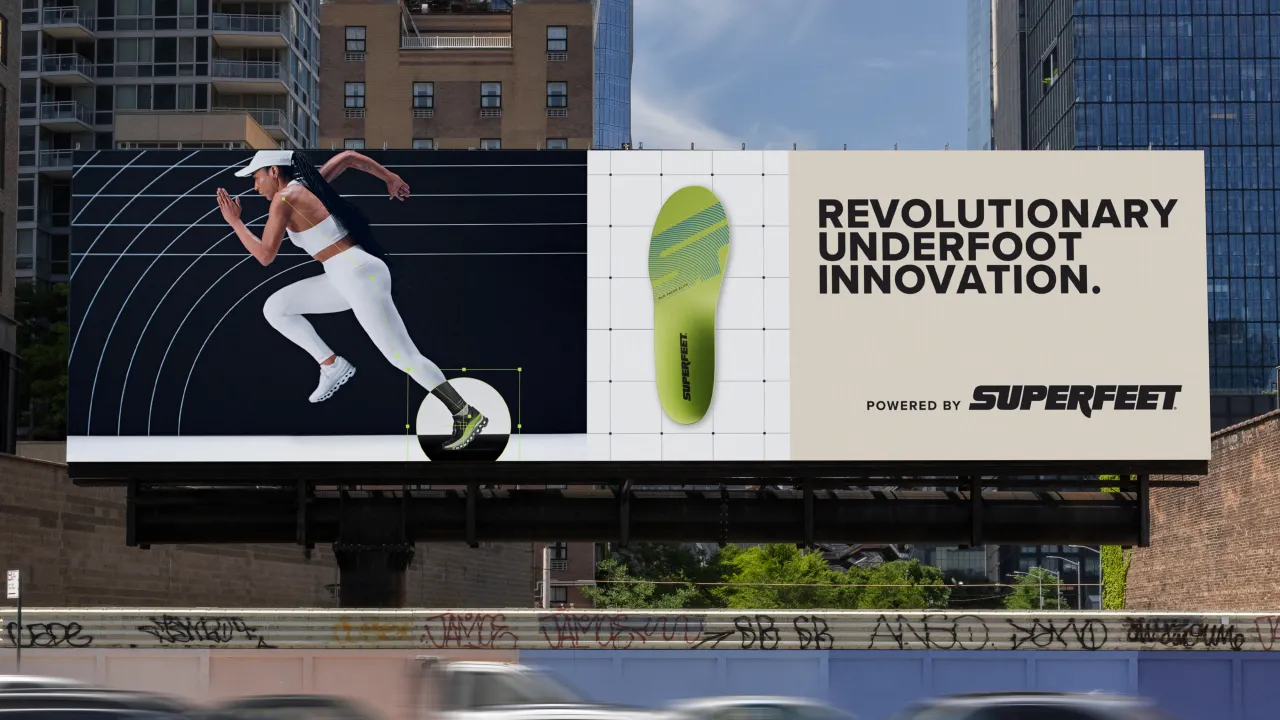
Partnering with New York-based creative agency MLTI NYC, Superfeet has unveiled a comprehensive rebrand, encompassing strategy, identity, packaging, photography, and motion, with the goal of reclaiming its performance-driven roots. The new direction was launched in style at a New York City event featuring former Olympian Sanya Richards-Ross and a first look at Superfeet's next-generation products.
"This brand refresh is about much more than a new look; it marks a new chapter in how we serve today's athletes," says Trip Randall, CEO of Superfeet. "Superfeet has always been trusted by those who push limits. Now we're doubling down on innovation and performance to power every kind of athlete, wherever their pursuits take them."
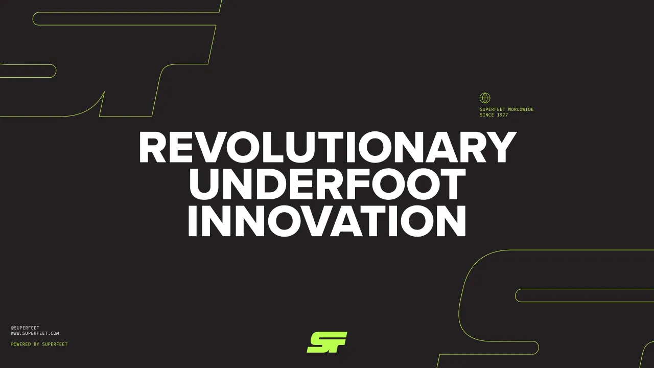
At the heart of the evolution is the rallying cry "Powered by Superfeet." More than just a tagline, it's a strategic platform designed to celebrate and amplify the diverse ways people rely on movement – from marathoners chasing personal bests to nurses logging twelve-hour shifts.
Mike Donnelly, VP of Marketing, explains: "Through a clear vision to focus on serving athletes, we built a brand system that leads with performance and flexes to meet the needs of athletes in every environment. Whether you're running 26.2 or navigating your daily grind, Superfeet powers your every move."

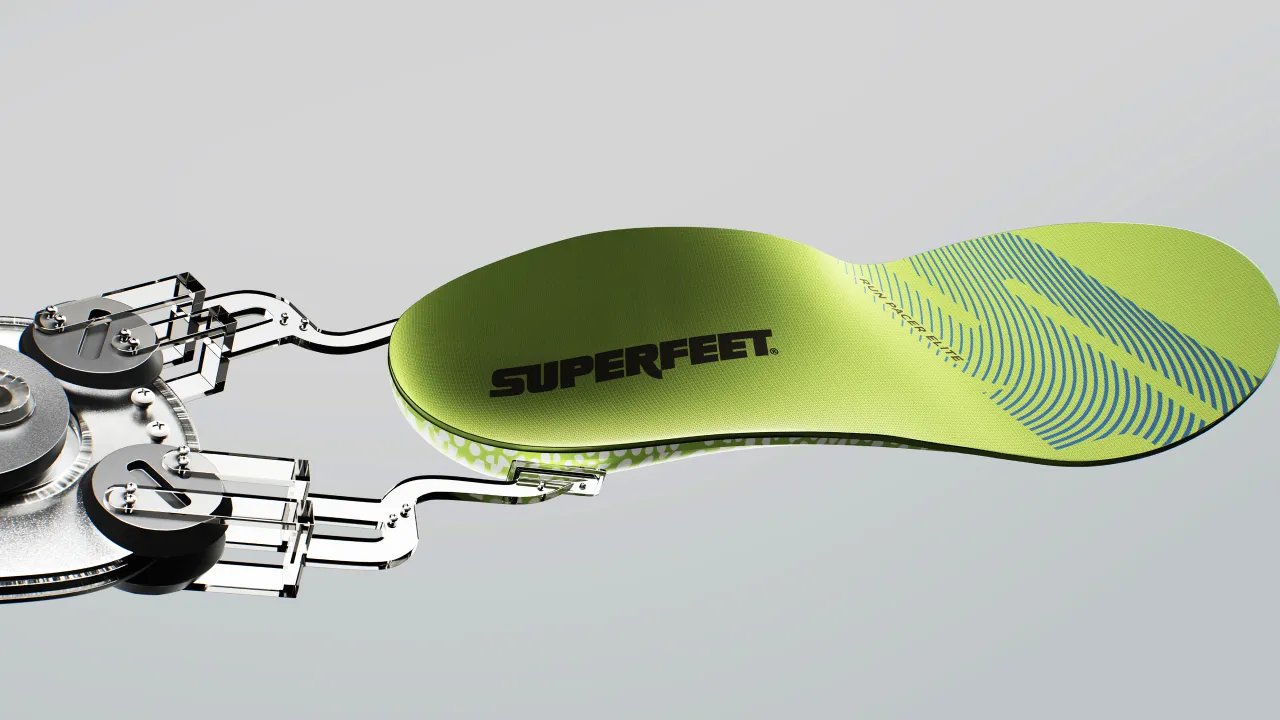
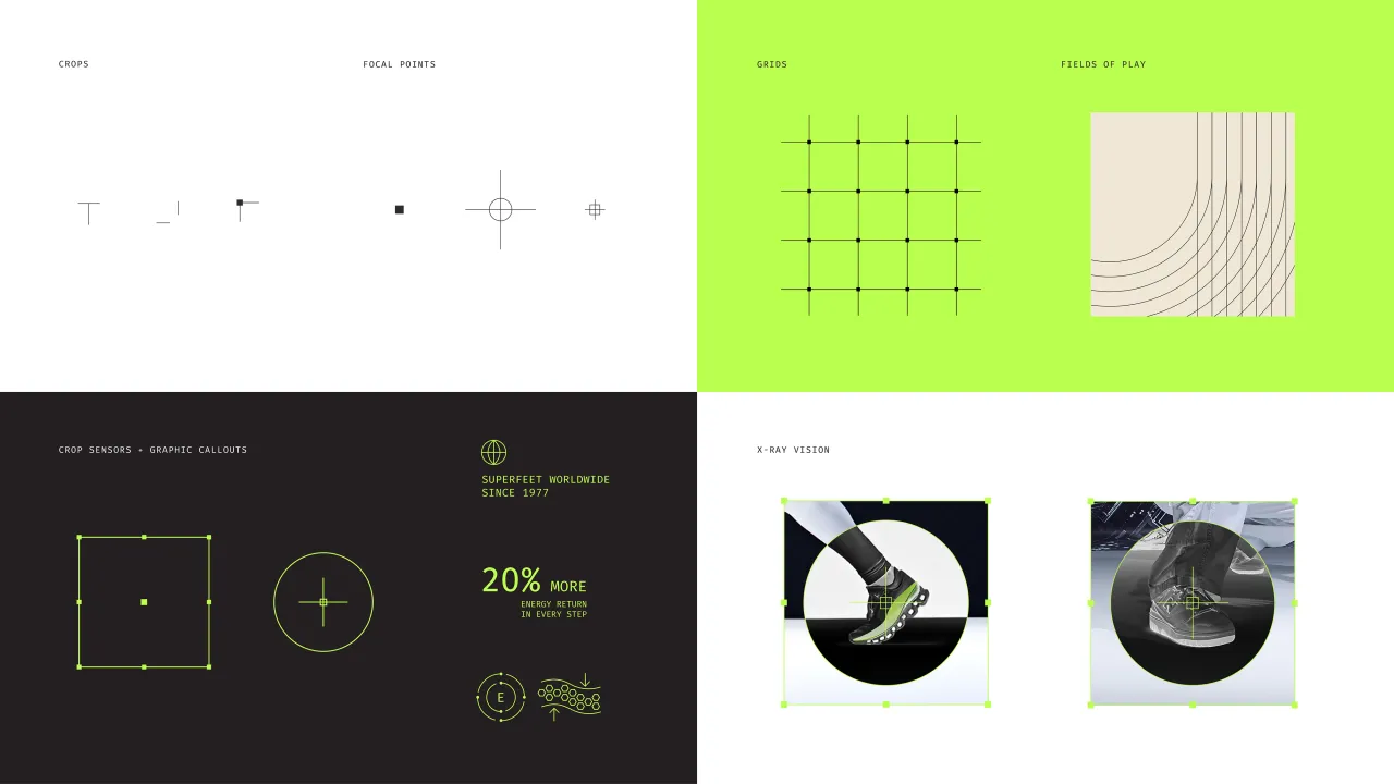
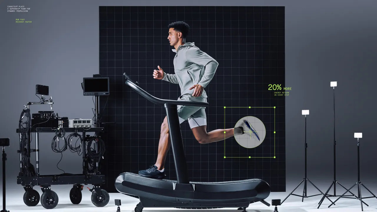
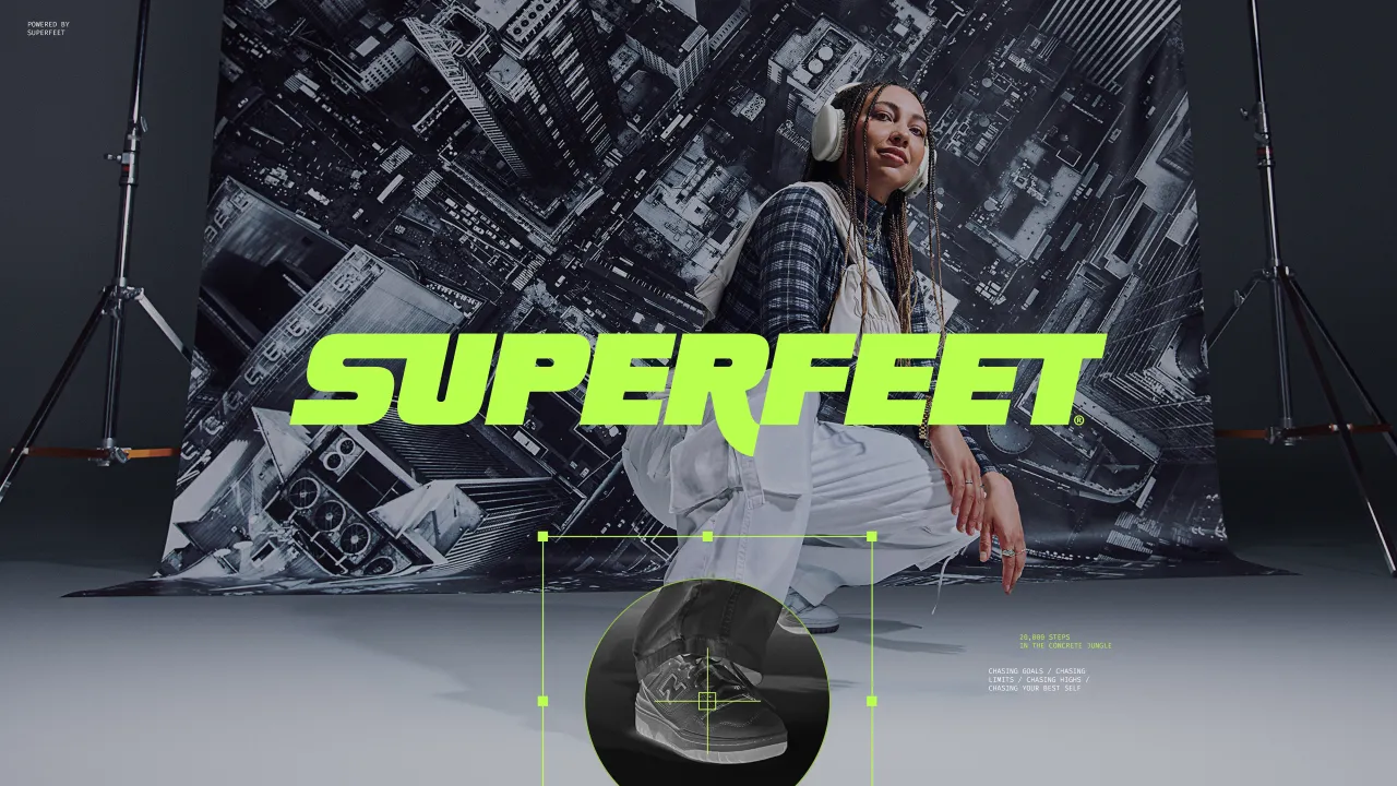
Seamlessly merging technical credibility and emotional resonance was central to the project. MLTI NYC drew inspiration from Superfeet's biomechanical heritage, creating a lab-inspired visual language. Photography and CGI feature authentic lab backdrops, motion-tracking devices, and anatomical references, building a sense of precision without sacrificing energy.
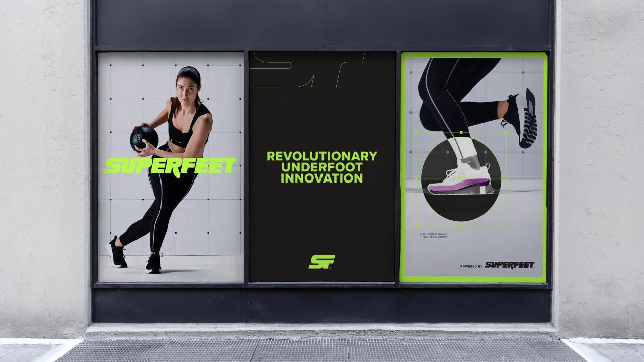
Kristen Shenk, founder and creative director of MLTI NYC, describes the approach as "turning a disadvantage into an advantage." Insoles aren't exactly showstoppers, but by layering x-ray-style CGI over athlete portraits, the design team made the invisible visible, transforming Superfeet's unseen performance benefits into a powerful visual metaphor.
"By showcasing the product in a cool, tech-y way, it makes the unseen seen and gives the feeling that Superfeet insoles are this unseen advantage – this secret weapon – to make you better," Shenk adds.
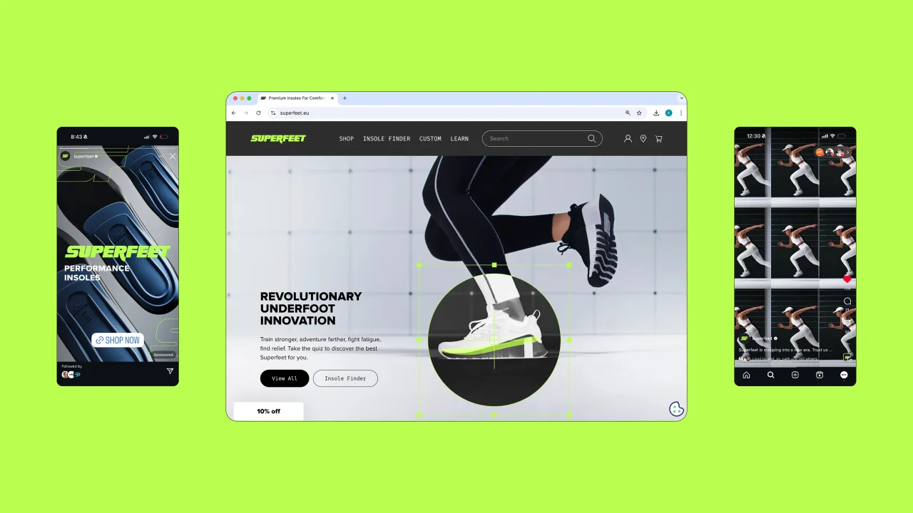
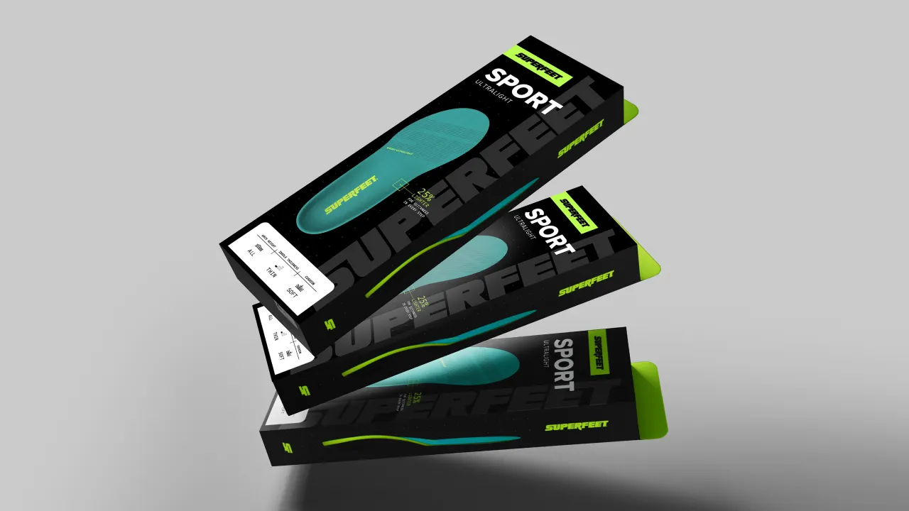
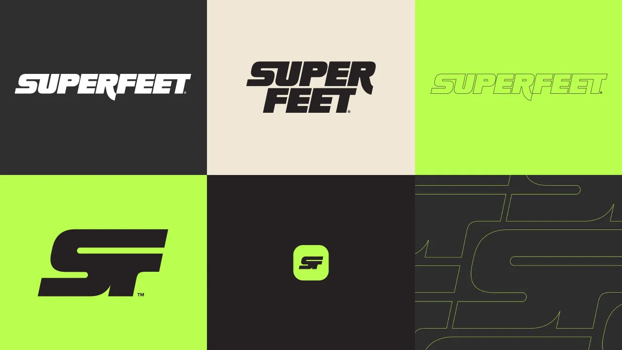
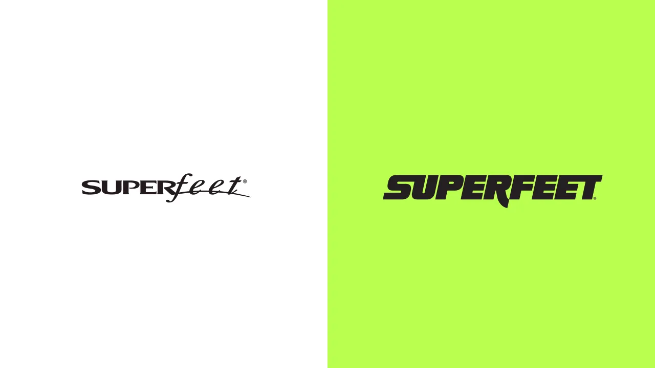
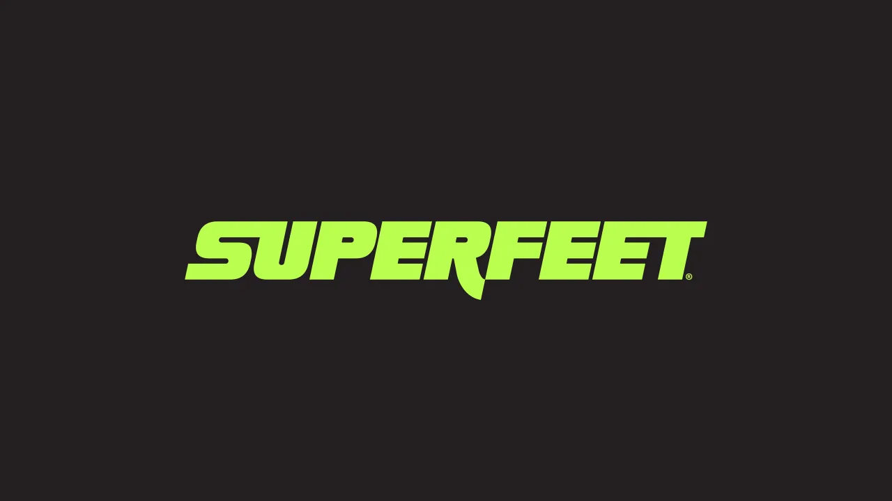
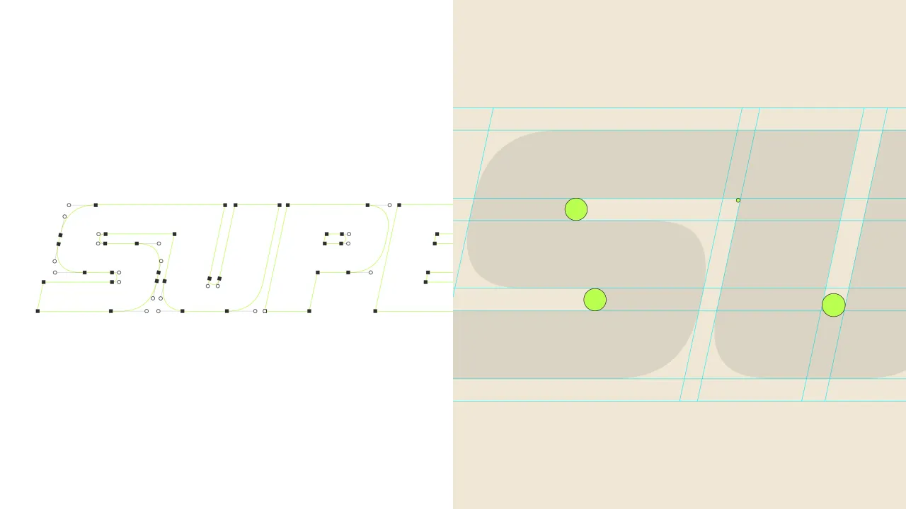
The updated Superfeet logo also tells a story of movement and connection. Bold, italicised letterforms suggest speed and forward momentum, while subtle ligatures between characters symbolise the relationship between foot and insole, science and motion.
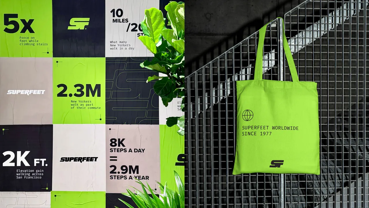
Supporting typography draws from monospaced, lab-style fonts like Fira Mono, reinforcing the brand's biomechanical expertise with a clean, research-driven aesthetic.
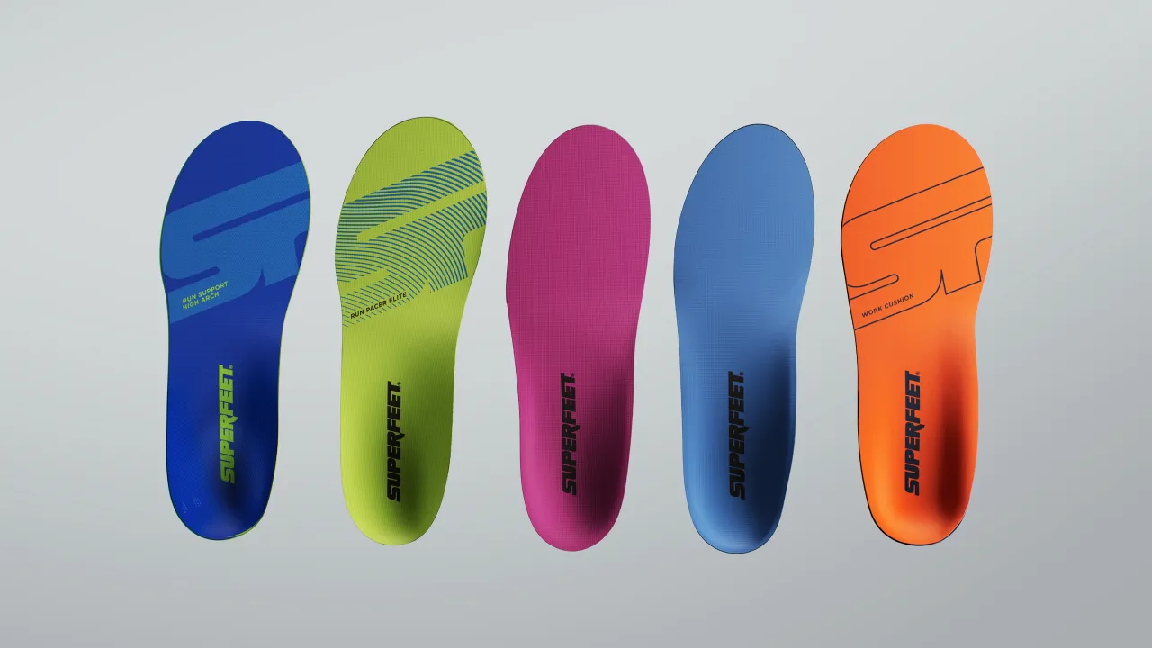
Then there's the recharged neon "Super Green", derived from Superfeet's best-selling insole, which anchors the whole colour scheme. It's supported by crisp black, white, and warm neutrals for balance and sophistication, making it bold without being brash and science-minded without being sterile.
[2-image]
True to Superfeet's multidisciplinary vision, the rebrand extended beyond static design. A 70-second hero film, also titled Powered by Superfeet, captures the brand's new energy in motion. Set to a poetic voiceover, the film charts the journey of athletes across training days, race days, game days – even two-a-days – celebrating both the everyday grind and the extraordinary heights of human movement.
It's not just about elite sports performance either, as the campaign reflects a broader, more inclusive view of what it means to move and achieve. By spotlighting construction workers, nurses, and everyday athletes, Superfeet's new platform reinforces the idea that performance isn't limited to the track or field but embedded in daily life.
The brand refresh signals a major step forward for Superfeet. With a reinvigorated strategy, a future-facing design system, and a strong emotional hook in Powered by Superfeet, the brand is firmly positioning itself for growth in a new era of performance culture.
"This moment represents the strength of Superfeet's vision and ambition for what's next," says Shenk. "It's been a true collaboration. Superfeet came to the table with breakthrough products and a clear sense of purpose.
"Together, we built a brand system that's as forward-thinking and high-performing as the people it's built for."
For a brand built on biomechanical precision, it's only fitting that Superfeet's next chapter looks this good.

Editor's Picks





Trending




Latest Jobs
Graphic Designer & Illustrator at Discord
Full-time·San Francisco·$116,000 – $130,500
Producer, Marcom at Code and Theory
Full-time·New York·$75,000 – $90,000
Lead Digital Designer at Together
Full-time·£55,000 – £75,000
Communications Strategy Director at David&Goliath
Full-time·Los Angeles·$120,000 – $180,000
Designer, Marketing (Games) at The New York Times
Full-time·New York·$85,000 – $100,000
Head of Production at Art&Graft
Full-time·London·£80,000 – £95,000