When it comes to branding, football fans can be a pretty conservative lot. Brave is the designer who sets out to change a crest, alter a colour or mess with a century-old, fussy emblem. Expect a social media storm within the hour, and some choice words to speculate on your parentage.
So when Fulham FC, a club with more than 145 years of history, decided it wished to breathe new life into its identity, some creatives might have made their excuses and left.

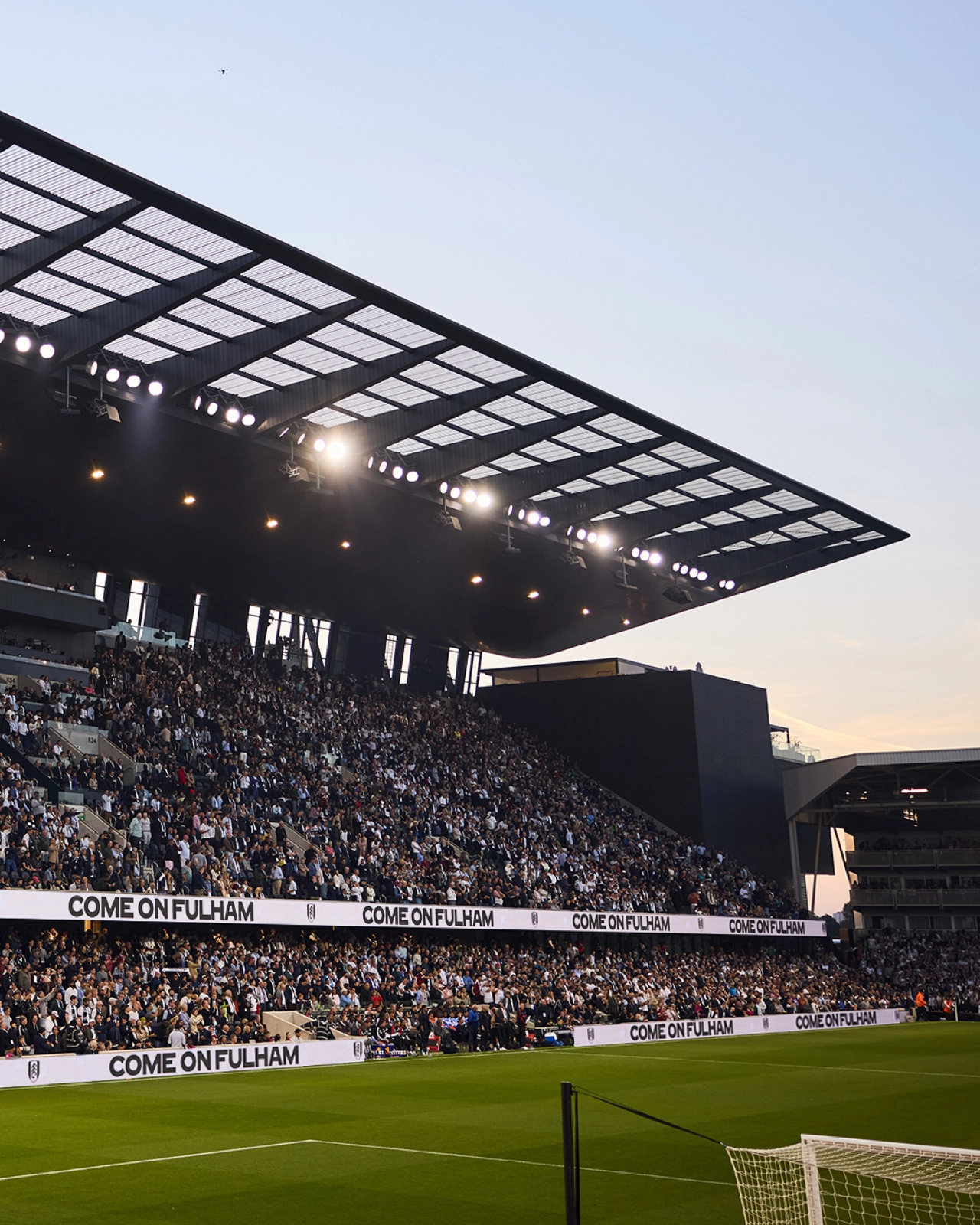
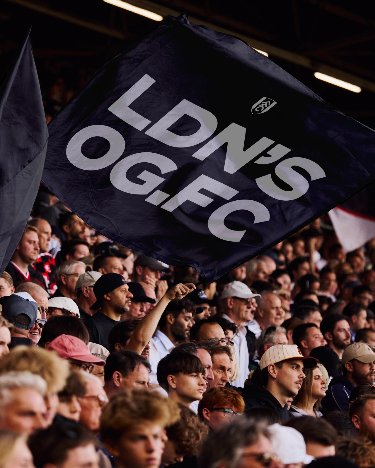
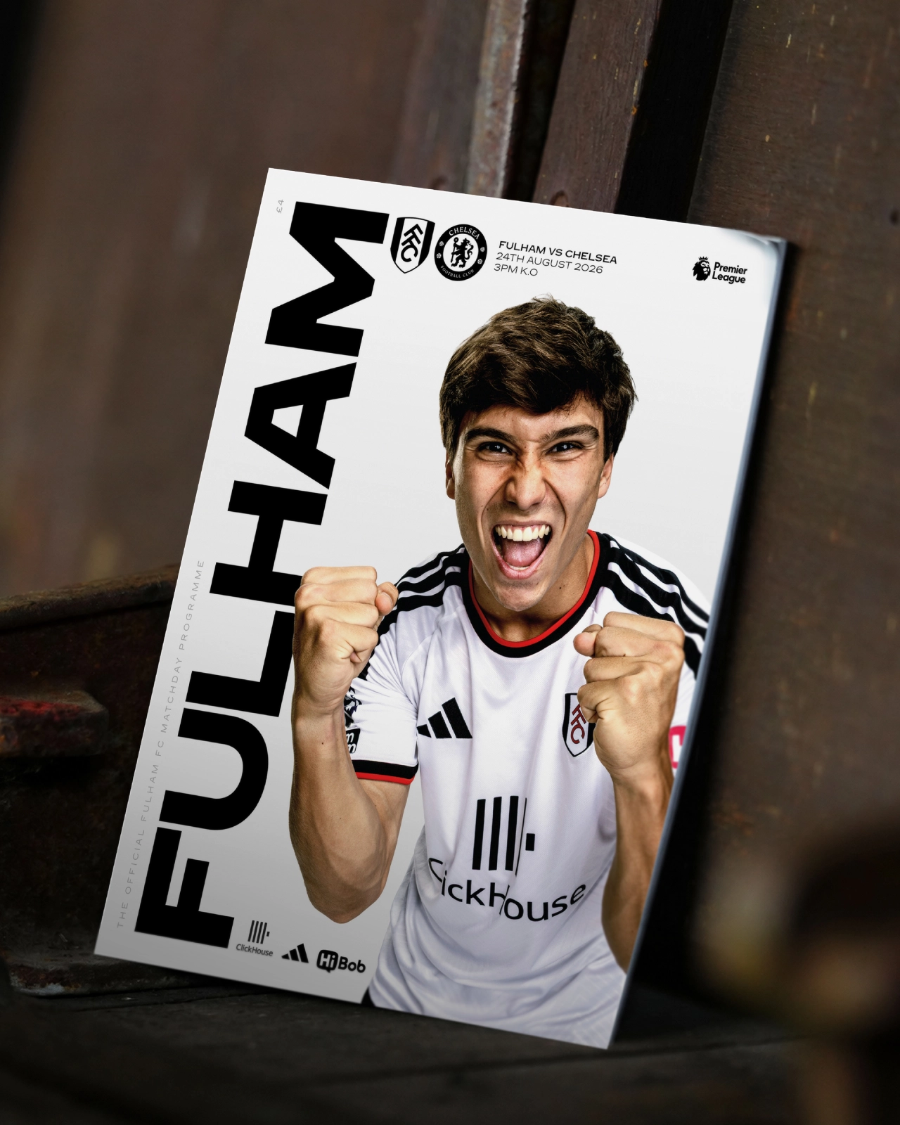
Manchester-based independent studio Music, however, was made of sterner stuff. The agency has a long-running relationship with Fulham, and together they built a new identity around a piece of hand-rendered lettering found within the fabric of Craven Cottage: the club's ground, and the oldest football stadium in all of London.
Reason for the rebrand
Why rebrand at all, though? From Fulham's perspective, the spur was how much the relationship between football clubs and their fans has changed. Today, supporters don't just connect with football via 90 minutes on the pitch. They follow it through digital and social, buy merch, attend events and experience it in wider culture.
This cultural change has been reflected at Fulham through, for instance, the redevelopment of the Riverside Stand and the arrival of Fulham Pier, creating new hospitality, entertainment and cultural experiences alongside the football.


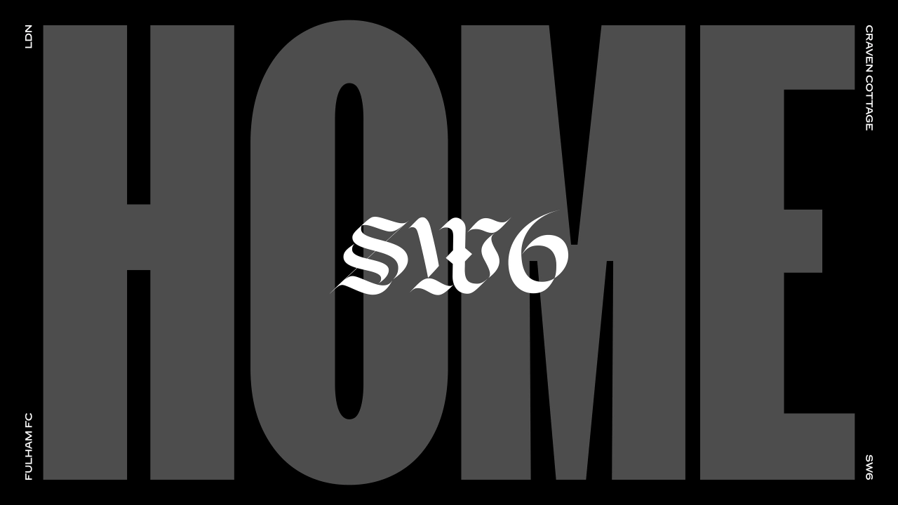

"Our club has grown significantly in recent years and so have the number of ways in which people experience us," says Jack Burrows, marketing director at Fulham FC. "We're speaking to lifelong supporters, new fans, local and international audiences as well as hospitality guests, each through very different channels and touchpoints. Some of these groups may attend matches regularly, others may never set foot inside Craven Cottage."
That's a lot of different audiences to keep happy. The brief to Music, then, was to create something distinctive and flexible, without throwing the baby out with the bathwater.
Real-world heritage
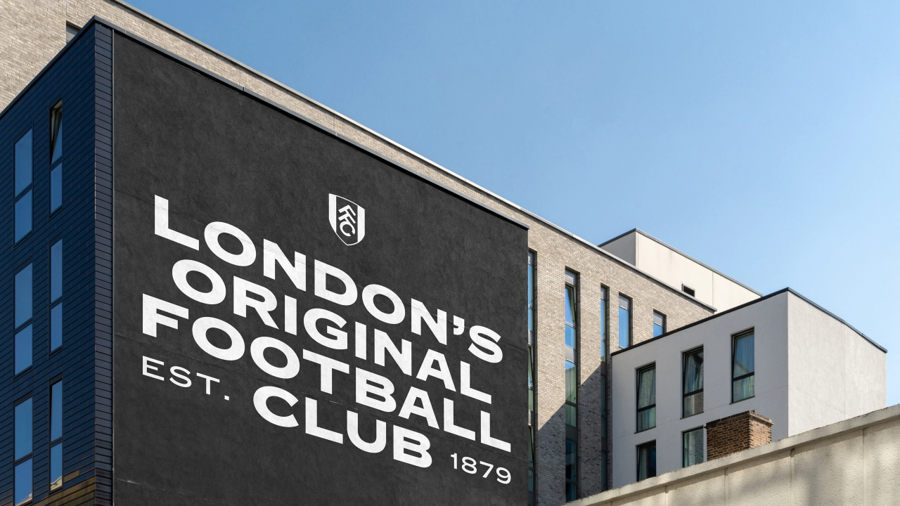
Following its own research, the agency found what it was looking for in the stadium itself: a piece of lettering on the side of the club's historic home. Music brought in type foundry F37 to develop the original lettering. The result is a family with true range, transforming the original stadium lettering into a full type system that works across all of the club's communications.

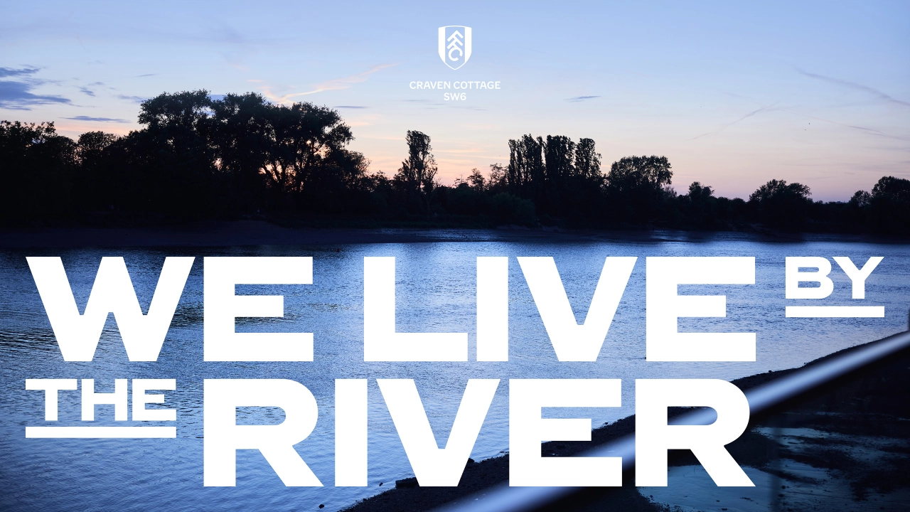

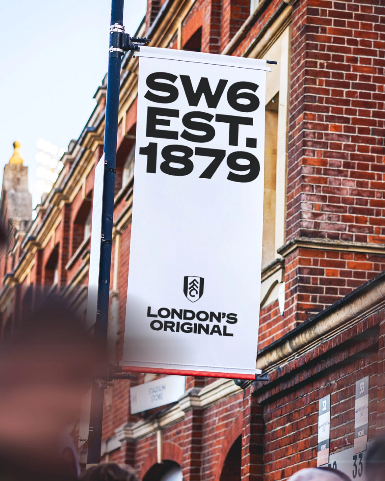
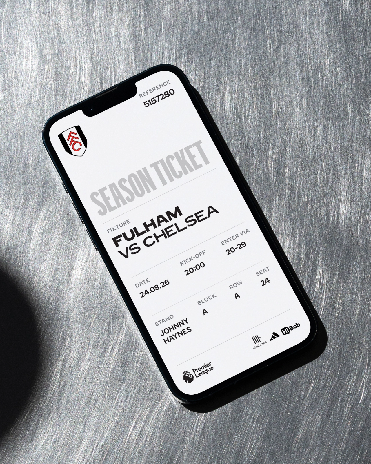
"We've worked with Fulham for a long time, which means this didn't begin with a desire to redesign everything," explains Dave Simpson, CEO and executive creative director at Music. "It began with understanding what was changing around the club and asking how the brand could become more distinctive without losing the things people already loved about it.
"Craven Cottage gave us the answer. The lettering within the stadium had all the character we were looking for: it was genuinely Fulham, rather than something applied to Fulham."
That, to me, is key to why it works so well. A depressing number of brands these days try to harness retro styles to give themselves a sense of heritage, but in a way that seems empty and rootless. Here, though, the source material was literally part of the building.
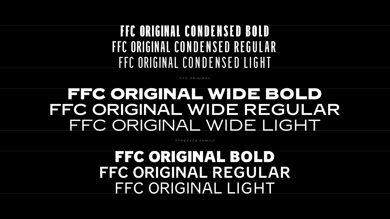
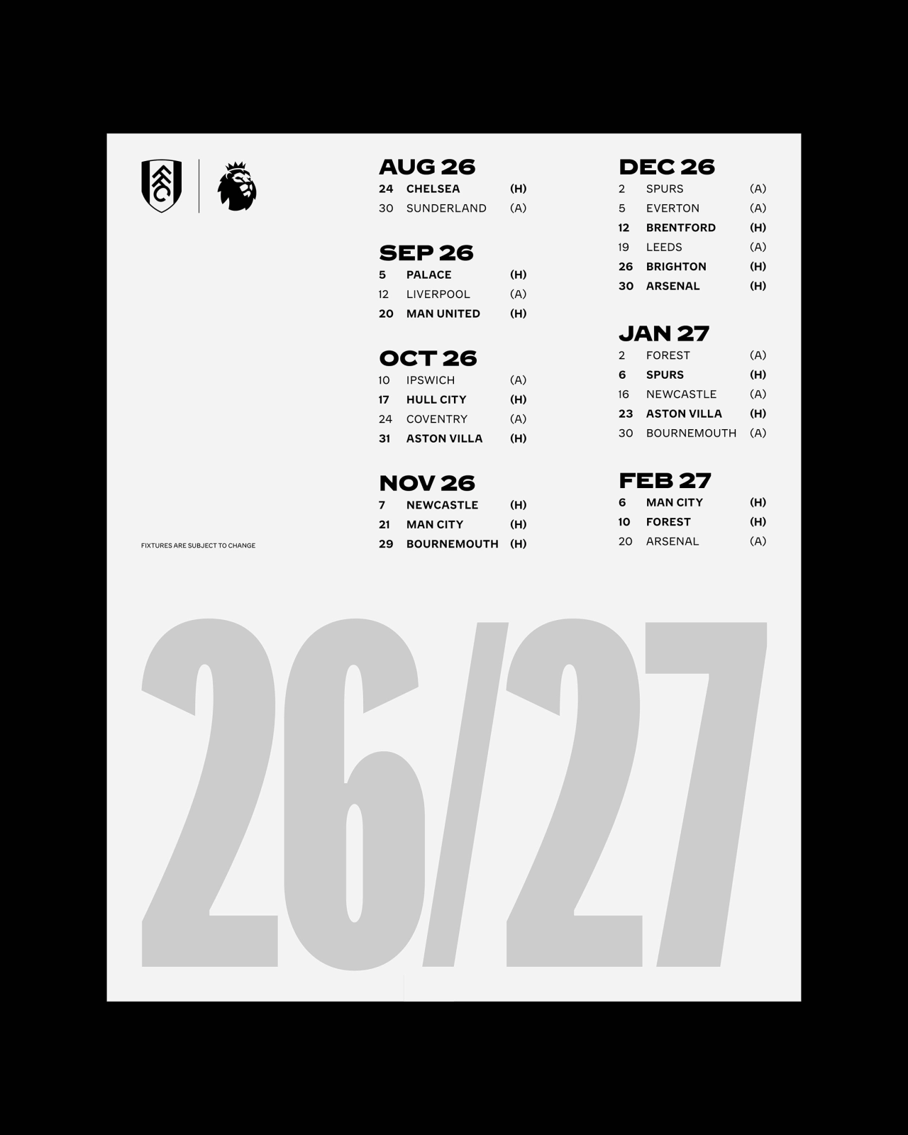
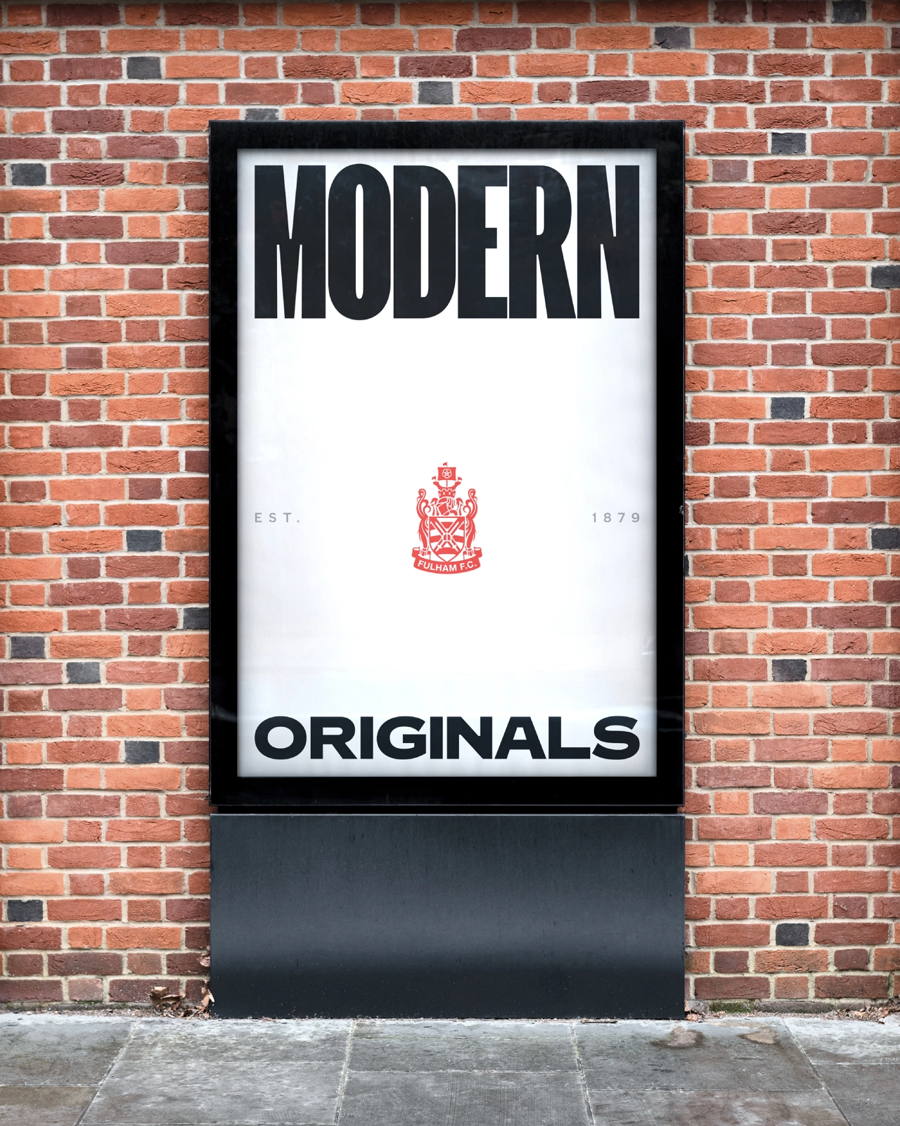

As Dave puts it: "The idea and the expression are the same thing. It isn't heritage sitting alongside a modern identity; the heritage is what creates the modern identity.
"This work gives us something that feels contemporary enough to support our growth whilst remaining vitally authentic," says Jack. "It allows us to be consistent, but also much more agile and expressive."
Editor's Picks




Trending






Latest Jobs
Designer (Digital, Brand & Localisation) at Journey
Contract·London·£45,000 – £62,500
Senior Director, Strategy at Interbrand
Full-time·New York·$210,000 – $260,000
Art Director at The New York Times
Full-time·New York·$120,000 – $130,000
Communications Strategy Director at David&Goliath
Full-time·Los Angeles·$120,000 – $180,000
Associate Director of Experience Design at California Academy of Sciences
Full-time·San Francisco·$150,000 – $165,000
Strategy Director at Landor
Full-time·New York·$150,000 – $175,000