Radox gets a brand refresh that marks its biggest relaunch in a decade
Global creative agency JDO has given Radox a complete brand update for its biggest relaunch in a decade, focusing on its experience in providing "self-care rituals that revive". The appointment comes as Radox's parent company Unilever felt the product had lost its way over the years.
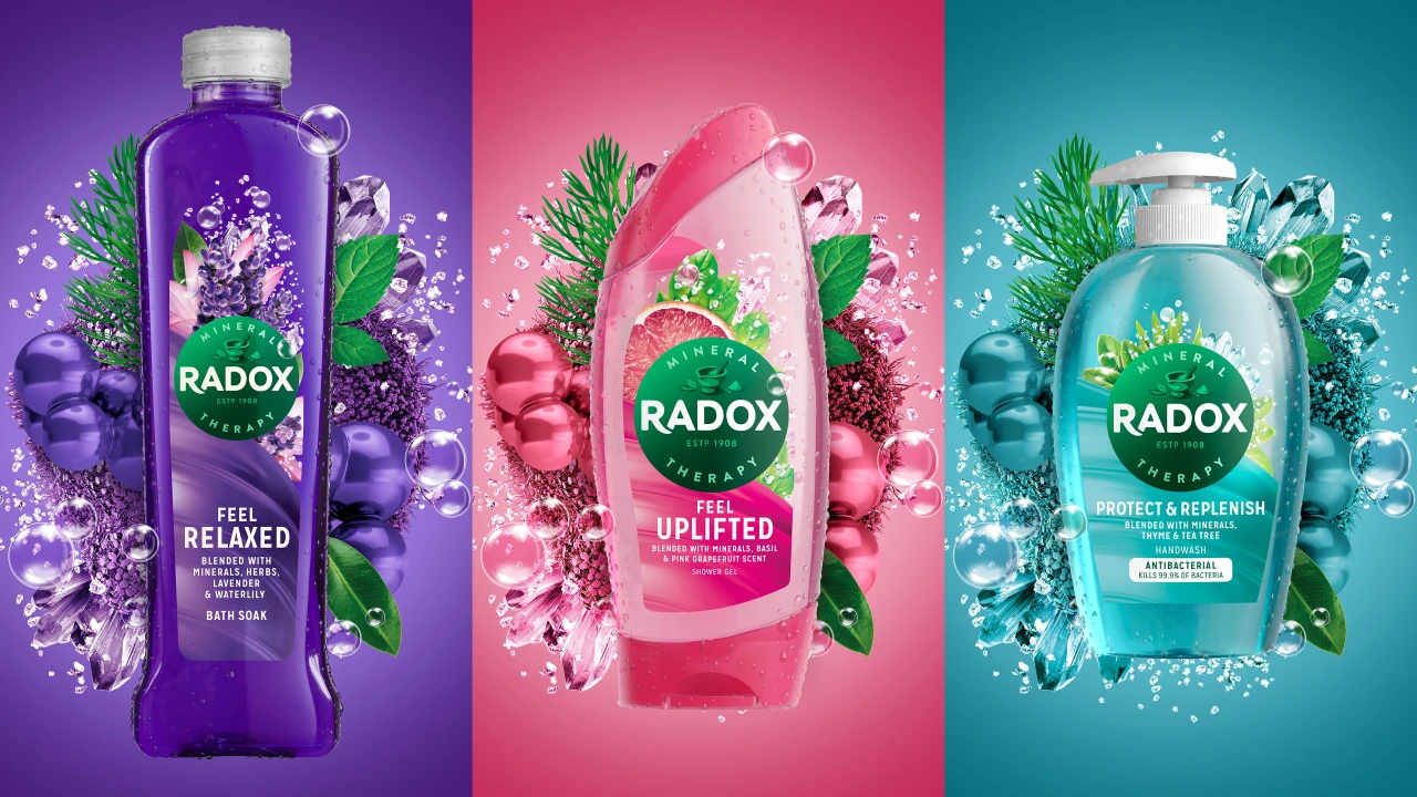
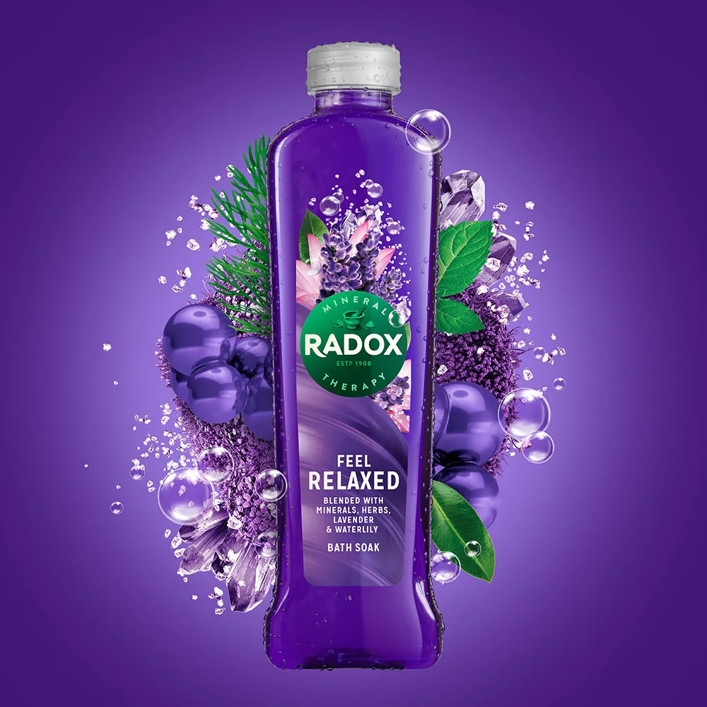
The new look balances contemporary with heritage cues and aims to reinforce Radox's position as the "number one bath and shower brand in the UK". At the heart of the refreshed identity is a new brandmark that features on over 80 different products, acting as a "bold beacon" to bring the updated proposition to life: 'Radox Revives You'. A herbal green colour reflects the blend of four minerals and 13 herbs found in Radox's recipes with a dark to light gradient evoking a "mood of transition".
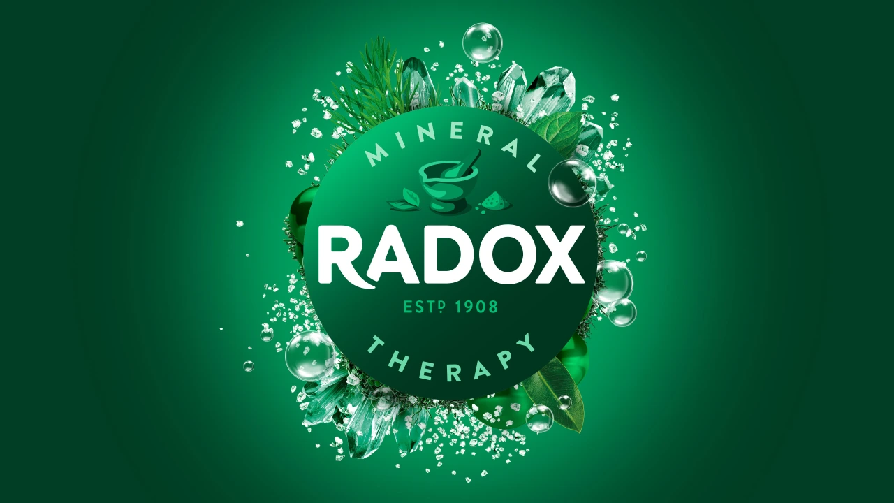
"Radox is a brand for the people who give their time to others, and deserve a moment to relax, refresh and recharge," says Fiona Florence, MD at JDO. "Our redesign focuses on these benefits, highlighting the ways Radox supports the well-being of consumers as they face the pressures and stresses of these challenging times."
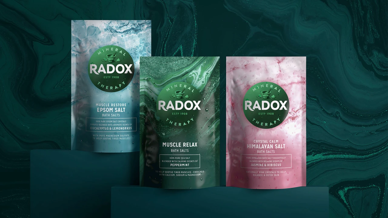
On pack, the boldness of the logo contrasts with vibrant photorealistic depictions of the product ingredients with abstract 'mineral swirls' of 3D colours – reinforcing the extensive range of ingredients. The premium tier of the product uses a more restrained visual language, drawing inspiration from mineral rock formations.
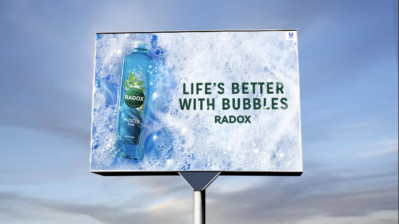
Alongside the identity and packaging, JDO further supported the relaunch in the execution of its Out of Home communication campaign. Created by adam&eveDDB, the campaign heroes the redesigned packs in a pool of soft bubbles to bring to life the new tagline 'Life's Better with Bubbles'.
"Self-care and well-being have become more important than ever, driving the demand for products that help busy, hardworking people destress and recharge. As a category leader, Radox is in the perfect position to respond to this need," adds Alex Deung, senior brand manager at Unilever. "The relaunch has been a massive undertaking and JDO has been an indispensable partner, delivering above and beyond expectations. Early research suggests that the new look will help increase purchase intent by over 18%, which is a testament that JDO's work is not only stunning, but strategically on point."
Editor's Picks





Trending





Latest Jobs
Digital Marketing Executive at Arise
Full-time·Sheffield·From £23,750
Creative Social Content Producer at Bompas & Parr
Contract·London·£32k–£40k
Agent & Producer at The Jacky Winter Group
Full-time·London·£35k–£40k
Growth and Client Development Director at 3800
Part-time·Sheffield·£60k-80k
Brand Designer at Adfin
Full-time·London·£30k–£50k
Art Director at The New York Times
Full-time·New York·$120k–$130k