The new Yearbook of Type showcases the world's latest typefaces in the theme of music
The choice of a typeface and the design of a text can have a dramatic impact on any piece of work. It can make or break it, as any respectable designer will know. Typography certainly plays a crucial role and that can be a heavy responsibility to bear. But do not be afraid, for your stressful type days could be over with the launch of a new reference book.
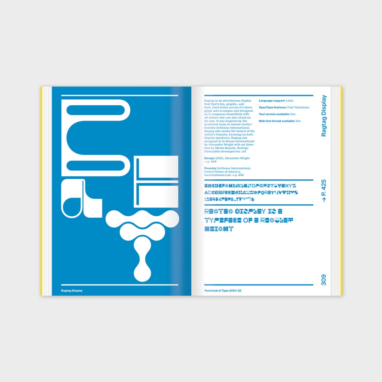
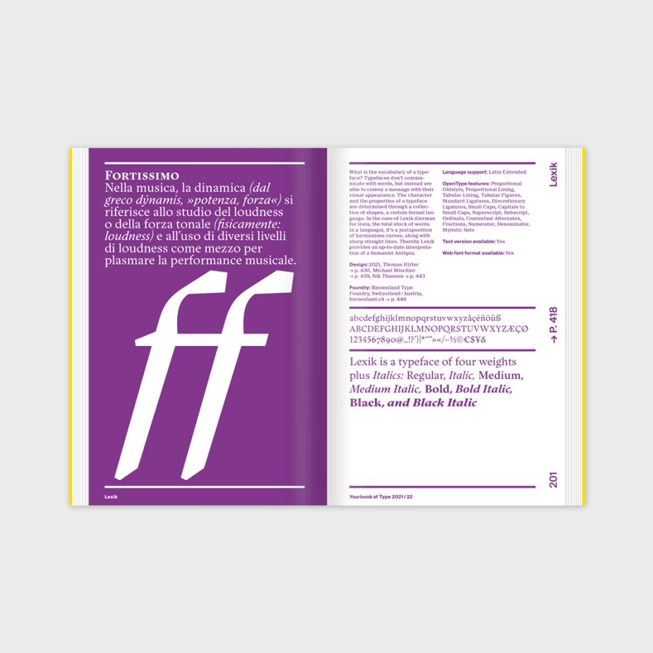
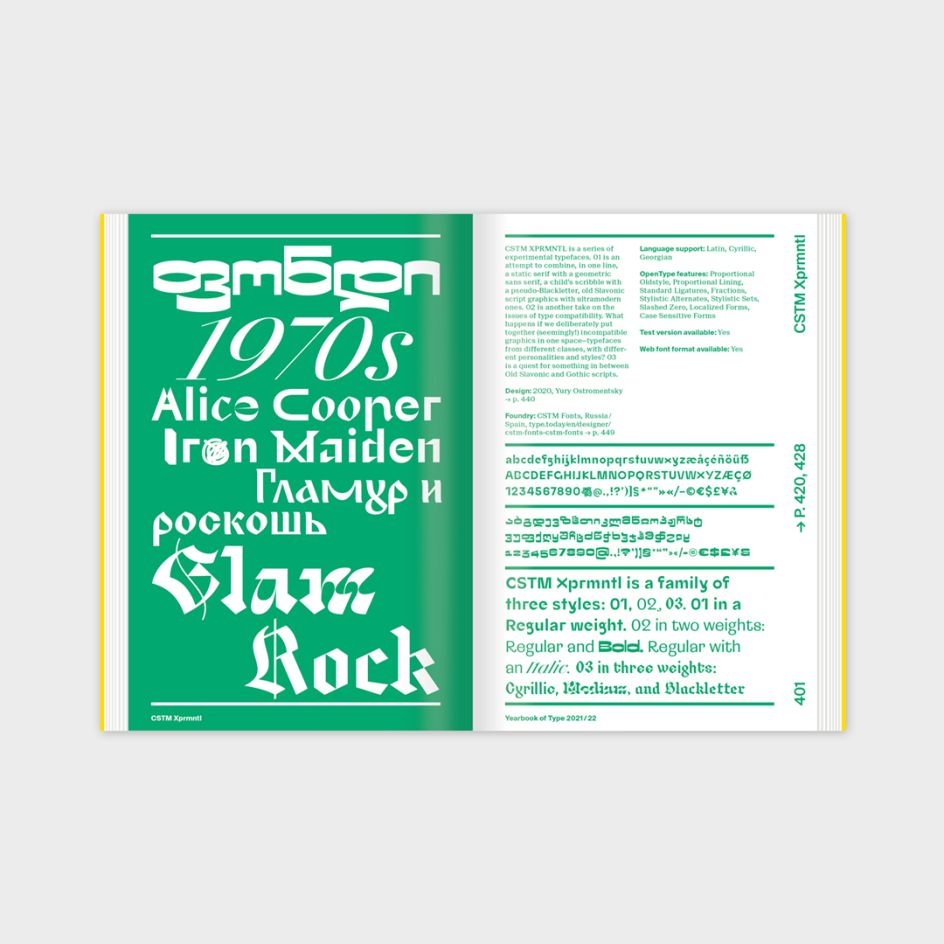
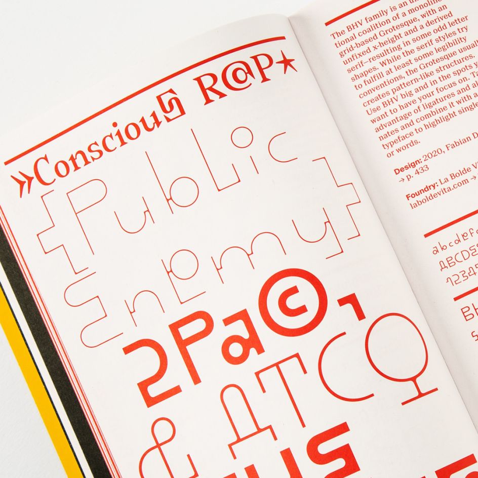
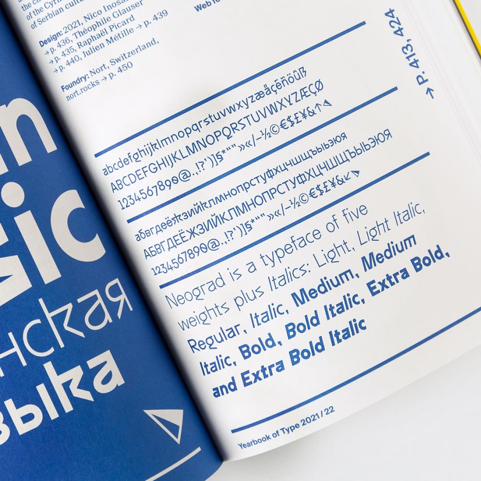
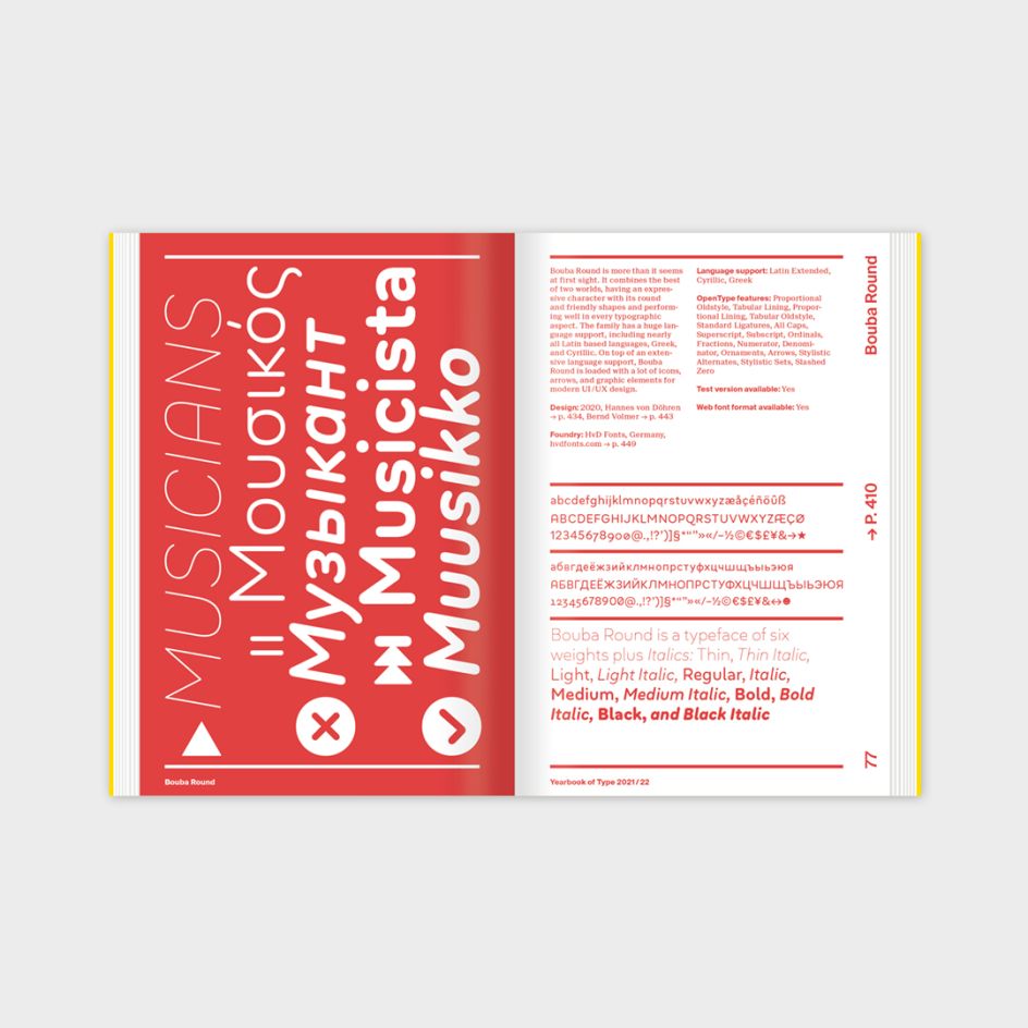
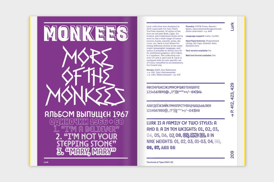
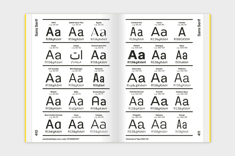
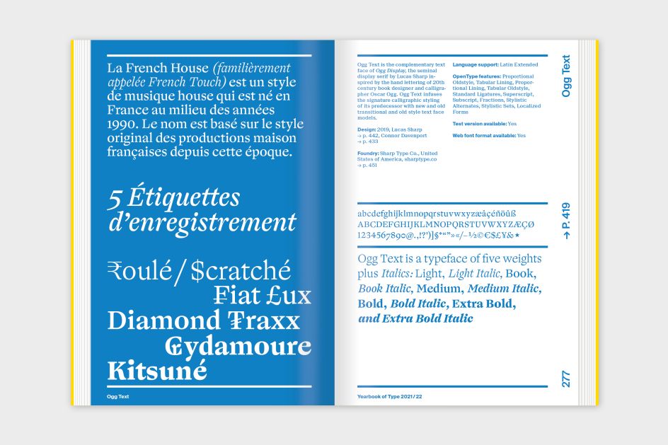
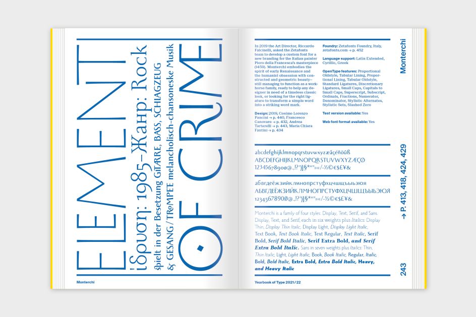
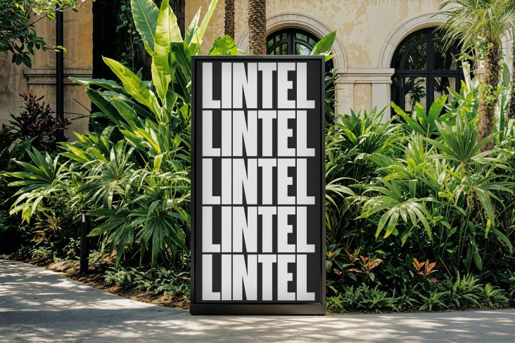
The Yearbook of Type 2021/22 makes it easy to get an overview of recently published typefaces from around the world while understanding their visual language. Each typeface is presented on a double-page spread: on the left side, a specimen gives an idea of possible applications and shows the beauty and character of each typeface while on the right, the page provides detailed information about the designers and foundries, as well as an overview of the typefaces' features.
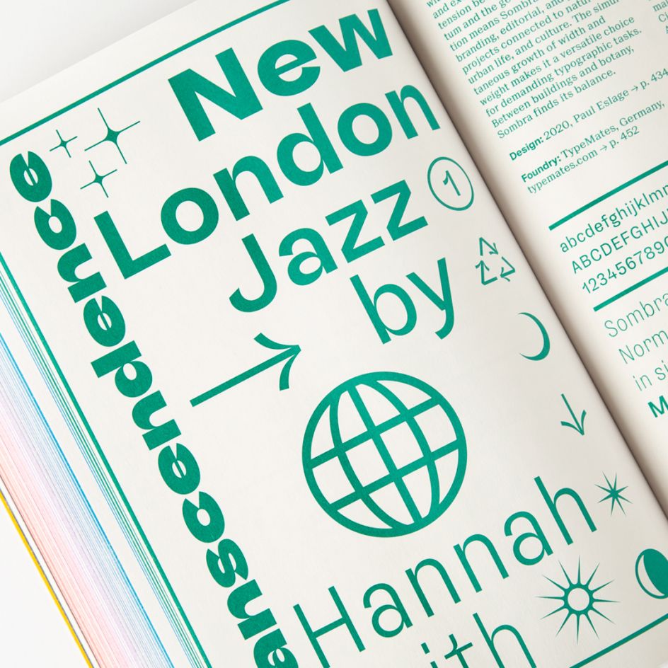
Foundries-wise, we're talking Blaze Type, Due Studio, Nova Type Foundry, Sacha Rein, TypeTogether and much more.
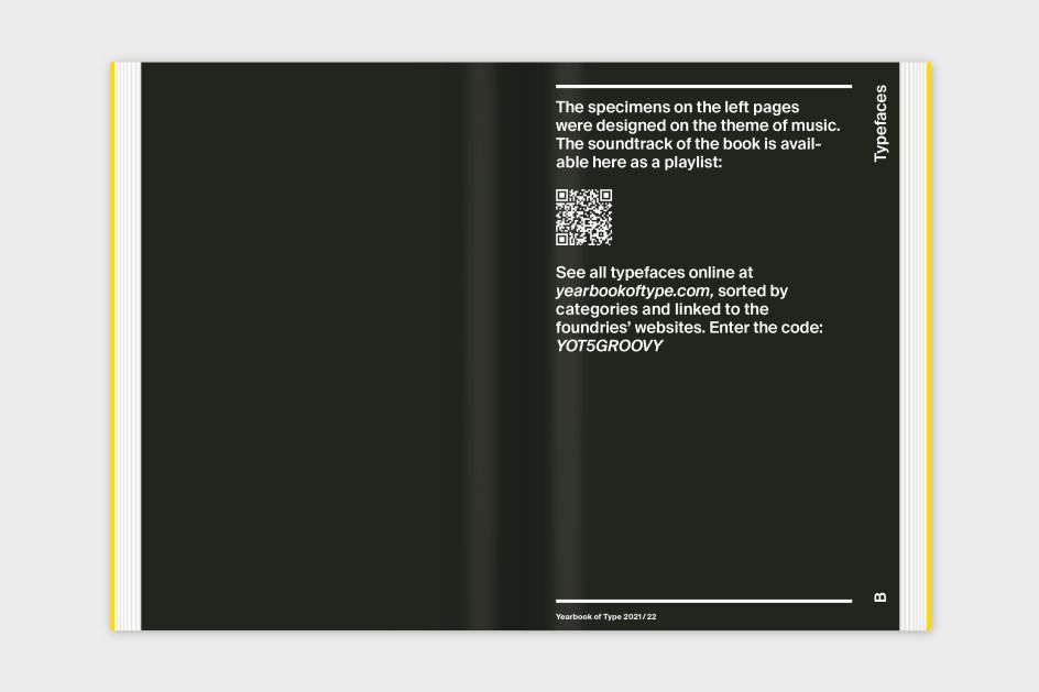
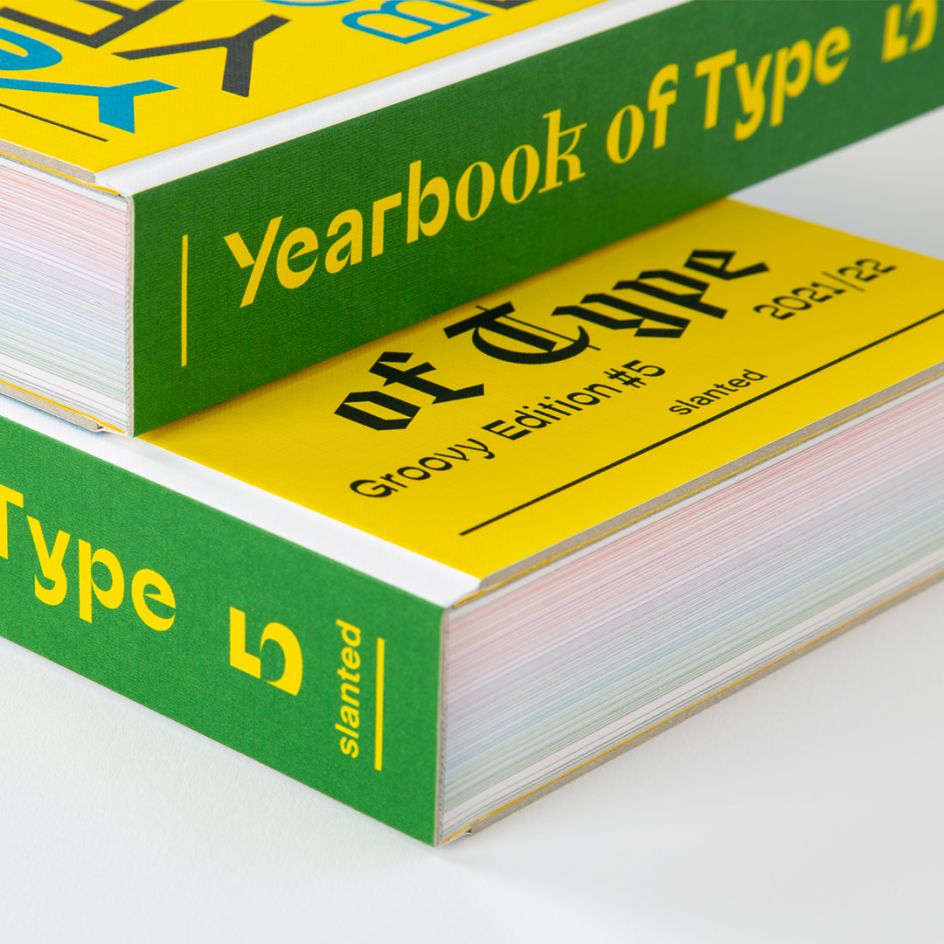
Each year, there's a theme and for the next 12 months, it's music. "As music conveys emotions through melodies and lyrics, typography does so through its form and balance of letters," explains Slanted, the German publishing house behind the annual title.
The Yearbook of Type is complemented by a series of essays that offer background information about typography, history, technical details and how-to guides, and the latest trends in current type design. A very helpful index sorts typefaces by classifications, besides listing designers, foundries, and OpenType features. And if that wasn't enough, there's an online microsite that presents all featured fonts, so that you can test or purchase them. What's not to love? A must for any graphic designer's bookshelf.


](https://www.creativeboom.com/upload/articles/59/5966589fcae3400b8bed99371b371395c485f42d_732.jpg)