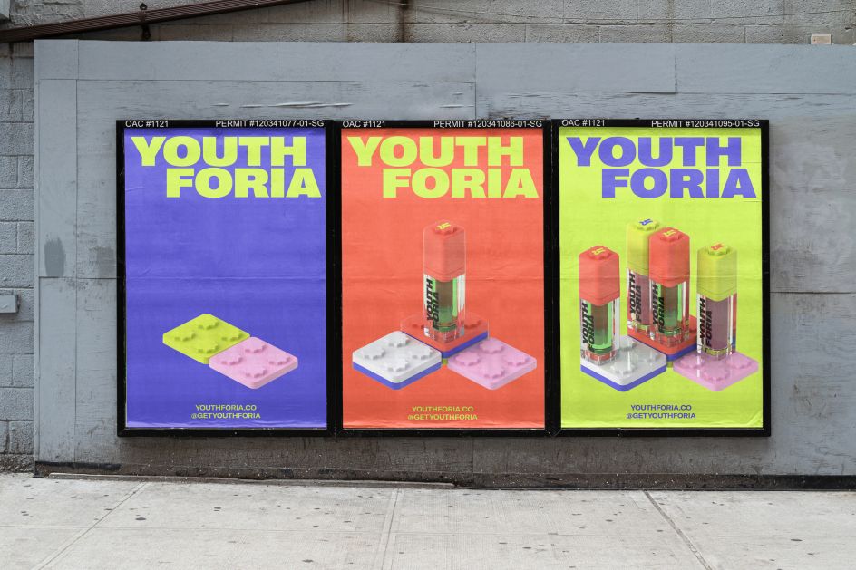
Universal Favourite's maximalist identity for new Gen-Z beauty brand, Youthforia
In a pleasing throwback to the late '90s, Universal Favourite has crafted a new identity for US beauty brand Youthforia, whose mission is to "make makeup more playful". But rather than go for a "boring" minimalist approach so often seen elsewhere, the Sydney-based design studio has created a maximalist look and feel. The result is "purposefully messy, uncurated, and raw".
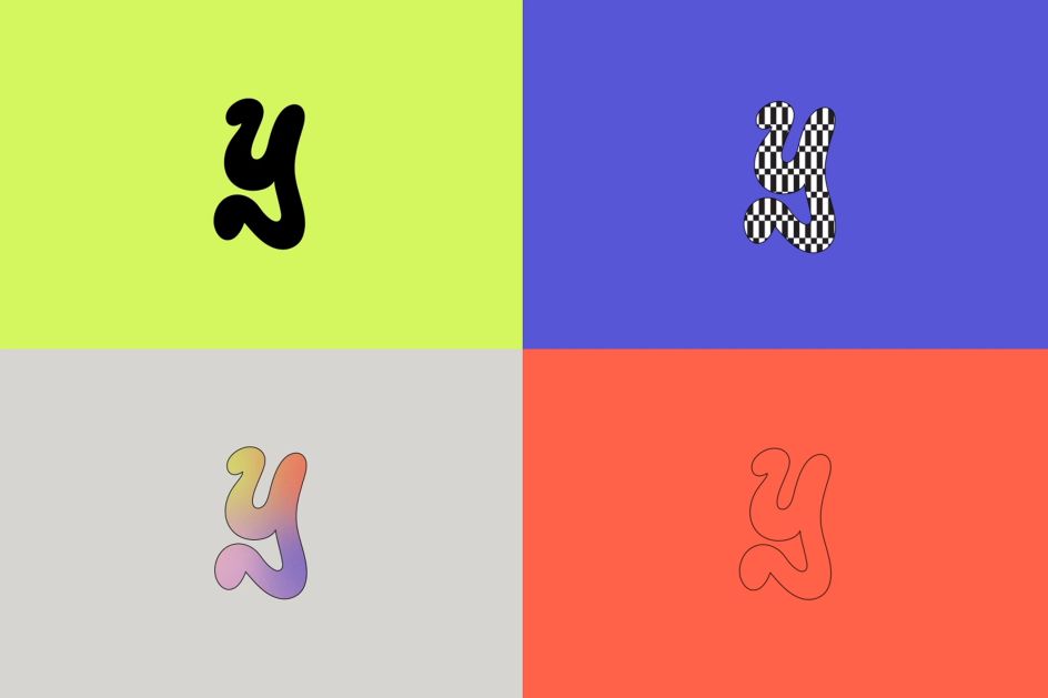
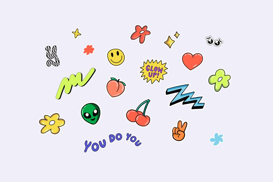
Drawing inspiration from '90s teen magazine mastheads, a 'Y' mark has a joyful rebellious feel but also acts as a changing container (think classic MTV logo) that introduces the idea of mixing up your makeup based on your mood. Sitting nicely alongside this is a suite of energetic shapes and stickers rolled out across all touchpoints (packaging, product, digital) that reflect the brand's intention to "let you flex your self-expression".
There's a cheeky tone of voice, too, which works nicely with the visual identity that gives off that carefree yet angsty attitude that comes with being a teen. "It's fun, it's fluid and exciting with a blast of bold colour and comforting nostalgic quirk that extends an invitation to anyone's inner-child," says Dari Israelstam, founder and creative director at Universal Favourite.
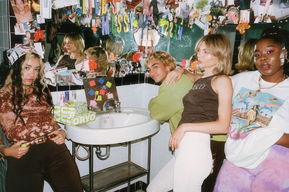
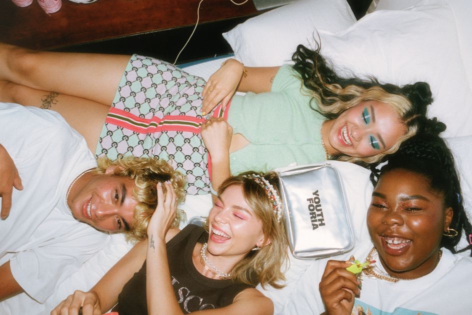
Elsewhere, the studio worked with Uncommon Agency's Jamie Heath and featured online icon Lil Ahenkan (aka Flex Mami) to art direct a lifestyle shoot "reminiscent of getting ready with friends for a night out as a teen and all the excitement that goes along with it," as the studio puts it. The result is a curated mess of posters, glitter and glam with a fun and colourful collage of images shot on 35mm, VHS (yes, VHS) and iPhone.
For the website, as well as social media assets, the identity's flexibility helps to showcase a brand that's constantly moving, evolving and flexing — much like its audience. "The website is custom-built and gives you all the gradient-dense, Wordart-heavy, emoticon-happy vibrance of the internet explorers of the '90s, without any of the slow-loading clunkiness," adds Dari. "The design of the site is still inherently conversion-focused but bucks the tired trends of the online beauty space and brings the playfulness of the brand to the forefront."
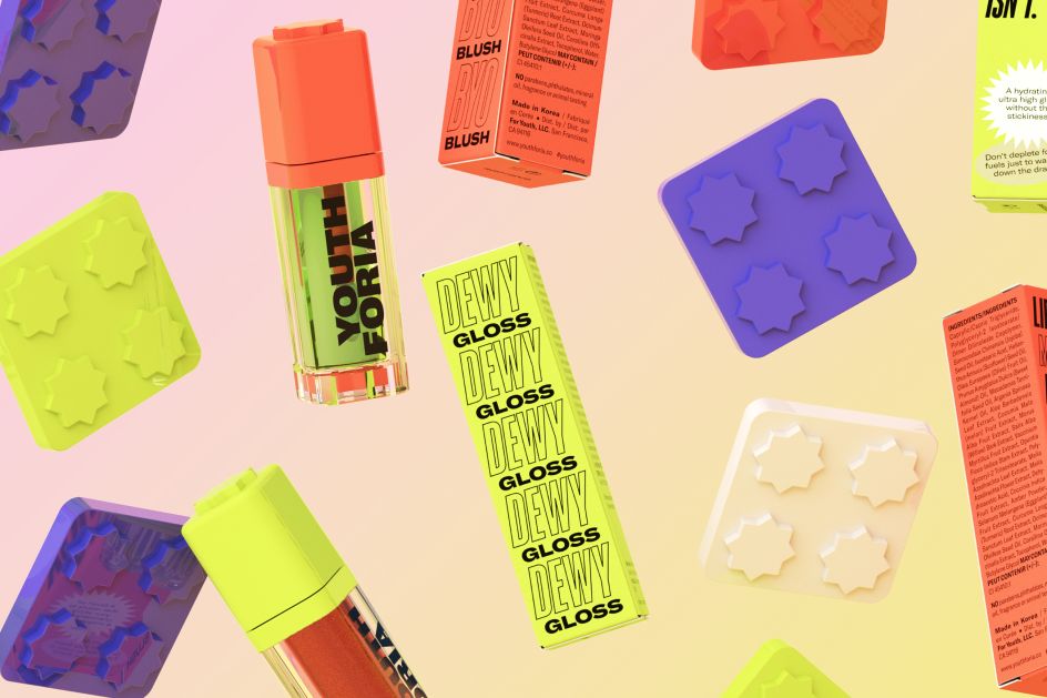
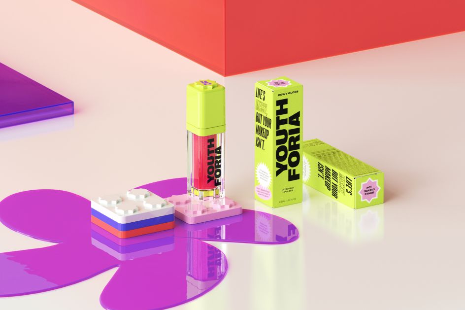
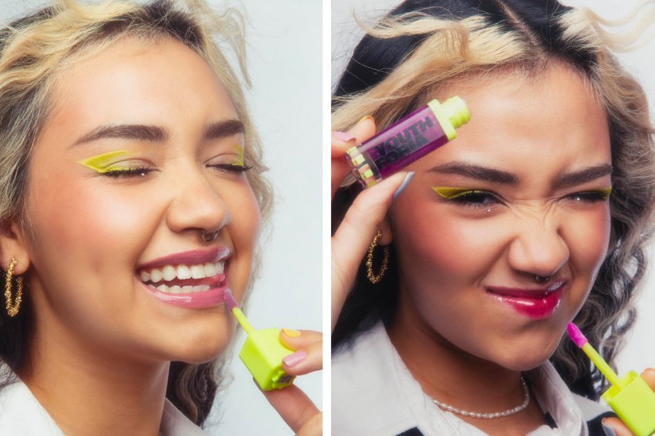
As for the packaging, a lot of fun and play was had. Each item comes in different colours, with different holders to choose from, bringing back the thrill of "coveted childhood collectables". As Dari explains: "The magnetic pans designed into the suite allow users to click, combine, stack and arrange their Youthforia makeup to suit their mood – an idea also reflected in the logo. They can mix and match their product arrangements based on however they're feeling that day."
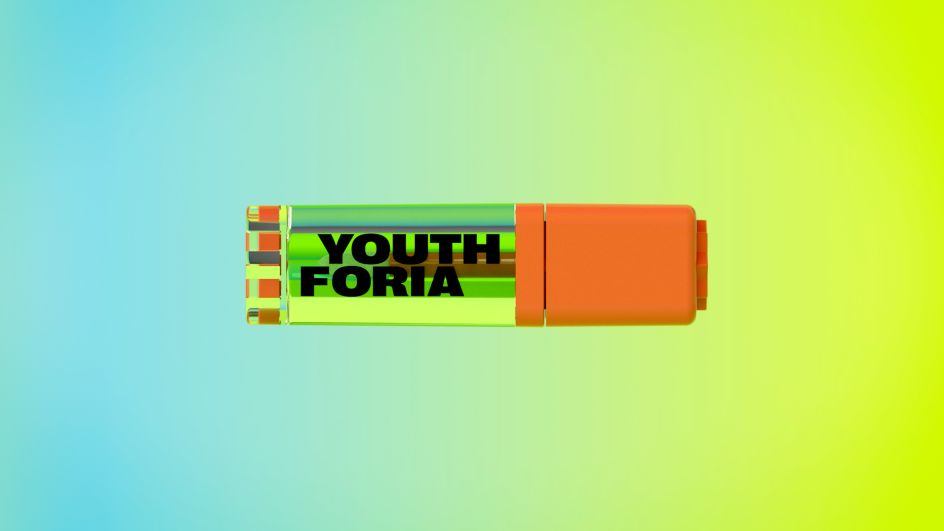
Universal Favourite also worked with 3D2D to develop a suite of motion and still 3D assets that would showcase the modularity of the products and that could be used across the website and marketing materials.
Editor's Picks


Trending


Podcasts


Editor's Picks
Further Reading