Pentagram's identity for Dublin tourism experience is delightfully cliche-free
The Book of Kells is one of Ireland's biggest tourist attractions. In branding its new visitor experience, Pentagram has masterfully avoided tired Celtic tropes to create a fresh and vibrant visual identity.
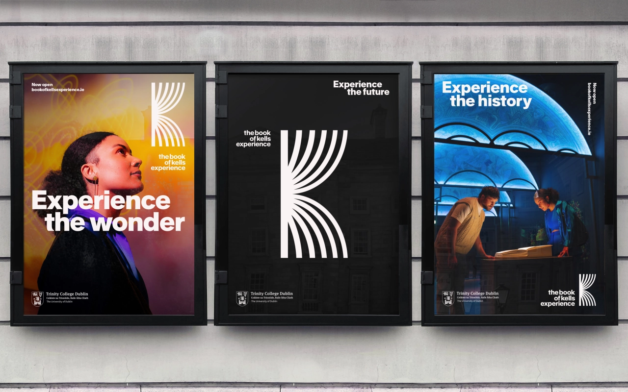
Many Brits' primary experience of Dublin might be on a stag weekend or hen do. But there's far more to this vibrant European capital than downing shots in Temple Bar. And if you ever have some time to spend in central Dublin, it's well worth visiting Trinity College Dublin, Ireland's oldest university, to view The Book of Kells.
The ninth-century manuscript is displayed in a carefully controlled environment in the Old Library, a beautiful building completed in the early 1700s. Only one spread of the book is visible at a time, but the pages of the book are turned every eight weeks. Currently, over a million visitors annually go to see the book in person.
They're greeted by The Book of Kells Experience: an immersive digital journey set within a specially constructed pavilion on the grounds of the College, which allows visitors to first see The Book of Kells in the Old Library and experience the beauty of the Long Room. This is followed by the digital presentation that spans 1,200 years and follows the book on its journey from Iona in Scotland over the Irish Sea to Kells and on to contemporary Dublin.
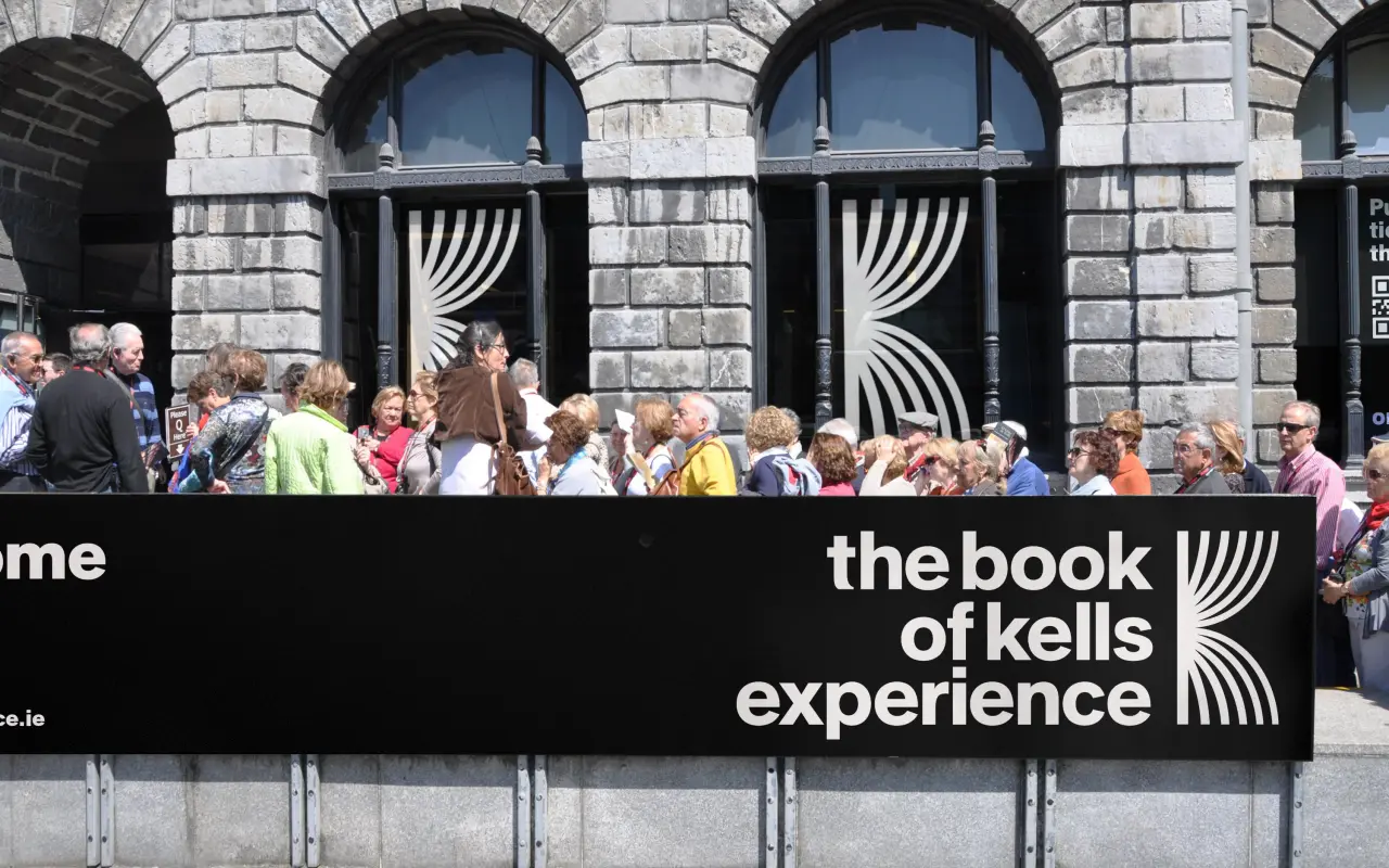
Trinity College's Library is currently undergoing some much-needed restoration work. But rather than house this in another part of the university, architectural firm Heneghan Peng was commissioned to create a sustainable and unique temporary structure that would sit within the grounds and enable a distinct presentation for the digital experience to happen.
The brief
To design an identity for the new Book of Kells experience, Trinity College approached Domenic Lippa of Pentagram. The College was looking for something that felt contemporary and cool, that would attract visitors and set the tone for the experience, but that would avoid the cliches of Celtic heritage design.
Of course, because this is a religious artefact, Pentagram's design team also needed to be sensitive to how the different audiences would be viewing both the book and the experience. With this in mind, the design team created a bold and modern identity that still feels authentic.
Graphic elements
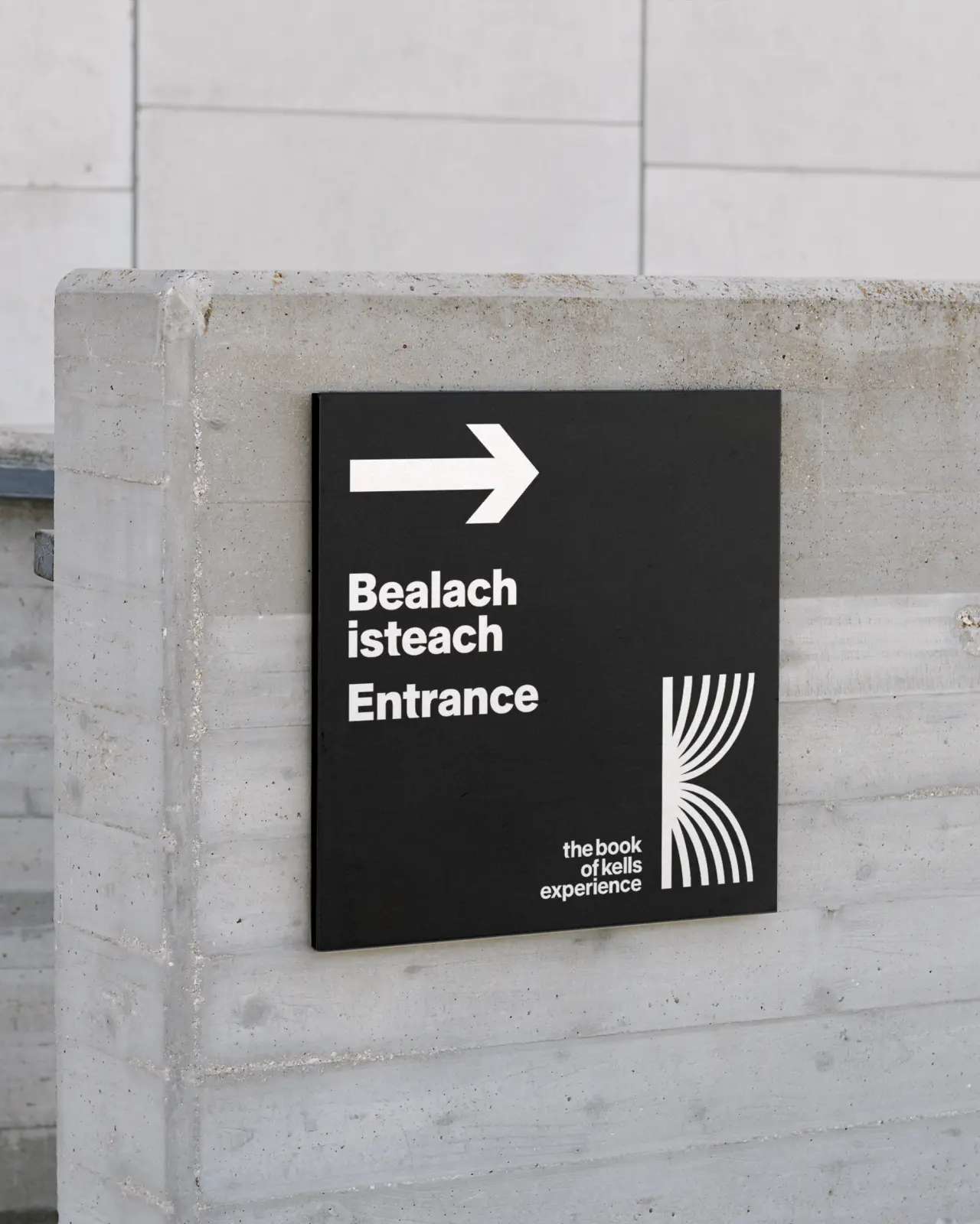
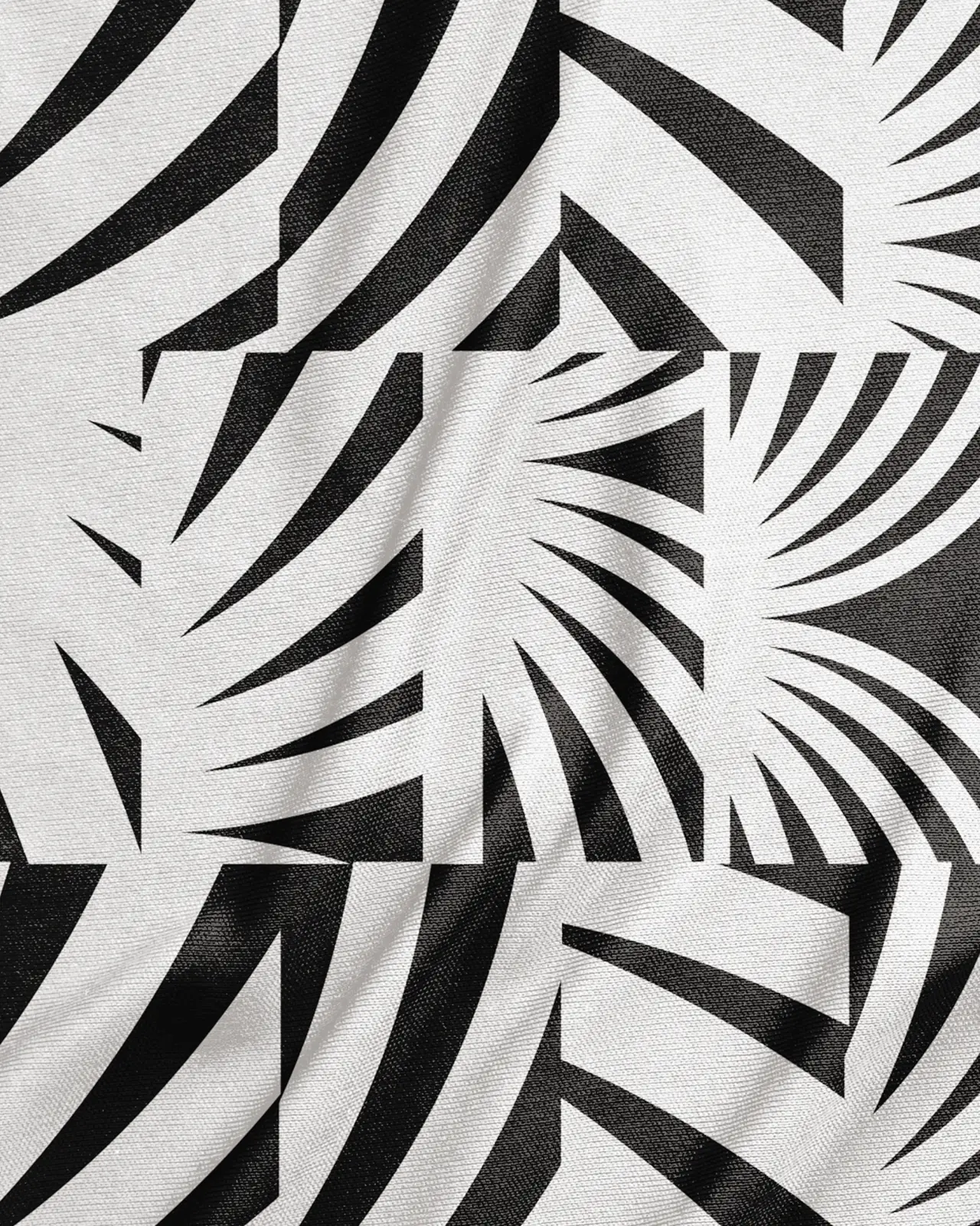
Inspired by Celtic history, the new identity includes a logo, typeface, colour palette, tone of voice, staff clothing, merchandise, marketing material, signage and wayfinding.
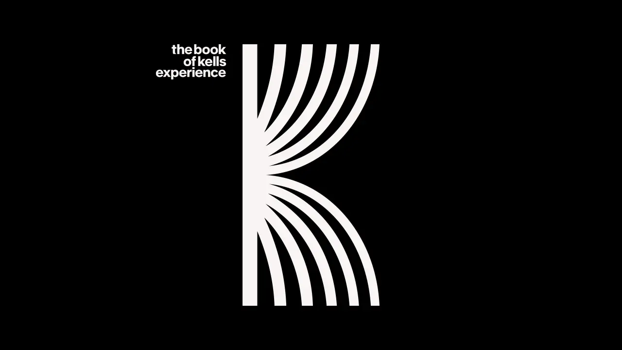
The striking symbol represents the Book of Kells itself, a bold, impactful presence with elegant details. It was inspired by the details of illuminated pages in the book and, more broadly, by ancient Celtic artefacts that showcase the craftsmanship of flowing line details.
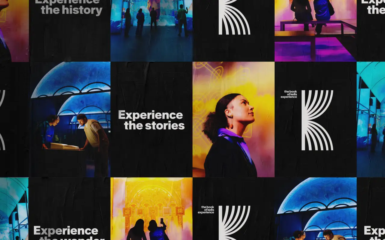
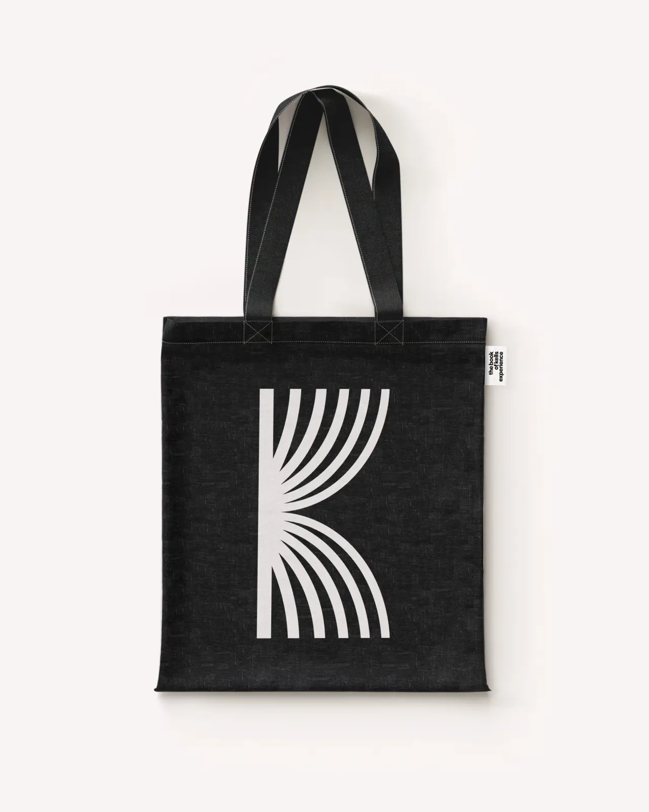
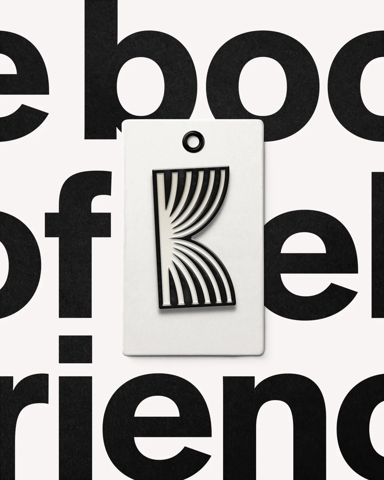
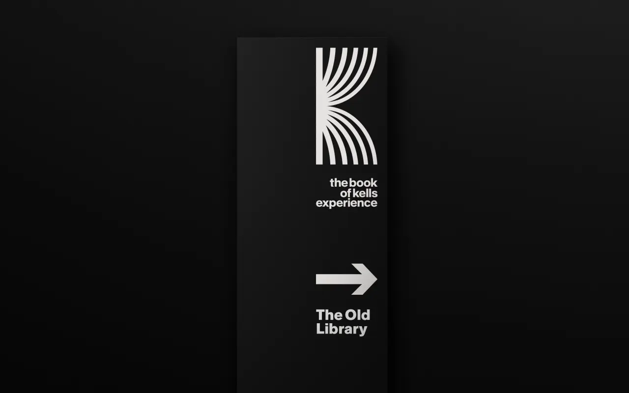
The wordmark is set in lowercase using the typeface Rand by Optimo and is crafted with alignment points to create a considered arrangement that echoes the simple but elegant structure of type within the Book of Kells itself. Rand combines type characters with modern forms like the letter 'a', with more unique characters like the letter 't'. These are similar to the crafted scriptures in the Book of Kells.
The colour palette, meanwhile, is inspired by the hues found in the book's illuminated details. These are joined by the core colour palette of black and white and a bright red, which echoes the red Pavilion in which the experience is housed.
Tone of voice
The tone of voice and campaign copy were developed by Pentagram's Brand Narrative team, led by Ashley Johnson. It aims to tell the story of the experience from the viewpoint of a visitor, with each strapline relating to a unique part of the Book of Kells Experience.
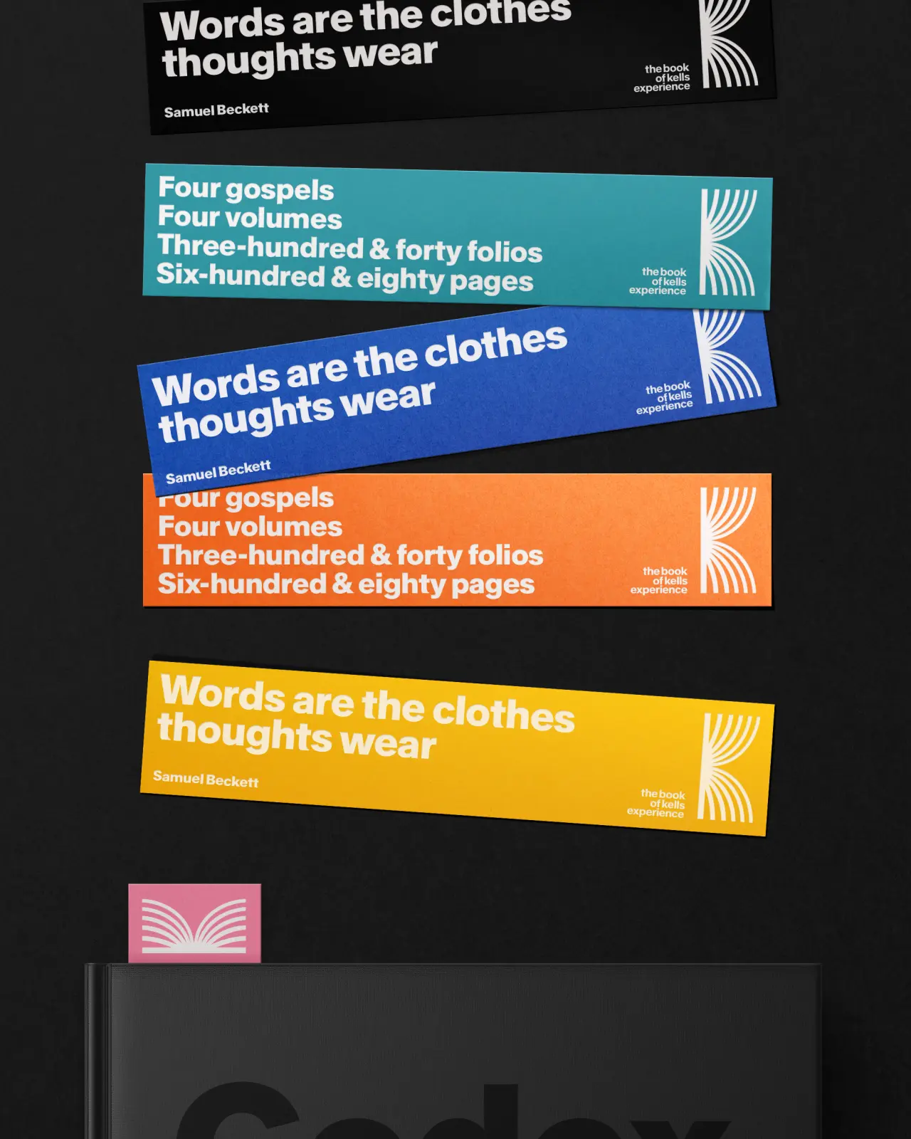
The new identity appears across all the online and offline applications, including social assets, website, ticketing, signage, wayfinding, staff clothing, and brand guidelines. It all adds up to classic Pentagram: an identity that communicates the excitement of the attraction and, like the experience itself, seamlessly blends traditional and modern.
Editor's Picks





Trending



Latest Jobs
Senior Designer at BKC
Full-time·£50k-£60k
Creative Director at Koto
Full-time·London·£95k-£130k
Design Director at Koto
Full-time·London·£72k-£90k
Digital Marketing Manager at HDK
Full-time·London·£34,000 – £38,000
Junior Project Coordinator at Colorido Studios
Full-time·Twickenham·£28k–£32k
Design Lead at Madeo
Full-time·New York City·$85k–$120k