Mungo's Hi Fi finally gets a brand identity that reflects its experience, status and warmth
Mungo's Hi Fi has been a key player in the UK sound system culture for over twenty years, but up until now, its brand identity has not reflected its uplifting and diverse energy. Enter Warriors Studio, who have captured Mungo's Hi Fi's vibe in a fresh and bold rebrand.
Creating a new look and feel for an established brand is no easy feat. Typically they need to make the company in question appeal to a new audience while still keeping the established fan base happy. Mungo's Hi Fi was no exception, but when they partnered with Warriors Studio, they also needed to express the breadth of their sound, which goes well beyond the reggae and dub they're known for.
"In our first meeting at Mungo's studio warehouse, all sat around a table, sharing stories, discussing music, clubbing, dancing and our paths in Glasgow, we felt a good vibe, and the connection was right," says James Gilchrist, Warriors' creative director. "Mungo's Hi Fi nights at The Art School in Glasgow were some of my first club and dance experiences at 17 (don't tell mum), so being able to connect with the guys at Mungo's was heartwarming for me."
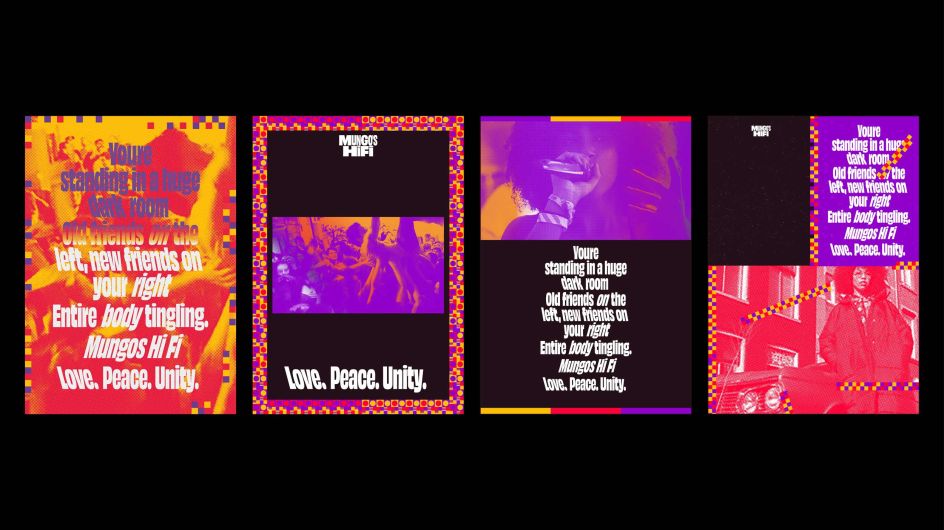
After a series of workshops, clear goals were defined, and a creative direction settled around emotions was agreed upon. It's a canny move. The rumbling, body-shaking thud that thunders out of sound systems is a sensation so closely linked with festivals on a warm summer's evening that it makes sense to use it as the basis of a brand. This then poses the question: how do you translate abstract sensations into visuals? The answer: colour.
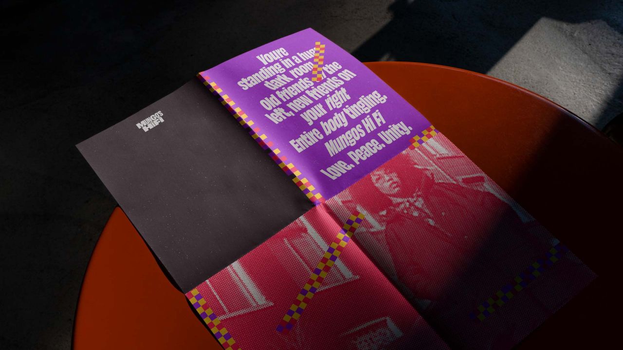
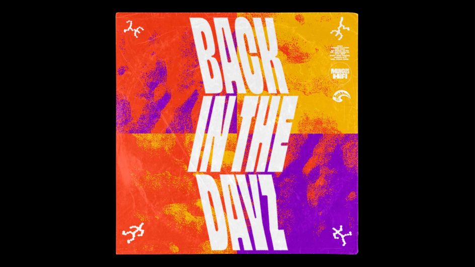
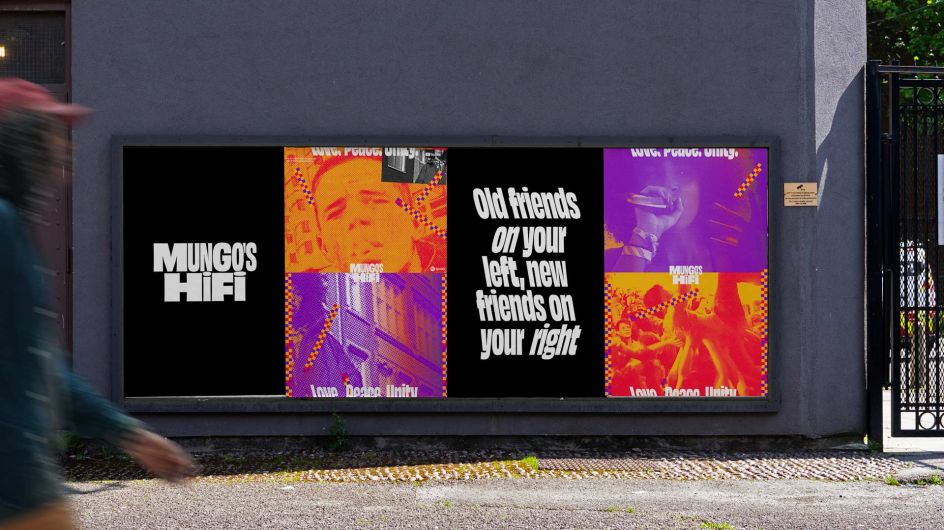
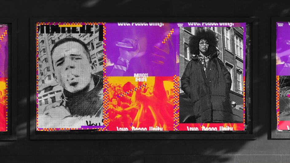
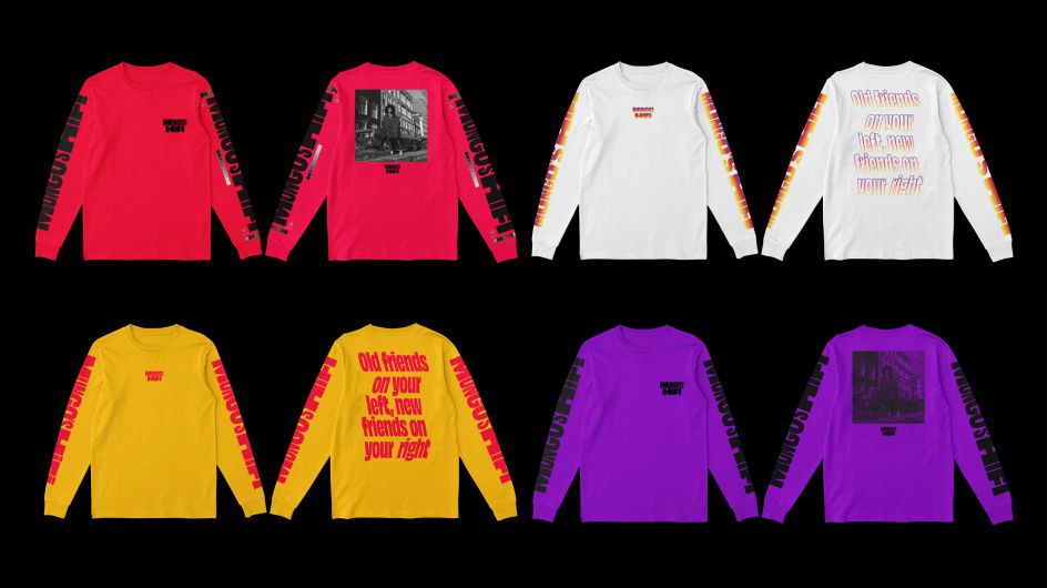
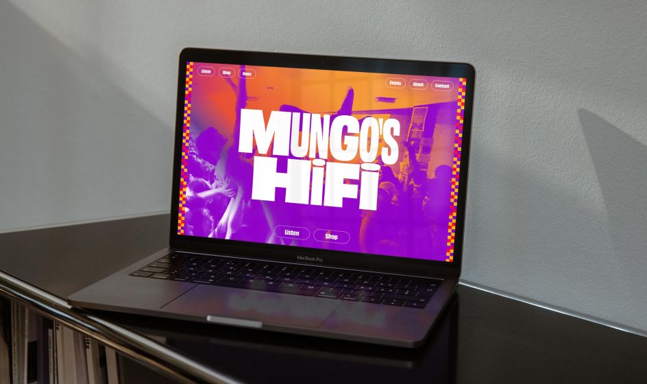
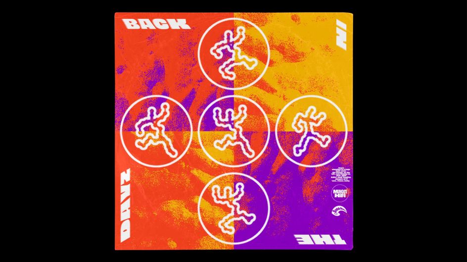
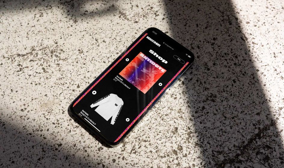
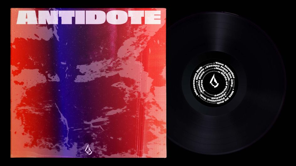
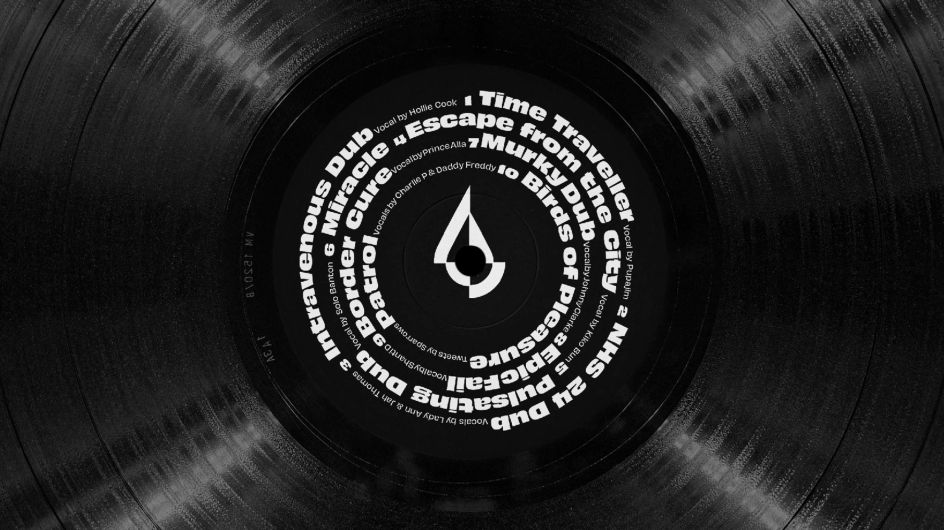
By using bright and warm tones, plus a generous amount of gradients, Mungo's Hi Fi could evoke those balmy evenings spent trudging around a festival site. Pairing them with many heavy blacks creates an interesting visual subversion and calls to mind the clubs and venues the collective is famous for. It also gives Mungo's Hi Fi the freedom to use alternating day/night visuals when appropriate.
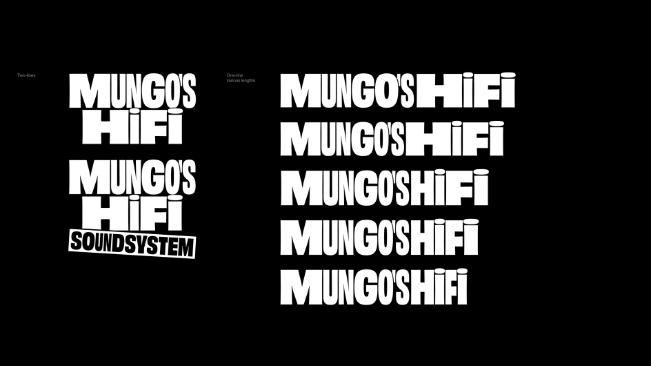
No brand would be complete without a good typeface, and that's just what Mungo's Hi Fi has been blessed with. The typeface, Obviously from Oh No, perfectly balances seriousness and reliability with personality and flavour. In other words, it's the perfect fit for Mungo's Hi Fi. And seeing as the type family is vast, it's flexible enough to be used print and online materials.
"Mixing and matching the weights and widths of the family helped create an irregular visual rhythm throughout the identity." says Warriors director Beth Wilson. Using dancehall posters as a jumping-off point, the creative team used their unique aesthetic to introduce a gradient treatment to the type.
As well as balancing the expectations of existing fans and newcomers, another challenge facing the rebranding process was Mungo's Hi Fi's fiercely independent approach to what they do. "We did not always agree as a team, which could lead to lengthy discussions," says Mungo's Hi Fi co-founder Tom Tattersall. However, through teasing out these points of difference, we would often hit upon fresh ideas."
"I think working closely, collaboratively and being human, as people really made sure this worked and achieved done successfully," adds Beth. "Introducing different audiences to glimpses of what we were working on along the way also offered reassurance on the decisions made. Although sometimes this can go either way!"
All this hard work has paid off, though, as Mungo's Hi Fi has been able to emerge from a difficult time for the music and live entertainment industries with a bold new look that is already breaking down barriers to people who may have previously been put off by them.
"We believe the brand in all of its forms is thoughtful, original and tasteful and represents us well," says Doug Paine, Mungo's Hi Fi co-founder.
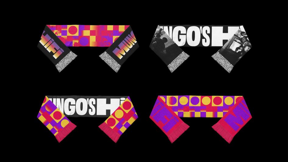
The new brand identity can now be seen on the Mungo's Hi Fi website, as social media, posters, merchandise and communications.
Editor's Picks


Trending


Podcasts


Editor's Picks
Further Reading