Kit Studio designs London Transport Museum’s new retail identity
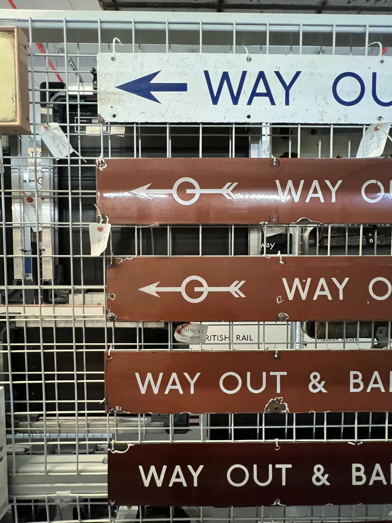
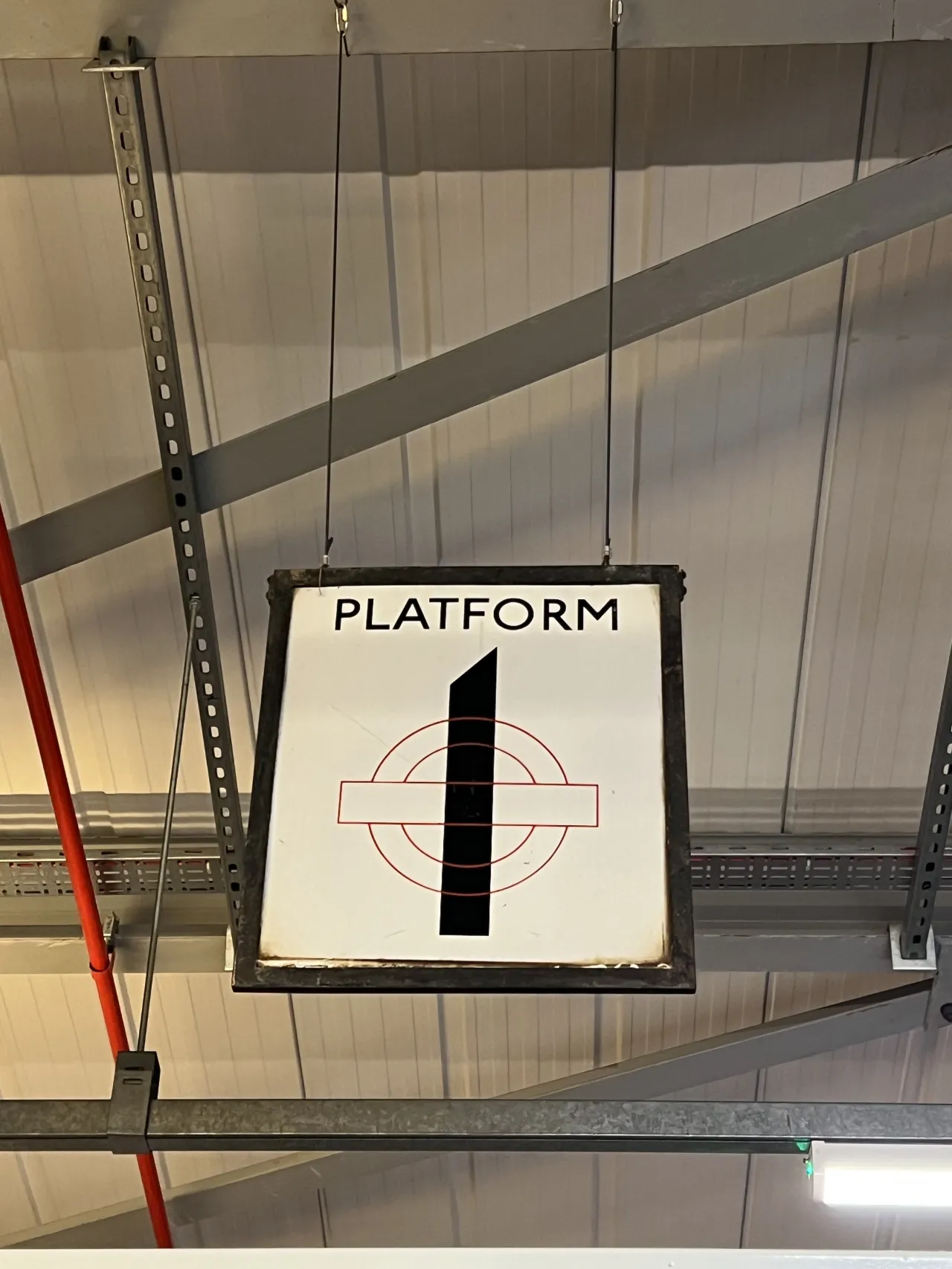
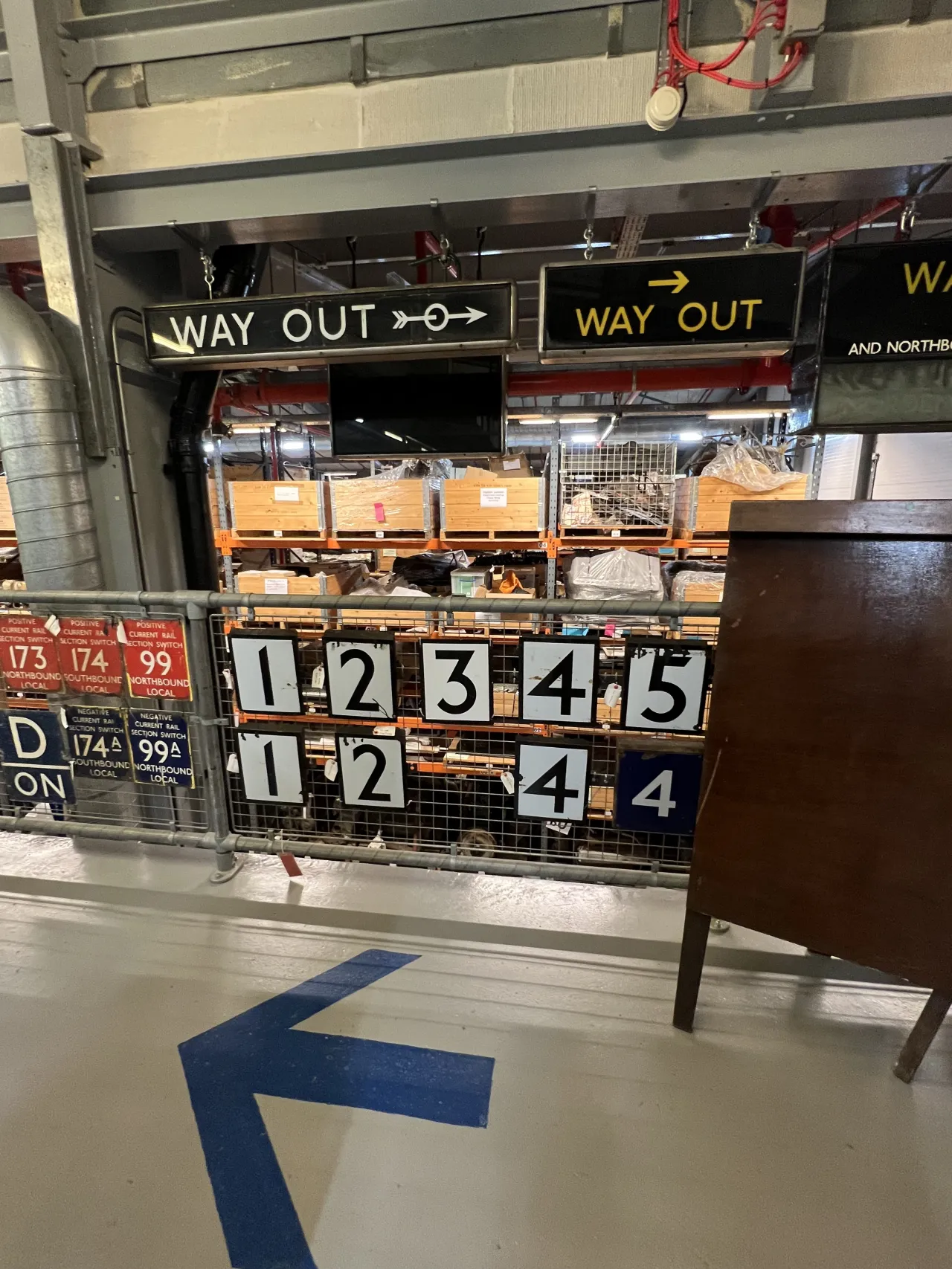
The aim was to respect the rich design history of London's transport network without just imitating the iconic patterns, shapes and colours.
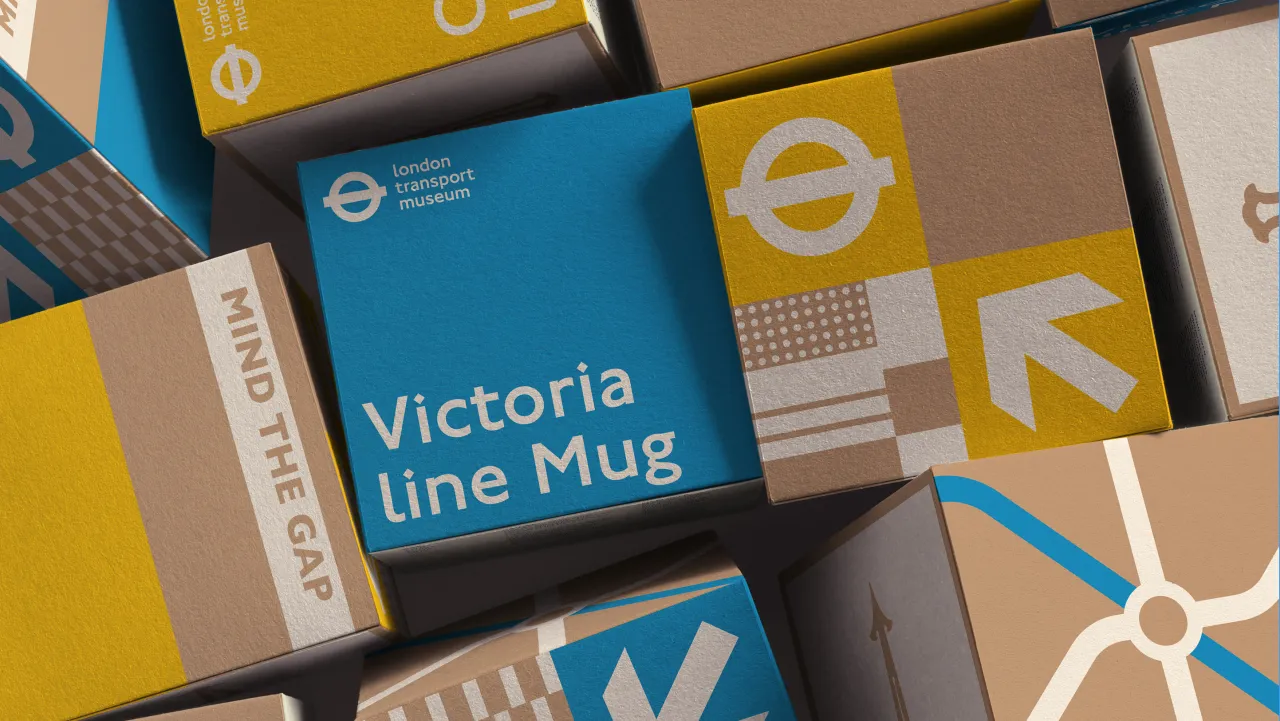
Kit Studio is behind the new visual identity for the London Transport Museum's retail offering – one that pays homage to the brand's rich design history and seeks to tell the true story of London Transport.
Because the brand had been working without retail brand guidelines in an ad hoc way and managing several different suppliers, the identity had become disjointed and no longer fit for purpose. The studio not only had to rectify this but also design a solution that could appeal to the Museum's four distinct audiences: young families, transport enthusiasts, design-focused urban millennials, and international visitors.
Kit Studio client partner Hannah Rea sheds light on the wider brand strategy: "to create a system that supports the Museum's mission to tell the story of London Transport, bringing the museum into the shop, whilst unifying their retail offer".
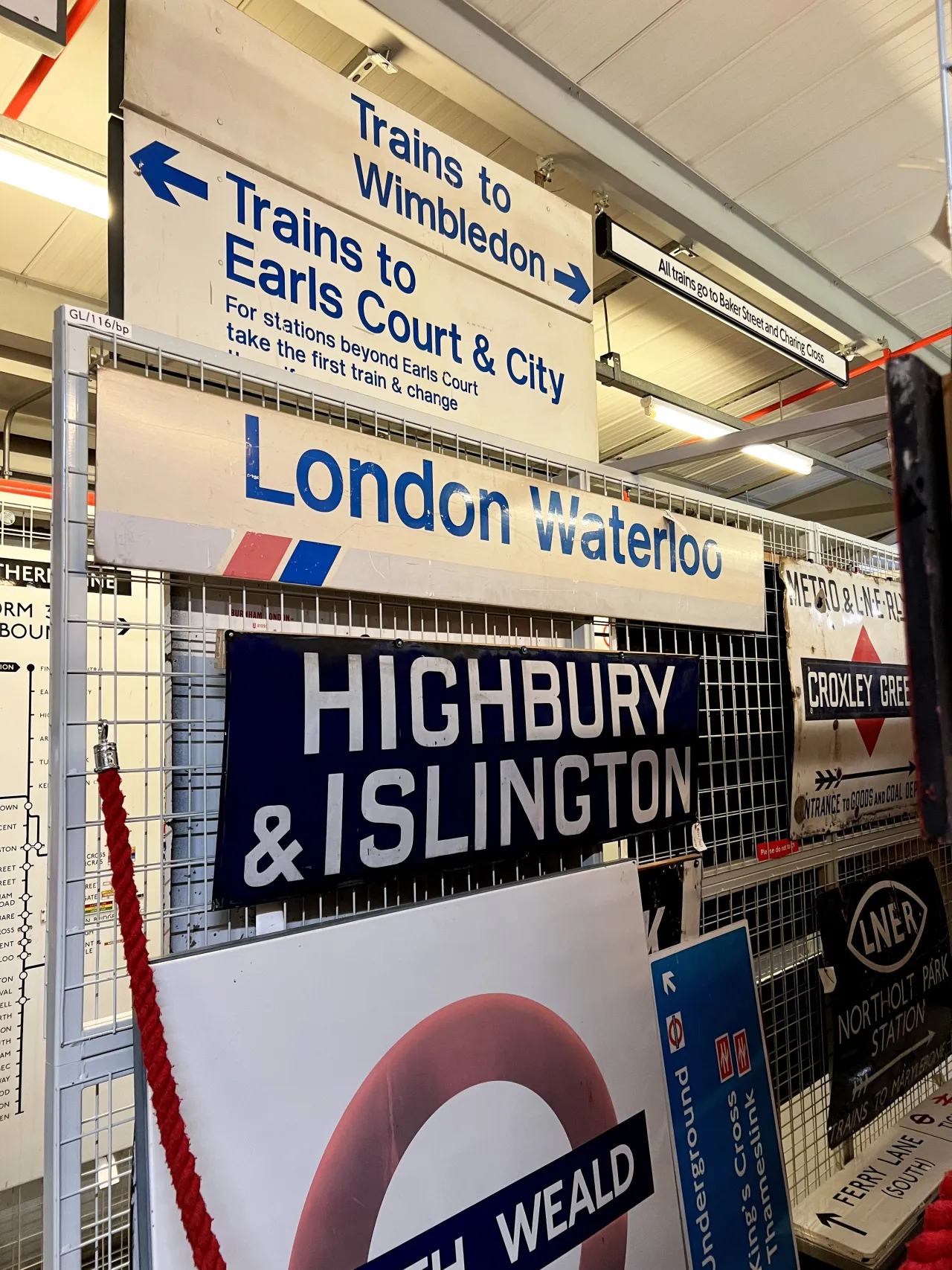
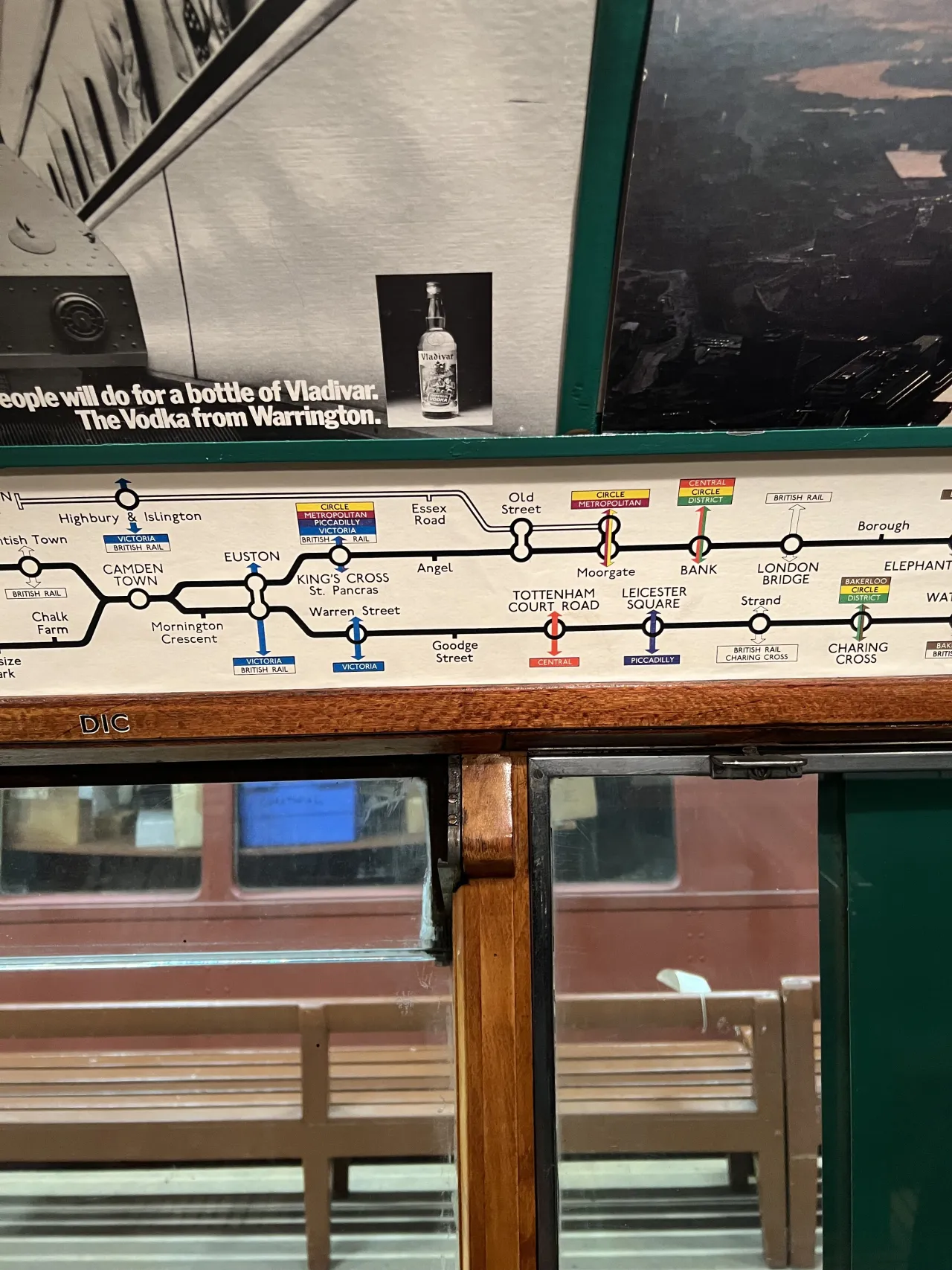
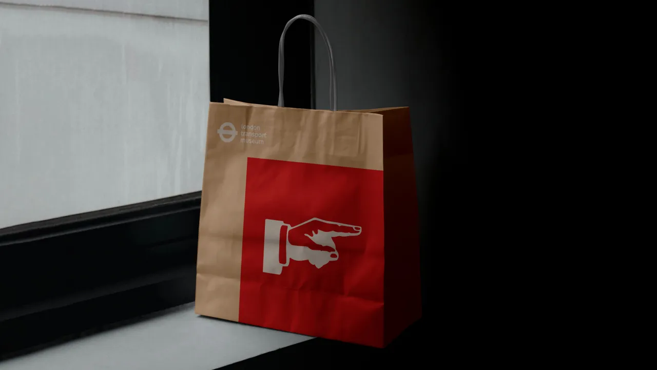
The design team at Kit Studio was excited about the project from the off, as it presented an opportunity to work with a globally recognised brand and renowned design system. "We were drawn to the project because of the opportunity to delve into the rich London Transport history, visiting the Museum archives, researching transport journeys and immersing ourselves in the well celebrated and iconic design system," explains the studio's creative partner Chris Bounds.
Though the project was undoubtedly a career highlight for many in the team, it didn't come without its challenges. Bounds reveals that the main challenge was balance, as the studio wanted to avoid creating a pastiche.
He questions: "How do you work with a brand that is so well respected and such a big part of our design history in a way that's respectful, fit for purpose, and feels new?
"As a creative team, it was a gift to work with such iconic design elements, and while we felt the pressure to get it right, the project has been full of education, inspiration and enjoyment."
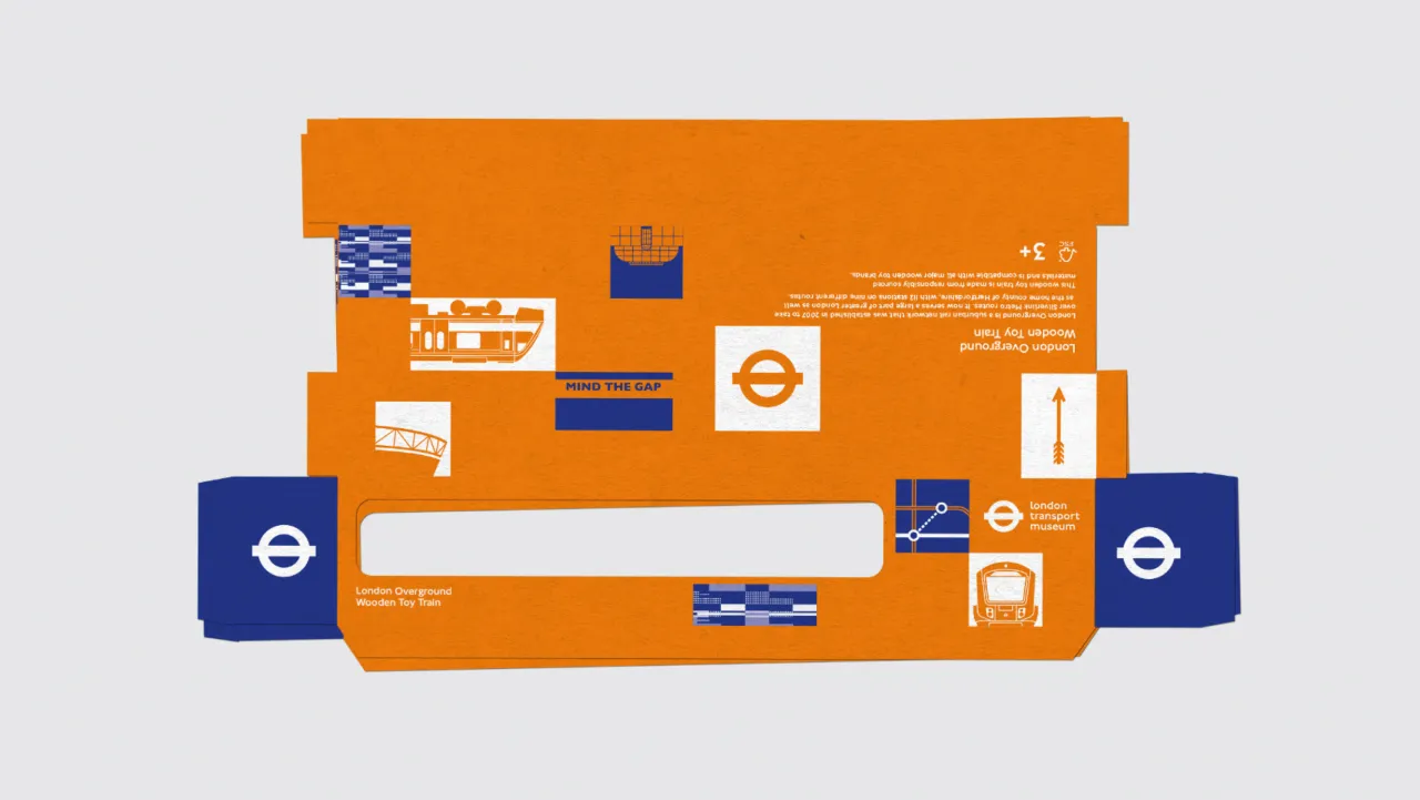
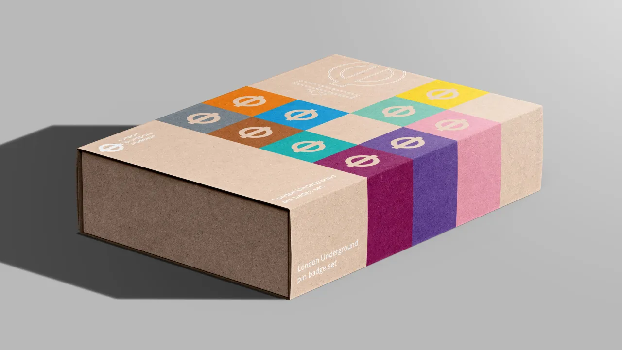
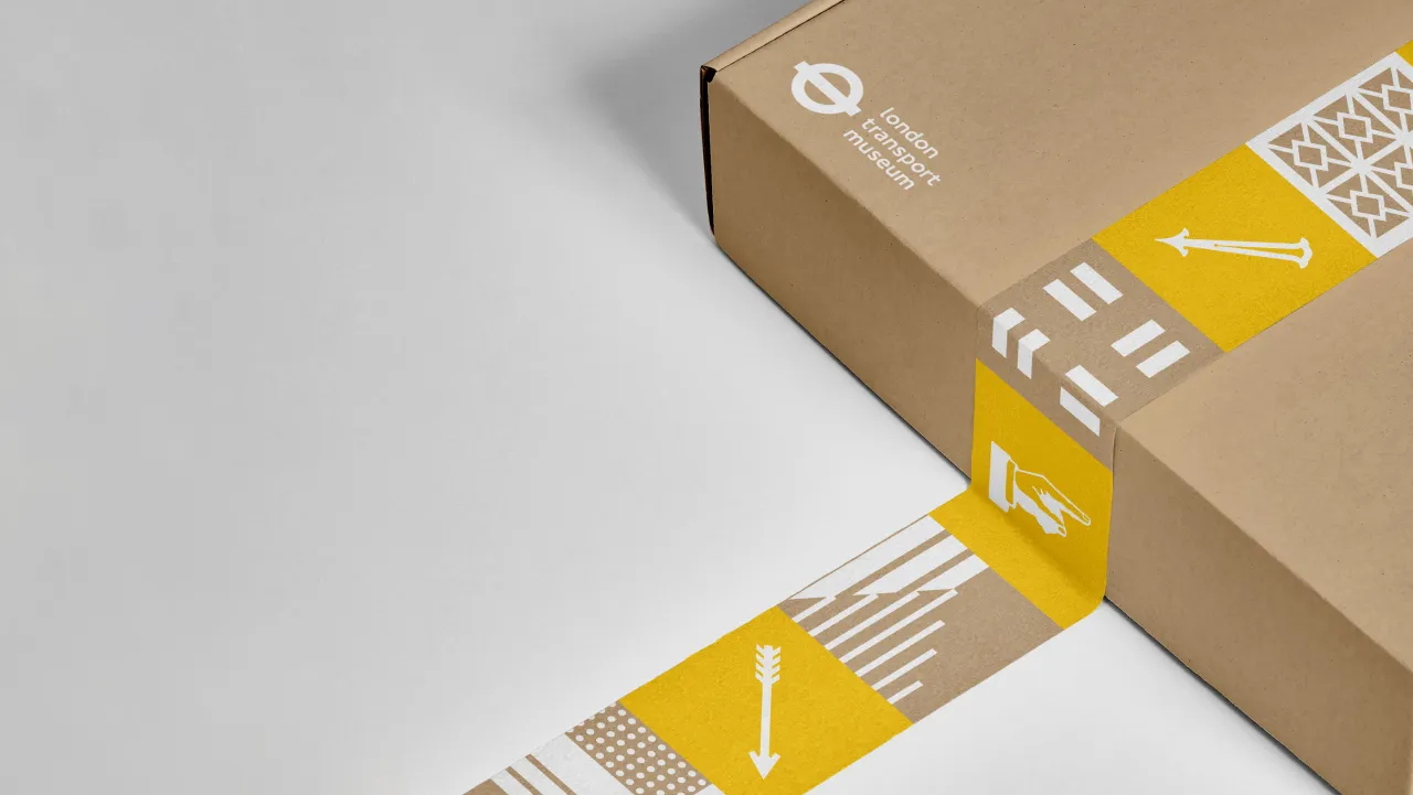
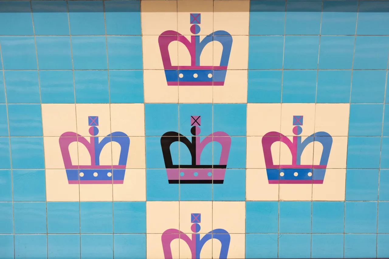
With balance in mind, Kit Studio designed a system that is inclusive of many of the celebrated design elements, including the tile artworks used across the network. In the research phase, the studio discovered two specific examples that inspired the evolution of the system: the graphic representation of the King's Cross and Seven Sisters underground stations.
Bounds says: "The tiles create a flexible system that unifies the broad range of design elements and visual cues taken from the transport network.
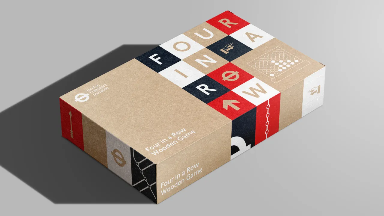
"The blocky nature of the tiles allows the system to be applied to varying packaging structures and formats, and importantly, the tiles enable us to tell the story of each product, feeding into the Museum's mission - to tell the story of London Transport."
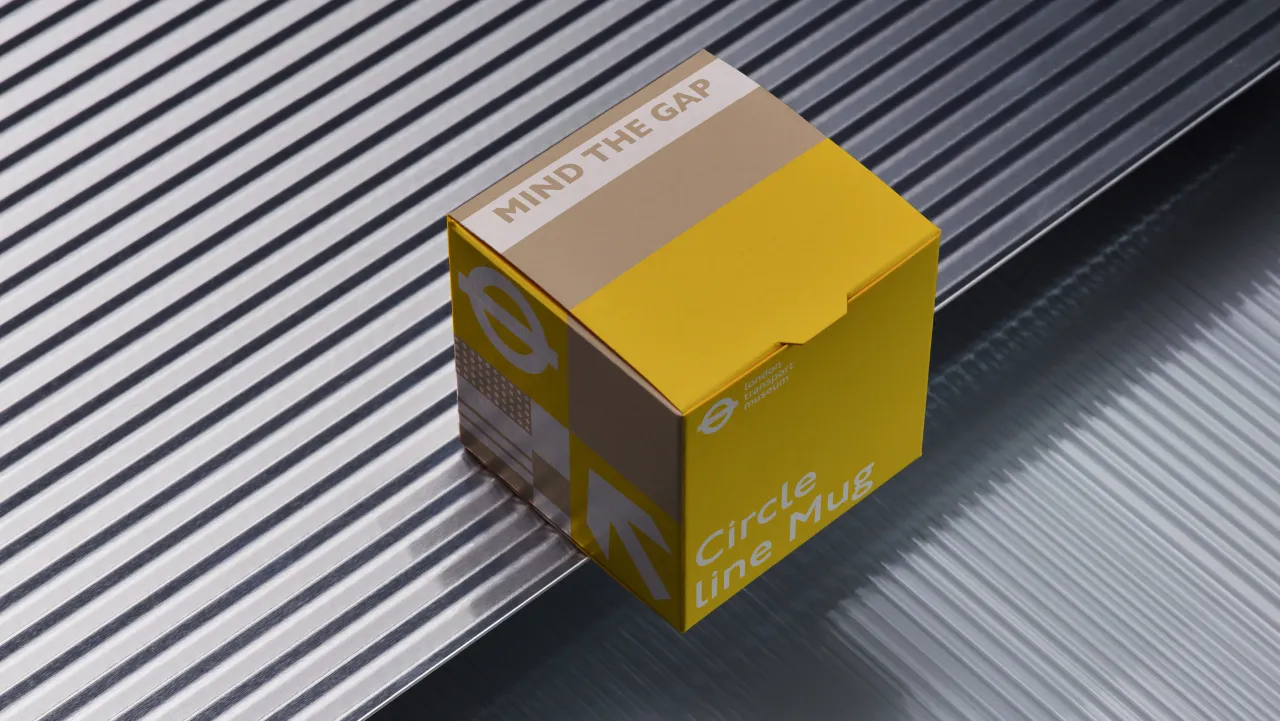
One example of its application is the overground wooden train, which features the moquette specific to that line as well as a number of illustrated landmarks that the train passes on the overground route. Bounds adds that the studio used 'mind the gap' markings on the top of the underground mug collection, "echoing the view from standing on the platform on the top of the box".
For Four in a Row, Kit Studio decided to illustrate the winning combinations for the game using the iconic Harry Beck tube map style.
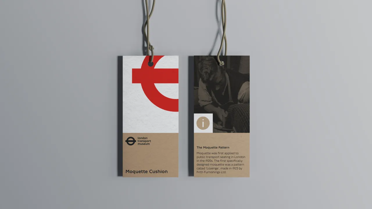
Many other symbols and design cues synonymous with the London Transport Network are visible across the retail identity, including arrows, along with a number of design elements specific to each piece of transport, such as moquette patterns and network colours. "Our approach was to create a flexible and adaptable tile system that allows us to mix the overarching design symbols with those that tell the product's story," says Bounds.
"For example, the bus sock collection features moquettes featured on the bus network, along with illustrations of those buses paired with an arrow and ampersand."
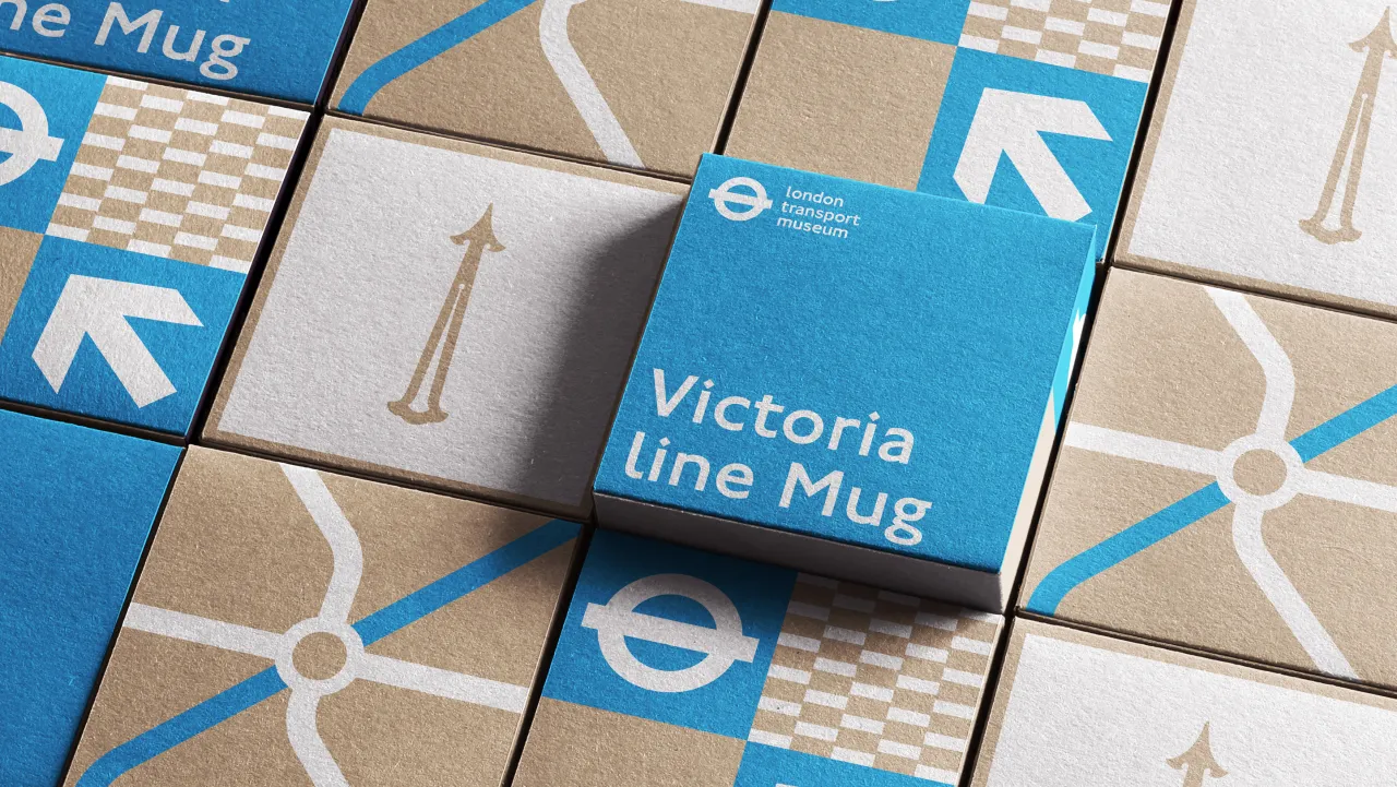
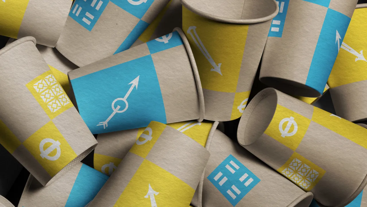
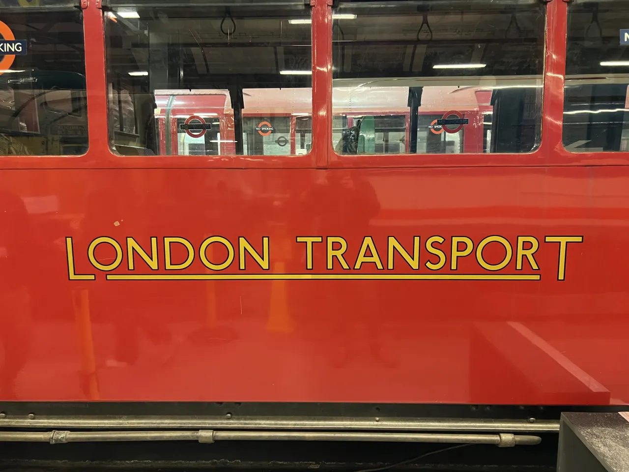
According to designer Hattie Evans, Kit Studio also worked with the existing and instantly recognisable colours from across the whole network and the iconic London Transport typeface, Johnston.
Evans explains that the brief also had "a strong focus on improving sustainability" in alignment with the London Transport Museum's wider goals. "We chose to remove the plastic ties and plastic windows, replacing these with cutouts, and then use illustrations of products in a new, ownable style to show product detail and features," she says.
"The approach is brought to life with a limited colour palette formed from the colours used across the London Transport Network, often paired with white and, wherever possible, printed directly to Kraft."
Editor's Picks





Trending






Latest Jobs
Head of design at Cog Design
Full-time·London·£55K
Account Manager at BUILDHOLLYWOOD
Full-time·London·£34k–£38k
Frontend Developer at Northern Artillery
Full-time·Leeds·£35k–£45k
Midweight Designer at Catalyst Creative
Full-time·London·£32k-£36k
Design Director at Human After All
Full-time·London·£66k–£88k
Midweight Full Stack Developer at Bureau for Visual Affairs
Full-time·London (Open to remote)·£35k–£50k