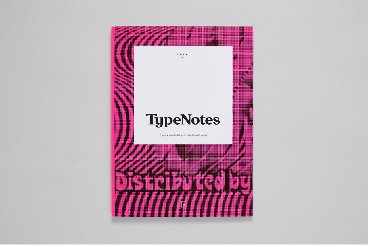
TypeNotes launches its second issue just in time for Christmas
Christmas has come early in the shape of issue two of TypeNotes, a magazine dedicated to typography and graphic design.
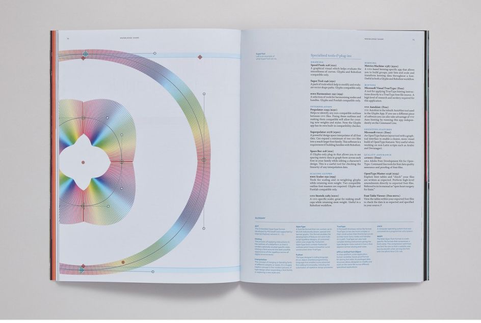
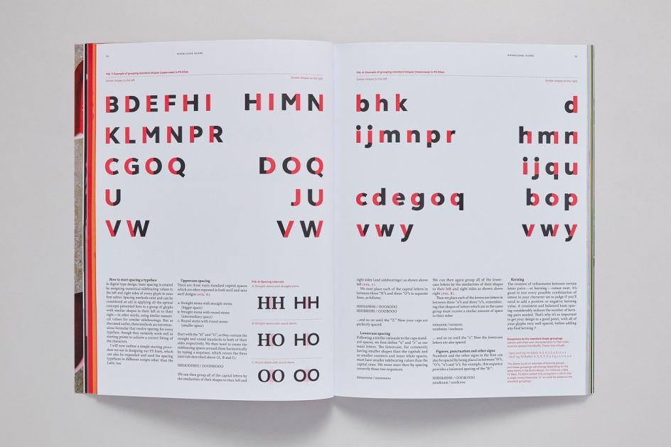
"Expect an in-depth guide to letter spacing, an exhaustive look at font software, and deep-dives on the minutiae of designing octothorpes and section signs," says TypeNotes editor, Emily Gosling.
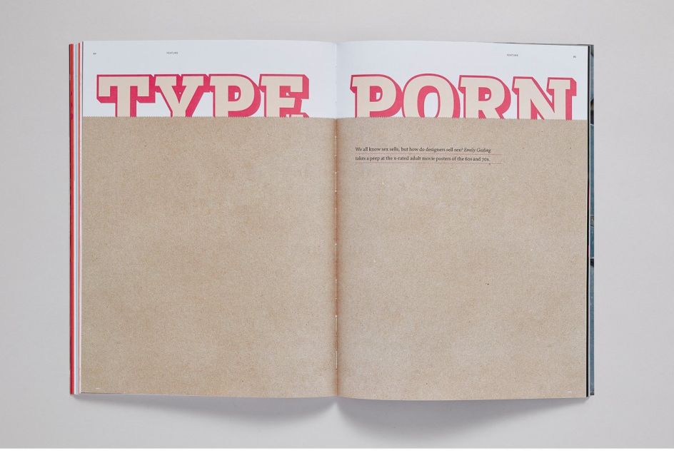
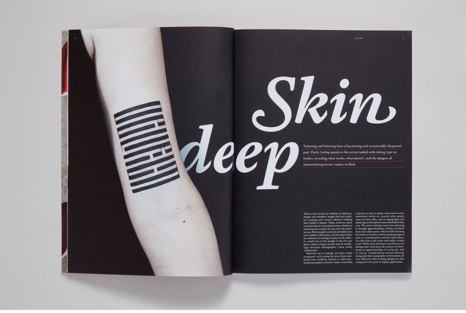
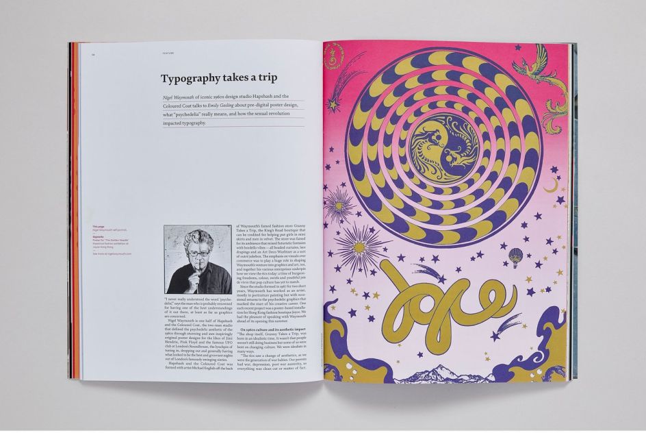
"We also uncover the saucy posters used to advertise x-rated movies in the 1960s and 70s, discuss the meaning of psychedelic with none other than Hapshash and the Coloured Coat’s Nigel Weymouth, and speak to a bunch of tattoo artists about the intricacies of lettering onto skin, and why some will never, ever ink a partner’s name. Turns out it ain’t easy to write the entire Lord’s Prayer on a person’s arm with a tattoo gun."
She adds: "It’s been a total joy to work on the issue and explore the myriad possibilities of how we use and interact with typography in places we often don’t even think about. Glasgow-based design agency O Street has contributed a superb exploration of its designs for Scottish banknotes, and Fontsmith’s own Stuart De Rozario delineates how the humble typewriter had a huge impact on the way type designers approached their craft in the wake of new technologies.
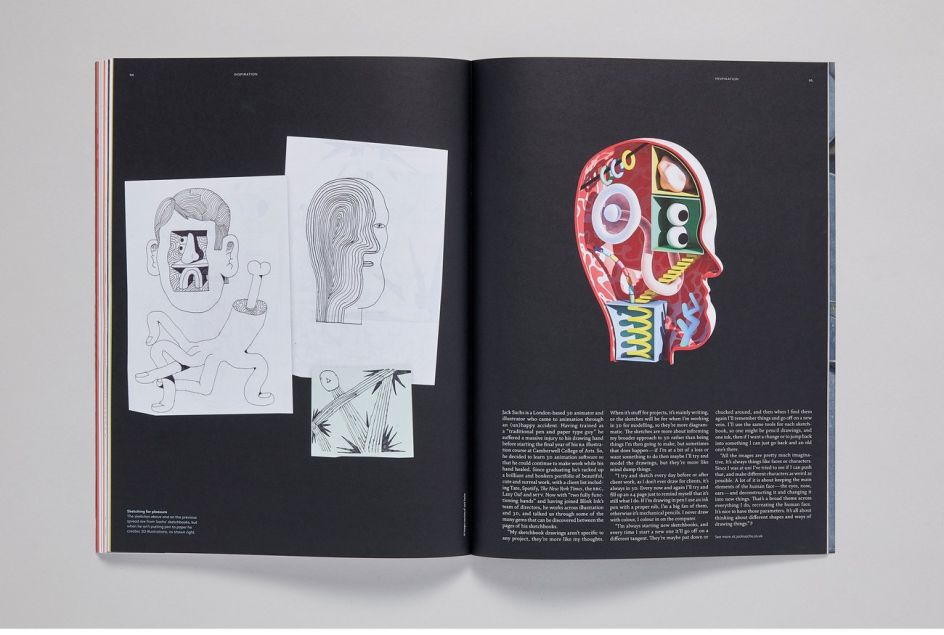
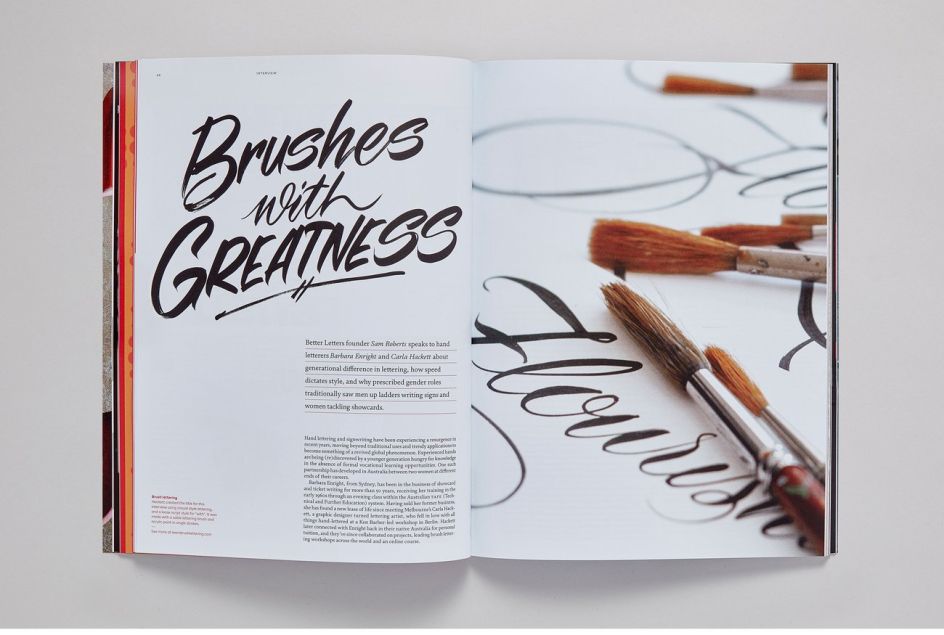
"We’ve been very lucky to work with so many talented and fascinating people who have been kind enough to talk about everything from Milton Glaser to being a female sign painter to designing title plates (and why we shouldn’t be saying 'mastheads'); or opening up their studios and sketchbooks for us." Grab a copy via Fontsmith.
Editor's Picks


Trending


](https://www.creativeboom.com/upload/articles/90/908fdb6378db1e95d12595416f54e6336d5e80b8_732.jpg)
Podcasts


Editor's Picks
Further Reading
](https://www.creativeboom.com/upload/articles/59/5966589fcae3400b8bed99371b371395c485f42d_732.jpg)