How the best whisky label of the year was designed on foot
When Thirst ditched the moodboard and walked East London instead, they created something no algorithm could ever generate.
One of the most talked-about booze projects of recent months very much went against the grain (so to speak). At a moment when the design industry is debating whether AI will consume creative work wholesale, one agency won the brief by doing something refreshingly, almost defiantly, analogue. They went for a walk.
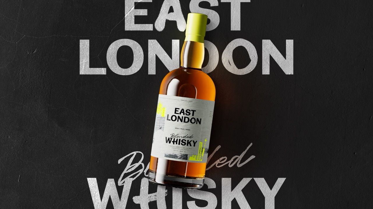
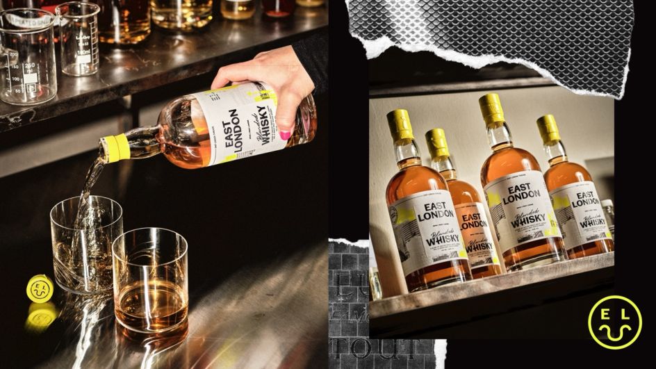
The project in question was the new East London Whisky from East London Liquor Company, the distillery's first foray into blended whisky. The design was by Thirst, the brand agency that works with ambitious drinks companies from its studios in Glasgow and New York.
The result is a label that feels genuinely rooted in place rather than assembled from category conventions, and it's worth picking apart exactly how they got there.
The brief nobody should underestimate
On paper, the brief sounds manageable enough. Create packaging for a new blended whisky that sits at an accessible premium price point, feels worth it in the hand, and cuts through a shelf still crowded with tartan, heritage type and moody landscape photography. Simple, right?
Well... not really, to be honest. After all, the whisky category is one of the most conservative in drinks design. Its visual grammar (aged leather, copper stills, coats of arms, typefaces that suggest ancestry rather than ambition) has been refined over generations precisely because it works.
Shoppers are trained to read those cues as quality. Disrupting them without losing credibility is genuinely difficult, and those who reach for novelty without substance tend to produce designs that look interesting for 30 seconds and then feel hollow.
Thirst's solution was to disrupt the category, not by ignoring its logic, but by replacing its raw material. If traditional whisky premium is built on heritage, theirs would be built on place, specifically, on a very particular, very alive, very contradictory place: E1, E2, E3.
An urban safari and a very good idea
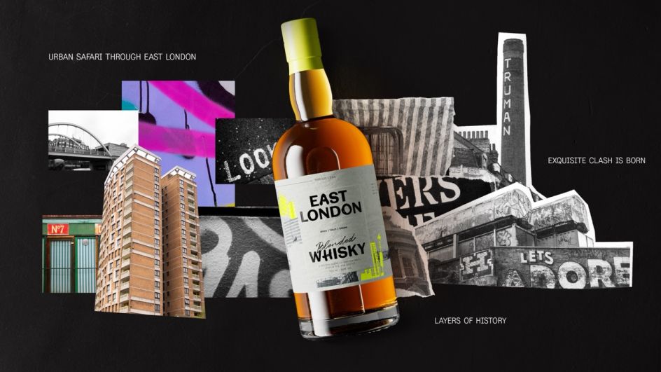
Rather than building a creative world from moodboards and stock imagery, senior designer Alex Page and the client spent a day walking in East London. Not popping out for a quick recce; genuinely pounding the streets, photographing signage, architecture, textures, typographic accidents, the kind of visual material that accumulates on a city block over decades and can't be curated into existence on a screen.
This sounds like an obvious approach, but it is actually quite rare. Remember, the pressure in most studio environments is toward efficiency. So, because reference imagery is abundant online, and AI tools can generate visual worlds on demand, taking a designer off billable work for a day wandering around Bethnal Green can feel like a frivolous luxury.
The fact that Thirst did it anyway and built their creative strategy around what they found tells us something profound about where genuinely interesting work is still being made.
What they brought back was the raw material for what they call "Exquisite Clash": the lived tension of East London, where old boozers sit next to new-world restaurants, Victorian detailing collides with concrete tower blocks, and layers of history pile up on every wall without ever quite resolving into coherence. It's not pretty in a conventional sense; it's better than that. It's real.
Making premium feel earned, not performed
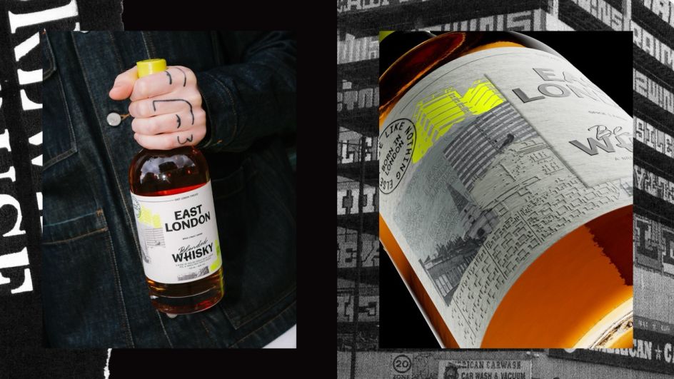
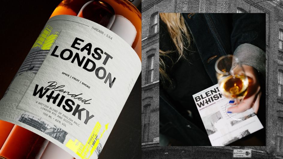
The creative strategy gave them something to work with, but execution is where packaging lives or dies. The label they produced is deliberately dimensional: embossing, micro-embossing, spot varnishes, foil details and die-cut shapes layered together to create something tactile that rewards attention. Sam Cutler, creative director at Thirst, puts it neatly: "Whisky can feel like it's trapped in an old-world idea of premium. This needed to feel worth it without becoming precious."
That phrase, "worth it without becoming precious", is doing a lot of useful work here. A shopper at the shelf is making a quick, largely subconscious calculation about whether the object in their hand justifies what they're about to spend. The design has to answer that question without the buyer fully knowing they've asked it.
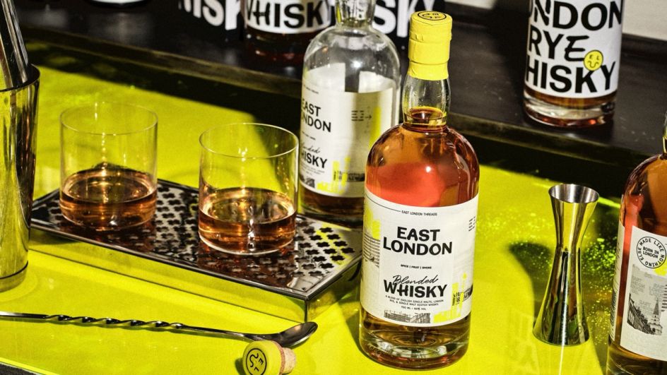
Faux tradition, the kind of pseudo-heritage that gets slapped on spirits brands by the dozen, tends to fail this test because seasoned buyers sense its inauthenticity. What Thirst built instead is craftsmanship that's legible at shelf distance (bold typographic structure, a distinctive neon-touched palette that cuts through without screaming) and rewards closer inspection (the layered collage detail, the textural print finishes). The quality is demonstrated rather than claimed.
What designers can learn
There's a broader lesson here that goes beyond whisky and into how we think about place, research and the temptation to work entirely from screens. The urban safari idea isn't new: designers have always drawn on the environment and observation. But the discipline to actually do it, to commit a day of studio time to walking and looking rather than searching and pinning, is increasingly rare. And the results, when you compare them to work generated from digital references alone, tend to have a different quality: messier in some ways, but more specific, more surprising, more genuinely rooted.
Alex Wolpert, founder of East London Liquor Company, notes that "letting new eyes under the hood of your brand is always an interesting exercise". That's putting it mildly. What Thirst did was conduct a forensic interrogation of what East London as a place actually means, rather than what it's assumed to mean, and then distil that into a label. Which, funnily enough, is precisely what the whisky itself does.
East London Whisky is a blend of English malt, London rye and Scotch: different traditions pulled together into something new. The design follows the same logic. The result is a bottle that feels unmistakably of its place, and a project that makes a fairly compelling case that the most interesting creative work still starts with leaving the studio.

Editor's Picks


Trending

Podcasts


Editor's Picks
Further Reading