HONDO brings global design conversation to Galicia with identity for Proxectar
The London studio has crafted a thoughtful visual identity for Proxectar, a new design event in Nigrán that blends local heritage with global perspective.
Proxectar, a new design event, is reshaping the creative landscape of northern Spain by bringing international design voices to Nigrán, a small coastal town in Galicia.
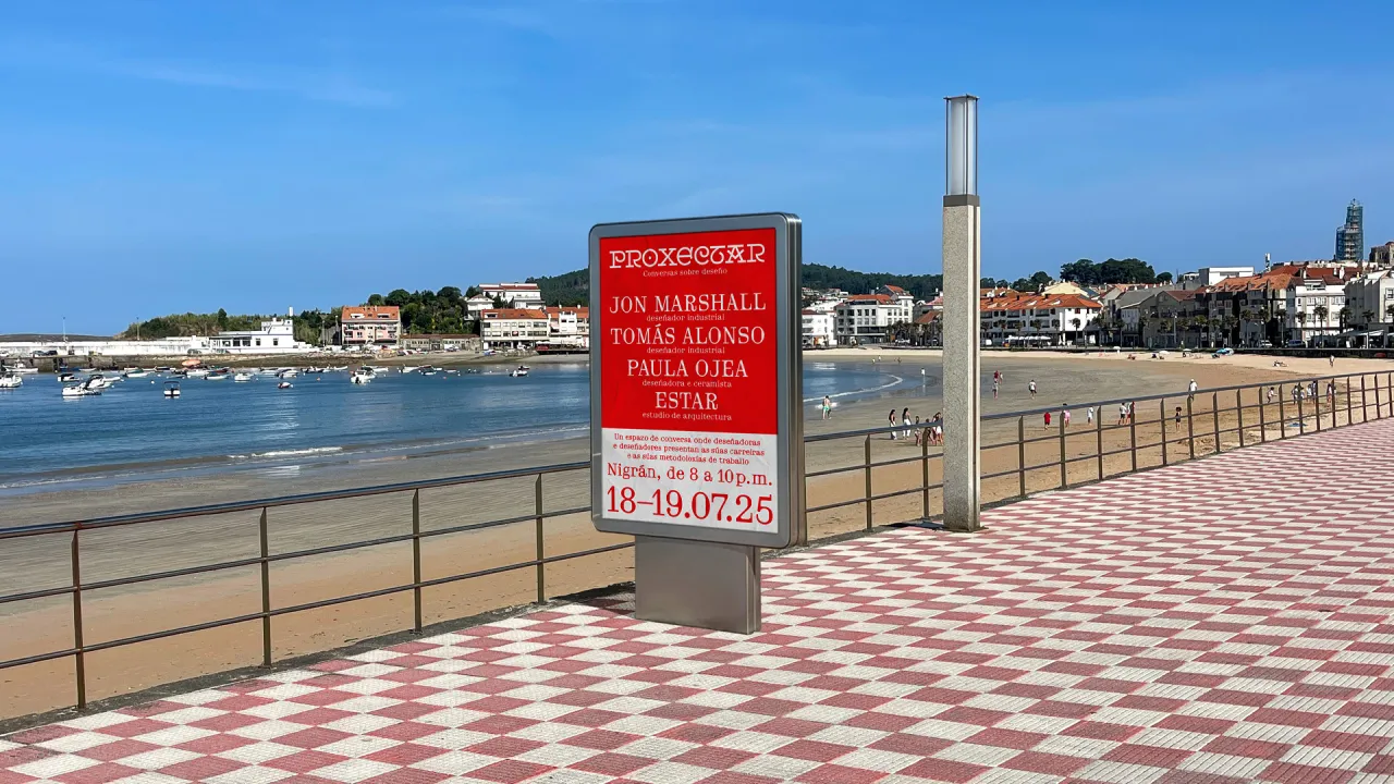
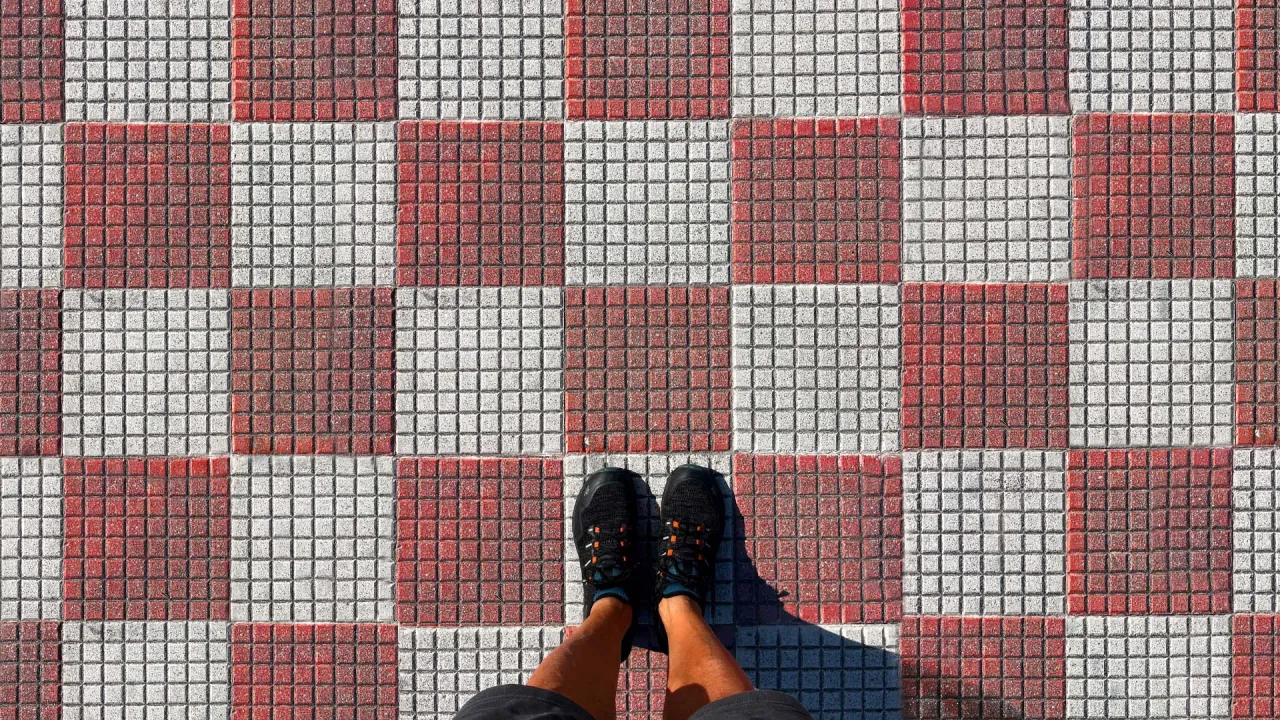
Incidentally, the town is better known for its red-and-white tiled promenade than for global conferences, but HONDO's visual identity for the programme has helped local talent get excited about behind-the-scenes conversations about craft, methodology, and the realities of design work.
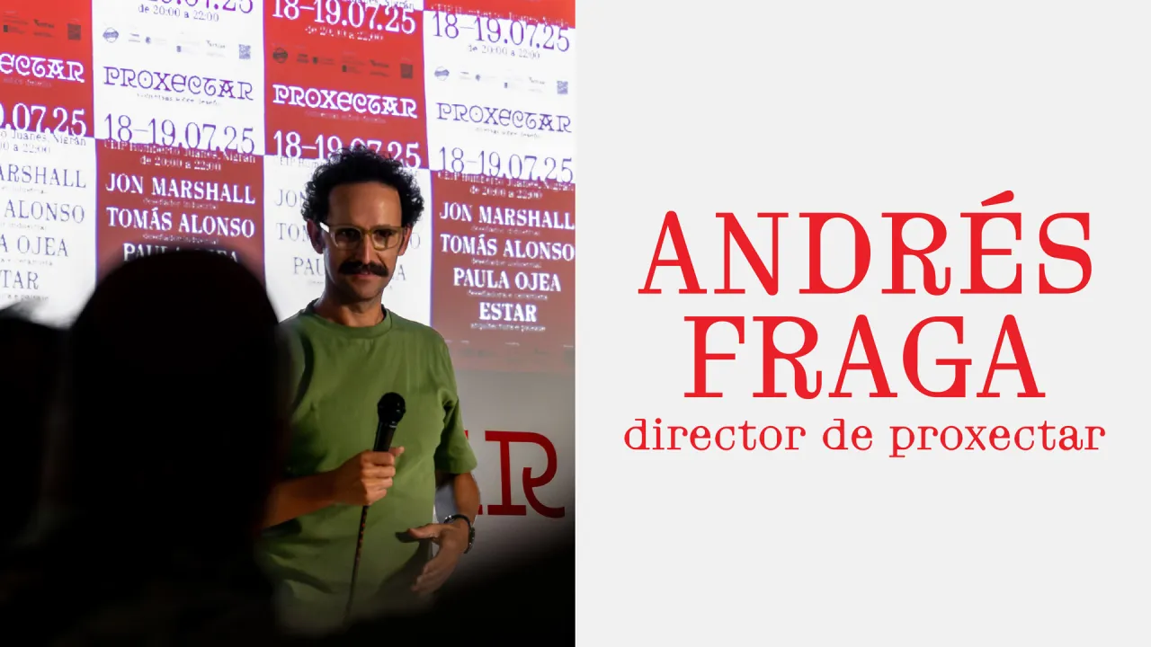
The event was the brainchild of Andrés Fraga and welcomed guests, including John Marshall of Pentagram, designer Tomás Alonso, ceramicist Paula Ojea, and representatives from Estar and the University of Vigo. For many local attendees, it offers access to conversations that rarely reach the region.
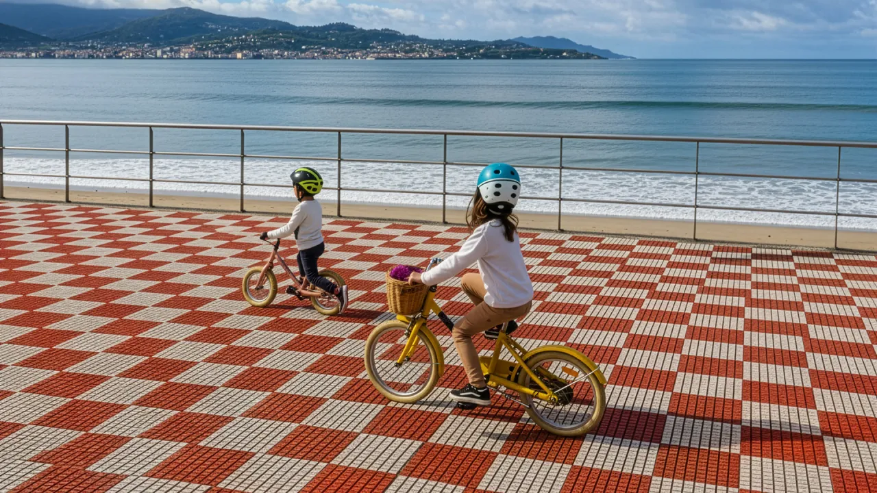

HONDO anchored the entire system to the distinctive tiled pattern of Nigrán's promenade, treating a familiar civic texture as a conceptual anchor. "Using that pattern allowed us to root the identity in something unmistakably from Nigrán, giving local audiences an immediate sense of familiarity and belonging," says Fran Méndez, HONDO co-founder and creative director.
While it may be an everyday motif, here it becomes a modular graphic framework that can shift in scale and rhythm. HONDO has made it feel contemporary without losing the warmth of its source.
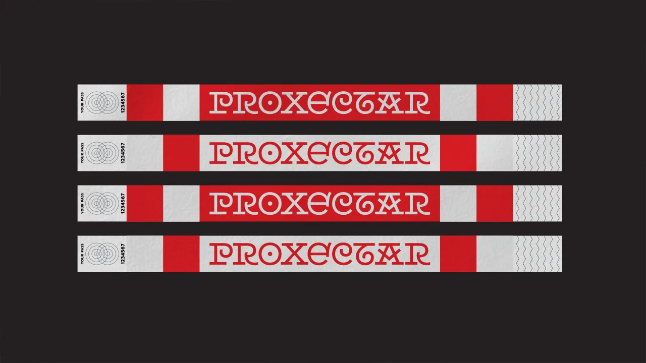
The studio also turned to the region's typographic heritage for inspiration. The logotype draws from 14th-century Galician engraved lettering and the work of Alfonso Daniel Rodríguez Castelao, a key cultural figure whose typographic experiments have shaped Galician visual culture.
Fran explains that it was important "that Proxectar's visual identity felt genuinely rooted in Galicia, not just geographically, but culturally and linguistically." The team also studied the original sources behind Castelao's influences, including inscriptions at San Pedro de Rocas in Ourense, allowing them to create a logotype that nods to the past without becoming an imitation.
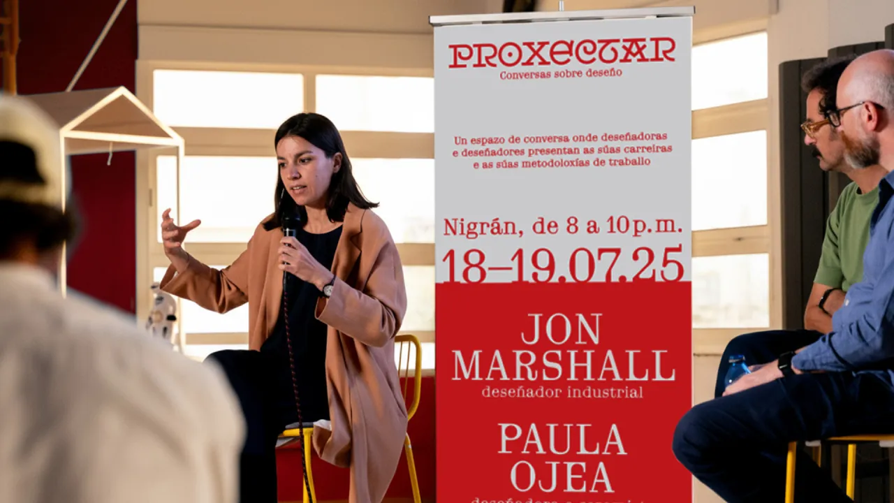
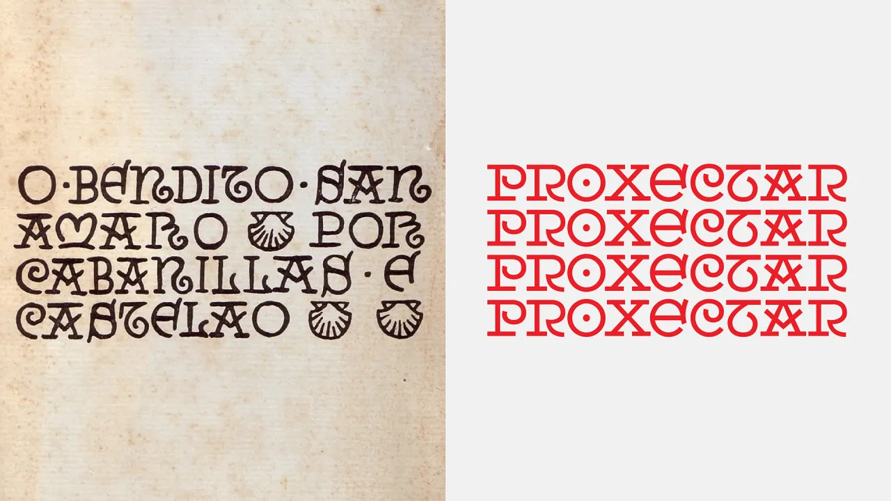
HONDO also consciously resisted the typical blues associated with the region and introduced red as a primary colour instead. It creates a confident break from expectation, lifting the identity out of the usual coastal palette.
"This shift away from the conventional blue created an unexpected and bold contrast," Fran says, positioning the brand as both grounded and forward-looking.
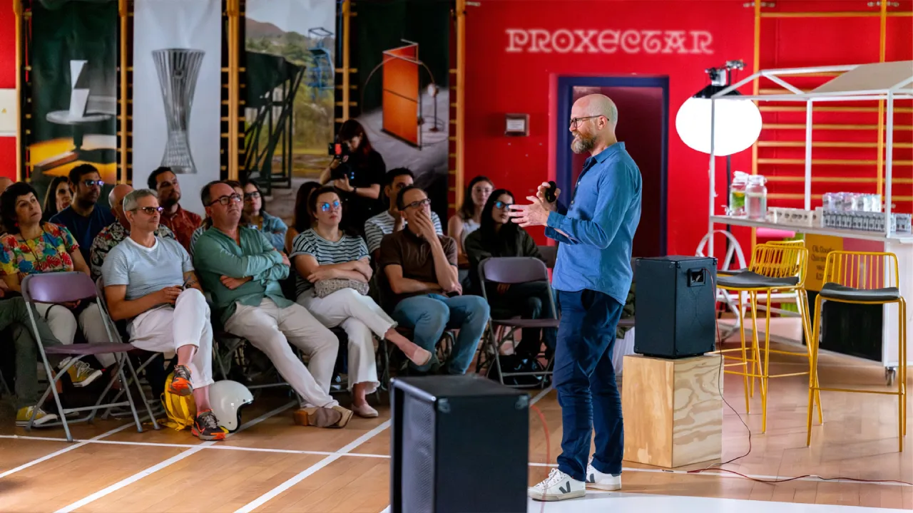
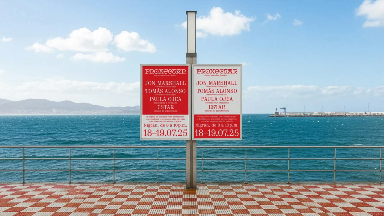
Because the event centres on the craft behind design, the studio also embedded subtle references to industrial process. A monospace typeface appears throughout, lending the identity a structural, almost mechanical edge. Its tone is deliberately raw in places, echoing the honesty of the event's conversations.
Although Proxectar is small in scale, its ambitions are not. HONDO conducted research on the region before designing, ensuring the identity would resonate locally while positioning Nigrán within the broader design conversation.
"Our goal was to craft a global brand identity that speaks beyond the traditional Spanish design hubs," Fran notes.
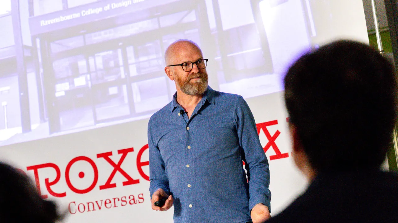
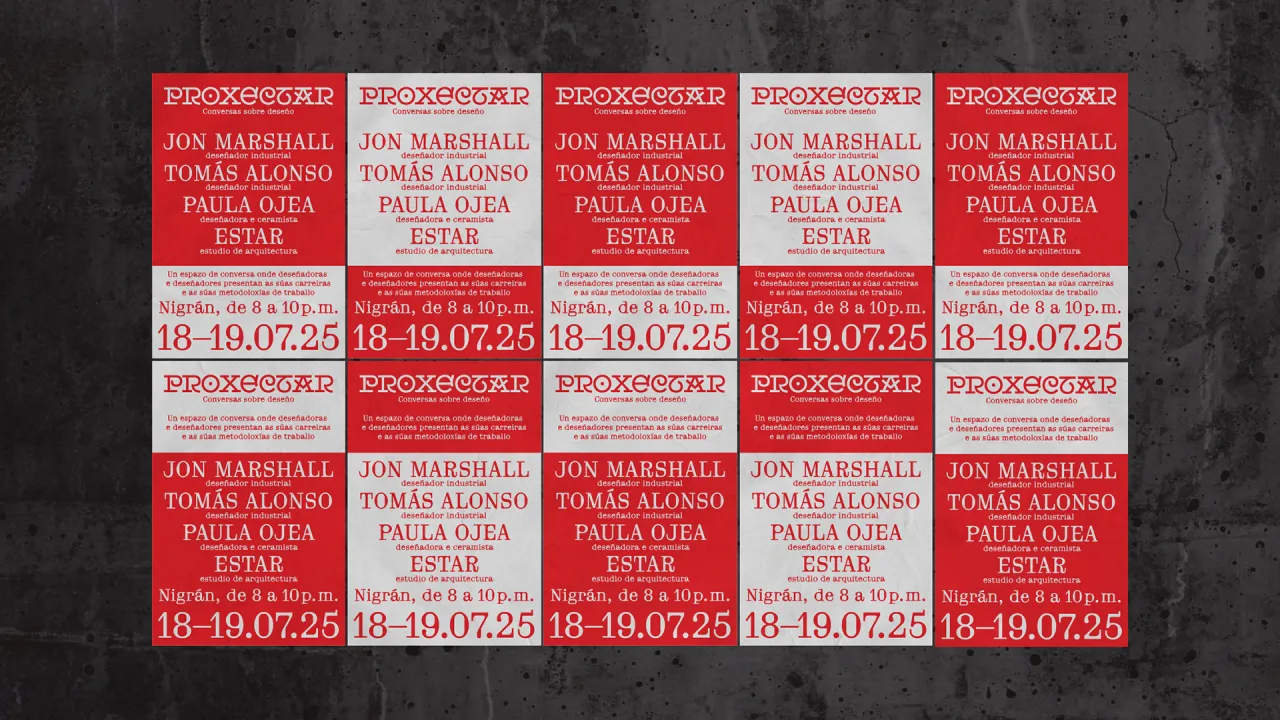
Perhaps fittingly for a project rooted in community, Fran describes its collaborative nature as the detail he is proudest of. Working alongside type designer Nancho from Best Typefaces helped refine the logotype, while supporting Andrés's vision gave the team a sense of purpose.
"For us, that mix of local focus, big ambitions, and teamwork is the part of the identity system we're most proud of," he says.
Proxectar may be at the beginning of its journey, but HONDO's identity gives the event a clear voice, grounded in its place of origin and ready to join a much broader dialogue.

Editor's Picks





Trending




Latest Jobs
Senior 2D Motion Designer at Art&Graft
Full-time·London·£50,000 – £65,000
Associate Web Designer at Planhat
Full-time·London·£30,000 – £35,000
Senior Designer, Audio at Penguin Random House UK
Full-time·London·Circa £38,000
Junior Content Producer at Welsh Rugby Union
Full-time·Cardiff·£28,000 – £30,000
GTA VI Social Lead at Future
Full-time·Bath·£29,000 – £40,000
Senior Designer at David&Goliath
Full-time·Los Angeles·$100,000 – $140,000